- Excel Charts - Home
- Excel Charts - Introduction
- Excel Charts - Creating Charts
- Excel Charts - Types
- Excel Charts - Column Chart
- Excel Charts - Line Chart
- Excel Charts - Pie Chart
- Excel Charts - Doughnut Chart
- Excel Charts - Bar Chart
- Excel Charts - Area Chart
- Excel Charts - Scatter (X Y) Chart
- Excel Charts - Bubble Chart
- Excel Charts - Stock Chart
- Excel Charts - Surface Chart
- Excel Charts - Radar Chart
- Excel Charts - Combo Chart
- Excel Charts - Chart Elements
- Excel Charts - Chart Styles
- Excel Charts - Chart Filters
- Excel Charts - Fine Tuning
- Excel Charts - Design Tools
- Excel Charts - Quick Formatting
- Excel Charts - Aesthetic Data Labels
- Excel Charts - Format Tools
- Excel Charts - Sparklines
- Excel Charts - PivotCharts
Excel Charts - Surface Chart
Surface charts are useful when you want to find the optimum combinations between two sets of data. As in a topographic map, the colors and patterns indicate the areas that are in the same range of values.
To create a Surface chart, ensure that both the categories and the data series are numeric values.
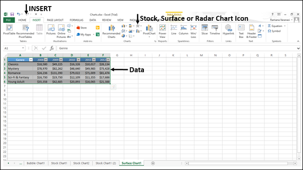
Step 1 − Arrange the data in columns or rows on the worksheet.
Step 2 − Select the data.
Step 3 − On the INSERT tab, in the Charts group, click the Stock, Surface or Radar Chart icon on the Ribbon.
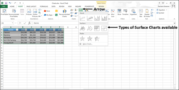
You will see the different types of available Surface charts.
A Surface chart has the following sub-types −
- 3-D Surface
- Wireframe 3-D Surface
- Contour
- Wireframe Contour
Step 4 − Point your mouse on each of the icons. A preview of that chart type will be shown on the worksheet.
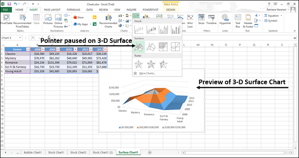
Step 5 − Double-click the chart type that suits your data.
In this chapter, you will understand when each of the Surface chart types is useful.
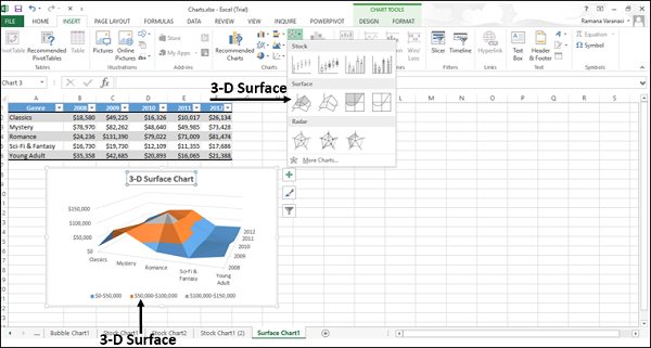
3-D Surface
3-D Surface chart shows a 3-D view of the data, which can be imagined as a rubber sheet stretched over a 3-D Column chart. It is typically used to show relationships between large amounts of data that may otherwise be difficult to see.
Color bands in a Surface chart −
Do not represent the data series
Indicate the difference between the values
You can use a 3-D Surface chart −
When the categories and the series are both numeric values.
To show the trends in values across two dimensions in a continuous curve.
Wireframe 3-D Surface
A Wireframe 3-D Surface chart is a 3-D Surface chart shown without color on the surface. This chart shows only the lines. A Wireframe 3-D Surface chart is not easy to read, but it can plot large data sets much faster than a 3-D Surface chart.
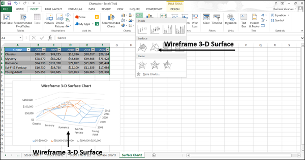
You can use a Wireframe 3-D Surface chart −
To show the trends in values across two dimensions in a continuous curve.
When the categories and the series are both numeric values.
When the data curves behind itself.
Contour
Contour charts are Surface charts viewed from above, similar to the 2-D topographic maps.
In a Contour chart,
The color bands represent specific ranges of the values.
The lines connect the interpolated points of equal value.
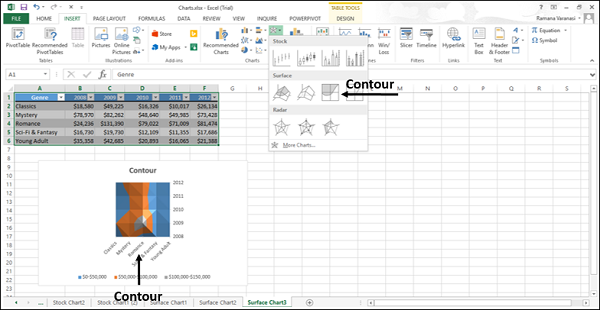
Use Contour chart −
To show the 2-D top view of a 3-D surface chart.
To represent the ranges of the values using color.
When both the categories and the series are numeric.
Wireframe Contour
Wireframe Contour charts are also Surface charts viewed from above. A Wireframe chart shows only the lines without the color bands on the surface. Wireframe Contour charts are not easy to read. You can use a 3-D Surface chart instead.
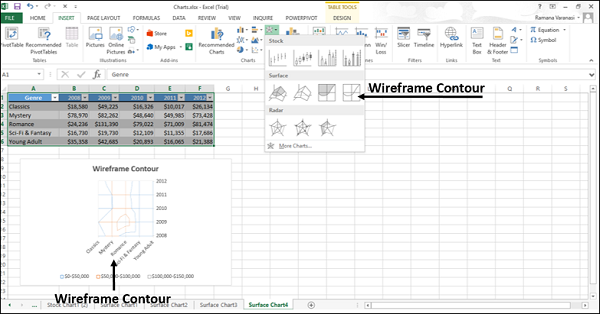
Use Wireframe Contour chart
To show the 2-D top view of a 3-D Surface chart only with lines.
Both the categories and the series are numeric.
Consider using a Contour chart instead, because the colors add detail to this chart type.
