- Excel Charts - Home
- Excel Charts - Introduction
- Excel Charts - Creating Charts
- Excel Charts - Types
- Excel Charts - Column Chart
- Excel Charts - Line Chart
- Excel Charts - Pie Chart
- Excel Charts - Doughnut Chart
- Excel Charts - Bar Chart
- Excel Charts - Area Chart
- Excel Charts - Scatter (X Y) Chart
- Excel Charts - Bubble Chart
- Excel Charts - Stock Chart
- Excel Charts - Surface Chart
- Excel Charts - Radar Chart
- Excel Charts - Combo Chart
- Excel Charts - Chart Elements
- Excel Charts - Chart Styles
- Excel Charts - Chart Filters
- Excel Charts - Fine Tuning
- Excel Charts - Design Tools
- Excel Charts - Quick Formatting
- Excel Charts - Aesthetic Data Labels
- Excel Charts - Format Tools
- Excel Charts - Sparklines
- Excel Charts - PivotCharts
Excel Charts - Column Chart
Column Charts are useful to visually compare values across a few categories or for showing data changes over a period of time.
A Column Chart typically displays the categories along the horizontal (category) axis and the values along the vertical (value) axis.
Follow the steps given to insert a column chart.
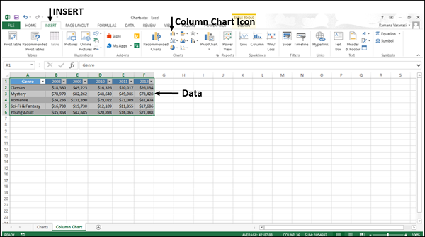
Step 1 − Arrange the data in columns or rows on the worksheet.
Step 2 − Select the data.
Step 3 − On the INSERT tab, in the Charts group, click the Column chart icon on the Ribbon.
You will see the different options available for Column Charts.
A Column Chart has the following sub-types −
2-D Column Charts
Clustered Column
Stacked Column
100% Stacked Column
3-D Column Charts
3-D Clustered Column
3-D Stacked Column
3-D 100% Stacked Column
3-D Column
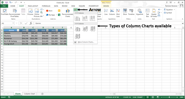
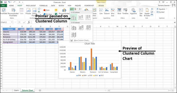
Step 4 − Point your mouse on each of the icons. You will see a preview of the chart type.
Step 5 − Double-click the chart type that suits your data.
In this chapter, you will understand when each of the column chart types is useful.
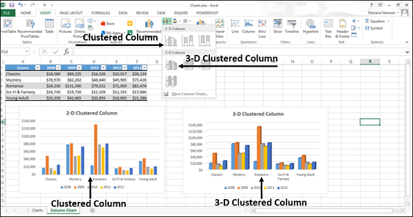
Clustered Column and 3-D Clustered Column
These chart types are useful to compare the values across a few categories, when the order of the categories is not important.
Remember that −
A Clustered Column chart shows values in 2-D rectangular columns.
A 3-D Clustered Column chart shows Columns in 3-D perspective, but it does not use a third value axis (depth axis).
You can use Clustered Column charts when you have multiple data series with categories that represent −
Ranges of values (e.g. item counts).
Specific scale arrangements (e.g. a Likert scale with entries like Strongly agree, Agree, Neutral, Disagree, Strongly disagree).
Names that are not in any specific order (e.g. item names, geographic names, or the names of people).
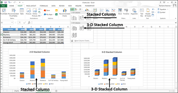
Stacked Column and 3-D Stacked Column
These charts are useful to −
- Compare parts of a whole
- Show how parts of a whole change over time
- Compare parts of a whole across categories
A Stacked Column chart displays values in 2-D vertical stacked rectangles. A 3-D Stacked Column chart displays the data by using a 3-D perspective, but it does not use a third value axis (depth axis).
A 100% Stacked bar shows 2-D bars that compare the percentage that each value contributes to a total across the categories.
100% Stacked Column and 3-D 100% Stacked Column
These charts are used to −
Compare the percentages that each value contributes to the total.
Check, how the percentage that each value contributes changes over time.
Compare the percentage that each value contributes across categories.
A 100% Stacked Column chart shows values in 2-D columns that are stacked to represent 100%. A 3-D 100% Stacked Column chart shows the columns using a 3-D perspective, but it does use a third value axis (depth axis).
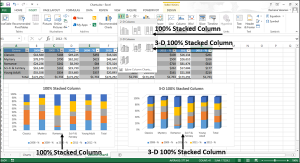
You can use 100% Stacked Column charts when you have three or more data series and you want to emphasize the contributions to the whole, especially if the total is the same for each category.
3-D Column
3-D Column charts use three axes that you can modify (a horizontal axis, a vertical axis, and a depth axis), and they compare data points along the horizontal and the depth axes.
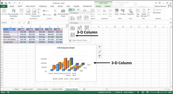
You can use this chart when you want to compare the data across both the categories and the data series.
