- Excel Charts - Home
- Excel Charts - Introduction
- Excel Charts - Creating Charts
- Excel Charts - Types
- Excel Charts - Column Chart
- Excel Charts - Line Chart
- Excel Charts - Pie Chart
- Excel Charts - Doughnut Chart
- Excel Charts - Bar Chart
- Excel Charts - Area Chart
- Excel Charts - Scatter (X Y) Chart
- Excel Charts - Bubble Chart
- Excel Charts - Stock Chart
- Excel Charts - Surface Chart
- Excel Charts - Radar Chart
- Excel Charts - Combo Chart
- Excel Charts - Chart Elements
- Excel Charts - Chart Styles
- Excel Charts - Chart Filters
- Excel Charts - Fine Tuning
- Excel Charts - Design Tools
- Excel Charts - Quick Formatting
- Excel Charts - Aesthetic Data Labels
- Excel Charts - Format Tools
- Excel Charts - Sparklines
- Excel Charts - PivotCharts
Excel Charts - Bubble Chart
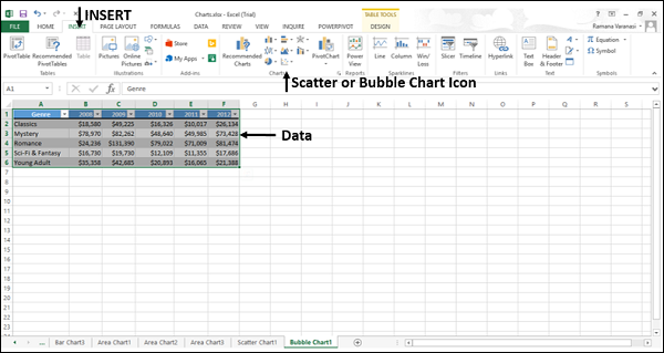
A Bubble chart is like a Scatter chart with an additional third column to specify the size of the bubbles it shows to represent the data points in the data series.
Step 1 − Place the X-Values in a row or column and then place the corresponding Y-Values in the adjacent rows or columns on the worksheet.
Step 2 − Select the data.
Step 3 − On the INSERT tab, in the Charts group, click the Scatter (X, Y) chart or Bubble chart icon on the Ribbon.
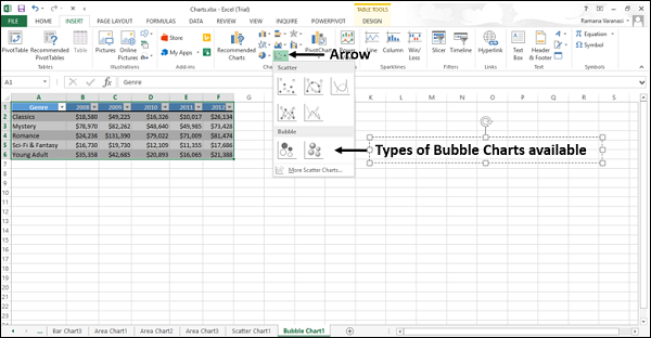
You will see the different types of available Bubble charts.
A Bubble chart has the following sub-types −
- Bubble
- 3-D Bubble
Step 4 − Point your mouse on each of the icons. A preview of that chart type will be shown on the worksheet.
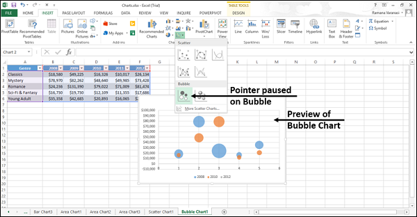
Step 5 − Double-click the chart type that suits your data.
In this chapter, you will understand when the Bubble Chart is useful.
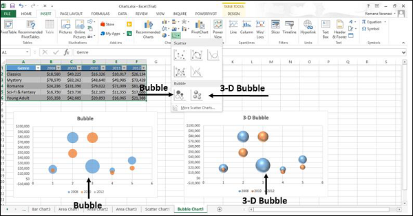
Bubble and 3-D Bubble
Bubble and 3-D Bubble charts are useful to compare three sets of values and show relationships between the sets of values. The third value specifies the size of the bubble.
A Bubble chart shows the data in 2-D format. 3-D Bubble chart shows the data in 3-D format without using a depth axis