- Excel Charts - Home
- Excel Charts - Introduction
- Excel Charts - Creating Charts
- Excel Charts - Types
- Excel Charts - Column Chart
- Excel Charts - Line Chart
- Excel Charts - Pie Chart
- Excel Charts - Doughnut Chart
- Excel Charts - Bar Chart
- Excel Charts - Area Chart
- Excel Charts - Scatter (X Y) Chart
- Excel Charts - Bubble Chart
- Excel Charts - Stock Chart
- Excel Charts - Surface Chart
- Excel Charts - Radar Chart
- Excel Charts - Combo Chart
- Excel Charts - Chart Elements
- Excel Charts - Chart Styles
- Excel Charts - Chart Filters
- Excel Charts - Fine Tuning
- Excel Charts - Design Tools
- Excel Charts - Quick Formatting
- Excel Charts - Aesthetic Data Labels
- Excel Charts - Format Tools
- Excel Charts - Sparklines
- Excel Charts - PivotCharts
Excel Charts - Pie Chart
Pie charts show the size of the items in one data series, proportional to the sum of the items. The data points in a Pie chart are shown as a percentage of the whole Pie.
Follow the steps given below to insert a pie chart in your worksheet.
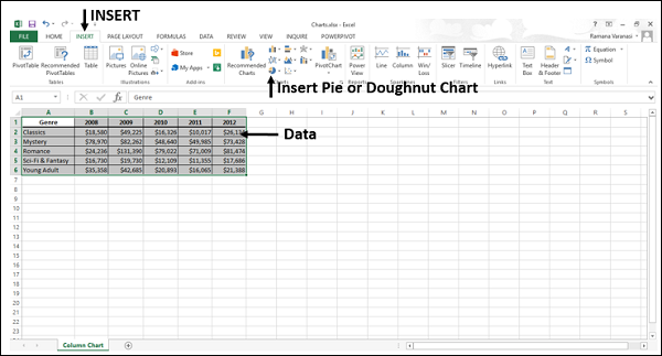
Step 1 − Arrange the data in columns or rows on the worksheet.
Step 2 − Select the data.
Step 3 − On the INSERT tab, in the Charts group, click the Pie chart icon on the Ribbon.
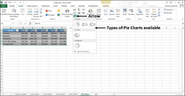
You will see the different types of Pie chart available.
A Pie chart has the following sub-types −
2-D Pie Charts
Pie
Pie of Pie
Bar of Pie
3-D Pie Charts
3-D Pie
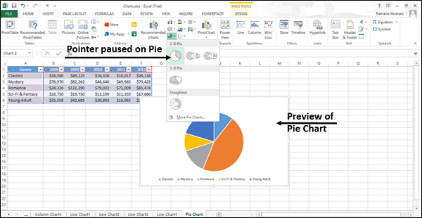
Step 4 − Point your mouse on each of the icons. A preview of that chart type will be displayed on the worksheet.
Consider using a Pie chart when −
You have only one data series.
None of the values in your data are negative.
Almost none of the values in your data are zero values.
You have no more than seven categories, all of which represent parts of the whole pie.
In this chapter, you will understand when each of the pie chart types is useful.
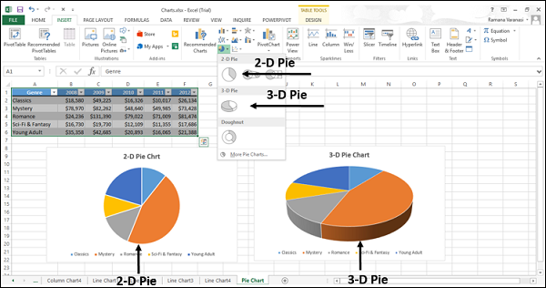
Pie and 3-D Pie
Pie charts show the contribution of each value to a total value in a 2-D or a 3-D format.
You can pull out the slices of a Pie chart manually to emphasize the slices. Follow the steps given below to give the 3-D effect.
Step 1 − Click on a slice that you want to emphasize.
Step 2 − Pull it out of the chart.
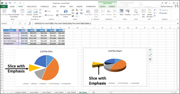
Use these chart types to show a proportion of the whole pie.
Use these chart types when −
Number is equal to 100%.
The chart contains only a few Pie slices.
Pie of Pie and Bar of Pie
Pie of Pie or Bar of Pie charts show Pie charts with smaller values pulled out into a secondary Pie or Stacked Bar chart, which makes them easier to distinguish.
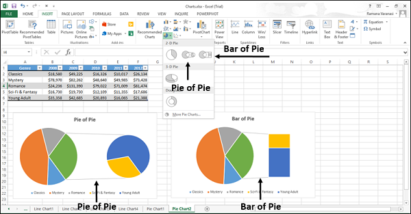
Use these chart types to −
Show proportions of the total value.
Take some values from the first pie and combine them in a
Second Pie, or
Stacked Bar
To make small percentages more readable, highlight the values in the second pie.
