- CSS - Home
- CSS - Roadmap
- CSS - Introduction
- CSS - Syntax
- CSS - Inclusion
- CSS - Types
- CSS - Measurement Units
- CSS - Selectors
- CSS - Colors
- CSS - Backgrounds
- CSS - Fonts
- CSS - Text
- CSS - Images
- CSS - Links
- CSS - Tables
- CSS - Borders
- CSS - Border Block
- CSS - Border Inline
- CSS - Margins
- CSS - Lists
- CSS - Padding
- CSS - Cursor
- CSS - Outlines
- CSS - Dimension
- CSS - Scrollbars
- CSS - Inline Block
- CSS - Dropdowns
- CSS - Visibility
- CSS - Overflow
- CSS - Clearfix
- CSS - Float
- CSS - Arrows
- CSS - Resize
- CSS - Quotes
- CSS - Order
- CSS - Position
- CSS - Hyphens
- CSS - Hover
- CSS - Display
- CSS - Focus
- CSS - Zoom
- CSS - Translate
- CSS - Height
- CSS - Hyphenate Character
- CSS - Width
- CSS - Opacity
- CSS - Z-Index
- CSS - Bottom
- CSS - Navbar
- CSS - Overlay
- CSS - Forms
- CSS - Align
- CSS - Icons
- CSS - Image Gallery
- CSS - Comments
- CSS - Loaders
- CSS - Attr Selectors
- CSS - Combinators
- CSS - Root
- CSS - Box Model
- CSS - Counters
- CSS - Clip
- CSS - Writing Mode
- CSS - Unicode-bidi
- CSS - min-content
- CSS - All
- CSS - Inset
- CSS - Isolation
- CSS - Overscroll
- CSS - Justify Items
- CSS - Justify Self
- CSS - Tab Size
- CSS - Pointer Events
- CSS - Place Content
- CSS - Place Items
- CSS - Place Self
- CSS - Max Block Size
- CSS - Min Block Size
- CSS - Mix Blend Mode
- CSS - Max Inline Size
- CSS - Min Inline Size
- CSS - Offset
- CSS - Accent Color
- CSS - User Select
- CSS - Cascading
- CSS - Universal Selectors
- CSS - ID Selectors
- CSS - Group Selectors
- CSS - Class Selectors
- CSS - Child Selectors
- CSS - Element Selectors
- CSS - Descendant Selectors
- CSS - General Sibling Selectors
- CSS - Adjacent Sibling Selectors
- CSS Advanced
- CSS - Grid
- CSS - Grid Layout
- CSS - Flexbox
- CSS - Visibility
- CSS - Positioning
- CSS - Layers
- CSS - Pseudo Classes
- CSS - Pseudo Elements
- CSS - @ Rules
- CSS - Text Effects
- CSS - Paged Media
- CSS - Printing
- CSS - Layouts
- CSS - Validations
- CSS - Image Sprites
- CSS - Important
- CSS - Data Types
- CSS3 Advanced Features
- CSS - Rounded Corner
- CSS - Border Images
- CSS - Multi Background
- CSS - Color
- CSS - Gradients
- CSS - Box Shadow
- CSS - Box Decoration Break
- CSS - Caret Color
- CSS - Text Shadow
- CSS - Text
- CSS - 2d transform
- CSS - 3d transform
- CSS - Transition
- CSS - Animation
- CSS - Multi columns
- CSS - Box Sizing
- CSS - Tooltips
- CSS - Buttons
- CSS - Pagination
- CSS - Variables
- CSS - Media Queries
- CSS - Functions
- CSS - Math Functions
- CSS - Masking
- CSS - Shapes
- CSS - Style Images
- CSS - Specificity
- CSS - Custom Properties
- CSS Responsive
- CSS RWD - Introduction
- CSS RWD - Viewport
- CSS RWD - Grid View
- CSS RWD - Media Queries
- CSS RWD - Images
- CSS RWD - Videos
- CSS RWD - Frameworks
- CSS References
- CSS Interview Questions
- CSS Online Quiz
- CSS Online Test
- CSS Mock Test
- CSS - Quick Guide
- CSS - Cheatsheet
- CSS - Properties References
- CSS - Functions References
- CSS - Color References
- CSS - Web Browser References
- CSS - Web Safe Fonts
- CSS - Units
- CSS - Animation
- CSS Resources
- CSS - Useful Resources
- CSS - Discussion
CSS - ::-webkit-scrollbar Property
CSS ::-webkit-scrollbar Pseudo-element
CSS ::-webkit-scrollbar pseudo-element is used to style the scrollbar of an element. It is a non-standard CSS property that is only supported by WebKit-based browsers, such as Chrome, Safari, and Edge.
The following ::-webkit-scrollbar pseudo-element can be used to style the scrollbar:
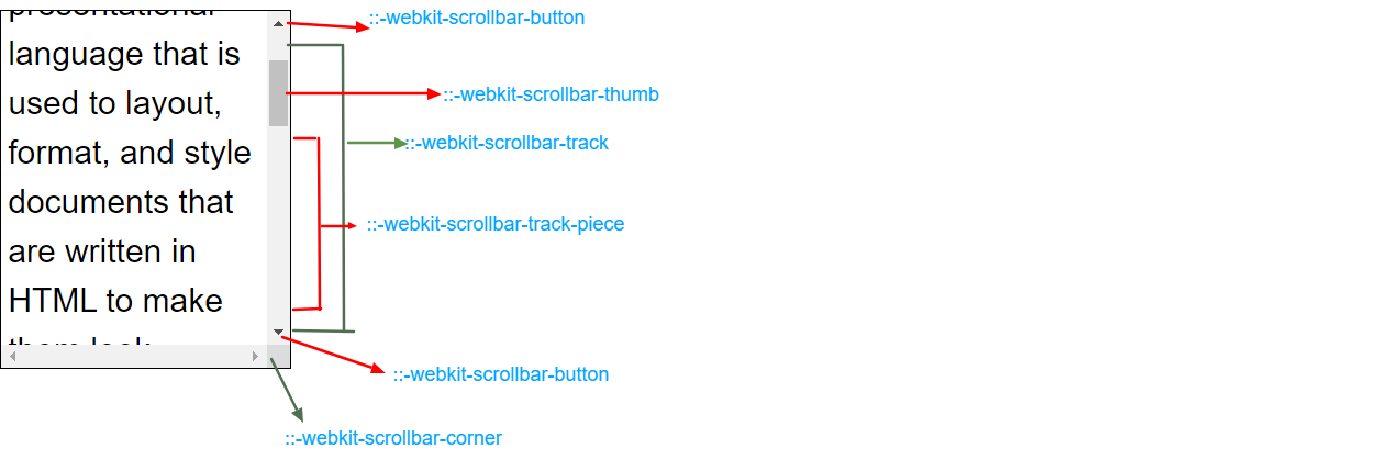
::-webkit-scrollbar-track − To style (border, background-color.) the track of the scrollbar.
::-webkit-scrollbar-thumb − To style the thumb (draggable scrolling handle) of the scrollbar.
::-webkit-scrollbar-button − To style the buttons (arrows pointing upwards and downwards that scroll one line at a time) of the scrollbar.
::-webkit-scrollbar-corner − To style the corner of the scrollbar where the horizontal and vertical scrollbars meet.
::-webkit-resizer − The draggable resizing handle that appears at the bottom corner of some elements.
::-webkit-scrollbar:horizontal{} − To style the horizontal scrollbar of an element.
::-webkit-scrollbar:vertical{} − To style the vertical scrollbar of an element.
::-webkit-scrollbar-track-piece − To style the part of the track (progress bar) not covered by the handle.
The following diagram demonstrates the scroll webkit structure for reference:
The following example demosrates how to use the -webkit-scrollbar CSS pseudo-element to change the look of scrollbars in WebKit browsers, such as Safari and Chrome −
<html>
<head>
<style>
   div {
      width: 370px;
      height: 120px;
      scrollbar-color: #8b8484 #ddd;
      scroll-margin-block-end: 20px;
      background-color: #F1EFB0;
      overflow: auto;
   }
   div::-webkit-scrollbar {
      width: 15px;
   }
   div::-webkit-scrollbar-track {
      background: #f1f1f1;
   }
   div::-webkit-scrollbar-thumb {
      background: #f02222;
   }
   div::-webkit-scrollbar-thumb:hover {
      background: #f55d5d;
   }
   h3 {
      color: #DC4299;
   }
</style>
</head>
<body>
   <div>
      <h3>Scrollbars using -webkit-scrollbar</h3>
      This block includes a large amount of content to demonstrate how scrollbars work when there is an overflow within an element box.
      They consist of vertical or horizontal bars with a draggable thumb, enabling users to move the content up and down or left to right.
   </div>
</body>
</html>
The following example demonstrates how to use the ::-webkit-scrollbar-button pseudo-element to style the scrollbar buttons of an element. The scrollbar buttons are the two arrows at the top and bottom of the scrollbar.
<html>
<head>
<style>
   div {
      width: 370px;
      height: 150px;
      scrollbar-color: #8b8484 #ddd;
      scroll-margin-block-end: 20px;
      background-color: #F1EFB0;
      overflow: auto;
   }
   div::-webkit-scrollbar {
      width: 15px;
   }
   div::-webkit-scrollbar-track {
      background: #f1f1f1;
   }
   div::-webkit-scrollbar-thumb {
      background: #888;
   }
   div::-webkit-scrollbar-thumb:hover {
      background: #555;
   }
   div::-webkit-scrollbar-button {
      height: 30px;
      background-color: rgb(19, 201, 19);
      border: 2px solid rgb(245, 9, 155);
      border-radius: 20px;
   }
   h3 {
      color: #DC4299;
   }
</style>
</head>
<body>
   <div>
      <h3>Scrollbars using -webkit-scrollbar</h3>
      This block includes a large amount of content to demonstrate how scrollbars work when there is an overflow within an element box.
      They consist of vertical or horizontal bars with a draggable thumb, enabling users to move the content up and down or left to right.
   </div>
</body>
</html>
You can use the ::-webkit-scrollbar pseudo-element to style any of the properties of the vertical scrollbar, such as its color, width, border, and border-radius.
Here is an example −
<html>
<head>
<style>
   div {
      width: 370px;
      height: 120px;
      scrollbar-color: #8b8484 #ddd;
      scroll-margin-block-end: 20px;
      background-color: #F1EFB0;
      overflow: auto;
   }
   div::-webkit-scrollbar {
      width: 15px;
   }
   div::-webkit-scrollbar-track:vertical {
      background: #f1f1f1;
   }
   div::-webkit-scrollbar-thumb:vertical {
      background: rgb(16, 230, 16);
      border-radius: 15px;
   }
   div::-webkit-scrollbar-thumb:vertical:hover {
      background: rgb(224, 44, 209);
   }
   h3 {
      color: #DC4299;
   }
</style>
</head>
<body>
   <div>
      <h3>Scrollbars using -webkit-scrollbar</h3>
      This block includes a large amount of content to demonstrate how scrollbars work when there is an overflow within an element box.
      They consist of vertical or horizontal bars with a draggable thumb, enabling users to move the content up and down or left to right.
   </div>
</body>
</html>
You can style the track piece of the vertical scrollbar of an element using the ::-webkit-scrollbar-track-piece pseudo-element.
Here is an example −
<html>
<head>
<style>
   div {
      width: 370px;
      height: 120px;
      scrollbar-color: #8b8484 #ddd;
      scroll-margin-block-end: 20px;
      background-color: #F1EFB0;
      overflow: auto;
   }
   div::-webkit-scrollbar {
      width: 15px;
   }
   div::-webkit-scrollbar-track-piece {
      background-color: rgb(91, 210, 214);
   }
   div::-webkit-scrollbar-thumb {
      background: rgb(21, 160, 21);
      border-radius: 10px;
   }
   div::-webkit-scrollbar-thumb:hover {
      background: #e449dc;
   }
   h3 {
      color: #DC4299;
   }
</style>
</head>
<body>
   <div>
      <h3>Scrollbars using -webkit-scrollbar</h3>
      This block includes a large amount of content to demonstrate how scrollbars work when there is an overflow within an element box.
      They consist of vertical or horizontal bars with a draggable thumb, enabling users to move the content up and down or left to right.
   </div>
</body>
</html>
Here is an example of how to style scrollbars in WebKit-based browsers using -webkit-scrollbar CSS properties such as box-shadow and background-color, and border −
<html>
<head>
<style>
   div {
      width: 370px;
      height: 120px;
      background-color: #F1EFB0;
      overflow: auto;
   }
   div::-webkit-scrollbar {
      width: 15px;
   }
   div::-webkit-scrollbar-track {
      box-shadow: inset 0 0 10px rgb(128, 197, 207);
   }
   div::-webkit-scrollbar-thumb {
      border: 1px solid #e21111;
      background-color: #2ce43b;
      border-radius: 5px;
   }
   div::-webkit-scrollbar-thumb:hover {
      background: #e045c7;
      border: 1px solid #11e22d;
   }
   h3 {
      color: #DC4299;
   }
</style>
</head>
<body>
   <div>
      <h3>Scrollbars using -webkit-scrollbar</h3>
      This block includes a large amount of content to demonstrate how scrollbars work when there is an overflow within an element box.
      They consist of vertical or horizontal bars with a draggable thumb, enabling users to move the content up and down or left to right.
   </div>
</body>
</html>
