
Article Categories
- All Categories
-
 Data Structure
-
 Networking
-
 RDBMS
RDBMS
-
 Operating System
-
 Java
Java
-
 MS Excel
-
 iOS
iOS
-
 HTML
HTML
-
 CSS
CSS
-
 Android
-
 Python
-
 C Programming
-
 C++
C++
-
 C#
C#
-
 MongoDB
-
 MySQL
MySQL
-
 Javascript
-
 PHP
PHP
-
 Economics & Finance
Selected Reading
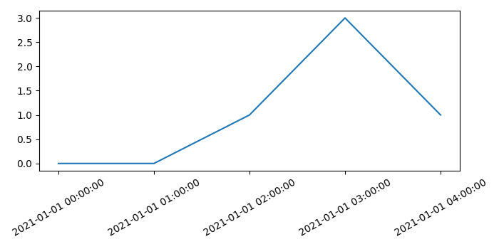
Creating a graph with date and time in axis labels with Matplotlib
To create a graph with date and time in axis labels, we can take the following steps−
- Create a figure and add a set of subplots.
- Create x and y data points using numpy.
- Set date formatter for X-axis.
- Plot x and y using plot() method.
- Set the ticks of X-axis.
- Set the date-time tick labels for X-axis, with some rotation.
- Make the plot tight layout using plt.tight_layout() method.
- To display the figure, use show() method.
Example
from matplotlib import pyplot as plt, dates
import datetime
import numpy as np
plt.rcParams["figure.figsize"] = [7.00, 3.50]
plt.rcParams["figure.autolayout"] = True
fig, ax = plt.subplots()
x = np.array([datetime.datetime(2021, 1, 1, i, 0) for i in range(5)])
y = np.random.randint(5, size=x.shape)
ax.xaxis.set_major_formatter(dates.DateFormatter('%m-%d %H:%M'))
plt.plot(x, y)
ax.set_xticks(x)
ax.set_xticklabels(x, rotation=30, fontdict={'horizontalalignment': 'center'})
plt.show()
Output

Updated on: 2021-05-06T13:25:04+05:30
4K+ Views

Advertisements