
Article Categories
- All Categories
-
 Data Structure
-
 Networking
-
 RDBMS
RDBMS
-
 Operating System
-
 Java
Java
-
 MS Excel
-
 iOS
iOS
-
 HTML
HTML
-
 CSS
CSS
-
 Android
-
 Python
-
 C Programming
-
 C++
C++
-
 C#
C#
-
 MongoDB
-
 MySQL
MySQL
-
 Javascript
-
 PHP
PHP
Selected Reading
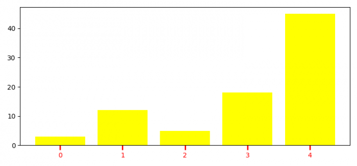
How to customize X-axis ticks in Matplotlib?
To customize X-axis ticks in Matplotlib, we can change the ticks length and width.
Steps
- Set the figure size and adjust the padding between and around the subplots.
- Create lists for height, bars and y_pos data points.
- Make a bar plot using bar() method.
- To customize X-axis ticks, we can use tick_params() method, with color=red, direction=outward, length=7, and width=2.
- To display the figure, use show() method.
Example
import numpy as np
import matplotlib.pyplot as plt

plt.rcParams["figure.figsize"] = [7.50, 3.50]
plt.rcParams["figure.autolayout"] = True

height = [3, 12, 5, 18, 45]
bars = ('A', 'B', 'C', 'D', 'E')
y_pos = np.arange(len(bars))

plt.bar(y_pos, height, color='yellow')
plt.tick_params(axis='x', colors='red', direction='out', length=7, width=2)

plt.show()
Output

Updated on: 2021-06-10T12:04:07+05:30
4K+ Views

Advertisements