- Matplotlib - Home
- Matplotlib - Introduction
- Matplotlib - Vs Seaborn
- Matplotlib - Environment Setup
- Matplotlib - Anaconda distribution
- Matplotlib - Jupyter Notebook
- Matplotlib - Pyplot API
- Matplotlib - Simple Plot
- Matplotlib - Saving Figures
- Matplotlib - Markers
- Matplotlib - Figures
- Matplotlib - Styles
- Matplotlib - Legends
- Matplotlib - Colors
- Matplotlib - Colormaps
- Matplotlib - Colormap Normalization
- Matplotlib - Choosing Colormaps
- Matplotlib - Colorbars
- Matplotlib - Working With Text
- Matplotlib - Text properties
- Matplotlib - Subplot Titles
- Matplotlib - Images
- Matplotlib - Image Masking
- Matplotlib - Annotations
- Matplotlib - Arrows
- Matplotlib - Fonts
- Matplotlib - Font Indexing
- Matplotlib - Font Properties
- Matplotlib - Scales
- Matplotlib - LaTeX
- Matplotlib - LaTeX Text Formatting in Annotations
- Matplotlib - PostScript
- Matplotlib - Mathematical Expressions
- Matplotlib - Animations
- Matplotlib - Celluloid Library
- Matplotlib - Blitting
- Matplotlib - Toolkits
- Matplotlib - Artists
- Matplotlib - Styling with Cycler
- Matplotlib - Paths
- Matplotlib - Path Effects
- Matplotlib - Transforms
- Matplotlib - Ticks and Tick Labels
- Matplotlib - Radian Ticks
- Matplotlib - Dateticks
- Matplotlib - Tick Formatters
- Matplotlib - Tick Locators
- Matplotlib - Basic Units
- Matplotlib - Autoscaling
- Matplotlib - Reverse Axes
- Matplotlib - Logarithmic Axes
- Matplotlib - Symlog
- Matplotlib - Unit Handling
- Matplotlib - Ellipse with Units
- Matplotlib - Spines
- Matplotlib - Axis Ranges
- Matplotlib - Axis Scales
- Matplotlib - Axis Ticks
- Matplotlib - Formatting Axes
- Matplotlib - Axes Class
- Matplotlib - Twin Axes
- Matplotlib - Figure Class
- Matplotlib - Multiplots
- Matplotlib - Grids
- Matplotlib - Object-oriented Interface
- Matplotlib - PyLab module
- Matplotlib - Subplots() Function
- Matplotlib - Subplot2grid() Function
- Matplotlib - Anchored Artists
- Matplotlib - Manual Contour
- Matplotlib - Coords Report
- Matplotlib - AGG filter
- Matplotlib - Ribbon Box
- Matplotlib - Fill Spiral
- Matplotlib - Findobj Method
- Matplotlib - Hyperlinks
- Matplotlib - Image Thumbnail
- Matplotlib - Plotting with Keywords
- Matplotlib - Create Logo
- Matplotlib - Multipage PDF
- Matplotlib - Multiprocessing
- Matplotlib - Print Stdout
- Matplotlib - Compound Path
- Matplotlib - Sankey Class
- Matplotlib - MRI with EEG
- Matplotlib - Stylesheets
- Matplotlib - Background Colors
- Matplotlib - Basemap
Matplotlib Events
- Matplotlib - Event Handling
- Matplotlib - Close Event
- Matplotlib - Mouse Move
- Matplotlib - Click Events
- Matplotlib - Scroll Event
- Matplotlib - Keypress Event
- Matplotlib - Pick Event
- Matplotlib - Looking Glass
- Matplotlib - Path Editor
- Matplotlib - Poly Editor
- Matplotlib - Timers
- Matplotlib - Viewlims
- Matplotlib - Zoom Window
Matplotlib Widgets
- Matplotlib - Cursor Widget
- Matplotlib - Annotated Cursor
- Matplotlib - Button Widget
- Matplotlib - Check Buttons
- Matplotlib - Lasso Selector
- Matplotlib - Menu Widget
- Matplotlib - Mouse Cursor
- Matplotlib - Multicursor
- Matplotlib - Polygon Selector
- Matplotlib - Radio Buttons
- Matplotlib - RangeSlider
- Matplotlib - Rectangle Selector
- Matplotlib - Ellipse Selector
- Matplotlib - Slider Widget
- Matplotlib - Span Selector
- Matplotlib - Textbox
Matplotlib Plotting
- Matplotlib - Line Plots
- Matplotlib - Area Plots
- Matplotlib - Bar Graphs
- Matplotlib - Histogram
- Matplotlib - Pie Chart
- Matplotlib - Scatter Plot
- Matplotlib - Box Plot
- Matplotlib - Arrow Demo
- Matplotlib - Fancy Boxes
- Matplotlib - Zorder Demo
- Matplotlib - Hatch Demo
- Matplotlib - Mmh Donuts
- Matplotlib - Ellipse Demo
- Matplotlib - Bezier Curve
- Matplotlib - Bubble Plots
- Matplotlib - Stacked Plots
- Matplotlib - Table Charts
- Matplotlib - Polar Charts
- Matplotlib - Hexagonal bin Plots
- Matplotlib - Violin Plot
- Matplotlib - Event Plot
- Matplotlib - Heatmap
- Matplotlib - Stairs Plots
- Matplotlib - Errorbar
- Matplotlib - Hinton Diagram
- Matplotlib - Contour Plot
- Matplotlib - Wireframe Plots
- Matplotlib - Surface Plots
- Matplotlib - Triangulations
- Matplotlib - Stream plot
- Matplotlib - Ishikawa Diagram
- Matplotlib - 3D Plotting
- Matplotlib - 3D Lines
- Matplotlib - 3D Scatter Plots
- Matplotlib - 3D Contour Plot
- Matplotlib - 3D Bar Plots
- Matplotlib - 3D Wireframe Plot
- Matplotlib - 3D Surface Plot
- Matplotlib - 3D Vignettes
- Matplotlib - 3D Volumes
- Matplotlib - 3D Voxels
- Matplotlib - Time Plots and Signals
- Matplotlib - Filled Plots
- Matplotlib - Step Plots
- Matplotlib - XKCD Style
- Matplotlib - Quiver Plot
- Matplotlib - Stem Plots
- Matplotlib - Visualizing Vectors
- Matplotlib - Audio Visualization
- Matplotlib - Audio Processing
Matplotlib Useful Resources
- Matplotlib - Quick Guide
- Matplotlib - Cheatsheet
- Matplotlib - Useful Resources
- Matplotlib - Discussion
Matplotlib - Formatting Axes
What is Formatting Axes?
Formatting axes in Matplotlib involves customizing various aspects of the plot's axes such as ticks, labels, scale, limits and more. This customization enhances the readability and presentation of the data visualization.
Formatting the axes in Matplotlib allows us to tailor the visualization according to our data's characteristics and presentation requirements. Experiment with various formatting options to create clear and informative plots.
Use Cases
The following are the use cases of Formatting Axes.
Enhancing Readability − Adjust font sizes, colors and labels for better visualization.
Data Emphasis − Set limits and scale to focus on specific data ranges.
Aesthetics − Customize appearance with titles, grid lines and spine properties.
Clarity and Context − Label axes and add titles for understanding the plot's content.
Axes Formatting Options
We have different Axes formatting options lets go through each and everyone in detail.
Ticks and Tick Labels
In Matplotlib ticks are the small marks on an axis that denote specific data points and where as tick labels are the values corresponding to those ticks. We can customize their appearance using various functions in Matplotlib.
To modify ticks and tick labels we can use methods like plt.xticks() and plt.yticks() to set their positions and labels. plt.xticks() and plt.yticks() allow us to set the locations and labels of ticks on the x and y axes respectively. We can adjust the appearance of ticks using plt.tick_params() to change aspects like size, color, direction etc.
Formatting the tick labels can be done through plt.gca().xaxis or plt.gca().yaxis with methods like set_major_formatter() to control their display such as scientific notation, decimal places, date format and etc.
Additionally for more granular control we can access specific ticks and labels using ax.get_xticks(), ax.get_yticks(), ax.get_xticklabels(), ax.get_yticklabels() and then modify them individually.
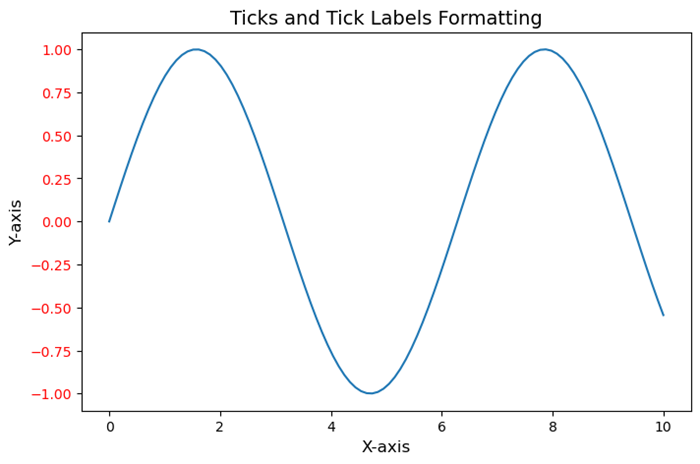
Example - Customizing Tick and Tick Label
In this example we are setting the ticks and tick labels of a plot with the use of above discussed functions and methods available in matplotlib library.
import matplotlib.pyplot as plt
import numpy as np

# Generating sample data
x = np.linspace(0, 10, 100)
y = np.sin(x)

# Creating a plot
plt.figure(figsize=(8, 5))
plt.plot(x, y)

# Customizing ticks and tick labels
plt.xticks(np.arange(0, 11, 2))  # Set x-axis ticks at intervals of 2
plt.yticks(fontsize=10, color='red')  # Customize y-axis tick labels (font size and color)
plt.xlabel('X-axis', fontsize=12)
plt.ylabel('Y-axis', fontsize=12)
plt.title('Ticks and Tick Labels Formatting', fontsize=14)
plt.show()
Output
On executing the above code we will get the following output −
Axis Limits and Scale
Axis limits and scale are fundamental aspects when creating visualizations. They control the range and appearance of the data displayed along the axes of a plot or chart.
Axis Limits
The Axis limits define the span of values shown on each axis. By setting limits we can focus on a specific range of data by emphasizing particular details or trends. For example in a scatter plot if we set axis limits then it can zoom in on a particular region of interest.
Scale
The scale determines how the data is distributed and represented along an axis. Common scales include linear, logarithmic and categorical. Linear scale represents data equally spaced along the axis where as logarithmic scale emphasizes changes in orders of magnitude and categorical scale is used for non-numeric data or categories.
Here are key considerations and actions related to axis limits and scale.
Setting Limits − Define the minimum and maximum values for each axis to control what portion of the data is displayed.
Zooming In/Out − Adjust axis limits to focus on specific data ranges or zoom out to show the overall context.
Scale Transformation − Changing the scale type can alter how the data is perceived. For instance by using a logarithmic scale can better visualize exponential growth or wide-ranging data.
Normalization − Normalize data if needed to bring different scales into a comparable range especially when plotting multiple datasets on the same graph.
- Limiting Outliers − Set axis limits to exclude outliers or anomalies by providing a clearer view of the main data distribution.
Scale Customization − Some visualization libraries allow customization of scale aesthetics such as tick placement and labeling for different scales.
In Python libraries like Matplotlib or Seaborn provide functionalities to manipulate axis limits and scales by allowing user for detailed control over how data is presented in plots.
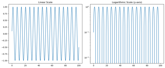
Example - Setting Axis Limits and Scales
Here's an example using Python's Matplotlib library to demonstrate setting axis limits and changing scales.
import matplotlib.pyplot as plt
import numpy as np

# Generating data
x = np.linspace(0.1, 100, 500)
y = np.sin(x)

# Creating a figure and axes object
fig, axs = plt.subplots(1, 2, figsize=(12, 5))

# Plot with default linear scale
axs[0].plot(x, y)
axs[0].set_title('Linear Scale')

# Plot with logarithmic scale for the y-axis
axs[1].plot(x, y)
axs[1].set_yscale('log')  # Set logarithmic scale for the y-axis
axs[1].set_title('Logarithmic Scale (y-axis)')
plt.tight_layout()
plt.show()
Output
On executing the above code we will get the following output −
Axis Labels and Titles
Axis labels and titles are crucial components of any visualization in providing context and information about the data represented on the plot. They help readers understand what each axis represents and the overall purpose of the visualization.
Customizing axis labels and titles involves specifying text, adjusting font size, setting font weight, changing color and positioning them appropriately within the plot to ensure clarity and readability.
Axis Labels
The Axis labels describe the quantity or nature of the data displayed along each axis. For example in a scatter plot with height on the y-axis and weight on the x-axis, the labels might be "Height (cm)" and "Weight (kg)". They make it clear what the plotted values signify.
Titles
A title provides an overarching description or context for the entire plot. It gives a brief explanation of what the visualization is about, what relationships or patterns it might illustrate or what insights can be drawn from it.
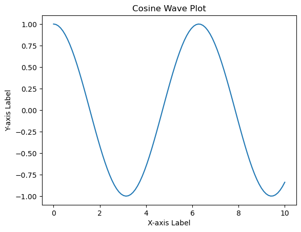
Example - Creating Labeled Axes
The following is an example using Python's Matplotlib library to create a simple plot with labeled axes and a title.
import matplotlib.pyplot as plt
import numpy as np

# Generating data
x = np.linspace(0, 10, 100)
y = np.cos(x)

# Creating the plot
plt.plot(x, y)

# Adding axis labels and title
plt.xlabel('X-axis Label')
plt.ylabel('Y-axis Label')
plt.title('Cosine Wave Plot')
plt.show()
Output
On executing the above code we will get the following output −
Grid Lines and Spines
Grid lines and spines are visual components that aid in understanding and interpreting plots by providing reference points and delineating the plot area.
Customizing grid lines and spines allows for better presentation and emphasis on certain aspects of the plot by enhancing its clarity and visual appeal. We can adjust the appearance, visibility and properties of grid lines and spines to suit the visualization's requirements.
Grid Lines
These are horizontal and vertical lines that span the plot area, intersecting at the ticks along the axes. They help in visually estimating data points and relationships within the plot. Grid lines can be present along one or both axes and they can be customized in terms of style, color and visibility.
Spines
Spines are the lines that form the boundaries of the plot box. They connect the axis tick marks and define the boundaries of the data area. Spines can be customized individually for each side of the plot such as top, bottom, left, right which allows changes in their appearance, thickness and position.
In Matplotlib we can control grid lines and spines using various methods and attributes.
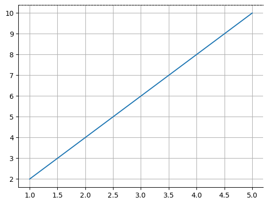
Example - Using Gridlines and Spines
Here is the example of setting the gridlines and spines of a plot by using the plt.grid() and plt.gca().spines methods.
import matplotlib.pyplot as plt

# Generating data
x = [1, 2, 3, 4, 5]
y = [2, 4, 6, 8, 10]

# Creating a plot
plt.plot(x, y)

# Displaying grid lines
plt.grid(True)  # Show grid lines

# Customizing spines
plt.gca().spines['top'].set_linestyle('--')  # Customize top spine style
plt.gca().spines['right'].set_visible(False)  # Hide right spine
plt.show()
Output
On executing the above code we will get the following output −
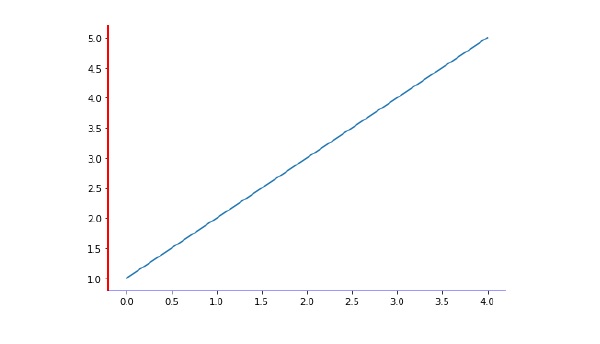
Axis spines are the lines connecting axis tick marks demarcating boundaries of plot area. The axes object has spines located at top, bottom, left and right.
Each spine can be formatted by specifying color and width. Any edge can be made invisible if its color is set to none.
Example - Formatting Spines
import matplotlib.pyplot as plt
fig = plt.figure()
ax = fig.add_axes([0,0,1,1])
ax.spines['bottom'].set_color('blue')
ax.spines['left'].set_color('red')
ax.spines['left'].set_linewidth(2)
ax.spines['right'].set_color(None)
ax.spines['top'].set_color(None)
ax.plot([1,2,3,4,5])
plt.show()
Output
On executing the above code we will get the following output −
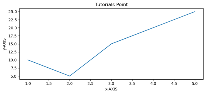
Example - Labeling X, Y-Axis
Here's an example code for Labeling x, y-Axis in Python's Matplotlib library.
# importing matplotlib module
import matplotlib.pyplot as plt
import numpy as np

# x-axis & y-axis values
x = [1, 2, 3, 4, 5]
y = [10, 5, 15, 20, 25]

# create a figure and axes
fig, ax = plt.subplots()

# setting title to graph
ax.set_title('Tutorials Point')

# label x-axis and y-axis
ax.set_ylabel('y-AXIS')
ax.set_xlabel('x-AXIS')

# function to plot and show graph
ax.plot(x, y)
plt.show()
Output
On executing the above code we will get the following output −
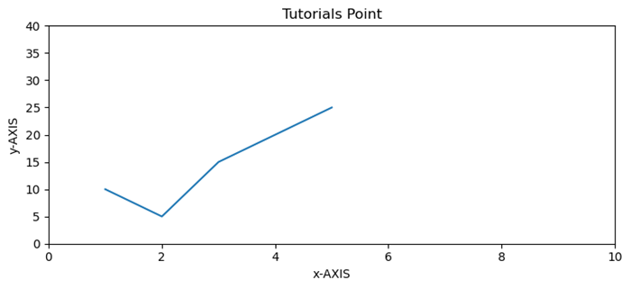
Example - Setting Limits of X, Y Axis
Formatting Axes in Python matplotlib Limits of x, y-axis which in this case is, (10,0) and (0,40) respectively. Limits of axes set the highest plots to be covered in the graph. By default the max value of x-axis and max value of y-axis of the given points will be pointed.
import matplotlib.pyplot as plt
import numpy as np

x = [1, 2, 3, 4, 5]
y = [10, 5, 15, 20, 25]

# create a figure and axes
fig, ax = plt.subplots()

ax.set_title('Tutorials Point')

ax.set_ylabel('y-AXIS')
ax.set_xlabel('x-AXIS')

# sets x, y-axis limits on the graph
ax.set_xlim(0, 10)
ax.set_ylim(0, 40)

# function to plot and show graph
ax.plot(x, y)
plt.show()
Output
On executing the above code we will get the following output −