- ASP.NET - Home
- ASP.NET - Introduction
- ASP.NET - Environment
- ASP.NET - Life Cycle
- ASP.NET - First Example
- ASP.NET - Event Handling
- ASP.NET - Server Side
- ASP.NET - Server Controls
- ASP.NET - HTML Server
- ASP.NET - Client Side
- ASP.NET - Basic Controls
- ASP.NET - Directives
- ASP.NET - Managing State
- ASP.NET - Validators
- ASP.NET - Database Access
- ASP.NET - ADO.net
- ASP.NET - File Uploading
- ASP.NET - Ad Rotator
- ASP.NET - Calendars
- ASP.NET - Multi Views
- ASP.NET - Panel Controls
- ASP.NET - AJAX Control
- ASP.NET - Data Sources
- ASP.NET - Data Binding
- ASP.NET - Custom Controls
- ASP.NET - Personalization
- ASP.NET - Error Handling
- ASP.NET - Debugging
- ASP.NET - LINQ
- ASP.NET - Security
- ASP.NET - Data Caching
- ASP.NET - Web Services
- ASP.NET - Multi Threading
- ASP.NET - Configuration
- ASP.NET - Deployment
ASP.NET - Custom Controls
ASP.NET allows the users to create controls. These user defined controls are categorized into:
- User controls
- Custom controls
User Controls
User controls behaves like miniature ASP.NET pages or web forms, which could be used by many other pages. These are derived from the System.Web.UI.UserControl class. These controls have the following characteristics:
- They have an .ascx extension.
- They may not contain any <html>, <body>, or <form> tags.
- They have a Control directive instead of a Page directive.
To understand the concept, let us create a simple user control, which will work as footer for the web pages. To create and use the user control, take the following steps:
- Create a new web application.
- Right click on the project folder on the Solution Explorer and choose Add New Item.
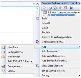
Select Web User Control from the Add New Item dialog box and name it footer.ascx. Initially, the footer.ascx contains only a Control directive.
<%@ Control Language="C#" AutoEventWireup="true" CodeBehind="footer.ascx.cs"
   Inherits="customcontroldemo.footer" %>
Add the following code to the file:
<table>
   <tr>
      <td align="center"> Copyright ©2010 TutorialPoints Ltd.</td>
   </tr>

   <tr>
      <td align="center"> Location: Hyderabad, A.P </td>
   </tr>
</table>
To add the user control to your web page, you must add the Register directive and an instance of the user control to the page. The following code shows the content file:
<%@ Page Language="C#" AutoEventWireup="true" CodeBehind="Default.aspx.cs" Inherits="customcontroldemo._Default" %>

<%@ Register Src="~/footer.ascx" TagName="footer" TagPrefix="Tfooter" %>

<!DOCTYPE html PUBLIC "-//W3C//DTD XHTML 1.0 Transitional//EN" "http://www.w3.org/TR/xhtml1/DTD/xhtml1-transitional.dtd">

<html xmlns="http://www.w3.org/1999/xhtml" >

   <head runat="server">
      <title>
         Untitled Page
      </title>
   </head>

   <body>

      <form id="form1" runat="server">
         <div>

            <asp:Label ID="Label1" runat="server" Text="Welcome to ASP.Net Tutorials "></asp:Label>
            <br />  <br />
            <asp:Button ID="Button1" runat="server" onclick="Button1_Click"  Text="Copyright Info" />

         </div>
         <Tfooter:footer ID="footer1" runat="server" />
      </form>

   </body>
</html>
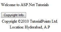
When executed, the page shows the footer and this control could be used in all the pages of your website.
Observe the following:
(1) The Register directive specifies a tag name as well as tag prefix for the control.
<%@ Register Src="~/footer.ascx" TagName="footer" TagPrefix="Tfooter" %>
(2) The following tag name and prefix should be used while adding the user control on the page:
<Tfooter:footer ID="footer1" runat="server" />
Custom Controls
Custom controls are deployed as individual assemblies. They are compiled into a Dynamic Link Library (DLL) and used as any other ASP.NET server control. They could be created in either of the following way:
- By deriving a custom control from an existing control
- By composing a new custom control combing two or more existing controls.
- By deriving from the base control class.
To understand the concept, let us create a custom control, which will simply render a text message on the browser. To create this control, take the following steps:
Create a new website. Right click the solution (not the project) at the top of the tree in the Solution Explorer.
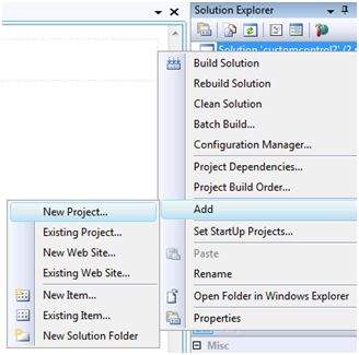
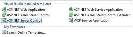
In the New Project dialog box, select ASP.NET Server Control from the project templates.
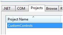
The above step adds a new project and creates a complete custom control to the solution, called ServerControl1. In this example, let us name the project CustomControls. To use this control, this must be added as a reference to the web site before registering it on a page. To add a reference to the existing project, right click on the project (not the solution), and click Add Reference.
Select the CustomControls project from the Projects tab of the Add Reference dialog box. The Solution Explorer should show the reference.
To use the control on a page, add the Register directive just below the @Page directive:
<%@ Register Assembly="CustomControls" Namespace="CustomControls" TagPrefix="ccs" %>
Further, you can use the control, similar to any other controls.
<form id="form1" runat="server">
<div>
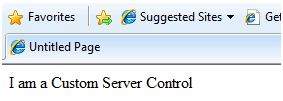
<ccs:ServerControl1 runat="server" Text = "I am a Custom Server Control" />
</div>
</form>
When executed, the Text property of the control is rendered on the browser as shown:
Working with Custom Controls
In the previous example, the value for the Text property of the custom control was set. ASP.NET added this property by default, when the control was created. The following code behind file of the control reveals this.
using System;
using System.Collections.Generic;
using System.ComponentModel;
using System.Linq;
using System.Text;

using System.Web;
using System.Web.UI;
using System.Web.UI.WebControls;

namespace CustomControls
{
   [DefaultProperty("Text")]
   [ToolboxData("<{0}:ServerControl1 runat=server></{0}:ServerControl1 >")]

   public class ServerControl1 : WebControl
   {
      [Bindable(true)]
      [Category("Appearance")]
      [DefaultValue("")]
      [Localizable(true)]

      public string Text
      {
         get
         {
            String s = (String)ViewState["Text"];
            return ((s == null) ? "[" + this.ID + "]" : s);
         }

         set
         {
            ViewState["Text"] = value;
         }
      }

      protected override void RenderContents(HtmlTextWriter output)
      {
         output.Write(Text);
      }
   }
}
The above code is automatically generated for a custom control. Events and methods could be added to the custom control class.
Example
Let us expand the previous custom control named SeverControl1. Let us give it a method named checkpalindrome, which gives it a power to check for palindromes.
Palindromes are words/literals that spell the same when reversed. For example, Malayalam, madam, saras, etc.
Extend the code for the custom control, which should look as:
using System;
using System.Collections.Generic;
using System.ComponentModel;
using System.Linq;
using System.Text;

using System.Web;
using System.Web.UI;
using System.Web.UI.WebControls;

namespace CustomControls
{
   [DefaultProperty("Text")]
   [ToolboxData("<{0}:ServerControl1 runat=server></{0}:ServerControl1  >")]

   public class ServerControl1 : WebControl
   {
      [Bindable(true)]
      [Category("Appearance")]
      [DefaultValue("")]
      [Localizable(true)]

      public string Text
      {
         get
         {
            String s = (String)ViewState["Text"];
            return ((s == null) ? "[" + this.ID + "]" : s);
         }

         set
         {
            ViewState["Text"] = value;
         }
      }

      protected override void RenderContents(HtmlTextWriter output)
      {
         if (this.checkpanlindrome())
         {
            output.Write("This is a palindrome: <br />");
            output.Write("<FONT size=5 color=Blue>");
            output.Write("<B>");
            output.Write(Text);
            output.Write("</B>");
            output.Write("</FONT>");
         }
         else
         {
            output.Write("This is not a palindrome: <br />");
            output.Write("<FONT size=5 color=red>");
            output.Write("<B>");
            output.Write(Text);
            output.Write("</B>");
            output.Write("</FONT>");
         }
      }

      protected bool checkpanlindrome()
      {
         if (this.Text != null)
         {
            String str = this.Text;
            String strtoupper = Text.ToUpper();
            char[] rev = strtoupper.ToCharArray();
            Array.Reverse(rev);
            String strrev = new String(rev);

            if (strtoupper == strrev)
            {
               return true;
            }
            else
            {
               return false;
            }
         }
         else
         {
            return false;
         }
      }
   }
}
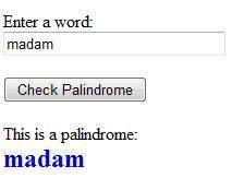
When you change the code for the control, you must build the solution by clicking Build --> Build Solution, so that the changes are reflected in your project. Add a text box and a button control to the page, so that the user can provide a text, it is checked for palindrome, when the button is clicked.
<form id="form1" runat="server">
   <div>
      Enter a word:
      <br />
      <asp:TextBox ID="TextBox1" runat="server" style="width:198px"> </asp:TextBox>

      <br /> <br />

      <asp:Button ID="Button1" runat="server onclick="Button1_Click" Text="Check Palindrome" style="width:132px" />

      <br /> <br />

      <ccs:ServerControl1 ID="ServerControl11" runat="server" Text = "" />
   </div>
</form>
The Click event handler for the button simply copies the text from the text box to the text property of the custom control.
protected void Button1_Click(object sender, EventArgs e)
{
   this.ServerControl11.Text = this.TextBox1.Text;
}
When executed, the control successfully checks palindromes.
Observe the following:
(1) When you add a reference to the custom control, it is added to the toolbox and you can directly use it from the toolbox similar to any other control.
(2) The RenderContents method of the custom control class is overridden here, as you can add your own methods and events.
(3) The RenderContents method takes a parameter of HtmlTextWriter type, which is responsible for rendering on the browser.
