- ASP.NET - Home
- ASP.NET - Introduction
- ASP.NET - Environment
- ASP.NET - Life Cycle
- ASP.NET - First Example
- ASP.NET - Event Handling
- ASP.NET - Server Side
- ASP.NET - Server Controls
- ASP.NET - HTML Server
- ASP.NET - Client Side
- ASP.NET - Basic Controls
- ASP.NET - Directives
- ASP.NET - Managing State
- ASP.NET - Validators
- ASP.NET - Database Access
- ASP.NET - ADO.net
- ASP.NET - File Uploading
- ASP.NET - Ad Rotator
- ASP.NET - Calendars
- ASP.NET - Multi Views
- ASP.NET - Panel Controls
- ASP.NET - AJAX Control
- ASP.NET - Data Sources
- ASP.NET - Data Binding
- ASP.NET - Custom Controls
- ASP.NET - Personalization
- ASP.NET - Error Handling
- ASP.NET - Debugging
- ASP.NET - LINQ
- ASP.NET - Security
- ASP.NET - Data Caching
- ASP.NET - Web Services
- ASP.NET - Multi Threading
- ASP.NET - Configuration
- ASP.NET - Deployment
ASP.NET - Calendars
The calendar control is a functionally rich web control, which provides the following capabilities:
- Displaying one month at a time
- Selecting a day, a week or a month
- Selecting a range of days
- Moving from month to month
- Controlling the display of the days programmatically
The basic syntax of a calendar control is:
<asp:Calender ID = "Calendar1" runat = "server">
</asp:Calender>
Properties and Events of the Calendar Control
The calendar control has many properties and events, using which you can customize the actions and display of the control. The following table provides some important properties of the Calendar control:
| Properties | Description |
|---|---|
| Caption | Gets or sets the caption for the calendar control. |
| CaptionAlign | Gets or sets the alignment for the caption. |
| CellPadding | Gets or sets the number of spaces between the data and the cell border. |
| CellSpacing | Gets or sets the space between cells. |
| DayHeaderStyle | Gets the style properties for the section that displays the day of the week. |
| DayNameFormat | Gets or sets format of days of the week. |
| DayStyle | Gets the style properties for the days in the displayed month. |
| FirstDayOfWeek | Gets or sets the day of week to display in the first column. |
| NextMonthText | Gets or sets the text for next month navigation control. The default value is >. |
| NextPrevFormat | Gets or sets the format of the next and previous month navigation control. |
| OtherMonthDayStyle | Gets the style properties for the days on the Calendar control that are not in the displayed month. |
| PrevMonthText | Gets or sets the text for previous month navigation control. The default value is <. |
| SelectedDate | Gets or sets the selected date. |
| SelectedDates | Gets a collection of DateTime objects representing the selected dates. |
| SelectedDayStyle | Gets the style properties for the selected dates. |
| SelectionMode | Gets or sets the selection mode that specifies whether the user can select a single day, a week or an entire month. |
| SelectMonthText | Gets or sets the text for the month selection element in the selector column. |
| SelectorStyle | Gets the style properties for the week and month selector column. |
| SelectWeekText | Gets or sets the text displayed for the week selection element in the selector column. |
| ShowDayHeader | Gets or sets the value indicating whether the heading for the days of the week is displayed. |
| ShowGridLines | Gets or sets the value indicating whether the gridlines would be shown. |
| ShowNextPrevMonth | Gets or sets a value indicating whether next and previous month navigation elements are shown in the title section. |
| ShowTitle | Gets or sets a value indicating whether the title section is displayed. |
| TitleFormat | Gets or sets the format for the title section. |
| Titlestyle | Get the style properties of the title heading for the Calendar control. |
| TodayDayStyle | Gets the style properties for today's date on the Calendar control. |
| TodaysDate | Gets or sets the value for today's date. |
| UseAccessibleHeader | Gets or sets a value that indicates whether to render the table header <th> HTML element for the day headers instead of the table data <td> HTML element. |
| VisibleDate | Gets or sets the date that specifies the month to display. |
| WeekendDayStyle | Gets the style properties for the weekend dates on the Calendar control. |
The Calendar control has the following three most important events that allow the developers to program the calendar control. They are:
| Events | Description |
|---|---|
| SelectionChanged | It is raised when a day, a week or an entire month is selected. |
| DayRender | It is raised when each data cell of the calendar control is rendered. |
| VisibleMonthChanged | It is raised when user changes a month. |
Working with the Calendar Control
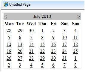
Putting a bare-bone calendar control without any code behind file provides a workable calendar to a site, which shows the months and days of the year. It also allows navigation to next and previous months.
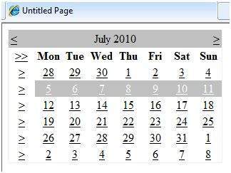
Calendar controls allow the users to select a single day, a week, or an entire month. This is done by using the SelectionMode property. This property has the following values:
| Properties | Description |
|---|---|
| Day | To select a single day. |
| DayWeek | To select a single day or an entire week. |
| DayWeekMonth | To select a single day, a week, or an entire month. |
| None | Nothing can be selected. |
The syntax for selecting days:
<asp:Calender ID = "Calendar1" runat = "server" SelectionMode="DayWeekMonth">
</asp:Calender>
When the selection mode is set to the value DayWeekMonth, an extra column with the > symbol appears for selecting the week, and a >> symbol appears to the left of the days name for selecting the month.
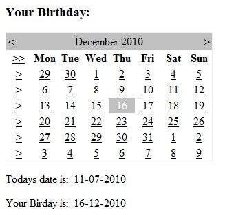
Example
The following example demonstrates selecting a date and displays the date in a label:
The content file code is as follows:
<%@ Page Language="C#" AutoEventWireup="true" CodeBehind="Default.aspx.cs" Inherits="calendardemo._Default" %>

<!DOCTYPE html PUBLIC "-//W3C//DTD XHTML 1.0 Transitional//EN" "http://www.w3.org/TR/xhtml1/DTD/xhtml1-transitional.dtd">

<html xmlns="http://www.w3.org/1999/xhtml" >

   <head runat="server">
      <title>
         Untitled Page
      </title>
   </head>

   <body>
      <form id="form1" runat="server">

         <div>
            <h3> Your Birthday:</h3>
            <asp:Calendar ID="Calendar1" runat="server  SelectionMode="DayWeekMonth" onselectionchanged="Calendar1_SelectionChanged">
            </asp:Calendar>
         </div>

         <p>Todays date is:
            <asp:Label ID="lblday" runat="server"></asp:Label>
         </p>

         <p>Your Birday is:
            <asp:Label ID="lblbday" runat="server"></asp:Label>
         </p>

      </form>
   </body>
</html>
The event handler for the event SelectionChanged:
protected void Calendar1_SelectionChanged(object sender, EventArgs e)
{
   lblday.Text = Calendar1.TodaysDate.ToShortDateString();
   lblbday.Text = Calendar1.SelectedDate.ToShortDateString();
}
When the file is run, it should produce the following output: