
- Android - Home
- Android - Overview
- Android - Environment Setup
- Android - Architecture
- Android - Application Components
- Android - Hello World Example
- Android - Resources
- Android - Activities
- Android - Services
- Android - Broadcast Receivers
- Android - Content Providers
- Android - Fragments
- Android - Intents/Filters
- Android - UI Layouts
- Android - UI Controls
- Android - Event Handling
- Android - Styles and Themes
- Android - Custom Components
- Android Advanced Concepts
- Android - Drag and Drop
- Android - Notifications
- Location Based Services
- Android - Sending Email
- Android - Sending SMS
- Android - Phone Calls
- Publishing Android Application
- Android Useful Examples
- Android - Alert Dialoges
- Android - Animations
- Android - Audio Capture
- Android - AudioManager
- Android - Auto Complete
- Android - Best Practices
- Android - Bluetooth
- Android - Camera
- Android - Clipboard
- Android - Custom Fonts
- Android - Data Backup
- Android - Developer Tools
- Android - Emulator
- Android - Facebook Integration
- Android - Gestures
- Android - Google Maps
- Android - Image Effects
- Android - ImageSwitcher
- Android - Internal Storage
- Android - JetPlayer
- Android - JSON Parser
- Android - Linkedin Integration
- Android - Loading Spinner
- Android - Localization
- Android - Login Screen
- Android - MediaPlayer
- Android - Multitouch
- Android - Navigation
- Android - Network Connection
- Android - NFC Guide
- Android - PHP/MySQL
- Android - Progress Circle
- Android - ProgressBar
- Android - Push Notification
- Android - RenderScript
- Android - RSS Reader
- Android - Screen Cast
- Android - SDK Manager
- Android - Sensors
- Android - Session Management
- Android - Shared Preferences
- Android - SIP Protocol
- Android - Spelling Checker
- Android - SQLite Database
- Android - Support Library
- Android - Testing
- Android - Text to Speech
- Android - TextureView
- Android - Twitter Integration
- Android - UI Design
- Android - UI Patterns
- Android - UI Testing
- Android - WebView Layout
- Android - Wi-Fi
- Android - Widgets
- Android - XML Parsers
- Android Useful Resources
- Android - Questions and Answers
- Android - Useful Resources
- Android - Discussion
Android - UI Layouts
The basic building block for user interface is a View object which is created from the View class and occupies a rectangular area on the screen and is responsible for drawing and event handling. View is the base class for widgets, which are used to create interactive UI components like buttons, text fields, etc.
The ViewGroup is a subclass of View and provides invisible container that hold other Views or other ViewGroups and define their layout properties.
At third level we have different layouts which are subclasses of ViewGroup class and a typical layout defines the visual structure for an Android user interface and can be created either at run time using View/ViewGroup objects or you can declare your layout using simple XML file main_layout.xml which is located in the res/layout folder of your project.
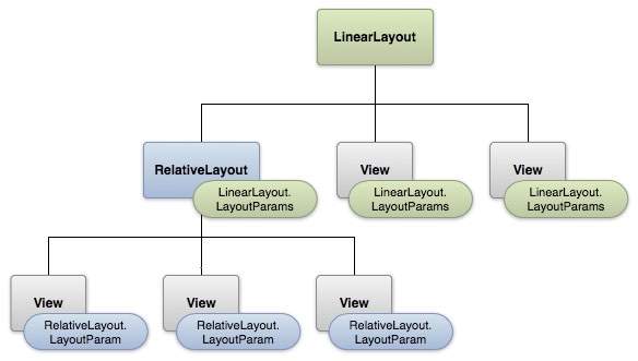
Layout params
This tutorial is more about creating your GUI based on layouts defined in XML file. A layout may contain any type of widgets such as buttons, labels, textboxes, and so on. Following is a simple example of XML file having LinearLayout −
<?xml version="1.0" encoding="utf-8"?>
<LinearLayout xmlns:android="http://schemas.android.com/apk/res/android"
   android:layout_width="fill_parent"
   android:layout_height="fill_parent"
   android:orientation="vertical" >

   <TextView android:id="@+id/text"
      android:layout_width="wrap_content"
      android:layout_height="wrap_content"
      android:text="This is a TextView" />

   <Button android:id="@+id/button"
      android:layout_width="wrap_content"
      android:layout_height="wrap_content"
      android:text="This is a Button" />

   <!-- More GUI components go here  -->

</LinearLayout>
Once your layout has created, you can load the layout resource from your application code, in your Activity.onCreate() callback implementation as shown below −
public void onCreate(Bundle savedInstanceState) {
   super.onCreate(savedInstanceState);
   setContentView(R.layout.activity_main);
}
Android Layout Types
There are number of Layouts provided by Android which you will use in almost all the Android applications to provide different view, look and feel.
| Sr.No | Layout & Description |
|---|---|
| 1 |
Linear Layout
LinearLayout is a view group that aligns all children in a single direction, vertically or horizontally. |
| 2 |
Relative Layout
RelativeLayout is a view group that displays child views in relative positions. |
| 3 |
Table Layout
TableLayout is a view that groups views into rows and columns. |
| 4 |
Absolute Layout
AbsoluteLayout enables you to specify the exact location of its children. |
| 5 |
Frame Layout
The FrameLayout is a placeholder on screen that you can use to display a single view. |
| 6 |
List View
ListView is a view group that displays a list of scrollable items. |
| 7 |
Grid View
GridView is a ViewGroup that displays items in a two-dimensional, scrollable grid. |
Layout Attributes
Each layout has a set of attributes which define the visual properties of that layout. There are few common attributes among all the layouts and their are other attributes which are specific to that layout. Following are common attributes and will be applied to all the layouts:
| Sr.No | Attribute & Description |
|---|---|
| 1 |
android:id This is the ID which uniquely identifies the view. |
| 2 |
android:layout_width This is the width of the layout. |
| 3 |
android:layout_height This is the height of the layout |
| 4 |
android:layout_marginTop This is the extra space on the top side of the layout. |
| 5 |
android:layout_marginBottom This is the extra space on the bottom side of the layout. |
| 6 |
android:layout_marginLeft This is the extra space on the left side of the layout. |
| 7 |
android:layout_marginRight This is the extra space on the right side of the layout. |
| 8 |
android:layout_gravity This specifies how child Views are positioned. |
| 9 |
android:layout_weight This specifies how much of the extra space in the layout should be allocated to the View. |
| 10 |
android:layout_x This specifies the x-coordinate of the layout. |
| 11 |
android:layout_y This specifies the y-coordinate of the layout. |
| 12 |
android:layout_width This is the width of the layout. |
| 13 |
android:paddingLeft This is the left padding filled for the layout. |
| 14 |
android:paddingRight This is the right padding filled for the layout. |
| 15 |
android:paddingTop This is the top padding filled for the layout. |
| 16 |
android:paddingBottom This is the bottom padding filled for the layout. |
Here width and height are the dimension of the layout/view which can be specified in terms of dp (Density-independent Pixels), sp ( Scale-independent Pixels), pt ( Points which is 1/72 of an inch), px( Pixels), mm ( Millimeters) and finally in (inches).
You can specify width and height with exact measurements but more often, you will use one of these constants to set the width or height −
android:layout_width=wrap_content tells your view to size itself to the dimensions required by its content.
android:layout_width=fill_parent tells your view to become as big as its parent view.
Gravity attribute plays important role in positioning the view object and it can take one or more (separated by '|') of the following constant values.
| Constant | Value | Description |
|---|---|---|
| top | 0x30 | Push object to the top of its container, not changing its size. |
| bottom | 0x50 | Push object to the bottom of its container, not changing its size. |
| left | 0x03 | Push object to the left of its container, not changing its size. |
| right | 0x05 | Push object to the right of its container, not changing its size. |
| center_vertical | 0x10 | Place object in the vertical center of its container, not changing its size. |
| fill_vertical | 0x70 | Grow the vertical size of the object if needed so it completely fills its container. |
| center_horizontal | 0x01 | Place object in the horizontal center of its container, not changing its size. |
| fill_horizontal | 0x07 | Grow the horizontal size of the object if needed so it completely fills its container. |
| center | 0x11 | Place the object in the center of its container in both the vertical and horizontal axis, not changing its size. |
| fill | 0x77 | Grow the horizontal and vertical size of the object if needed so it completely fills its container. |
| clip_vertical | 0x80 | Additional option that can be set to have the top and/or bottom edges of the child clipped to its container's bounds. The clip will be based on the vertical gravity: a top gravity will clip the bottom edge, a bottom gravity will clip the top edge, and neither will clip both edges. |
| clip_horizontal | 0x08 | Additional option that can be set to have the left and/or right edges of the child clipped to its container's bounds. The clip will be based on the horizontal gravity: a left gravity will clip the right edge, a right gravity will clip the left edge, and neither will clip both edges. |
| start | 0x00800003 | Push object to the beginning of its container, not changing its size. |
| end | 0x00800005 | Push object to the end of its container, not changing its size. |
View Identification
A view object may have a unique ID assigned to it which will identify the View uniquely within the tree. The syntax for an ID, inside an XML tag is −
android:id="@+id/my_button"
Following is a brief description of @ and + signs −
The at-symbol (@) at the beginning of the string indicates that the XML parser should parse and expand the rest of the ID string and identify it as an ID resource.
The plus-symbol (+) means that this is a new resource name that must be created and added to our resources. To create an instance of the view object and capture it from the layout, use the following −
Button myButton = (Button) findViewById(R.id.my_button);
