- Flexbox - Home
- Flexbox - Overview
- Flexbox - Flex Containers
- Flexbox - Flex-Direction
- Flexbox - Flex-Wrap
- Flexbox - Justifying Contents
- Flexbox - Align Items
- Flexbox - Align Content
- Flexbox - Flex-Order
- Flexbox - Flexibility
- Flexbox - Align Self
Flexbox - Align Items
The align-items property is same as justify content. But here, the items were aligned across the cross access (vertically).
Usage −
align-items: flex-start | flex-end | center | baseline | stretch;
This property accepts the following values −
flex-start − The flex items were aligned vertically at the top of the container.
flex-end − The flex items were aligned vertically at the bottom of the container.
flex-center − The flex items were aligned vertically at the center of the container.
stretch − The flex items were aligned vertically such that they fill up the whole vertical space of the container.
baseline − The flex items were aligned such that the baseline of their text align along a horizontal line.
flex-start
On passing this value to the property align-items, the flex items were aligned vertically at the top of the container.
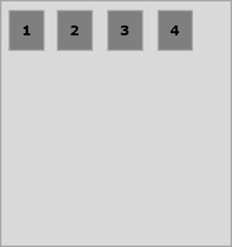
The following example demonstrates the result of passing the value flex-start to the align-items property.
<!doctype html>
<html lang = "en">
   <style>
      .box1{background:green;}
      .box2{background:blue;}
      .box3{background:red;}
      .box4{background:magenta;}
      .box5{background:yellow;}
      .box6{background:pink;}

      .box{
         font-size:35px;
         padding:15px;
      }
      .container{
         display:flex;
         height:100vh;
         align-items:flex-start;
      }
   </style>

   <body>
      <div class = "container">
         <div class = "box box1">One</div>
         <div class = "box box2">two</div>
         <div class = "box box3">three</div>
         <div class = "box box4">four</div>
         <div class = "box box5">five</div>
         <div class = "box box6">six</div>
      </div>
   </body>
</html>
It will produce the following result −
flex-end
On passing this value to the property align-items, the flex-items are aligned vertically at the bottom of the container.
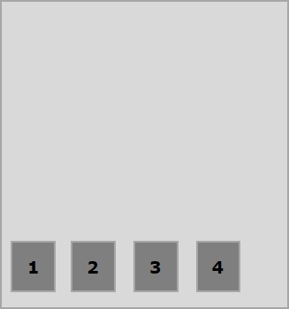
The following example demonstrates the result of passing the value flex-end to the align-items property.
<!doctype html>
<html lang = "en">
   <style>
      .box1{background:green;}
      .box2{background:blue;}
      .box3{background:red;}
      .box4{background:magenta;}
      .box5{background:yellow;}
      .box6{background:pink;}

      .box{
         font-size:35px;
         padding:15px;
      }
      .container{
         display:flex;
         height:100vh;
         align-items:flex-end;
      }
   </style>

   <body>
      <div class = "container">
         <div class = "box box1">One</div>
         <div class = "box box2">two</div>
         <div class = "box box3">three</div>
         <div class = "box box4">four</div>
         <div class = "box box5">five</div>
         <div class = "box box6">six</div>
      </div>
   </body>
</html>
It will produce the following result −
center
On passing this value to the property align-items, the flex-items are aligned vertically at the center of the container.
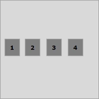
The following example demonstrates the result of passing the value flex-center to the align-items property.
<!doctype html>
<html lang = "en">
   <style>
      .box1{background:green;}
      .box2{background:blue;}
      .box3{background:red;}
      .box4{background:magenta;}
      .box5{background:yellow;}
      .box6{background:pink;}

      .box{
         font-size:35px;
         padding:15px;
      }
      .container{
         display:flex;
         height:100vh;
         align-items:center;
      }
   </style>

   <body>
      <div class = "container">
         <div class = "box box1">One</div>
         <div class = "box box2">two</div>
         <div class = "box box3">three</div>
         <div class = "box box4">four</div>
         <div class = "box box5">five</div>
         <div class = "box box6">six</div>
      </div>
   </body>
</html>
It will produce the following result −
stretch
On passing this value to the property align-items, the flex-items are aligned vertically such that they fill up the whole vertical space of the container.
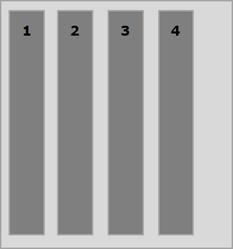
The following example demonstrates the result of passing the value stretch to the align-items property.
<!doctype html>
<html lang = "en">
   <style>
      .box1{background:green;}
      .box2{background:blue;}
      .box3{background:red;}
      .box4{background:magenta;}
      .box5{background:yellow;}
      .box6{background:pink;}

      .box{
         font-size:35px;
         padding:15px;
      }
      .container{
         display:flex;
         height:100vh;
         align-items:stretch;
      }
   </style>

   <body>
      <div class = "container">
         <div class = "box box1">One</div>
         <div class = "box box2">two</div>
         <div class = "box box3">three</div>
         <div class = "box box4">four</div>
         <div class = "box box5">five</div>
         <div class = "box box6">six</div>
      </div>
   </body>
</html>
It will produce the following result −
baseline
On passing this value to the property align-items, the flex-items are aligned such that the baseline of their text align along a horizontal line.
The following example demonstrates the result of passing the value baseline to the align-items property.
<!doctype html>
<html lang = "en">
   <style>
      .box1{background:green;}
      .box2{background:blue;}
      .box3{background:red;}
      .box4{background:magenta;}
      .box5{background:yellow;}
      .box6{background:pink;}

      .box{
         font-size:35px;
         padding:15px;
      }
      .container{
         display:flex;
         height:100vh;
         align-items:baseline;
      }
   </style>

   <body>
      <div class = "container">
      <div class = "box box1">One</div>
      <div class = "box box2">two</div>
      <div class = "box box3">three</div>
      <div class = "box box4">four</div>
      <div class = "box box5">five</div>
      <div class = "box box6">six</div>
      </div>
   </body>
</html>
It will produce the following result −