- XAML Tutorial
- XAML - Home
- XAML - Overview
- XAML - Environment Setup
- Writing XAML Aplication On MAC OS
- XAML Vs C# Code
- XAML Vs.VB.NET
- XAML - Building Blocks
- XAML - Controls
- XAML - Layouts
- XAML - Event Handling
- XAML - Data Binding
- XAML - Markup Extensions
- XAML - Dependency Properties
- XAML - Resources
- XAML - Templates
- XAML - Styles
- XAML - Triggers
- XAML - Debugging
- XAML - Custom Controls
- XAML Useful Resources
- XAML - Quick Guide
- XAML - Useful Resources
- XAML - Discussion
XAML - ToggleButton
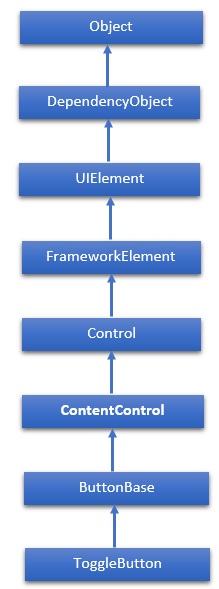
A toggle button is a control that can switch states, such as CheckBox and RadioButton. The hierarchical inheritance of ToggleButton class is as follows −
Properties
| Sr.No. | Property & Description |
|---|---|
| 1 | IsChecked Gets or sets whether the ToggleButton is checked. |
| 2 | IsCheckedProperty Identifies the IsChecked dependency property. |
| 3 | IsThreeState Gets or sets a value that indicates whether the control supports three states. |
| 4 | IsThreeStateProperty Identifies the IsThreeState dependency property. |
Events
| Sr.No. | Event & Description |
|---|---|
| 1 | Checked Fires when a ToggleButton is checked. |
| 2 | Indeterminate Fires when the state of a ToggleButton is switched to the indeterminate state. |
| 3 | Unchecked Occurs when a ToggleButton is unchecked. |
Example
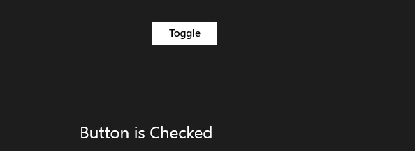
The following example shows the usage of ToggleButton in an XAML application. Here is the XAML code to create and initialize a ToggleButton with some properties.
<Page x:Class = "XAMLToggleButton.MainPage"
   xmlns = "http://schemas.microsoft.com/winfx/2006/xaml/presentation"
   xmlns:x = "http://schemas.microsoft.com/winfx/2006/xaml"
   xmlns:local = "using:XAMLToggleButton"
   xmlns:d = "http://schemas.microsoft.com/expression/blend/2008"
   xmlns:mc = "http://schemas.openxmlformats.org/markup-compatibility/2006"
   mc:Ignorable = "d">

   <Grid Background = "{ThemeResource ApplicationPageBackgroundThemeBrush}">
      <StackPanel Orientation = "Vertical">
         <ToggleButton x:Name = "cb2" Content = "Toggle"
            Checked = "HandleCheck" Unchecked = "HandleUnchecked"
            Margin = "100" Width = "100" HorizontalAlignment = "Center"/>

         <TextBlock x:Name = "text2" Margin = "10" Width = "300"
            HorizontalAlignment = "Center" Height = "50" FontSize = "24"/>
      </StackPanel>
   </Grid>

</Page>
Here is the C# implementation of Checked and Unchecked events −
using System;
using Windows.UI.Xaml;
using Windows.UI.Xaml.Controls;

// The Blank Page item template is documented at http://go.microsoft.com/fwlink/?LinkId=234238

namespace XAMLToggleButton {
   /// <summary>
      /// An empty page that can be used on its own or navigated to within a Frame.
   /// </summary>

   public sealed partial class MainPage : Page {
      public MainPage() {
         this.InitializeComponent();
      }
      private void HandleCheck(object sender, RoutedEventArgs e) {
         text2.Text = "Button is Checked";
      }
      private void HandleUnchecked(object sender, RoutedEventArgs e) {
         text2.Text = "Button is unchecked.";
      }
   }
}
When you compile and execute the above code, it will produce the following output −
We recommend you to execute the above example code and experiment with some other properties and events.