- XAML Tutorial
- XAML - Home
- XAML - Overview
- XAML - Environment Setup
- Writing XAML Aplication On MAC OS
- XAML Vs C# Code
- XAML Vs.VB.NET
- XAML - Building Blocks
- XAML - Controls
- XAML - Layouts
- XAML - Event Handling
- XAML - Data Binding
- XAML - Markup Extensions
- XAML - Dependency Properties
- XAML - Resources
- XAML - Templates
- XAML - Styles
- XAML - Triggers
- XAML - Debugging
- XAML - Custom Controls
- XAML Useful Resources
- XAML - Quick Guide
- XAML - Useful Resources
- XAML - Discussion
XAML - Templates
A template describes the overall look and visual appearance of a control. For each control, there is a default template associated with it which gives the appearance to that control.
In XAML, you can easily create your own templates when you want to customize the visual behavior and visual appearance of a control. Connectivity between the logic and template can be achieved by data binding.
The main difference between styles and templates are −
Styles can only change the appearance of your control with default properties of that control.
With templates, you can access more parts of a control than in styles. You can also specify both existing and new behavior of a control.
There are two types of templates which are most commonly used.
- Control Template
- Data Template
Control Template
The Control Template defines or specifies the visual appearance and structure of a control. All of the UI elements have some kind of appearance as well as behavior, e.g., Button has an appearance and behavior. Click event or mouse hover events are the behaviors which are fired in response to a click and hover, and there is also a default appearance of button which can be changed by the Control template.
Let’s have a look at a simple example again in which two buttons are created with some properties. One is with template and the other one is with the default button.
<Window x:Class = "TemplateDemo.MainWindow"
   xmlns = "http://schemas.microsoft.com/winfx/2006/xaml/presentation"
   xmlns:x = "http://schemas.microsoft.com/winfx/2006/xaml"
   Title = "MainWindow" Height = "350" Width = "604">

   <Window.Resources>
      <ControlTemplate x:Key = "ButtonTemplate" TargetType = "Button">
         <Grid>
            <Ellipse x:Name = "ButtonEllipse" Height = "100" Width = "150" >
               <Ellipse.Fill>
                  <LinearGradientBrush StartPoint = "0,0.2" EndPoint = "0.2,1.4">
                     <GradientStop Offset = "0" Color = "Red"/>
                     <GradientStop Offset = "1" Color = "Orange"/>
                  </LinearGradientBrush>
               </Ellipse.Fill>
            </Ellipse>
            <ContentPresenter Content = "{TemplateBinding Content}"
               HorizontalAlignment = "Center" VerticalAlignment = "Center" />
         </Grid>
         <ControlTemplate.Triggers>
            <Trigger Property = "IsMouseOver" Value = "True">
               <Setter TargetName = "ButtonEllipse" Property = "Fill" >
                  <Setter.Value>
                     <LinearGradientBrush StartPoint = "0,0.2" EndPoint="0.2,1.4">
                        <GradientStop Offset = "0" Color = "YellowGreen"/>
                        <GradientStop Offset = "1" Color = "Gold"/>
                     </LinearGradientBrush>
                  </Setter.Value>
               </Setter>
            </Trigger>

            <Trigger Property = "IsPressed" Value = "True">
               <Setter Property = "RenderTransform">
                  <Setter.Value>
                     <ScaleTransform ScaleX = "0.8" ScaleY = "0.8" CenterX = "0" CenterY = "0" />
                  </Setter.Value>
               </Setter>

               <Setter Property = "RenderTransformOrigin" Value = "0.5,0.5" />
            </Trigger>
         </ControlTemplate.Triggers>
      </ControlTemplate>
   </Window.Resources>

   <StackPanel>
      <Button Content = "Round Button!" Template = "{StaticResource ButtonTemplate}"
         Width = "150" Margin = "50" />
      <Button Content = "Default Button!" Height = "40" Width = "150" Margin = "5" />
   </StackPanel>

</Window>
When the above code is compiled and executed, it will produce the following MainWindow −
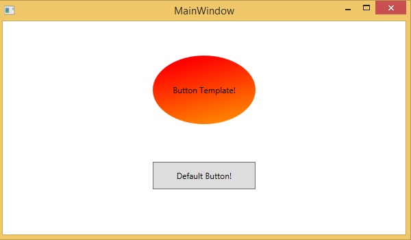
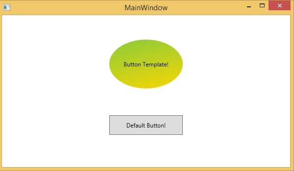
When you hover the mouse over the button with custom template, then it also changes the color as shown below −
Data Template
A Data Template defines and specifies the appearance and structure of the collection of data. It provides the flexibility to format and define the presentation of the data on any UI element. It is mostly used on data related Item controls such as ComboBox, ListBox, etc.
Let’s have a look at a simple example of data template. The following XAML code creates a combobox with Data Template and text blocks.
<Window x:Class = "XAMLDataTemplate.MainWindow"
   xmlns = "http://schemas.microsoft.com/winfx/2006/xaml/presentation"
   xmlns:x = "http://schemas.microsoft.com/winfx/2006/xaml"
   Title = "MainWindow" Height = "350" Width = "604">

   <Grid VerticalAlignment = "Top">
      <ComboBox Name = "Presidents" ItemsSource = "{Binding}" Height = "30" Width = "400">
         <ComboBox.ItemTemplate>
            <DataTemplate>
               <StackPanel Orientation = "Horizontal" Margin = "2">
                  <TextBlock Text = "Name: " Width = "95" Background = "Aqua" Margin = "2" />
                  <TextBlock Text = "{Binding Name}" Width = "95" Background = "AliceBlue" Margin = "2" />
                  <TextBlock Text = "Title: " Width = "95" Background = "Aqua" Margin = "10,2,0,2" />
                  <TextBlock Text = "{Binding Title}" Width = "95" Background = "AliceBlue" Margin = "2" />
               </StackPanel>
            </DataTemplate>
         </ComboBox.ItemTemplate>
      </ComboBox>
   </Grid>

</Window>
Here is the implementation in C# in which the employee object is assigned to DataContext −
using System;
using System.Windows;
using System.Windows.Controls;

namespace XAMLDataTemplate {
   /// <summary>
      /// Interaction logic for MainWindow.xaml
   /// </summary>

   public partial class MainWindow : Window {
      public MainWindow() {
         InitializeComponent();
         DataContext = Employee.GetEmployees();
      }
   }
}
Here is the implementation in C# for Employee class −
using System;
using System.Collections.Generic;
using System.Collections.ObjectModel;
using System.ComponentModel;
using System.Linq;
using System.Runtime.CompilerServices;
using System.Text;
using System.Threading.Tasks;

namespace XAMLDataTemplate {
   public class Employee : INotifyPropertyChanged {
      private string name; public string Name {
         get { return name; }
         set { name = value; RaiseProperChanged(); }
      }
      private string title; public string Title {
         get { return title; }
         set { title = value; RaiseProperChanged(); }
      }
      public static Employee GetEmployee() {
         var emp = new Employee() {
            Name = "Waqas", Title = "Software Engineer" };
         return emp;
      }
      public event PropertyChangedEventHandler PropertyChanged;
      private void RaiseProperChanged( [CallerMemberName] string caller = ""){
         if (PropertyChanged != null) {
            PropertyChanged(this, new PropertyChangedEventArgs(caller));
         }
      }
      public static ObservableCollection<Employee> GetEmployees() {
         var employees = new ObservableCollection<Employee>();
         employees.Add(new Employee() { Name = "Ali", Title = "Developer" });
         employees.Add(new Employee() { Name = "Ahmed", Title = "Programmer" });
         employees.Add(new Employee() { Name = "Amjad", Title = "Desiner" });
         employees.Add(new Employee() { Name = "Waqas", Title = "Programmer" });
         employees.Add(new Employee() { Name = "Bilal", Title = "Engineer" });
         employees.Add(new Employee() { Name = "Waqar", Title = "Manager" });
         return employees;
      }
   }
}
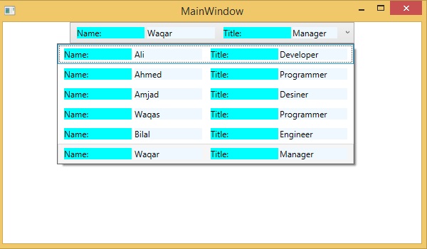
When the above code is compiled and executed, it will produce the following output. It contains a combobox and when you click on the combobox, you see that the collection of data which are created in the Employee class is listed as the combobox items.
We recommend you to execute the above code and experiment with it.