- Forex Trading Tutorial
- Forex Trading - Home
- Forex Trading - Introduction
- The structure of the forex market
- Major Currencies & Trade Systems
- Types of Market Analysis
- Kinds of Foreign Exchange Market
- Benefits of Trading Forex
- Driving Forces behind Forex Market
- Fundamental Market Forces
- Technical Indicators
- Pattern Study of Trends, Support and Resistance
- Technical Strategy in Price Patterns
- Oscillator Divergences
- The Role of Inflation
- The Commodity Connection
- Position Sizing & Money Management
- Foreign Exchange Risks
- Trading Rules to Live By
- Forex Trading Useful Resources
- Forex Trading - Quick Guide
- Forex Trading - Useful Resources
- Forex Trading - Discussion
Forex Trading - Technical Indicators
In this chapter, we will learn about charts that act as technical indicators in forex trading.
What is a chart?
Charts are the main tools of technical analysis. In technical analysis, we use charts to plot a sequence of prices (price movements) of an asset over a certain duration. It is a graphical way of showing how the stock prices have performed in the past.
The period to represent the price movement of an asset (ex. currency) vary from minutes (30 min), hour, day, week, month or many years. It has an x-axis (horizontal axis) and a y-axis (vertical axis). On the chart, the vertical axis (y-axis) represents price and the horizontal axis (x-axis) represents the time. Thus, by plotting a currency pair price over a period of time (time frame), we end up with a pictorial representation of any asset (stock, commodity or FX) trading history.
A chart can also represent the history of the volume of trading in an asset. It can illustrate the number of shares (in case of equity) that change hands over a certain period.
Types of Charts
The asset price (stock, currency pair, commodity, etc.) charts come in many varieties. It is the choice of the individual traders or investors to choose one type over another. This decision may be based on −
Familiarity and comfort
Ease of use
Underlying purpose
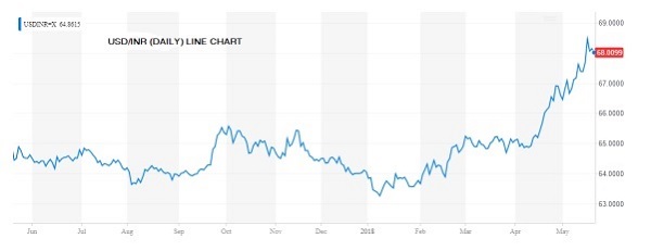
The line chart
Line charts are formed by connecting the closing price of a specific stock or market over a given period. It means, if we want to draw a line chart of a particular currency pair (USD/INR) in a 30 min time frame, we can draw the line chart by putting a straight line between prices before 30 min and current price after 30 min. The charts provide a clear visual illustration of the trend of a particular currency (or stock price) or a market’s (index) movement. It is an extremely valuable analytical tool for technical analysts, traders and also investors.
Line charts are mostly used when two or more trends have to be compared. For example, comparing closing prices of two more companies (same exchange listed and from same domain) or for a currency pair (USD/INR) compared to all the other listed currency pair in the region (ex. Asia).
The line chart exhibits price information with a straight line (or lines) connecting data (price or volume) values.
Below is the line chart of USDINR of 1-year time frame.
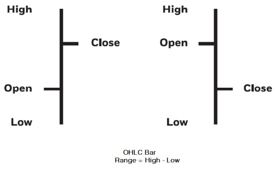
Bar Chart
Bar chart is a commonly used type of chart by technical analysts. It is called bar chart because each day’s range is represented by a vertical bar.
Although daily bar charts are best known, bar charts can be created for any period – weekly, monthly and yearly for example. A bar shows the high price for the period at the top and the lowest price at the bottom of the bar. Lines on either side of the vertical bar serve to mark the opening and closing prices of an asset (stock, currency pair). A small tick on the left side of the bar shows the opening price and a tick to the right of the bar shows closing price.
Many traders work with bar charts created over a matter of minutes during a day’s trading.
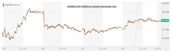
Following is a 5-Day Bar chart of USDINR in 5 minutes interval.
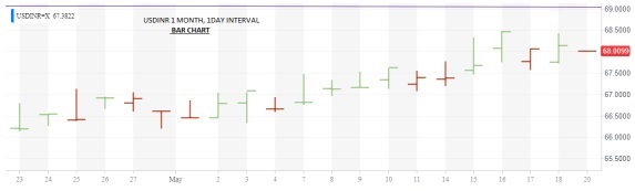
With 1-Day interval, 1-month chart of USDINR will be shown like this −
Candlesticks Chart
The candlesticks chart is very popular among the traders community. This chart provides visual insight to current market psychology. A candlestick displays the open, high, low and closing price of a security very similar to a modern-day bar chart, but in a manner that mitigates the relationship between the opening and closing prices. Each candlestick represents one time frame (e.g., day) of data. The figure given below displays various elements of a candle.
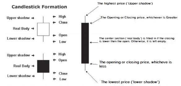
Elements of a Candle
A candlestick chart can be created using the data of High, Open, Low and Closing prices for each time period that you want to display. The middle portion (filled portion) of the candlestick is called “the body (“the real body”). The long thin lines above and below the body represent the high/low range and are called “shadows” (sometimes called “wicks” and “tails”).
The body of the candlestick represents a stock’s opening and closing price of the security (stock or currency pair).
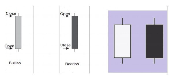
The following image shows Candlestick chart of USDINR (3 month) on 1-Day interval. The color of the candlestick denotes a higher close in green whereas lower close in red, for the day.
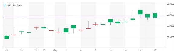
The red candles in the above figure show days when the USDINR closed than the previous day. In contrast, green candles denotes days when the USDINR closed higher than the previous day.
Professional traders and investors sometimes prefer using candlestick chart because there are patterns in the candlesticks that can be actionable. However, candlestick charts consume time and skills to identify the patterns.
What is the chart pattern to use when trading?
The professional traders try to check the same security across different chart types. You may find one type of chart that works for you. Once we decided on what type of chart to follow, next step is to look for historical patterns like trends, support and resistance and other actionable patterns.