- Agile Data Science Tutorial
- Agile Data Science - Home
- Agile Data Science - Introduction
- Methodology Concepts
- Agile Data Science - Process
- Agile Tools & Installation
- Data Processing in Agile
- SQL versus NoSQL
- NoSQL & Dataflow programming
- Collecting & Displaying Records
- Data Visualization
- Data Enrichment
- Working with Reports
- Role of Predictions
- Extracting features with PySpark
- Building a Regression Model
- Deploying a predictive system
- Agile Data Science - SparkML
- Fixing Prediction Problem
- Improving Prediction Performance
- Creating better scene with agile & data science
- Implementation of Agile
- Agile Data Science Useful Resources
- Agile Data Science - Quick Guide
- Agile Data Science - Resources
- Agile Data Science - Discussion
Agile Data Science - Data Visualization
Data visualization plays a very important role in data science. We can consider data visualization as a module of data science. Data Science includes more than building predictive models. It includes explanation of models and using them to understand data and make decisions. Data visualization is an integral part of presenting data in the most convincing way.
From the data science point of view, data visualization is a highlighting feature which shows the changes and trends.
Consider the following guidelines for effective data visualization −
Position data along common scale.
Use of bars are more effective in comparison of circles and squares.
Proper color should be used for scatter plots.
Use pie chart to show proportions.
Sunburst visualization is more effective for hierarchical plots.
Agile needs a simple scripting language for data visualization and with data science in collaboration “Python” is the suggested language for data visualization.
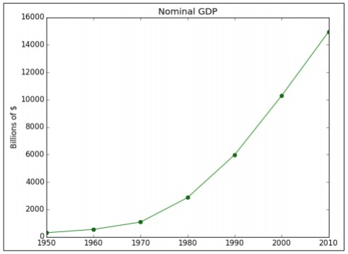
Example 1
The following example demonstrates data visualization of GDP calculated in specific years. “Matplotlib” is the best library for data visualization in Python. The installation of this library is shown below −
Consider the following code to understand this −
import matplotlib.pyplot as plt
years = [1950, 1960, 1970, 1980, 1990, 2000, 2010]
gdp = [300.2, 543.3, 1075.9, 2862.5, 5979.6, 10289.7, 14958.3]

# create a line chart, years on x-axis, gdp on y-axis
plt.plot(years, gdp, color='green', marker='o', linestyle='solid')

# add a title plt.title("Nominal GDP")
# add a label to the y-axis
plt.ylabel("Billions of $")
plt.show()
Output
The above code generates the following output −
There are many ways to customize the charts with axis labels, line styles and point markers. Let’s focus on the next example which demonstrates the better data visualization. These results can be used for better output.
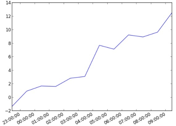
Example 2
import datetime
import random
import matplotlib.pyplot as plt

# make up some data
x = [datetime.datetime.now() + datetime.timedelta(hours=i) for i in range(12)]
y = [i+random.gauss(0,1) for i,_ in enumerate(x)]

# plot
plt.plot(x,y)

# beautify the x-labels
plt.gcf().autofmt_xdate()
plt.show()
Output
The above code generates the following output −