- Windows 10 - Home
- Windows 10 - Introduction
- Windows 10 – UWP
- Windows 10 – First App
- Windows 10 - Store
- Windows 10 - XAML Controls
- Windows 10 - Data Binding
- Windows 10 - XAML Performance
- Windows 10 - Adaptive Design
- Windows 10 - Adaptive UI
- Windows 10 - Adaptive Code
- Windows 10 - File Management
- Windows 10 - SQLite Database
- Windows 10 – Communication
- Windows 10 - App Localization
- Windows 10 - App Lifecycle
- Windows 10 - Background Execution
- Windows 10 - APP Services
- Windows 10 - Web Platform
- Windows 10 - Connected Experience
- Windows 10 - Navigation
- Windows 10 - Networking
- Windows 10 - Cloud Services
- Windows 10 - Live Tiles
- Windows 10 - Sharing Contract
- Windows 10 - Porting to Windows
Windows 10 Development - XAML Controls
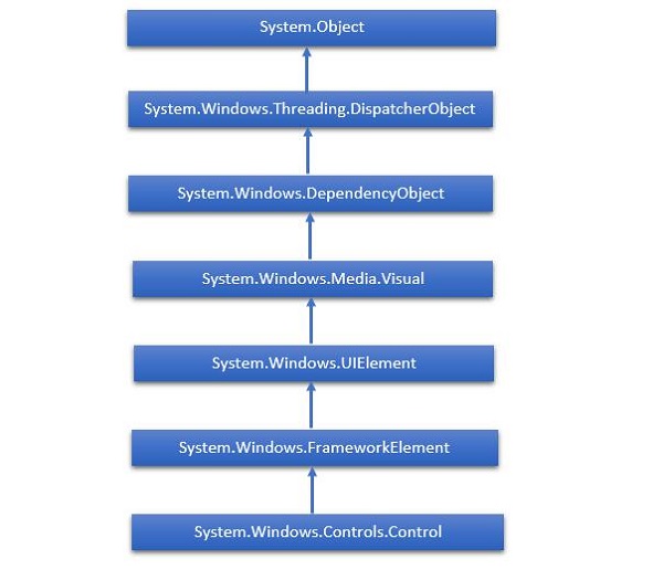
XAML Stands for Extensible Application Markup Language. It is a User Interface framework and it offers an extensive library of controls that support UI development for Windows. Some of them have a visual representation such as a Button, Textbox and TextBlock etc; while other controls are used as the containers for other controls or content, such as images etc. All the XAML controls are inherited from System.Windows.Controls.Control.
XAML Emerging Story
XAML is used in many important Microsoft platforms such as the Windows Presentation Foundation (WPF), the Silverlight and now, Windows apps. Now, Microsoft Office 2016 is also a family of UWP apps. XAML is a rich Platform, which provides very cool features and controls that can be used in UWP applications.
The complete inheritance hierarchy of controls is shown below.
Layout Controls
Layout of Controls is very important and critical for application usability. It is used to arrange a group of GUI elements in your application. There are certain important things to consider while selecting the layout panels −
- Positions of the child elements.
- Sizes of the child elements.
- Layering of overlapping child elements on top of each other.
A list of Layout Controls is given below −
| S.No. | Controls & Description |
|---|---|
| 1 | StackPanel StackPanel is a simple and useful layout panel in XAML. In stack panel, child elements can be arranged in a single line either horizontally or vertically based on orientation property. |
| 2 | WrapPanel In WrapPanel, child elements are positioned in sequential order from left to right or from top to bottom based on the orientation property. The only difference between StackPanel and WrapPanel is that it does not stack all the child elements into a single line but it wraps the remaining elements to another line if there is no space left. |
| 3 | DockPanel DockPanel defines an area to arrange child elements relative to each other, either horizontally or vertically. With DockPanel you can easily dock child elements to top, bottom, right, left and center with Dock property. With LastChildFill property, the last child element fill the remaining space regardless of any other dock value when set for that element. |
| 4 | Canvas Canvas is the basic layout panel in which child elements can be positioned explicitly using coordinates that are relative to any side such as left, right, top and bottom. Typically Canvas is used for 2D graphic elements (such as Ellipse, Rectangle etc.) but not for UI elements because specifying absolute coordinates give trouble while resizing, localizing or scaling in an XAML application. |
| 5 | Grid Grid provides a flexible area, which consists of rows and columns. In Grid, child elements can be arranged in a tabular form. Elements can be added to any specific row and column by using Grid.Row and Grid.Column properties. |
| 6 | SplitView SplitView represents a container with two views; one view for the main content and another view that is typically used for navigation commands. |
| 7 | RelativePanel RelativePanel defines an area within which you can position and align child objects in relation to each other or the parent panel. |
| 8 | ViewBox ViewBox defines a content decorator that can stretch and scale a single child to fill the available space. |
| 9 | FlipView FlipView represents an items control that displays one item at a time, and enables "flip" behavior for traversing its collection of items. |
| 10 | GridView GridView is a control that presents a collection of items in rows and columns and can be scrolled horizontally. |
UI Controls
Here is a list of UI Controls, which are visible to the end users.
| S.No. | UI Controls & Description |
|---|---|
| 1 | Button A control that responds to user input |
| 2 | Calendar Represents a control that enables a user to select a date by using a visual calendar display. |
| 3 | CheckBox A control that a user can select or clear. |
| 4 | ComboBox A drop-down list of items, a user can select from. |
| 5 | ContextMenu Gets or sets the context menu element that should appear whenever the context menu is requested through user interface (UI) from within this element. |
| 6 | DataGrid Represents a control that displays data in a customizable grid. |
| 7 | DatePicker A control that lets a user select a date. |
| 8 | Dialogs An application may also display additional windows to do the user to gather or display important information. |
| 9 | Flyout Represents a control that displays lightweight UI that is either information, or requires user interaction. Unlike a dialog, a Flyout can be light dismissed by clicking or tapping outside of it, pressing the devices back button, or pressing the Esc key. |
| 10 | Image A control that presents an image. |
| 11 | ListBox A control that presents an inline list of items that the user can select from. |
| 12 | Menus Represents a Windows menu control that enables you to hierarchically organize the elements associated with commands and event handlers. |
| 13 | MenuFlyout Represents a flyout that displays a menu of commands. |
| 14 | PasswordBox A control for entering passwords. |
| 15 | Popup Displays content on top of the existing content, within the bounds of the application window. |
| 16 | ProgressBar A control that indicates the progress by displaying a bar. |
| 17 | ProgressRing A control that indicates the indeterminate progress by displaying a ring. |
| 18 | RadioButton A control that allows a user to select a single option from a group of options. |
| 19 | RichEditBox A control that lets a user edit rich text documents with content like formatted text, hyperlinks, and images. |
| 20 | ScrollViewer A container control that lets the user pan and zoom its content. |
| 21 | SearchBox A control that lets a user enter search queries. |
| 22 | Slider A control that lets the user select from a range of values by moving a Thumb control along a track. |
| 23 | TextBlock A control that displays the text. |
| 24 | TimePicker A control that lets a user set a time value. |
| 25 | ToggleButton A button that can be toggled between 2 states. |
| 26 | ToolTip A pop-up window that displays information for an element. |
| 27 | Window The root window which provides minimize/maximize option, Title bar, border and close button. |
Given below is an example, which contains different types of controls in a SplitView. In XAML file, different controls are created with some properties and events.
<Page
x:Class = "UWPControlsDemo.MainPage"
xmlns = "http://schemas.microsoft.com/winfx/2006/xaml/presentation"
xmlns:x = "http://schemas.microsoft.com/winfx/2006/xaml"
xmlns:local = "using:UWPControlsDemo"
xmlns:d = "http://schemas.microsoft.com/expression/blend/2008"
xmlns:mc = "http://schemas.openxmlformats.org/markup-compatibility/2006"
mc:Ignorable = "d">
<Grid Background = "{ThemeResource ApplicationPageBackgroundThemeBrush}">
<StackPanel Margin = "20">
<StackPanel Orientation = "Horizontal">
<ToggleButton x:Name = "HamburgerButton" FontFamily = "Segoe MDL2 Assets"
Content = "" Checked = "HandleCheck" Unchecked = "HandleUnchecked"
HorizontalAlignment = "Center"/>
<AppBarButton Icon = "Like" />
<AppBarButton Icon = "Dislike" />
<AppBarSeparator/>
<AppBarButton Icon = "Accept" />
<AppBarButton Icon = "Add" />
</StackPanel>
<SplitView x:Name = "splitView" DisplayMode = "Inline"
OpenPaneLength = "296">
<SplitView.Pane>
<StackPanel>
<TextBlock Text = "SplitView Pane" FontSize = "36"
VerticalAlignment = "Center" HorizontalAlignment = "Center"
Margin = "10"/>
<Button Content = "Options" Margin = "10">
<Button.Flyout>
<MenuFlyout>
<MenuFlyoutItem Text = "Reset"/>
<MenuFlyoutSeparator/>
<MenuFlyoutItem Text = "Repeat"/>
<MenuFlyoutItem Text = "Shuffle"/>
</MenuFlyout>
</Button.Flyout>
</Button>
</StackPanel>
</SplitView.Pane>
<StackPanel>
<TextBlock Text = "SplitView Content" FontSize = "36"
VerticalAlignment = "Center" HorizontalAlignment = "Center"
Margin = "10"/>
<Border BorderThickness = "3" BorderBrush = "Red" Margin = "5">
<StackPanel Orientation = "Horizontal">
<TextBlock Text = "Hyperlink example" Margin = "5"/>
<HyperlinkButton Content = "www.microsoft.com"
NavigateUri = "http://www.microsoft.com"/>
</StackPanel>
</Border>
<RelativePanel BorderBrush = "Red" BorderThickness = "2"
CornerRadius = "10" Padding = "12" Margin = "5">
<TextBlock x:Name = "txt" Text = "Relative Panel example"
RelativePanel.AlignLeftWithPanel = "True"
Margin = "5,0,0,0"/>
<TextBox x:Name = "textBox1" RelativePanel.RightOf = "btn"
Margin = "5,0,0,0"/>
<Button x:Name = "btn" Content = "Name"
RelativePanel.RightOf = "txt" Margin = "5,0,0,0"/>
</RelativePanel>
<FlipView Height = "400" Margin = "10" Width = "400">
<Image Source = "Images/DSC_0104.JPG"/>
<Image Source = "Images/DSC_0080.JPG"/>
<Image Source = "Images/DSC_0076.JPG"/>
<Image Source = "Images/thGTF7BWGW.jpg"/>
</FlipView>
</StackPanel>
</SplitView>
</StackPanel>
</Grid>
</Page>
Given below is the Events implementation in C#.
using Windows.UI.Xaml;
using Windows.UI.Xaml.Controls;
using Windows.UI.Xaml.Media;

// The Blank Page item template is documented at
   http://go.microsoft.com/fwlink/?LinkId=402352&clcid=0x409

namespace UWPControlsDemo {

   /// <summary>
      /// An empty page that can be used on its own or navigated to within a Frame.
   /// </summary>

   public sealed partial class MainPage : Page {

      public MainPage() {
         this.InitializeComponent();
      }

      private void HandleCheck(object sender, RoutedEventArgs e) {
         splitView.IsPaneOpen = true;
      }

      private void HandleUnchecked(object sender, RoutedEventArgs e) {
         splitView.IsPaneOpen = false;
      }

   }

}
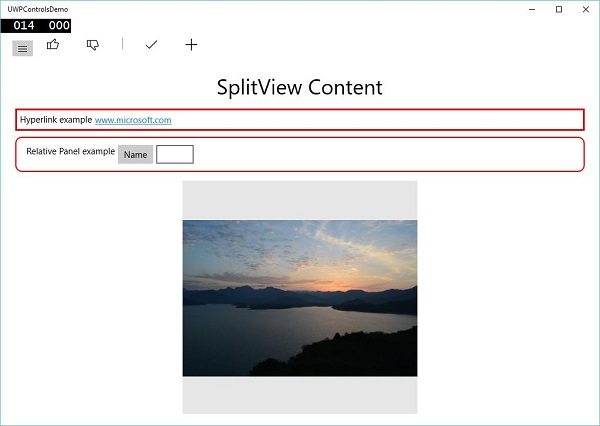
When the above code is compiled and executed, you will see the following window −
When you click on the hamburger button on the top left side, it will open/close the SplitView pane.
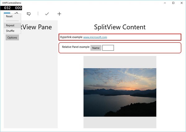
In the SplitView Pane, you can see the Flyout, MenuFlyout and FlipView controls.
In the SplitView Content, you can see the Hyperlink, Relative Panel, ViewBox and other buttons and textbox controls.
