- Windows 10 - Home
- Windows 10 - Introduction
- Windows 10 – UWP
- Windows 10 – First App
- Windows 10 - Store
- Windows 10 - XAML Controls
- Windows 10 - Data Binding
- Windows 10 - XAML Performance
- Windows 10 - Adaptive Design
- Windows 10 - Adaptive UI
- Windows 10 - Adaptive Code
- Windows 10 - File Management
- Windows 10 - SQLite Database
- Windows 10 – Communication
- Windows 10 - App Localization
- Windows 10 - App Lifecycle
- Windows 10 - Background Execution
- Windows 10 - APP Services
- Windows 10 - Web Platform
- Windows 10 - Connected Experience
- Windows 10 - Navigation
- Windows 10 - Networking
- Windows 10 - Cloud Services
- Windows 10 - Live Tiles
- Windows 10 - Sharing Contract
- Windows 10 - Porting to Windows
Windows 10 Development - Adaptive UI
A Universal Windows Platform (UWP) application can run on many different devices and each device has its own form of input, screen resolutions, DPI density, and other unique characteristics.
In Windows 10, with the help of new universal controls, layout panels, and tooling you can adapt your UI easily to the devices your application may run on. For example, when your UWP application is running either on a desktop computer, a mobile device or on a tablet, you can tailor the UI to take advantage of different screen resolution, screen sizes and DPI density.
In Windows 10, you can easily target your UI to multiple devices with the following features −
You can enhance your UI for different screen resolutions and screen sizes by using universal controls and layout panels.
Common input handling allows you to receive input through a touch pad, a pen, a mouse, a keyboard, or a controller such as a Microsoft Xbox controller.
With the help of Tools, you can design your application UI that can adapt to different screen resolutions.
Adaptive scaling adjusts to the resolution and DPI differences across devices.
In Windows 10, you can easily arrange, resize and position applications in any way you want. It also gives some sort of flexibility to the user to use your application the way they want. In Windows 10, there are various ways to implement responsive techniques in your UWP application, so it looks great no matter what is the screen or window size.
VisualStateManager
In Windows 10, the VisualStateManager class has two new mechanisms with the help of which you can implement a responsive design in your UWP applications. The new VisualState.StateTriggers allows the developer to check certain conditions like the window height or window width and then the VisualState.Setters APIs define visual states in response to those certain conditions.
Let us have a look at the example given below in which some controls are added in stack panel.
<Page
   x:Class = "UWPAdaptiveUI.MainPage"
   xmlns = "http://schemas.microsoft.com/winfx/2006/xaml/presentation"
   xmlns:x = "http://schemas.microsoft.com/winfx/2006/xaml"
   xmlns:local = "using:UWPAdaptiveUI"
   xmlns:d = "http://schemas.microsoft.com/expression/blend/2008"
   xmlns:mc = "http://schemas.openxmlformats.org/markup-compatibility/2006"
   mc:Ignorable = "d">

   <Grid Background = "{ThemeResource ApplicationPageBackgroundThemeBrush}">
      <VisualStateManager.VisualStateGroups>

         <VisualStateGroup>

            <VisualState>

               <VisualState.StateTriggers>
                  <!-- VisualState to be triggered when window
                     width is >=720 effective pixels. -->
                  <AdaptiveTrigger MinWindowWidth = "720" />
               </VisualState.StateTriggers>

               <VisualState.Setters>
                  <Setter Target = "myPanel.Orientation" Value = "Horizontal" />
               </VisualState.Setters>

            </VisualState>

         </VisualStateGroup>

      </VisualStateManager.VisualStateGroups>

      <StackPanel x:Name = "myPanel" Orientation = "Vertical">

         <TextBlock Text = "Windows 10 Tutorials: Text block 1. "
            Style = "{ThemeResource BodyTextBlockStyle}"/>

         <TextBlock Text = "Windows 10 Tutorials: Text block 2. "
            Style = "{ThemeResource BodyTextBlockStyle}"/>

         <TextBlock Text = "Windows 10 Tutorials: Text block 3. "
            Style = "{ThemeResource BodyTextBlockStyle}"/>

      </StackPanel>

   </Grid>

</Page>
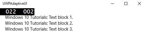
Now VisualStateManager, will adjust the orientation of stack panel based on the windows width. If width is >= 720, then the orientation will become Horizontal otherwise it will remain vertical. When the above code is compiled and executed, you will see the following window, which contains three text blocks in vertical order.
Let us resize the width of the above window and you will see the following window −
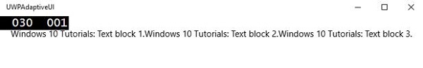
Now you can see that the text blocks are in horizontal order.
RelativePanel
RelativePanel can be used to lay out the UI elements by expressing spatial relationships between the elements. Let us take an example in which some rectangles are created in the relative panel.
<Page
   x:Class = "UWPAdaptiveUI.MainPage"
   xmlns = "http://schemas.microsoft.com/winfx/2006/xaml/presentation"
   xmlns:x = "http://schemas.microsoft.com/winfx/2006/xaml"
   xmlns:local = "using:UWPAdaptiveUI"
   xmlns:d = "http://schemas.microsoft.com/expression/blend/2008"
   xmlns:mc = "http://schemas.openxmlformats.org/markup-compatibility/2006"
   mc:Ignorable = "d">

   <Grid Background = "{ThemeResource ApplicationPageBackgroundThemeBrush}">

      <VisualStateManager.VisualStateGroups>

         <VisualStateGroup>

            <VisualState>

               <VisualState.StateTriggers>
                  <AdaptiveTrigger MinWindowWidth = "720" />
               </VisualState.StateTriggers>

               <VisualState.Setters>
                  <Setter Target = "GreenRect.(RelativePanel.RightOf)"
                     Value = "BlueRect" />
                  <Setter Target = "GreenRect.(RelativePanel.AlignRightWithPanel)"
                     Value = "True" />
               </VisualState.Setters>

            </VisualState>

         </VisualStateGroup>

      </VisualStateManager.VisualStateGroups>

      <RelativePanel BorderBrush = "Gray" BorderThickness = "10">
         <Rectangle x:Name = "RedRect" Fill = "Red" MinHeight = "100"
            MinWidth = "100"/>

         <Rectangle x:Name = "BlueRect" Fill = "Blue" MinHeight = "100"
            MinWidth = "100" RelativePanel.RightOf = "RedRect" />

         <!-- Width is not set on the green and yellow rectangles.
            It's determined by the RelativePanel properties. -->

         <Rectangle x:Name = "GreenRect" Fill = "Green" MinHeight = "100"
            RelativePanel.Below = "BlueRect" RelativePanel.AlignLeftWith = "RedRect"
            RelativePanel.AlignRightWith = "BlueRect"/>

         <Rectangle Fill = "Yellow" MinHeight = "100" RelativePanel.Below = "GreenRect"
            RelativePanel.AlignLeftWith = "BlueRect"
            RelativePanel.AlignRightWithPanel = "True"/>

      </RelativePanel>

   </Grid>

</Page>
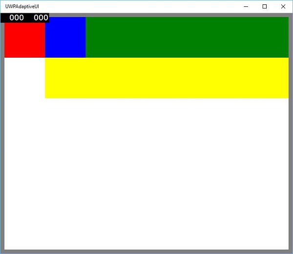
When the above code is compiled and executed, you will see the following window.
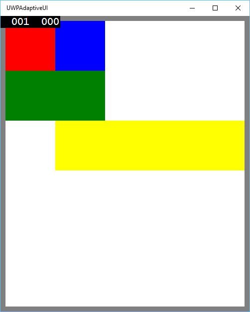
When you resize the above window, you will see that the green rectangle is now adjusted in the top row to the left of blue rectangle as shown below.