- Plotly - Home
- Plotly - Introduction
- Plotly - Environment Setup
- Plotly - Online & Offline Plotting
- Plotting Inline with Jupyter Notebook
- Plotly - Package Structure
- Plotly - Exporting to Static Images
- Plotly - Legends
- Plotly - Format Axis & Ticks
- Plotly - Subplots & Inset Plots
- Plotly - Bar Chart & Pie Chart
- Plotly - Scatter Plot, Scattergl Plot & Bubble Charts
- Plotly - Dot Plots & Table
- Plotly - Histogram
- Plotly - Box Plot Violin Plot & Contour Plot
- Plotly - Distplots, Density Plot & Error Bar Plot
- Plotly - Heatmap
- Plotly - Polar Chart & Radar Chart
- Plotly - OHLC Chart Waterfall Chart & Funnel Chart
- Plotly - 3D Scatter & Surface Plot
- Plotly - Adding Buttons/Dropdown
- Plotly - Slider Control
- Plotly - FigureWidget Class
- Plotly with Pandas and Cufflinks
- Plotly with Matplotlib and Chart Studio
- Plotly Useful Resources
- Plotly - Quick Guide
- Plotly - Cheatsheet
- Plotly - Useful Resources
- Plotly - Discussion
Plotly with Matplotlib and Chart Studio
This chapter deals with data visualization library titled Matplotlib and online plot maker named Chart Studio.
Matplotlib
Matplotlib is a popular Python data visualization library capable of producing production-ready but static plots. you can convert your static matplotlib figures into interactive plots with the help of mpl_to_plotly() function in plotly.tools module.
Following script produces a Sine wave Line plot using Matplotlibs PyPlot API.
from matplotlib import pyplot as plt
import numpy as np
import math
#needed for definition of pi
x = np.arange(0, math.pi*2, 0.05)
y = np.sin(x)
plt.plot(x,y)
plt.xlabel("angle")
plt.ylabel("sine")
plt.title('sine wave')
plt.show()
Now we shall convert it into a plotly figure as follows −
fig = plt.gcf()
plotly_fig = tls.mpl_to_plotly(fig)
py.iplot(plotly_fig)
The output of the code is as given below −

Chart Studio
Chart Studio is an online plot maker tool made available by Plotly. It provides a graphical user interface for importing and analyzing data into a grid and using stats tools. Graphs can be embedded or downloaded. It is mainly used to enable creating graphs faster and more efficiently.
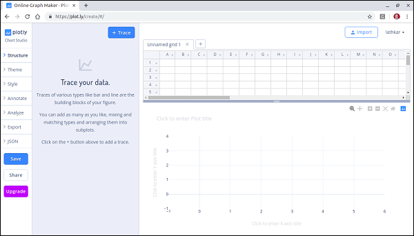
After logging in to plotlys account, start the chart studio app by visiting the link https://plot.ly/create. The web page offers a blank work sheet below the plot area. Chart Studio lets you to add plot traces by pushing + trace button.
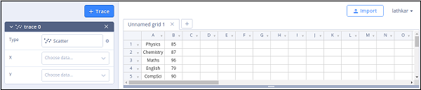
Various plot structure elements such as annotations, style etc. as well as facility to save, export and share the plots is available in the menu.
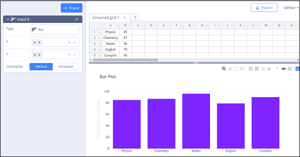
Let us add data in the worksheet and add choose bar plot trace from the trace types.
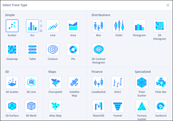
Click in the type text box and select bar plot.
Then, provide data columns for x and y axes and enter plot title.