- SEO - Home
- SEO - What is SEO?
- SEO - Tactics & Methods
- SEO - On Page Techniques
- SEO - Off Page Techniques
- SEO - Web Site Domain
- SEO - Relevant Filenames
- SEO - Design & Layout
- SEO - Optimized Keywords
- SEO - Long-tail Keywords
- SEO - Title Tags
- SEO - Meta Description
- SEO - Optimized Metatags
- SEO - Optimize for Google
- SEO - Robots.txt
- SEO - URL Structure
- SEO - Headings
- SEO - Redirects
- SEO - Authority & Trust
- SEO - PDF Files
- SEO - Optimized Anchor
- SEO - Optimize Images
- SEO - Duplicate Content
- SEO - Meta Robots Tag
- SEO - Nofollow Links
- SEO - XML Sitemap
- SEO - Canonical URL
- SEO - Role of UI/UX
- SEO - Keyword Gap Analysis
- SEO - Get Quality Backlinks
- SEO - Adding Schema Markup
- SEO - Author Authority
- SEO - Fix Broken Links
- SEO - Internal Page Linking
- SEO - Clean Up Toxic Links
- SEO - Earn Authority Backlinks
- SEO - Core Web Vitals
- SEO - Update Old Content
- SEO - Fill Content Gaps
- SEO - Link Building
- SEO - Featured Snippets
- SEO - Remove URLS from Google
- SEO - Content is the King
- SEO - Verifying Web Site
- SEO - Multiple Media Types
- SEO - Google Passage Ranking
- SEO - Maximize Social Shares
- SEO - First Link Priority Rule
- SEO - Optimize Page Load Time
- SEO - Hiring an Expert
- SEO - Learn EAT Principle
- SEO - Mobile SEO Techniques
- SEO - Avoid Negative Tactics
- SEO - Misc Techniques
- SEO - Continuous Site Audit
- SEO - Summary
- SEO Useful Resources
- SEO - Quick Guide
- SEO - Useful Resources
- SEO - Discussion
SEO - Mobile SEO Techniques
Mobile SEO: What Is It?
Making your website mobile-friendly for devices such as tablets and smartphones is known as mobile SEO. Similar techniques to desktop SEO are necessary. However, more consumers nowadays are searching on their mobile phones and tablets. The user experience on mobile devices must therefore be given top priority. This requires optimising site layout, content, and other aspects for mobile users.
Mobile SEO: Significance
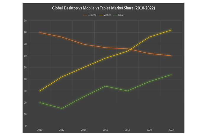
Nowadays, smartphones and tablets account for more than fifty percent of traffic from search engines. Desktop search traffic is continuing to decline as mobile search volume increases.
Google Makes Use of "Mobile-First Indexing."
Google employs a mobile-first algorithm. In other words, it primarily indexes and ranks material available on mobile phones and tablets. In 2019, this was adopted as the standard procedure.
The mobile-friendly version of your website is therefore given priority whenever Google crawls and indexes your content. Notably, there aren't distinct mobile and desktop indexes. There is only one. And mobile is given priority.
However, Google will keep displaying the web page that is most pertinent to visitors in search results, whether they are on a desktop or smartphone or tablet. If this is something you still need to do so, the most effective option is to take precautions and optimise your website for smartphone consumers.
| Configuration | URL Status | HTML Status |
|---|---|---|
| Flexible Web Design | Remains Constant | Remains Constant |
| Different URL For Mobile Devices | Changed URL | Changed HTML Syntax |
| Dynamic Serving | Remains Constant | Changed HTML Syntax |
Principles of Mobile SEO
Website Performance
For smartphone and tablet users specifically, website performance is much more crucial than for users on desktops due to hardware and network concerns. In addition to image optimization, you should minimize your source code, use browser caching, and minimize redirects.
Allow Images, Javascript, And CSS
When these elements first became available, many mobile phones could not support all of them; thus, developers of mobile websites either restricted the entire trio or just one of them. The modern smartphone has changed that, though, for the majority of the portion.
The goal of SmartphoneGoogleBot is to examine and classify content in a similar way as consumers. These components are equally essential for Google to determine whether your website is flexible or uses an alternative mobile solution. Therefore, don't conceal them.
Mobile-Friendly Website Design
The design of websites is being simplified and revolutionized by smartphones and tablets.
With an adaptive grid and an adaptable layout that automatically adjusts to a user's screen size, responsively-designed websites utilize CSS3 media queries to offer identical content to smartphones and desktop consumers.
Using Only HTML5
The consumer might not have the plugin installed on their device; in this instance, the engaging experience won't be felt. Rather than using HTML4, utilize HTML5 to generate extraordinary effects.
Avoid Using Pop-Up Windows
Attempting to close them on your smartphone or tablet might be challenging and unpleasant. Unfavorable bounce rates could result from this.
A Large, Finger-Friendly Design
If your buttons are excessively big or too tiny, or they get in the way of a finger attempting to navigate through the content, touchscreen navigation could result in an accidental click or click-through.
Make Use Of Schema.Org Structured Data
Rich snippets are much more likely to be displayed when viewing a mobile device than on a desktop due to the smaller screen size.
Optimise Meta-Titles and Description
When making the titles, URLs, and meta descriptions, try to keep things as short as possible while maintaining your content's ability to display your finest work in SERPS. Note that you have limited screen space when a consumer explores on a smartphone or tablet.
Implement Local Search Optimizatio
If your business includes a localized component, always remember to optimise the data on the mobile version of your website for local searches. Standardizing your contact details, including your companyname, localaddress, and regionalphone number, as well as your city and state names in the site's metadata, is required.
Different URLs for Smartphone
Making a separate, duplicate website for smartphone visitors is an additional choice. This enables you to produce unique content for customers using smartphones and other mobile devices. Most parallel mobile websites utilize a "m" subdomain to prevent URL ambiguity.

Keep it simple for visitors who land in the incorrect location to move over to access their preferable content because parallel mobile versions may prove just as ineffective as dynamic serving websites at getting users to the correct version.
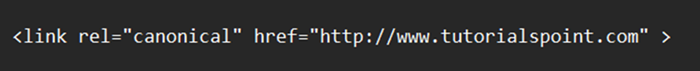
To improvethe loading time of your website, you will also need to take steps to ensure that all of the website's redirects are set up and as little as feasible. Remember to include <rel="canonical"> tag to prevent duplicating content issues.
Serving in a Dynamic Environment
The URL of your website doesn't change when it's browsed through a smartphone or tablet thanks to a setup known as "dynamic serving," which serves alternative HTML content.
Example Code


Conclusion
Nowadays, smartphones and tablets are preferred by people over desktops due to mobility, usability and availability. Thus, it is essential to take into account that the website operates in aneffective mobile-friendly manner. Employ mobile SEO recommendations for your company's website since you've become knowledgeable about the technique.
