- SAP UI5 - Home
- SAP UI5 - Overview
- SAP UI5 - Architecture
- SAP UI5 - Key Components
- SAP UI5 - Control Libraries
- SAP UI5 - Development Kit
- SAP UI5 - MVC Concept
- SAP UI5 - Views
- SAP UI5 - Developer Studio
- SAP UI5 - Creating a UI5 Project
- SAP UI5 - Controls
- SAP UI5 - Data binding
- SAP UI5 - Design Patterns
- SAP UI5 - Modularization
- SAP UI5 - Localization
- SAP UI5 - Notepad Controls
- SAP UI5 - Extending Applications
- SAP UI5 - Theming
- SAP UI5 - Mobile
- Creating a Project in Web IDE
SAP UI5 - Quick Guide
SAP UI5 - Overview
SAP provides various tools that the users can use to enhance their user experience to create apps with rich user interfaces for Web business applications. The most common enablement tools include −
- Theme Designer
- NWBC and Side Panel
- FPM Screens
- SAP UI5 Development Tools
Web-based apps that you create using SAP UI5 provides more consistent user experience and can be accessed on devices such as tablets, smartphones, and laptop. Using the NetWeaver gateway with UI5, you can define a clear separation between the user interface and business logic.
SAP UI5 provides the following key features −
- Extensibility concepts at the code and application level.
- Ability to create complex UI patterns and predefined layouts for typical use cases.
- Model-View-Controller (MVC) and data binding methods.
- Keyboard interaction support and accessibility features.
- SAP UI5 is based on open standards like JavaScript, CSS, and HTML5.
- Theming support based on CSS.
Following are the advantages of using SAP UI in business −
- It helps in increasing productivity.
- Increase user adaption.
- Less manual errors.
- Reduce the cost of training.
- High performance of SAP system.
- Perfectly designed API and can be consumed easily.
SAP UI5 Version
Following is the list of recent UI5 versions that have been introduced. Each UI5 provides new features and enhancements from the previous versions, platform support, usability enhancements, etc.
- SAP UI5 1.26
- SAP UI5 1.28
- SAP UI5 1.30
- SAP UI5 1.32
- SAP UI5 1.34
- SAP UI5 1.36
- SAP UI5 1.38 and many more like SAP UI5 1.6
Version Scheme
SAP UI5 uses 3-digit version number. For example, SAPUI5 1.36.5. Here, the digit (1) specifies the major version. The second digit (36) specifies the minor version number. The third digit specifies the patch version number (5).
In each SAP UI5, the major and minor version as well as the patch version can be used to identify the patches.
SAP UI5 vs Open UI5
SAP UI5 and Open UI5, both provide the UI development environment. However, they are different from each other in the following aspects −
SAP UI5 is part of SAP product suite and is not a separate license. It is integrated with different SAP products like −
- SAP NW 7.4 or higher
- SAP NetWeaver AS 7.3x
- SAP HANA Cloud and on premise solution
Open UI5 is an open source technology for application development and it was released with Apache 2.0.
| SAP UI5 is not a separate product and is available with SAP product suite | Open UI5 is free open source platform for application development |
SAP UI5 is integrated with
|
Open UI5 was introduced with Apache 2.0 license OpenUI5 is Open Source, and is available on GitHub |
UI5 Browser Support
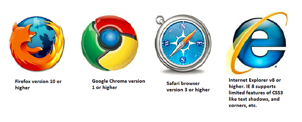
SAP UI5 supports all the main browsers from Microsoft, Google and Firefox with latest releases. However, features supported varies with the browser version and the vendor.
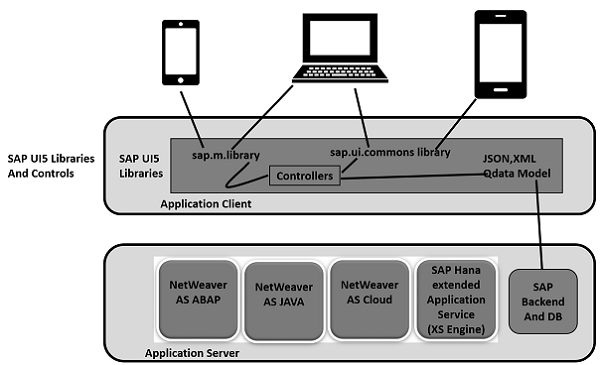
SAP UI5 - Architecture
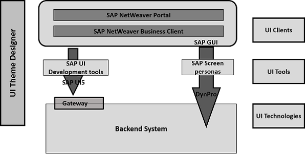
In SAP UI5 architecture, you have three layers −
At the top, is the presentation layer, where UI5 components are consumed by devices like mobile, tablets, and laptops.
At the middle layer, is the application clients that includes SAP UI5 libraries for theming and control. UI5 control libraries include
Sap.viz
Sap.ui.commons (Controls like text fields and buttons)
Sap.ui.table (Input controls for table)
Sap.ui.ux3
Sap.m (Includes input control for mobile devices)
At the bottom, is the option server component. This includes SAP NetWeaver Application Server for ABAP/Java, SAP backend, HANA XS engine for development or database.
SAP UI5 - Key Components
SAP UI5 has multiple components which are independent and reusable objects in UI5 application. These components can be developed by different people and can be used in different projects.
An application can use the components from different locations and hence you can easily get the structure of an application. You can create different types of components under SAP UI5 development.
Faceless Components
Faceless components are used to get the data from the backend system and they dont contain a user interface.
Example− They are a part of class sap.ui.core.component
UI Components
UI components are used to add rendering functionality and represent a screen area or element on the user interface.
Example − UI component can be a button with settings to perform some task. It is a part of class: sap.ui.core.UIComponent
Note − sap.ui.core.component is the base class for faceless and UI components. To define the extensibility function, the components can inherit from the base class or from other components in UI development.
The module name of a component is known as the package name, and .component where the package name is defined as the name of the parameter passed to the component constructor.
SAP UI5 components can also be divided as per the system landscape −
- Client side component: This includes,
- Control libraries sap.m, sap.ui.common, etc.
- Core Javascript
- Test includes HTML and Javascript
- Server side component
- Theming Generator
- Control and application development tools in Eclipse
- Resource handler
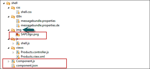
Structure of a Component
Each component is represented in the form of a folder and contains the name of the components and the resources required to manage the component.
Each component should contain the following files −
Component.json file that contains metadata for design time and is used only for design time tools.
Component.js is used to define properties, events, and components methods that are responsible for runtime metadata.
How to Create a New SAP UI5 Component?
To create a new component, you have to create new folder. Let us name this as button.
Next is to create the component.js file
Then, you have to extend UI component base class sap.ui.core.UIComponent.extend and enter the name of the component and package path.
Later, to define a new component, you have to start with the require statement as follows −
// defining a new UI Component
jQuery.sap.require("sap.ui.core.UIComponent");
jQuery.sap.require("sap.ui.commons.Button");
jQuery.sap.declare("samples.components.button.Component");

// new Component
sap.ui.core.UIComponent.extend("samples.components.button.Component", {
   metadata : {
      properties : {
         text: "string"
      }
   }
});

samples.components.button.Component.prototype.createContent = function(){
   this.oButton = new sap.ui.commons.Button("btn");
   return this.oButton;
};

/*
* Overrides setText method of the component to set this text in the button
*/
samples.components.button.Component.prototype.setText = function(sText) {
   this.oButton.setText(sText);
   this.setProperty("text", sText);
   return this;
};
The next step is to define the component.json in your folder as follows −
{
   "name": "samples.components.button",
   "version": "0.1.0",
   "description": "Sample button component",
   "keywords": [
      "button",
      "example"
   ],
   "dependencies": {
   }
}
How to Use a Component
To use a component, you have to wrap the component in a component container. You cannot directly use a UI component in a page using placeAt method. Another way is to pass the component to the componentContainer constructor.
Using placeAt Method
It includes adding the component to the container and using placeAt method to place the component on the page.
var oComp = sap.ui.getCore().createComponent({
   name: "samples.components.shell",
   id: "Comp1",
   settings: {appTitle: "Hello John"}
});

var oCompCont = new sap.ui.core.ComponentContainer("CompCont1", {
   component: oComp
});

oCompCont.placeAt("target1");
//using placeAt method
Using componentContainer Constructor
A component container carries specific settings and also contains the lifecycle methods of a regular control. The following code segment shows how to pass the component to the componentContainer constructor.
var oCompCont2 = new sap.ui.core.ComponentContainer("CompCont2", {
   name: " samples.components.shell",
   settings: {text: "Hello John 1"}
});
oCompCont2.placeAt("target2");
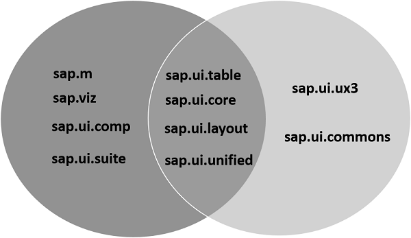
SAP UI5 - Control Libraries
There are various JavaScript and CSS libraries that you can use in combination for the application development. SAPUI5 can use these libraries in combination and they are called SAPUI5 control libraries.
Common SAPUI5 control libraries −
- Sap.ui.commons for control fields, buttons, etc.
- Sap.m is the most common control library and is used for mobile devices
- Sap.ui.table includes table control
- Sap.ui.ux3
Note − SAPUI5 control library sap.m is the most common library and is used for application development. These libraries can be combined with other control libraries.
Control Library Combinations
You can use the control library sap.m with other control libraries - sap.ui.unified, sap.viz, sap.ui.table, sap.ui.layout, and sap.suite.
You can combine control libraries - sap.ui.commons, sap.ui.table, sap.ui.ux3 and sap.ui.suite with each other.
You can also combine control library sap.ui.commons and sap.ui.ux3 with other libraries like sap.ui.core, sap.ui.unified, sap.ui.layout, and sap.ui.table.
You can combine sap.viz with all other libraries.
The following table shows the main SAPUI5 control libraries and their description −
| sap.m | Library with controls specialized for mobile devices. |
| sap.makit | SAPUI5 library contains the markit charts. |
| sap.ui.commons | Common library for standard controls |
| sap.ui.ux3 | SAPUI5 library with controls that implement the SAP User Experience(UX) Guidelines 3.0 |
| sap.viz | SAPUI5 library containing chart controls based on the VIZ charting library. |
SAP UI5 - Development Kit
SAP UI5 development kit for HTML5 provides you an environment for the development of web-based applications and it provides an application with one consistent user experience. Web apps that you develop with SAP UI5 are responsive across browsers and devices, and they can run on smartphones, tablets, and desktops.
The UI controls automatically adapt themselves to the capabilities of each device.
You can use SAP UI5 on the following platforms −
- SAP HANA
- SAP HANA Cloud Platform
- SAP NetWeaver for SAP NetWeaver 7.4 or higher
- User interface add-on for SAP NetWeaver for SAP NetWeaver Application Server 7.3x
You can deploy the application on the server that includes storing the libraries and getting data from the database. You can use the NetWeaver Application server or HANA Cloud platform for application deployment, and data can be accessed by a business application using the OData model using Gateway. Take a look at the following illustration.
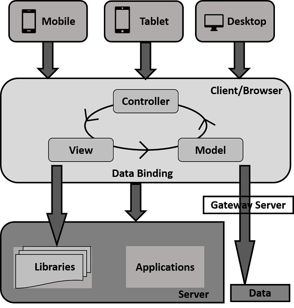
When a user sends a client request from his mobile/laptop, a request is sent to the server to load the application in a browser, and data is accessed via database and the relevant libraries are accessed.
To build a UI5 application, you can download the SAP UI5 developers tools of Eclipse. Once you download, you can unzip the file and deploy on the web server. For ABAP, you can install a UI Add-On for SAP NetWeaver and this also includes UI5 Theme Designer.
Prerequisites for SAP UI5
To install and update UI5 development toolkit for HTML5, you should meet the following prerequisites −
| Eclipse Platform | Mars (4.5) |
|---|---|
| Operating System | Windows OS (XP, Vista, 7 or 8/8.1) |
| Java Runtime | JRE Version 1.6 or higher, 32-Bit or 64-Bit |
| SAP GUI | Only relevant when installing the SAP UI5 ABAP Repository Team Provider
|
| Microsoft | Only relevant when installing the SAP UI5 ABAP Repository Team Provider For Windows OS: DLLs VS2010 for communication with the back-end system is required Note: Install either the x86 or the x64 variant, accordingly to your 32 or 64-Bit Eclipse installation |
Let us now proceed and discuss how you can install the SAP UI5 Development Kit in your system.
Step 1 − To install JDK, go to Oracle.com and search for the required JDK version.
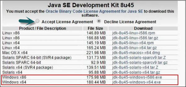
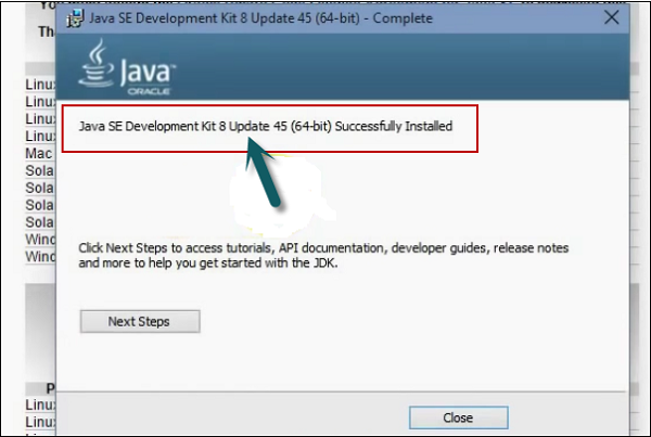
Step 2 − Download and run the setup. You will get a message as shown in the following screenshot.
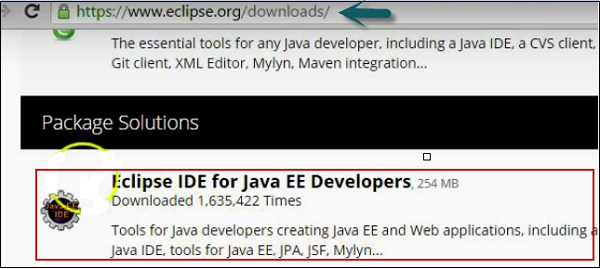
Step 3 − To install Eclipse, go to www.Eclipse.org/downloads
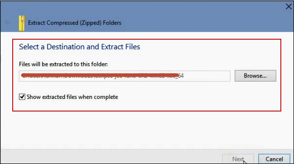
Step 4 − Extract the file as shown in the following screenshot.
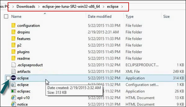
Step 5 − To run the installation, go to the extracted folder and run the application file as shown in the following screenshot.
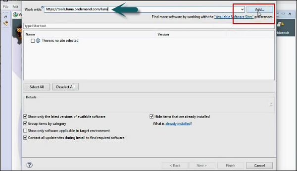
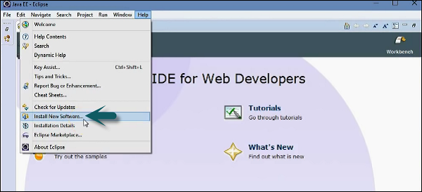
Step 6 − To install SAPUI5 tools, go to Eclipse → Help → Install New software.
You can install directly using the URL or by entering the path of UI5 demo kit.
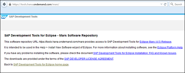
Step 7 − Next, enter the URL in install dialog https://tools.hana.ondemand.com/mars
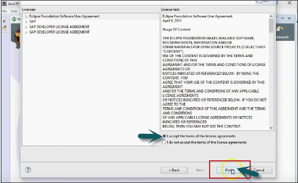
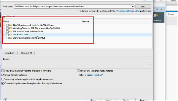
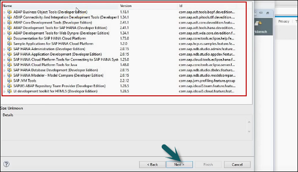
Step 8 − To see the available features. Press the ENTER key. You can select the features and click on Next. It will display the list of features to be installed → Click Next.
Step 9 − Accept the license agreement and click Finish to start the installation.
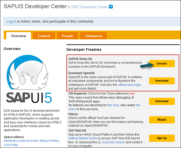
Step 10 − Download UI Development Kit for HTML 5 from the following link −
https://sapui5.hana.ondemand.com/sdk/#/topic/95d113be50ae40d5b0b562b84d715227 and extract the content in the same folder.
Step 11 − Start the Eclipse environment. Go to Help → Install New Software.
Step 12 − Click Add → Local.
Step 13 − Next, navigate to the local update site location and select the tool-update site folder with the folder where you extracted the HTML5 Development toolkit as the update source.
Step 14 − Select all plugins and features for installation.
Step 15 − Select the dialog to Contact all update sites during the installation to find the required software.
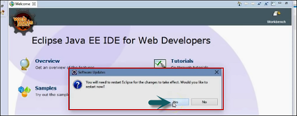
Step 16 − Click the Finish button to complete the setup. Restart Eclipse.
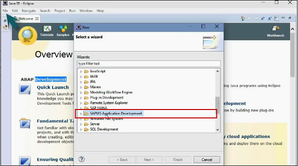
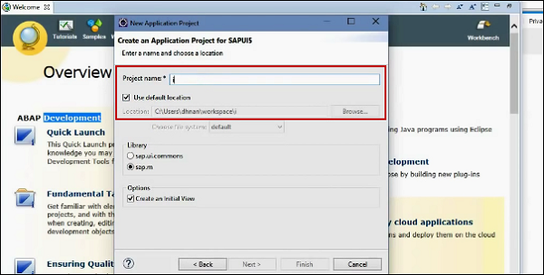
Step 17 − You can verify the installation by creating a new SAPUI5 Application Project via Eclipse menu File → New → Other at the bottom. Select SAP UI5 Application Development folder and expand to create a new project.
Step 18 − Enter the project name, select library and you can check the box to create an initial view.
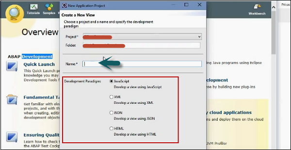
Step 19 − Create a view using some sample code in the project. Enter the name of the view and click the Next button.
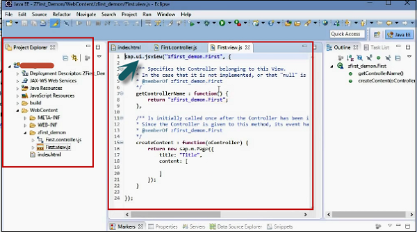
Step 20 − Select the development paradigm and click on Finish. You will see a new SAPUI5 development project in a new window as shown in the following screenshot.
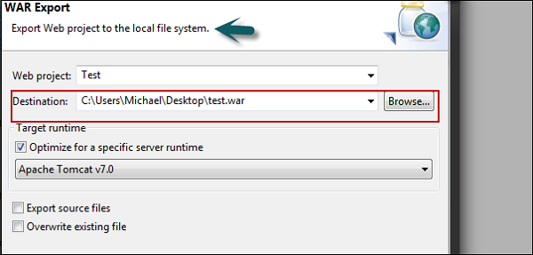
Now, to present your application or run it in production, you can deploy your SAPUI5 application on the tomcat server. If you dont have a tool like MAVEN, in that you can use the export option to export the project manually. Right-click on Project → Export.
Step 21 − Enter the destination path where you want to place the war file.
Next, copy the war-File to webapps directory of your apache tomcat. You can access your application by going to this path - http://localhost:8080/<your_app>/
Note − In a normal scenario, many SAP projects run in Internet Explorer but for SAPUI5 development it is recommended to use Google Chrome or Firefox with firebug plugin as both systems allow the use of tools and plugins to debug JavaScript, as well as use HTML and CSS.
SAP UI5 - MVC Concept
Model-View-Controller (MVC) concept is used in SAP UI5 development to keep the application data separate from the user interactions. This allows you to develop the web applications and make changes to the applications independently.
Model-View-Controller plays a different role in UI development −
The Model is responsible for managing the application data in the database/backend.
The View is responsible for defining the user interface to users. When a user sends a requests from his device, the view is responsible for data view as per the request submitted.
The Controller is used to control the data and view events as per user interaction by updating the view and model.
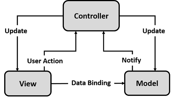
You can define Model-View-Controller concept in SAPUI5 with the following features −
Model
- Model acts as a bridge between the view and the application data.
- Model is used to get the request from the view and respond as per the users input.
- Model doesnt depend on classes.
View
- View is responsible to manage information display to the users.
- Views are based on Model.
Controller
Controller is responsible for taking the input given by devices and communicates to model/view and to trigger correct action.
Controllers are based on model.
SAP UI5 offers Views and Controllers in the form of single files −
- sap.ui.core.mvc.XMLView
- sap.ui.core.mvc.JSView
- sap.ui.core.mvc.Controller
- sap.ui.core.mvc.JSONView
JSON Model
- JSON model is a client-side model and is used for small data sets.
- JSON model supports two-way binding. Data binding concept is mentioned in the latter half of this tutorial.
- JSON model can be used to bind controls to JavaScript object data.
XML Model
- XML model can be used to bind controls to XML data.
- XML is also a client side model and hence is used only for small data sets.
- XML model doesnt provide any mechanism for server-based paging or loading of deltas.
- XML model also supports two-way data binding.
SAP UI5 - Views
Views are defined using SAP libraries as follows −
- XML with HTML, mixed, or Standalone: Library- sap.ui.core.mvc.XMLView
- JavaScript: Library- sap.ui.core.mvc.JSView
- JSON: Library - sap.ui.core.mvc.JSONView
- HTML: Library - sap.ui.core.mvc.HTMLView
JavaScript View Sample
Sap.ui.jsview(sap.hcm.address, {
   getControllerName: function() {
      return sap.hcm.address;
   },
   createContent: function(oController) {
      var oButton = new sap.ui.commons.Button({ text: Hello });
      oButton.attachPress(function() {
         oController.Hello();
      })
      Return oButton;
   }
});
HTML View Sample
<template data-controller-name = sap.hcm.address>
   <h1>title</h1>
   <div> Embedded html </div>
   <div class = test data-sap-ui-type = sap.ui.commons.Button
      Id = Button1 data-text =  Hello Data-press = sayHello>
   </div>
</template>
Similarly, you can create JSON view derived from sap.ui.core.mvc.JsonView.
{
   type:sap.ui.core.mvc.JsonView,
   controllerName:sap.hcm.address,
   .
   ...
   .
}
Comparison of View Types
The following table lists key features associated with MVC concept and comparison of different view types w.r.t the features.
| Feature | JS View | XML View | JSON View | HTML View |
|---|---|---|---|---|
| Standard and Custom Libraries | Yes | Yes | Yes | Yes |
| Properties of types string, int Boolean, float | Yes | Yes | Yes | Yes |
| Aggregation 1:1, 1:n Association 1:1, 1:n | Yes | Yes | Yes | Yes |
| Simple Data Binding | Yes | Yes | Yes | Yes |
| Customize Data Binding | Yes | No | No | No |
| Embedded HTML | No | Yes | No | No |
| Code Completion | Yes | Yes | No | No |
| Templating | Yes | No | No | No |
| Validation | No | Yes | No | No |
| Single Event Listener | Yes | Yes | Yes | Yes |
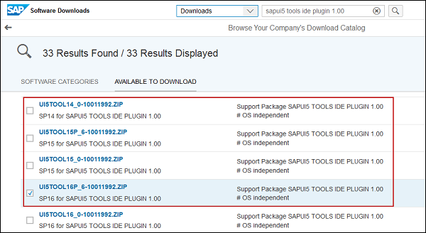
SAP UI5 - Developer Studio
SAPUI5 Developer Studio provides tools to ease the UI5 development process. Following are the functions −
- Wizard for Control development
- Wizard for Project creation
- Wizard for View/Controller creation
You can download it from SAP Marketplace using the link https://support.sap.com/software.html. Search for UI Add-on 1.0 for NetWeaver.
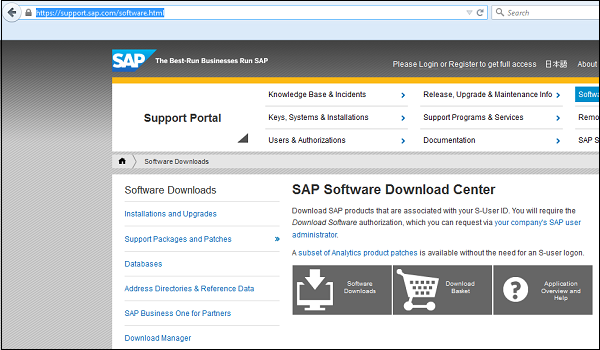
Go to Software downloads and enter your Id and password. Then, go to support packages and patches. Search for sapui5 tools ide plugin 1.00.
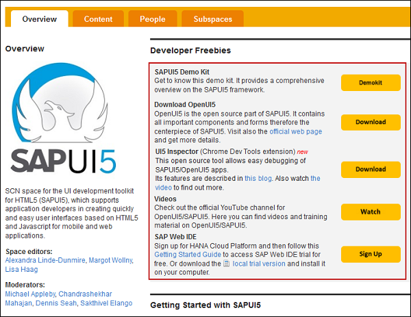
A trail of SAPUI5 framework is also available under SCN. You can go to this link https://pages.community.sap.com/topics/ui5
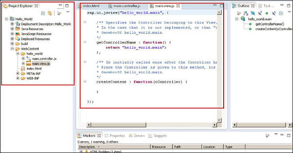
SAP UI5 - Creating a UI5 Project
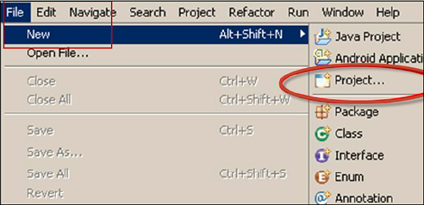
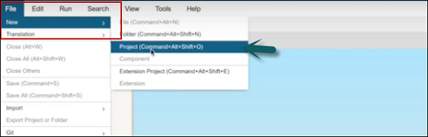
Step 1 − To create a new project in UI5 developer Studio, go to File → New → Project.
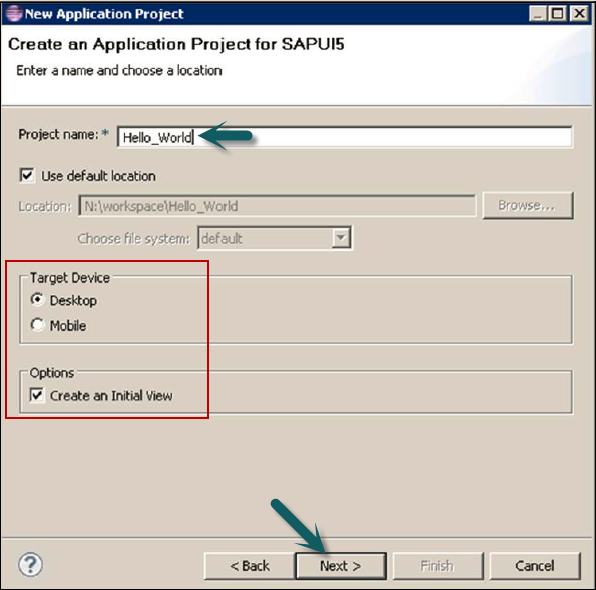
Step 2 − Enter the name of project, target device, and Create an Initial View.
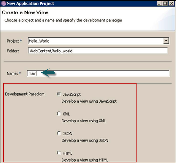
Step 3 − Enter the View name and View type in the next window and click Next.
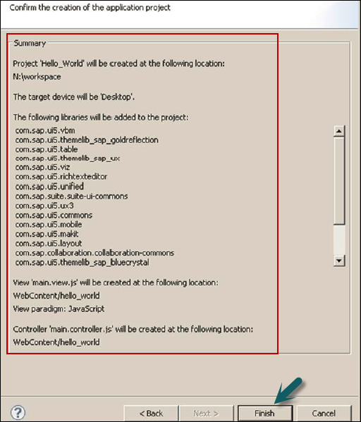
Step 4 − In the last window, you see the project summary. It shows you the project properties. Click the Finish button to create the project.
Step 5 − You will be prompted to switch to Java EE perspective. Click Yes and it will open a new UI5 project window with an initial view - JSView.
Step 6 − Now to add a Shell to this view, you can use the library sap.ui.ux3.Shell().
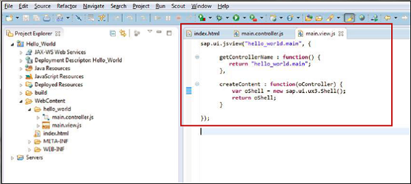
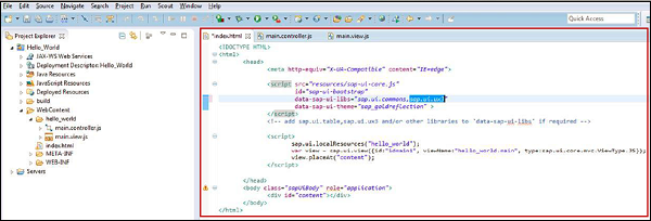
Step 7 − As Shell is not part of sap.ui.commons, you need to add sap.ui.ux3 library. You can add additional libraries to data-sap-ui-libs.
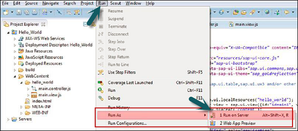
To run an application, you have two options −
- Run on server
- Run on webapp
Run on server is recommended as it has a fixed port and it is not like run on webapp with one-time random port.
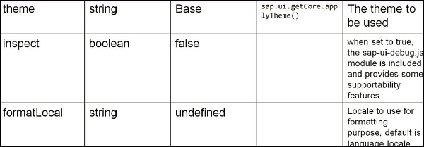
SAP UI5 Configuration
As shown in the following table, you can define various configuration attributes in SAP UI5 −
Core Functions
The core functions in SAP UI5 are as follows −
Sap.ui.getCore() − This is used to get a core instance.
Sap.ui.getCore().byid(id) − This is used to get an instance of UI5 control created with id.
Sap.ui.getCore().applyChanges() − This is used to carry out and render the changes for UI5 controls immediately.
jQuery.sap.domById(id) − This is used to get any HTML element with id. If there is a UI5 control with id, the element returned is top most HTML element of UI5 control.
jQuery.sap.byId(id) − This is used to return jQuery object of DOM element with specified Id.
SAP UI5 - Controls
There are different types of UI controls that you can use while developing UI5 applications. These controls allow you to add a button, table, images, layout, combo box, and various other controls in UI5 application.
Common control types include −
- Simple Controls
- Complex Controls
- UX3 Controls
- Dialogs
- Layout
Image Control
Var image = new sap.ui.commons.Image();
Image.setSrc(Image1.gif);
Image.setAlt(alternat.text);
Combo Box
You can use a combo box to provide predefined entries.
Properties − items, selectedKey
Var oComboBox2 = new sap.ui.commons.ComboBox (ComboBox,{
   Items:{path:/data,
      Template:oItemTemplate, filters:[oFilter]},
   Change: function(oEvent){
      Sap.ui.getCore(). byId(field).setValue(
         oEvent.oSource.getSelectedKey());
   }
});
Simple Button Control
Use attachPresss assign event handler for a push action.
Var oButton = new sap.ui.commons.Button ({text : Click,
   Press: oController.update
});
Autocomplete Control
To autocomplete the entered value.
Var uiElement = new sap.ui.commons.AutoComplete({
   Tooltip: Enter the product,
   maxPopupItems: 4
});
For (var i = 0; i<aData.lenght; i++){
   uiElement.addItem(new sap.ui.core.ListItem(
      {text: aData[i].name}));
}
Table Control Box
It is derived from sap.ui.table and each table contains columns.
Var oTable = new sap.ui.table.Table({
   Columns: [
      New sap.ui.table.Column({
         Label: new sap.ui.commons.lable({ text: First Column}),
         Template: new sap.ui.commons.TextView({ text: {Firstcolumn} }),
         Width: 120px
      })
SAP UI5 - Data binding
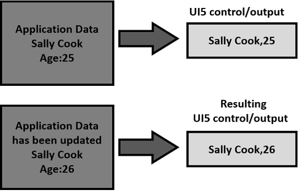
In SAP UI5, data binding concept is used to update the data automatically by binding the data with the controls that holds the application data. Using data binding, you can bind simple controls like text field, simple button to application data, and data is automatically updated when there is a new value.
Using two-way data binding, application data is updated when the value of bound control changes. The value can be changed via different methods, like user input, etc.
In SAP UI5, different data models can be used for data binding. These data models support different features −
JSON Model
JSON model is used to bind JavaScript objects to controls. This data model is a client-side model and is suggested for small data sets. It doesnt provide any mechanism for serverside paging or loading.
Key features include −
- JSON model for data binding supports data in JavaScript notation format.
- It supports two-way data binding.
Creating a model instance −
Var oModel = new sap.ui.model.json.JSONModel(dataUrlorData);
XML Model
XML model of data binding allows you to bind the controls to XML data. It is used for clientside objects and for small data sets. It doesnt provide any mechanism for server-side paging or loading.
Key features include −
- XML model of data binding supports XML data.
- It also supports two-way data binding.
Creating a model instance −
Var oModel = new sap.ui.model.xml.XMLModel(dataUrlorData);
OData Model
OData model is a server-side model, so entire data is available at the server side. Client side can see only rows and fields and you cant use sorting and filtering at the client side. There is a need to send this request to the server to complete these tasks.
Data binding in OData model is one way but you can enable two-way binding using experimental write support.
Key features include −
- OData model of data binding supports Odata compliant data.
- This data model allows you to create OData requests and handle responses.
- It supports experimental two-way binding.
Creating a model instance −
Var oModel = new sap.ui.model.odata.ODataModel (dataUrl [,useJSON, user, pass]);
Assigning the Model
You can use the setModel method to assign the model to specific controls or core.
Sap.ui.getcore().setModel(oModel);
To bind a model to view −
Var myView = sap.ui.view({type:sap.ui.core.mvc.ViewType.JS, viewname:view name});
myView.setModel(oModel);
To bind a model to a control −
Var oTable = sap.ui.getCore().byId(table);
oTable.setModel(oModel);
You can bind the properties of a control to model properties. You can bind the properties of a model to a control using bindproperty method −
oControl.bindProperty(controlProperty, modelProperty);
or by using below methodvar
oControl = new sap.ui.commons.TextView({
   controlProperty: {modelProperty}
});
Aggregation Binding
You can use aggregation binding to bind a collection of values like binding multiple rows to a table. To use aggregation, you have to use a control that acts as a template.
You can define aggregation binding using bindAgregation method.
oComboBox.bindaggregation( items, /modelaggregation, oItemTemplate);
SAP UI5 - Design Patterns
Design Pattern is a new term in SAP UI5 development when we talk about SAP development or SAP Fiori system. SAP is working hard to find new design patterns that support development in SAP system using UI5 SDK.
SAP has released different types of design patterns −
Master-Detail
This is a first step in application binding and is supported by SplitApp control of SAP UI5. This design pattern supports the list of content and allows lead selection and detailed view.
Master-Master Detail
This design pattern displays the detail of transaction in the detail section.
Example − You are placing an order online and you want to see a confirmation page that displays what you are buying and display the detail of the transaction with detailed view.
Full Screen
This design pattern is mostly recommended for displaying charts, pictorial data, and various types of graphs.
Multi-Flow
This design pattern is recommended when you are using a complex application flow and there is a need to make use of all design patterns to build a working application.
SAP UI5 - Modularization
In SAPUI5 development for larger JavaScript applications, UI5 framework provides built in support for modularization. Modularization concept allows you to split application into smaller parts and they can be combined together at run time. These smaller application parts are called modularization.
You can declare your own JavaScript module by calling the query jQuery.sap.declare function and this is used to keep track of the module name and already loaded module.
To load a module, you have to use jQuery.sap.require
Example
<script>
   jQuery.sap.require(sap.ui.commons.MessageBox);

</script>
When a module is required jQuery.sap.require and that module is not loaded, it automatically loads. It calls the declare method so when require is called it knows that the module has been loaded.
SAP UI5 - Localization
SAP UI5 supports localization concept based on Java platform.
Identifying the Language Code − For the identification of languages, the framework uses a language code of type string.
Resource Bundles − A resource bundle file is a Java properties file and contains key/value pairs where the values are language-dependent texts and the keys are language independent and used by the application to identify and access the corresponding values.
Resource bundles are a collection of *.properties files. All files are named with the same base name (prefix identifying the resource bundle), an optional suffix that identifies the language contained in each file, and the fixed .properties extension.
The language suffixes are formed according to the older JDK locale syntax. By convention, a file without a language suffix should exist and contain the raw untranslated texts in the developer's language. This file is used if no more suitable language can be found.
Resource bundle sap.ui.commons.message_bundle contains the following files −
sap.ui.commons.message_bundle.properties − This file carries the raw text from the developer and it determines the set of keys.
sap.ui.commons.message_bundle_en.properties − This file carries English text.
sap.ui.commons.message_bundle_en_US.properties − This file carries text in American English.
sap.ui.commons.message_bundle_en_UK.properties − This file carries text in British English.
Use of Localized Texts in Applications
SAPUI5 provides two options to use localized texts in applications the jQuery.sap.resources module and data binding.
The following code is used to get resource bundle for a given language −
jQuery.sap.require(jquery.sap.resources);
var oBundle = jQuery.sap.resources({url ; sUrl, locale:sLocale});
The following code is used to access the text in resource bundle −
Var sText = oBundle.getText(sKey);
The following code is used to get URL of a resource −
Var sUrl = sap.ui.resource(sap.ui.table,messagebundle.properties);
SAP UI5 - Notepad Controls
A Control is used to define the appearance and screen area. It contains properties likewidth and text. These properties are used to modify the appearance or change the data displayed by the control. You can create aggregate controls or associated controls.
Associated control of a control is defined as loosely related controls, which are not child controls or a part of the main control. Controls are used to trigger well-defined events.
Controls in SAPUI5 can be created directly using a tool or JavaScript file. Controls that are created using the extend() method are also known as Notepad controls.
The following code is used to define a Control using the Extend method −
Sap.ui.core.control.extend (sname, oDefinition);
The parameters that are passed to this control −
- Name of the control
- Definition of the control
The definition of a control contains information about control API, aggregations, events, etc. and implementation methods.
You can also create custom controls. Definition of custom control can contain public and private methods, metadata, and rendering method, etc.
metadata:{
   properties: {},
   events: {},
   aggregations: {}
},

publicMethod: function() {},
_privateMethod: function() {},
init: function() {}
onclick: function(e) {},
renderer: function(rm, oControl) {}
Creating a new control inherits from Button −
Sap.ui.commons.Button.extend (sname, oDefinition);
The metadata in control definition consists of objects for control properties, events, and aggregations.
Property
- Type: data type of control property
- String: string for a string property
- Int or float for number properties
- Int[] for an integers array
- String[] for an string array
Events
Events are defined by the name event only. You normally pass an empty object to an event. Application use enablePreventDefault flag to interrupt the event.
Events: {
   Logout:{},
   Close: {
      enablePreventDefault : true
   }
}
SAP UI5 - Extending Applications
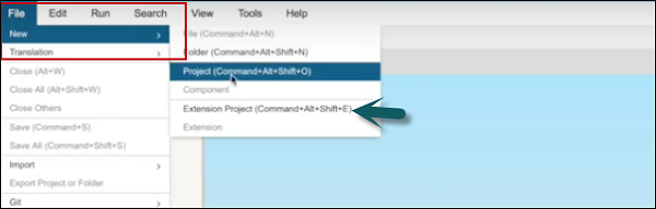
You can extend UI5 applications that are either remote or in Web IDE. To create a new Extension project, you should have an application remotely or on IDE.
Step 1 − To create a new Project, go to File → Extension Project.

Step 2 − Select the Workspace to select the desired SAP Fiori application that you want to use as your original application.
Step 3 − When you select an application, Extension Project Name field is populated with the name of the original application with the suffix extension. You can change this name → Next
Step 4 − If necessary, select the Open extension project in extensibility pane checkbox to automatically open the extensibility pane after the project is generated.
Step 5 − Click Finish.
Similarly, you can also extend applications that reside in SAP HANA Cloud platform. Follow the steps given below.
Step 1 − To create a new Project, go to File → Extension Project.
Step 2 − Select the start → Remote → SAP HANA Cloud Platform → Select Application from SAP HANA Cloud Platform dialog box.
Step 3 − In the next window, you have to enter SAP HANA Cloud Platform account, user name, and password.
Step 4 − Select Get Applications and search for the application that you want to extend.
Step 5 − Select the desired application → OK. The Extension Project Name field is automatically populated in the wizard. If necessary, you can edit this name.
Step 6 − Click Next. Choose Finish to confirm and create your extension project.
SAP UI5 - Theming
The UI theme designer is a browser-based tool that allows you to develop your themes by modifying one of the theme templates provided by SAP.
Example − You can change the color scheme, or add your company's logo. The tool provides a live preview of the theme while you are designing.
Apply your corporate branding and look to applications built with SAP UI technologies. The UI theme designer is a browser-based tool for cross-theming scenarios. Use it to easily build your corporate identity themes by modifying one of the theme templates provided by SAP. For example, you can change the color scheme, or add your company's logo. The tool is targeted at different user groups, including developers, visual designers, and administrators.
Supported Platform
- SAP NetWeaver as ABAP (via UI Add-On 1.0 SP4)
- SAP NetWeaver Portal (7.30 SP10 and higher version)
- SAP HANA Cloud (Planned)
- SAP NetWeaver Portal (7.02 Planned)
Key Features and Benefits
Browser-based, graphical WYSIWYG editor − Changes the values of theming parameters and immediately sees how it affects the visualization of the selected preview page.
Built-in preview pages − Select built-in preview pages to see what your custom theme will look like when it is applied to an application −
Application previews (Example: Purchase Order Approval, SAP Fiori Launchpad)
Control previews
Different levels of theming −
Quick theming (basic cross-technology theme settings)
Expert theming (technology-specific theme settings)
Manual LESS or CSS editing
Color palette for reuse − Specifies a set of parameters with the main color values defining your corporate branding.
Cross-technology theming − Create one consistent theme that applies to various SAP UI clients and technologies −
SAPUI5 standard libraries (including SAP Fiori applications and SAP Fiori Launchpad)
Unified Rendering technologies (such as Web Dynpro ABAP and Floorplan Manager)
SAP NetWeaver Business Client
| SAP UI Client | UI parts can be themed |
|---|---|
| Web Dynpro ABAP | You can theme applications that do not use the following UI elements:
You can only consume themes created with the UI theme designer for Web Dynpro ABAP applications as of SAP NetWeaver 7.0 EHP2 |
| Floorplan Manager for Web Dynpro ABAP (FPM) | You can theme applications that do not use HTMLIslands or Chart UIBBs |
| SAPUI5 | You can theme SAP Standard libraries. Custom SAPUI5 libraries cannot be themed |
| SAP NetWeaver Business Client (NWBC) | NWBC for Desktop (4.0 or higher): You can theme NWBC shell and overview pages (index page, new tab page, service map). NWBC for HTML (3.6): You can theme the service map. The shell cannot be themed. |
How to Call a Theme Designer in SAP Fiori?
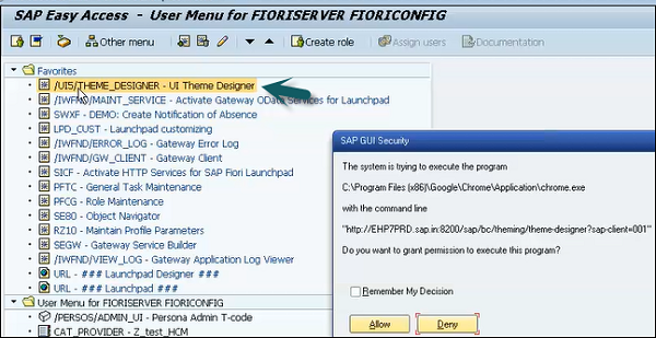
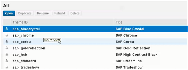
Step 1 − Login to SAP Fiori Front-End server. You can use T-Code: Theme Designer or use shortcut as shown in the following screenshot and login.
Step 2 − Once you login, you will have all the default templates provided by SAP for Theme Designer. Select the default theme and click Open.
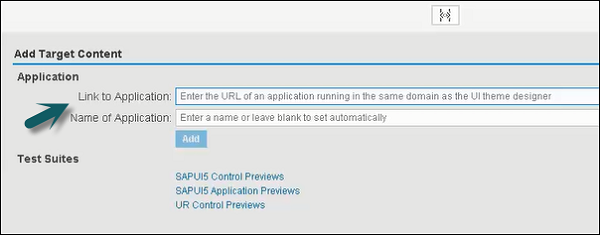
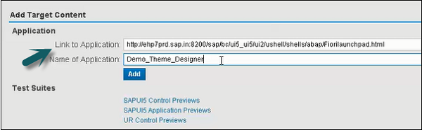
Step 3 − Enter the Fiori Launchpad link and Name of the application and click Add.
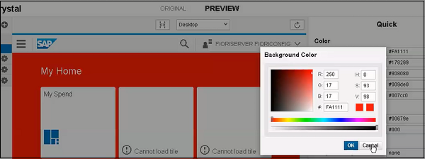
Step 4 − From the right side of the screen panel, you can select Color, Font, Image and other properties. You can edit colors as shown in the following screenshots.
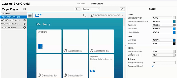
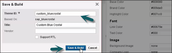
Step 5 − To save the Theme, you can click the Save icon as shown in the following screenshot. You also have an option for save and build option.
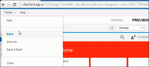
Once you click Save and Build, it will start saving and when completed, you will get a confirmation message - Save and Build completed.
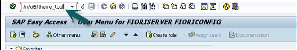
Step 6 − To get the link of this Custom Theme, use T-code as shown in the following screenshot −
Step 7 − Select the Theme that you have created and click the Info tab.
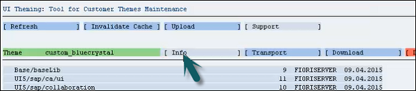
Step 8 − Use Ctrl+Y to copy the URL from the screen and make a note of this.

Supported Themes
These are the default themes that are shipped with UI5 −
- Blue Crystal
- Gold Reflection
- Mobile Visual Identify
- High Contrast Black
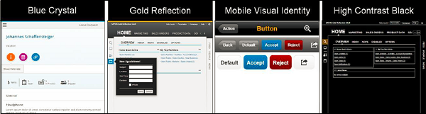
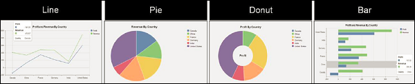
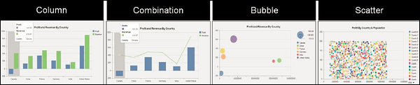
Chart Types
There are various chart types in sap.viz.ui5 charting library that can be used to represent the business data. Following are some CVOM chart types- Column, Bubble, Line, Pie, etc.
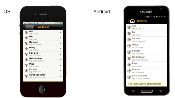
SAP UI5 - Mobile
SAP UI5 applications run on different mobile devices like iPad and smartphones. However, for better user experience, you need to control the appearance, touch interactions, and various other UI parameters.
UI5 contains a control library sap.m that supports application development for mobile devices and supports all key concepts like data binding, MVC, etc.
Key Features
- Platform support for Android, iOS, BlackBerry
- It contains 40 controls
- Webkit browsers - Google Chrome
- UI5 concepts - MVC, localization, modularization, etc.
SAP UI5 - Creating a Project in Web IDE
In this chapter, we will learn how to create a project in Web IDE. Lets go step by step.
Step 1 − To start a new project, go to File → New → Project
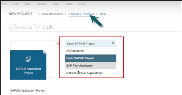
Step 2 − Enter the name of the project. In the next window, select the template.
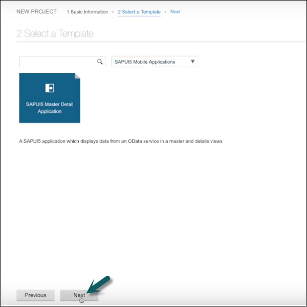
Step 3 − Select template SAPUI5 Mobile Applications → Next
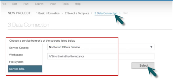
Step 4 − The next step is to select the data connection. Select service URL → Select
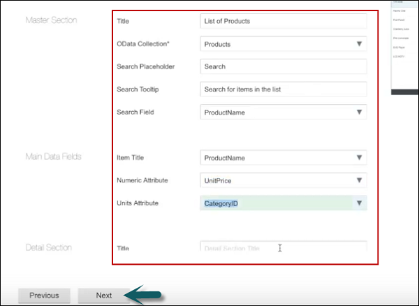
Step 5 − In the next step, you have to perform template customization.
Step 6 − On clicking Next, you will see the Finish button.
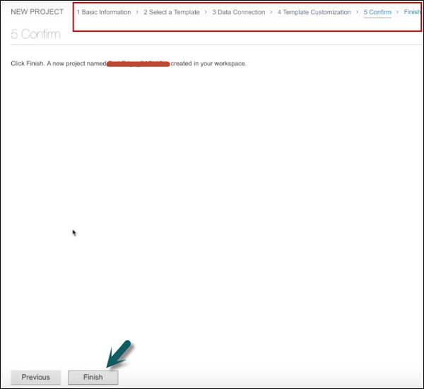
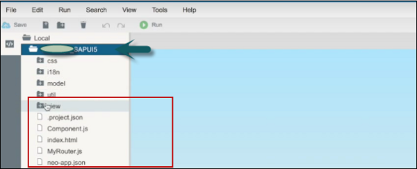
Once you click Finish, you can see a new project created that has default structure of UI application. It contains the view, model, and name of the project.