
Article Categories
- All Categories
-
 Data Structure
-
 Networking
-
 RDBMS
RDBMS
-
 Operating System
-
 Java
Java
-
 MS Excel
-
 iOS
iOS
-
 HTML
HTML
-
 CSS
CSS
-
 Android
-
 Python
-
 C Programming
-
 C++
C++
-
 C#
C#
-
 MongoDB
-
 MySQL
MySQL
-
 Javascript
-
 PHP
PHP
-
 Economics & Finance
Plot a graph to visualize the death cases of Rajasthan Heat Wave
Introduction
Excel is one of the precious tools where various case studies need to be monitored by the data analyst to understand the actual scenarios of the problem, choose the appropriate model, and predict the accurate result of the dataset that is imported into the Excel worksheet. One of the best techniques to visualize the data is to construct an interactive graph in Excel.
In this article, we will identify the death cases of the Rajasthan Heat Wave by creating an interactive clustered column chart.
Benefits of Developing Graphs in Excel Worksheet
Enhanced Data Visibility
By developing a 2D/3D graph, we can quickly identify individual records or entries within the dataset. The shaded background acts as a visual aid, helping our eyes follow along more effortlessly.
Improved Readability
By creating the desired graph, we provide clear separations between different pieces of information or categories within your dataset.
Easier Comparison Between the Columnar Data
When dealing with massive amounts of data, comparing data valuers in different columns might seem like searching for a needle in a haystack - time-consuming and frustrating. With each row clearly distinguishable from its neighboring ones through shades or colors, any inconsistencies or mistakes are more likely to catch the attention immediately.
Accelerated Data Analysis
Analyzing complex datasets often involves comparing various records against one another quickly creating interactive graph greatly facilitate this process by highlighting relative differences visually at first glance rather than conducting tedious comparisons line-by-line manually.
Maintains Consistency and Professionalism
Using style alternation in graphs consistently throughout an Excel sheet keeps the presentation neat and organized?increasing readability and professionalism. This uniformity helps you maintain a clean visual layout, which can be particularly essential when sharing the data with colleagues or stakeholders.
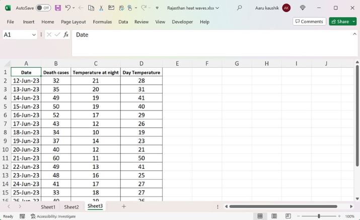
Step 1
Consider the sample dataset as shown in below image
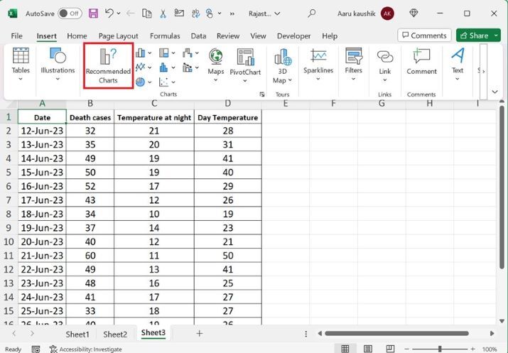
Step 2
Select the complete data and then go to the "Insert" tab and click on the "Recommended Charts" as highlighted below image
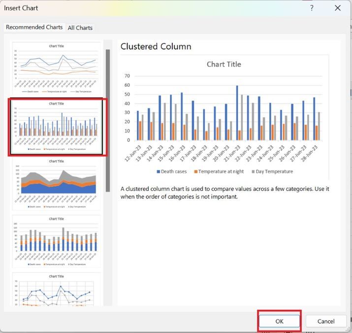
Step 3
Another dialog box named "Insert Chart" will appear and then choose the second option "Clustered Chart" and click on the OK button.
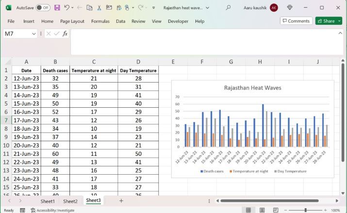
Step 4
The required chart is generated in the worksheet. Users need to change the Chart titles heading "Rajasthan Heat Waves".
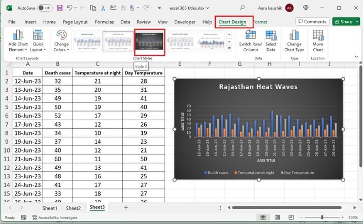
Step 5
Now, change the style of plotted graph. Users need to click on the Chart area and then go to the "Chart Design" tab and then click on "Style 8". Therefore, the style of the chart would be altered.
Conclusion
It would be concluded that real-time case studies like Rajasthan heat waves are examined in Excel by constructing the desired chart where the sample dataset can be visualized as depicted in the example.

562 Views
