- Kibana - Home
- Kibana - Overview
- Kibana - Environment Setup
- Kibana - Introduction To Elk Stack
- Kibana - Loading Sample Data
- Kibana - Management
- Kibana - Discover
- Kibana - Aggregation And Metrics
- Kibana - Create Visualization
- Kibana - Working With Charts
- Kibana - Working With Graphs
- Kibana - Working With Heat Map
- Working With Coordinate Map
- Kibana - Working With Region Map
- Working With Guage And Goal
- Kibana - Working With Canvas
- Kibana - Create Dashboard
- Kibana - Timelion
- Kibana - Dev Tools
- Kibana - Monitoring
- Creating Reports Using Kibana
- Kibana Useful Resources
- Kibana - Quick Guide
- Kibana - Useful Resources
- Kibana - Discussion
Kibana - Working With Heat Map
In this chapter we will understand how to work with heat map. Heat map will show the data presentation in different colours for the range selected in the data metrics.
Getting Started with Heat Map
To start with, we need to create visualization by clicking on the visualization tab on the left side as shown below −
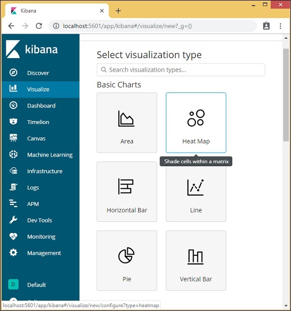
Select visualization type as heat map as shown above. It will ask you to choose the index as shown below −
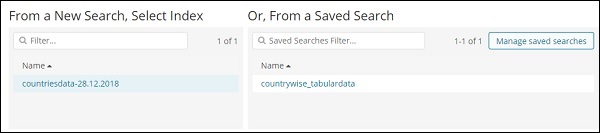
Select the index countriesdata-28.12.2018 as shown above. Once the index is selected the we have the data to be selected as shown below −
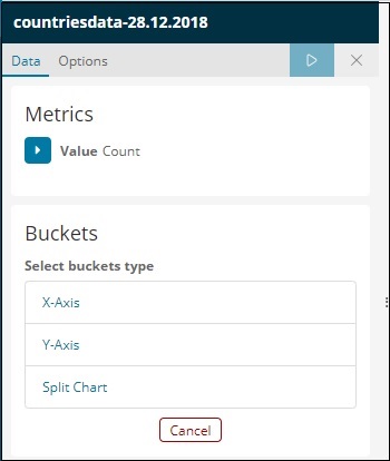
Select the Metrics as shown below −
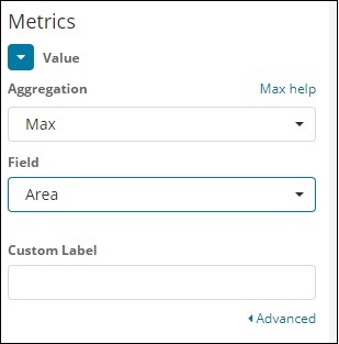
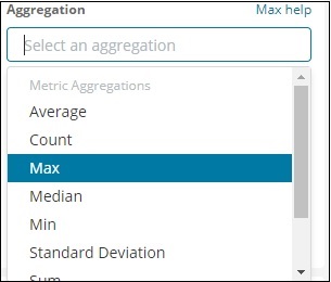
Select Max Aggregation from dropdown as shown below −
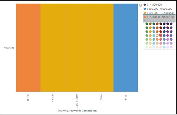
We have select Max since we want to plot Max Area country wise.
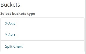
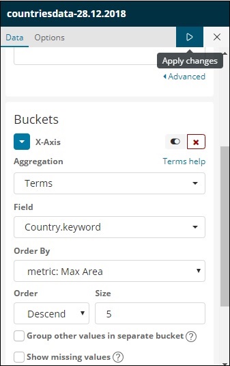
Now will select the values for Buckets as shown below −
Now, let us select the X-Axis as shown below −
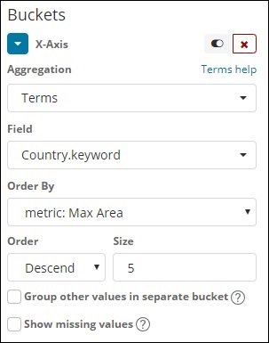
We have used Aggregation as Terms, Field as Country and Order By Max Area. Click on Apply Changes as shown below −
If you click Apply Changes, the heat map looks as shown below −
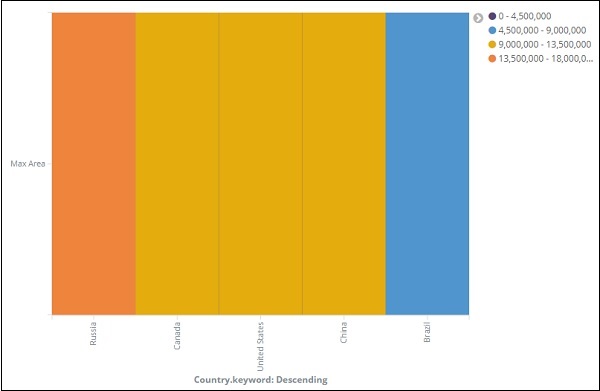
The heat map is shown with different colours and the range of areas are displayed at the right side. You can change the colour by click on the small circles next to the area range as shown below −