- Kibana - Home
- Kibana - Overview
- Kibana - Environment Setup
- Kibana - Introduction To Elk Stack
- Kibana - Loading Sample Data
- Kibana - Management
- Kibana - Discover
- Kibana - Aggregation And Metrics
- Kibana - Create Visualization
- Kibana - Working With Charts
- Kibana - Working With Graphs
- Kibana - Working With Heat Map
- Working With Coordinate Map
- Kibana - Working With Region Map
- Working With Guage And Goal
- Kibana - Working With Canvas
- Kibana - Create Dashboard
- Kibana - Timelion
- Kibana - Dev Tools
- Kibana - Monitoring
- Creating Reports Using Kibana
- Kibana Useful Resources
- Kibana - Quick Guide
- Kibana - Useful Resources
- Kibana - Discussion
Kibana - Quick Guide
Kibana - Overview
Kibana is an open source browser based visualization tool mainly used to analyse large volume of logs in the form of line graph, bar graph, pie charts , heat maps, region maps, coordinate maps, gauge, goals, timelion etc. The visualization makes it easy to predict or to see the changes in trends of errors or other significant events of the input source.Kibana works in sync with Elasticsearch and Logstash which together forms the so called ELK stack.
What is ELK Stack?
ELK stands for Elasticsearch, Logstash, and Kibana. ELK is one of the popular log management platform used worldwide for log analysis. In the ELK stack, Logstash extracts the logging data or other events from different input sources. It processes the events and later stores them in Elasticsearch.
Kibana is a visualization tool, which accesses the logs from Elasticsearch and is able to display to the user in the form of line graph, bar graph, pie charts etc.
The basic flow of ELK Stack is shown in the image here −
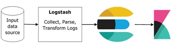
Logstash is responsible to collect the data from all the remote sources where the logs are filed and pushes the same to Elasticsearch.
Elasticsearch acts as a database where the data is collected and Kibana uses the data from Elasticsearch to represent the data to the user in the form of bargraphs, pie charts, heat maps as shown below −
It shows the data on real time basis, for example, day-wise or hourly to the user. Kibana UI is user friendly and very easy for a beginner to understand.
Features of Kibana
Kibana offers its users the following features −
Visualization
Kibana has a lot of ways to visualize data in an easy way. Some of the ones which are commonly used are vertical bar chart, horizontal bar chart, pie chart, line graph, heat map etc.
Dashboard
When we have the visualizations ready, all of them can be placed on one board the Dashboard. Observing different sections together gives you a clear overall idea about what exactly is happening.
Dev Tools
You can work with your indexes using dev tools. Beginners can add dummy indexes from dev tools and also add, update, delete the data and use the indexes to create visualization.
Reports
All the data in the form of visualization and dashboard can be converted to reports (CSV format), embedded in the code or in the form of URLs to be shared with others.
Filters and Search query
You can make use of filters and search queries to get the required details for a particular input from a dashboard or visualization tool.
Plugins
You can add third party plugins to add some new visualization or also other UI addition in Kibana.
Coordinate and Region Maps
A coordinate and region map in Kibana helps to show the visualization on the geographical map giving a realistic view of the data.
Timelion
Timelion, also called as timeline is yet another visualization tool which is mainly used for time based data analysis. To work with timeline, we need to use simple expression language which helps us connect to the index and also perform calculations on the data to obtain the results we need. It helps more in comparison of data to the previous cycle in terms of week , month etc.
Canvas
Canvas is yet another powerful feature in Kibana. Using canvas visualization, you can represent your data in different colour combinations, shapes, texts, multiple pages basically called as workpad.
Advantages of Kibana
Kibana offers the following advantages to its users −
Contains open source browser based visualization tool mainly used to analyse large volume of logs in the form of line graph, bar graph, pie charts, heat maps etc.
Simple and easy for beginners to understand.
Ease of conversion of visualization and dashboard into reports.
Canvas visualization help to analyse complex data in an easy way.
Timelion visualization in Kibana helps to compare data backwards to understand the performance better.
Disadvantages of Kibana
Adding of plugins to Kibana can be very tedious if there is version mismatch.
You tend to face issues when you want to upgrade from older version to a new one.
Kibana - Environment Setup
To start working with Kibana we need to install Logstash, Elasticsearch and Kibana. In this chapter, we will try to understand the installation of the ELK stack here.
We would discuss the following installations here −
- Elasticsearch Installation
- Logstash Installation
- Kibana Installation
Elasticsearch Installation
A detailed documentation on Elasticsearch exists in our library. You can check here for elasticsearch installation. You will have to follow the steps mentioned in the tutorial to install Elasticsearch.
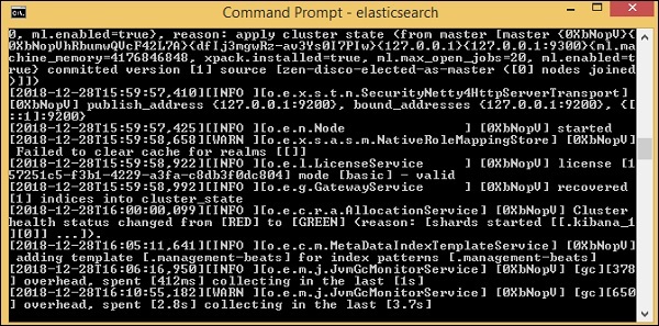
Once done with the installation, start the elasticsearch server as follows −
Step 1
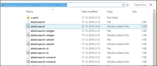
For Windows
> cd kibanaproject/elasticsearch-6.5.4/elasticsearch-6.5.4/bin
> elasticsearch
Please note for windows user, the JAVA_HOME variable has to be set to the java jdk path.
For Linux
$ cd kibanaproject/elasticsearch-6.5.4/elasticsearch-6.5.4/bin
$ elasticsearch
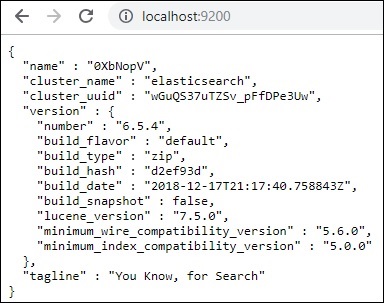
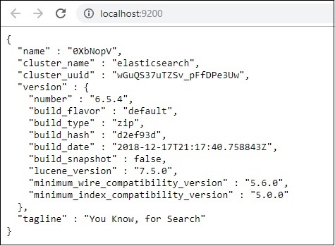
The default port for elasticsearch is 9200. Once done, you can check the elasticsearch at port 9200 on localhost http://localhost:9200/as shown below −
Logstash Installation
For Logstash installation, follow this elasticsearch installation which is already existing in our library.
Kibana Installation
Go to the official Kibana site −https://www.elastic.co/products/kibana
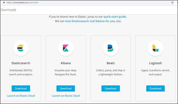
Click the downloads link on the top right corner and it will display screen as follows −
Click the Download button for Kibana. Please note to work with Kibana we need 64 bit machine and it will not work with 32 bit.
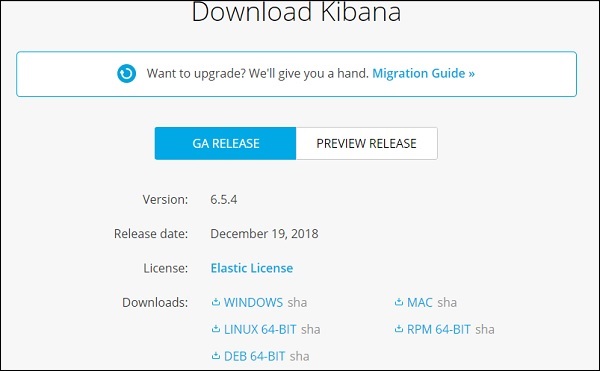
In this tutorial, we are going to use Kibana version 6. The download option is available for Windows, Mac and Linux. You can download as per your choice.
Create a folder and unpack the tar/zip downloads for kibana. We are going to work with sample data uploaded in elasticsearch. Thus, for now let us see how to start elasticsearch and kibana. For this, go to the folder where Kibana is unpacked.
For Windows
> cd kibanaproject/kibana-6.5.4/kibana-6.5.4/bin
> kibana
For Linux
$ cd kibanaproject/kibana-6.5.4/kibana-6.5.4/bin
$ kibana
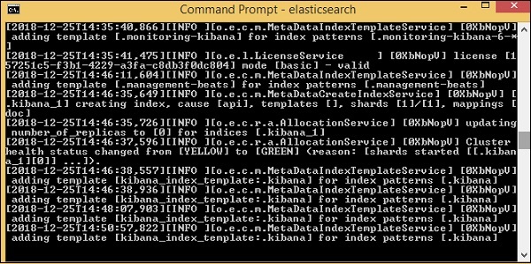
Once Kibana starts, the user can see the following screen −
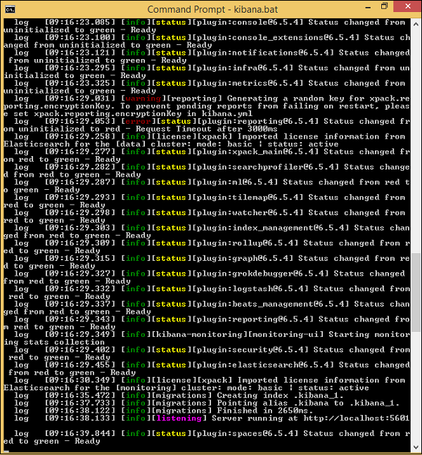
Once you see the ready signal in the console, you can open Kibana in browser using http://localhost:5601/.The default port on which kibana is available is 5601.
The user interface of Kibana is as shown here −
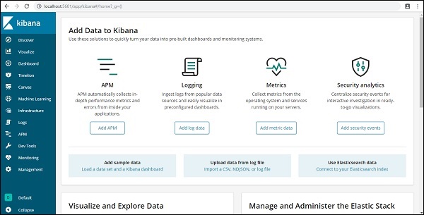
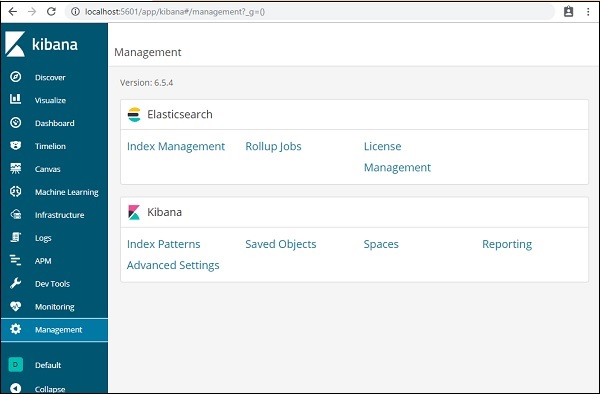
In our next chapter, we will learn how to use the UI of Kibana. To know the Kibana version on Kibana UI, go to Management Tab on left side and it will display you the Kibana version we are using currently.
Kibana - Introduction To Elk Stack
Kibana is an open source visualization tool mainly used to analyze a large volume of logs in the form of line graph, bar graph, pie charts, heatmaps etc. Kibana works in sync with Elasticsearch and Logstash which together forms the so called ELK stack.
ELK stands for Elasticsearch, Logstash, and Kibana. ELK is one of the popular log management platform used worldwide for log analysis.
In the ELK stack −
Logstash extracts the logging data or other events from different input sources. It processes the events and later stores it in Elasticsearch.
Kibana is a visualization tool, which accesses the logs from Elasticsearch and is able to display to the user in the form of line graph, bar graph, pie charts etc.
In this tutorial, we will work closely with Kibana and Elasticsearch and visualize the data in different forms.
In this chapter, let us understand how to work with ELK stack together. Besides, you will also see how to −
- Load CSV data from Logstash to Elasticsearch.
- Use indices from Elasticsearch in Kibana.
Load CSV data from Logstash to Elasticsearch
We are going to use CSV data to upload data using Logstash to Elasticsearch. To work on data analysis, we can get data from kaggle.com website. Kaggle.com site has all types of data uploaded and users can use it to work on data analysis.
We have taken the countries.csv data from here: https://www.kaggle.com/datasets/fernandol/countries-of-the-world. You can download the csv file and use it.
The csv file which we are going to use has following details.
File name − countriesdata.csv
Columns − "Country","Region","Population","Area"
You can also create a dummy csv file and use it. We will be using logstash to dump this data from countriesdata.csv to elasticsearch.
Start the elasticsearch and Kibana in your terminal and keep it running. We have to create the config file for logstash which will have details about the columns of the CSV file and also other details as shown in the logstash-config file given below −
input {
   file {
      path => "C:/kibanaproject/countriesdata.csv"
      start_position => "beginning"
      sincedb_path => "NUL"
   }
}
filter {
   csv {
      separator => ","
      columns => ["Country","Region","Population","Area"]
   }
   mutate {convert => ["Population", "integer"]}
   mutate {convert => ["Area", "integer"]}
}
output {
   elasticsearch {
      hosts => ["localhost:9200"]
      => "countriesdata-%{+dd.MM.YYYY}"
   }
   stdout {codec => json_lines }
}
In the config file, we have created 3 components −
Input
We need to specify the path of the input file which in our case is a csv file. The path where the csv file is stored is given to the path field.
Filter
Will have the csv component with separator used which in our case is comma, and also the columns available for our csv file. As logstash considers all the data coming in as string , in-case we want any column to be used as integer , float the same has to be specified using mutate as shown above.
Output
For output, we need to specify where we need to put the data. Here, in our case we are using elasticsearch. The data required to be given to the elasticsearch is the hosts where it is running, we have mentioned it as localhost. The next field in is index which we have given the name as countries-currentdate. We have to use the same index in Kibana once the data is updated in Elasticsearch.
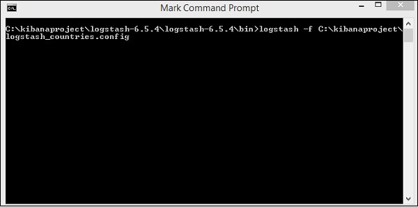
Save the above config file as logstash_countries.config. Note that we need to give the path of this config to logstash command in the next step.
To load the data from the csv file to elasticsearch, we need to start the elasticsearch server −
Now, run http://localhost:9200 in the browser to confirm if elasticsearch is running successfully.
We have elasticsearch running. Now go to the path where logstash is installed and run following command to upload the data to elasticsearch.
> logstash -f logstash_countries.conf
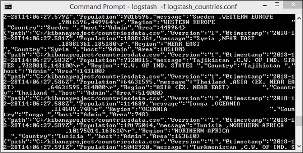
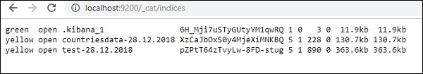
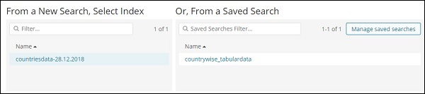
The above screen shows data loading from the CSV file to Elasticsearch. To know if we have the index created in Elasticsearch we can check same as follows −
We can see the countriesdata-28.12.2018 index created as shown above.
The details of the index − countries-28.12.2018 is as follows −
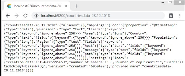
Note that the mapping details with properties are created when data is uploaded from logstash to elasticsearch.
Use Data from Elasticsearch in Kibana
Currently, we have Kibana running on localhost, port 5601 − http://localhost:5601. The UI of Kibana is shown here −
Note that we already have Kibana connected to Elasticsearch and we should be able to see index :countries-28.12.2018 inside Kibana.
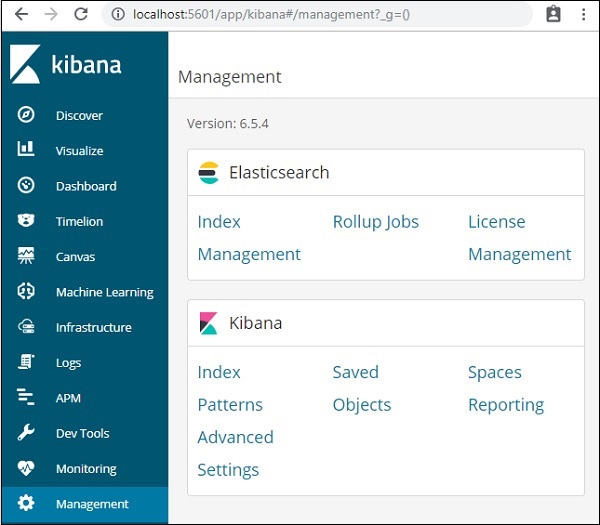
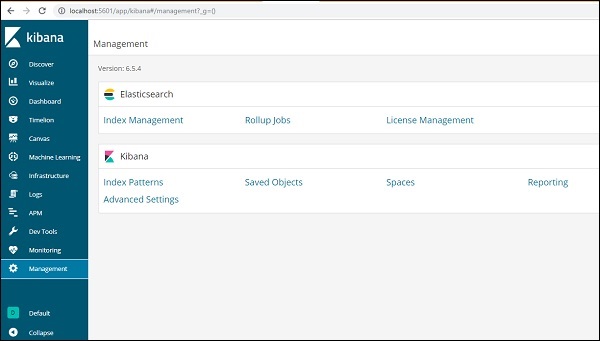
In the Kibana UI, click on Management Menu option on left side −
Now, click Index Management −
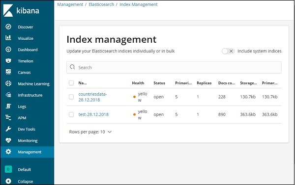
The indices present in Elasticsearch are displayed in index management. The index we are going to use in Kibana is countriesdata-28.12.2018.
Thus, as we already have the elasticsearch index in Kibana, next will understand how to use the index in Kibana to visualize data in the form of pie chart, bar graph, line chart etc.
Kibana - Loading Sample Data
We have seen how to upload data from logstash to elasticsearch. We will upload data using logstash and elasticsearch here. But about the data that has date, longitude and latitudefields which we need to use, we will learn in the upcoming chapters. We will also see how to upload data directly in Kibana, if we do not have a CSV file.
In this chapter, we will cover following topics −
- Using Logstash upload data having date, longitude and latitude fields in Elasticsearch
- Using Dev tools to upload bulk data
Using Logstash upload for data having fields in Elasticsearch
We are going to use data in the form of CSV format and the same is taken from Kaggle.com which deals with data that you can use for an analysis.
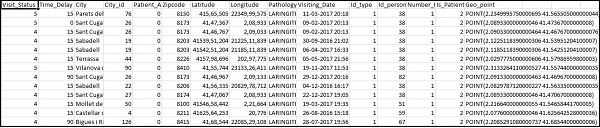
The data home medical visits to be used here is picked up from site Kaggle.com.
The following are the fields available for the CSV file −
["Visit_Status","Time_Delay","City","City_id","Patient_Age","Zipcode","Latitude","Longitude",
"Pathology","Visiting_Date","Id_type","Id_personal","Number_Home_Visits","Is_Patient_Minor","Geo_point"]
The Home_visits.csv is as follows −
The following is the conf file to be used with logstash −
input {
   file {
      path => "C:/kibanaproject/home_visits.csv"
      start_position => "beginning"
      sincedb_path => "NUL"
   }
}
filter {
   csv {
      separator => ","
      columns =>
      ["Visit_Status","Time_Delay","City","City_id","Patient_Age",
      "Zipcode","Latitude","Longitude","Pathology","Visiting_Date",
      "Id_type","Id_personal","Number_Home_Visits","Is_Patient_Minor","Geo_point"]
   }
   date {
      match => ["Visiting_Date","dd-MM-YYYY HH:mm"]
      target => "Visiting_Date"
   }
   mutate {convert => ["Number_Home_Visits", "integer"]}
   mutate {convert => ["City_id", "integer"]}
   mutate {convert => ["Id_personal", "integer"]}
   mutate {convert => ["Id_type", "integer"]}
   mutate {convert => ["Zipcode", "integer"]}
   mutate {convert => ["Patient_Age", "integer"]}
   mutate {
      convert => { "Longitude" => "float" }
      convert => { "Latitude" => "float" }
   }
   mutate {
      rename => {
         "Longitude" => "[location][lon]"
         "Latitude" => "[location][lat]"
      }
   }
}
output {
   elasticsearch {
      hosts => ["localhost:9200"]
      index => "medicalvisits-%{+dd.MM.YYYY}"
   }
   stdout {codec => json_lines }
}
By default, logstash considers everything to be uploaded in elasticsearch as string. Incase your CSV file has date field you need to do following to get the date format.
For date field −
date {
   match => ["Visiting_Date","dd-MM-YYYY HH:mm"]
   target => "Visiting_Date"
}
In-case of geo location, elasticsearch understands the same as −
"location": {
   "lat":41.565505000000044,
   "lon": 2.2349995750000695
}
So we need to make sure we have Longitude and Latitude in the format elasticsearch needs it. So first we need to convert longitude and latitude to float and later rename it so that it is available as part of location json object with lat and lon. The code for the same is shown here −
mutate {
      convert => { "Longitude" => "float" }
      convert => { "Latitude" => "float" }
   }
mutate {
   rename => {
      "Longitude" => "[location][lon]"
      "Latitude" => "[location][lat]"
   }
}
For converting fields to integers, use the following code −
mutate {convert => ["Number_Home_Visits", "integer"]}
mutate {convert => ["City_id", "integer"]}
mutate {convert => ["Id_personal", "integer"]}
mutate {convert => ["Id_type", "integer"]}
mutate {convert => ["Zipcode", "integer"]}
mutate {convert => ["Patient_Age", "integer"]}
Once the fields are taken care, run the following command to upload the data in elasticsearch −
- Go inside Logstash bin directory and run the following command.
logstash -f logstash_homevisists.conf
- Once done you should see the index mentioned in logstash conf file in elasticsearch as shown below −
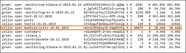
We can now create index pattern on above index uploaded and use it further for creating visualization.
Using Dev Tools to Upload Bulk Data
We are going to use Dev Tools from Kibana UI. Dev Tools is helpful to upload data in Elasticsearch, without using Logstash. We can post, put, delete, search the data we want in Kibana using Dev Tools.
In this section, we will try to load sample data in Kibana itself. We can use it to practice with the sample data and play around with Kibana features to get a good understanding of Kibana.
Let us take the json data from the following url and upload the same in Kibana. Similarly, you can try any sample json data to be loaded inside Kibana.
Before we start to upload the sample data, we need to have the json data with indices to be used in elasticsearch. When we upload it using logstash, logstash takes care to add the indices and the user does not have to bother about the indices which are required by elasticsearch.
Normal Json Data
[
   {"type":"act","line_id":1,"play_name":"Henry IV",

   "speech_number":"","line_number":"","speaker":"","text_entry":"ACT I"},
   {"type":"scene","line_id":2,"play_name":"Henry IV",
   "speech_number":"","line_number":"","speaker":"","text_entry":"SCENE I.London. The palace."},
   {"type":"line","line_id":3,"play_name":"Henry IV",
   "speech_number":"","line_number":"","speaker":"","text_entry":
   "Enter KING HENRY, LORD JOHN OF LANCASTER, the
   EARL of WESTMORELAND, SIR WALTER BLUNT, and others"}
]
The json code to used with Kibana has to be with indexed as follows −
{"index":{"_index":"shakespeare","_id":0}}
{"type":"act","line_id":1,"play_name":"Henry IV",
"speech_number":"","line_number":"","speaker":"","text_entry":"ACT I"}
{"index":{"_index":"shakespeare","_id":1}}
{"type":"scene","line_id":2,"play_name":"Henry IV",
"speech_number":"","line_number":"","speaker":"",
"text_entry":"SCENE I. London. The palace."}
{"index":{"_index":"shakespeare","_id":2}}
{"type":"line","line_id":3,"play_name":"Henry IV",
"speech_number":"","line_number":"","speaker":"","text_entry":
"Enter KING HENRY, LORD JOHN OF LANCASTER, the EARL
of WESTMORELAND, SIR WALTER BLUNT, and others"}
Note that there is an additional data that goes in the jsonfile −{"index":{"_index":"nameofindex","_id":key}}.
To convert any sample json file compatible with elasticsearch, here we have a small code in php which will output the json file given to the format which elasticsearch wants −
PHP Code
<?php
   $myfile = fopen("todo.json", "r") or die("Unable to open file!"); // your json
   file here
   $alldata = fread($myfile,filesize("todo.json"));
   fclose($myfile);
   $farray = json_decode($alldata);
   $afinalarray = [];
   $index_name = "todo";
   $i=0;
   $myfile1 = fopen("todonewfile.json", "w") or die("Unable to open file!"); //
   writes a new file to be used in kibana dev tool
   foreach ($farray as $a => $value) {
      $_index = json_decode('{"index": {"_index": "'.$index_name.'", "_id": "'.$i.'"}}');
      fwrite($myfile1, json_encode($_index));
      fwrite($myfile1, "\n");
      fwrite($myfile1, json_encode($value));
      fwrite($myfile1, "\n");
      $i++;
   }
?>
We have taken the todo json file from https://jsonplaceholder.typicode.com/todos and use php code to convert to the format we need to upload in Kibana.
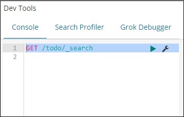
To load the sample data, open the dev tools tab as shown below −
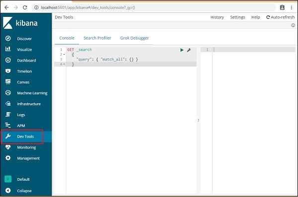
We are now going to use the console as shown above. We will take the json data which we got after running it through php code.
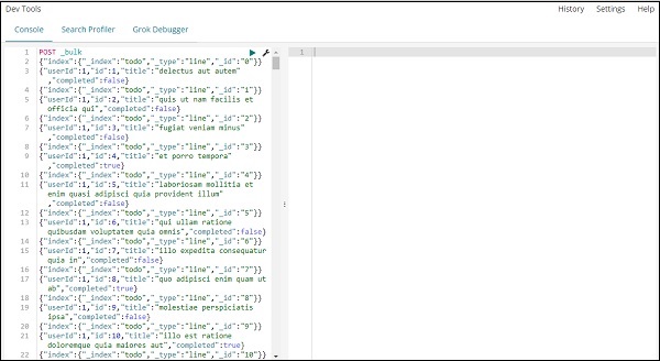
The command to be used in dev tools to upload the json data is −
POST _bulk
Note that the name of the index we are creating is todo.
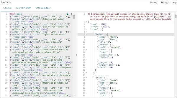
Once you click the green button the data is uploaded, you can check if the index is created or not in elasticsearch as follows −
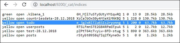
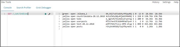
You can check the same in dev tools itself as follows −
Command −
GET /_cat/indices
If you want to search something in your index:todo , you can do that as shown below −
Command in dev tool
GET /todo/_search
The output of the above search is as shown below −
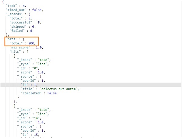
It gives all the records present in the todoindex. The total records we are getting is 200.
Search for a Record in todo Index
We can do that using the following command −
GET /todo/_search
{
   "query":{
      "match":{
         "title":"delectusautautem"
      }
   }
}
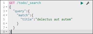
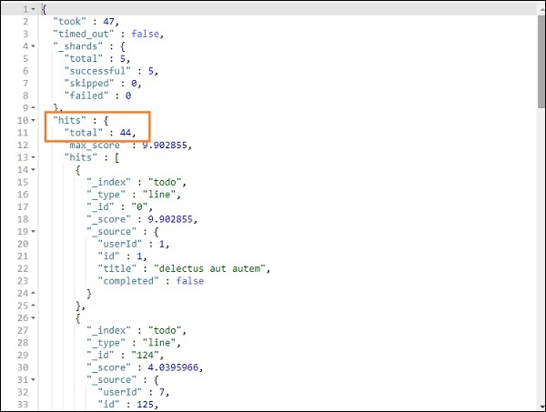
We are able to fetch the records which match with the title we have given.
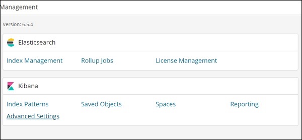
Kibana - Management
The Management section in Kibana is used to manage the index patterns. In this chapter, we will discuss the following −
- Create Index Pattern without Time filter field
- Create Index Pattern with Time filter field
Create Index Pattern Without Time Filter field
To do this, go to Kibana UI and click Management −
To work with Kibana, we first have to create index which is populated from elasticsearch. You can get all the indices available from Elasticsearch → Index Management as shown −
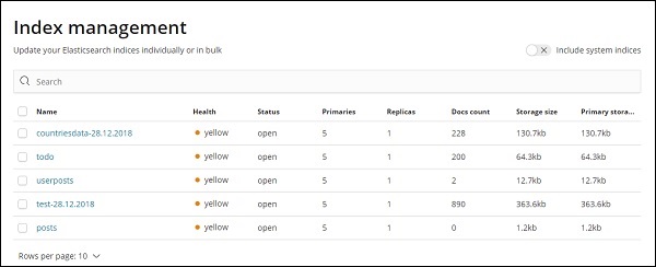
At present elasticsearch has the above indices. The Docs count tells us the no of records available in each of the index. If there is any index which is updated, the docs count will keep changing. Primary storage tells the size of each index uploaded.
To create New index in Kibana, we need to click on Index Patterns as shown below −
Once you click Index Patterns, we get the following screen −
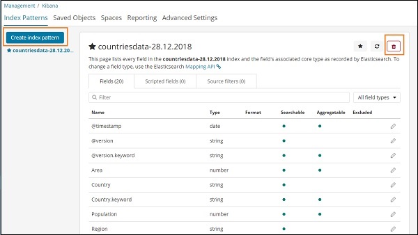
Note that the Create Index Pattern button is used to create a new index. Recall that we already have countriesdata-28.12.2018 created at the very start of the tutorial.
Create Index Pattern with Time filter field
Click on Create Index Pattern to create a new index.
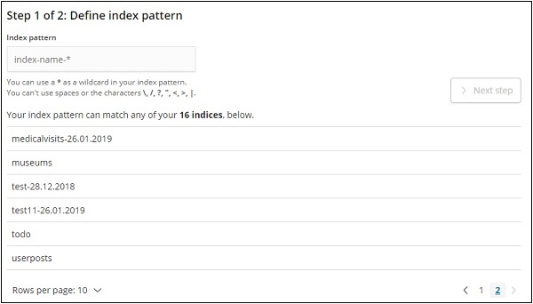
The indices from elasticsearch are displayed, select one to create a new index.
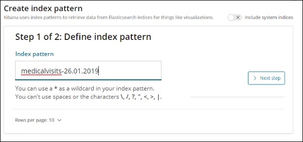
Now, click Next step.
The next step is to configure the setting, where you need to enter the following −
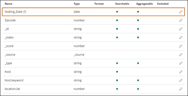
Time filter field name is used to filter data based on time. The dropdown will display all time and date related fields from the index.
In the image shown below, we have Visiting_Date as a date field. Select Visiting_Date as the Time Filter field name.
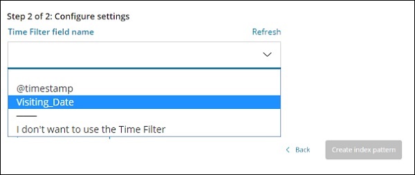
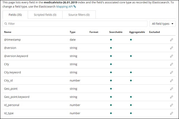
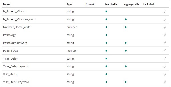
Click Create index pattern button to create the index. Once done it will display all the fields present in your index medicalvisits-26.01.2019 as shown below −
We have following fields in the index medicalvisits-26.01.2019 −
["Visit_Status","Time_Delay","City","City_id","Patient_Age","Zipcode","Latitude
","Longitude","Pathology","Visiting_Date","Id_type","Id_personal","Number_Home_
Visits","Is_Patient_Minor","Geo_point"].
The index has all the data for home medical visits. There are some additional fields added by elasticsearch when inserted from logstash.
Kibana - Discover
This chapter discusses the Discover Tab in Kibana UI. We will learn in detail about the following concepts −
- Index without date field
- Index with date field
Index without date field
Select Discover on the left side menu as shown below −
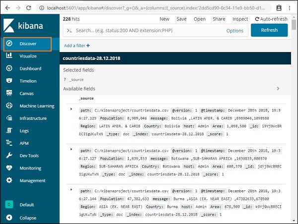
On the right side, it displays the details of the data available in countriesdata- 28.12.2018 index we created in previous chapter.
On the top left corner, it shows the total number of records available −

We can get the details of the data inside the index (countriesdata-28.12.2018) in this tab. On the top left corner in screen shown above, we can see Buttons like New, Save, Open, Share ,Inspect and Auto-refresh.
If you click Auto-refresh, it will display the screen as shown below −
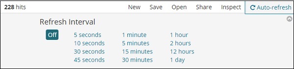
You can set the auto-refresh interval by clicking on the seconds, minutes or hour from above. Kibana will auto-refresh the screen and get fresh data after every interval timer you set.
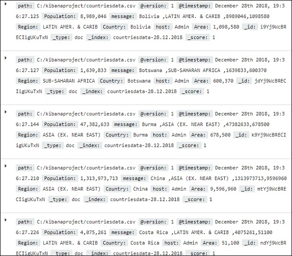
The data from index:countriesdata-28.12.2018 is displayed as shown below −
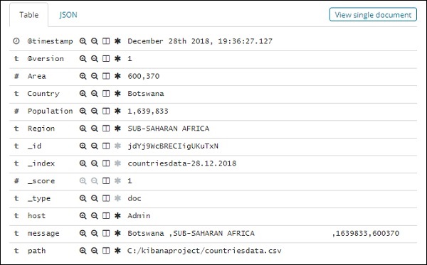
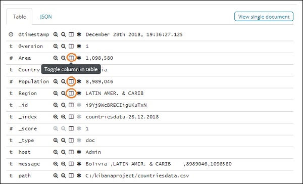
All the fields along with the data are shown row wise. Click the arrow to expand the row and it will give you details in Table format or JSON format
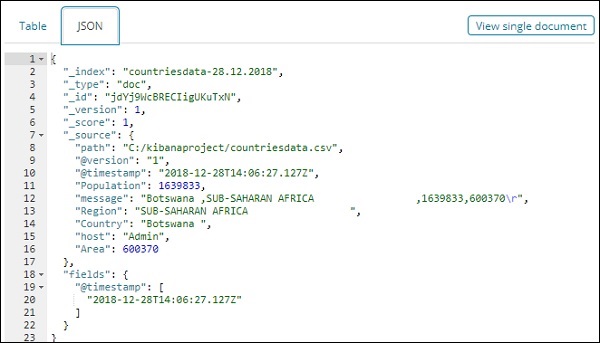
JSON Format
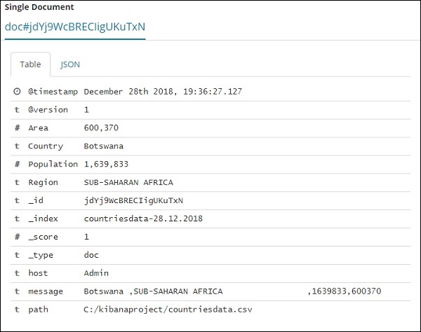
There is a button on the left side called View single document.

If you click it, it will display the row or the data present in the row inside the page as shown below −
Though we are getting all the data details here, it is difficult to go through each of them.
Now let us try to get the data in tabular format. One way to expand one of the row and click the toggle column option available across each field is shown below −
Click on Toggle column in table option available for each and you will notice the data being shown in table format −
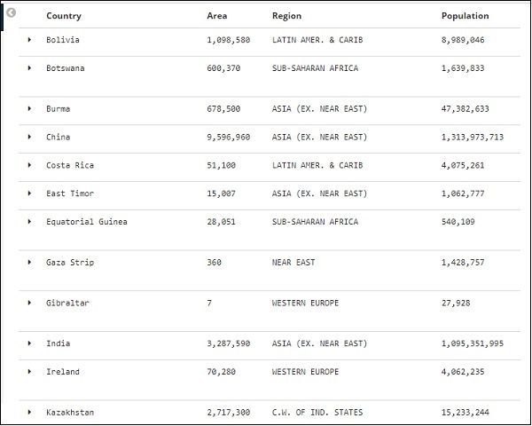
Here, we have selected fields Country, Area, Region and Population. Collapse the expanded row and you should see all the data in tabular format now.
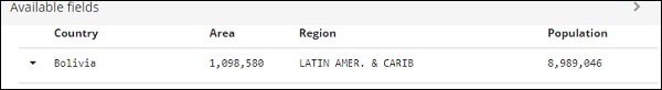
The fields we selected are displayed on the left side of the screen as shown below −
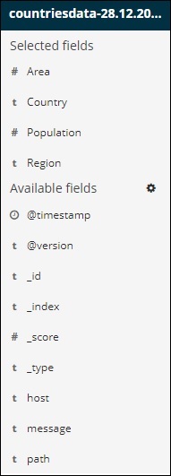
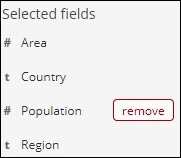
Observe that there are 2 options − Selected fields and Available fields. The fields we have selected to show in tabular format are a part of selected fields. In case you want to remove any field you can do so by clicking the remove button which will be seen across the field name in selected field option.
Once removed, the field will be available inside the Available fields where you can add back by clicking the add button which will be shown across the field you want. You can also use this method to get your data in tabular format by choosing the required fields from Available fields.
We have a search option available in Discover, which we can use to search for data inside the index. Let us try examples related to search option here −
Suppose you want to search for country India, you can do as follows −
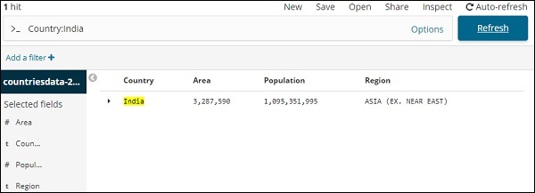
You can type your search details and click the Update button. If you want to search for countries starting with Aus, you can do so as follows −
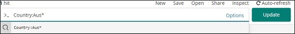
Click Update to see the results
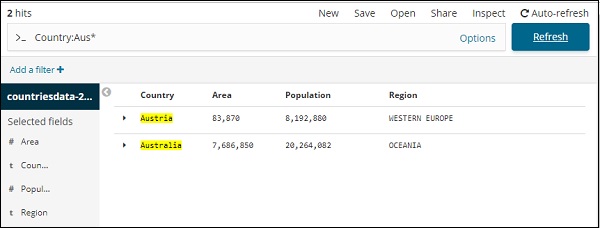
Here, we have two countries starting with Aus*. The search field has a Options button as shown above. When a user clicks it, it displays a toggle button which when ON helps in writing the search query.
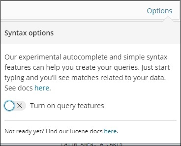
Turn on query features and type the field name in search, it will display the options available for that field.
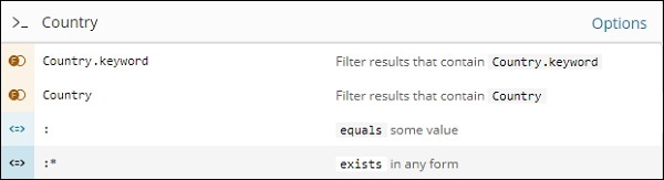
For example, Country field is a string and it displays following options for the string field −
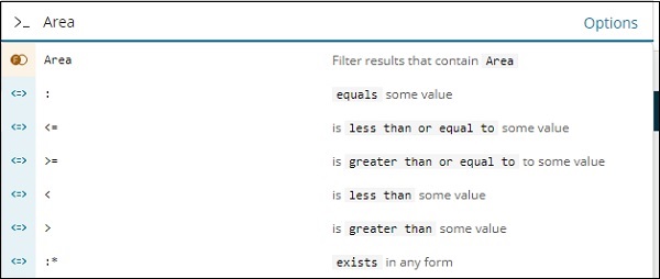
Similarly, Area is a Number field and it displays following options for Number field −
You can try out different combination and filter the data as per your choice in Discover field. The data inside the Discover tab can be saved using the Save button, so that you can use it for future purpose.
To save the data inside discover click on the save button on top right corner as shown below −
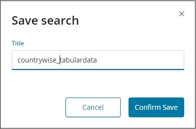
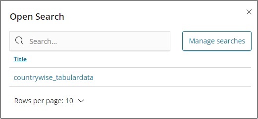
Give title to your search and click Confirm Save to save it. Once saved, next time you visit the Discover tab, you can click the Open button on the top right corner to get the saved titles as shown below −
You can also share the data with others using the Share button available on top right corner. If you click it, you can find sharing options as shown below −
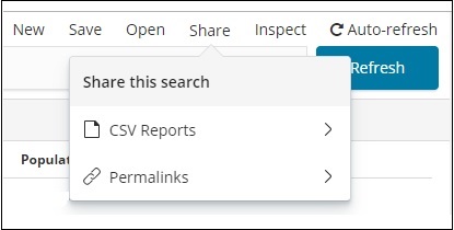
You can share it using CSV Reports or in the form of Permalinks.
The option available onclick on CSV Reports are −
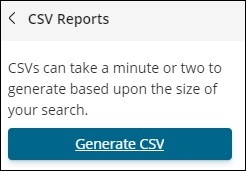
Click Generate CSV to get the report to be shared with others.
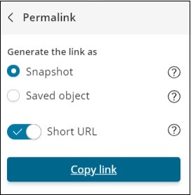
The option available onclick of Permalinks are as follows −
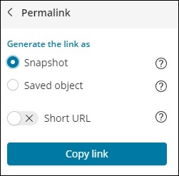
The Snapshot option will give a Kibana link which will display data available in the search currently.
The Saved object option will give a Kibana link which will display the recent data available in your search.
Snapshot − http://localhost:5601/goto/309a983483fccd423950cfb708fabfa5 Saved Object :http://localhost:5601/app/kibana#/discover/40bd89d0-10b1-11e9-9876-4f3d759b471e?_g=()
You can work with Discover tab and search options available and the result obtained can be saved and shared with others.
Index with Date Field
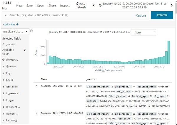
Go to Discover tab and select index:medicalvisits-26.01.2019
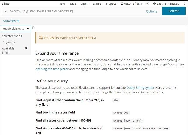
It has displayed the message − No results match your search criteria, for the last 15 minutes on the index we have selected. The index has data for years 2015,2016,2017 and 2018.
Change the time range as shown below −
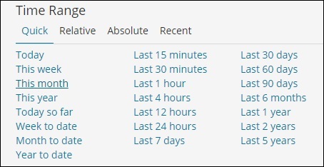
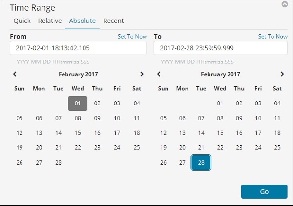
Click Absolute tab.
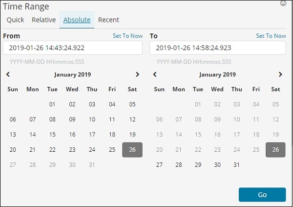
Select the date From − 1st Jan 2017 and To − 31st Dec2017 as we will analyze data for year 2017.
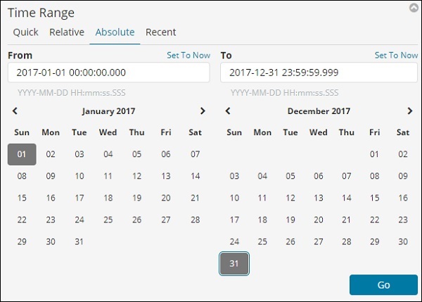
Click the Go button to add the timerange. It will display you the data and bar chart as follows −
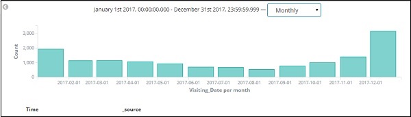
This is the monthly data for the year 2017 −
Since we also have the time stored along with date, we can filter the data on hours and minutes too.
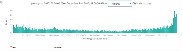
The figure shown above displays the hourly data for the year 2017.
Here the fields displayed from the index − medicalvisits-26.01.2019
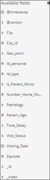
We have the available fields on left side as shown below −
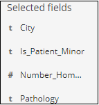
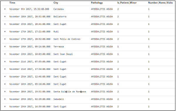
You can select the fields from available fields and convert the data into tabular format as shown below. Here we have selected the following fields −
The tabular data for above fields is shown here −
Kibana - Aggregation And Metrics
The two terms that you come across frequently during your learning of Kibana are Bucket and Metrics Aggregation. This chapter discusses what role they play in Kibana and more details about them.
What is Kibana Aggregation?
Aggregation refers to the collection of documents or a set of documents obtained from a particular search query or filter. Aggregation forms the main concept to build the desired visualization in Kibana.
Whenever you perform any visualization, you need to decide the criteria, which means in which way you want to group the data to perform the metric on it.
In this section, we will discuss two types of Aggregation −
- Bucket Aggregation
- Metric Aggregation
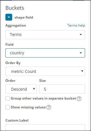
Bucket Aggregation
A bucket mainly consists of a key and a document. When the aggregation is executed, the documents are placed in the respective bucket. So at the end you should have a list of buckets, each with a list of documents. The list of Bucket Aggregation you will see while creating visualization in Kibana is shown below −
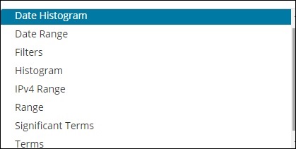
Bucket Aggregation has the following list −
- Date Histogram
- Date Range
- Filters
- Histogram
- IPv4 Range
- Range
- Significant Terms
- Terms
While creating, you need to decide one of them for Bucket Aggregation i.e. to group the documents inside the buckets.
As an example, for analysis, consider the countries data that we have uploaded at the start of this tutorial. The fields available in the countries index is country name, area, population, region. In the countries data, we have name of the country along with its population, region and the area.
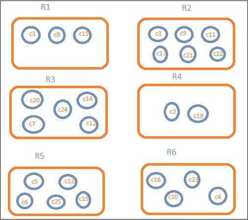
Let us assume that we want region wise data. Then, the countries available in each region becomes our search query, so in this case the region will form our buckets. The block diagram below shows that R1, R2,R3,R4,R5 and R6 are the buckets which we got and c1 , c2 ..c25 are the list of documents which are part of the buckets R1 to R6.
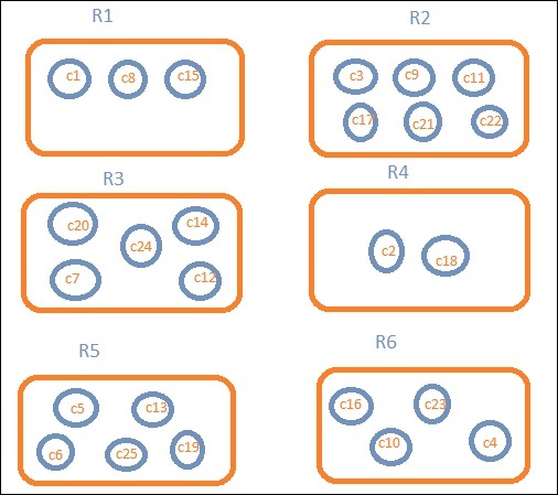
We can see that there are some circles in each of the bucket. They are set of documents based on the search criteria and considered to be falling in each of the bucket. In the bucket R1, we have documents c1, c8 and c15. These documents are the countries that falling in that region, same for others. So if we count the countries in Bucket R1 it is 3, 6 for R2, 6 for R3, 2 for R4, 5 for R5 and 4 for R6.
So through bucket aggregation, we can aggregate the document in buckets and have a list of documents in those buckets as shown above.
The list of Bucket Aggregation we have so far is −
- Date Histogram
- Date Range
- Filters
- Histogram
- IPv4 Range
- Range
- Significant Terms
- Terms
Let us now discuss how to form these buckets one by one in detail.
Date Histogram
Date Histogram aggregation is used on a date field. So the index that you use to visualize, if you have date field in that index than only this aggregation type can be used. This is a multi-bucket aggregation which means you can have some of the documents as a part of more than 1 bucket. There is an interval to be used for this aggregation and the details are as shown below −
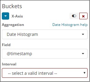
When you Select Buckets Aggregation as Date Histogram, it will display the Field option which will give only the date related fields. Once you select your field, you need to select the Interval which has the following details −
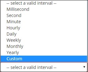
So the documents from the index chosen and based on the field and interval chosen will categorize the documents in buckets. For example, if you chose the interval as monthly, the documents based on date will be converted into buckets and based on the month i.e, Jan-Dec the documents will be put in the buckets. Here Jan,Feb,..Dec will be the buckets.
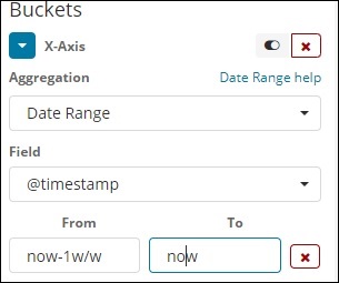
Date Range
You need a date field to use this aggregation type. Here we will have a date range, that is from date and to date are to be given. The buckets will have its documents based on the form and to date given.
Filters
With Filters type aggregation, the buckets will be formed based on the filter. Here you will get a multi-bucket formed as based on the filter criteria one document can exists in one or more buckets.
Using filters, users can write their queries in the filter option as shown below −
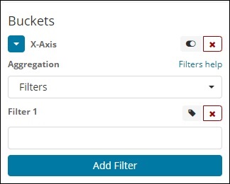
You can add multiple filters of your choice by using Add Filter button.
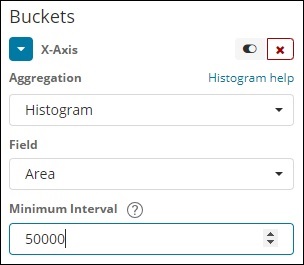
Histogram
This type of aggregation is applied on a number field and it will group the documents in a bucket based on the interval applied. For example, 0-50,50-100,100-150 etc.
IPv4 Range
This type of aggregation is used and mainly used for IP addresses.
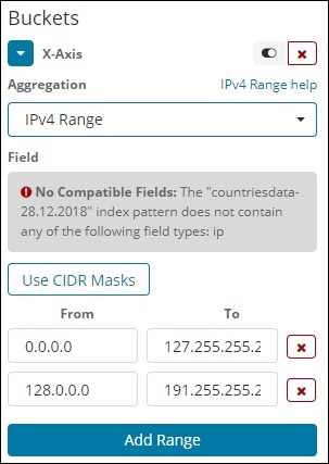
The index that we have that is the contriesdata-28.12.2018 does not have field of type IP so it displays a message as shown above. If you happen to have the IP field, you can specify the From and To values in it as shown above.
Range
This type of Aggregation needs fields to be of type number. You need to specify the range and the documents will be listed in the buckets falling in the range.
You can add more range if required by clicking on the Add Range button.
Significant Terms
This type of aggregation is mostly used on the string fields.
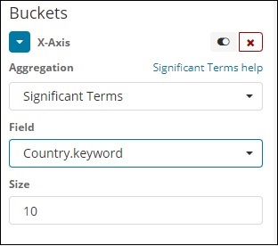
Terms
This type of aggregation is used on all the available fields namely number, string, date, boolean, IP address, timestamp etc. Note that this is the aggregation we are going to use in all our visualization that we are going to work on in this tutorial.
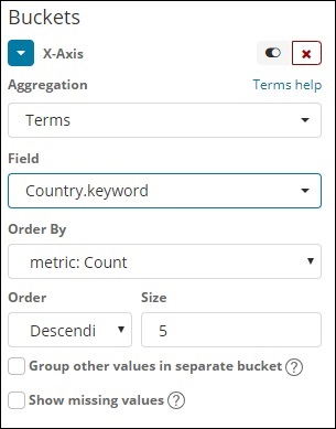
We have an option order by which we will group the data based on the metric we select. The size refers to the number of buckets you want to display in the visualization.
Next, let us talk about Metric Aggregation.
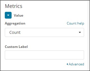
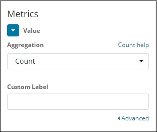
Metric Aggregation
Metric Aggregation mainly refers to the maths calculation done on the documents present in the bucket. For example if you choose a number field the metric calculation you can do on it is COUNT, SUM, MIN, MAX, AVERAGE etc.
A list of metric aggregation that we shall discuss is given here −
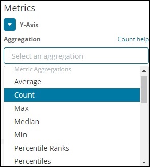
In this section, let us discuss the important ones which we are going to use often −
- Average
- Count
- Max
- Min
- Sum
The metric will be applied on the individual bucket aggregation that we have already discussed above.
Next, let us discuss the list of metrics aggregation here −
Average
This will give the average for the values of the documents present in the buckets. For example −
R1 to R6 are the buckets. In R1 we have c1,c8 and c15. Consider the value of c1 is 300, c8 is500 and c15 is 700. Now to get the average value of R1 bucket
R1 = value of c1 + value of c8 + value of c15 / 3 = 300 + 500 + 700 / 3 = 500.
The average is 500 for bucket R1. Here the value of the document could be anything like if you consider the countries data it could be the area of the country in that region.
Count
This will give the count of documents present in the Bucket. Suppose you want the count of the countries present in the region, it will be the total documents present in the buckets. For example, R1 it will be 3, R2 = 6, R3 = 5, R4 = 2, R5 = 5 and R6 = 4.
Max
This will give the max value of the document present in the bucket. Considering the above example if we have area wise countries data in the region bucket. The max for each region will be the country with the max area. So it will have one country from each region i.e. R1 to R6.
in
This will give the min value of the document present in the bucket. Considering above example if we have area wise countries data in the region bucket. The min for each region will be the country with the minimum area. So it will have one country from each region i.e. R1 to R6.
Sum
This will give the sum of the values of the document present in the bucket. For example if you consider the above example if we want the total area or countries in the region, it will be sum of the documents present in the region.
For example, to know the total countries in the region R1 it will be 3, R2 = 6, R3 = 5, R4 = 2, R5 = 5 and R6 = 4.
In case we have documents with area in the region than R1 to R6 will have the country wise area summed up for the region.
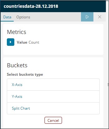
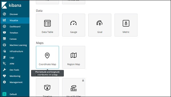
Kibana - Create Visualization
We can visualize the data we have in the form of bar charts, line graphs, pie charts etc. In this chapter, we will understand how to create visualization.
Create Visualization
Go to Kibana Visualization as shown below −
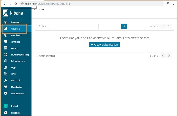
We do not have any visualization created, so it shows blank and there is a button to create one.
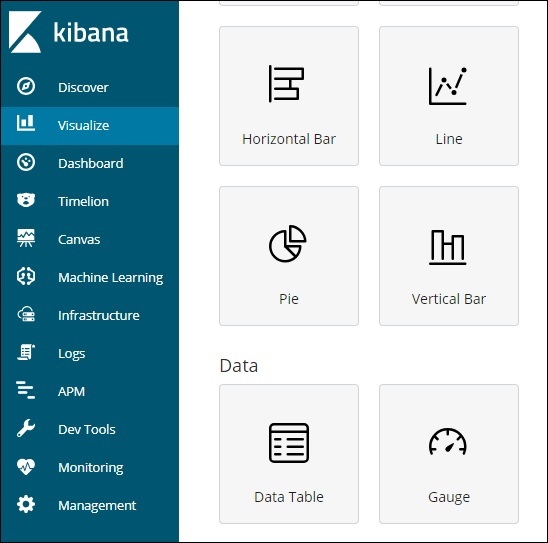
Click the button Create a visualization as shown in the screen above and it will take you to the screen as shown below −
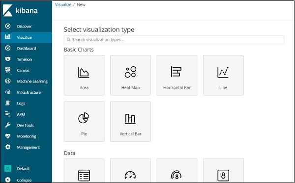
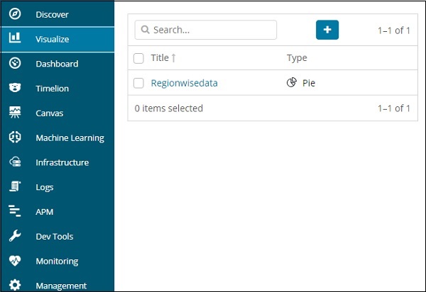
Here you can select the option which you need to visualize your data. We will understand each one of them in detail in the upcoming chapters. Right now will select pie chart to start with.
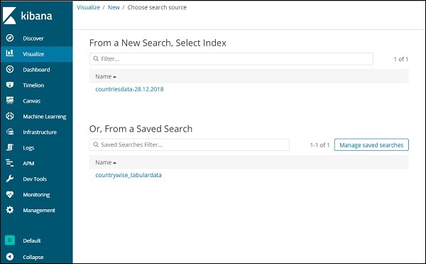
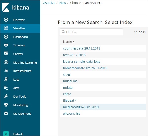
Once you select the visualization type, now you need to select the index on which you want to work on, and it will take you the screen as shown below −
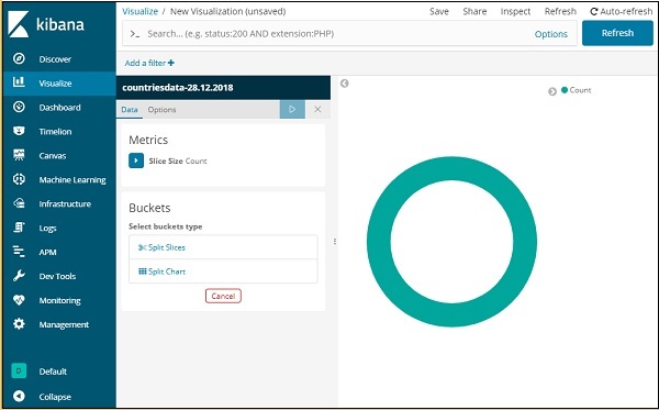
Now we have a default pie chart. We will use the countriesdata-28.12.2018 to get the count of regions available in the countries data in pie chart format.
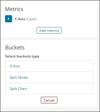
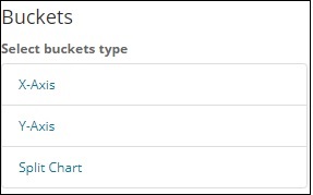
Bucket and Metric Aggregation
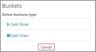
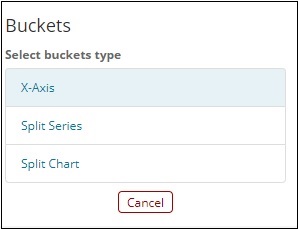
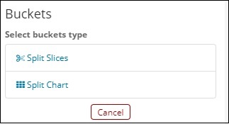
The left side has metrics, which we will select as count. In Buckets, there are 2 options Split slices and split chart. We will use the option Split slices.
Now, select Split Slices and it will display following options −
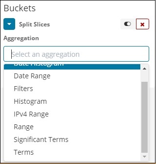
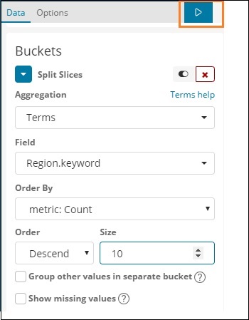
Now, select the Aggregation as Terms and it will display more options to be entered as follows −
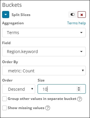
The Fields dropdown will have all the field from the index:countriesdata chosen. We have chosen the Region field and Order By. Note that we have chosen, the metric Count for Order By. We will order it Descending and the size we have taken as 10. It means here, we will get the top 10 regions count from the countries index.
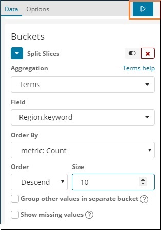
Now, click the analyse button as highlighted below and you should see the pie chart updated on right side.
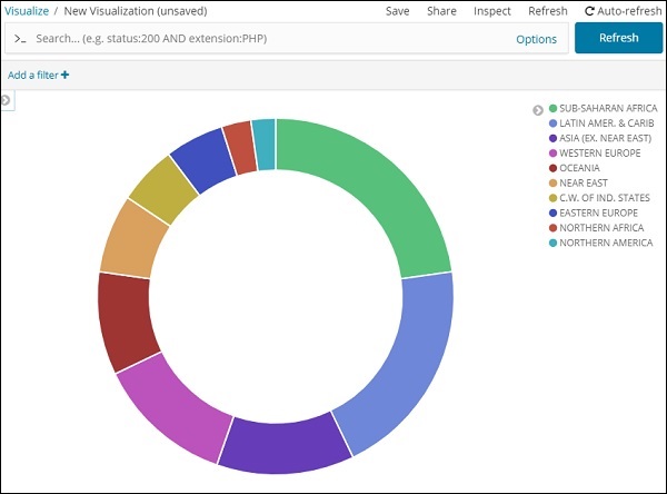
Pie chart display

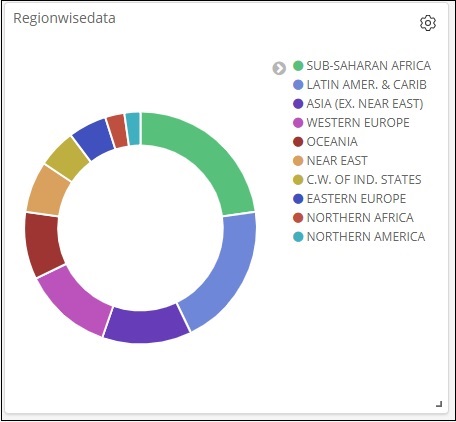
All the regions are listed at the right top corner with colours and the same colour is shown in the pie chart. If you mouse over the pie chart it will give the count of the region and also the name of the region as shown below −
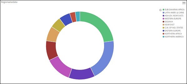
So it tells us that 22.77% of region is occupied by Sub-Saharan Afri from the countries data we have uploaded.
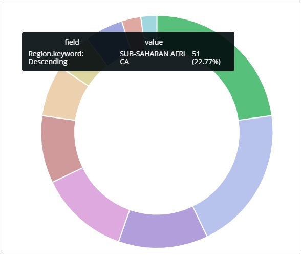
Asia region covers 12.5% and the count is 28.
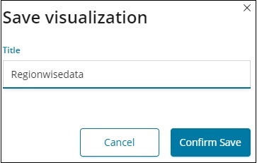
Now we can save the visualization by clicking on the save button on top right corner as shown below −

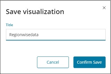
Now, save the visualization so that it can be used later.
We can also get the data as we want by using the search option as shown below −
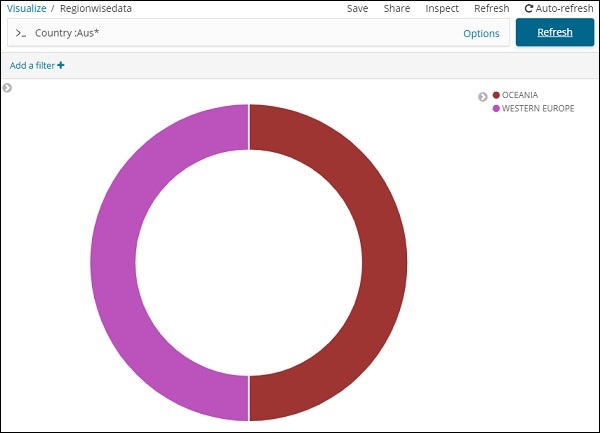
We have filtered data for countries starting with Aus*. We will understand more on pie-chart and other visualization in the upcoming chapters.
Kibana - Working With Charts
Let us explore and understand the most commonly used charts in visualization.
- Horizontal Bar Chart
- Vertical Bar Chart
- Pie Chart
The following are the steps to be followed to create above visualization. Let us start with Horizontal Bar.
Horizontal Bar Chart
Open Kibana and click Visualize tab on left side as shown below −
Click the + button to create a new visualization −
Click the Horizontal Bar listed above. You will have to make a selection of the index you want to visualize.
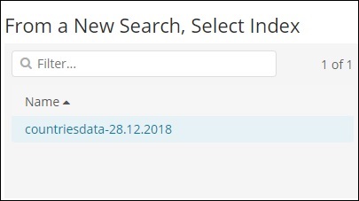
Select the countriesdata-28.12.2018 index as shown above. On selecting the index, it displays a screen as shown below −
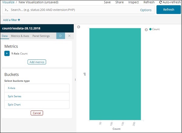
It shows a default count. Now, let us plot a horizontal graph where we can see the data of top 10 country wise populations.
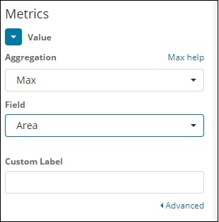
For this purpose, we need to select what we want on the Y and X axis. Hence, select the Bucket and Metric Aggregation −
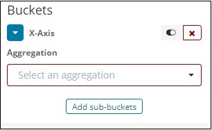
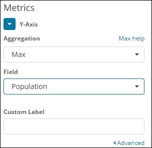
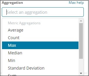
Now, if you click on Y-Axis, it will display the screen as shown below −
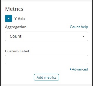
Now, select the Aggregation that you want from the options shown here −
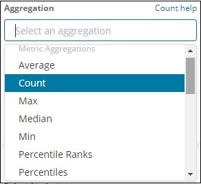
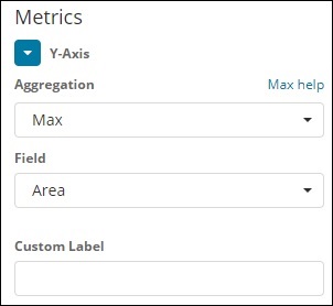
Note that here we will select the Max aggregation as we want to display data as per the max population available.
Next we have to select the field whose max value is required. In the index countriesdata-28.12.2018, we have only 2 numbers field area and population.
Since we want the max population, we select the Population field as shown below −
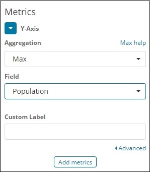
By this, we are done with the Y-axis. The output that we get for Y-axis is as shown below −
Now let us select the X-axis as shown below −
If you select X-Axis, you will get the following output −
Choose Aggregation as Terms.
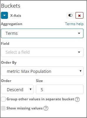
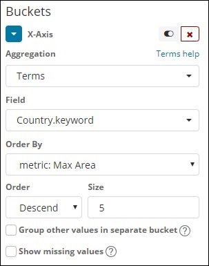
Choose the field from the dropdown. We want country wise population so select country field. Order by we have following options −
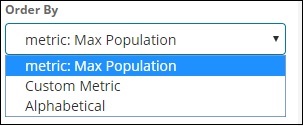
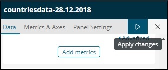
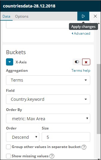
We are going to choose the order by as Max Population as want the country with highest population to be displayed first and so on. Once the data we want is added click on the apply changes button on top of the Metrics data as shown below −
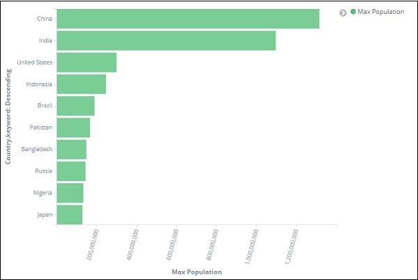
Once you click apply changes, we have the horizontal graph wherein we can see that China is the country with highest population, followed by India, United States etc.
Similarly, you can plot different graphs by choosing the field you want. Next, we will save this visualization as max_population to be used later for Dashboard creation.
In the next section, we will create vertical bar chart.
Vertical Bar Chart
Click the Visualize tab and create a new visualization using vertical bar and index as countriesdata-28.12.2018.
In this vertical bar visualization, we will create bar graph with countries wise area, i.e. countries will be displayed with highest area.
So let us select the Y and X axes as shown below −
Y-axis
X-axis
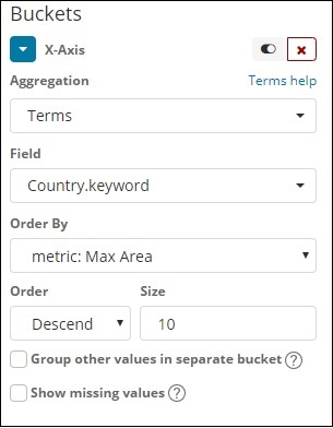
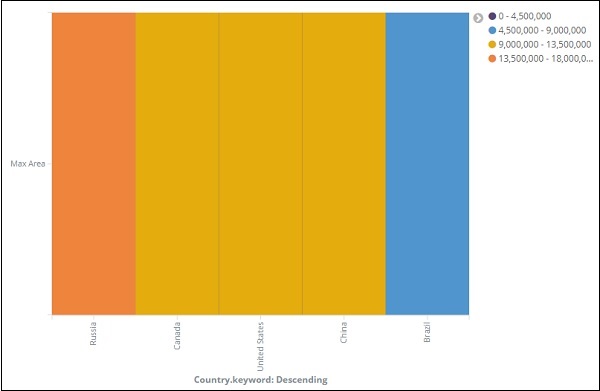
When we apply the changes here, we can see the output as shown below −
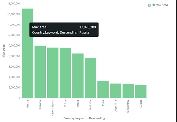
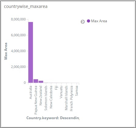
From the graph, we can see that Russia is having the highest area, followed by Canada and United States. Please note this data is picked from the index countriesdata, and its dummy data, so figures might not be correct with live data.
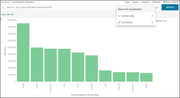
Let us save this visualization as countrywise_maxarea to be used with dashboard later.
Next, let us work on Pie chart.
Pie Chart
So first create a visualization and select the pie chart with index as countriesdata. We are going to display the count of regions available in the countriesdata in pie chart format.
The left side has metrics which will give count. In Buckets, there are 2 options: Split slices and split chart. Now, we will use the option Split slices.
Now, if you select Split Slices, it will display the following options −
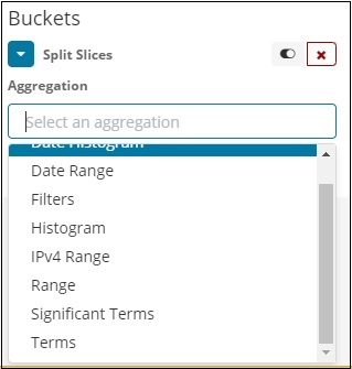
Select the Aggregation as Terms and it will display more options to be entered as follows −

The Fields dropdown will have all the fields from the index chosen. We have selected Region field and Order By that we have selected as Count. We will order it Descending and the size will take as 10. So here we will be get the 10 regions count from the countries index.
Now, click the play button as highlighted below and you should see the pie chart updated on the right side.
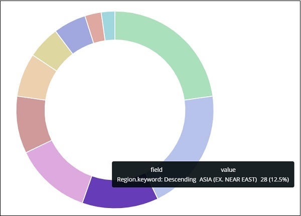
Pie chart display
All the regions are listed at the right top corner with colours and the same colour is shown in the pie chart. If you mouse over the pie chart, it will give the count of the region and also the name of the region as shown below −


Thus, it tells us that 22.77% of region is occupied by Sub-Saharan Afri in the countries data we have uploaded.
From the pie chart, observe that the Asia region covers 12.5% and the count is 28.
Now we can save the visualization by clicking the save button on top right corner as shown below −

Now, save the visualization so that it can be used later in dashboard.
Kibana - Working With Graphs
In this chapter, we will discuss the two types of graphs used in visualization −
- Line Graph
- Area
Line Graph
To start with, let us create a visualization, choosing a line graph to display the data and use contriesdata as the index. We need to create the Y -axis and X-axis and the details for the same are shown below −
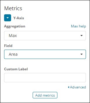
For Y-axis
Observe that we have taken Max as the Aggregation. So here we are going to show data presentation in line graph. Now,we will plot graph that will show the max population country wise. The field we have taken is Population since we need maximum population country wise.
For X-axis
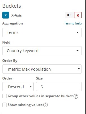
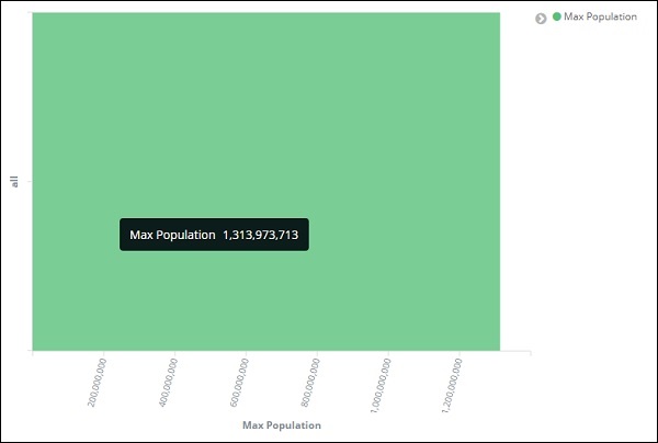
On x-axis we have taken Terms as Aggregation, Country.keyword as Field and metric:Max Population for Order By, and order size is 5. So it will plot the 5 top countries with max population. After applying the changes, you can see the line graph as shown below −
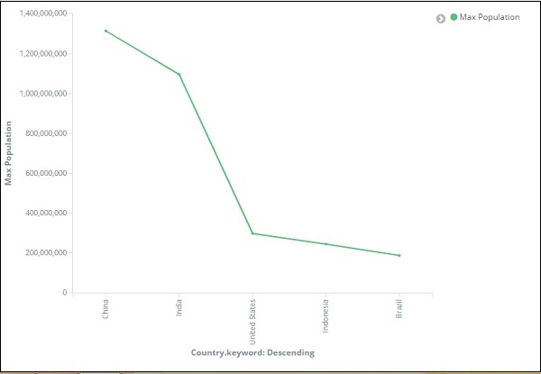
So we have Max population in China, followed by India, United States, Indonesia and Brazil as the top 5 countries in population.
Now, let us save this line graph so that we can use in dashboard later.
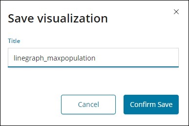
Click Confirm Save and you can save the visualization.
Area Graph
Go to visualization and choose area with index as countriesdata. We need to select the Y-axis and X-axis. We will plot area graph for max area for country wise.
So here the X- axis and Y-axis will be as shown below −
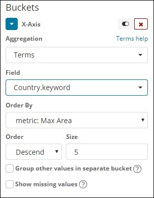
After you click the apply changes button, the output that we can see is as shown below −
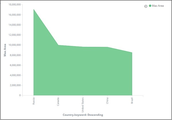
From the graph, we can observe that Russia has the highest area, followed by Canada, United States , China and Brazil. Save the visualization to use it later.
Kibana - Working With Heat Map
In this chapter we will understand how to work with heat map. Heat map will show the data presentation in different colours for the range selected in the data metrics.
Getting Started with Heat Map
To start with, we need to create visualization by clicking on the visualization tab on the left side as shown below −
Select visualization type as heat map as shown above. It will ask you to choose the index as shown below −
Select the index countriesdata-28.12.2018 as shown above. Once the index is selected the we have the data to be selected as shown below −
Select the Metrics as shown below −
Select Max Aggregation from dropdown as shown below −
We have select Max since we want to plot Max Area country wise.
Now will select the values for Buckets as shown below −
Now, let us select the X-Axis as shown below −
We have used Aggregation as Terms, Field as Country and Order By Max Area. Click on Apply Changes as shown below −
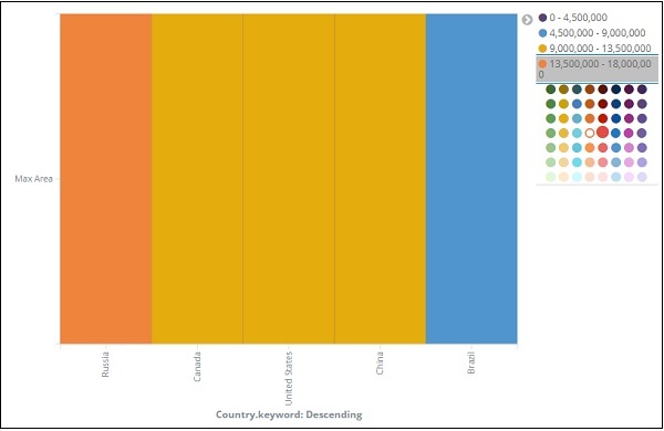
If you click Apply Changes, the heat map looks as shown below −
The heat map is shown with different colours and the range of areas are displayed at the right side. You can change the colour by click on the small circles next to the area range as shown below −
Kibana - Working With Coordinate Map
Coordinate maps in Kibana will show you the geographic area and mark the area with circles based on aggregation you specify.
Create Index for Coordinate Map
The Bucket aggregation used for coordinate map is geohash aggregation. For this type of aggregation, your index which you are going to use should have a field of type geo point. The geo point is combination of latitude and longitude.
We will create an index using Kibana dev tools and add bulk data to it. We will add mapping and add the geo_point type that we need.
The data that we are going to use is shown here −
{"index":{"_id":1}}
{"location": "2.089330000000046,41.47367000000008", "city": "SantCugat"}
{"index":{"_id":2}}
{"location": "2.2947825000000677,41.601800991000076", "city": "Granollers"}
{"index":{"_id":3}}
{"location": "2.1105957495300474,41.5496295760424", "city": "Sabadell"}
{"index":{"_id":4}}
{"location": "2.132605678083895,41.5370461908878", "city": "Barbera"}
{"index":{"_id":5}}
{"location": "2.151270020052683,41.497779918345415", "city": "Cerdanyola"}
{"index":{"_id":6}}
{"location": "2.1364609496220606,41.371303520399344", "city": "Barcelona"}
{"index":{"_id":7}}
{"location": "2.0819450306711165,41.385491966414705", "city": "Sant Just Desvern"}
{"index":{"_id":8}}
{"location": "2.00532082278266,41.542294286427385", "city": "Rubi"}
{"index":{"_id":9}}
{"location": "1.9560805366930398,41.56142635214226", "city": "Viladecavalls"}
{"index":{"_id":10}}
{"location": "2.09205348251486,41.39327140161001", "city": "Esplugas de Llobregat"}
Now, run the following commands in Kibana Dev Tools as shown below −
PUT /cities
{
   "mappings": {
      "_doc": {
         "properties": {
            "location": {
               "type": "geo_point"
            }
         }
      }
   }
}

POST /cities/_city/_bulk?refresh
{"index":{"_id":1}}
{"location": "2.089330000000046,41.47367000000008", "city": "SantCugat"}
{"index":{"_id":2}}
{"location": "2.2947825000000677,41.601800991000076", "city": "Granollers"}
{"index":{"_id":3}}
{"location": "2.1105957495300474,41.5496295760424", "city": "Sabadell"}
{"index":{"_id":4}}
{"location": "2.132605678083895,41.5370461908878", "city": "Barbera"}
{"index":{"_id":5}}
{"location": "2.151270020052683,41.497779918345415", "city": "Cerdanyola"}
{"index":{"_id":6}}
{"location": "2.1364609496220606,41.371303520399344", "city": "Barcelona"}
{"index":{"_id":7}}
{"location": "2.0819450306711165,41.385491966414705", "city": "Sant Just Desvern"}
{"index":{"_id":8}}
{"location": "2.00532082278266,41.542294286427385", "city": "Rubi"}
{"index":{"_id":9}}
{"location": "1.9560805366930398,41.56142635214226", "city": "Viladecavalls"}
{"index":{"_id":10}}
{"location": "2.09205348251486,41.3s9327140161001", "city": "Esplugas de Llobregat"}
Now, run the above commands in Kibana dev tools −
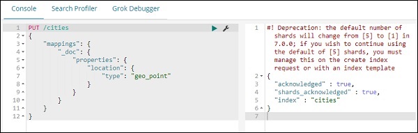
The above will create index name cities of type _doc and the field location is of type geo_point.
Now lets add data to the index: cities −
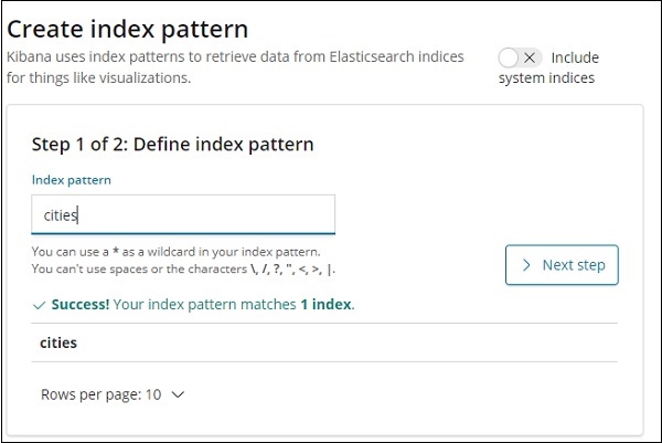
We are done creating index name cites with data. Now let us Create index pattern for cities using Management tab.
The details of fields inside cities index are shown here −
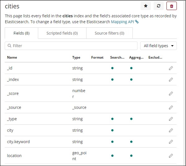
We can see that location is of type geo_point. We can now use it to create visualization.
Getting Started with Coordinate Maps
Go to Visualization and select coordinate maps.
Select the index pattern cities and configure the Aggregation metric and bucket as shown below −
If you click on Analyze button, you can see the following screen −
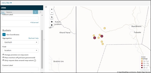
Based on the longitude and latitude, the circles are plotted on the map as shown above.
Kibana - Working With Region Map
With this visualization, you see the data represented on the geographical world map. In this chapter, let us see this in detail.
Create Index for Region Map
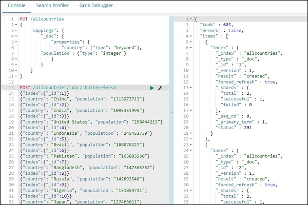
We will create a new index to work with region map visualization. The data that we are going to upload is shown here −
{"index":{"_id":1}}
{"country": "China", "population": "1313973713"}
{"index":{"_id":2}}
{"country": "India", "population": "1095351995"}
{"index":{"_id":3}}
{"country": "United States", "population": "298444215"}
{"index":{"_id":4}}
{"country": "Indonesia", "population": "245452739"}
{"index":{"_id":5}}
{"country": "Brazil", "population": "188078227"}
{"index":{"_id":6}}
{"country": "Pakistan", "population": "165803560"}
{"index":{"_id":7}}
{"country": "Bangladesh", "population": "147365352"}
{"index":{"_id":8}}
{"country": "Russia", "population": "142893540"}
{"index":{"_id":9}}
{"country": "Nigeria", "population": "131859731"}
{"index":{"_id":10}}
{"country": "Japan", "population": "127463611"}
Note that we will use _bulk upload in dev tools to upload the data.
Now, go to Kibana Dev Tools and execute following queries −
PUT /allcountries
{
   "mappings": {
      "_doc": {
         "properties": {
            "country": {"type": "keyword"},
               "population": {"type": "integer"}
         }
      }
   }
}
POST /allcountries/_doc/_bulk?refresh
{"index":{"_id":1}}
{"country": "China", "population": "1313973713"}
{"index":{"_id":2}}
{"country": "India", "population": "1095351995"}
{"index":{"_id":3}}
{"country": "United States", "population": "298444215"}
{"index":{"_id":4}}
{"country": "Indonesia", "population": "245452739"}
{"index":{"_id":5}}
{"country": "Brazil", "population": "188078227"}
{"index":{"_id":6}}
{"country": "Pakistan", "population": "165803560"}
{"index":{"_id":7}}
{"country": "Bangladesh", "population": "147365352"}
{"index":{"_id":8}}
{"country": "Russia", "population": "142893540"}
{"index":{"_id":9}}
{"country": "Nigeria", "population": "131859731"}
{"index":{"_id":10}}
{"country": "Japan", "population": "127463611"}
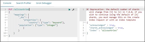
Next, let us create index allcountries. We have specified the country field type as keyword −
PUT /allcountries
{
   "mappings": {
      "_doc": {
         "properties": {
            "country": {"type": "keyword"},
            "population": {"type": "integer"}
         }
      }
   }
}
Note − To work with region maps we need to specify the field type to be used with aggregation as type as keyword.
Once done, upload the data using _bulk command.
We will now create index pattern. Go to Kibana Management tab and select create index pattern.
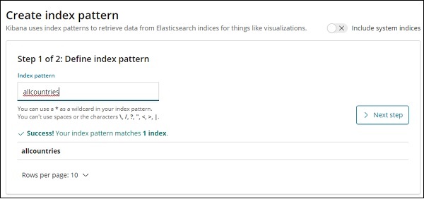
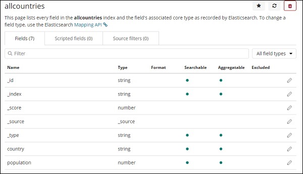
Here are the fields displayed from allcountries index.
Getting Started with Region Maps
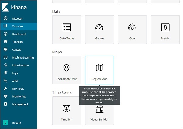
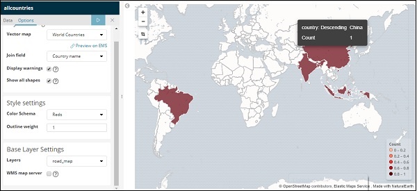
We will now create the visualization using Region Maps. Go to Visualization and select Region Maps.
Once done select index as allcountries and proceed.
Select Aggregation Metrics and Bucket Metrics as shown below −
Here we have selected field as country, as i want to show the same on the world map.
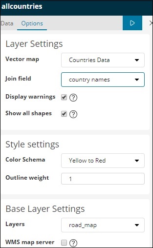
Vector Map and Join Field for Region Map
For region maps we need to also select Option tabs as shown below −
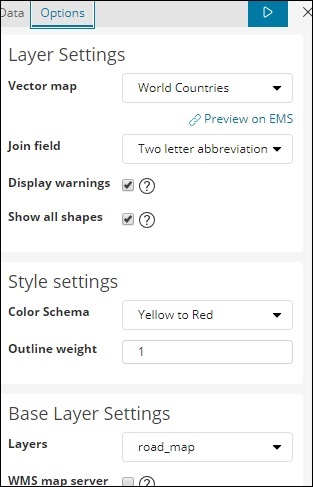
The options tab has Layer Settings configuration which are required to plot the data on the world map.
A Vector Map has the following options −
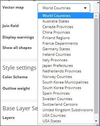
Here we will select world countries as i have countries data.
The Join Field has following details −
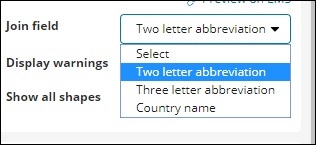
In our index we have the country name, so we will select country name.
In Style settings you can choose the color to be displayed for the countries −
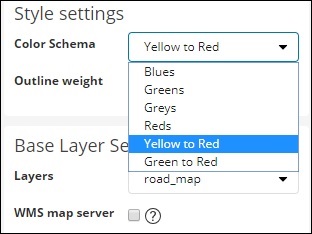
We will select Reds. We will not touch the rest of the details.
Now,click on Analyze button to see the details of the countries plotted on the world map as shown below −
Self-hosted Vector Map and Join Field in Kibana
You can also add your own Kibana settings for vector map and join field. To do that go to kibana.yml from the kibana config folder and add the following details −
regionmap:
   includeElasticMapsService: false
   layers:
      - name: "Countries Data"
      url: "http://localhost/kibana/worldcountries.geojson"
      attribution: "INRAP"
      fields:
         - name: "Country"
         description: "country names"
The vector map from options tab will have the above data populated instead of the default one. Please note the URL given has to be CORS enabled so that Kibana can download the same. The json file used should be in such a way that the coordinates are in continuation. For example −
https://vector.maps.elastic.co/blob/5659313586569216?elastic_tile_service_tos=agreeThe options tab when region-map vector map details are self-hosted is shown below −
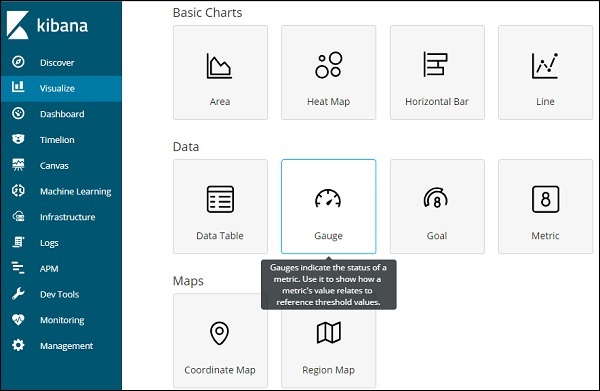
Kibana - Working With Guage And Goal
A gauge visualization tells how your metric considered on the data falls in the predefined range.
A goal visualization tells about your goal and how your metric on your data progresses towards the goal.
Working with Gauge
To start using Gauge, go to visualization and select Visualize tab from Kibana UI.
Click on Gauge and select the index you want to use.
We are going to work on medicalvisits-26.01.2019 index.
Select the time range of February 2017
Now you can select the metric and bucket aggregation.
We have selected the metric aggregation as Count.
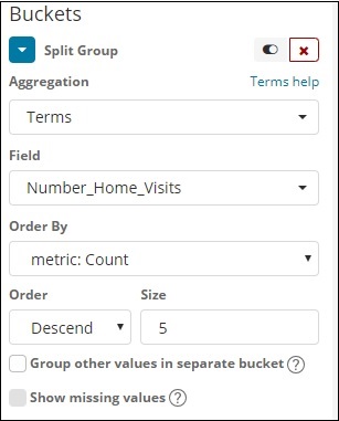
The bucket aggregation we have selected Terms and the field selected is Number_Home_Visits.
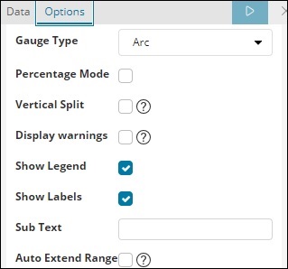
From Data options Tab, the options selected are shown below −
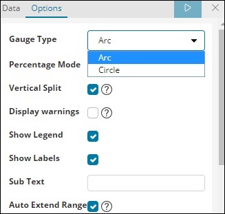
Gauge Type can be in the form of circle or arc. We have selected as arc and rest all others as the default values.
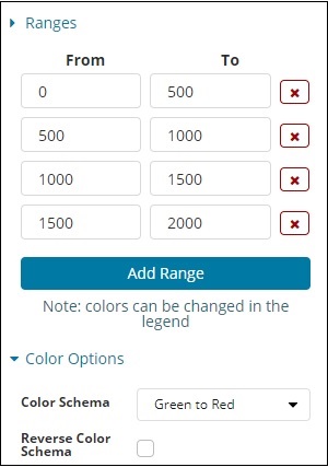
The predefined range we have added is shown here −
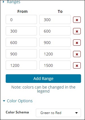
The colour selected is Green To Red.
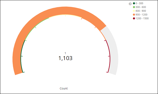
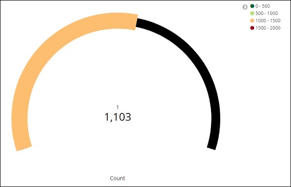
Now, click on Analyze Button to see the visualization in the form of Gauge as shown below −
Working with Goal
Go to Visualize Tab and select Goal as shown below −
Select Goal and select the index.
Use medicalvisits-26.01.2019 as the index.
Select the metric aggregation and bucket aggregation.
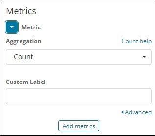
Metric Aggregation
We have selected Count as the metric aggregation.
Bucket Aggregation
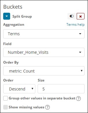
We have selected Terms as the bucket aggregation and field is Number_Home_Visits.
The options selected are as follows −
The Range selected is as follows −
Click on Analyze and you see the goal displayed as follows −
Kibana - Working With Canvas
Canvas is yet another powerful feature in Kibana. Using canvas visualization, you can represent your data in different color combination, shapes, text, multipage setup etc.
We need data to show in the canvas. Now, let us load some sample data already available in Kibana.
Loading Sample Data for Canvas Creation
To get the sample data go to Kibana home page and click on Add sample data as shown below −
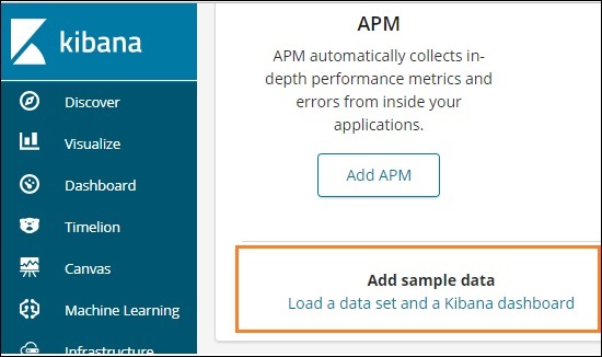
Click on Load a data set and a Kibana dashboard. It will take you to the screen as shown below −
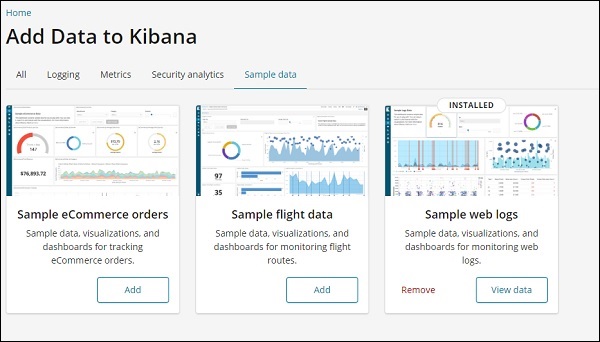
Click on Add button for Sample eCommerce orders. It will take some time to load the sample data. Once done you will get an alert message showing Sample eCommerce data loaded.
Getting Started with Canvas Visualization
Now go to Canvas Visualization as shown below −
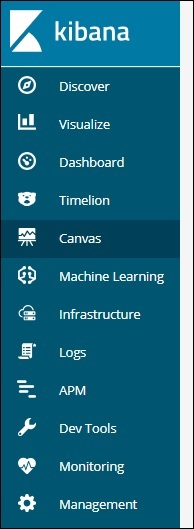
Click on Canvas and it will display screen as shown below −
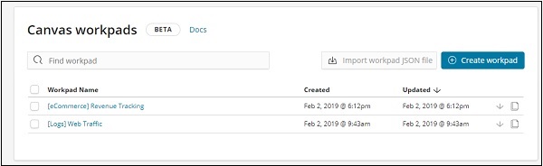
We have eCommerce and Web Traffic sample data added. We can create new workpad or use the existing one.
Here, we will select the existing one. Select eCommerce Revenue Tracking Workpad Name and it will display the screen as shown below −
Cloning an Existing Workpad in Canvas
We will clone the workpad so that we can make changes to it. To clone an existing workpad, click on the name of the workpad shown at the bottom left −
Click on the name and select clone option as shown below −
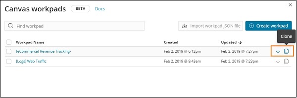
Click on the clone button and it will create a copy of the eCommerce Revenue Tracking workpad. You can find it as shown below −
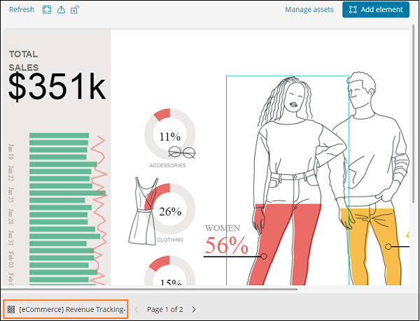
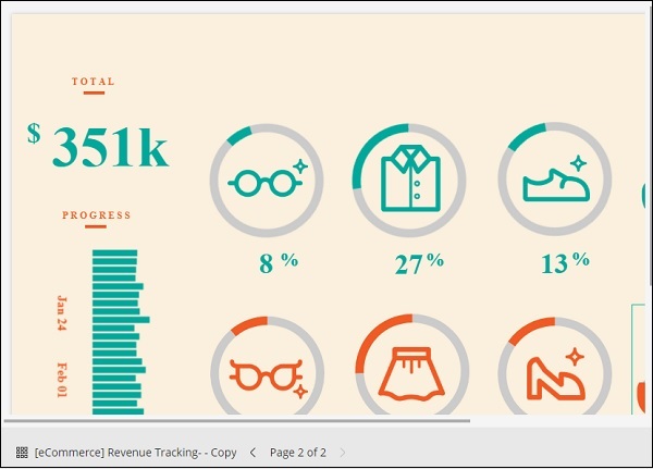
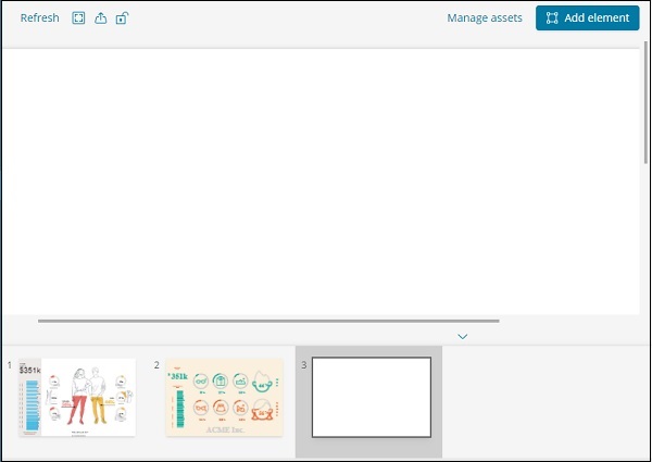
In this section, let us understand how to use the workpad. If you see above workpad, there are 2 pages for it. So in canvas we can represent the data in multiple pages.
The page 2 display is as shown below −
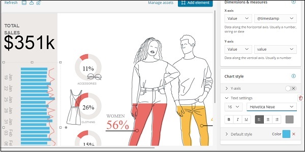
Select Page 1 and click on the Total sales displayed on left side as shown below −
On the right side, you will get the data related to it −
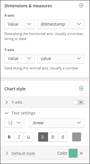
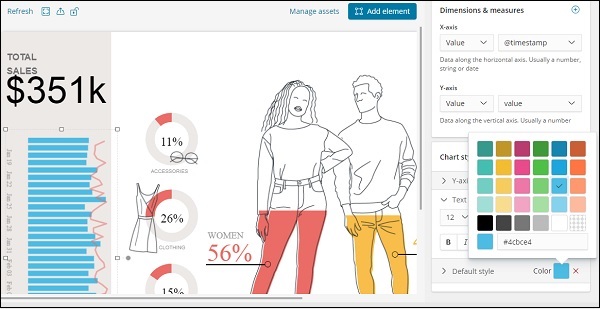
Right now the default style used is green colour. We can change the colour here and check the display of same.
We have also changed the font and size for text settings as shown below −
Adding New Page to Workpad Inside Canvas
To add new page to the workpad, do as shown below −
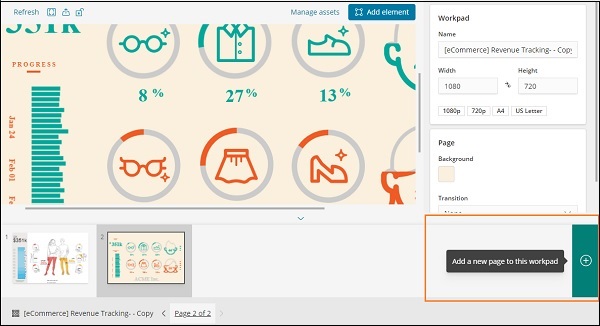
Once the page is created as shown below −
Click on Add element and it will display all possible visualization as shown below −
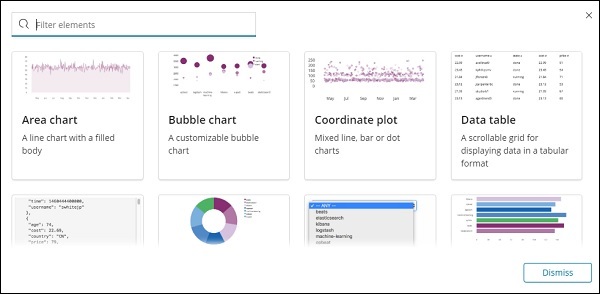
We have added two elements Data table and Area Chart as shown below
You can add more data elements to the same page or add more pages too.
Kibana - Create Dashboard
In our previous chapters, we have seen how to create visualization in the form of vertical bar, horizontal bar, pie chart etc. In this chapter, let us learn how to combine them together in the form of Dashboard. A dashboard is collection of your visualizations created, so that you can take a look at it all together at a time.
Getting Started with Dashboard
To create Dashboard in Kibana, click on the Dashboard option available as shown below −
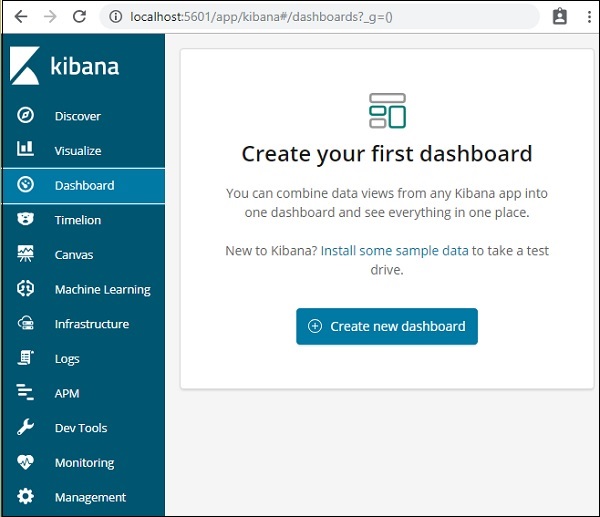
Now, click on Create new dashboard button as shown above. It will take us to the screen as shown below −
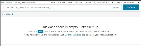
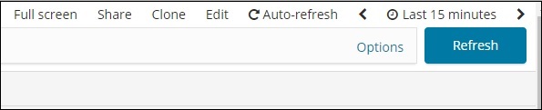
Observe that we do not have any dashboard created so far. There are options at the top where we can Save, Cancel, Add, Options, Share, Auto-refresh and also change the time to get the data on our dashboard. We will create a new dashboard, by clicking on the Add button shown above.
Add Visualization to Dashboard
When we click the Add button (top left corner), it displays us the visualization we created as shown below −
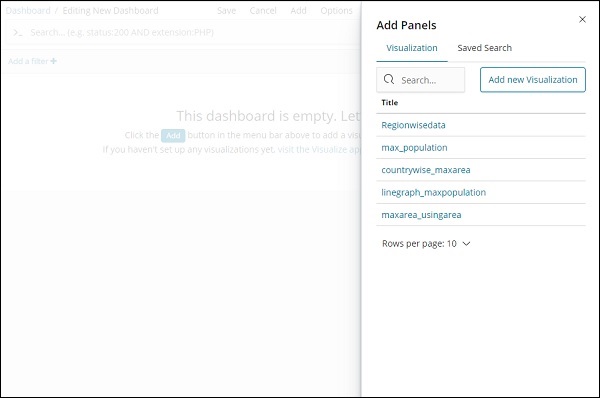
Select the visualization you want to add to your dashboard. We will select the first three visualizations as shown below −
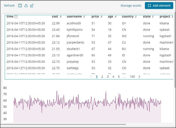
This is how it is seen on the screen together −
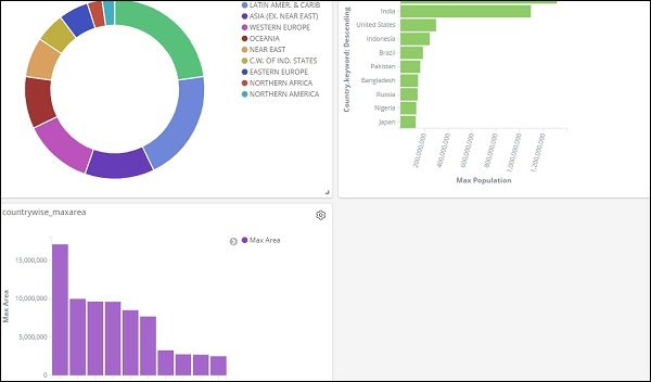
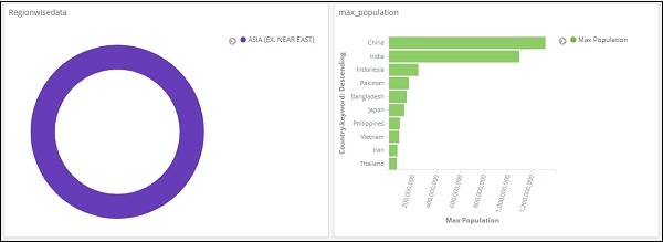
Thus, as a user you are able to get the overall details about the data we have uploaded country wise with fields country-name, regionname, area and population.
So now we know all the regions available, the max population country wise in descending order, the max area etc.
This is just the sample data visualization we uploaded, but in real world it becomes very easy to track the details of your business like for example you have a website which gets millions of hits monthly or daily, you want to keep a track on the sales done every day, hour, minute, seconds and if you have your ELK stack in place Kibana can show you your sales visualization right in front of your eyes every hour, minute, seconds as you want to see. It displays the real time data as it is happening in the real world.
Kibana, on the whole, plays a very important role in extracting the accurate details about your business transaction day wise, hourly or every minute, so the company knows how the progress is going on.
Save Dashboard
You can save your dashboard by using the save button at the top.
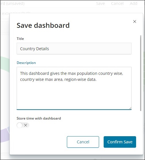
There is a title and description where you can enter the name of the dashboard and a short description which tells what the dashboard does. Now, click on Confirm Save to save the dashboard.
Changing Time Range for Dashboard
At present you can see the data shown is of Last 15 minutes. Please note this is a static data without any time field so the data displayed will not change. When you have the data connected to real time system changing the time, will also show the data reflecting.
By default, you will see Last 15 minutes as shown below −
Click on the Last 15 minutes and it will display you the time range which you can select as per your choice.
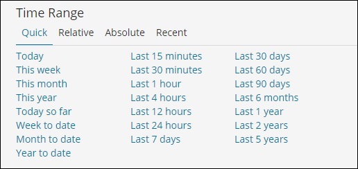
Observe that there are Quick, Relative, Absolute and Recent options. The following screenshot shows the details for Quick option −
Now, click on Relative to see the option available −
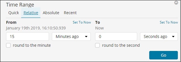
Here you can specify the From and To date in minutes , hours, seconds, months, years ago.
The Absolute option has the following details −
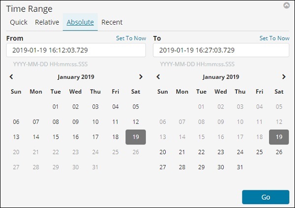
You can see the calendar option and can select a date range.
The recent option will give back the Last 15 minutes option and also other option which you have selected recently. Choosing the time range will update the data coming within that time range.
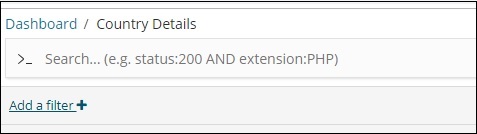
Using Search and Filter in Dashboard
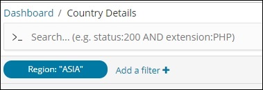
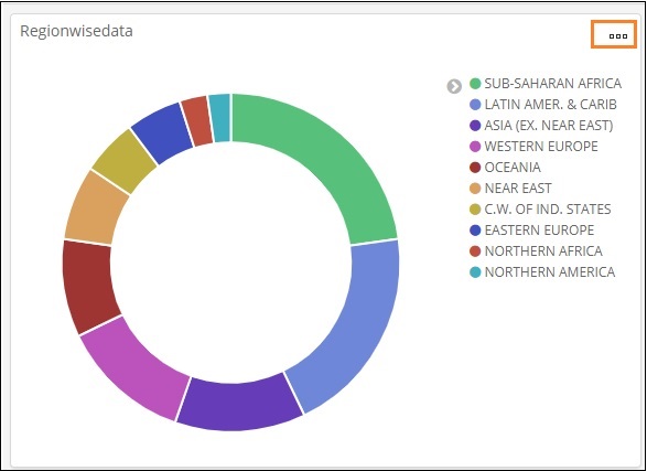
We can also use search and filter on the dashboard. In search suppose if we want to get the details of a particular region, we can add a search as shown below −
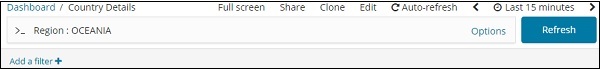
In the above search, we have used the field Region and want to display the details of region:OCEANIA.
We get following results −
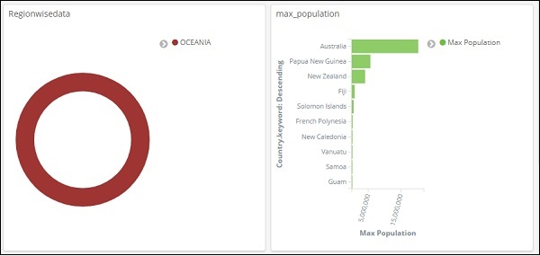
Looking at the above data we can say that in OCEANIA region, Australia has the max population and Area.
Similarly, we can add a filter as shown below −
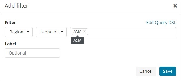
Next, click on Add a filter button and it will display the details of the field available in your index as shown below −
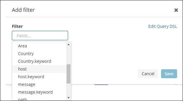
Choose the field you want to filter on. I will use Region field to get the details of ASIA region as shown below −
Save the filter and you should see the filter as follows −
The data will now be shown as per the filter added −
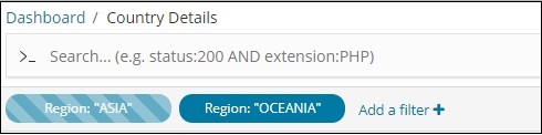
You can also add more filters as shown below −
You can disable the filter by clicking on the disable checkbox as shown below.
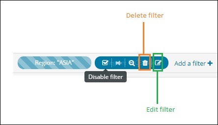
You can activate the filter by clicking on the same checkbox to activate it. Observe that there is delete button to delete the filter. Edit button to edit the filter or change the filter options.
For the visualization displayed, you will notice three dots as shown below −
Click on it and it will display options as shown below −
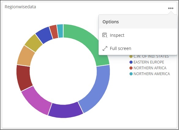
Inspect and Fullscreen
Click on Inspect and it gives the details of the region in tabular format as shown below −
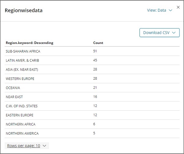
There is an option to download the visualization in CSV format in-case you want to see it in excel sheet.
The next option fullscreen will get the visualization in a fullscreenmode as shown below −
You can use the same button to exit the fullscreen mode.
Sharing Dashboard
We can share the dashboard using the share button. Onclick of share button, you will get display as follows −
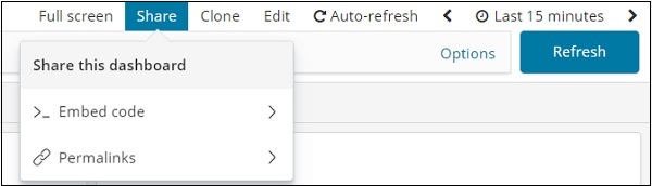
You can also use embed code to show the dashboard on your site or use permalinks which will be a link to share with others.
The url will be as follows −
http://localhost:5601/goto/519c1a088d5d0f8703937d754923b84b
Kibana - Timelion
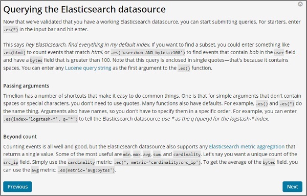
Timelion, also called as timeline is yet another visualization tool which is mainly used for time based data analysis. To work with timeline, we need to use simple expression language which will help us connect to the index and also perform calculations on the data to get the results we need.
Where can we use Timelion?
Timelion is used when you want to compare time related data. For example, you have a site, and you get your views daily. You want to analyse the data wherein you want to compare the current week data with previous week, i.e. Monday-Monday, Tuesday -Tuesday and so on how the views are differing and also the traffic.
Getting Started with Timelion
To start working with Timelion, click on Timelion as shown below −
Timelion by default shows the timeline of all indexes as shown below −
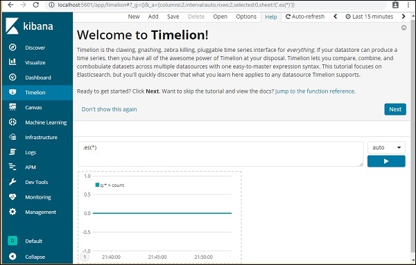
Timelion works with expression syntax.
Note − es(*) => means all indexes.
To get the details of function available to be used with Timelion, simply click on the textarea as shown below −
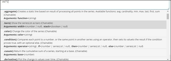
It gives you the list of function to be used with the expression syntax.
Once you start with Timelion, it displays a welcome message as shown below. The highlighted section i.e. Jump to the function reference, gives the details of all the functions available to be used with timelion.
Timelion Welcome Message
The Timelion welcome message is as shown below −
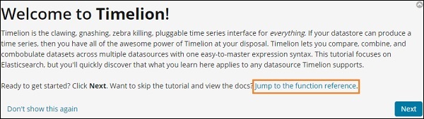
Click on the next button and it will walk you through its basic functionality and usage. Now when you click Next, you can see the following details −
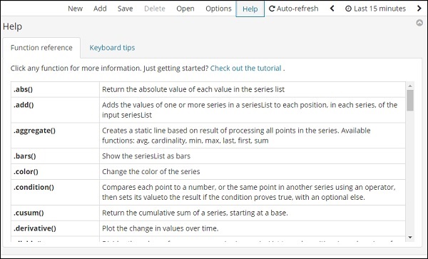
Timelion Function Reference
Click on Help button to get the details of the function reference available for Timelion −
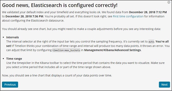
Timelion Configuration
The settings for timelion is done in Kibana Management → Advanced Settings.
Click on Advanced Settings and select Timelion from Category
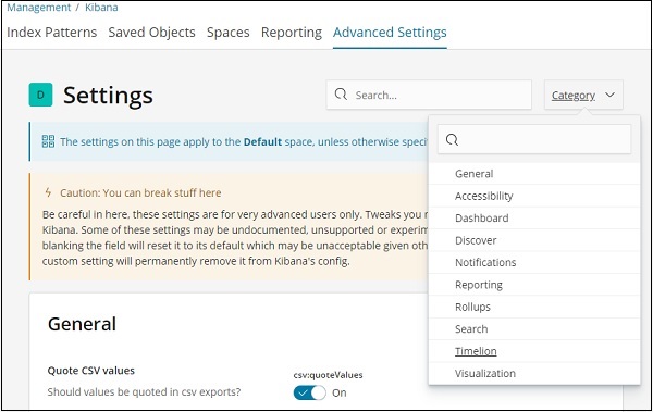
Once Timelion is selected it will display all the necessary fields required for timelion configuration.
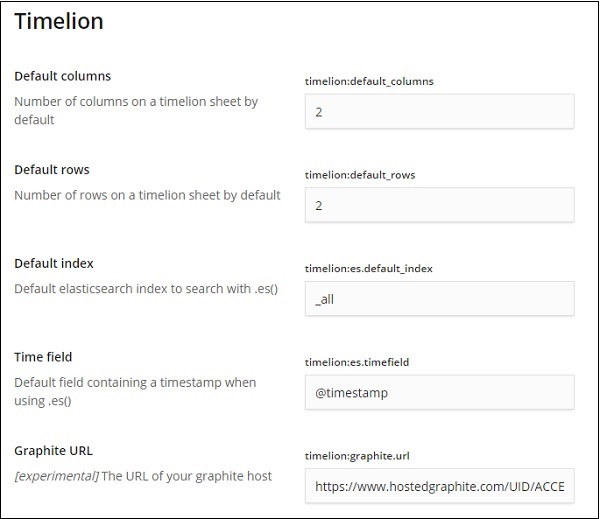
In the following fields you can change the default index and the timefield to be used on the index −
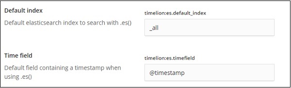
The default one is _all and timefield is @timestamp. We would leave it as it is and change the index and timefield in the timelion itself.
Using Timelion to Visualize Data
We are going to use index:medicalvisits-26.01.2019. The following is the data displayed from timelion for 1st Jan 2017 to 31st Dec 2017 −
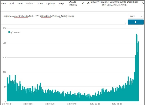
The expression used for above visualization is as follows −
.es(index=medicalvisits-26.01.2019,timefield=Visiting_Date).bars()
We have used the index medicalvisits-26.01.2019 and timefield on that index is Visiting_Date and used bars function.
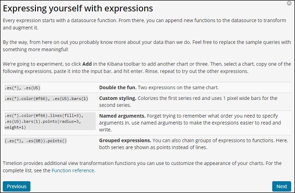
In the following we have analyzed 2 cities for the month of jan 2017, day wise.
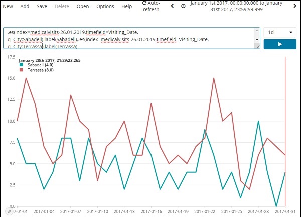
The expression used is −
.es(index=medicalvisits-26.01.2019,timefield=Visiting_Date,
q=City:Sabadell).label(Sabadell),.es(index=medicalvisits-26.01.2019,
timefield=Visiting_Date, q=City:Terrassa).label(Terrassa)
The timeline comparison for 2 days is shown here −
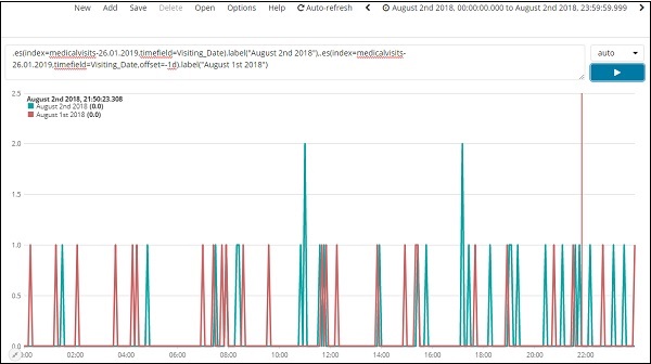
Expression
.es(index=medicalvisits-26.01.2019,timefield=Visiting_Date).label("August 2nd 2018"),
.es(index=medicalvisits-26.01.2019,timefield=Visiting_Date,offset=-1d).label("August 1st 2018")
Here we have used offset and given a difference of 1day. We have selected the current date as 2nd August 2018. So it gives data difference for 2nd Aug 2018 and 1st Aug 2018.
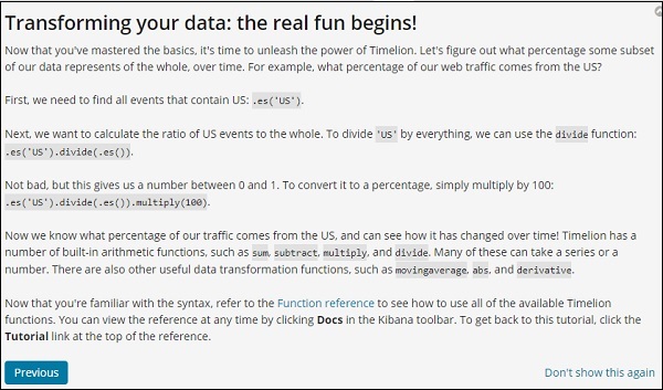
The list of top 5 cities data for the month of Jan 2017 is shown below. The expression that we have used here is given below −
.es(index=medicalvisits-26.01.2019,timefield=Visiting_Date,split=City.keyword:5)
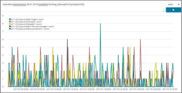
We have used split and given the field name as city and the since we need top five cities from the index we have given it as split=City.keyword:5
It gives the count of each city and lists their names as shown in the graph plotted.
Kibana - Dev Tools
We can use Dev Tools to upload data in Elasticsearch, without using Logstash. We can post, put, delete, search the data we want in Kibana using Dev Tools.
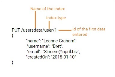
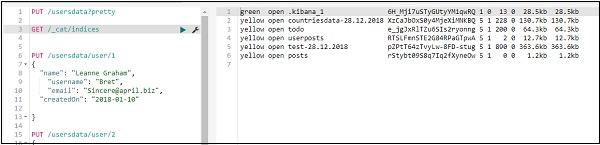
To create new index in Kibana we can use following command in dev tools −
Create Index USING PUT
The command to create index is as shown here −
PUT /usersdata?pretty
Once you execute this, an empty index userdata is created.
We are done with the index creation. Now will add the data in the index −
Add Data to Index Using PUT
You can add data to an index as follows −
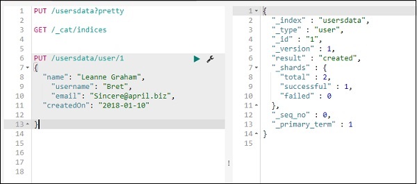
We will add one more record in usersdata index −
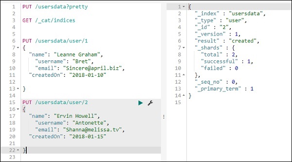
So we have 2 records in usersdata index.
Fetch Data from Index Using GET
We can get the details of record 1 as follows −
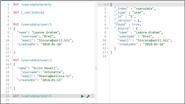
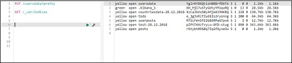
You can get all records as follows −
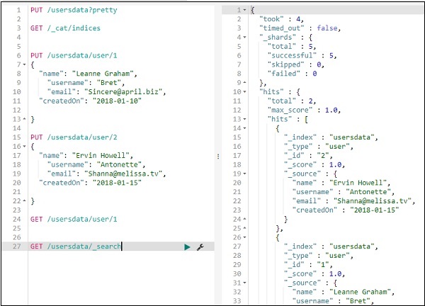
Thus, we can get all the records from usersdata as shown above.
Update data in Index using PUT
To update the record, you can do as follows −
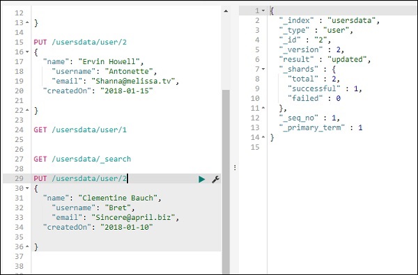
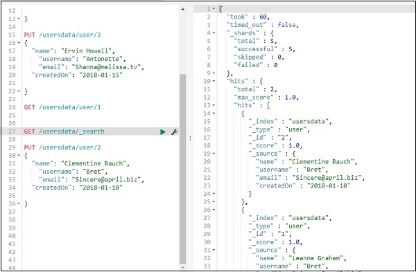
We have changed the name from Ervin Howell to Clementine Bauch. Now we can get all records from the index and see the updated record as follows −
Delete data from index using DELETE
You can delete the record as shown here −
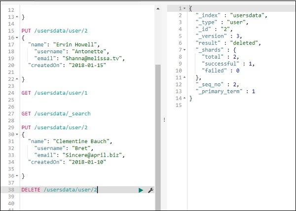
Now if you see the total records we will have only one record −
We can delete the index created as follows −
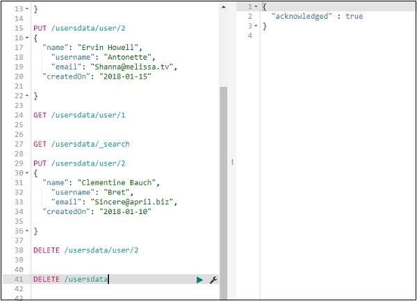
Now if you check the indices available we will not have usersdata index in it as deleted the index.
Kibana - Monitoring
Kibana Monitoring gives the details about the performance of ELK stack. We can get the details of memory used, response time etc.
Monitoring Details
To get monitoring details in Kibana, click on the monitoring tab as shown below −
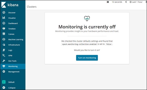
Since we are using the monitoring for the first time, we need to keep it ON. For this, click the button Turn on monitoring as shown above. Here are the details displayed for Elasticsearch −
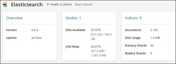
It gives the version of elasticsearch, disk available, indices added to elasticsearch, disk usage etc.
The monitoring details for Kibana are shown here −
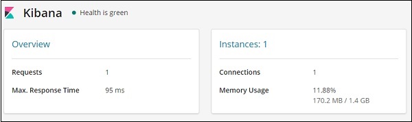
It gives the Requests and max response time for the request and also the instances running and memory usage.
Kibana - Creating Reports Using Kibana
Reports can be easily created by using the Share button available in Kibana UI.
Reports in Kibana are available in the following two forms −
- Permalinks
- CSV Report
Report as Permalinks
When performing visualization, you can share the same as follows −
Use the share button to share the visualization with others as Embed Code or Permalinks.
In-case of Embed code you get the following options −
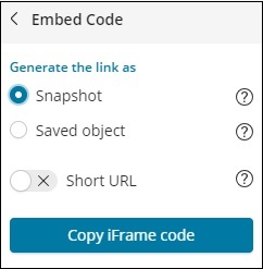
You can generate the iframe code as short url or long url for snapshot or saved object. Snapshot will not give the recent data and user will be able to see the data saved when the link was shared. Any changes done later will not be reflected.
In case of saved object, you will get the recent changes done to that visualization.
Snapshot IFrame code for long url −
<iframe src="http://localhost:5601/app/kibana#/visualize/edit/87af
cb60-165f-11e9-aaf1-3524d1f04792?embed=true&_g=()&_a=(filters:!(),linked:!f,query:(language:lucene,query:''),
uiState:(),vis:(aggs:!((enabled:!t,id:'1',params:(field:Area),schema:metric,type:max),(enabled:!t,id:'2',p
arams:(field:Country.keyword,missingBucket:!f,missingBucketLabel:Missing,order:desc,orderBy:'1',otherBucket:!
f,otherBucketLabel:Other,size:10),schema:segment,type:terms)),params:(addLegend:!t,addTimeMarker:!f,addToo
ltip:!t,categoryAxes:!((id:CategoryAxis-1,labels:(show:!t,truncate:100),position:bottom,scale:(type:linear),
show:!t,style:(),title:(),type:category)),grid:(categoryLines:!f,style:(color:%23eee)),legendPosition:right,
seriesParams:!((data:(id:'1',label:'Max+Area'),drawLi
nesBetweenPoints:!t,mode:stacked,show:true,showCircles:!t,type:histogram,valueAxis:ValueAxis-1)),times:!(),
type:histogram,valueAxes:!((id:ValueAxis-1,labels:(filter:!f,rotate:0,show:!t,truncate:100),name:LeftAxis-1,
position:left,scale:(mode:normal,type:linear),show:!t,style:(),title:(text:'Max+Area'),type:value))),title:
'countrywise_maxarea+',type:histogram))" height="600" width="800"></iframe>
Snapshot Iframe code for short url −
<iframe src="http://localhost:5601/goto/f0a6c852daedcb6b4fa74cce8c2ff6c4?embed=true" height="600" width="800"><iframe>
As snapshot and shot url.
With Short url −
http://localhost:5601/goto/f0a6c852daedcb6b4fa74cce8c2ff6c4
With Short url off, the link looks as below −
http://localhost:5601/app/kibana#/visualize/edit/87afcb60-165f-11e9-aaf1-3524d1f04792?_g=()&_a=(filters:!(
),linked:!f,query:(language:lucene,query:''),uiState:(),vis:(aggs:!((enabled:!t,id:'1',params:(field:Area),
schema:metric,type:max),(enabled:!t,id:'2',params:(field:Country.keyword,missingBucket:!f,missingBucketLabel:
Missing,order:desc,orderBy:'1',otherBucket:!f,otherBucketLabel:Other,size:10),schema:segment,type:terms)),
params:(addLegend:!t,addTimeMarker:!f,addTooltip:!t,categoryAxes:!((id:CategoryAxis-1,labels:(show:!t,trun
cate:100),position:bottom,scale:(type:linear),show:!t,style:(),title:(),type:category)),grid:(categoryLine
s:!f,style:(color:%23eee)),legendPosition:right,seriesParams:!((data:(id:'1',label:'Max%20Area'),drawLines
BetweenPoints:!t,mode:stacked,show:true,showCircles:!t,type:histogram,valueAxis:ValueAxis-1)),times:!(),
type:histogram,valueAxes:!((id:ValueAxis-1,labels:(filter:!f,rotate:0,show:!t,truncate:100),name:LeftAxis-1,
position:left,scale:(mode:normal,type:linear),show:!t,style:(),title:(text:'Max%20Area'),type:value))),title:'countrywise_maxarea%20',type:histogram))
When you hit the above link in the browser, you will get the same visualization as shown above. The above links are hosted locally, so it will not work when used outside the local environment.
CSV Report
You can get CSV Report in Kibana where there is data, which is mostly in the Discover tab.
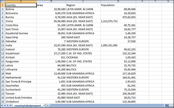
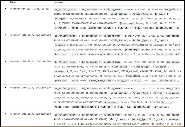
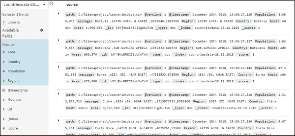
Go to Discover tab and take any index you want the data for. Here we have taken the index:countriesdata-26.12.2018. Here is the data displayed from the index −
You can create tabular data from above data as shown below −
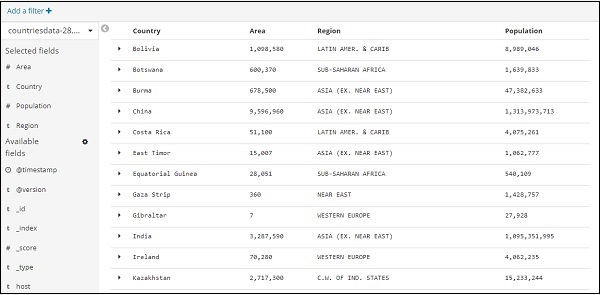
We have selected the fields from Available fields and the data seen earlier is converted into tabular format.
You can get above data in CSV report as shown below −
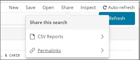
The share button has option for CSV report and permalinks. You can click on CSV Report and download the same.
Please note to get the CSV Reports you need to save your data.
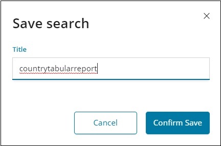
Confirm Save and click on Share button and CSV Reports. You will get following display −
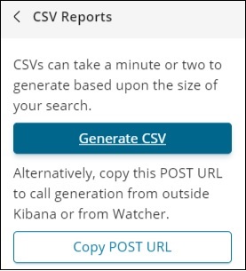
Click on Generate CSV to get your report. Once done, it will instruct you to go the management tab.
Go to Management Tab → Reporting
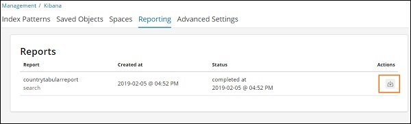
It displays the report name, created at, status and actions. You can click on the download button as highlighted above and get your csv report.
The CSV file we just downloaded is as shown here −