- Seaborn - Home
- Seaborn - Introduction
- Seaborn - Environment Setup
- Importing Datasets and Libraries
- Seaborn - Figure Aesthetic
- Seaborn- Color Palette
- Seaborn - Histogram
- Seaborn - Kernel Density Estimates
- Seaborn - Visualizing Pairwise Relationship
- Seaborn - Plotting Categorical Data
- Distribution of Observations
- Seaborn - Statistical Estimation
- Seaborn - Plotting Wide Form Data
- Seaborn - Multi Panel Categorical Plots
- Seaborn - Linear Relationships
- Seaborn - Facet Grid
- Seaborn - Pair Grid
- Seaborn Function Reference
- Seaborn - Function Reference
- Relational Plots
- Distribution Plots
- Categorial plots
- Regression plots
- Matrix Plots
- Multi plot grids
- Themeing
- Color Palettes
- Palette widgets
- Utility Functions
- Seaborn Useful Resources
- Seaborn - Quick Guide
- Seaborn - cheatsheet
- Seaborn - Useful Resources
- Seaborn - Discussion
Seaborn.set_context() method
The Seaborn.set_context() method is used to set the parameters that control the scaling of plot elements. By using this the general style is unaffected, although it does influence things like the size of the labels, lines, and other plot points. The rcParams system in matplotlib is used to achieve this.
The terms "paper," "talk," and "poster" are versions of the notebook parameters scaled by different values, while "notebook" serves as the base context. Additionally, font elements may be scaled separately from the other values.
Syntax
Following is the syntax of the seaborn.set_context() method −
seaborn.set_context(context=None, font_scale=1, rc=None)
Parameters
The parameters of the set_context() method are discussed below.
| S.No | Parameter and Description |
|---|---|
| 1 | context Takes the following as input none, dict, or one of {paper, notebook, talk, poster} and determines a dictionary of parameters or the name of a preconfigured set. |
| 2 | rc Takes rcdict as value and is an optional parameter that performs Parameter mappings to override the values in the preset seaborn style dictionaries. This only update parameter that are considered part of the style definition. |
| 3 | font_scale Takes a floating-point value as input and is optional parameter. Its separate scaling factor to independently scale the size of the font elements. |
Let us load the seaborn library and the dataset before moving on to the developing the plots.
Loading the seaborn library
To load or import the seaborn library the following line of code can be used.
Import seaborn as sns
Loading the dataset
in this article, we will make use of the Tips dataset inbuilt in the seaborn library. the following command is used to load the dataset.
tips=sns.load_dataset("tips")
The below mentioned command is used to view the first 5 rows in the dataset. This enables us to understand what variables can be used to plot a graph.
tips.head()
the below is the output for the above piece of code.
index,total_bill,tip,sex,smoker,day,time,size
0,16.99,1.01,Female,No,Sun,Dinner,2
1,10.34,1.66,Male,No,Sun,Dinner,3
2,21.01,3.5,Male,No,Sun,Dinner,3
3,23.68,3.31,Male,No,Sun,Dinner,2
4,24.59,3.61,Female,No,Sun,Dinner,4
Now that we have loaded the data, we will move onto understanding how the method works in the following examples.
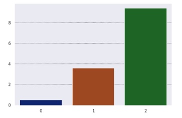
Example 1
We will plot a graph after setting the context. The context can have values paper, notebook, talk and poster. In this example, we are setting the context to paper and then a bar plot is generated by passing lists to the x,y parameters of bar plot.
import seaborn as sns
import matplotlib.pyplot as plt
tips=sns.load_dataset("tips")
tips.head()
sns.set_context("paper")
sns.barplot(x=[0, 1, 2], y=[0.5, 3.6, 9.4])
plt.show()
Output
the output generated is as follows,
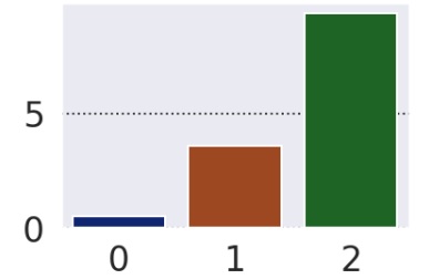
Example 2
In this example, we will use the font_scale parameter. This parameter is used to increase or decrease the font size in the plot. In this example, 1.5 is passed to the font_scale.
import seaborn as sns
import matplotlib.pyplot as plt
tips=sns.load_dataset("tips")
tips.head()
sns.set_context("poster", font_scale=1.5)
sns.barplot(x=[0, 1, 2], y=[0.5, 3.6, 9.4])
plt.show()
Output
The output is as follows,
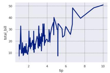
Example 3
In this example, we will use the tips dataset and set a context and later plot a line plot for the dataset using the context. The context is set to notebook and one of the rc parameters, lines.linewidth is set to 3 to show how rc parameters can be used.
Then tips dataset and columns from this dataset are passed to the lineplot.
import seaborn as sns
import matplotlib.pyplot as plt
tips=sns.load_dataset("tips")
tips.head()
sns.set_context("notebook", rc={"lines.linewidth": 3})
sns.lineplot(data=tips,x="tip",y="total_bill")
plt.show()
Output
The output obtained is as follows −