
Article Categories
- All Categories
-
 Data Structure
-
 Networking
-
 RDBMS
RDBMS
-
 Operating System
-
 Java
Java
-
 MS Excel
-
 iOS
iOS
-
 HTML
HTML
-
 CSS
CSS
-
 Android
-
 Python
-
 C Programming
-
 C++
C++
-
 C#
C#
-
 MongoDB
-
 MySQL
MySQL
-
 Javascript
-
 PHP
PHP
-
 Economics & Finance
How to Implement Tooltip in Android Studio?
Android Studio is a widely used IDE for creating Android applications. To provide users with the best experience, incorporating tooltips is crucial. Tooltips are informative hints that help users understand various functions within an app. By integrating these tooltips in Android Studio, developers can enhance the user experience by providing helpful contextual guidance.
Developers who aim to incorporate tooltips into their Android applications can follow specific steps for a seamless implementation. This tutorial walks through the process of integrating tooltips in Android Studio, ensuring clear comprehension and enhanced functionality for all app users.
Tooltip
A tooltip is a handy feature in Android that provides users with additional information about on-screen elements like icons or buttons. By hovering over an element or tapping it briefly, users can trigger the appearance of a small popup containing relevant explanations or hints that help them to understand how to effectively interact with the app's interface.
Tooltips are designed to make app usage intuitive and smooth by providing clear instructions, descriptions, and context-sensitive guidance at the user's fingertips. These concise UI components often contain text or symbols and appear near the referenced element for quick accessibility.
Approaches
Different methods and approaches exist to implement tooltips in Android Studio. Three common options are available for users to choose from:
AndroidX Tooltip Library
Custom Tooltip View
Third-party Libraries
AndroidX Tooltip Library
This method involves adding the AndroidX Tooltip library to your project's dependencies and using the TooltipCompat.Builder class to create and display tooltips. You can customize properties such as text, background color, and arrow style, and then attach the tooltip to the target view using the show() method. This method offers a convenient and straightforward way to implement tooltips with minimal code and configuration.
Algorithm
Add the AndroidX Tooltip library as a dependency in your project.
Create a TooltipCompat.Builder object.
Set properties like text, background color, and arrow style for the tooltip.
Attach the tooltip to the target view using the show() method.
Example
import androidx.appcompat.app.AppCompatActivity;
import android.os.Bundle;
import android.view.View;
import androidx.appcompat.widget.TooltipCompat;

public class MainActivity extends AppCompatActivity {

   @Override
   protected void onCreate(Bundle savedInstanceState) {
      super.onCreate(savedInstanceState);
      setContentView(R.layout.activity_main);

      View targetView = findViewById(R.id.target_view);
      TooltipCompat.Builder tooltipBuilder = new TooltipCompat.Builder(this)
            .setText("Click me to see tooltip")
            .setBackgroundColor(getResources().getColor(R.color.tooltip_background))
            .setArrow(new CustomArrowDrawable());

      TooltipCompat.setTooltipText(targetView, tooltipBuilder.build());
   }
}
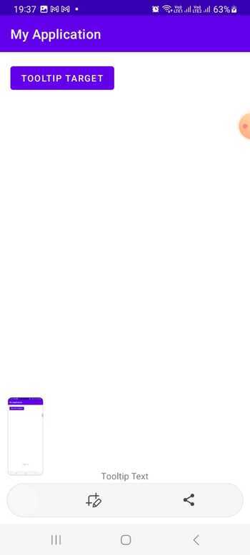
Output
Custom Tooltip View
With this method, you create a custom view class that extends from View or a suitable subclass like TextView. By overriding relevant methods such as onDraw(), onTouchEvent(), or onHoverEvent(), you can handle the drawing and interaction logic of the tooltip. Within the custom view, you manage the visibility, position, and content of the tooltip based on user interaction and the associated view's state. This approach provides greater control and flexibility for creating customized tooltips tailored to your app's design and behavior.
Algorithm
Create a custom view class that extends from View or a suitable subclass.
Override relevant methods like onDraw(), onTouchEvent(), or onHoverEvent() to handle tooltip drawing and interaction.
Manage the visibility, position, and content of the tooltip within the custom view based on user interaction and view state.
Example
import android.content.Context;
import android.graphics.Canvas;
import android.graphics.Color;
import android.graphics.Paint;
import android.util.AttributeSet;
import android.view.View;

public class CustomTooltipView extends View {

   private String tooltipText = "Click me to see tooltip";
   private Paint paint;

   public CustomTooltipView(Context context, AttributeSet attrs) {
      super(context, attrs);
      init();
   }

   private void init() {
      paint = new Paint();
      paint.setColor(Color.BLUE);
      paint.setTextSize(24);
   }

   @Override
   protected void onDraw(Canvas canvas) {
      super.onDraw(canvas);
      canvas.drawText(tooltipText, 50, 50, paint);
   }
}
Output

Third-party Libraries
This method involves leveraging third-party libraries available on platforms like GitHub, such as "SuperToolTips" or "TooltipView." After adding the library's dependency to your project, you can follow the provided documentation and APIs to configure and display tooltips. These libraries typically offer a wide range of options to set tooltip content, position, animation, and appearance. Using third-party libraries can save development time and provide additional features and styling options for tooltips in your Android app.
Algorithm
Add the desired third-party library dependency to your project.
Consult the library's documentation for specific configuration and usage instructions.
Typically, you'll set tooltip content, position, animation, and appearance using provided methods or attributes.
Call the appropriate method to display the tooltip when needed.
Program
import androidx.appcompat.app.AppCompatActivity;
import android.os.Bundle;
import android.view.View;
import com.example.awesometooltip.TooltipView;

public class MainActivity extends AppCompatActivity {

   @Override
   protected void onCreate(Bundle savedInstanceState) {
      super.onCreate(savedInstanceState);
      setContentView(R.layout.activity_main);

      View targetView = findViewById(R.id.target_view);
      TooltipView tooltipView = findViewById(R.id.tooltip_view);
      tooltipView.setToolTipText("Click me to see tooltip");
      tooltipView.attachTo(targetView);
   }
}
Output

Conclusion
In this tutorial, implementing tooltips in Android Studio allows developers to enhance the user experience by providing informative hints and explanations about various elements within their applications. Whether using the AndroidX Tooltip Library, creating a custom tooltip view, or leveraging third-party libraries, tooltips offer a valuable means of guiding users and improving usability. By choosing the appropriate method and incorporating tooltips effectively, developers can provide users with contextual assistance, ultimately leading to a more intuitive and engaging app interaction.

2K+ Views
