
Article Categories
- All Categories
-
 Data Structure
-
 Networking
-
 RDBMS
RDBMS
-
 Operating System
-
 Java
Java
-
 MS Excel
-
 iOS
iOS
-
 HTML
HTML
-
 CSS
CSS
-
 Android
-
 Python
-
 C Programming
-
 C++
C++
-
 C#
C#
-
 MongoDB
-
 MySQL
MySQL
-
 Javascript
-
 PHP
PHP
-
 Economics & Finance
How to Implement Shapeable ImageView in Android?
The Shapeable ImageView is an influential feature that belongs to the Android Material Design library, permitting app developers to create individualized and uniquely shaped image views.
The Shapeable ImageView in Android offers developers a simple and intuitive way to apply various shapes to image views, including circles and rounded rectangles. By following a few straightforward steps, visual appeal can easily be enhanced for their apps.
Developers can easily create a visually pleasing user interface with the Shapeable Image-View, enhancing the user experience. This tutorial will guide through implementing Shape-able ImageView in an Android application.
ImageView
The ImageView component is a vital part of many Android applications. It falls under the View class and can seamlessly render images within an application's user interface, boasting impressive efficiency. In addition to its primary function, ImageView offers a wide array of features and functionalities that help manipulate images for display purposes.
Developers can easily use the ImageView tool to load images from various sources such as local resources, network URLs or generated bitmap objects. The built-in scaling and resizing options of ImageView adjust the image within its bounds seamlessly. Moreover, transformations like rotation, cropping, and alpha blending are available for developers' convenience. Different formats such as JPEG, PNG, GIF and WebP are supported by this feature-rich tool.
The ImageView in an Android app is incredibly versatile. Developers can adjust its appe-arance using both attributes and methods to manipulate everything from the image size to the background, filters, and even clicking effects. If you want your app imagery to look stunning and be interactive for users, mastering this component is a must.
Approaches
To implement a Shapeable ImageView in Android, you can use different methods. Here are three common approaches:
XML Layout Approach
Programmatically Approach
Style Approach
XML Layout Approach
In this approach, you define a ShapeableImageView element in your XML layout file and specify the desired shape appearance using the app:shapeAppearanceOverlay attribute. This allows you to easily configure the shape and other attributes directly in the XML, providing a declarative way of implementing the Shapeable ImageView.
Algorithm
Declare a ShapeableImageView element in your XML layout file.
Specify the desired shape appearance using the app:shapeAppearanceOverlay attribute.
Customize other attributes as needed.
Example
//activity_main.xml
<?xml version="1.0" encoding="utf-8"?>
<RelativeLayout
xmlns:android="http://schemas.android.com/apk/res/android"
   xmlns:app="http://schemas.android.com/apk/res-auto"
   xmlns:tools="http://schemas.android.com/tools"
   android:layout_width="match_parent"
   android:layout_height="match_parent"
   tools:context=".MainActivity">

   <com.google.android.material.imageview.ShapeableImageView
      android:id="@+id/shapeableImageView"
      android:layout_width="200dp"
      android:layout_height="200dp"

app:shapeAppearanceOverlay="@style/ShapeAppearanceOverlay.App.Corner
Size"
      android:src="@drawable/your_image" />

</RelativeLayout>

// styles.xml
<style name="ShapeAppearanceOverlay.App.CornerSize">
   <item name="cornerSize">16dp</item> <!-- Customize the
corner
size as per your requirement -->
</style>

// MainActivity.java
import android.os.Bundle;
import androidx.appcompat.app.AppCompatActivity;
import com.google.android.material.imageview.ShapeableImageView;

public class MainActivity extends AppCompatActivity {

   @Override
   protected void onCreate(Bundle savedInstanceState) {
      super.onCreate(savedInstanceState);
      setContentView(R.layout.activity_main);

      ShapeableImageView shapeableImageView = findViewById(R.id.
shapeableImageView);
      // You can further customize the ImageView here if needed
   }
}
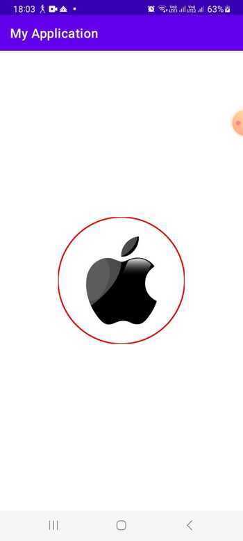
Output
Programmatically Approach
With the programmatically approach, you create an instance of ShapeableImageView in your Java code using the constructor. You can then set the shape appearance using the setShapeAppearanceModel() method, allowing you to dynamically define the shape and customize other properties programmatically. This method is useful when you need to apply different shapes or modify the shape appearance at runtime.
Algorithm
Create an instance of ShapeableImageView in your Java code.
Set the shape appearance using the setShapeAppearanceModel() method.
Customize other properties programmatically.
Example
// MainActivity.java
import android.os.Bundle;
import android.widget.LinearLayout;

import androidx.appcompat.app.AppCompatActivity;

import com.google.android.material.imageview.ShapeableImageView;
import com.google.android.material.shape.CornerFamily;
import com.google.android.material.shape.ShapeAppearanceModel;

public class MainActivity extends AppCompatActivity {

   @Override
   protected void onCreate(Bundle savedInstanceState) {
      super.onCreate(savedInstanceState);
      setContentView(R.layout.activity_main);

      LinearLayout parentLayout = findViewById(R.id.parent_layout);

      // Create ShapeableImageView instance
      ShapeableImageView shapeableImageView = new
ShapeableImageView(this);

      // Create ShapeAppearanceModel with rounded corners
      ShapeAppearanceModel shapeAppearanceModel = new
ShapeAppearanceModel()
            .toBuilder()
            .setAllCorners(CornerFamily.ROUNDED, 20) // Set radius
for rounded corners
            .build();

      // Set ShapeAppearanceModel to ShapeableImageView

shapeableImageView.setShapeAppearanceModel(shapeAppearanceModel);

      // Set image resource
      shapeableImageView.setImageResource(R.drawable.my_image);

      // Add ShapeableImageView to parent layout
      parentLayout.addView(shapeableImageView);
   }
}

//activity_main.xml
<!-- activity_main.xml -->
<LinearLayout
xmlns:android="http://schemas.android.com/apk/res/android"
   xmlns:tools="http://schemas.android.com/tools"
   android:id="@+id/parent_layout"
   android:layout_width="match_parent"
   android:layout_height="match_parent"
   android:orientation="vertical"
   android:gravity="center"
   android:padding="16dp"
   tools:context=".MainActivity">

   <!-- Add other views or elements as needed -->

</LinearLayout>
Output

Style Approach
The style approach involves defining a style in your styles.xml file that extends Widget.MaterialComponents.ShapeableImageView. Within the style, you set the desired shape appearance using the cornerFamily and cornerSize attributes. By applying this style to a regular ImageView in your XML layout file using the style attribute, you can achieve the shapeable behavior without directly using the ShapeableImageView class. This approach is suitable when you want to apply the same shape appearance to multiple ImageViews or when you prefer to define the appearance in styles rather than individual XML elements.
Algorithm
Define a style in your styles.xml file that extends Widget.MaterialComponents.ShapeableImageView.
Set the desired shape appearance using the cornerFamily and cornerSize attributes.
Apply the style to a regular ImageView in your XML layout file using the style attribute.
Example
styles.xml

<?xml version="1.0" encoding="utf-8"?>
<resources>
   <style name="ShapeableImageViewStyle"
parent="Widget.MaterialComponents.ShapeableImageView">
      <item name="shapeAppearanceOverlay">
@style/ShapeAppearanceOverlay.MyApp.Image</item>
   </style>

   <style name="ShapeAppearanceOverlay.MyApp.Image" parent="">
      <!-- Define the shape appearance properties here -->
      <item name="cornerFamily">rounded</item>
      <item name="cornerSize">16dp</item>
   </style>
</resources>

activity_main.xml

<com.google.android.material.imageview.ShapeableImageView
   android:id="@+id/shapeableImageView"
   style="@style/ShapeableImageViewStyle"
   android:layout_width="200dp"
   android:layout_height="200dp"
   android:src="@drawable/my_image"
   app:layout_constraintTop_toTopOf="parent"
   app:layout_constraintStart_toStartOf="parent"
   app:layout_constraintEnd_toEndOf="parent"
   app:layout_constraintBottom_toBottomOf="parent" />

MainActivity.java
import android.os.Bundle;

import androidx.appcompat.app.AppCompatActivity;

import com.google.android.material.imageview.ShapeableImageView;

public class MainActivity extends AppCompatActivity {

   @Override
   protected void onCreate(Bundle savedInstanceState) {
      super.onCreate(savedInstanceState);
      setContentView(R.layout.activity_main);

      ShapeableImageView shapeableImageView =
findViewById(R.id.shapeableImageView);
      shapeableImageView.setImageResource(R.drawable.my_image);
   }
}
Output

Conclusion
In this tutorial, implementing a Shapeable ImageView in Android offers versatile ways to customize the shape appearance of image views. Whether through XML layout, programmatically in Java, or by using styles, developers can easily achieve visually appealing and interactive user interfaces by applying different shapes to their image views. This flexibility enhances the overall design and user experience of Android applications.

2K+ Views
