
Article Categories
- All Categories
-
 Data Structure
-
 Networking
-
 RDBMS
RDBMS
-
 Operating System
-
 Java
Java
-
 MS Excel
-
 iOS
iOS
-
 HTML
HTML
-
 CSS
CSS
-
 Android
-
 Python
-
 C Programming
-
 C++
C++
-
 C#
C#
-
 MongoDB
-
 MySQL
MySQL
-
 Javascript
-
 PHP
PHP
-
 Economics & Finance
How to create CircularImageView in android?
This example demonstrate about how to Create CircularImageView in android.
Step 1 − Create a new project in Android Studio, go to File ⇒ New Project and fill all required details to create a new project.
Step 2 −To make circler view, we should add CircularImageView library in gradle file as shown below.
apply plugin: 'com.android.application'
android {
   compileSdkVersion 28
   defaultConfig {
      applicationId "com.example.andy.myapplication"
      minSdkVersion 15
      targetSdkVersion 28
      versionCode 1
      versionName "1.0"
      testInstrumentationRunner "android.support.test.runner.AndroidJUnitRunner"
   }
   buildTypes {
      release {
         minifyEnabled false
         proguardFiles getDefaultProguardFile('proguard-android.txt'), 'proguard-rules.pro'
      }
   }
}
dependencies {
   implementation fileTree(dir: 'libs', include: ['*.jar'])
   implementation 'com.android.support:appcompat-v7:28.0.0'
   implementation 'com.android.support.constraint:constraint-layout:1.1.3'
   testImplementation 'junit:junit:4.12'
   androidTestImplementation 'com.android.support.test:runner:1.0.2'
   implementation 'com.mikhaellopez:circularimageview:3.2.0'
   androidTestImplementation 'com.android.support.test.espresso:espresso-core:3.0.2'
}
Step 3 − Following is the content of the modified main activity file MainActivity.java. This file can include each of the fundamental life cycle methods. We have created a CircularImageView in activity_main.xml
import android.support.v7.app.AppCompatActivity;
import android.os.Bundle;
public class MainActivity extends AppCompatActivity {
   @Override
   protected void onCreate(Bundle savedInstanceState) {
      super.onCreate(savedInstanceState);
      setContentView(R.layout.activity_main);
   }
}
Step 4 − Following will be the content of res/layout/activity_main.xml file to include a CircularImageView.
<?xml version = "1.0" encoding = "utf-8"?>
<android.support.constraint.ConstraintLayout xmlns:android = "http://schemas.android.com/apk/res/android"
xmlns:app = "http://schemas.android.com/apk/res-auto"
   xmlns:tools = "http://schemas.android.com/tools"
   android:layout_width = "match_parent"
   android:layout_height = "match_parent"
   tools:context = ".MainActivity">
<LinearLayout
   android:layout_width = "match_parent"
   android:gravity = "center_horizontal"
   android:orientation = "vertical"
   android:layout_height = "match_parent">
   <com.mikhaellopez.circularimageview.CircularImageView
      android:layout_width = "250dp"
      android:layout_height = "250dp"
      android:src = "@drawable/image"
      app:civ_border_color = "#EEEEEE"
      app:civ_border_width = "4dp"
      app:civ_shadow = "true"
      app:civ_shadow_radius = "10"
      app:civ_shadow_color = "#8BC34A"/>
   <TextView
      android:text = "Mohammad Mohtashim"
      android:layout_width = "match_parent"
      android:layout_height = "match_parent"
      android:layout_marginTop = "20dp"
      android:textSize = "20sp"
      android:textAlignment = "center"/>
</LinearLayout>
</android.support.constraint.ConstraintLayout>
The above layout we have declared CircularImageView as com.mikhaellopez.circularimageview.CircularImageView and added image from drawable as id is image.
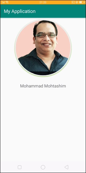
Let's try to run your application. I assume you have connected your actual Android Mobile device with your computer. To run the app from android studio, open one of your project's activity files and click Run  icon from the toolbar. Select your mobile device as an option and then check your mobile device which will display your default screen −
Properties of CircularImageView
app:civ_border − This property is used to create border and default value is true
app:civ_border_color − This property is used to create border color and default color is white
app:civ_border_width − This property is used to create border width and default value is 4dp
app:civ_background_color − This property is used to create background color and default background color is white
app:civ_shadow − This property is used to create shadow for image and default value is false, if required shadow we need to make true
app:civ_shadow_color − This property is used to create shadow color for image and default value is black
app:civ_shadow_radius − This property is used to create shadow radius for image and default value is 8.0f
app:civ_shadow_gravity − This property is used to create shadow gravity for image and default value is bottom.
Click here to download the project on this topic.

1K+ Views
