
Article Categories
- All Categories
-
 Data Structure
-
 Networking
-
 RDBMS
RDBMS
-
 Operating System
-
 Java
Java
-
 MS Excel
-
 iOS
iOS
-
 HTML
HTML
-
 CSS
CSS
-
 Android
-
 Python
-
 C Programming
-
 C++
C++
-
 C#
C#
-
 MongoDB
-
 MySQL
MySQL
-
 Javascript
-
 PHP
PHP
-
 Economics & Finance
Selected Reading
How to draw a violin plot in R?
A violin plot is similar to a boxplot but looks like a violin and shows the distribution of the data for different categories. It shows the density of the data values at different points. In R, we can draw a violin plot with the help of ggplot2 package as it has a function called geom_violin for this purpose.
Example
Consider the below data frame −
set.seed(1)
x <-rep(c("S1","S2","S3","S4","S5"),each=50)
set.seed(1)
x <-rep(c("S1","S2","S3","S4","S5"),each=100)
y <-rnorm(500)
grp <-rep(c("A","B"),times=250)
df <-data.frame(x,y,grp)
head(df,20)
Output
   x    y    grp
1 S1 -0.62645381 A
2 S1 0.18364332 B
3 S1 -0.83562861 A
4 S1 1.59528080 B
5 S1 0.32950777 A
6 S1 -0.82046838 B
7 S1 0.48742905 A
8 S1 0.73832471 B
9 S1 0.57578135 A
10 S1 -0.30538839 B
11 S1 1.51178117 A
12 S1 0.38984324 B
13 S1 -0.62124058 A
14 S1 -2.21469989 B
15 S1 1.12493092 A
16 S1 -0.04493361 B
17 S1 -0.01619026 A
18 S1 0.94383621 B
19 S1 0.82122120 A
20 S1 0.59390132 B
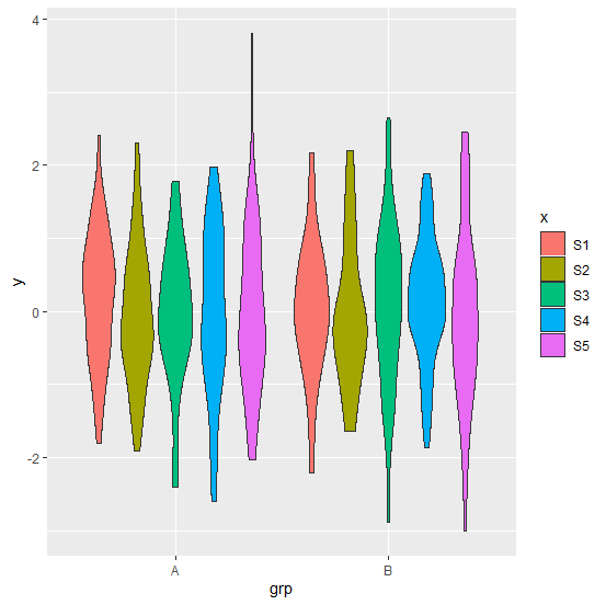
Creating violin plot by filling colors with x variable −
ggplot(df,aes(grp,y,fill=x))+geom_violin()
Output
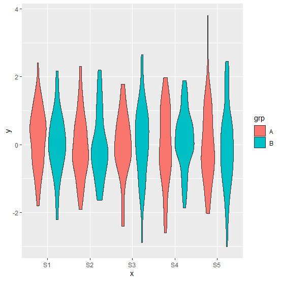
Creating violin plot by filling colors with grp variable −
Example
ggplot(df,aes(x,y,fill=grp))+geom_violin()
Output

Updated on: 2020-08-24T12:19:46+05:30
518 Views

Advertisements