- Plotly - Home
- Plotly - Introduction
- Plotly - Environment Setup
- Plotly - Online & Offline Plotting
- Plotting Inline with Jupyter Notebook
- Plotly - Package Structure
- Plotly - Exporting to Static Images
- Plotly - Legends
- Plotly - Format Axis & Ticks
- Plotly - Subplots & Inset Plots
- Plotly - Bar Chart & Pie Chart
- Plotly - Scatter Plot, Scattergl Plot & Bubble Charts
- Plotly - Dot Plots & Table
- Plotly - Histogram
- Plotly - Box Plot Violin Plot & Contour Plot
- Plotly - Distplots, Density Plot & Error Bar Plot
- Plotly - Heatmap
- Plotly - Polar Chart & Radar Chart
- Plotly - OHLC Chart Waterfall Chart & Funnel Chart
- Plotly - 3D Scatter & Surface Plot
- Plotly - Adding Buttons/Dropdown
- Plotly - Slider Control
- Plotly - FigureWidget Class
- Plotly with Pandas and Cufflinks
- Plotly with Matplotlib and Chart Studio
- Plotly Useful Resources
- Plotly - Quick Guide
- Plotly - Cheatsheet
- Plotly - Useful Resources
- Plotly - Discussion
Plotly - Histogram
Introduced by Karl Pearson, a histogram is an accurate representation of the distribution of numerical data which is an estimate of the probability distribution of a continuous variable (CORAL). It appears similar to bar graph, but, a bar graph relates two variables, whereas a histogram relates only one.
A histogram requires bin (or bucket) which divides the entire range of values into a series of intervalsand then count how many values fall into each interval. The bins are usually specified as consecutive, non-overlapping intervals of a variable. The bins must be adjacent, and are often of equal size. A rectangle is erected over the bin with height proportional to the frequencythe number of cases in each bin.
Histogram trace object is returned by go.Histogram() function. Its customization is done by various arguments or attributes. One essential argument is x or y set to a list, numpy array or Pandas dataframe object which is to be distributed in bins.
By default, Plotly distributes the data points in automatically sized bins. However, you can define custom bin size. For that you need to set autobins to false, specify nbins (number of bins), its start and end values and size.
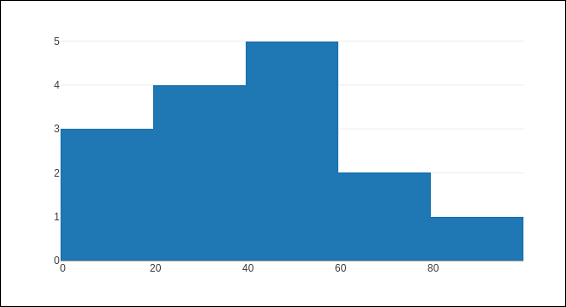
Following code generates a simple histogram showing distribution of marks of students in a class inbins (sized automatically) −
import numpy as np
x1 = np.array([22,87,5,43,56,73,55,54,11,20,51,5,79,31,27])
data = [go.Histogram(x = x1)]
fig = go.Figure(data)
iplot(fig)
The output is as shown below −
The go.Histogram() function accepts histnorm, which specifies the type of normalization used for this histogram trace. Default is "", the span of each bar corresponds to the number of occurrences (i.e. the number of data points lying inside the bins). If assigned "percent" / "probability", the span of each bar corresponds to the percentage / fraction of occurrences with respect to the total number of sample points. If it is equal to "density", the span of each bar corresponds to the number of occurrences in a bin divided by the size of the bin interval.
There is also histfunc parameter whose default value is count. As a result, height of rectangle over a bin corresponds to count of data points. It can be set to sum, avg, min or max.
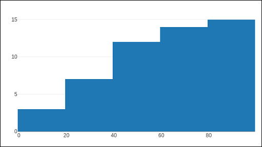
The histogram() function can be set to display cumulative distribution of values in successive bins. For that, you need to set cumulative property to enabled. Result can be seen as below −
data=[go.Histogram(x = x1, cumulative_enabled = True)]
fig = go.Figure(data)
iplot(fig)
The output is as mentioned below −