- ggplot2 - Home
- ggplot2 - Introduction
- ggplot2 - Installation of R
- ggplot2 - Default Plot in R
- ggplot2 - Working with Axes
- ggplot2 - Working with Legends
- ggplot2 - Scatter Plots & Jitter Plots
- ggplot2 - Bar Plots & Histograms
- ggplot2 - Pie Charts
- ggplot2 - Marginal Plots
- ggplot2 - Bubble Plots & Count Charts
- ggplot2 - Diverging Charts
- ggplot2 - Themes
- ggplot2 - Multi Panel Plots
- ggplot2 - Multiple Plots
- ggplot2 - Background Colors
- ggplot2 - Time Series
- ggplot2 Useful Resources
- ggplot2 - Quick Guide
- ggplot2 - Useful Resources
- ggplot2 - Discussion
ggplot2 - Working with Legends
Axes and legends are collectively called as guides. They allow us to read observations from the plot and map them back with respect to original values. The legend keys and tick labels are both determined by the scale breaks. Legends and axes are produced automatically based on the respective scales and geoms which are needed for plot.
Following steps will be implemented to understand the working of legends in ggplot2 −
Inclusion of package and dataset in workspace
Let us create the same plot for focusing on the legend of the graph generated with ggplot2 −
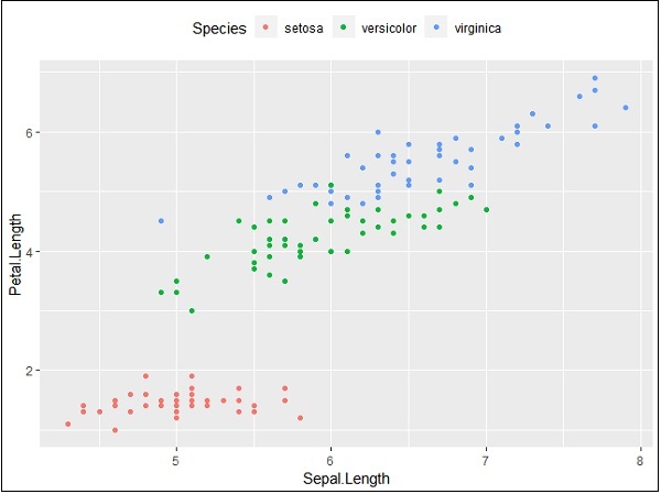
> # Load ggplot
> library(ggplot2)
>
> # Read in dataset
> data(iris)
>
> # Plot
> p <- ggplot(iris, aes(Sepal.Length, Petal.Length, colour=Species)) + geom_point()
> p
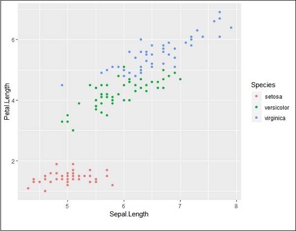
If you observe the plot, the legends are created on left most corners as mentioned below −
Here, the legend includes various types of species of the given dataset.
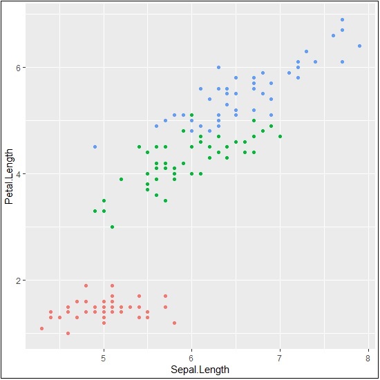
Changing attributes for legends
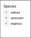
We can remove the legend with the help of property legend.position and we get the appropriate output −
> # Remove Legend
> p + theme(legend.position="none")
We can also hide the title of legend with property element_blank() as given below −
> # Hide the legend title
> p + theme(legend.title=element_blank())
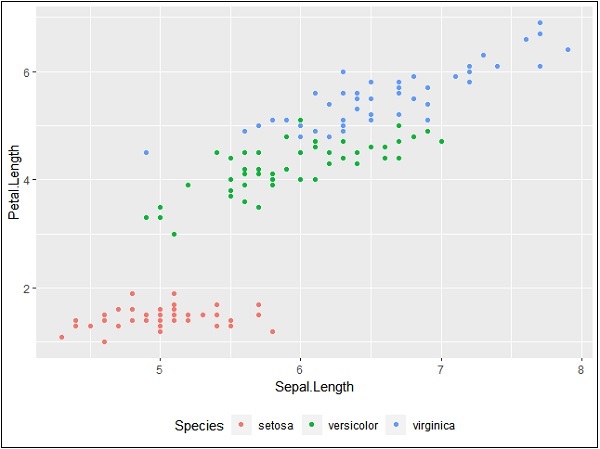
We can also use the legend position as and when needed. This property is used for generating the accurate plot representation.
> #Change the legend position
> p + theme(legend.position="top")
>
> p + theme(legend.position="bottom")
Top representation
Bottom representation
Changing font style of legends
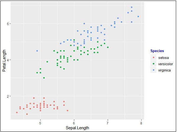
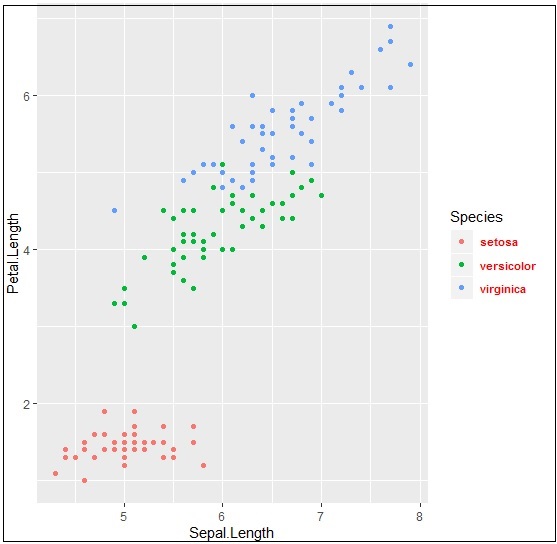
We can change the font style and font type of title and other attributes of legend as mentioned below −
> #Change the legend title and text font styles
> # legend title
> p + theme(legend.title = element_text(colour = "blue", size = 10, + face = "bold"))
> # legend labels
> p + theme(legend.text = element_text(colour = "red", size = 8, + face = "bold"))
The output generated is given below −
Upcoming chapters will focus on various types of plots with various background properties like color, themes and the importance of each one of them from data science point of view.
