- ggplot2 - Home
- ggplot2 - Introduction
- ggplot2 - Installation of R
- ggplot2 - Default Plot in R
- ggplot2 - Working with Axes
- ggplot2 - Working with Legends
- ggplot2 - Scatter Plots & Jitter Plots
- ggplot2 - Bar Plots & Histograms
- ggplot2 - Pie Charts
- ggplot2 - Marginal Plots
- ggplot2 - Bubble Plots & Count Charts
- ggplot2 - Diverging Charts
- ggplot2 - Themes
- ggplot2 - Multi Panel Plots
- ggplot2 - Multiple Plots
- ggplot2 - Background Colors
- ggplot2 - Time Series
- ggplot2 Useful Resources
- ggplot2 - Quick Guide
- ggplot2 - Useful Resources
- ggplot2 - Discussion
ggplot2 - Marginal Plots
In this chapter, we shall discuss about Marginal Plots.
Understanding Marginal Plots
Marginal plots are used to assess relationship between two variables and examine their distributions. When we speak about creating marginal plots, they are nothing but scatter plots that has histograms, box plots or dot plots in the margins of respective x and y axes.
Following steps will be used to create marginal plot with R using package ggExtra. This package is designed to enhance the features of ggplot2 package and includes various functions for creating successful marginal plots.
Step 1
Install ggExtra package using following command for successful execution (if the package is not installed in your system).
> install.packages("ggExtra")
Step 2
Include the required libraries in the workspace to create marginal plots.
> library(ggplot2)
> library(ggExtra)
Step 3
Reading the required dataset mpg which we have used in previous chapters.
> data(mpg)
> head(mpg)
# A tibble: 6 x 11
manufacturer   model  displ   year   cyl   trans      drv   cty   hwy  fl  class
<chr> <chr> <dbl> <int> <int> <chr> <chr> <int> <int> <chr> <chr>
1 audi         a4     1.8     1999   4     auto(l5)   f     18    29   p   compa~
2 audi         a4     1.8     1999   4     manual(m5) f     21    29   p   compa~
3 audi         a4     2       2008   4     manual(m6) f     20    31   p   compa~
4 audi         a4     2       2008   4     auto(av)   f     21    30   p   compa~
5 audi         a4     2.8     1999   6     auto(l5)   f     16    26   p   compa~
6 audi         a4     2.8     1999   6     manual(m5) f     18    26   p   compa~
>
Step 4
Now let us create a simple plot using ggplot2 which will help us understand the concept of marginal plots.
> #Plot
> g <- ggplot(mpg, aes(cty, hwy)) +
+    geom_count() +
+    geom_smooth(method="lm", se=F)
> g
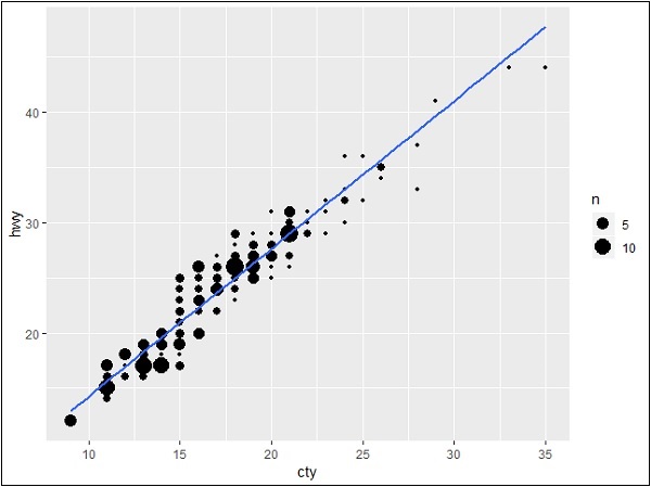
Relationship between Variables
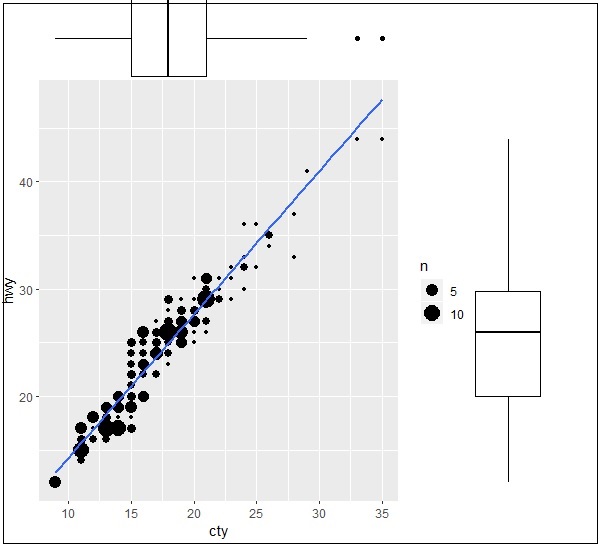
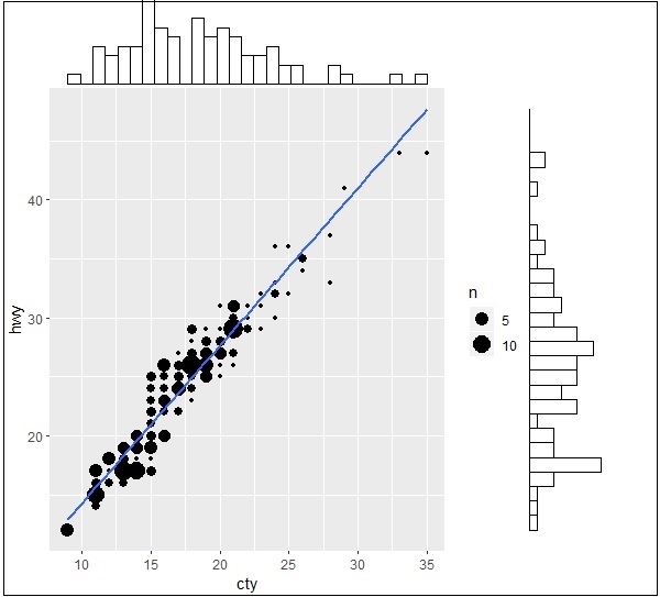
Now let us create the marginal plots using ggMarginal function which helps to generate relationship between two attributes hwy and cty.
> ggMarginal(g, type = "histogram", fill="transparent")
> ggMarginal(g, type = "boxplot", fill="transparent")
The output for histogram marginal plots is mentioned below −
The output for box marginal plots is mentioned below −