- ggplot2 - Home
- ggplot2 - Introduction
- ggplot2 - Installation of R
- ggplot2 - Default Plot in R
- ggplot2 - Working with Axes
- ggplot2 - Working with Legends
- ggplot2 - Scatter Plots & Jitter Plots
- ggplot2 - Bar Plots & Histograms
- ggplot2 - Pie Charts
- ggplot2 - Marginal Plots
- ggplot2 - Bubble Plots & Count Charts
- ggplot2 - Diverging Charts
- ggplot2 - Themes
- ggplot2 - Multi Panel Plots
- ggplot2 - Multiple Plots
- ggplot2 - Background Colors
- ggplot2 - Time Series
- ggplot2 Useful Resources
- ggplot2 - Quick Guide
- ggplot2 - Useful Resources
- ggplot2 - Discussion
ggplot2 - Bubble Plots & Count Charts
Bubble plots are nothing but bubble charts which is basically a scatter plot with a third numeric variable used for circle size. In this chapter, we will focus on creation of bar count plot and histogram count plots which is considered as replica of bubble plots.
Following steps are used to create bubble plots and count charts with mentioned package −
Understanding Dataset
Load the respective package and the required dataset to create the bubble plots and count charts.
> # Load ggplot
> library(ggplot2)
>
> # Read in dataset
> data(mpg)
> head(mpg)
# A tibble: 6 x 11
manufacturer  model  displ  year  cyl  trans      drv   cty  hwy  fl  class
<chr> <chr> <dbl> <int> <int> <chr> <chr> <int> <int> <chr> <chr>
1 audi        a4     1.8    1999  4    auto(l5)   f     18   29   p   compa~
2 audi        a4     1.8    1999  4    manual(m5) f     21   29   p   compa~
3 audi        a4     2      2008  4    manual(m6) f     20   31   p   compa~
4 audi        a4     2      2008  4    auto(av)   f     21   30   p   compa~
5 audi        a4     2.8    1999  6    auto(l5)   f     16   26   p   compa~
6 audi        a4     2.8    1999  6    manual(m5) f     18   26   p   compa~
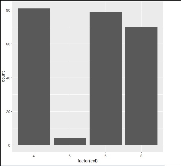
The bar count plot can be created using the following command −
> # A bar count plot
> p <- ggplot(mpg, aes(x=factor(cyl)))+
+ geom_bar(stat="count")
> p
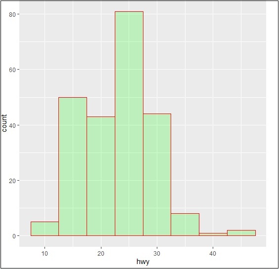
Analysis with Histograms
The histogram count plot can be created using the following command −
> # A historgram count plot
> ggplot(data=mpg, aes(x=hwy)) +
+    geom_histogram( col="red",
+       fill="green",
+       alpha = .2,
+       binwidth = 5)
Bubble Charts
Now let us create the most basic bubble plot with the required attributes of increasing the dimension of points mentioned in scattered plot.
ggplot(mpg, aes(x=cty, y=hwy, size = pop)) +geom_point(alpha=0.7)
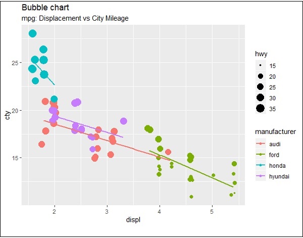
The plot describes the nature of manufacturers which is included in legend format. The values represented include various dimensions of hwy attribute.
