- ggplot2 - Home
- ggplot2 - Introduction
- ggplot2 - Installation of R
- ggplot2 - Default Plot in R
- ggplot2 - Working with Axes
- ggplot2 - Working with Legends
- ggplot2 - Scatter Plots & Jitter Plots
- ggplot2 - Bar Plots & Histograms
- ggplot2 - Pie Charts
- ggplot2 - Marginal Plots
- ggplot2 - Bubble Plots & Count Charts
- ggplot2 - Diverging Charts
- ggplot2 - Themes
- ggplot2 - Multi Panel Plots
- ggplot2 - Multiple Plots
- ggplot2 - Background Colors
- ggplot2 - Time Series
- ggplot2 Useful Resources
- ggplot2 - Quick Guide
- ggplot2 - Useful Resources
- ggplot2 - Discussion
ggplot2 - Time Series
A time series is a graphical plot which represents the series of data points in a specific time order. A time series is a sequence taken with a sequence at a successive equal spaced points of time. Time series can be considered as discrete-time data. The dataset which we will use in this chapter is economics dataset which includes all the details of US economic time series.
The dataframe includes following attributes which is mentioned below −
| Date | Month of data collection |
| Psavert | Personal savings rate |
| Pce | Personal consumption expenditure |
| Unemploy | Number of unemployed in thousands |
| Unempmed | Median duration of unemployment |
| Pop | Total population in thousands |
Load the required packages and set the default theme to create a time series.
> library(ggplot2)
> theme_set(theme_minimal())
> # Demo dataset
> head(economics)
# A tibble: 6 x 6
date           pce            pop          psavert       uempmed       unemploy
<date>         <dbl>         <dbl>         <dbl>         <dbl>         <dbl>
1 1967-07-01    507.          198712        12.6          4.5           2944
2 1967-08-01    510.          198911        12.6          4.7           2945
3 1967-09-01    516.          199113        11.9          4.6           2958
4 1967-10-01    512.          199311        12.9          4.9           3143
5 1967-11-01    517.          199498        12.8          4.7           3066
6 1967-12-01    525.          199657        11.8          4.8           3018
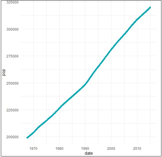
Create a basic line plots which creates a time series structure.
> # Basic line plot
> ggplot(data = economics, aes(x = date, y = pop))+
+ geom_line(color = "#00AFBB", size = 2)
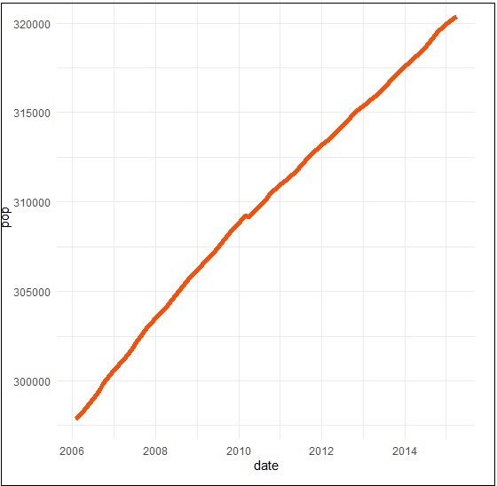
We can plot the subset of data using following command −
> # Plot a subset of the data
> ss <- subset(economics, date > as.Date("2006-1-1"))
> ggplot(data = ss, aes(x = date, y = pop)) +
+ geom_line(color = "#FC4E07", size = 2)
Creating Time Series
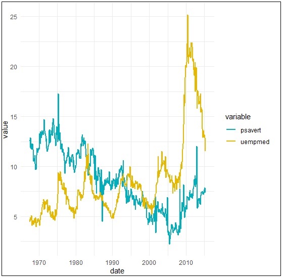
Here we will plot the variables psavert and uempmed by dates. Here we must reshape the data using the tidyr package. This can be achieved by collapsing psavert and uempmed values in the same column (new column). R function: gather()[tidyr]. The next step involves creating a grouping variable that with levels = psavert and uempmed.
> library(tidyr)
> library(dplyr)
Attaching package: dplyr
The following object is masked from package:ggplot2: vars
The following objects are masked from package:stats: filter, lag
The following objects are masked from package:base: intersect, setdiff, setequal, union
> df <- economics %>%
+    select(date, psavert, uempmed) %>%
+    gather(key = "variable", value = "value", -date)
> head(df, 3)
# A tibble: 3 x 3
date          variable     value
<date> <chr>   <dbl>
1 1967-07-01   psavert       12.6
2 1967-08-01   psavert       12.6
3 1967-09-01   psavert       11.9
Create a multiple line plots using following command to have a look on the relationship between psavert and unempmed −
> ggplot(df, aes(x = date, y = value)) +
+    geom_line(aes(color = variable), size = 1) +
+    scale_color_manual(values = c("#00AFBB", "#E7B800")) +
+    theme_minimal()