- ggplot2 - Home
- ggplot2 - Introduction
- ggplot2 - Installation of R
- ggplot2 - Default Plot in R
- ggplot2 - Working with Axes
- ggplot2 - Working with Legends
- ggplot2 - Scatter Plots & Jitter Plots
- ggplot2 - Bar Plots & Histograms
- ggplot2 - Pie Charts
- ggplot2 - Marginal Plots
- ggplot2 - Bubble Plots & Count Charts
- ggplot2 - Diverging Charts
- ggplot2 - Themes
- ggplot2 - Multi Panel Plots
- ggplot2 - Multiple Plots
- ggplot2 - Background Colors
- ggplot2 - Time Series
- ggplot2 Useful Resources
- ggplot2 - Quick Guide
- ggplot2 - Useful Resources
- ggplot2 - Discussion
ggplot2 - Quick Guide
ggplot2 - Introduction
ggplot2 is an R package which is designed especially for data visualization and providing best exploratory data analysis. It provides beautiful, hassle-free plots that take care of minute details like drawing legends and representing them. The plots can be created iteratively and edited later. This package is designed to work in a layered fashion, starting with a layer showing the raw data collected during exploratory data analysis with R then adding layers of annotations and statistical summaries.
Even the most experienced R users need help for creating elegant graphics. This library is a phenomenal tool for creating graphics in R but even after many years of near-daily use we still need to refer to our Cheat Sheet.
This package works under deep grammar called as Grammar of graphics which is made up of a set of independent components that can be created in many ways. Grammar of graphics is the only sole reason which makes ggplot2 very powerful because the R developer is not limited to set of pre-specified graphics which is used in other packages. The grammar includes simple set of core rules and principles.
In the year 2005, Wilkinson created or rather originated the concept of grammar of graphics to describe the deep features which is included between all statistical graphics. It focuses on the primary of layers which includes adapting features embedded with R.
Relationship between Grammar of Graphics and R
It tells the user or developer that a statistical graphic is used for mapping the data to aesthetic attributes such as color, shape, size of the concerned geometric objects like points, lines and bars. The plot may also contain various statistical transformations of the concerned data which is drawn on the mentioned coordinate system. It also includes a feature called as Faceting which is generally used to create the same plot for different subsets of the mentioned dataset. R includes various in-built datasets. The combination of these independent components totally comprises a particular graphic.
Now let us focus on different types of plots which can be created with reference to the grammar −
Data
If user wants to visualize the given set of aesthetic mappings which describes how the required variables in the data are mapped together for creation of mapped aesthetic attributes.
Layers
It is made up of geometric elements and the required statistical transformation. Layers include geometric objects, geoms for short data which actually represent the plot with the help of points, lines, polygons and many more. The best demonstration is binning and counting the observations to create the specific histogram for summarizing the 2D relationship of a specific linear model.
Scales
Scales are used to map values in the data space which is used for creation of values whether it is color, size and shape. It helps to draw a legend or axes which is needed to provide an inverse mapping making it possible to read the original data values from the mentioned plot.
Coordinate System
It describes how the data coordinates are mapped together to the mentioned plane of the graphic. It also provides information of the axes and gridlines which is needed to read the graph. Normally it is used as a Cartesian coordinate system which includes polar coordinates and map projections.
Faceting
It includes specification on how to break up the data into required subsets and displaying the subsets as multiples of data. This is also called as conditioning or latticing process.
Theme
It controls the finer points of display like the font size and background color properties. To create an attractive plot, it is always better to consider the references.
Now, it is also equally important to discuss the limitations or features which grammar doesnt provide −
It lacks the suggestion of which graphics should be used or a user is interested to do.
It does not describe the interactivity as it includes only description of static graphics. For creation of dynamic graphics other alternative solution should be applied.
The simple graph created with ggplot2 is mentioned below −
ggplot2 - Installation of R
R packages come with various capabilities like analyzing statistical information or getting in depth research of geospatial data or simple we can create basic reports.
Packages of R can be defined as R functions, data and compiled code in a well-defined format. The folder or directory where the packages are stored is called the library.
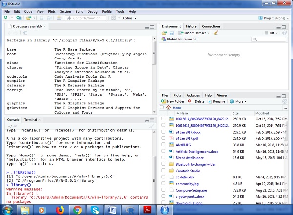
As visible in the above figure, libPaths() is the function which displays you the library which is located, and the function library shows the packages which are saved in the library.
R includes number of functions which manipulates the packages. We will focus on three major functions which is primarily used, they are −
- Installing Package
- Loading a Package
- Learning about Package
The syntax with function for installing a package in R is −
Install.packages(<package-name>)
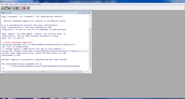
The simple demonstration of installing a package is visible below. Consider we need to install package ggplot2 which is data visualization library, the following syntax is used −
Install.packages(ggplot2)
To load the particular package, we need to follow the below mentioned syntax −
Library(<package-name>)
The same applies for ggplot2 as mentioned below −
library(ggplot2)
The output is depicted in snapshot below −
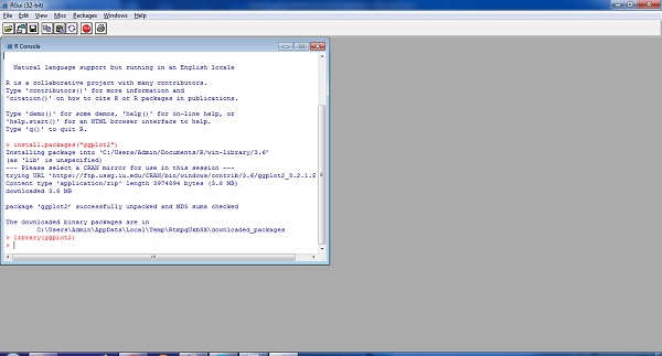
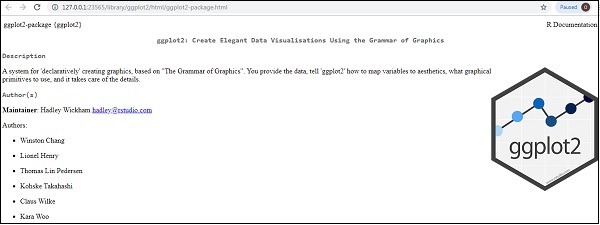
To understand the need of required package and basic functionality, R provides help function which gives the complete detail of package which is installed.
The complete syntax is mentioned below −
help(ggplot2)
ggplot2 - Default Plot in R
In this chapter, we will focus on creating a simple plot with the help of ggplot2. We will use following steps to create the default plot in R.
Inclusion of library and dataset in workspace
Include the library in R. Loading the package which is needed. Now we will focus on ggplot2 package.
# Load ggplot2
library(ggplot2)
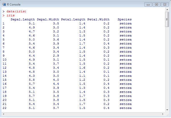
We will implement dataset namely Iris. The dataset contains 3 classes of 50 instances each, where each class refers to a type of iris plant. One class is linearly separable from the other two; the latter are NOT linearly separable from each other.
# Read in dataset
data(iris)
The list of attributes which is included in the dataset is given below −
Using attributes for sample plot
Plotting the iris dataset plot with ggplot2 in simpler manner involves the following syntax −
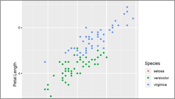
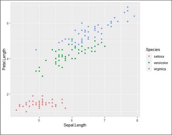
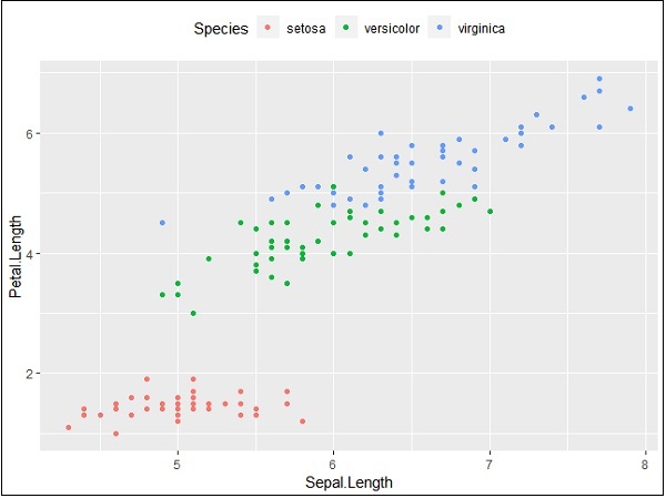
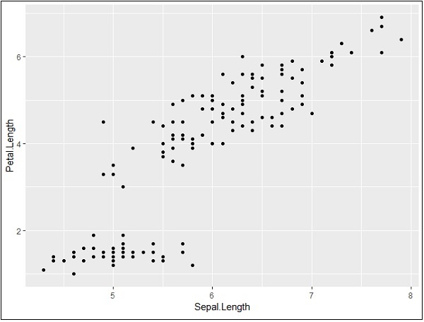
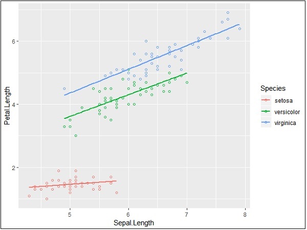
# Plot
IrisPlot <- ggplot(iris, aes(Sepal.Length, Petal.Length, colour=Species))
   + geom_point()
print(IrisPlot)
The first parameter takes the dataset as input, second parameter mentions the legend and attributes which need to be plotted in the database. In this example, we are using legend Species. Geom_point() implies scattered plot which will be discussed in later chapter in detail.
The output generated is mentioned below −
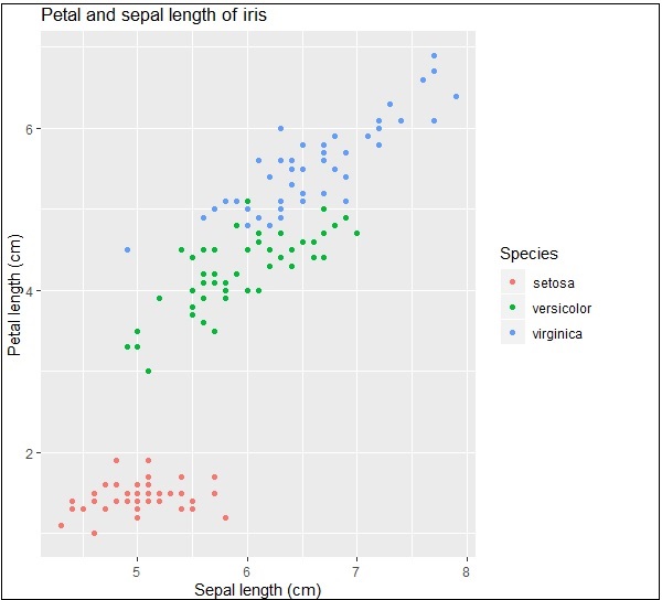
Here we can modify the title, x label and y label which means x axis and y axis labels in systematic format as given below −
print(IrisPlot + labs(y="Petal length (cm)", x = "Sepal length (cm)")
   + ggtitle("Petal and sepal length of iris"))
ggplot2 - Working with Axes
When we speak about axes in graphs, it is all about x and y axis which is represented in two dimensional manner. In this chapter, we will focus about two datasets Plantgrowth and Iris dataset which is commonly used by data scientists.
Implementing axes in Iris dataset
We will use the following steps to work on x and y axes using ggplot2 package of R.
It is always important to load the library to get the functionalities of package.
# Load ggplot
library(ggplot2)

# Read in dataset
data(iris)
Creating the plot points
Like discussed in the previous chapter, we will create a plot with points in it. In other words, it is defined as scattered plot.
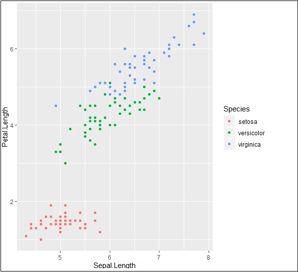
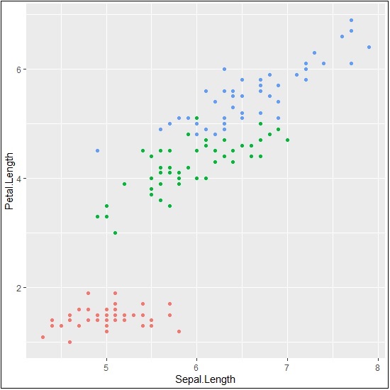
# Plot
p <- ggplot(iris, aes(Sepal.Length, Petal.Length, colour=Species)) + geom_point()
p
Now let us understand the functionality of aes which mentions the mapping structure of ggplot2. Aesthetic mappings describe the variable structure which is needed for plotting and the data which should be managed in individual layer format.
The output is given below −
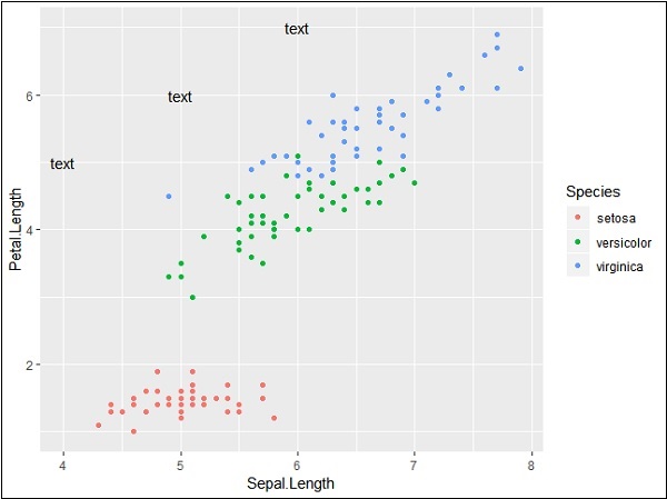
Highlight and tick marks
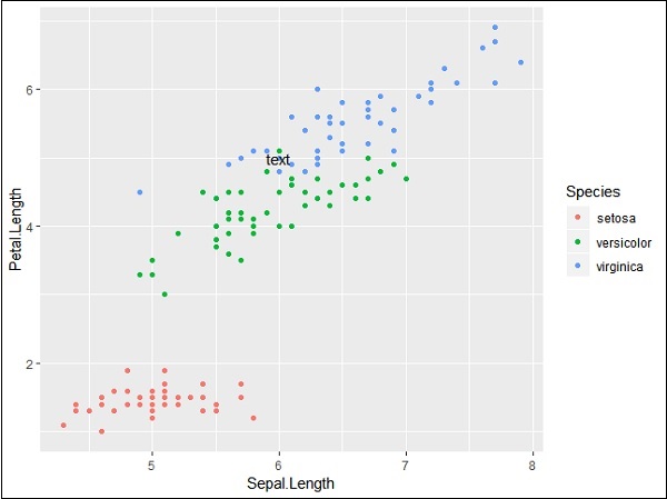
Plot the markers with mentioned co-ordinates of x and y axes as mentioned below. It includes adding text, repeating text, highlighting particular area and adding segment as follows −
# add text
p + annotate("text", x = 6, y = 5, label = "text")
# add repeat
p + annotate("text", x = 4:6, y = 5:7, label = "text")
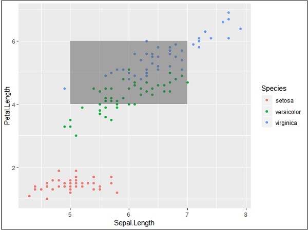
# highlight an area
p + annotate("rect", xmin = 5, xmax = 7, ymin = 4, ymax = 6, alpha = .5)
# segment
p + annotate("segment", x = 5, xend = 7, y = 4, yend = 5, colour = "black")
The output generated for adding text is given below −
Repeating particular text with mentioned co-ordinates generates the following output. The text is generated with x co-ordinates from 4 to 6 and y co-ordinates from 5 to 7 −
The segmentation and highlighting of particular area output is given below −
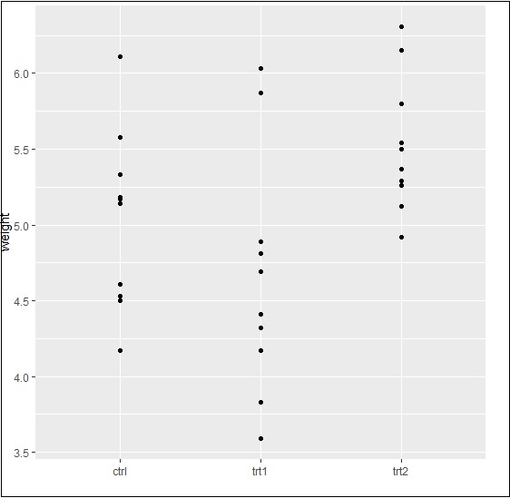
PlantGrowth Dataset
Now let us focus on working with other dataset called Plantgrowth and the step which is needed is given below.
Call for the library and check out the attributes of Plantgrowth. This dataset includes results from an experiment to compare yields (as measured by dried weight of plants) obtained under a control and two different treatment conditions.
> PlantGrowth
  weight group
1 4.17 ctrl
2 5.58 ctrl
3 5.18 ctrl
4 6.11 ctrl
5 4.50 ctrl
6 4.61 ctrl
7 5.17 ctrl
8 4.53 ctrl
9 5.33 ctrl
10 5.14 ctrl
11 4.81 trt1
12 4.17 trt1
13 4.41 trt1
14 3.59 trt1
15 5.87 trt1
16 3.83 trt1
17 6.03 trt1
Adding attributes with axes
Try plotting a simple plot with required x and y axis of the graph as mentioned below −
> bp <- ggplot(PlantGrowth, aes(x=group, y=weight)) +
+    geom_point()
> bp
The output generated is given below −
Finally, we can swipe x and y axes as per our requirement with basic function as mentioned below −
> bp <- ggplot(PlantGrowth, aes(x=group, y=weight)) +
+    geom_point()
> bp
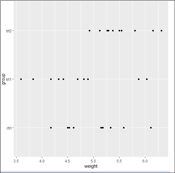
Basically, we can use many properties with aesthetic mappings to get working with axes using ggplot2.
ggplot2 - Working with Legends
Axes and legends are collectively called as guides. They allow us to read observations from the plot and map them back with respect to original values. The legend keys and tick labels are both determined by the scale breaks. Legends and axes are produced automatically based on the respective scales and geoms which are needed for plot.
Following steps will be implemented to understand the working of legends in ggplot2 −
Inclusion of package and dataset in workspace
Let us create the same plot for focusing on the legend of the graph generated with ggplot2 −
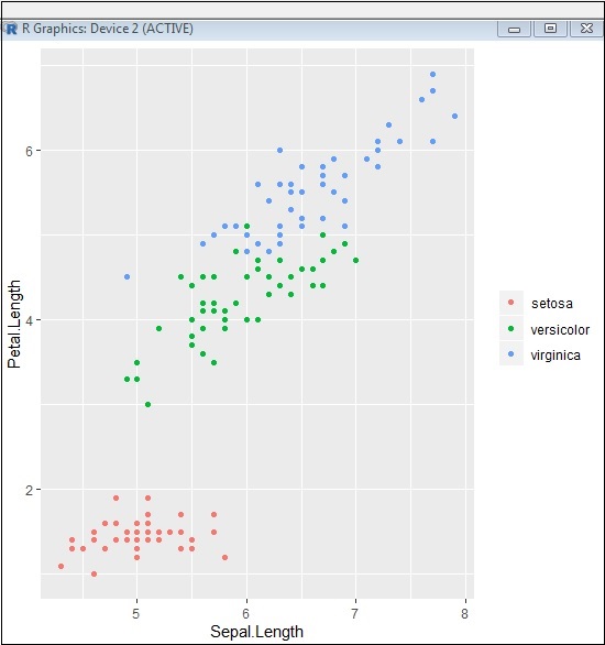
> # Load ggplot
> library(ggplot2)
>
> # Read in dataset
> data(iris)
>
> # Plot
> p <- ggplot(iris, aes(Sepal.Length, Petal.Length, colour=Species)) + geom_point()
> p
If you observe the plot, the legends are created on left most corners as mentioned below −
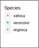
Here, the legend includes various types of species of the given dataset.
Changing attributes for legends
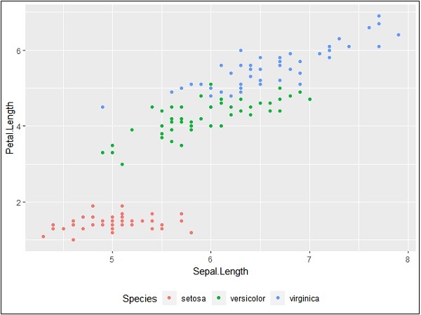
We can remove the legend with the help of property legend.position and we get the appropriate output −
> # Remove Legend
> p + theme(legend.position="none")
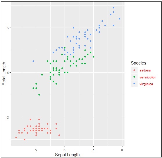
We can also hide the title of legend with property element_blank() as given below −
> # Hide the legend title
> p + theme(legend.title=element_blank())
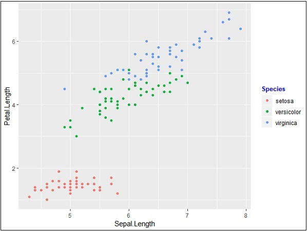
We can also use the legend position as and when needed. This property is used for generating the accurate plot representation.
> #Change the legend position
> p + theme(legend.position="top")
>
> p + theme(legend.position="bottom")
Top representation
Bottom representation
Changing font style of legends
We can change the font style and font type of title and other attributes of legend as mentioned below −
> #Change the legend title and text font styles
> # legend title
> p + theme(legend.title = element_text(colour = "blue", size = 10, + face = "bold"))
> # legend labels
> p + theme(legend.text = element_text(colour = "red", size = 8, + face = "bold"))
The output generated is given below −
Upcoming chapters will focus on various types of plots with various background properties like color, themes and the importance of each one of them from data science point of view.
ggplot2 - Scatter Plots & Jitter Plots
Scatter Plots are similar to line graphs which are usually used for plotting. The scatter plots show how much one variable is related to another. The relationship between variables is called as correlation which is usually used in statistical methods. We will use the same dataset called Iris which includes a lot of variation between each variable. This is famous dataset which gives measurements in centimeters of the variables sepal length and width with petal length and width for 50 flowers from each of 3 species of iris. The species are called Iris setosa, versicolor and virginica.
Creating Basic Scatter Plot
Following steps are involved for creating scatter plots with ggplot2 package −
For creating a basic scatter plot following command is executed −
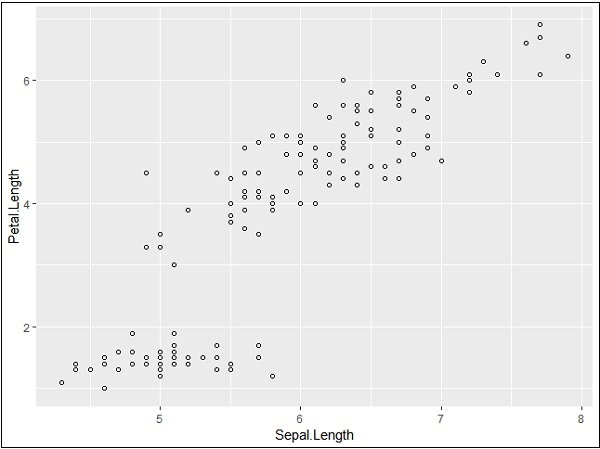
> # Basic Scatter Plot
> ggplot(iris, aes(Sepal.Length, Petal.Length)) +
+    geom_point()
Adding attributes
We can change the shape of points with a property called shape in geom_point() function.
> # Change the shape of points
> ggplot(iris, aes(Sepal.Length, Petal.Length)) +
+    geom_point(shape=1)
We can add color to the points which is added in the required scatter plots.
> ggplot(iris, aes(Sepal.Length, Petal.Length, colour=Species)) +
+    geom_point(shape=1)
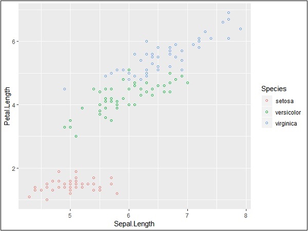
In this example, we have created colors as per species which are mentioned in legends. The three species are uniquely distinguished in the mentioned plot.
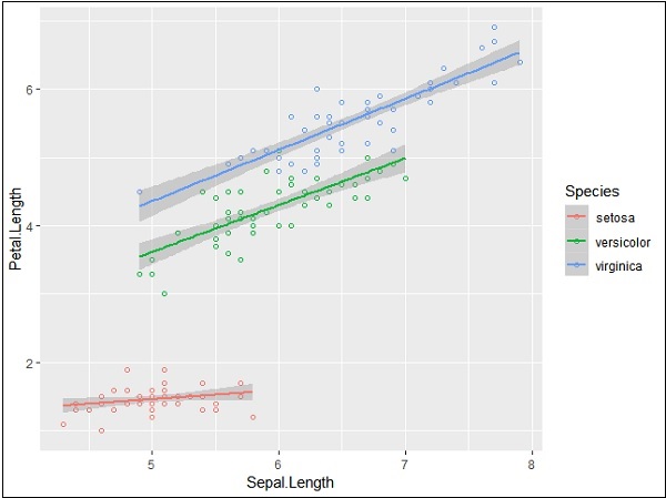
Now we will focus on establishing relationship between the variables.
> ggplot(iris, aes(Sepal.Length, Petal.Length, colour=Species)) +
+    geom_point(shape=1) +
+    geom_smooth(method=lm)
geom_smooth function aids the pattern of overlapping and creating the pattern of required variables.
The attribute method lm mentions the regression line which needs to be developed.
> # Add a regression line
> ggplot(iris, aes(Sepal.Length, Petal.Length, colour=Species)) +
+    geom_point(shape=1) +
+    geom_smooth(method=lm)
We can also add a regression line with no shaded confidence region with below mentioned syntax −
># Add a regression line but no shaded confidence region
> ggplot(iris, aes(Sepal.Length, Petal.Length, colour=Species)) +
+    geom_point(shape=1) +
+    geom_smooth(method=lm, se=FALSE)
Shaded regions represent things other than confidence regions.
Jitter Plots
Jitter plots include special effects with which scattered plots can be depicted. Jitter is nothing but a random value that is assigned to dots to separate them as mentioned below −
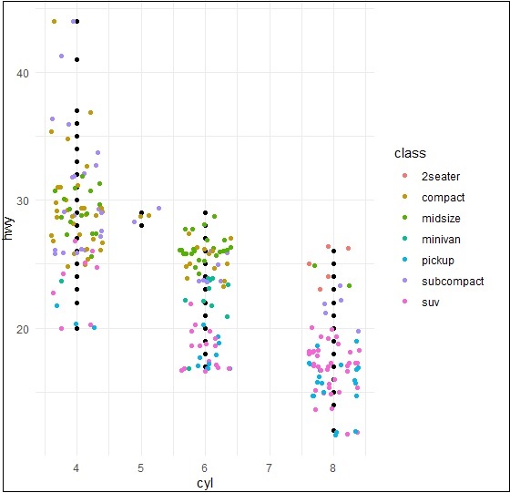
> ggplot(mpg, aes(cyl, hwy)) +
+    geom_point() +
+    geom_jitter(aes(colour = class))
ggplot2 - Bar Plots & Histograms
Bar plots represent the categorical data in rectangular manner. The bars can be plotted vertically and horizontally. The heights or lengths are proportional to the values represented in graphs. The x and y axes of bar plots specify the category which is included in specific data set.
Histogram is a bar graph which represents the raw data with clear picture of distribution of mentioned data set.
In this chapter, we will focus on creation of bar plots and histograms with the help of ggplot2.
Understanding MPG Dataset
Let us understand the dataset which will be used. Mpg dataset contains a subset of the fuel economy data that the EPA makes available in the below link −
It consists of models which had a new release every year between 1999 and 2008. This was used as a proxy for the popularity of the car.
Following command is executed to understand the list of attributes which is needed for dataset.
> library(ggplot2)
The attaching package is ggplot2.
The following object is masked _by_ .GlobalEnv −
mpg
Warning messages
- package arules was built under R version 3.5.1
- package tuneR was built under R version 3.5.3
- package ggplot2 was built under R version 3.5.3
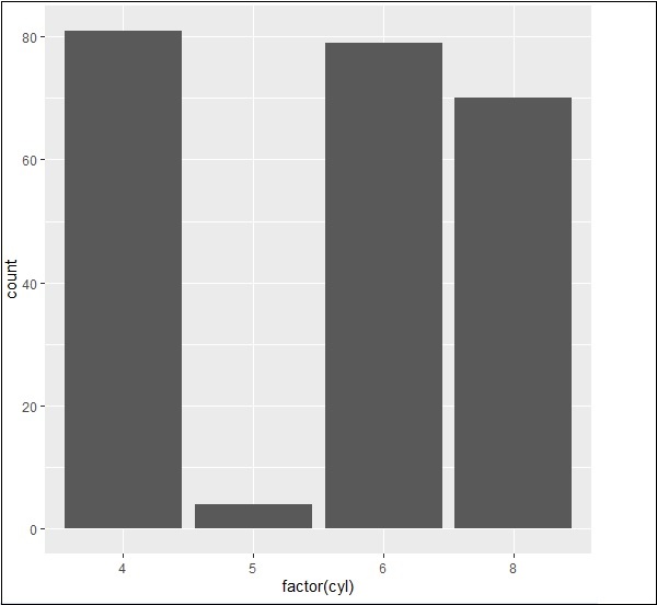
Creating Bar Count Plot
The Bar Count plot can be created with below mentioned plot −
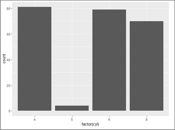
> # A bar count plot
> p <- ggplot(mpg, aes(x=factor(cyl)))+
+    geom_bar(stat="count")
> p
geom_bar() is the function which is used for creating bar plots. It takes the attribute of statistical value called count.
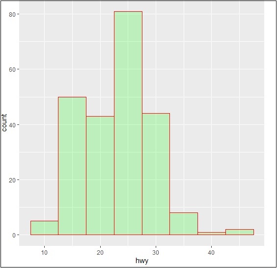
Histogram
The histogram count plot can be created with below mentioned plot −
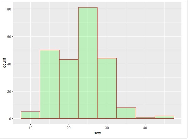
> # A historgram count plot
> ggplot(data=mpg, aes(x=hwy)) +
+    geom_histogram( col="red",
+       fill="green",
+       alpha = .2,
+       binwidth = 5)
geom_histogram() includes all the necessary attributes for creating a histogram. Here, it takes the attribute of hwy with respective count. The color is taken as per the requirements.
Stacked Bar Chart
The general plots of bar graphs and histogram can be created as below −
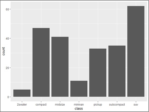
> p <- ggplot(mpg, aes(class))
> p + geom_bar()
> p + geom_bar()
This plot includes all the categories defined in bar graphs with respective class. This plot is called stacked graph.
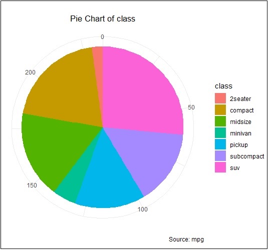
ggplot2 - Pie Charts
A pie chart is considered as a circular statistical graph, which is divided into slices to illustrate numerical proportion. In the mentioned pie chart, the arc length of each slice is proportional to the quantity it represents. The arc length represents the angle of pie chart. The total degrees of pie chart are 360 degrees. The semicircle or semi pie chart comprises of 180 degrees.
Creating Pie Charts
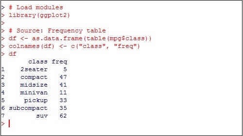
Load the package in the mentioned workspace as shown below −
> # Load modules
> library(ggplot2)
>
> # Source: Frequency table
> df <- as.data.frame(table(mpg$class))
> colnames(df) <- c("class", "freq")
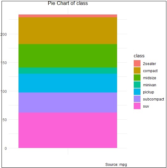
The sample chart can be created using the following command −
> pie <- ggplot(df, aes(x = "", y=freq, fill = factor(class))) +
+ geom_bar(width = 1, stat = "identity") +
+ theme(axis.line = element_blank(),
+    plot.title = element_text(hjust=0.5)) +
+    labs(fill="class",
+       x=NULL,
+       y=NULL,
+       title="Pie Chart of class",
+       caption="Source: mpg")
> pie
If you observe the output, the diagram is not created in circular manner as mentioned below −
Creating co-ordinates
Let us execute the following command to create required pie chart as follows −
> pie + coord_polar(theta = "y", start=0)
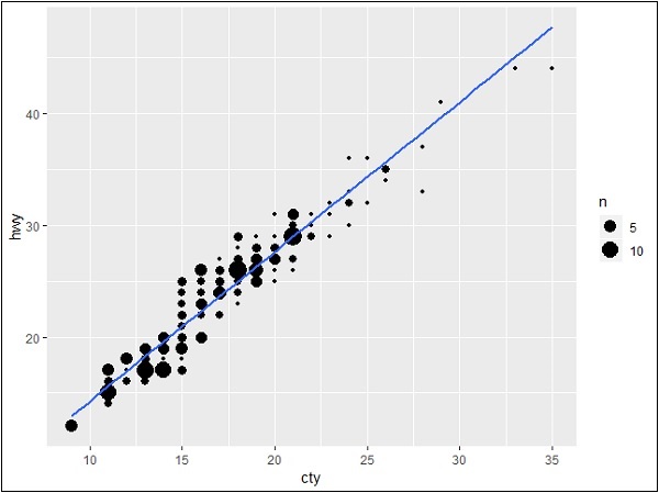
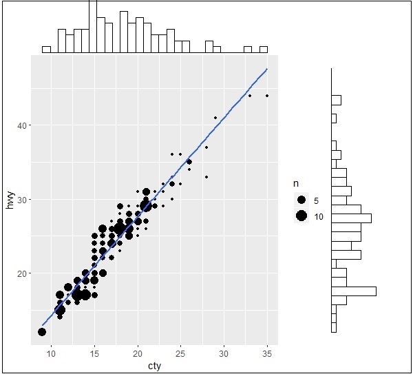
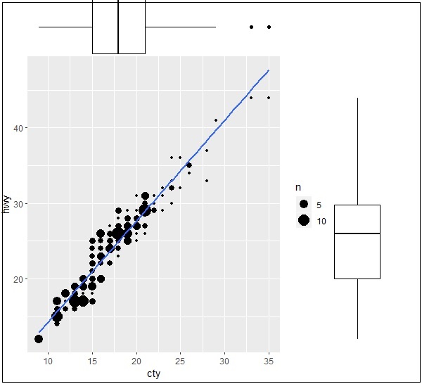
ggplot2 - Marginal Plots
In this chapter, we shall discuss about Marginal Plots.
Understanding Marginal Plots
Marginal plots are used to assess relationship between two variables and examine their distributions. When we speak about creating marginal plots, they are nothing but scatter plots that has histograms, box plots or dot plots in the margins of respective x and y axes.
Following steps will be used to create marginal plot with R using package ggExtra. This package is designed to enhance the features of ggplot2 package and includes various functions for creating successful marginal plots.
Step 1
Install ggExtra package using following command for successful execution (if the package is not installed in your system).
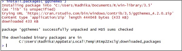
> install.packages("ggExtra")
Step 2
Include the required libraries in the workspace to create marginal plots.
> library(ggplot2)
> library(ggExtra)
Step 3
Reading the required dataset mpg which we have used in previous chapters.
> data(mpg)
> head(mpg)
# A tibble: 6 x 11
manufacturer   model  displ   year   cyl   trans      drv   cty   hwy  fl  class
<chr> <chr> <dbl> <int> <int> <chr> <chr> <int> <int> <chr> <chr>
1 audi         a4     1.8     1999   4     auto(l5)   f     18    29   p   compa~
2 audi         a4     1.8     1999   4     manual(m5) f     21    29   p   compa~
3 audi         a4     2       2008   4     manual(m6) f     20    31   p   compa~
4 audi         a4     2       2008   4     auto(av)   f     21    30   p   compa~
5 audi         a4     2.8     1999   6     auto(l5)   f     16    26   p   compa~
6 audi         a4     2.8     1999   6     manual(m5) f     18    26   p   compa~
>
Step 4
Now let us create a simple plot using ggplot2 which will help us understand the concept of marginal plots.
> #Plot
> g <- ggplot(mpg, aes(cty, hwy)) +
+    geom_count() +
+    geom_smooth(method="lm", se=F)
> g
Relationship between Variables
Now let us create the marginal plots using ggMarginal function which helps to generate relationship between two attributes hwy and cty.
> ggMarginal(g, type = "histogram", fill="transparent")
> ggMarginal(g, type = "boxplot", fill="transparent")
The output for histogram marginal plots is mentioned below −
The output for box marginal plots is mentioned below −
ggplot2 - Bubble Plots & Count Charts
Bubble plots are nothing but bubble charts which is basically a scatter plot with a third numeric variable used for circle size. In this chapter, we will focus on creation of bar count plot and histogram count plots which is considered as replica of bubble plots.
Following steps are used to create bubble plots and count charts with mentioned package −
Understanding Dataset
Load the respective package and the required dataset to create the bubble plots and count charts.
> # Load ggplot
> library(ggplot2)
>
> # Read in dataset
> data(mpg)
> head(mpg)
# A tibble: 6 x 11
manufacturer  model  displ  year  cyl  trans      drv   cty  hwy  fl  class
<chr> <chr> <dbl> <int> <int> <chr> <chr> <int> <int> <chr> <chr>
1 audi        a4     1.8    1999  4    auto(l5)   f     18   29   p   compa~
2 audi        a4     1.8    1999  4    manual(m5) f     21   29   p   compa~
3 audi        a4     2      2008  4    manual(m6) f     20   31   p   compa~
4 audi        a4     2      2008  4    auto(av)   f     21   30   p   compa~
5 audi        a4     2.8    1999  6    auto(l5)   f     16   26   p   compa~
6 audi        a4     2.8    1999  6    manual(m5) f     18   26   p   compa~
The bar count plot can be created using the following command −
> # A bar count plot
> p <- ggplot(mpg, aes(x=factor(cyl)))+
+ geom_bar(stat="count")
> p
Analysis with Histograms
The histogram count plot can be created using the following command −
> # A historgram count plot
> ggplot(data=mpg, aes(x=hwy)) +
+    geom_histogram( col="red",
+       fill="green",
+       alpha = .2,
+       binwidth = 5)
Bubble Charts
Now let us create the most basic bubble plot with the required attributes of increasing the dimension of points mentioned in scattered plot.
ggplot(mpg, aes(x=cty, y=hwy, size = pop)) +geom_point(alpha=0.7)
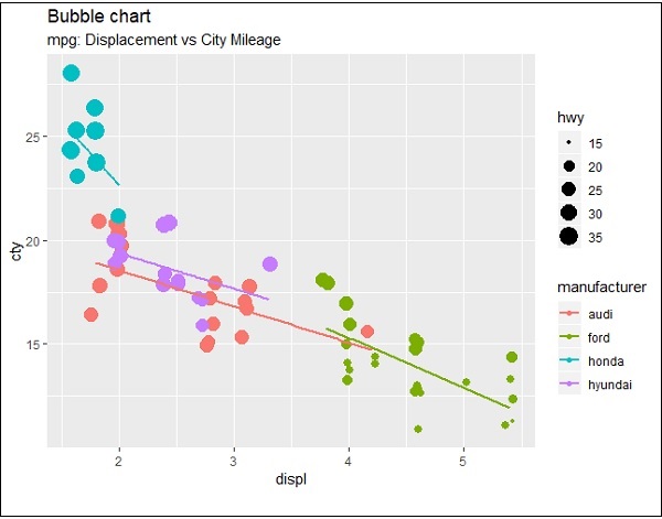
The plot describes the nature of manufacturers which is included in legend format. The values represented include various dimensions of hwy attribute.
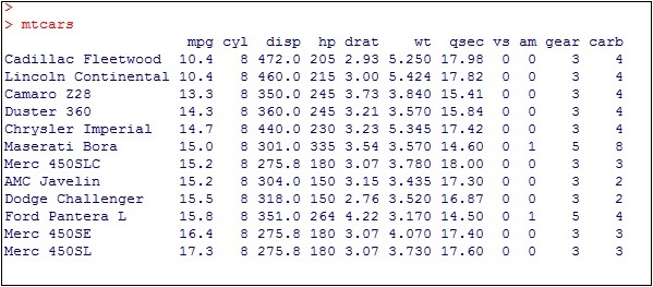
ggplot2 - Diverging Charts
In the previous chapters, we had a look on various types of charts which can be created using ggplot2 package. We will now focus on the variation of same like diverging bar charts, lollipop charts and many more. To begin with, we will start with creating diverging bar charts and the steps to be followed are mentioned below −
Understanding dataset
Load the required package and create a new column called car name within mpg dataset.
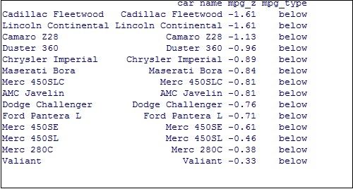
#Load ggplot
> library(ggplot2)
> # create new column for car names
> mtcars$`car name` <- rownames(mtcars)
> # compute normalized mpg
> mtcars$mpg_z <- round((mtcars$mpg - mean(mtcars$mpg))/sd(mtcars$mpg), 2)
> # above / below avg flag
> mtcars$mpg_type <- ifelse(mtcars$mpg_z < 0, "below", "above")
> # sort
> mtcars <- mtcars[order(mtcars$mpg_z), ]
The above computation involves creating a new column for car names, computing the normalized dataset with the help of round function. We can also use above and below avg flag to get the values of type functionality. Later, we sort the values to create the required dataset.
The output received is as follows −
Convert the values to factor to retain the sorted order in a particular plot as mentioned below −
> # convert to factor to retain sorted order in plot.
> mtcars$`car name` <- factor(mtcars$`car name`, levels = mtcars$`car name`)
The output obtained is mentioned below −
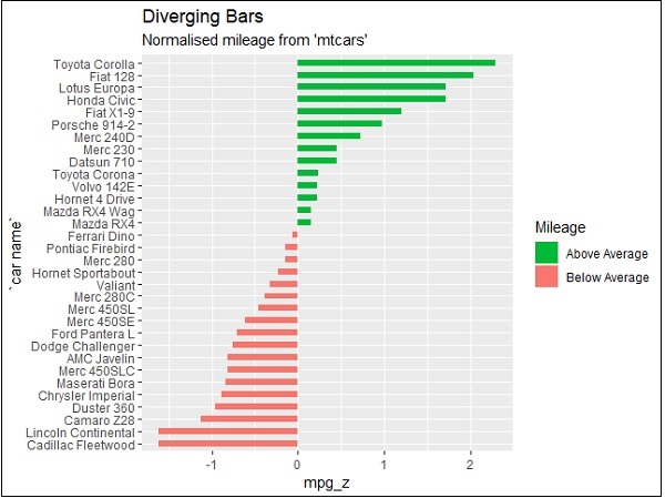
Diverging Bar Chart
Now create a diverging bar chart with the mentioned attributes which is taken as required co-ordinates.
> # Diverging Barcharts
> ggplot(mtcars, aes(x=`car name`, y=mpg_z, label=mpg_z)) +
+ geom_bar(stat='identity', aes(fill=mpg_type), width=.5) +
+ scale_fill_manual(name="Mileage",
+    labels = c("Above Average", "Below Average"),
+    values = c("above"="#00ba38", "below"="#f8766d")) +
+ labs(subtitle="Normalised mileage from 'mtcars'",
+    title= "Diverging Bars") +
+ coord_flip()
Note − A diverging bar chart marks for some dimension members pointing to up or down direction with respect to mentioned values.
The output of diverging bar chart is mentioned below where we use function geom_bar for creating a bar chart −
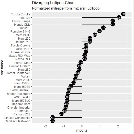
Diverging Lollipop Chart
Create a diverging lollipop chart with same attributes and co-ordinates with only change of function to be used, i.e. geom_segment() which helps in creating the lollipop charts.
> ggplot(mtcars, aes(x=`car name`, y=mpg_z, label=mpg_z)) +
+ geom_point(stat='identity', fill="black", size=6) +
+ geom_segment(aes(y = 0,
+    x = `car name`,
+    yend = mpg_z,
+    xend = `car name`),
+       color = "black") +
+ geom_text(color="white", size=2) +
+ labs(title="Diverging Lollipop Chart",
+    subtitle="Normalized mileage from 'mtcars': Lollipop") +
+ ylim(-2.5, 2.5) +
+ coord_flip()
Diverging Dot Plot
Create a diverging dot plot in similar manner where the dots represent the points in scattered plots in bigger dimension.
> ggplot(mtcars, aes(x=`car name`, y=mpg_z, label=mpg_z)) +
+  geom_point(stat='identity', aes(col=mpg_type), size=6) +
+  scale_color_manual(name="Mileage",
+     labels = c("Above Average", "Below Average"),
+     values = c("above"="#00ba38", "below"="#f8766d")) +
+ geom_text(color="white", size=2) +
+ labs(title="Diverging Dot Plot",
+     subtitle="Normalized mileage from 'mtcars': Dotplot") +
+ ylim(-2.5, 2.5) +
+ coord_flip()
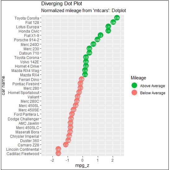
Here, the legends represent the values Above Average and Below Average with distinct colors of green and red. Dot plot convey static information. The principles are same as the one in Diverging bar chart, except that only point are used.
ggplot2 - Themes
In this chapter, we will focus on using customized theme which is used for changing the look and feel of workspace. We will use ggthemes package to understand the concept of theme management in workspace of R.
Let us implement following steps to use the required theme within mentioned dataset.
GGTHEMES
Install ggthemes package with the required package in R workspace.
> install.packages("ggthemes")
> Library(ggthemes)
Implement new theme to generate legends of manufacturers with year of production and displacement.
> library(ggthemes)
> ggplot(mpg, aes(year, displ, color=factor(manufacturer)))+
+ geom_point()+ggtitle("This plot looks a lot different from the default")+
+ theme_economist()+scale_colour_economist()
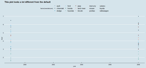
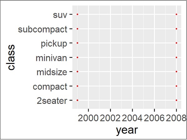
It can be observed that the default size of the tick text, legends and other elements are little small with previous theme management. It is incredibly easy to change the size of all the text elements at once. This can be done on creating a custom theme which we can observe in below step that the sizes of all the elements are relative (rel()) to the base_size.
> theme_set(theme_gray(base_size = 30))
> ggplot(mpg, aes(x=year, y=class))+geom_point(color="red")
ggplot2 - Multi Panel Plots
Multi panel plots mean plot creation of multiple graphs together in a single plot. We will use par() function to put multiple graphs in a single plot by passing graphical parameters mfrow and mfcol.
Here we will use AirQuality dataset to implement multi panel plots. Let us understand the dataset first to have a look on creation of multi panel plots. This dataset includes Contains the responses of a gas multi-sensor device deployed on the field in an Italian city. Hourly responses averages are recorded along with gas concentrations references from a certified analyzer.
Insight of par() function
Understand the par() function to create a dimension of required multi panel plots.
> par(mfrow=c(1,2))
> # set the plotting area into a 1*2 array
This creates a blank plot with dimension of 1*2.
Now create the bar plot and pie chart of the mentioned dataset using following command. This same phenomenon can be achieved with the graphical parameter mfcol.
Creating Multi Panel Plots
The only difference between the two is that, mfrow fills in the subplot region row wise while mfcol fills it column wise.
> Temperature <- airquality$Temp
> Ozone <- airquality$Ozone
> par(mfrow=c(2,2))
> hist(Temperature)
> boxplot(Temperature, horizontal=TRUE)
> hist(Ozone)
> boxplot(Ozone, horizontal=TRUE)
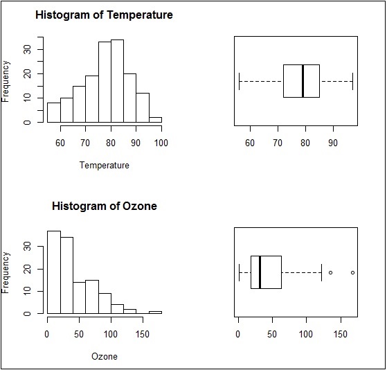
The boxplots and barplots are created in single window basically creating a multi panel plots.
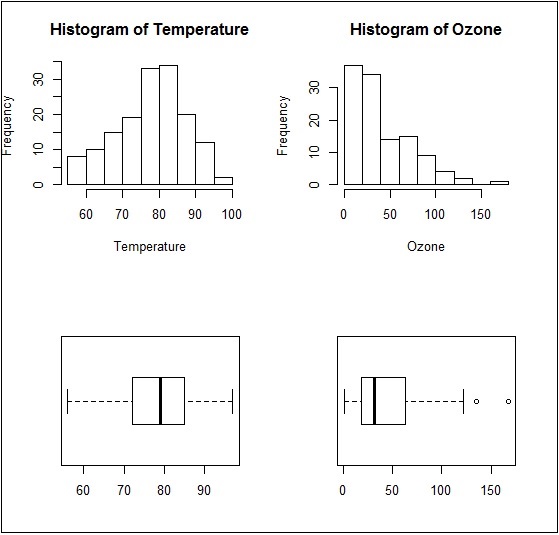
Same plot with a change of dimensions in par function would look as follows −
par(mfcol = c(2, 2))
ggplot2 - Multiple Plots
In this chapter, we will focus on creation of multiple plots which can be further used to create 3 dimensional plots. The list of plots which will be covered includes −
- Density Plot
- Box Plot
- Dot Plot
- Violin Plot
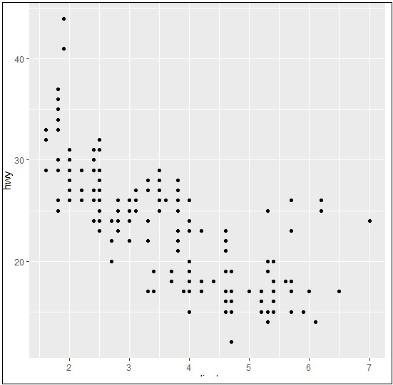
We will use mpg dataset as used in previous chapters. This dataset provides fuel economy data from 1999 and 2008 for 38 popular models of cars. The dataset is shipped with ggplot2 package. It is important to follow the below mentioned step to create different types of plots.
> # Load Modules
> library(ggplot2)
>
> # Dataset
> head(mpg)
# A tibble: 6 x 11
manufacturer  model   displ   year   cyl   trans       drv   cty   hwy  fl   class
<chr> <chr> <dbl> <int> <int> <chr> <chr> <int> <int> <chr> <chr>
1 audi        a4      1.8     1999   4     auto(l5)    f     18    29   p    compa~
2 audi        a4      1.8     1999   4     manual(m5)  f     21    29   p    compa~
3 audi        a4      2       2008   4     manual(m6)  f     20    31   p    compa~
4 audi        a4      2       2008   4     auto(av)    f     21    30   p    compa~
5 audi        a4      2.8     1999   6     auto(l5)    f     16    26   p    compa~
6 audi        a4      2.8     1999   6     manual(m5)  f     18    26   p    compa~
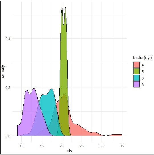
Density Plot
A density plot is a graphic representation of the distribution of any numeric variable in mentioned dataset. It uses a kernel density estimate to show the probability density function of the variable.
ggplot2 package includes a function called geom_density() to create a density plot.
We will execute the following command to create a density plot −
> p −- ggplot(mpg, aes(cty)) +
+  geom_density(aes(fill=factor(cyl)), alpha=0.8)
> p
We can observe various densities from the plot created below −
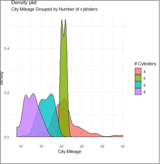
We can create the plot by renaming the x and y axes which maintains better clarity with inclusion of title and legends with different color combinations.
> p + labs(title="Density plot",
+    subtitle="City Mileage Grouped by Number of cylinders",
+    caption="Source: mpg",
+    x="City Mileage",
+    fill="# Cylinders")
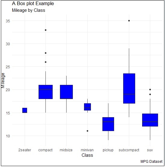
Box Plot
Box plot also called as box and whisker plot represents the five-number summary of data. The five number summaries include values like minimum, first quartile, median, third quartile and maximum. The vertical line which goes through the middle part of box plot is considered as median.
We can create box plot using the following command −
> p <- ggplot(mpg, aes(class, cty)) +
+  geom_boxplot(varwidth=T, fill="blue")
> p + labs(title="A Box plot Example",
+    subtitle="Mileage by Class",
+    caption="MPG Dataset",
+    x="Class",
+    y="Mileage")
>p
Here, we are creating box plot with respect to attributes of class and cty.
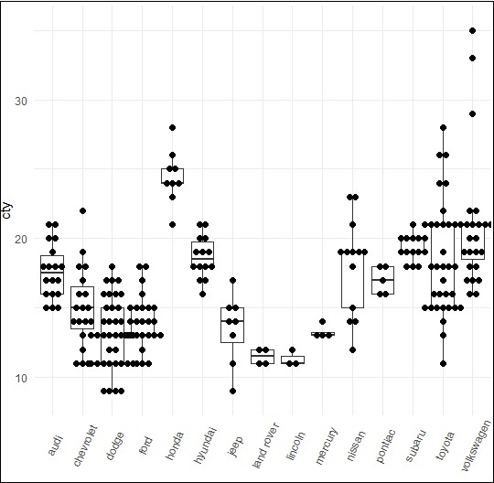
Dot Plot
Dot plots are similar to scattered plots with only difference of dimension. In this section, we will be adding dot plot to the existing box plot to have better picture and clarity.
The box plot can be created using the following command −
> p <- ggplot(mpg, aes(manufacturer, cty)) +
+    geom_boxplot() +
+    theme(axis.text.x = element_text(angle=65, vjust=0.6))
> p
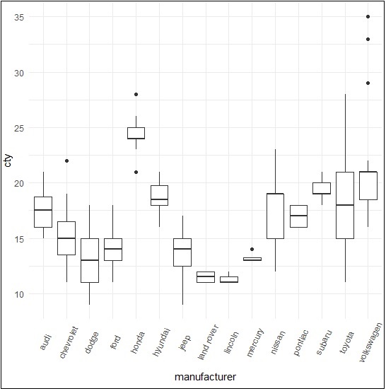
The dot plot is created as mentioned below −
> p + geom_dotplot(binaxis='y',
+    stackdir='center',
+    dotsize = .5
+    )
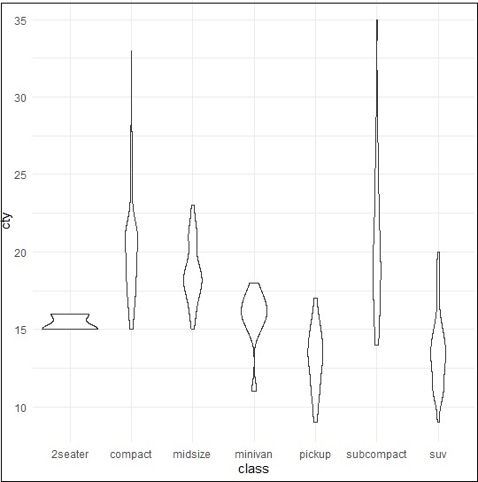
Violin Plot
Violin plot is also created in similar manner with only structure change of violins instead of box. The output is clearly mentioned below −
> p <- ggplot(mpg, aes(class, cty))
>
> p + geom_violin()
ggplot2 - Background Colors
There are ways to change the entire look of your plot with one function as mentioned below. But if you want to simply change the background color of the panel you can, use the following −
Implementing Panel background
We can change the background color using following command which helps in changing the panel (panel.background) −
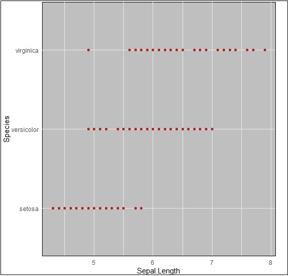
> ggplot(iris, aes(Sepal.Length, Species))+geom_point(color="firebrick")+
+ theme(panel.background = element_rect(fill = 'grey75'))
The change in color is clearly depicted in picture below −
Implementing Panel.grid.major
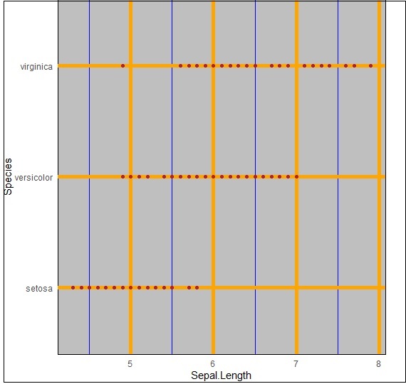
We can change the grid lines using property panel.grid.major as mentioned in command below −
> ggplot(iris, aes(Sepal.Length, Species))+geom_point(color="firebrick")+
+    theme(panel.background = element_rect(fill = 'grey75'),
+    panel.grid.major = element_line(colour = "orange", size=2),
+    panel.grid.minor = element_line(colour = "blue"))
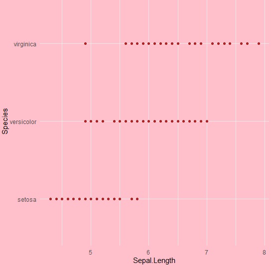
We can even change the plot background especially excluding the panel using plot.background property as mentioned below −
ggplot(iris, aes(Sepal.Length, Species))+geom_point(color="firebrick")+
+   theme(plot.background = element_rect(fill = 'pink'))
ggplot2 - Time Series
A time series is a graphical plot which represents the series of data points in a specific time order. A time series is a sequence taken with a sequence at a successive equal spaced points of time. Time series can be considered as discrete-time data. The dataset which we will use in this chapter is economics dataset which includes all the details of US economic time series.
The dataframe includes following attributes which is mentioned below −
| Date | Month of data collection |
| Psavert | Personal savings rate |
| Pce | Personal consumption expenditure |
| Unemploy | Number of unemployed in thousands |
| Unempmed | Median duration of unemployment |
| Pop | Total population in thousands |
Load the required packages and set the default theme to create a time series.
> library(ggplot2)
> theme_set(theme_minimal())
> # Demo dataset
> head(economics)
# A tibble: 6 x 6
date           pce            pop          psavert       uempmed       unemploy
<date>         <dbl>         <dbl>         <dbl>         <dbl>         <dbl>
1 1967-07-01    507.          198712        12.6          4.5           2944
2 1967-08-01    510.          198911        12.6          4.7           2945
3 1967-09-01    516.          199113        11.9          4.6           2958
4 1967-10-01    512.          199311        12.9          4.9           3143
5 1967-11-01    517.          199498        12.8          4.7           3066
6 1967-12-01    525.          199657        11.8          4.8           3018
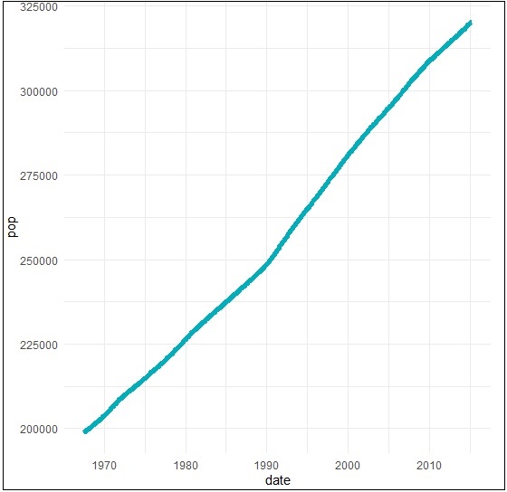
Create a basic line plots which creates a time series structure.
> # Basic line plot
> ggplot(data = economics, aes(x = date, y = pop))+
+ geom_line(color = "#00AFBB", size = 2)
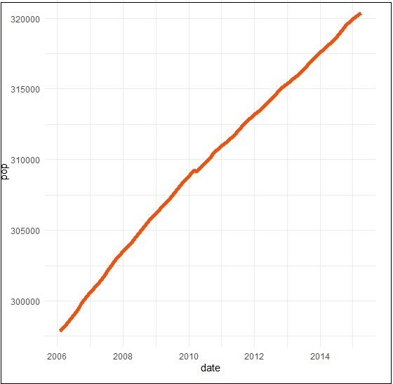
We can plot the subset of data using following command −
> # Plot a subset of the data
> ss <- subset(economics, date > as.Date("2006-1-1"))
> ggplot(data = ss, aes(x = date, y = pop)) +
+ geom_line(color = "#FC4E07", size = 2)
Creating Time Series
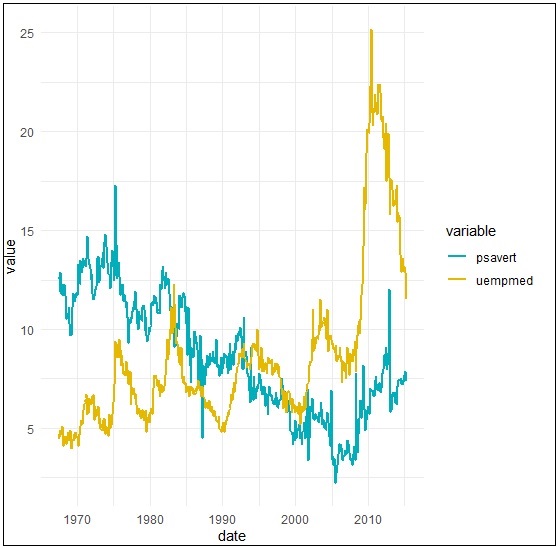
Here we will plot the variables psavert and uempmed by dates. Here we must reshape the data using the tidyr package. This can be achieved by collapsing psavert and uempmed values in the same column (new column). R function: gather()[tidyr]. The next step involves creating a grouping variable that with levels = psavert and uempmed.
> library(tidyr)
> library(dplyr)
Attaching package: dplyr
The following object is masked from package:ggplot2: vars
The following objects are masked from package:stats: filter, lag
The following objects are masked from package:base: intersect, setdiff, setequal, union
> df <- economics %>%
+    select(date, psavert, uempmed) %>%
+    gather(key = "variable", value = "value", -date)
> head(df, 3)
# A tibble: 3 x 3
date          variable     value
<date> <chr>   <dbl>
1 1967-07-01   psavert       12.6
2 1967-08-01   psavert       12.6
3 1967-09-01   psavert       11.9
Create a multiple line plots using following command to have a look on the relationship between psavert and unempmed −
> ggplot(df, aes(x = date, y = value)) +
+    geom_line(aes(color = variable), size = 1) +
+    scale_color_manual(values = c("#00AFBB", "#E7B800")) +
+    theme_minimal()