- Axure RP - Home
- Introduction to Prototyping
- Axure RP - Introduction
- Axure RP - User Interface
- Axure RP - Basic Interactions
- Using Masters & Dynamic Panels
- Axure RP - Condition Logic
- Axure RP - Advanced Interactions
- Axure RP - Widget Library
- Axure RP - Exporting Prototype
Axure RP - User Interface
Once you install Axure, you will be presented with an interface as shown in the following screenshot.
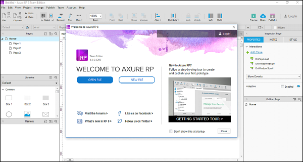
This screen will always be shown at the startup until you opt for not to show it.
On this screen, you have the following options −
- Start a New File in Axure
- Open an existing Axure project
Let us now create a new file with Axure.
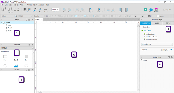
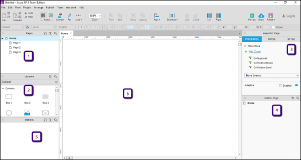
When you click the button NEW FILE, you will be presented with the following screen to create a new prototype.

As shown in the figure above, the workspace is divided into 6 parts.
- Pages
- Libraries
- Inspector
- Outline
- Masters
- Design Area
Let us walk through these parts one by one.
Pages
This section shows the pages you are working on. These pages are shown in a default tree structure as follows. Home page has the following child pages.
Home
Page 1
Page 2
Page 3
You can continue with the structure given or you can change it as per your needs. For doing so, right-click on any of the page, then you will be presented with the options such as Add, Move, Delete, Rename, Duplicate, etc.
Like most of the different tools available, this section allows you to interact with the pages in your prototype. You can use it to plan the screens in the intended prototype.
Libraries Pane
In the libraries pane, most of the controls required for the prototype are available. Typical controls available in this section are Box, Image, Placeholder, Buttons, etc. Axure RP provides a rich set of UI controls categorized according to their area of applications.
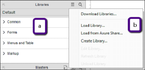
As shown in the figure above (a), the libraries have the categories as Common, Forms, Menus and Table, and Markup. All these categories are expanded when you open the application. For convenience, it is collapsed in this screenshot.
Common libraries include basic shapes, buttons, heading text, Hot Spot, Dynamic panel, etc.
With Axure RP, for all your prototyping requirements, there comes a very effective control called Hot Spot. Using this control, you can provide click interaction to almost any control in the UI. An example will be provided in the proceeding pages.
In the forms library, as the name suggests, List Box, Checkbox, radio button, text area, and text field controls are included. For designing a user input form, you may use controls from this section under the library.
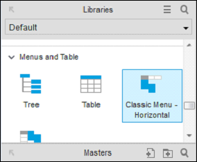
Menus and tables have a traditional structure. Such structure, maybe in a horizontal or a vertical form, is available under this library called Menus and tables.
Last, but not the least, comes the Markup library, which is inclusive of stickies, markers, and arrows. Mostly, this will be used for annotations in your prototype.
Design Area
This is the actual playground for the UX engineers. This space will be used for creating the prototypes as per your requirement. To start with, refer to the area highlighted with number 6 in the following screenshot.
In this area, you can drag and drop your desired controls from the library. Let us create a quick menu bar using the library.
Example - Menu Bar
From the libraries, under Menus and Table, drag Classic Menu − Horizontal control to design area.
Once youve dragged the control in the design area, you will see the following screen.
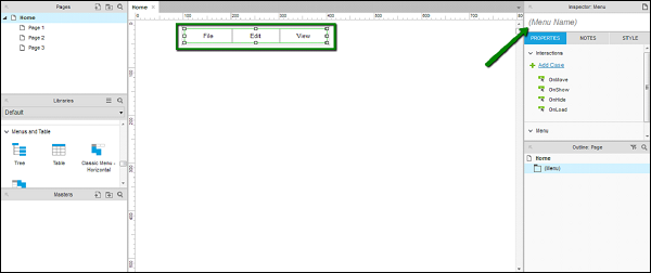
As shown in the screen above, Axure RP is intelligent enough to show the intended text in a menu. Considering it is a menu bar, Axure RP has automatically created File, Edit and View as menus in the control.
As pointed by the arrow, the inspector section shows the properties of the control. Use this section to create a name for your control for unique identification, when creating complex prototypes.
Let us give a name to this control as TestMenu. We will use this name in the proceeding examples.
Page Properties
When planning for a prototype, it makes sense to have a clear idea of the user and hence the device on which the prototype will be showcased/viewed. For the best experience of interacting with prototype, Axure has provided a feature to set the page properties.
As shown in figure above, the area denoted by number 3 is the page properties section. In this section, you will be able to see the interactions dropdown and the sub-section Adaptive.
Let us discuss these sections in detail.
Interactions section deals with the possible interactions (cases) with the page. As you can see, the interaction case OnPageLoad handles the events when the page loads. In most of the prototypes, the UX engineers prefer to put an animation to make the first impression. This particular event for showing the animation is usually triggered on OnPageLoad case.
Similarly, other cases include OnWindowResize, OnWindowScroll. In the dropdown, More Events, you can see other supported cases to configure the interactions related to the page.
With the Adaptive section, Axure RP enters into a responsive web design. Nowadays, designing an experience for websites is not sufficient, along with this, businesses prefer mobile sites to co-exist with the websites.
The same page, as viewed from different screen sizes and layouts constitute different adaptive views. Commonly, adaptive views are designed for mobiles and tablets. Axure provides this feature of adaptive views, so that the UX engineers have a grip over the responsive aspect of the prototypes right from the scratch.
The Inspector Pane for Widget
The Widget Interactions pane is the critical most section in Axure. You can see this pane by clicking any widget in the design area.
Consider an example of the menu item that we used in previous section. Select the menu item named TestMenu and observe the section highlighted in the following screenshot.
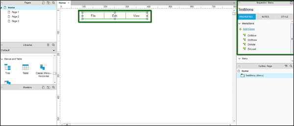
As you can see under Properties tab, there are different interactions such as OnMove, OnShow, OnHide and OnLoad. These are specific to the Menu control as a whole.
Now, click File from the menu control.
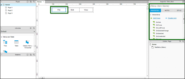
You will notice a change in the type of interactions in the Widget Properties pane. Also, it provides flexibility to provide a name for this menu item. Let us take OnClick case as an example.
OnClick − The case OnClick defines the behavior of the control, when you click the control when running the prototype. This enables various interactions such as page navigation, menu popup, etc.
Notes Pane − In the inspector pane itself, there is a sub-section called Notes. In the notes pane, you will be able to add certain points to remember, for the control of your choice.
These points will be clear once we dive into an example in the next chapter.
Grids and Guides
For a prototype with maximum level of quality and precision, UX engineers require the ability to align/position a control with the other control.
For instance, consider you want to show a login popup. If this popup is to be shown right in the middle of the screen, you need the overall dimensions of the screen. Also, to align exactly in the middle of the screen, you should have the grids to align it appropriately.
Axure provides the feature of Grids and Guides, so that you can use your design area effectively.
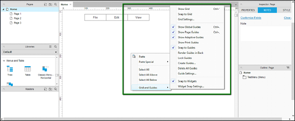
To see Grids and Guides available, right-click on the design area, and the context menu shown in the following screenshot will pop up.
Now, let us understand the options available.
Grid − The first three options shown in the context menu are associated with grids. They are Show Grid, Snap to Grid, and Grid Settings.
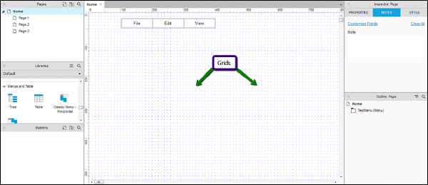
Show Grid − When Show Grid is enabled, you will be able to see the grid on the design area as shown in the following screenshot. This is very useful in aligning the controls with the other controls on the screen.
Snap to Grid − When Snap to Grid is enabled, the controls will automatically get attached according to the grids present around. You will be able to see this behavior when you will drag a control and it will attach itself to the grid nearby.
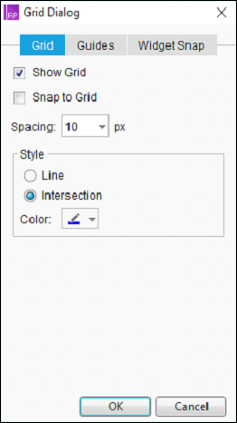
Grid Settings − More settings related to Grids are present in this dialog. As shown in the following screenshot, spacing between the grid, type of a grid, etc. will be available in this dialog. You can select the grids of type intersection, as per your convenience.
Guides − In the context menu as shown in the following screenshot, the options after the first separator are related to the guides.

We will cover the options which are commonly used for Guides.
Show Global Guides − These guides will be visible when you drag from both the horizontal and vertical rulers in the design area. Try it for yourself!
Show Page Guides − Guides are also available at a page level. These guides are created when you drag them from the vertical and horizontal rulers. They are more common than Global Guides. Having a page guide increases the flexibility of design at a page-level.
Show Adaptive Guides − When it comes to designing the pages for different adaptive views, it is worthwhile to have the adaptive guides in place. This option enables visibility of adaptive guides, which will be used to align the objects across different adaptive views.
Snap to Guides − When arranging the different screen elements in the design area, this functionality enables the objects to be snapped to the guides. This comes handy when you place a particular object on the screen and arrange it with respect to the other object.
