- Axure RP - Home
- Introduction to Prototyping
- Axure RP - Introduction
- Axure RP - User Interface
- Axure RP - Basic Interactions
- Using Masters & Dynamic Panels
- Axure RP - Condition Logic
- Axure RP - Advanced Interactions
- Axure RP - Widget Library
- Axure RP - Exporting Prototype
Axure RP - Basic Interactions
This chapter will take you through the basic interactions set provided by Axure when designing a screen.
The purpose of Axure RP is to allow interactive prototypes. Now, when it comes to making the interactive prototypes, there is always a caveat of creating an overly interactive prototype. This is the reason why, it makes sense to start with single important interactions at a time, in order to sprint through the rest of the available pages.
Axure Interactions
Interactions is the term coined for the functional elements that transform a static wireframe into a clickable interactive prototype. To make it a simple approach towards interactions, Axure eliminates the need to code the prototype by providing an interface for defining structures and logics.
While generating HTML prototype, Axure RP converts the interactions into the real code (HTML, CSS and JavaScript). This acts as a catalyst to show the intended design and interactions on the page.
Typically, the interactions will begin with When the interaction is happening. For instance, when the page is loaded in the browser, when the user clicks on one of the elements, etc.
Then comes the question, Where on the screen the interaction is taking place. It can be a simple screen element such as a rectangle, which we want to turn into a clickable button for the purpose of a menu (example shown later).
Finally, there is the description of What is happening in the interaction. Let us consider the page loading when the browser loads the page; you can simply select a particular slideshow to begin or have an image grow bigger when entered on the screen.
Axure Events
The events in Axure can be of two types, triggered by two types of events.
Page and Master Level Events
When a page loads, there is a plethora of events happening to fetch the design information, content, and hence, the alignment of every single element on the screen. As these events take place during the initial page load, you can consider that these events will be repetitive on every page load. Following are some examples of Page and Master Level Events.
- OnPageLoad
- OnWindowResize
- OnMouseMove
- OnAdaptiveViewChange
Object or Widget Level Events
Let us consider, we have created a page and a particular button widget on the page. Now, for interacting with this button widget, maybe by touch (on mobile prototype) or a mouse click. Following are some examples of Object or Widget Level Events.
- OnClick
- OnMouseEnter
- OnDrag
- OnDrop
- OnMouseHover
Cases
As discussed in the previous chapter, in the page properties section, a particular widget interaction can be designed. These are called cases. A particular interaction can be a constitution of multiple cases.
Let us consider an example, to understand this better.
Example: Axure Prototype Show Menu on Mouse Hover
To start with this example, create a new file by clicking New under File Menu or using the shortcut key Ctrl + N.
In this example, we are going to design the simple Menu Bar as seen in most of the software products. The menu structure will have the following menu elements and the submenu under each of them.
File
- New
- Open
- Save
- Close
Edit
- Cut
- Copy
- Paste
- Find
- Replace
View
- Show Status Bar
- Toolbars
- Main Toolbar
- Styling Toolbar
Help
- Getting Started
- Using Help
- Whats this
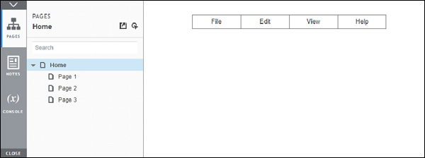
To get started, drag and drop Classic Menu Horizontal in the design area. You will find it under Libraries → Menus and Tables. Name the control as MenuBarExample. Let us make this element of width 300 px and height 30 px. Position it at 100 on X-axis and at 30 on Y-axis. You can adjust these values under the Style tab under Inspector section on the right.
At the end of the above procedure, you will be able to see the end result as shown in the following screenshot.
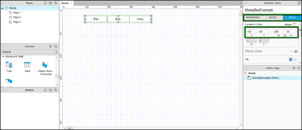
Let us add the names to the menu titles in the Inspector section as well. Click each menu title and observe the inspector section. If the name is not given to the specific menu bar, the name will turn as (Menu Item Name).
Name the File menu as FileMenu.
Same goes for Edit as EditMenu and View as ViewMenu.
To confirm whether the names have been provided, click each individual menu and confirm under Inspector: Menu Item. You will be able to see the names and not (Menu Item Name).
Now, as per our requirement, let us complete the menu bar with the Help menu. Right-click the menu bar title View, you will see a context menu. Click Add Menu Item After.
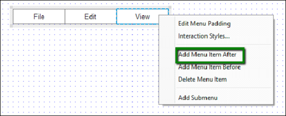
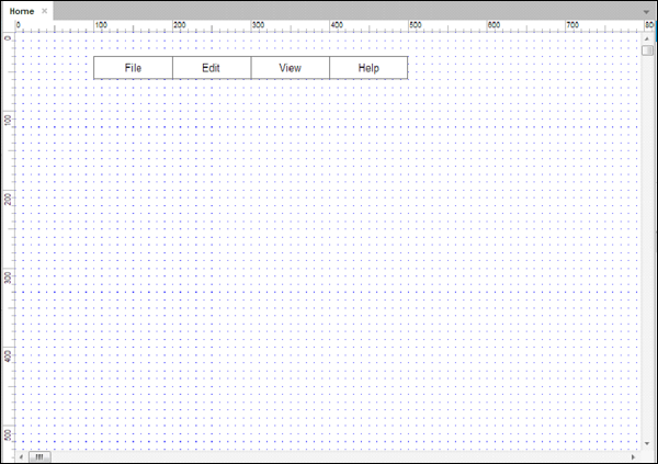
A blank menu item will appear. Double-click the blank menu item, and enter menu title as Help. Repeat the procedure, providing it a name under Inspector: Menu Item Name. Once complete, you will see the design area as follows.
Next, let us design the interaction for File Menu.
Click the File menu bar title and observe the Inspector: Menu Item.
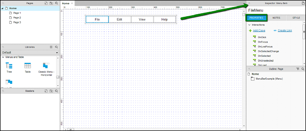
As highlighted in the screenshot above, observe the Properties tab.
Under Properties tab, we will create the interaction for File Menu.
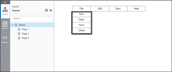
It is very simple to add a submenu to the menu. Right-click on File menu, in the context menu that appears, click Add Submenu.
Note − We can also remove the submenu by repeating the same step, and clicking Remove Submenu.
Once the submenu has been added, a blank sub-menu will appear. Double-click each of the menu items and provide names such as New, Open, Save.
Right-click on the last submenu item and add one more submenu item. Name it as Close.
It is a good practice to name all the submenu items under the Inspector section as well. This helps referencing them in your overall design process.
While designing this part, notice that whenever we click any other part of the design area, the submenu will disappear. We need to click the File menu item to view the submenu.
Let us talk about the interaction Hover. This interaction has a unique behavior of getting triggered, when the mouse pointer is hovered over a particular element. In Axure, this interaction is automatically implemented with the Classic Menu Horizontal.
To see the interaction in action, click the Preview button in the toolbar. Axure will open the preview in the default browser.
Hover on the File menu. The submenu will be displayed as shown in the following screenshot.
If we look at it objectively, we have just utilized Axure to create a complex interaction, such as hovering on the menu item. In usual HTML coding, it would have taken close to 1 to 1.5 hours of time.
As an assignment, complete the rest of the menus for their submenus.
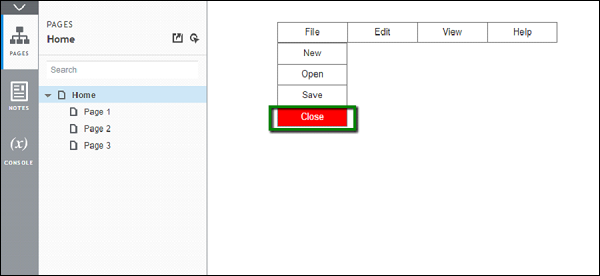
Now, let us quickly create an interaction on the Close submenu under the File menu. We will highlight it in red when hovered. To do this, right-click on Close submenu. Click Interaction Styles
Under MouseOver tab, check select Fill Color and select red color. Axure will immediately show the preview in the design area. Assuming that the Apply to section Selected Menu and all submenus is selected, it will highlight the whole menu in red.
Click Selected Menu Item only. Now check select Font Color and choose white color for the font. The preview will be updated immediately.
Click OK to complete this setup.
Click Preview again to see the interaction in action.
This completes the example.
You may try the following interaction as a quick assignment.
OnClick property by using a button widget.
