- Axure RP - Home
- Introduction to Prototyping
- Axure RP - Introduction
- Axure RP - User Interface
- Axure RP - Basic Interactions
- Using Masters & Dynamic Panels
- Axure RP - Condition Logic
- Axure RP - Advanced Interactions
- Axure RP - Widget Library
- Axure RP - Exporting Prototype
Axure RP - Quick Guide
Axure RP - Introduction to Prototyping
The word prototyping is very common and relevant to folks in Software Development as well as Architectural development. When it comes to architectural development, in Egypt, there are prototypes of the Great Pyramids of Giza. These were constructed with (of course) a smaller version in order to take the agreement or approval from the ruler.
This small but meaningful example precisely illustrates the purpose of a prototype. According to Wikipedia, a prototype is, A first or preliminary version of a device or vehicle from which other forms are developed.
For the software development world, the definition can be adapted as, a preliminary version of a page, screen, or functionality, which supports the other development by visualizing the screen elements effectively and showcasing the interactions. This definition includes the most critical part, interaction.
In software development, for developing a part of functionality or the complete functionality itself, a considerable investment is required in terms of time and efforts. It is an unending process of developing, validating and correcting issues as per the feedback from clients.
Most of the software development companies want this process to be as quick as possible. Hence, they do not go ahead with effort and time investment from all the team members. Instead, they make a smart move of hiring a User Experience (UX) engineer, who has the skillset of visualizing a particular feature. This gets them on the driving seat when developing the product.
In essence, prototyping is required to simulate and visualize the software requirement very early in the development. The process eventually becomes beneficial to both software development companies and the clients as it reduces the unknown in the feature, thereby providing a right direction to the development.
Right Phase for Prototype Development
In the current era of high profile software development, there have been many advances in the overall software development life cycle table. These advances are from the aspect of technologies as well as the role/position of a particular team member in the life cycle. One such position has started getting traction, which is called a UX engineer.
A UX engineer is equipped with a skill set, which is beneficial for the customers. By using different techniques or steps to know the customer better, the UX engineer can get a good hold of what the user is expecting out of a given software product.
Usually, when the requirement gathering process takes place, tech companies are now involving the UX engineers to go out in the market to understand what the user needs. With the latest trend of Responsive Web XDesign and Mobile-First Approach to software development, there can be a number of areas one wants to focus their attention on. A UX engineer employs processes such as User Interviews, Market Surveys to know the pulse of its intended audience.
This process is time taking as well as important, as it gets the path clear for the software product to see its suitability in the market. These steps are employed when gathering the software requirements and eliciting them. It is an ideal phase, as it reduces the overall cost of development. However, when the software product is mature, one can introduce the UX research phase in order to gauge the viability of the enhancement being made.
Axure RP - Introduction
For the UX engineers, the process of understanding their user base is not just limited to getting the inputs from the customer or the related conversations. There are some interesting steps that they need to take to understand what a user wants. The real work starts when they are somewhat clear about what the user might be expecting out of the software product.
Once some data is available about how the user is perceiving the upcoming software or an enhancement in the existing software, the UX engineer comes back to its den to design the user interface for them. Traditionally or as a common approach, when someone says design, it means software such as Adobe Photoshop, CorelDraw, or even Microsoft Paint. At times, to get back to the users real quick, UX designers make use of good old pen and paper to design interfaces.
However, for UX designer, providing the quality in designing the User Interface means more than just showing an awesome design. User Experience consists of not only how the user sees the interface but also how the user interacts with it. The software tools mentioned above and the likes in the market come with their own feature sets. It is indeed a tedious task for the UX engineer to choose the appropriate software which will enable − brainstorming, designing, and getting feedback.
Enter Axure, the currently trending software to design beautiful user interfaces and interactions. Axure has been around since close to a decade to allow UX engineers to get to the details of creating a software prototype with ease. Axure, along with being the prototyping tool, has a powerful community contributing to the UX world with many examples and skillful interactions.
At a higher level, following are the features offered by Axure −
- Diagramming and Documentation
- Effective prototyping with Dynamic Content
- Conditional Flows
- Beautiful animations to enhance the interactions
- Adaptive Views
- Support on Windows and Mac
To explore the detailed feature list provided by Axure, please visit https://www.axure.com. For installation instructions, follow the link https://www.axure.com/download.
For rapid prototyping, Axure RP provides a varied range of tools and techniques, which always help the Analysts/User Experience engineers to visualize the end goal.
With a strong community always available to assist, Axure RP is becoming the preferred tool for UX enthusiasts and practitioners.
Axure RP - User Interface
Once you install Axure, you will be presented with an interface as shown in the following screenshot.
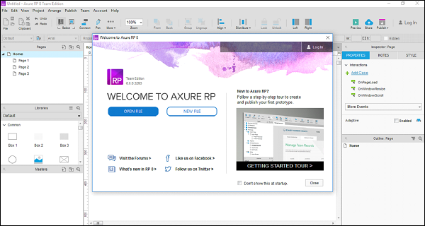
This screen will always be shown at the startup until you opt for not to show it.
On this screen, you have the following options −
- Start a New File in Axure
- Open an existing Axure project
Let us now create a new file with Axure.
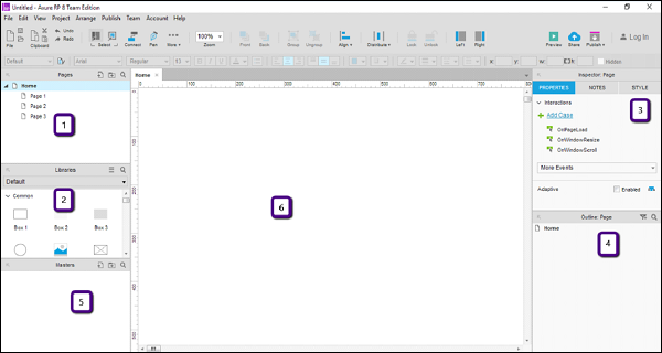
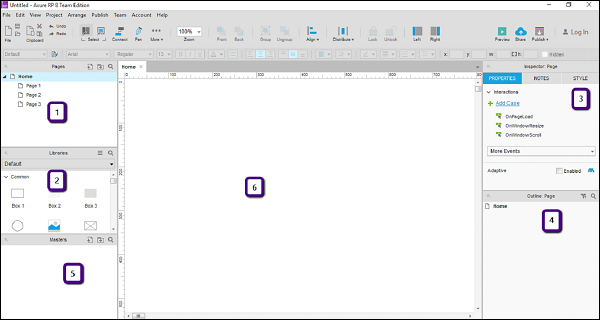
When you click the button NEW FILE, you will be presented with the following screen to create a new prototype.

As shown in the figure above, the workspace is divided into 6 parts.
- Pages
- Libraries
- Inspector
- Outline
- Masters
- Design Area
Let us walk through these parts one by one.
Pages
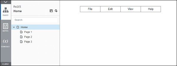
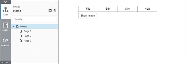
This section shows the pages you are working on. These pages are shown in a default tree structure as follows. Home page has the following child pages.
Home
Page 1
Page 2
Page 3
You can continue with the structure given or you can change it as per your needs. For doing so, right-click on any of the page, then you will be presented with the options such as Add, Move, Delete, Rename, Duplicate, etc.
Like most of the different tools available, this section allows you to interact with the pages in your prototype. You can use it to plan the screens in the intended prototype.
Libraries Pane
In the libraries pane, most of the controls required for the prototype are available. Typical controls available in this section are Box, Image, Placeholder, Buttons, etc. Axure RP provides a rich set of UI controls categorized according to their area of applications.
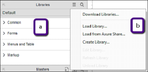
As shown in the figure above (a), the libraries have the categories as Common, Forms, Menus and Table, and Markup. All these categories are expanded when you open the application. For convenience, it is collapsed in this screenshot.
Common libraries include basic shapes, buttons, heading text, Hot Spot, Dynamic panel, etc.
With Axure RP, for all your prototyping requirements, there comes a very effective control called Hot Spot. Using this control, you can provide click interaction to almost any control in the UI. An example will be provided in the proceeding pages.
In the forms library, as the name suggests, List Box, Checkbox, radio button, text area, and text field controls are included. For designing a user input form, you may use controls from this section under the library.
Menus and tables have a traditional structure. Such structure, maybe in a horizontal or a vertical form, is available under this library called Menus and tables.
Last, but not the least, comes the Markup library, which is inclusive of stickies, markers, and arrows. Mostly, this will be used for annotations in your prototype.
Design Area
This is the actual playground for the UX engineers. This space will be used for creating the prototypes as per your requirement. To start with, refer to the area highlighted with number 6 in the following screenshot.
In this area, you can drag and drop your desired controls from the library. Let us create a quick menu bar using the library.
Example - Menu Bar
From the libraries, under Menus and Table, drag Classic Menu − Horizontal control to design area.
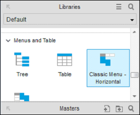
Once youve dragged the control in the design area, you will see the following screen.
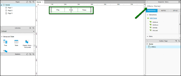
As shown in the screen above, Axure RP is intelligent enough to show the intended text in a menu. Considering it is a menu bar, Axure RP has automatically created File, Edit and View as menus in the control.
As pointed by the arrow, the inspector section shows the properties of the control. Use this section to create a name for your control for unique identification, when creating complex prototypes.
Let us give a name to this control as TestMenu. We will use this name in the proceeding examples.
Page Properties
When planning for a prototype, it makes sense to have a clear idea of the user and hence the device on which the prototype will be showcased/viewed. For the best experience of interacting with prototype, Axure has provided a feature to set the page properties.
As shown in figure above, the area denoted by number 3 is the page properties section. In this section, you will be able to see the interactions dropdown and the sub-section Adaptive.
Let us discuss these sections in detail.
Interactions section deals with the possible interactions (cases) with the page. As you can see, the interaction case OnPageLoad handles the events when the page loads. In most of the prototypes, the UX engineers prefer to put an animation to make the first impression. This particular event for showing the animation is usually triggered on OnPageLoad case.
Similarly, other cases include OnWindowResize, OnWindowScroll. In the dropdown, More Events, you can see other supported cases to configure the interactions related to the page.
With the Adaptive section, Axure RP enters into a responsive web design. Nowadays, designing an experience for websites is not sufficient, along with this, businesses prefer mobile sites to co-exist with the websites.
The same page, as viewed from different screen sizes and layouts constitute different adaptive views. Commonly, adaptive views are designed for mobiles and tablets. Axure provides this feature of adaptive views, so that the UX engineers have a grip over the responsive aspect of the prototypes right from the scratch.
The Inspector Pane for Widget
The Widget Interactions pane is the critical most section in Axure. You can see this pane by clicking any widget in the design area.
Consider an example of the menu item that we used in previous section. Select the menu item named TestMenu and observe the section highlighted in the following screenshot.
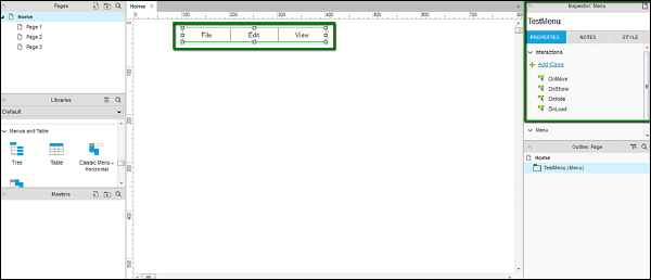
As you can see under Properties tab, there are different interactions such as OnMove, OnShow, OnHide and OnLoad. These are specific to the Menu control as a whole.
Now, click File from the menu control.
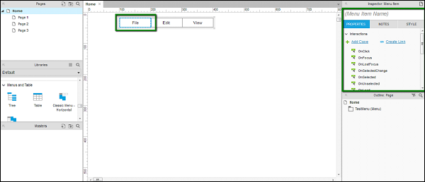
You will notice a change in the type of interactions in the Widget Properties pane. Also, it provides flexibility to provide a name for this menu item. Let us take OnClick case as an example.
OnClick − The case OnClick defines the behavior of the control, when you click the control when running the prototype. This enables various interactions such as page navigation, menu popup, etc.
Notes Pane − In the inspector pane itself, there is a sub-section called Notes. In the notes pane, you will be able to add certain points to remember, for the control of your choice.
These points will be clear once we dive into an example in the next chapter.
Grids and Guides
For a prototype with maximum level of quality and precision, UX engineers require the ability to align/position a control with the other control.
For instance, consider you want to show a login popup. If this popup is to be shown right in the middle of the screen, you need the overall dimensions of the screen. Also, to align exactly in the middle of the screen, you should have the grids to align it appropriately.
Axure provides the feature of Grids and Guides, so that you can use your design area effectively.
To see Grids and Guides available, right-click on the design area, and the context menu shown in the following screenshot will pop up.
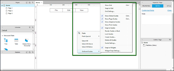
Now, let us understand the options available.
Grid − The first three options shown in the context menu are associated with grids. They are Show Grid, Snap to Grid, and Grid Settings.
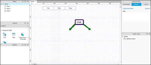
Show Grid − When Show Grid is enabled, you will be able to see the grid on the design area as shown in the following screenshot. This is very useful in aligning the controls with the other controls on the screen.
Snap to Grid − When Snap to Grid is enabled, the controls will automatically get attached according to the grids present around. You will be able to see this behavior when you will drag a control and it will attach itself to the grid nearby.
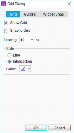
Grid Settings − More settings related to Grids are present in this dialog. As shown in the following screenshot, spacing between the grid, type of a grid, etc. will be available in this dialog. You can select the grids of type intersection, as per your convenience.
Guides − In the context menu as shown in the following screenshot, the options after the first separator are related to the guides.

We will cover the options which are commonly used for Guides.
Show Global Guides − These guides will be visible when you drag from both the horizontal and vertical rulers in the design area. Try it for yourself!
Show Page Guides − Guides are also available at a page level. These guides are created when you drag them from the vertical and horizontal rulers. They are more common than Global Guides. Having a page guide increases the flexibility of design at a page-level.
Show Adaptive Guides − When it comes to designing the pages for different adaptive views, it is worthwhile to have the adaptive guides in place. This option enables visibility of adaptive guides, which will be used to align the objects across different adaptive views.
Snap to Guides − When arranging the different screen elements in the design area, this functionality enables the objects to be snapped to the guides. This comes handy when you place a particular object on the screen and arrange it with respect to the other object.
Axure RP - Basic Interactions
This chapter will take you through the basic interactions set provided by Axure when designing a screen.
The purpose of Axure RP is to allow interactive prototypes. Now, when it comes to making the interactive prototypes, there is always a caveat of creating an overly interactive prototype. This is the reason why, it makes sense to start with single important interactions at a time, in order to sprint through the rest of the available pages.
Axure Interactions
Interactions is the term coined for the functional elements that transform a static wireframe into a clickable interactive prototype. To make it a simple approach towards interactions, Axure eliminates the need to code the prototype by providing an interface for defining structures and logics.
While generating HTML prototype, Axure RP converts the interactions into the real code (HTML, CSS and JavaScript). This acts as a catalyst to show the intended design and interactions on the page.
Typically, the interactions will begin with When the interaction is happening. For instance, when the page is loaded in the browser, when the user clicks on one of the elements, etc.
Then comes the question, Where on the screen the interaction is taking place. It can be a simple screen element such as a rectangle, which we want to turn into a clickable button for the purpose of a menu (example shown later).
Finally, there is the description of What is happening in the interaction. Let us consider the page loading when the browser loads the page; you can simply select a particular slideshow to begin or have an image grow bigger when entered on the screen.
Axure Events
The events in Axure can be of two types, triggered by two types of events.
Page and Master Level Events
When a page loads, there is a plethora of events happening to fetch the design information, content, and hence, the alignment of every single element on the screen. As these events take place during the initial page load, you can consider that these events will be repetitive on every page load. Following are some examples of Page and Master Level Events.
- OnPageLoad
- OnWindowResize
- OnMouseMove
- OnAdaptiveViewChange
Object or Widget Level Events
Let us consider, we have created a page and a particular button widget on the page. Now, for interacting with this button widget, maybe by touch (on mobile prototype) or a mouse click. Following are some examples of Object or Widget Level Events.
- OnClick
- OnMouseEnter
- OnDrag
- OnDrop
- OnMouseHover
Cases
As discussed in the previous chapter, in the page properties section, a particular widget interaction can be designed. These are called cases. A particular interaction can be a constitution of multiple cases.
Let us consider an example, to understand this better.
Example: Axure Prototype Show Menu on Mouse Hover
To start with this example, create a new file by clicking New under File Menu or using the shortcut key Ctrl + N.
In this example, we are going to design the simple Menu Bar as seen in most of the software products. The menu structure will have the following menu elements and the submenu under each of them.
File
- New
- Open
- Save
- Close
Edit
- Cut
- Copy
- Paste
- Find
- Replace
View
- Show Status Bar
- Toolbars
- Main Toolbar
- Styling Toolbar
Help
- Getting Started
- Using Help
- Whats this
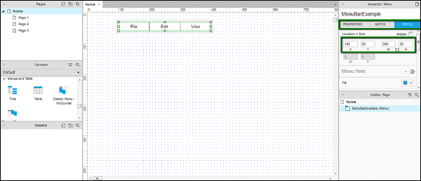
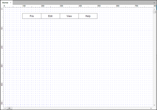
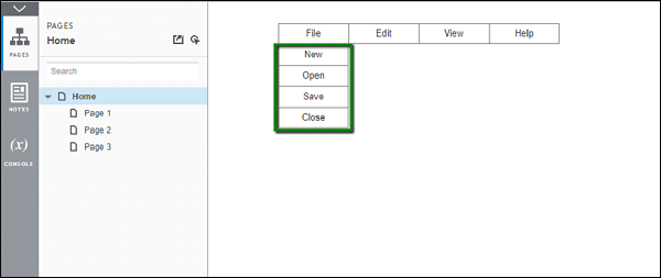
To get started, drag and drop Classic Menu Horizontal in the design area. You will find it under Libraries → Menus and Tables. Name the control as MenuBarExample. Let us make this element of width 300 px and height 30 px. Position it at 100 on X-axis and at 30 on Y-axis. You can adjust these values under the Style tab under Inspector section on the right.
At the end of the above procedure, you will be able to see the end result as shown in the following screenshot.
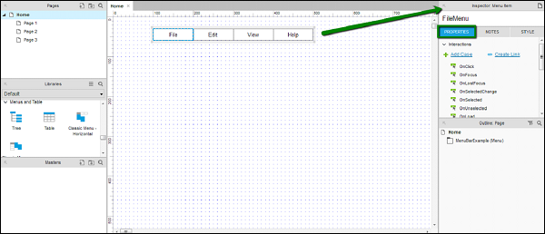
Let us add the names to the menu titles in the Inspector section as well. Click each menu title and observe the inspector section. If the name is not given to the specific menu bar, the name will turn as (Menu Item Name).
Name the File menu as FileMenu.
Same goes for Edit as EditMenu and View as ViewMenu.
To confirm whether the names have been provided, click each individual menu and confirm under Inspector: Menu Item. You will be able to see the names and not (Menu Item Name).
Now, as per our requirement, let us complete the menu bar with the Help menu. Right-click the menu bar title View, you will see a context menu. Click Add Menu Item After.
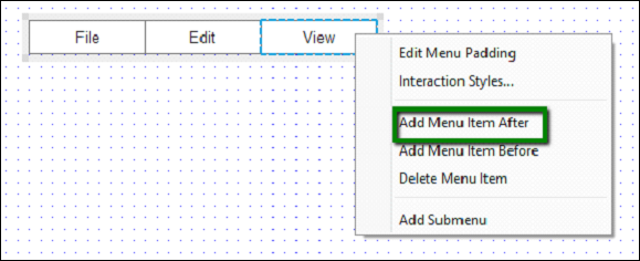
A blank menu item will appear. Double-click the blank menu item, and enter menu title as Help. Repeat the procedure, providing it a name under Inspector: Menu Item Name. Once complete, you will see the design area as follows.
Next, let us design the interaction for File Menu.
Click the File menu bar title and observe the Inspector: Menu Item.
As highlighted in the screenshot above, observe the Properties tab.
Under Properties tab, we will create the interaction for File Menu.
It is very simple to add a submenu to the menu. Right-click on File menu, in the context menu that appears, click Add Submenu.
Note − We can also remove the submenu by repeating the same step, and clicking Remove Submenu.
Once the submenu has been added, a blank sub-menu will appear. Double-click each of the menu items and provide names such as New, Open, Save.
Right-click on the last submenu item and add one more submenu item. Name it as Close.
It is a good practice to name all the submenu items under the Inspector section as well. This helps referencing them in your overall design process.
While designing this part, notice that whenever we click any other part of the design area, the submenu will disappear. We need to click the File menu item to view the submenu.
Let us talk about the interaction Hover. This interaction has a unique behavior of getting triggered, when the mouse pointer is hovered over a particular element. In Axure, this interaction is automatically implemented with the Classic Menu Horizontal.
To see the interaction in action, click the Preview button in the toolbar. Axure will open the preview in the default browser.
Hover on the File menu. The submenu will be displayed as shown in the following screenshot.
If we look at it objectively, we have just utilized Axure to create a complex interaction, such as hovering on the menu item. In usual HTML coding, it would have taken close to 1 to 1.5 hours of time.
As an assignment, complete the rest of the menus for their submenus.
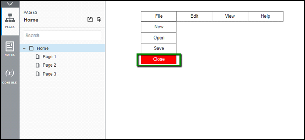
Now, let us quickly create an interaction on the Close submenu under the File menu. We will highlight it in red when hovered. To do this, right-click on Close submenu. Click Interaction Styles
Under MouseOver tab, check select Fill Color and select red color. Axure will immediately show the preview in the design area. Assuming that the Apply to section Selected Menu and all submenus is selected, it will highlight the whole menu in red.
Click Selected Menu Item only. Now check select Font Color and choose white color for the font. The preview will be updated immediately.
Click OK to complete this setup.
Click Preview again to see the interaction in action.
This completes the example.
You may try the following interaction as a quick assignment.
OnClick property by using a button widget.
Axure RP - Using Masters & Dynamic Panels
Many of the software development approaches, when it comes to user interfaces development, employ a common technique − Creating Masters.
A master is a reusable wireframe, which will be created once and used extensively thereafter on the subsequent pages. With Axure RP, when we create a master page, the changes made to this page will be applied to the pages where it is being used. Hence, it reduces time to a great extent for the components common to all pages.
To get started with Masters, you can focus on the Masters section (marked as 5) as highlighted in the following screenshot.

Use this masters section to −
Organize the prototypes masters by adding, deleting, or editing master page/folder.
Select a particular master for editing.
Dynamic Panels
In Axure RP, as we have seen in the previous chapter, there are different states associated with a given widget. For consolidating/organizing the states of a particular widget or set of widgets, we need a container/placeholder. Dynamic panels serve as the container/placeholder for the states of a widget.
Let us understand the dynamic panel better using an example. We will continue from our menu bar example.
The addition in this example will be an image area and a button underneath the menu bar. Use the widget Placeholder for the image area and button under common widgets. Name the placeholder as ImageAreaPlaceholder, button as showImageButton.
Also, let us have the menu bar added into masters. Right-click on the menu bar and click Convert to Master. A dialog box will appear prompting the name for the master. Add the name as menuBarMaster.
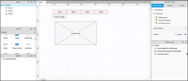
As shown in the above screenshot, the menu bar turns pink and the entry for the masters has been added.
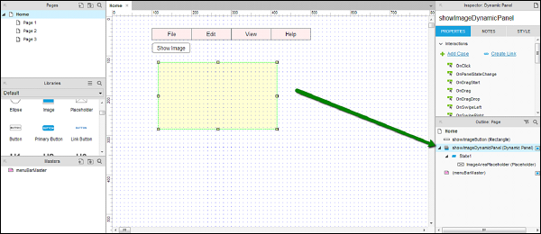
Now, let us create a dynamic panel. The context for dynamic panel is, you want to control the visibility of image area based on Show Image button click. Having a dynamic panel will allow for the flexibility of image area.
Let us see how to create the dynamic panel. Right-click on the Image Area, the context menu will appear, select Convert to Dynamic Panel.
The dynamic panel will be under Outline: Page. Also under Inspector, it shows the dynamic panel. Name the dynamic panel as showImageDynamicPanel. The name for this dynamic panel will get updated under Outline: Page section.
In the design area, right-click on Show Image dynamic panel to see the context menu. Select Set Hidden, the dynamic panel will disappear from the screen.
The dynamic panel can be accessed by double-clicking under Outline: Page.
Now, let us provide a click event to the button. Click the Show Image button, under Inspector → Properties, double-click OnClick interaction.
As shown in the above screenshot, click the Show/Hide under Widgets. It will automatically show the available widgets to configure actions. Check select showImageDynamicPanel. Click OK.
Now, click Preview. On the preview screen, click Show Image. Another interaction for a button is finally created.
Axure RP - Condition Logic
In this chapter, we will discuss the conditional logic used in Axure RP.
If - Then - Else in Axure
Just like any other programming tools, Axure also supports conditional logic to create enhanced interactions in prototypes. Once you are familiar with how you can provide interactions, providing conditional logic to the interactions is the next level.
Following is the simple and concise flow for conditional logic −
- If, a particular widget/screen is clicked
- Then, perform a particular action/interaction
- Else, keep/change the state of the widget or the screen
To understand this better, let us resume our flow from the previous example. For this purpose, its required for us to get acquainted with the Condition Builder.
The Condition Builder
Double-click any of the interactions, for instance OnClick. You will be able to see the Case Editor as shown in the following screenshot.
Click the button Add Condition near the Case Name. It will show below in the dialog box.
As shown under the Description, the condition builder will create the If-Then-Else flow as per the conditions chosen in the condition section.
Let us create a condition on this button.
We want to show the hide image button, once the dynamic panel is visible. We made the dynamic panel visible on the Show Image button click in the previous example. Now, let us make another button Hide Image visible.
Close the condition builder, and come back to the design area.
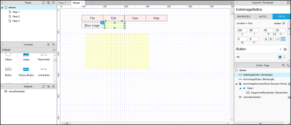
Insert the Hide Image button from the Libraries under common libraries. To reiterate, it is a best practice to name the UI element right after youve inserted it in the design area.
Right-click the Hide Image button and click Set Hidden. The button will be hidden from the design area as shown in the following screenshot.
Now, let us come back to the interactions for Show Image button.
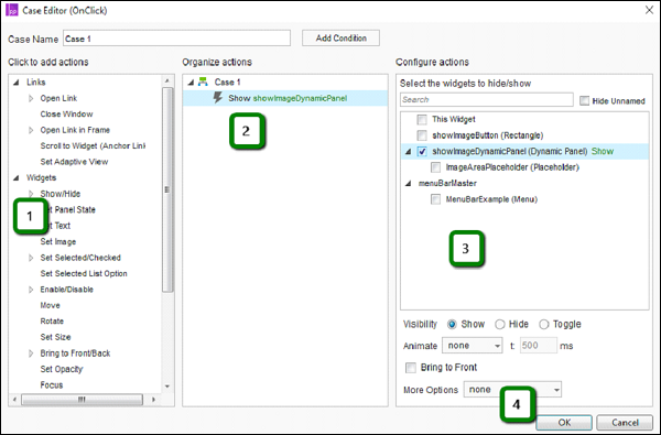
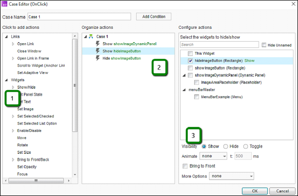
First, under the Show Image button interactions, double-click Case 1, you will be able to see the case editor. Use the Show/Hide action, to select hideImageButton and set its visibility to show.
Similarly, using the Show/Hide action, select showImageButton and set its visibility to hide.
We have managed the visibility of Hide Image button such that, when we click the Show Image button, the button will be shown.
A complete condition will be as shown in the following screenshot.
Let us build the condition.
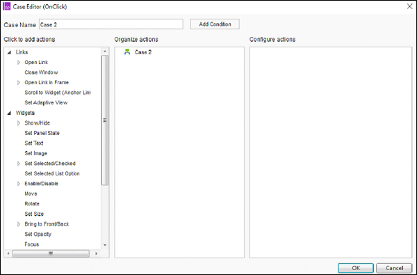
Under the design area, click the Hide Image button. From the Inspector section, click Add Case.
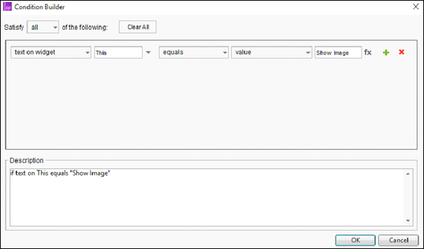
Under Add Case, click Add Condition button. As per the background provided earlier, create the condition set using the dropdown values in the Condition Builder.
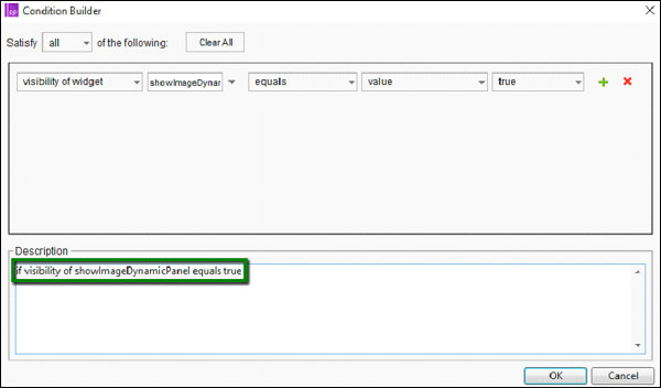
In simple words, with the above condition, we are checking whether the dynamic panel showImageDynamicPanel is visible or not
Now, let us design the interaction for Hide Image button, configure it as follows −
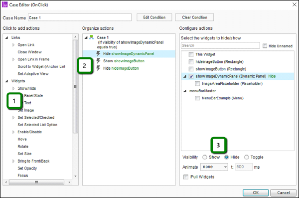
- Select Show/Hide action.
- Select the widget showImageDynamicPanel.
- Set the visibility to Hide.
Similarly, repeat the drill for showing showImageButton and hiding the hideImageButton.
Once done, click OK to close Case Editor.
Then, click Preview to see the changes done.
The successful results will be as shown in the following screenshots.
When the Show Image button is clicked −
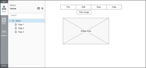
When the Hide Image button is clicked −
Axure RP - Advanced Interactions
Until now, we have got ourselves introduced to the basic features of Axure for interactions. However, there will be many real-world scenarios, where the prototype will have to be intelligent. By the word intelligent, the prototype will need to detect the state of a certain widget in order to perform an action/trigger a certain behavior.
A typical example of such an interaction is setting the color of a button. This requires UX engineer to wear the thinking hat and take the prototype designing to the next level.
Using Variables in Axure
Variable, by definition, stands for a factor that is liable to vary or change. In Axure, we can use variables to represent or identify the state of a widget/interaction.
A typical example will be storing a data value when transferring data from one page to the other. To keep the example simple and clear, let us consider a scenario where we need to show the state of a particular widget.
Continuing with our last example, let us consider that we want to show how many times the image was shown.
Here is how we will do it −
We will create a variable for initiating the count to 0.
On the click of the button Show Image, we will increment the value of this variable.
Display the value in the text label.
For this example, we will be creating a text below the Dynamic Panel. The text will read Image is shown 0 times.
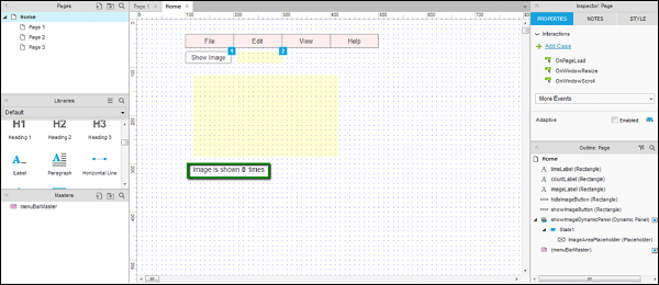
Critical − It is important that the labels are broken into three. Please follow the label names and text listed in the table.
| Label Name | Label Text |
|---|---|
| imageLabel | Image is shown |
| countLabel | 0 (zero in digits) |
| timesLabel | Times |
This is required as we want to control the countLabel value for every Show Image button click.
Let us define a variable first.
We will need a variable, which will be controlled when the button is clicked. This variable in Axures terminology is − Global Variable. To define a global variable, click Project in the menu bar, and then click Global Variables. A dialog box will open as shown in the following screenshot.
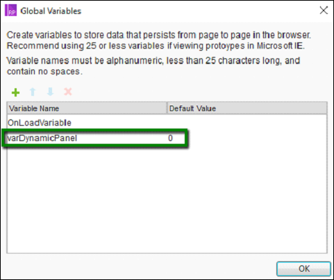
Click the green plus (+) icon to add a global variable. Let us call our global variable − varDynamicPanel. Its default value will be 0.
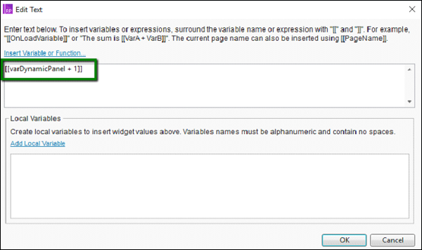
With the Show Image button interactions, double-click on Case 1. Add another action. As shown in the following screenshot, the action is Set Text on countLabel to [[varDynamicPanel + 1]].
Selecting a text label to a value is pretty straightforward. Let us see how to get the value from a dynamic panel.
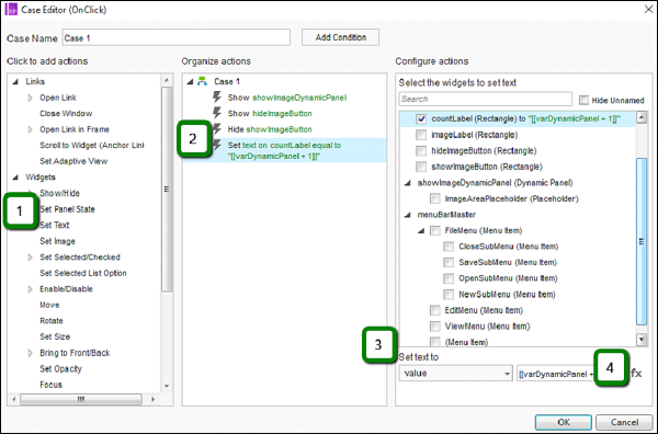
As indicated by step 4 in the above screenshot, click fx button and the following dialog box will open up.
Under the first text area, enter the following string.
[[varDynamicPanel + 1]]
Click OK.
Now, we need to ensure that the variable is updated after every button click.
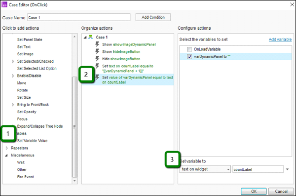
In the case editor dialog box, under actions, select Variables → Set Variable Value.
Select the varDynamicPanel as the variable.
Set the variable to fetch value from the text on widget as countLabel from the available options.
Close the Case Editor by clicking OK. Then, click Preview button.
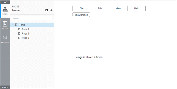
After showing/hiding image for four times, here is the result on the preview screen.
Axure RP - Widget Library
Now that you are well-versed with different interactions and events that are possible in Axure, you may want to extend your work in order to minimize efforts in future.
For instance, the very first example with Classic Menu Horizontal, was once present in Axure versions as a combination of different available widgets. This means, Axure evolved with time to accommodate frequently used widgets in the form of single widget library.
The concept of widget library is applicable more prominently in large UX teams. Some organizations keep approved widgets for subsequent UX engineers on a central repository.
Thus, in a nutshell, Axure Widget Library is a collection of custom widgets stored in a single file. The file type for Axure Widget Library is RPLIB.
Types of Widget Libraries
Axure Built-in Libraries
These libraries are accessible from Libraries pane. These libraries cant be updated/removed. For most of the complex prototyping needs, Axure built-in libraries come to rescue.
The library consists of 17 unique flow widgets, which are used primarily for diagram creation. Also, there are 25 widgets in the wireframe library.
A brief functioning of libraries is present in Chapter 3 − User Interface.
Axure Custom Libraries
Axure community, growing day-by-day in size, has a vast collection of user-created libraries. You can visit them at − https://www.axure.com/support/download-widget-libraries.
The UX professionals from all around the world, who are committed to make this community grow, submit their work on the above link.
You can download the libraries from the website and add them to Axure using Load Library option under libraries. Also, you can directly download libraries from the application interface itself.
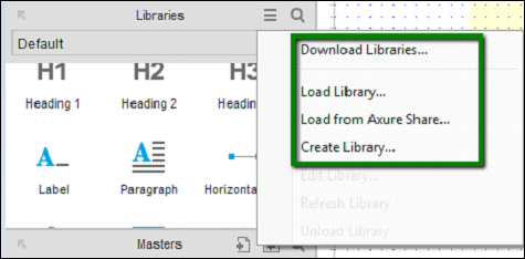
As shown in the above screen, we have a context menu, where you can download different libraries as offered on https://www.axure.com/support/download-widget-libraries. You can also create your own library, which will be handy while creating repetitive controls for a given prototype.
The complete instructions to download/load libraries is available at: https://www.axure.com/support/reference/widget-libraries.
When it comes to using a custom widget from one of your loaded libraries, drag and drop it in the design area similar to the built-in widgets. If the widget includes variables or a custom style, the Import Wizard dialog would flag such dependencies.
Among such dependencies, you may notice there are certain incompatible styles that come along with the widget library being imported. You may choose to Cancel and import only the widgets or click the Finish button to import the entire package.
Once you drag and drop a widget into your wireframe, that particular instance is no longer associated with its original widget library. Thus, edits and changes made to widgets in the imported widget library are not applied to any of the instances of these widgets in your project file, even after you refresh the library. Rest assured, once imported, you can utilize the widgets in the imported library without worrying about the updates that take place in the same widget library as available online.
Using RPLIB
Using an Axure RP Library file is pretty straightforward. When you download a library, the icon for library file (.rplib) is clearly distinguished from the Axure RP prototype file (.rp). For instance, as seen in the following screenshot.
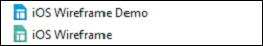
The mechanism for this to work - You can import the iOS Wireframe document in iOS Wireframe Demo.
This library can be used for multiple projects and updates in the library file will be available once you Refresh the library from the context menu. As highlighted earlier, this comes very handy when working on a team project and distributing the libraries in this fashion.
Axure RP - Exporting Prototype
Axure RP 8 supports collaboration with the feature − Team Projects. This feature is not only beneficial for the distributed teams but also for the single user. The benefit to the single user is the ability to create versioning on the work in progress.
Working with Team Projects
In the Team Projects scenario, each team member has a copy of the project on their computer. This project will be synced with a shared repository. This shared repository is connected to other members of the team.
After the course of a day's work, each team member will create new elements, check out files, and generally edit the project. Check Out is a commonly used term for indicating the work in progress for a particular file.
The changes will not be reflected in the shared repository until the team member checks in all their checked out elements. The Manage Team Project console provides all team members with a real-time view of the availability status of the elements that are managed by the system.
This view provides the details of an element that is checked out by another team member.
Initiate a team project
For working with or creating a team project, head over to the Team menu. Click Team and then select Create Team Project from Current File. Following screen pops up.
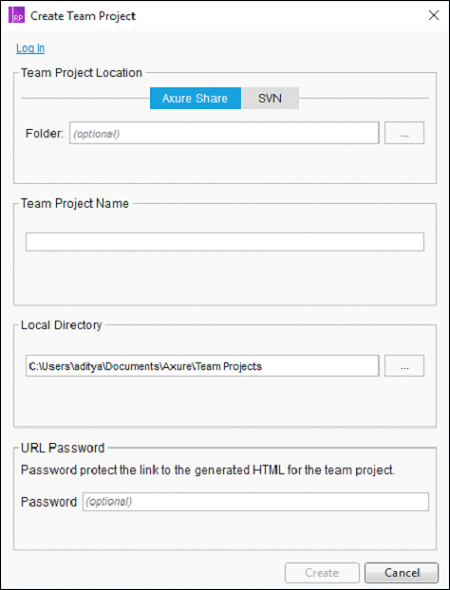
Available options for hosting a team project are − using AxShare and SVN. We will discuss AxShare in the next section. SVN is the commonly used Version Controlling System, which provides a server to host your documents.
Follow the on-screen guidelines for creating a team project and then you will be able to start collaborating with a single Axure file across the team/use it for your own historical storage.
Axure Share
When it comes to showcasing your prototype, there are multiple options available as per the environment you are in. Most commonly used method to export your prototype is to use Axure Share (aka AxShare).
With Axure Share, the following collaboration capabilities are possible.
Prototypes can be hosted on Axure Share and shared with the involved team members/clients.
With the discussion/comments feature, you can get the on-the-go inputs on the prototype in the making.
Once you are ready with the prototype, you can upload the prototype to AxShare using Publish → Publish to Axure Share. Following dialog box will be displayed.
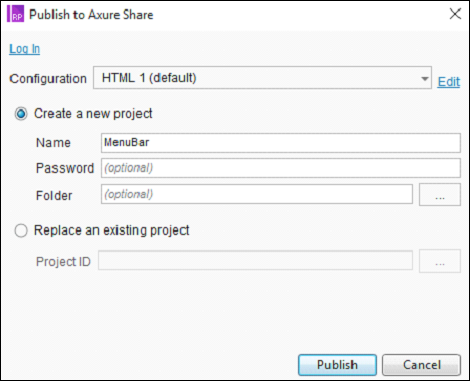
You must create an account at AxShare.com in order to progress ahead. If you already have an account, you can use the Log In option to log in and upload your work to AxShare.
The uploaded data is in HTML, CSS, and JavaScript. Once uploaded, you are provided with a link, which you can provide to the intended stakeholders/team.
