- Advanced Excel Charts - Home
- Advanced Excel - Introduction
- Advanced Excel - Waterfall Chart
- Advanced Excel - Band Chart
- Advanced Excel - Gantt Chart
- Advanced Excel - Thermometer
- Advanced Excel - Gauge Chart
- Advanced Excel - Bullet Chart
- Advanced Excel - Funnel Chart
- Advanced Excel - Waffle Chart
- Advanced Excel Charts - Heat Map
- Advanced Excel - Step Chart
- Box and Whisker Chart
- Advanced Excel Charts - Histogram
- Advanced Excel - Pareto Chart
- Advanced Excel - Organization Chart
- Advanced Excel Charts - Quick Guide
- Advanced Excel Charts - Resources
- Advanced Excel Charts - Discussion
Advanced Excel - Waffle Chart
Waffle chart adds beauty to your data visualization, if you want to display work progress as percentage of completion, goal achieved vs Target, etc. It gives a quick visual cue of what you want to portray.
Waffle chart is also known as Square Pie chart or Matrix chart.
What is a Waffle Chart?
Waffle chart is a 10 × 10 cell grid with the cells colored as per conditional formatting. The grid represents values in the range 1% - 100% and the cells will be highlighted with the conditional formatting applied to the % values they contain. For example, if the percentage of completion of work is 85%, it is portrayed by formatting all the cells that contain values <= 85% with a specific color, say green.
Waffle chart looks as shown below.
Advantages of Waffle Chart
Waffle chart has the following advantages −
- It is visually interesting.
- It is very readable.
- It is discoverable.
- It does not distort the data.
- It provides visual communication beyond simple data visualization.
Uses of Waffle Chart
The Waffle chart is used for completely flat data that adds up to 100%. The percentage of a variable is highlighted to give the depiction by the number of cells that are highlighted. It can be used for various purposes, including the following −
- To display the percentage of work that is complete.
- To display the percentage of progress that is made.
- To depict the expenses incurred as against the budget.
- To display Profit %.
- To portray the actual value achieved as against the set target, say in sales.
- To visualize the company progress as against the goals that are set.
- To display the pass percentage in an exam in a college / city/ state.
Creating a Waffle Chart Grid
For the Waffle Chart, you need to first create the 10 × 10 Grid of square cells such that the Grid itself will be a square.
Step 1 − Create a 10 × 10 square grid on an Excel sheet by adjusting the cell widths.
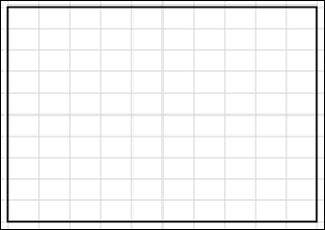
Step 2 − Fill the cells with % values, starting with 1% in the left-bottom cell and ending with 100% in the right-top cell.
Step 3 − Decrease the font size such that all the values are visible but do not change the shape of the grid.
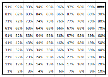
This is the grid that you will use for the Waffle chart.
Creating a Waffle Chart
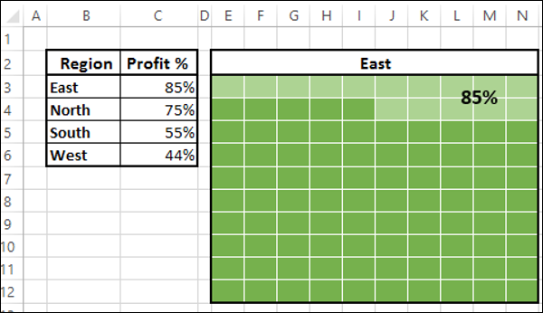
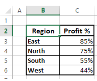
Suppose you have the following data −
Step 1 − Create a Waffle chart that displays the Profit% for the Region East by applying Conditional Formatting to the Grid you have created as follows −
Select the Grid.
Click Conditional Formatting on the Ribbon.
Select New Rule from the drop down list.
Define the Rule to format values <= 85 % (give the cell reference of the Profit %) with fill color and font color as dark green.
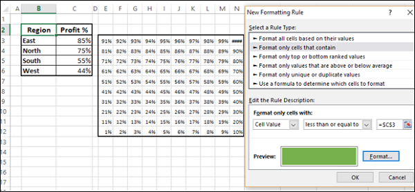
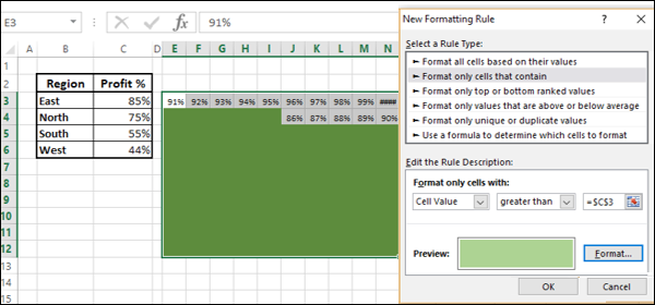
Step 2 − Define another rule to format values > 85 % (give the cell reference of the Profit %) with fill color and font color as light green.
Step 3 − Give the Chart Title by giving reference to the cell B3.
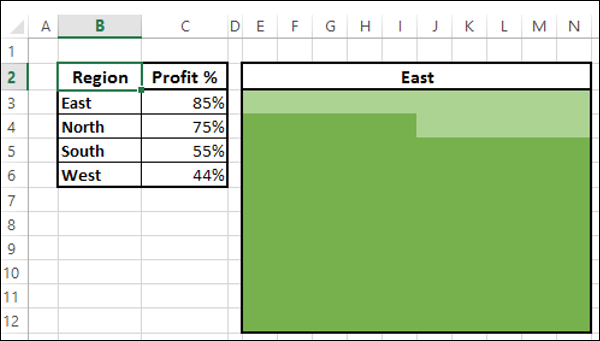
As you can see, choosing the same color for both Fill and Font enable you not to display the %values.
Step 4 − Give a Label to the chart as follows.
- Insert a Text box in the chart.
- Give the reference to the cell C3 in the Text box.
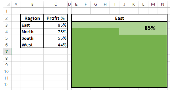
Step 5 − Color the cell borders white.

Your Waffle chart for the Region East is ready.
Create Waffle charts for the Regions, i.e. North, South and West as follows −
Create the Grids for North, South and West as given in the previous section.
For each Grid, apply conditional formatting as given above based on the corresponding Profit % value.
You can also make Waffle charts for different regions distinctly, by choosing a variation in the colors for Conditional Formatting.
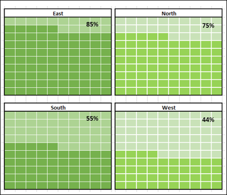
As you can see, the colors chosen for the Waffle charts on the right are varying from the colors chosen for the Waffle charts on the left.
