- Advanced Excel Charts - Home
- Advanced Excel - Introduction
- Advanced Excel - Waterfall Chart
- Advanced Excel - Band Chart
- Advanced Excel - Gantt Chart
- Advanced Excel - Thermometer
- Advanced Excel - Gauge Chart
- Advanced Excel - Bullet Chart
- Advanced Excel - Funnel Chart
- Advanced Excel - Waffle Chart
- Advanced Excel Charts - Heat Map
- Advanced Excel - Step Chart
- Box and Whisker Chart
- Advanced Excel Charts - Histogram
- Advanced Excel - Pareto Chart
- Advanced Excel - Organization Chart
- Advanced Excel Charts - Quick Guide
- Advanced Excel Charts - Resources
- Advanced Excel Charts - Discussion
Advanced Excel Charts - Quick Guide
Advanced Excel Charts - Introduction
You are aware that charts are the efficient data visualization means to convey the results. In addition to the chart types that are available in Excel, some widely used application charts are popular. In this tutorial, you will learn about these advanced charts and how you can create them in Excel.
Types of Advanced Charts
Following are the advanced charts that you will learn in this tutorial −
- Waterfall Chart
- Band Chart
- Gantt Chart
- Thermometer Chart
- Gauge Chart
- Bullet Chart
- Funnel Chart
- Waffle Chart
- Heat Map
- Step Chart
- Box and Whisker Chart
- Histogram
- Pareto Chart
- Organization Chart
Advanced Charts in Brief
We will see all the advanced charts briefly.
Waterfall Chart
A Waterfall chart is a form of data visualization that helps in understanding the cumulative effect of sequentially introduced positive or negative values.
Band Chart
A Band chart is a Line chart with added shaded areas to display the upper and lower boundaries of the defined data ranges.
Gantt Chart
A Gantt chart is a chart in which a series of horizontal lines depicting tasks, task duration and task hierarchy are used planning and tracking projects.
Thermometer Chart
A Thermometer chart keeps track of a single task, for e.g. completion of work, representing the current status as compared to a Target. It displays the percentage of the task completed, taking Target as 100%.
Gauge Chart
Gauge charts, also referred to as Dial charts or Speedometer charts, use a pointer or a needle to show information as a reading on a dial.
Bullet Chart
Bullet charts support the comparison of a measure to one or more related measures with a linear design.
Funnel Chart
Funnel chart is used to visualize the progressive reduction of data as it passes from one phase to another in a process.
Waffle Chart
Waffle chart is a 10 × 10 cell grid with the cells colored as per conditional formatting to portray a percent value such % work complete.
Heat Map
A Heat Map is a visual representation of data in a Table to highlight the data points of significance.
Step Chart
A Step chart is a Line chart that uses vertical and horizontal lines to connect the data points in a series, forming a step-like progression.
Box and Whisker Chart
Box and Whisker charts, also referred to as Box Plots are commonly used in statistical analysis. In a Box and Whisker chart, numerical data is divided into quartiles and a box is drawn between the first and third quartiles, with an additional line drawn along the second quartile to mark the median. The minimums and maximums outside the first and third quartiles are depicted with lines, which are called whiskers. Whiskers indicate variability outside the upper and lower quartiles, and any point outside the whiskers is considered as an outlier.
Histogram
A Histogram is a graphical representation of the distribution of numerical data and is widely used in Statistical Analysis. A Histogram is represented by rectangles with lengths corresponding to the number of occurrences of a variable in successive numerical intervals.
Pareto Chart
Pareto chart is widely used in Statistical Analysis for decision-making. It represents the Pareto principle, also called 80/20 Rule, which states that 80% of the results are due to 20% of the causes.
Organization Chart
An Organization chart graphically represents the management structure of an organization.
Though some of these charts are included in Excel 2016, Excel 2013 and earlier versions do not have them as built-in charts. In this tutorial, you will learn how to create these charts from the built-in chart types in Excel.
Methodology for Creating Advanced Excel Charts
For each of the advanced charts mentioned above, you will learn how to create them in Excel with the following steps −
Prepare data for the chart − Your input data might have to be put in a format that can be used to create the chart at hand. Hence, for each of the charts you will learn how to prepare the data.
Create the chart − You will learn step by step how you can arrive at the chart, with illustrations.
Advanced Excel - Waterfall Chart
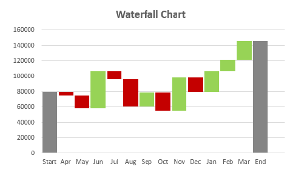
Waterfall chart is one of the most popular visualization tools used in small and large businesses, especially in Finance. Waterfall charts are ideal for showing how you have arrived at a net value such as net income, by breaking down the cumulative effect of positive and negative contributions.
What is a Waterfall Chart?
A Waterfall chart is a form of data visualization that helps in understanding the cumulative effect of sequentially introduced positive or negative values. A typical Waterfall chart is used to show how an initial value is increased and decreased by a series of intermediate values, leading to a final value.
In a Waterfall chart, the columns are color coded so that you can quickly tell positive from negative numbers. The initial and the final value columns start on the horizontal axis, while the intermediate values are floating columns.
Because of this look, Waterfall charts are also called Bridge charts, Flying Bricks charts or Cascade charts.
Advantages of Waterfall Charts
A Waterfall chart has the following advantages −
Analytical purposes − Used especially for understanding or explaining, the gradual transition in the quantitative value of an entity, which is subjected to increment or decrement.
Quantitative analysis − Used in quantitative analysis ranging from inventory analysis to performance analysis.
Tracking contracts − Starting with the number of contracts at hand at the beginning of the year, taking into account −
The new contracts that are added
The contracts that got cancelled
The contracts that are finished, and
Finally ending with the number of contracts at hand at the end of the year.
Tracking performance of company over a given number of years.
In general, if you have an initial value, and changes (positive and negative) occur to that value over a period of time, then Waterfall chart can be used to depict the initial value, positive and negative changes in their order of occurrence and the final value.
Preparation of Data
You need to prepare the data from the given input data, so that it can be portrayed as a Waterfall chart.
Consider the following data −
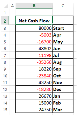
Prepare the data for the Waterfall chart as follows −
Ensure the column Net Cash Flow is to the left of the Months Column (This is because you will not include Net Cash Flow column while creating the chart).
Add two columns − Increase and Decrease for positive and negative cash flows respectively.
Add a column Start − the first column in the chart with the start value in the Net Cash Flow.
Add a column End − the last column in the chart with the end value in the Net Cash Flow.
Add a column Float − that supports the intermediate columns.
Insert formulas to compute the values in these columns as given in the table below.
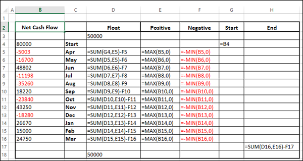
In the Float column, insert a row in the beginning and at the end. Place an arbitrary value 50000. This is just to have some space to the left and right sides of the chart.
The data will look as given in the following table −
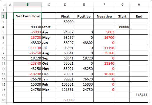
The data is ready to create a Waterfall chart.
Creating a Waterfall Chart
You can create a Waterfall chart customizing Stacked Column chart as follows −
Step 1 − Select the cells C2:H18 (i.e. excluding the Net Cash Flow column).
Step 2 − Insert Stacked Column chart.
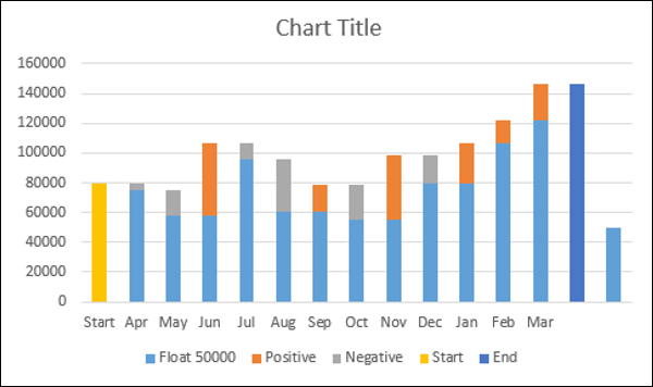
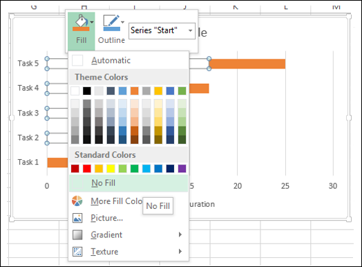
Step 3 − Right click on the Float series.
Step 4 − Click Format Data Series in the dropdown list.
Step 5 − Select No fill for FILL in the SERIES OPTIONS in the Format Data Series pane.
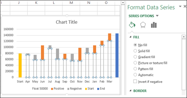
Step 6 − Right click on the Negative series.
Step 7 − Select Fill color as red.
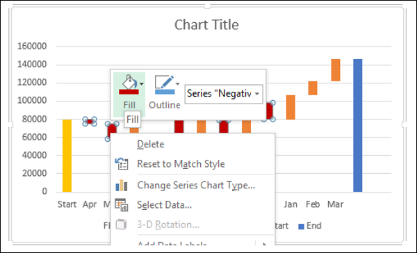
Step 8 − Right click on the Positive series.
Step 9 − Select Fill color as green.
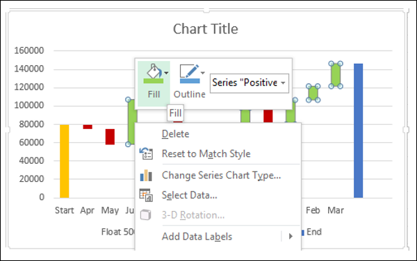
Step 10 − Right click on the Start series.
Step 11 − Select Fill color as gray.
Step 12 − Right click on the End series.
Step 13 − Select Fill color as gray.
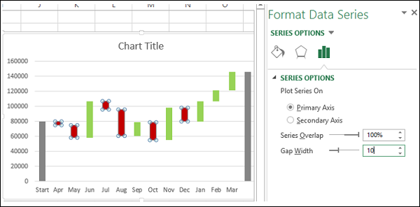
Step 14 − Right click on any of the series.
Step 15 − Select Gap Width as 10% under SERIES OPTIONS in the Format Data Series pane.
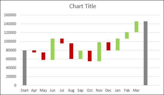
Step 16 − Give a name to the chart.
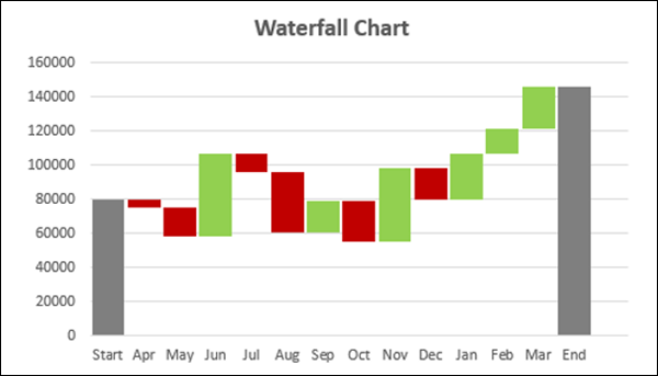
Your Waterfall chart is ready.
Advanced Excel - Band Chart
Suppose you have data across a time period to represent graphically, confiding each data point to a defined interval. For example, you might have to present customer survey results of a product from different regions. Band chart is suitable for this purpose.
What is Band Chart?
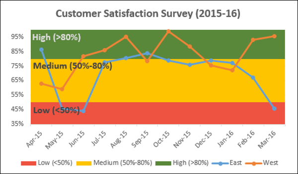
A Band chart is a Line chart with added shaded areas to display the upper and lower boundaries of the defined data ranges. The shaded areas are the Bands.
Band chart is also referred to as Range chart, High-Low Line chart or Corridor chart.
Advantages of Band Charts
Band chart is used in the following scenarios −
Monitoring a metric within standard defined bands.
Profit % for each of the regions (represented by Line chart) and bands with defined intervals in the range 0% - 100%.
Performance measurements of an employee or company responses to clients complaints.
Monitoring Service Tickets- Responded service tickets as line and the throughput time as bands.
Preparation of Data
You need to prepare the data that can be used to create a Band chart from the given input data.
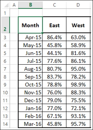
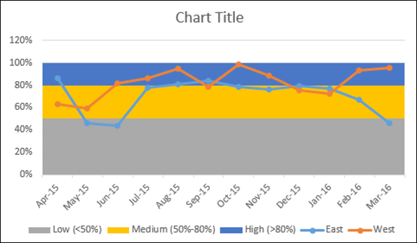
Step 1 − Consider the following data that you have from the customer survey for two regions East and West across the financial year April - March.
Suppose you want to compare this data across three intervals −
- Low (<50%).
- Medium (50% - 80%).
- High (>80%).
Step 2 − Add three columns to the above table as shown below.
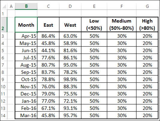
As you can observe, the values in the column Low are 50%, denoting the band 0% - 50% and the values in the column Medium are 30%, denoting the bandwidth of Medium above the band Low. Similarly the values in the column High are 20%, denoting the band width of High above the band Low.
Use this data to create a Band chart.
Creating a Band Chart
Follow the steps given below to create a Band chart −
Step 1 − Select the data in the above table.
Step 2 − Insert a Combo chart.
Step 3 − Click on Change Chart Type. Change the chart types for the data series as follows −
- Line with Markers for East series and West series.
- Stacked Column for the series - Low, Medium and High.
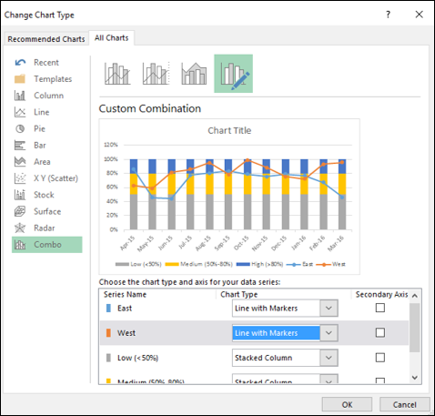
Your chart looks as shown below.
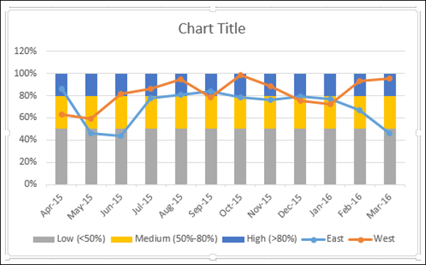
Step 4 − Click one of the Columns.
Step 5 − Change Gap Width to 0% in the Format Data Series pane.
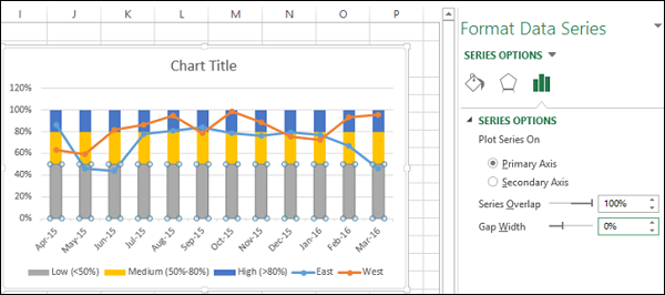
You will get Bands instead of Columns.
Step 6 − Make the chart appealing −
- Add Chart Title.
- Adjust Vertical Axis range.
- Change the colors of the bands to Green-Yellow-Red.
- Add Data Labels to bands.
The result is a Band chart with defined boundaries depicted by bands. The survey results are represented across the bands. One can quickly and clearly make out from the chart whether the survey results are satisfactory or they need attention.
Your Band chart is ready.
Advanced Excel - Gantt Chart
Gantt charts are widely in use for project planning and tracking. A Gantt chart provides a graphical illustration of a schedule that helps to plan, coordinate, and track specific tasks in a project. There are software applications that provide Gantt chart as a means of planning work and tracking the same such as Microsoft Project. However, you can create a Gantt chart easily in Excel also.
What is a Gantt Chart?
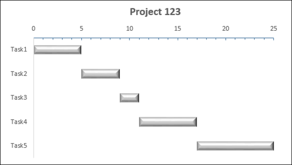
A Gantt chart is a chart in which a series of horizontal lines shows the amount of work done in certain periods of time with relation to the amount of work planned for those periods. The horizontal lines depict tasks, task duration and task hierarchy.
Henry L. Gantt, an American engineer and social scientist, developed gantt chart as a production control tool in 1917.
In Excel, you can create a Gantt chart by customizing a Stacked Bar chart type with the Bars representing tasks. An Excel Gantt chart typically uses days as the unit of time along the horizontal axis.
Advantages of Gantt Charts
Gantt chart is frequently used in project management to manage project schedule.
It provides visual timeline for starting and finishing specific tasks.
It accommodates multiple tasks and timelines into a single chart.
It is an easy way to understand visualization that shows the amount of work done, the remaining work, and schedule slippages, if any at any point of time.
If the Gantt chart is shared at a common place, it limits the number of status meetings.
Gantt chart promotes on-time deliveries, as the timeline is visible to everyone who is involved in the work.
It promotes collaboration and team spirit with project completion on-time as a common goal.
It provides a realistic view of the project progress and eliminates project end surprises.
Preparation of Data
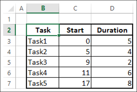
Arrange your data in a table in the following way −
Create three columns Task, Start and Duration.
In the Task column, give the names of the Tasks in the project.
In the Start column, for each Task, place the number of days from the Start Date of the project.
In the Duration column, for each Task, place the duration of the Task in days.
Note − When the Tasks are in a hierarchy, Start of any Task Taskg is Start of previous Task + its Duration. That is, Start of a Task Taskh is the End of the previous Task, Taskg if they are in a hierarchy, meaning that Taskh is dependent on Taskg. This is referred to as Task Dependency.
Following is the data −
Creating a Gantt Chart
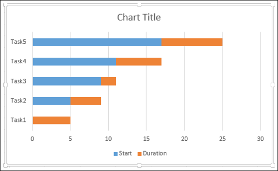
Step 1 − Select the data.
Step 2 − Insert a Stacked Bar chart.
Step 3 − Right click on a bar representing Start series.
Step 4 − Click the Fill icon. Select No Fill from the dropdown list.
Step 5 − Right click on the Vertical Axis (Categories Axis).
Step 6 − Select Format Axis from the dropdown list.
Step 7 − On the AXIS OPTIONS tab, in the Format Axis pane, check the box - Categories in reverse order.
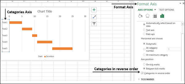
You will see that the Vertical Axis values are reversed. Moreover, the Horizontal Axis shifts to the top of the chart.
Step 8 − Make the chart appealing with some formatting.
- In Chart Elements, deselect the following −
- Legend.
- Gridlines.
- Format the Horizontal Axis as follows −
- Adjust the range.
- Major Tick Marks at 5 day intervals.
- Minor Tick Marks at 1 day intervals.
- Format Data Series to make the Bars look impressive.
- Give a Chart Title.
Your Gantt chart is ready.
Advanced Excel - Thermometer Chart
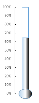
Thermometer chart is a visualization of the actual value of well-defined measure, for example, task status as compared to a target value. This is a linear version of Gauge chart that you will learn in the next chapter.
You can track your progress against the target over a period of time with a simple rising Thermometer chart.
What is a Thermometer Chart?
A Thermometer chart keeps track of a single task, for example, completion of work, representing the current status as compared to the target. It displays the percentage of the task completed, taking target as 100%.
A Thermometer chart looks as shown below.
Advantages of Thermometer Charts
Thermometer chart can be used to track any actual value as compared to the target value as percentage completed. It works with a single value and is an appealing chart that can be included in dashboards for a quick visual impact on % achieved, % performance against the target sales target, % profit, % work completion, % budget utilized, etc.
If you have multiple values to track the actuals against the targets, you can use Bullet chart that you will learn in a later chapter.
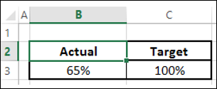
Preparation of Data
Prepare the data in the following way −
Calculate the Actual as a percentage of the actual value as compared to the target value.
Target should always be 100%.
Place your data in a table as given below.
Creating a Thermometer Chart
Following are the steps to create a Thermometer chart −
Step 1 − Select the data.
Step 2 − Insert a Clustered Column chart.
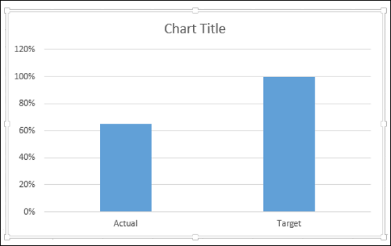
As you can see, the right Column is Target.
Step 3 − Click on a Column in the chart.
Step 4 − Click the DESIGN tab on the Ribbon.
Step 5 − Click the Switch Row/ Column button.
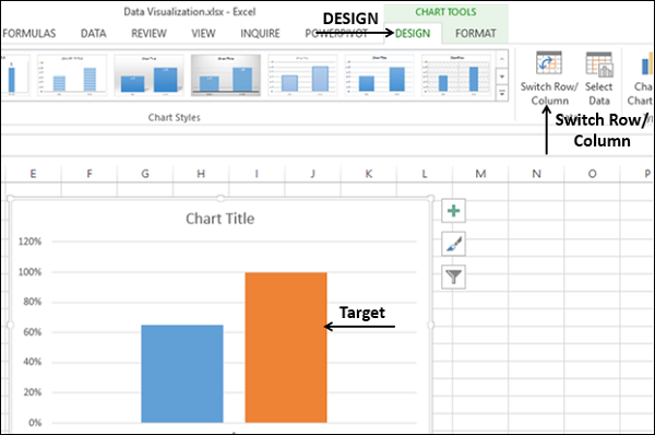
Step 6 − Right click on the Target Column.
Step 7 − Select Format Data Series from the dropdown list.
Step 8 − Click on Secondary Axis under SERIES OPTIONS in the Format Data Series pane.
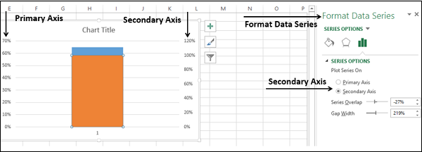
As you can see, the Primary Axis and the Secondary Axis have different ranges.
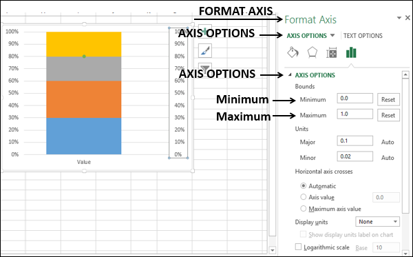
Step 9 − Right click on the Primary Axis. Select Format Axis from the dropdown list.
Step 10 − Type the following in Bounds under AXIS OPTIONS in the Format Axis pane −
- 0 for Minimum.
- 1 for Maximum.
Repeat the steps given above for the Secondary Axis to change the Bounds to 0 and 1.
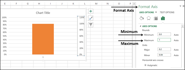
Both the Primary Axis and Secondary Axis will be set to 0% - 100%.
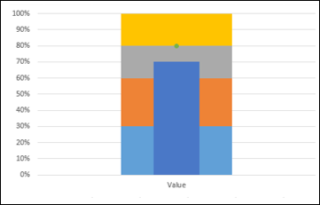
As you can observe, the Target Column hides the Actual Column.
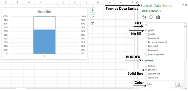
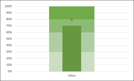
Step 11 − Right click on the visible Column, i.e. Target.
Step 12 − Select Format Data Series from the dropdown list.
In the Format Data Series pane, select the following −
- No fill under the FILL option.
- Solid line under the BORDER option.
- Blue under the Color option.
Step 13 − In Chart Elements, deselect the following −
- Axis → Primary Horizontal.
- Axis → Secondary Vertical.
- Gridlines.
- Chart Title.
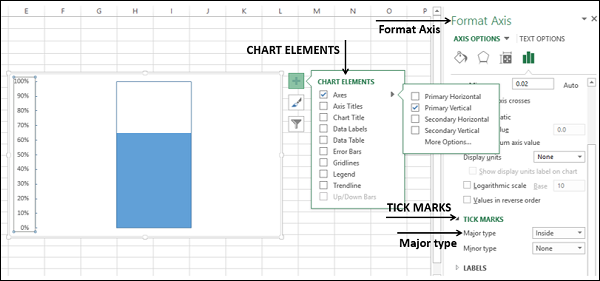
Step 14 − Right click on the Primary Vertical Axis.
Step 15 − Select Format Axis from the dropdown list.
Step 16 − Click TICK MARKS under the AXIS OPTIONS in the Format Axis pane.
Step 17 − Select the option Inside for Major type.
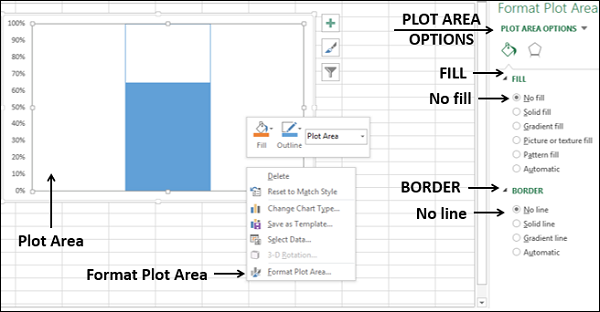
Step 18 − Right click on the Chart Area.
Step 19 − Select Format Plot Area from the dropdown list.
Step 20 − Click Fill & Line in the Format Plot Area pane. Select the following −
- No fill under the FILL option.
- No line under the BORDER option.
Step 21 − Resize the Chart Area to get the Thermometer shape for the chart.
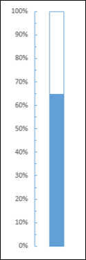
You got your Thermometer chart, with the Actual Value as against Target Value being shown.
Step 22 − You can make this Thermometer chart more appealing with some formatting.
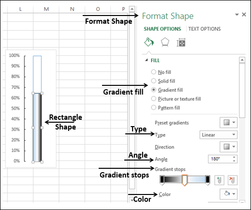
- Insert a Rectangle shape superimposing the blue rectangular part in the chart.
- In the Format Shape options, select the following −
- Gradient fill for FILL.
- Linear for Type.
- 1800 for Angle.
- Set the Gradient stops at 0%, 50% and 100%.
- For the Gradient stops at 0% and 100%, choose the color black.
- For the Gradient stop at 50%, choose the color white.
- Insert an oval shape at the bottom.
- Format the oval shape with the same options as of rectangle.
- The result will be as shown below −
Your aesthetic Thermometer chart is ready. This will look good on a dashboard or as a part of a presentation.
Advanced Excel - Gauge Chart
A Gauge is a device for measuring the amount or size of something, for example, fuel/rain/temperature gauge.
There are various scenarios where a Gauge is utilized −
- To Gauge the temperature of a person, a thermometer is used.
- To Gauge the speed of an automotive, a speedometer is used.
- To Gauge the performance of a student, a mark sheet is used.
Gauge charts came into usage to visualize the performance as against a set goal. The Gauge charts are based on the concept of speedometer of the automobiles. These have become the most preferred charts by the executives, to know at a glance whether values are falling within an acceptable value (green) or the outside acceptable value (red).
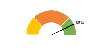
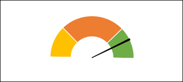
What is a Gauge Chart?
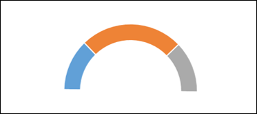
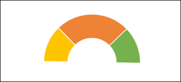
Gauge charts, also referred to as Dial charts or Speedometer charts, use a pointer or a needle to show information as a reading on a dial. A Gauge Chart shows the minimum, the maximum and the current value depicting how far from the maximum you are. Alternatively, you can have two or three ranges between the minimum and maximum values and visualize in which range the current value is falling.
A Gauge chart looks as shown below −
Advantages of Gauge Charts
Gauge charts can be used to display a value relative to one to three data ranges. They are commonly used to visualize the following −
- Work completed as against total work.
- Sales compared to a target.
- Service tickets closed as against total service tickets received.
- Profit compared to the set goal.
Disadvantages of Gauge Charts
Though the Gauge charts are still the preferred ones by most of the executives, there are certain drawbacks with them. They are −
Very simple in nature and cannot portray the context.
Often mislead by omitting key information, which is possible in the current Big Data visualization needs.
They waste space in case multiple charts are to be used. For example, to display information regarding different cars on a single dashboard.
They are not color-blind friendly.
For these reasons Bullet charts, introduced by Stephen Few are becoming prominent. The data analysts find Bullet charts to be the means for data analysis.
Creating a Gauge Chart
You can create Gauge charts in two ways −
Creating a simple Gauge chart with one value − This simple Gauge chart is based on a Pie chart.
Creating a Gauge chart with more number of Ranges − This Gauge chart is based on the combination of a Doughnut chart and a Pie chart.
Simple Gauge Chart with One Value
We will learn how to prepare the data and create a simple Gauge chart with single value.
Preparation of Data
Consider the following data −
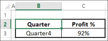
Step 1 − Create data for Gauge chart as shown below.
Step 2 − The data will look as follows −
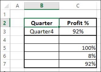
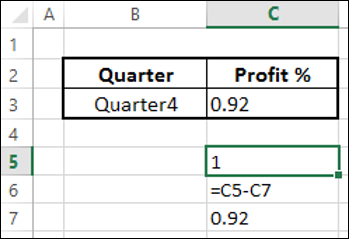
You can observe the following −
- C7 contains the value corresponding to C2.
- C5 has 100% to represent half of the Pie chart.
- C6 has a value to make C6 and C7 to be 100% that makes second half of the Pie chart.
Creating a Simple Gauge Chart
Following are the steps to create a simple Gauge chart with one value −
Step 1 − Select the data C5:C7.
Step 2 − Insert a Pie chart.
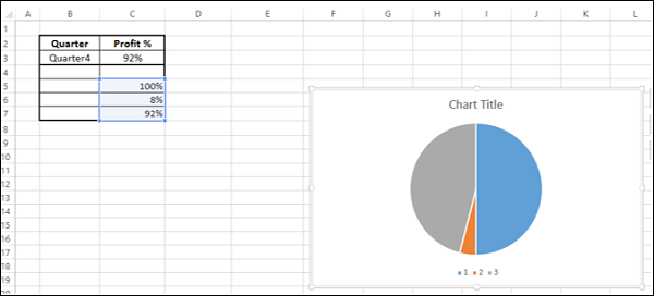
Step 3 − Right click on the chart.
Step 4 − Select Format Data Series from the dropdown list.
Step 5 − Click SERIES OPTIONS.
Step 6 − Type 90 in the box Angle of first slice.
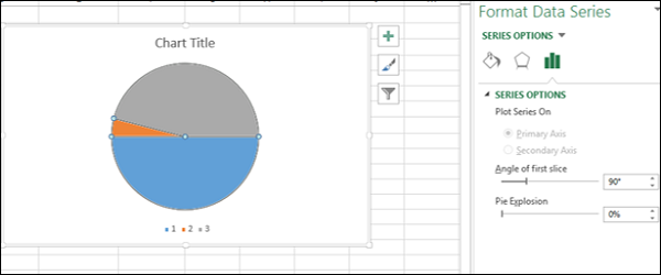
As you can observe, the upper half of the Pie chart is what you will convert to a Gauge chart.
Step 7 − Right click on the bottom Pie slice.
Step 8 − Click on Fill. Select No Fill.
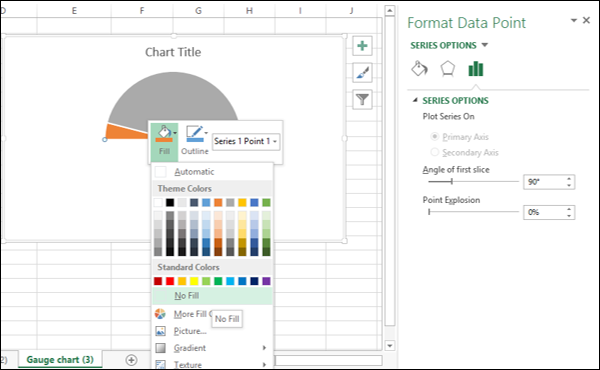
This will make the bottom Pie slice invisible.
You can see that the Pie slice on the right represents the Profit %.
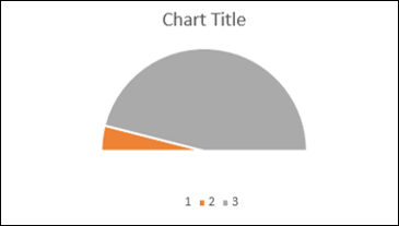
Step 9 − Make the chart appealing as follows.
- Change the Fill colors of the Pie slices.
- Click on the right Pie slice, select 3-D FORMAT as Top bevel, and choose Angle.
- Click on the left Pie slice, select 3-D FORMAT as Top bevel, and choose Divot.
- Click on the right Pie slice, select 1% as Point Explosion under SERIES OPTIONS.
- Click on the right Pie slice and add Data Label.
- Size and Position the Data Label.
- Deselect Legend in Chart Elements.
- Give the chart Title as Profit % and Position it.
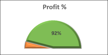
Your Gauge chart is ready.
Gauge Chart with Multiple Ranges
Now let us see how to make a gauge chart with more ranges.
Preparation of Data
Arrange the data for values as given below.
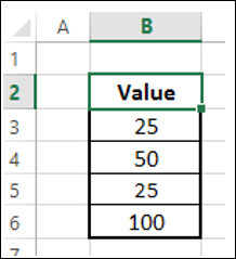
This data will be used for Doughnut chart. Arrange the data for Pointer as given below.
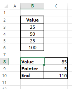
You can observe the following −
The value in the cell C8 is the value you want display in the Gauge chart.
The value in the cell C9 is the Pointer size. You can take it as 5 for brevity in formatting and later change to 1, to make it a thin pointer.
The value in the cell C10 is calculated as 200 (C8+C9). This is to complete the Pie chart.
Creating Gauge Chart with Multiple Ranges
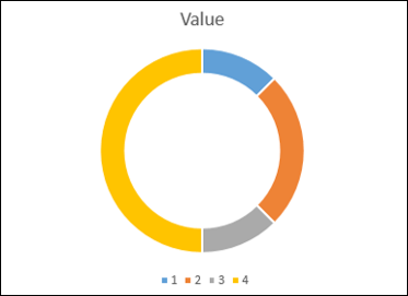
You can create the Gauge chart with a Doughnut chart showing different regions corresponding to different Values and a Pie chart denoting the pointer. Such a Gauge chart looks as follows −
Step 1 − Select the values data and create a Doughnut chart.
Step 2 − Double click on the half portion of the Doughnut chart (shown in yellow color in the above chart).
Step 3 − Right click and under the Fill category, select No Fill.
Step 4 − Deselect Chart Title and Legend from Chart Elements.
Step 5 − Right click on the chart and select Format Data Series.
Step 6 − Type 271 in the box Angle of first slice in the SERIES OPTIONS in the Format Data Series pane.
Step 7 − Change the Doughnut Hole Size to 50% in the SERIES OPTIONS in the Format Data Series pane.
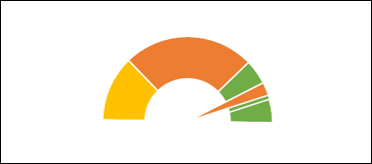
Step 8 − Change the colors to make the chart appealing.
As you can observe, the Gauge chart is complete in terms of values. The next step is to have a pointer or needle to show the status.
Step 9 − Create the pointer with a Pie chart as follows.
- Click on the Doughnut chart.
- Click the DESIGN tab on the Ribbon.
- Click Select Data in the Data group.
- Select Data Source dialog box appears. Click the Add button.
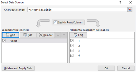
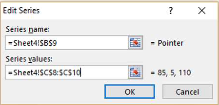
Step 10 − The Edit Series dialog box appears.
Select the cell containing the name Pointer for Series name.
Select the cells containing data for Value, Pointer and End, i.e. C8:C10 for Series values. Click OK.
Step 11 − Click OK in the Select Data Source dialog box.
Click the DESIGN tab on the Ribbon.
Click Change Chart Type in the Type group.
Change Chart Type dialog box appears. Select Combo under the tab All Charts.
Select the chart types as following −
Doughnut for Value series.
Pie for Pointer series.
Check the box Secondary Axis for the Pointer series. Click OK.
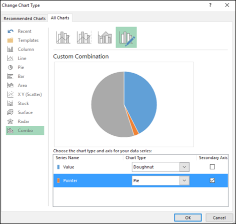
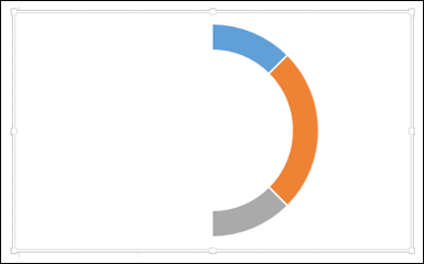
Your chart looks as shown below.
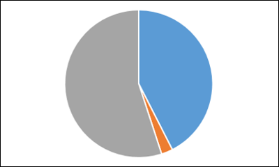
Step 12 − Right click on each of the two bigger Pie slices.
Click on Fill and then select No Fill. Right click on the Pointer Pie slice and select Format Data Series.
Type 270 for Angle of first slice in the SERIES OPTIONS. Your chart looks as shown below.
Step 13 − Right click on the Pointer Pie slice.
- Click on Format Data Series.
- Click on Fill & Line.
- Select Solid Fill for Fill and select the color as black.
- Select Solid Line for Border and select the color as black.
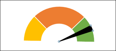
Step 14 − Change the Pointer value from 5 to 1 in the data to make the Pointer Pie slice a thin line.
Step 15 − Add a Data Label that depicts % complete.
Your Gauge chart is ready.
Advanced Excel - Bullet Chart
Bullet charts came into existence to overcome the drawbacks of Gauge charts. We can refer to them as Liner Gauge charts. Bullet charts were introduced by Stephen Few. A Bullet chart is used to compare categories easily and saves on space. The format of the Bullet chart is flexible.
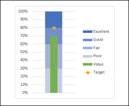
What is a Bullet Chart?
According to Stephen Few, Bullet charts support the comparison of a measure to one or more related measures (for example, a target or the same measure at some point in the past, such as a year ago) and relate the measure to defined quantitative ranges that declare its qualitative state (for example, good, satisfactory and poor). Its linear design not only gives it a small footprint, but also supports more efficient reading than the Gauge charts.
Consider an example given below −
In a Bullet chart, you will have the following components −
- The qualitative bands representing the qualitative states −
| Band | Qualitative Value |
|---|---|
| <30% | Poor |
| 30% - 60% | Fair |
| 60% - 80% | Good |
| > 80% | Excellent |
- Target Value, say 80%.
- Actual Value, say 70%.
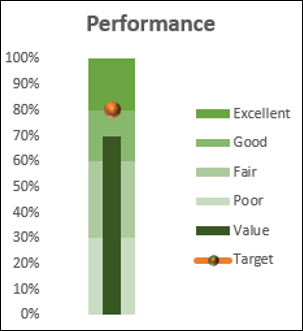
With the above values, the Bullet chart looks as shown below.
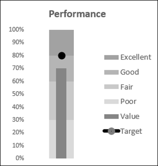
Though we used colors in the above chart, Stephen Few suggests the usage of only Gray shades in the interest of color-blind people.
Advantages of Bullet Charts
Bullet charts have the following uses and advantages −
Bullet Charts are widely used by data analysts and dashboard vendors.
Bullet charts can be used to compare the performance of a metric. For example, if you want to compare the sales of two years or to compare the total sales to a target, you can use bullet charts.
You can use Bullet chart to track the number of defects in Low, Medium and High categories.
You can visualize the Revenue flow across the Fiscal year.
You can visualize the expenses across the Fiscal year.
You can track Profit%.
You can visualize customer satisfaction and can be used to display KPIs also.
Preparation of Data
Arrange the data as given below.
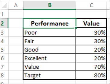
As you can observe, the qualitative values are given in the column Performance. The Bands are represented by the column Value.
Creating a Bullet Chart
Following are the steps to create a Bullet chart −
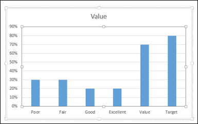
Step 1 − Select the data and insert a Stacked Column chart.
Step 2 − Click on the chart.
Step 3 − Click the DESIGN tab on the Ribbon.
Step 4 − Click Switch Row/ Column button in the Data group.
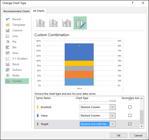
Step 5 − Change the chart type.
- Click Change Chart Type.
- Click the Combo icon.
- Change the chart type for Target to Stacked Line with Markers.
- Check the box Secondary Axis for Target and click OK.
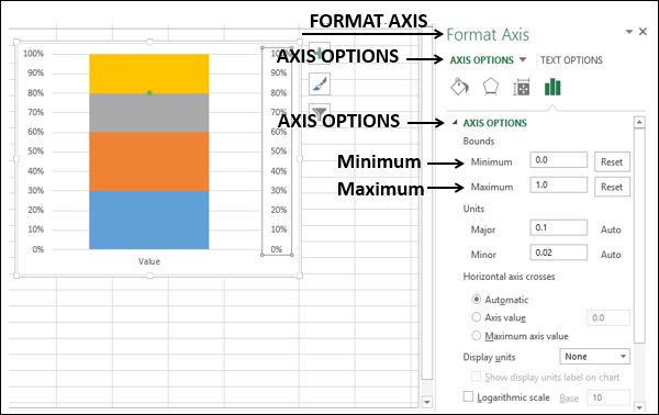
Step 6 − As you can see, the Primary and the Secondary Vertical Axis have different ranges. Make them equal as follows.
- Right click on Primary Vertical Axis and select Format Axis.
- Click on the AXIS OPTIONS tab in the Format Axis pane.
- In AXIS OPIONS, under Bounds, type the following −
- 0.0 for Minimum
- 1.0 for Maximum
- Repeat the above steps for Secondary Vertical Axis.
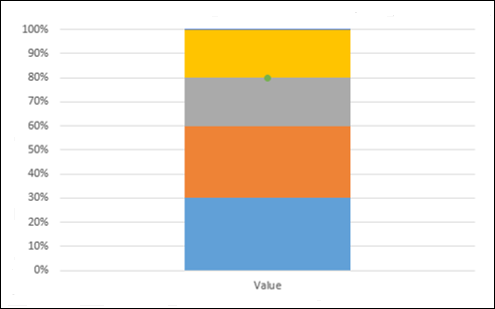
Step 7 − Deselect Secondary Vertical Axis in the Chart Elements.
Step 8 − Design the chart
- Click on the chart.
- Click the DESIGN tab on the Ribbon.
- Click Change Chart Type.
- Check the Secondary Axis box for the Value series.
Step 9 − Right click on the column for Value (blue color in the above chart).
Step 10 − Select Format Data Series.
Step 11 − Change Gap Width to 500% under SERIES OPTIONS in Format Data Series pane.
Step 12 − Deselect Secondary Vertical Axis in the Chart Elements.
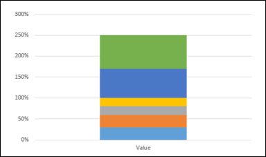
The chart will look as follows −
Step 13 − Design the chart as follows −
- Click on the chart.
- Click Chart Styles at the right corner of the chart.
- Click the COLOR tab.
- Select Color 17.
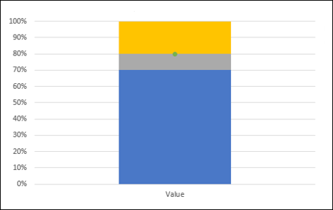
Step 14 − Fine tune the chart as follows.
- Right click on the Value column.
- Change the Fill color to dark green.
- Click on the Target.
- Change the Fill and Line color of Marker to orange.
- Increase the size of the Marker.
Step 15 − Fine-tune the chart design.
- Resize the chart.
- Select Legend in Chart Elements.
- Deselect Primary Horizontal Axis in Chart Elements.
- Deselect Gridlines in Chart Elements.
- Give a Chart Title.
Your Bullet chart is ready.
You can change the color of the chart to gray gradient scale to make it colorblind friendly.
Bullet Chart in Reverse Contexts
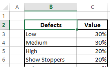
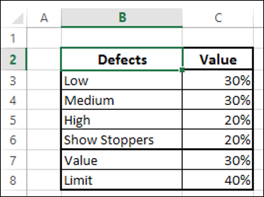
Suppose you want to display the number of defects found in a Bullet chart. In this case, lesser defects mean greater quality. You can define defect categories as follows −
Step 1 − You can then define a Limit for number of defects and represent the number of defects found by a Value. Add Value and Limit to the above table.
Step 2 − Select the data.
Step 3 − Create a Bullet chart as you have learnt in the previous section.
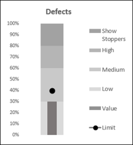
As you can see, the ranges are changed to correctly interpret the context.
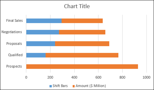
Advanced Excel - Funnel Chart
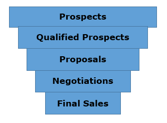
Funnel chart is used to visualize the progressive reduction of data as it passes from one phase to another. Data in each of these phases is represented as different portions of 100% (the whole). Like the Pie chart, the Funnel chart does not use any axes either.
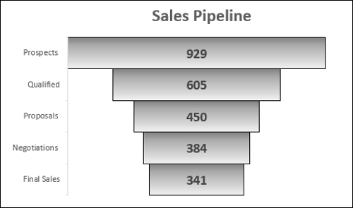
For example, in a sales pipeline, there will be stages as shown below.
Prospects → Qualified Prospects → Proposals → Negotiations → Final Sales.
Typically, the values decrease gradually. Many prospects are identified, but a part of them are validated and even lesser qualify for Proposals. A still lesser number come for negotiations and in the end, there is only a handful of deals that are won. This will make the bars resemble a funnel.
What is a Funnel Chart?
The Funnel chart shows a process that starts at the initial state and ends with a final state, where it is noticeable in what stages the fall out happens and by what magnitude. If the chart is also combined with research data, meaning quantified measurements of just how many items are lost at each step of the sales or order fulfillment process, then the Funnel chart illustrates where the biggest bottlenecks are in the process.
Unlike a real funnel, not everything that is poured in at the top flows through to the bottom. The name only refers to the shape of the chart, the purpose of which is illustrative.
Another variant of Funnel chart is where the data in each of these phases is represented as different portions of 100% (the whole), to show at what rate the changes occur along the Funnel.
Like the Pie chart, the Funnel chart does not use any axes either.
Advantages of Funnel Charts
Funnel chart can be used in various scenarios, including the following −
To allow executives to see how effective the sales team is in turning a sales lead into a closed deal.
A Funnel chart can be used to display Web site visitor trends. It can display visitor page hits to the home page at the top, and the other areas, for e.g. the web site downloads or the people interested in buying the product will be proportionally smaller.
Order fulfillment funnel chart with the initiated orders on top and down to the bottom the orders delivered to satisfied customers. It shows how many there are still in the process and the percentage cancelled and returned.
Another use of Funnel chart is to display sales by each salesperson.
Funnel chart can also be used to evaluate Recruitment process.
Funnel chart can also be used to analyze the order fulfillment process.
Preparation of Data
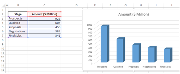
Place the data values in a table.
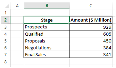
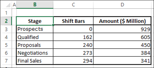
Step 1 − Insert a column in the table as shown below.
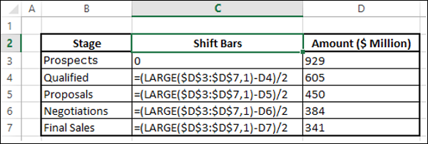
You will get the following data. You will use this table to create the Funnel chart.
Creating a Funnel Chart
Following are the steps to create the Funnel chart −
Step 1 − Select the data and insert a Stacked Bar chart.
Step 2 − Right click on the Shift Bars (blue color in the above chart) and change Fill color to No Fill.
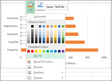
The chart looks as shown below.
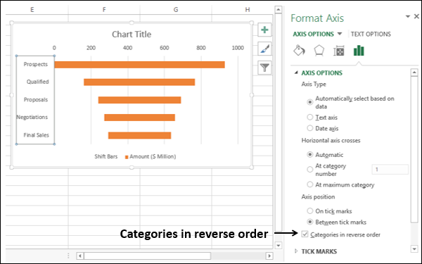
Step 3 − Design the chart as follows.
- Right click on the Vertical Axis.
- Select Format Axis from the dropdown list.
- Click AXIS OPTIONS in the Format Axis pane.
- Check the box Categories in reverse order.
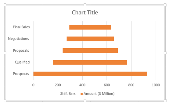
Step 4 − Fine tune the chart as follows.
- Deselect Legend in Chart Elements.
- Change the Chart Title.
- Right click on the orange Bars.
- Select Format Data Series.
- Change the Gap Width to 0% in the SERIES OPTIONS.
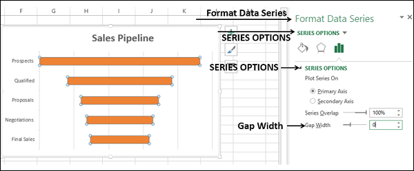
Step 5 − Select Data Labels in Chart Elements.
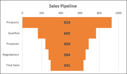
Your Sales Pipeline Funnel chart is ready.
Formatting a Funnel Chart
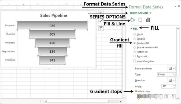
Step 6 − Make the chart more appealing as follows
- Click on the Chart Elements.
- Deselect Horizontal Axis.
- Deselect Gridlines.
- Right click on the Bars.
- Select Format Data Series from the dropdown list.
- Click on Fill & Line under SERIES OPTIONS in the Format Data Series pane.
- Click on Gradient fill under the Fill option.
- Set Gradient stops.
Step 7 − Click on Solid line under BORDER. Select Color as black.
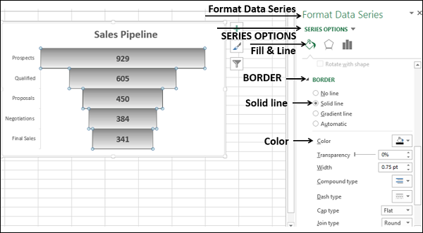
Your formatted Funnel chart is ready.
Aesthetic Funnel Chart
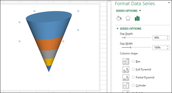
Now that you understood the fundamentals of Funnel chart, you can proceed to create an aesthetic Funnel chart that actually looks like a Funnel as follows −
Step 1 − Start with the original table of data.

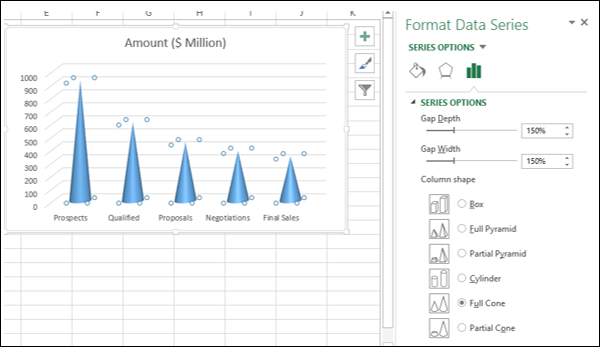
Step 2 − Select the data and insert a 3-D Stacked Column chart.
Step 3 − Design the chart as follows.
- Right click on the Columns.
- Select Format Data Series.
- Click on SERIES OPTIONS in the Format Data Series pane.
- Select Full Cone under Column shape.
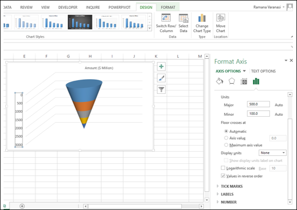
Step 4 − Fine tune the chart as follows.
- Click the Design tab on the Ribbon.
- Click Switch Row / Column.
- Right click on the Vertical Axis and select Format Axis from the dropdown list.
- Click AXIS OPTIONS in the Format Axis pane.
- Check the box Values in reverse order.
Step 5 − Deselect all the Chart Elements
Step 6 − Right click on the Bars and select Format Data Series from the dropdown list.
Step 7 − Click on SERIES OPTIONS in the Format Data Series pane and type 50% for Gap Depth under SERIES OPTIONS.
Step 8 − Format your chart with details as follows.
- Select Data Labels in Chart Elements.
- Place them and format them.
- You can choose Call Out option for the Data Label of the bottom part.
- Give a Chart Title.
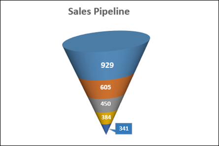
Your Funnel chart is ready.
Advanced Excel - Waffle Chart
Waffle chart adds beauty to your data visualization, if you want to display work progress as percentage of completion, goal achieved vs Target, etc. It gives a quick visual cue of what you want to portray.
Waffle chart is also known as Square Pie chart or Matrix chart.
What is a Waffle Chart?
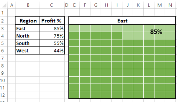
Waffle chart is a 10 × 10 cell grid with the cells colored as per conditional formatting. The grid represents values in the range 1% - 100% and the cells will be highlighted with the conditional formatting applied to the % values they contain. For example, if the percentage of completion of work is 85%, it is portrayed by formatting all the cells that contain values <= 85% with a specific color, say green.
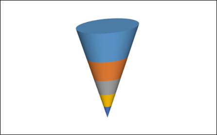
Waffle chart looks as shown below.
Advantages of Waffle Chart
Waffle chart has the following advantages −
- It is visually interesting.
- It is very readable.
- It is discoverable.
- It does not distort the data.
- It provides visual communication beyond simple data visualization.
Uses of Waffle Chart
The Waffle chart is used for completely flat data that adds up to 100%. The percentage of a variable is highlighted to give the depiction by the number of cells that are highlighted. It can be used for various purposes, including the following −
- To display the percentage of work that is complete.
- To display the percentage of progress that is made.
- To depict the expenses incurred as against the budget.
- To display Profit %.
- To portray the actual value achieved as against the set target, say in sales.
- To visualize the company progress as against the goals that are set.
- To display the pass percentage in an exam in a college / city/ state.
Creating a Waffle Chart Grid
For the Waffle Chart, you need to first create the 10 × 10 Grid of square cells such that the Grid itself will be a square.
Step 1 − Create a 10 × 10 square grid on an Excel sheet by adjusting the cell widths.
Step 2 − Fill the cells with % values, starting with 1% in the left-bottom cell and ending with 100% in the right-top cell.
Step 3 − Decrease the font size such that all the values are visible but do not change the shape of the grid.
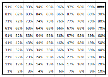
This is the grid that you will use for the Waffle chart.
Creating a Waffle Chart
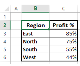
Suppose you have the following data −
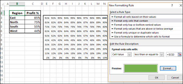
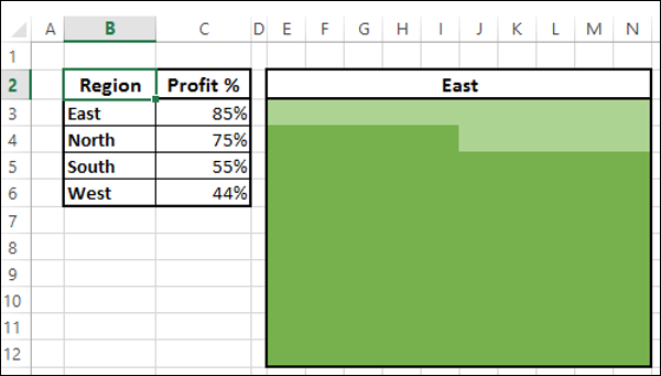
Step 1 − Create a Waffle chart that displays the Profit% for the Region East by applying Conditional Formatting to the Grid you have created as follows −
Select the Grid.
Click Conditional Formatting on the Ribbon.
Select New Rule from the drop down list.
Define the Rule to format values <= 85 % (give the cell reference of the Profit %) with fill color and font color as dark green.
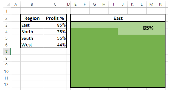
Step 2 − Define another rule to format values > 85 % (give the cell reference of the Profit %) with fill color and font color as light green.
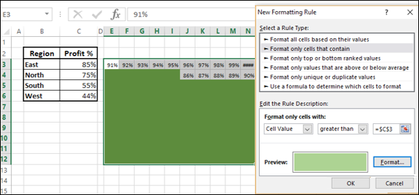
Step 3 − Give the Chart Title by giving reference to the cell B3.
As you can see, choosing the same color for both Fill and Font enable you not to display the %values.
Step 4 − Give a Label to the chart as follows.
- Insert a Text box in the chart.
- Give the reference to the cell C3 in the Text box.
Step 5 − Color the cell borders white.

Your Waffle chart for the Region East is ready.
Create Waffle charts for the Regions, i.e. North, South and West as follows −
Create the Grids for North, South and West as given in the previous section.
For each Grid, apply conditional formatting as given above based on the corresponding Profit % value.
You can also make Waffle charts for different regions distinctly, by choosing a variation in the colors for Conditional Formatting.
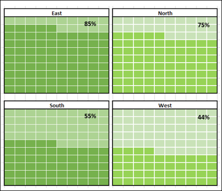
As you can see, the colors chosen for the Waffle charts on the right are varying from the colors chosen for the Waffle charts on the left.
Advanced Excel Charts - Heat Map
Heat Map is normally used to refer to the colored distinction of areas in a two dimensional array, with each color associated with a different characteristic shared by each area.
In Excel, Heat Map can be applied to a range of cells based on the values that they contain by using cell colors and/or font colors. Excel Conditional Formatting comes handy for this purpose.
What is a Heat Map?
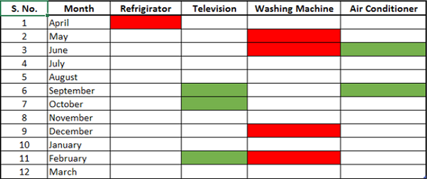
A Heat Map is a visual representation of data in a table to highlight the data points of significance. For example, if you have month wise data on sale of products over the last one year, you can project in which months a product has high or low sales.
A Heat Map looks as shown below.
Advantages of Heat Maps
Heat Map can be used to visually display the different ranges of data with distinct colors. This is very useful when you have large data sets and you want to quickly visualize certain traits in the data.
Heat maps are used to −
- Highlight the top few and the bottom few of a range of values.
- Portray a trend in the values by using color shades.
- Identify blank cells say in an answer sheet or a questionnaire.
- Highlight the quality ranges of the products.
- Highlight the numbers in supply chain.
- Highlight negative values.
- Highlight zero values.
- Highlight outliers defined by thresholds.
Preparation of Data
Arrange the data in a table.
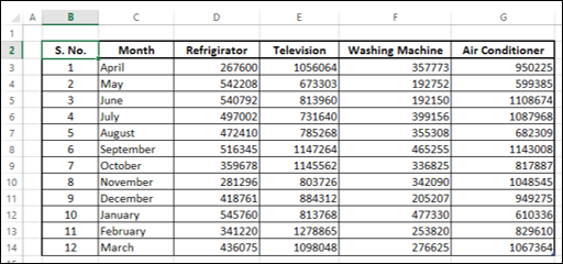
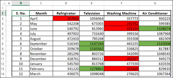
As you can see, the data is for a fiscal year, April March, month-wise for each product. You can create a Heat Map to quickly identify during what months the sales were high or low.
Creating a Heat Map
Following are the steps to create a Heat Map −
Step 1 − Select the data.
Step 2 − Click Conditional Formatting on the Ribbon. Click Manage Rules and add rules as shown below.
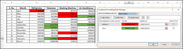
The top five values are colored with green (fill) and the bottom five values are colored with red (fill).
Creating Heat Map without Displaying Values
At times, the viewers might be just be interested in the information and the numbers might not be necessary. In such a case, you can do a bit of formatting as follows −
Step 1 − Select the data and select the font color as white.
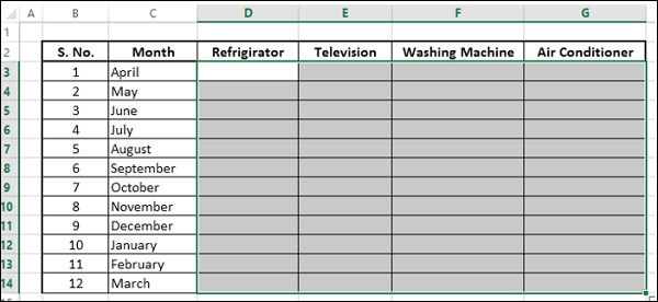
As you can see, the numbers are not visible. Next, you need to highlight the top five and bottom five values without displaying the numbers.
Step 2 − Select the data (which is not visible, of course).
Step 3 − Apply Conditional Formatting such that the top five values are colored with green (both fill and font) and the bottom five values are colored with red (both fill and font).
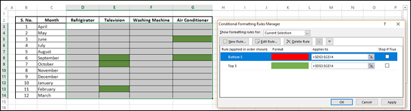
Step 4 − Click the Apply button.
This gives a quick visualization of high and low sales across the year and across the products. As you have chosen the same color for both fill and font, the values are not visible.
Advanced Excel - Step Chart
Step chart is useful if you have to display the data that changes at irregular intervals and remains constant between the changes. For example, Step chart can be used to show the price changes of commodities, changes in tax rates, changes in interest rates, etc.
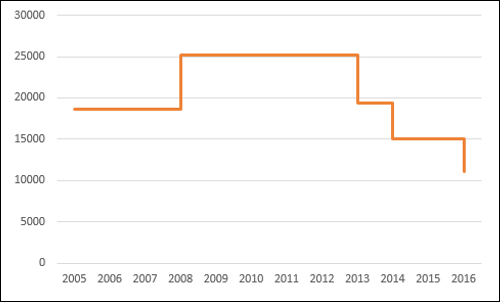
What is a Step Chart?
A Step chart is a Line chart that does not use the shortest distance to connect two data points. Instead, it uses vertical and horizontal lines to connect the data points in a series forming a step-like progression. The vertical parts of a Step chart denote changes in the data and their magnitude. The horizontal parts of a Step chart denote the constancy of the data.
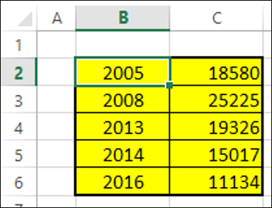
Consider the following data −
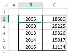
As you can observe, the data changes are occurring at irregular intervals.
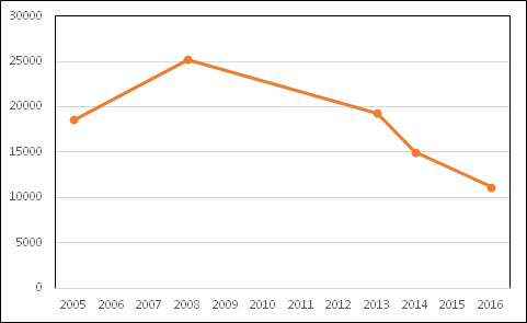
A Step chart looks as shown below.
As you can see, the data changes are occurring at irregular intervals. When the data remains constant, it is depicted by a horizontal Line, till a change occurs. When a change occurs, its magnitude is depicted by a vertical Line.
If you had displayed the same data with a Line chart, it would be like as shown below.
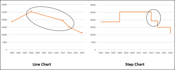
Differences between Line Charts and Step Charts
You can identify the following differences between a Line chart and a Step chart for the same data −
The focus of the Line chart is on the trend of the data points and not the exact time of the change. A Step chart shows the exact time of the change in the data along with the trend.
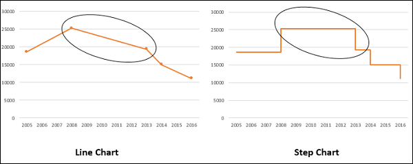
A Line chart cannot depict the magnitude of the change but a Step chart visually depicts the magnitude of the change.
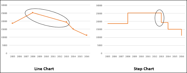
Line chart cannot show the duration for which there is no change in a data value. A Step chart can clearly show the duration for which there is no change in a data value.
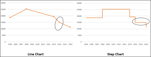
A Line chart can sometimes be deceptive in displaying the trend between two data values. For example, Line chart can show a change between two values, while it is not the case. On the other hand, a step chart can clearly display the steadiness when there are no changes.
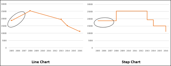
A Line chart can display a sudden increase/decrease, though the changes occur only on two occasions. A Step chart can display only the two occurred changes and when the changes actually happened.
Advantages of Step Charts
Step charts are useful to portray any type of data that has an innate nature of data changes at irregular intervals of time. Examples include the following −
- Interest rates vs. time.
- Tax rates vs. income.
- Electricity charges slabs based on the Units utilized.
Preparation of Data
Consider the following data −
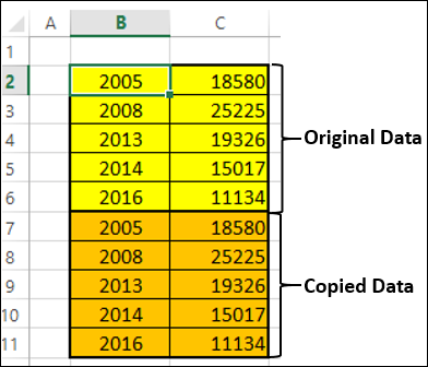
Step 1 − Select the data. Copy and paste the data below the last row of the data.
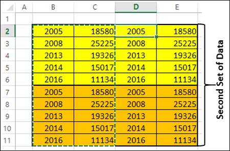
Step 2 − Copy and paste the entire data on the right side of the data. The data looks as given below.
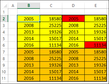
Step 3 − Delete the cells highlighted in red that are depicted in the table of second set of data given below.
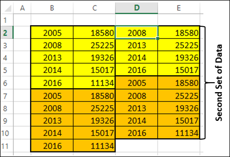
Step 4 − Shift the cells up while deleting. The second set of data looks as given below.
Step 5 − Copy the second set of data and paste it to the right side of it to get the third set of data.
Step 6 − Select the third set of data. Sort it from the smallest to the largest values.
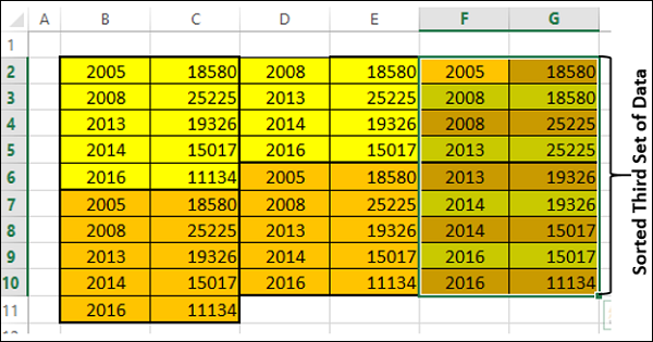
You need to use this sorted third set of data to create the Step chart.
Creating a Step Chart
Follow the steps given below to create a step chart −
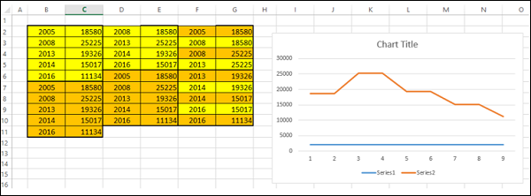
Step 1 − Select the third set of data and insert a Line chart.
Step 2 − Format the chart as follows −
Click on the chart.
Click the DESIGN tab on the Ribbon.
Click Select Data in the Data group. The Select Data Source dialog box appears.
Select Series1 under Legend Entries (Series).
Click the Remove button.
Click the Edit button under Horizontal (Category) Axis Labels. Click OK.
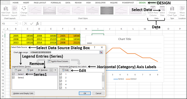
The Axis Labels dialog box appears.
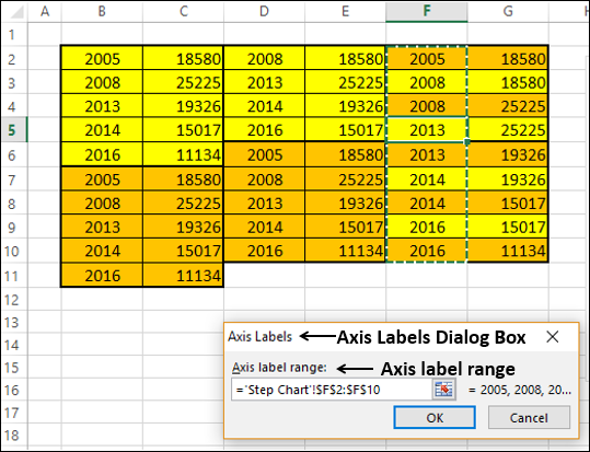
Step 3 − Select the cells F2:F10 under the Axis labels range and click OK.
Step 4 − Click OK in the Select Data Source dialog box. Your chart will look as shown below.
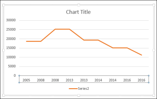
Step 5 − As you can observe, some values (Years) in the Horizontal (Category) Axis are missing. To insert the values, follow the steps given below.
- Right click on the Horizontal Axis.
- Select Format Axis.
- Click AXIS OPTIONS in the Format Axis pane.
- Select Date Axis under Axis Type in AXIS OPTIONS.
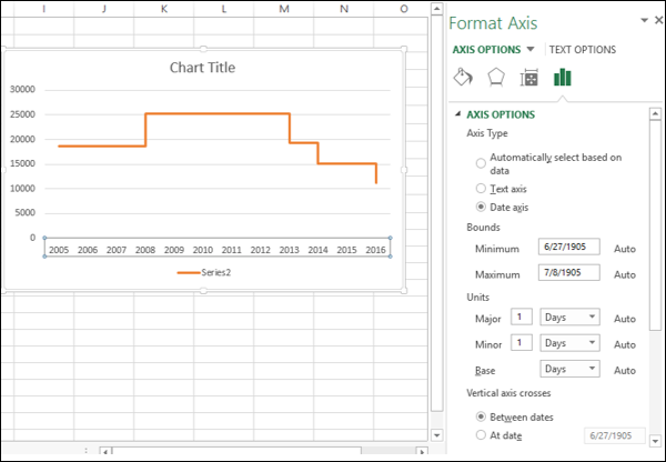
As you can see, the Horizontal (Category) Axis now contains even the missing Years in the Category values. Further, until a change occurs, the line is horizontal. When there is a change, its magnitude is depicted by the height of the vertical line.
Step 6 − Deselect the Chart Title and Legend in Chart Elements.
Your Step chart is ready.
Advanced Excel - Box and Whisker Chart
Box and Whisker charts, also referred to as Box Plots are commonly used in statistical analysis. For example, you can use a Box and Whisker chart to compare experimental results or competitive exam results.
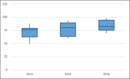
What is a Box and Whisker Chart?
In a Box and Whisker chart, numerical data is divided into quartiles and a box is drawn between the first and third quartiles, with an additional line drawn along the second quartile to mark the median. The minimums and maximums outside the first and third quartiles are depicted with lines, which are called whiskers. Whiskers indicate variability outside the upper and lower quartiles, and any point outside the whiskers is considered as an outlier.
A Box and Whisker chart looks as shown below.
Advantages of Box and Whisker Charts
You can use Box and Whisker chart wherever to understand the distribution of data. And the data can be diverse that is drawn from any field for statistical analysis. Examples include the following −
Survey responses on a particular product or service to understand the users preferences.
Examination results to identify which students need more attention in a particular subject.
Question-Answer patterns for a competitive examination to finalize the combination of categories.
Laboratory results to draw conclusions on a new drug that is invented.
Traffic patterns on a particular route to streamline the signals that are enroute. The outliers also help in identifying the reasons for the data to get outcast.
Preparation of Data
Suppose you are given the following data −
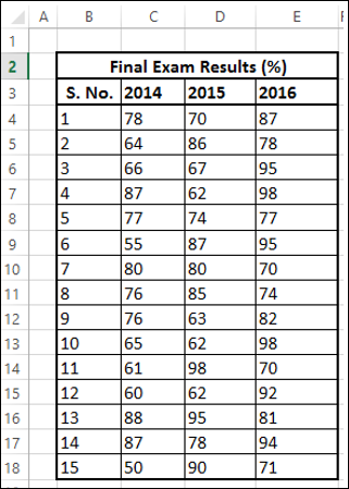
Create a second table from the above table as follows −
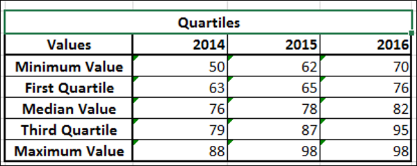
Step 1 − Compute the following for each of the series 2014, 2015 and 2016 using Excel Functions MIN, QUARTILE and MAX.
- Minimum Value.
- First Quartile.
- Median Value.
- Third Quartile.
- Maximum Value.
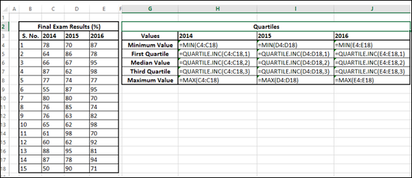
The resulting second table will be as given below.
Step 2 − Create a third table from the second table, computing the differences −
- Retain the first row Minimum Value as it is.
- In the second row compute values as First Quartile - Minimum Value.
- In the third row compute values as Median Value - First Quartile.
- In the fourth row compute values as Third Quartile - Median Value.
- In the fifth row compute values as Maximum Value - Third Quartile.
You will get the third table as shown below.
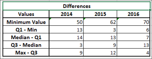
You will use this data for the Box and Whisker chart.
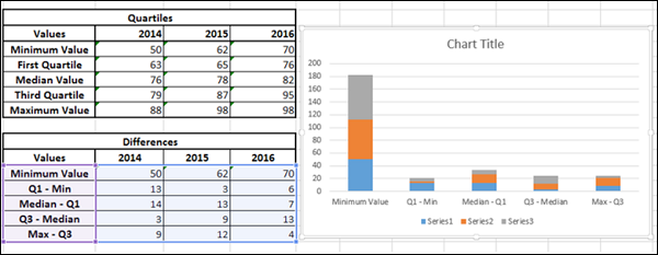
Creating a Box and Whisker Chart
Following are the steps to create a Box and Whisker chart.
Step 1 − Select the data obtained as the third table in the previous section.
Step 2 − Insert a Stacked Column chart.
Step 3 − Click the DESIGN tab on the Ribbon.
Step 4 − Click Switch Row / Column button in the Data group.
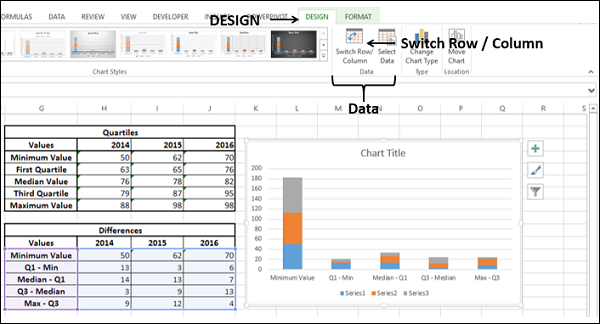
Your chart will be as shown below.
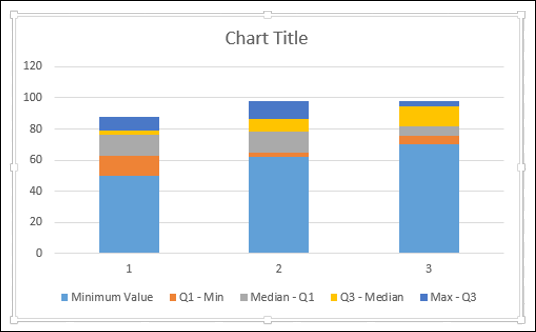
Step 5 − Right click on the bottom Data Series. Click Fill and select No Fill.
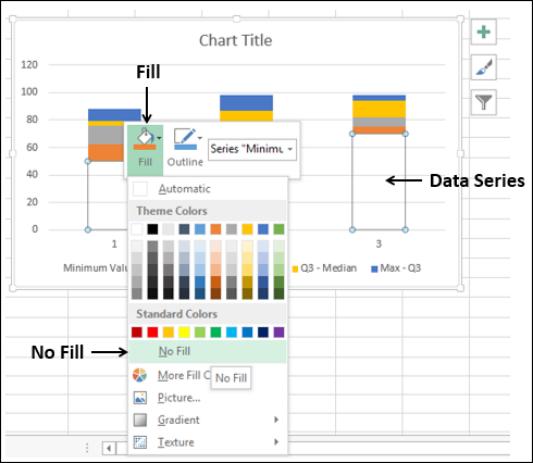
The bottom Data series becomes invisible.
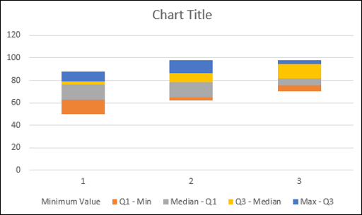
Step 6 − Deselect Chart Title and Legend in Chart Elements.
Step 7 − Change the Horizontal Axis Labels to 2014, 2015 and 2016.
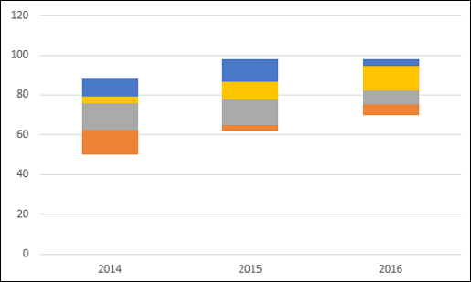
Step 8 − Now, your Boxes are ready. Next, you have to create the Whiskers.
- Right click on the Top Data Series.
- Change Fill to No Fill.
- Click the DESIGN tab on the Ribbon.
- Click Add Chart Element in the Chart layouts group.
- Click Error Bars in the dropdown list and select Standard Deviation.
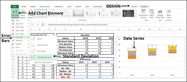
Step 9 − You got the top Whiskers. Next, format Whiskers (Error Bars) as follows −
Right click on the Error Bars.
Select Format Error Bars.
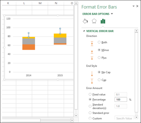
Select the following under ERROR BAR OPTIONS in the Format Error Bars pane.
Select Minus under Direction.
Select No Cap under End Style.
Select Percentage under Error Amount and type 100.
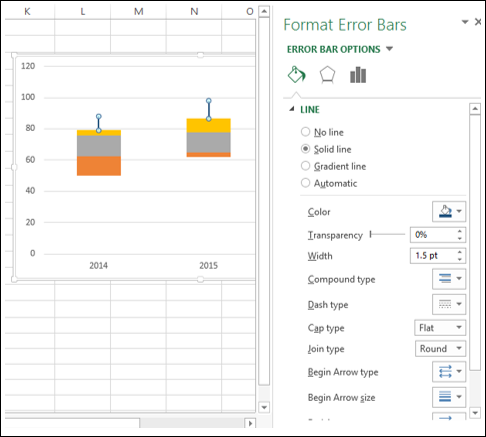
Step 10 − Click the Fill & Line tab under ERROR BAR OPTIONS in the Format Error Bars pane.
- Select Solid line under LINE.
- Select the color as dark blue.
- Type 1.5 in the Width box.
Step 11 − Repeat the above given steps for the second lower bottom Series.
Step 12 − Next, format the boxes as follows.
- Right click on one of the Box series.
- Click Fill.
- Choose color as light blue.
- Click Outline.
- Choose the color as dark blue.
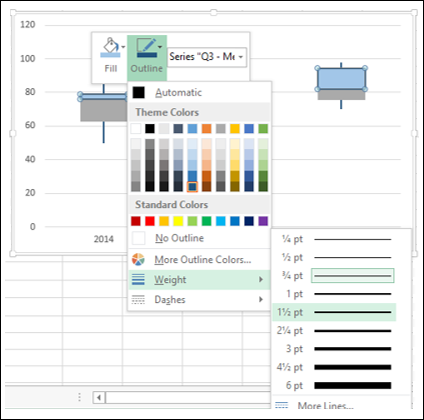
- Click Weight.
- Select 1½ pt.
Step 13 − Repeat the steps given above for the other Box series.
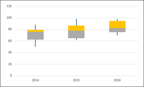
Your Box and Whisker chart is ready.
Advanced Excel Charts - Histogram
A Histogram is a graphical representation of the distribution of numerical data. It is widely used in Statistical Analysis. Karl Pearson introduced histogram.
In Excel, you can create a Histogram from the Analysis ToolPak that comes as an add-in with Excel. However, in such a case, when the data is updated, Histogram will not reflect the changed data unless it is modified through Analysis ToolPak again.
In this chapter, you will learn how to create a Histogram from a Column chart. In this case, when the source data is updated the chart also gets refreshed.
What is a Histogram?
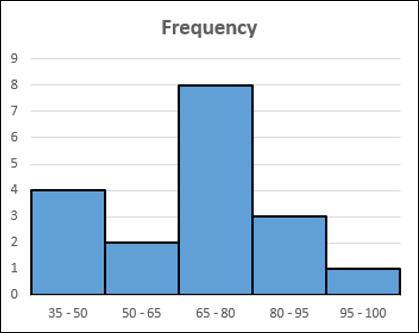
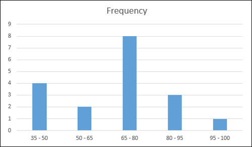
A Histogram is represented by rectangles with lengths corresponding to the number of occurrences of a variable in successive numerical intervals. The numerical intervals are called bins and the number of occurrences is called frequency.
The bins are usually specified as consecutive, non-overlapping intervals of the variable. The bins must be adjacent and are of equal size. A rectangle over a bin with height proportional to the frequency of the bin depicts the number of cases in that bin. Thus, the horizontal axis represents the bins whereas the vertical axis represents the frequency. The rectangles are colored or shaded.
A Histogram will be as shown below.
Advantages of Histograms
Histogram is used to inspect the data for its underlying distribution, outliers, skewness, etc. For example, Histogram can be used in statistical analysis in the following scenarios −
A census of a country to obtain the people of various age groups.
A survey focused on the demography of a country to obtain the literacy levels.
A study on the effect of tropical diseases during a season across different regions in a state.
Preparation of Data
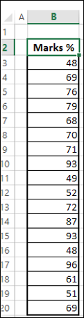
Consider the data given below.
Create bins and calculate the number of values in each bin from the above data as shown below −
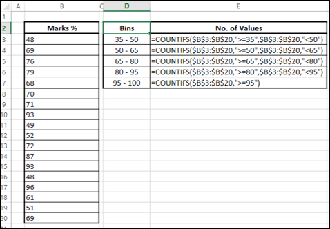
The number of values in a bin is referred to as the frequency of that bin.
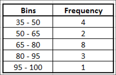
This table is called a Frequency table and we will use it to create the Histogram.
Creating a Histogram
Following are the steps to create a Histogram.
Step 1 − Select the data in the Frequency table.
Step 2 − Insert a Clustered Column chart.
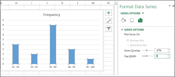
Step 3 − Right click on the Columns and select Format Data Series from the dropdown list.
Step 4 − Click SERIES OPTIONS and change the Gap Width to 0 under SERIES OPTIONS.
Step 5 − Format the chart as follows.
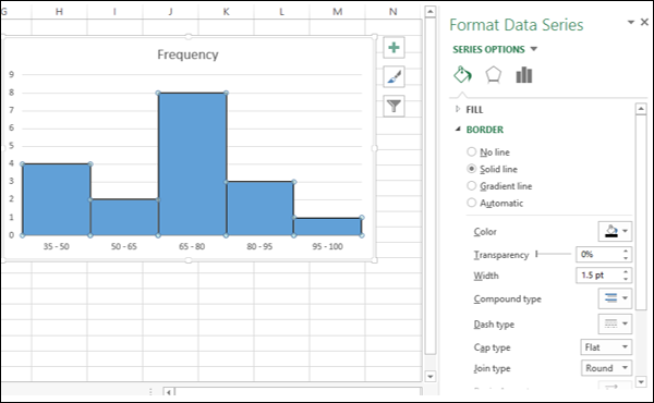
- Click on Fill & Line.
- Click on Solid Line under Border.
- Select black for color.
- Type 1.5 for Width.
Step 6 − Adjust the size of the chart.
Your Histogram is ready. As you can observe, the length of each column corresponds to the frequency of that particular bin.
Advanced Excel - Pareto Chart
Pareto chart is widely used in Statistical Analysis for decision-making. It represents the Pareto principle, also called the 80/20 Rule.
Pareto Principle (80/20 Rule)
Pareto principle, also called the 80/20 Rule means that 80% of the results are due to 20% of the causes. For example, 80% of the defects can be attributed to the key 20% of the causes. It is also termed as vital few and trivial many.
Vilfredo Pareto conducted surveys and observed that 80% of income in most of the countries went to 20% of the population.
Examples of Pareto Principle (80/20 Rule)
The Pareto principle or the 80/20 Rule can be applied to various scenarios −
- 80% of customer complaints arise from 20% of your supplies.
- 80% of schedule delays result from 20% of the key causes.
- 80% of a company profit can be attributed to 20% of its products.
- 80% of a company revenues are produced by 20% of the employees.
- 80% of the system problems are caused by 20% of causes of defects.
What is a Pareto Chart?
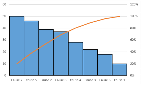
A Pareto chart is a combination of a Column chart and a Line chart. The Pareto chart shows the Columns in descending order of the Frequencies and the Line depicts the cumulative totals of Categories.
A Pareto chart will be as shown below −
Advantages of Pareto Charts
You can use a Pareto chart for the following −
- To analyze data about the frequency of problems in a process.
- To identify the significant causes for problems in a process.
- To identify the significant areas of defects in a product.
- To understand the significant bottlenecks in a process pipeline.
- To identify the largest issues being faced by a team or an organization.
- To know the top few reasons for employee attrition.
- To identify the topmost products that result in high profit.
- To decide on the significant improvements that increase the value of a company.
Preparation of Data
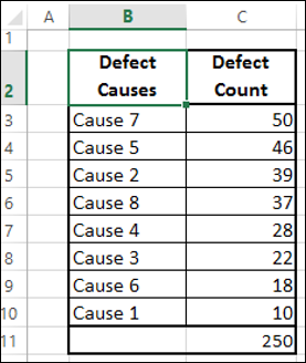
Consider the following data, where the defect causes and the respective counts are given.
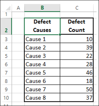
Step 1 − Sort the table by the column - Defect Count in descending order (Largest to Smallest).
Step 2 − Create a column Cumulative Count as given below −
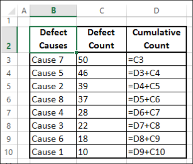
This would result in the following table −
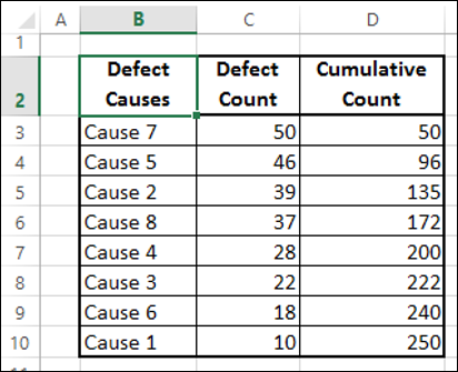
Step 3 − Sum the column Defect Count.
Step 4 − Create a column Cumulative % as given below.
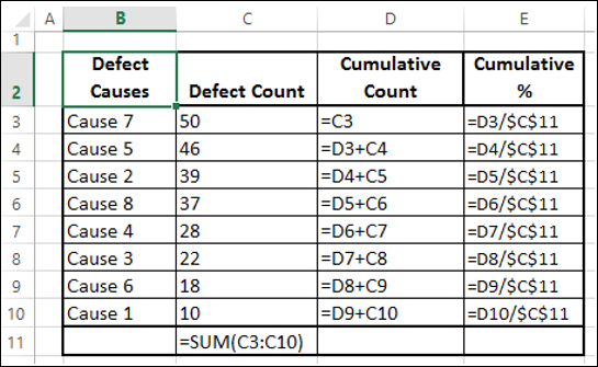
Step 5 − Format the column Cumulative % as Percentage.
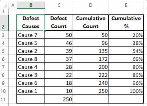
You will use this table to create a Pareto chart.
Creating a Pareto Chart
By creating a Pareto chart, you can conclude what are the key causes for the defects. In Excel, you can create a Pareto chart as a combo chart of Column chart and Line chart.
Following are the steps to create Pareto chart −
Step 1 − Select the columns Defect Causes and Defect Count in the table.
Step 2 − Insert a Clustered Column chart.
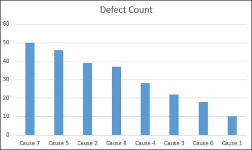
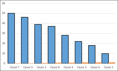
Step 3 − As you can see, the columns representing causes are in descending order. Format the chart as follows.
- Right click on the Columns and click on Format Data Series.
- Click SERIES OPTIONS in the Format Data Series pane.
- Change the Gap Width to 0 under SERIES OPTIONS.
- Right click on the Columns and select Outline.
- Select a dark color and a Weight to make the border conspicuous.
Your chart will be as shown below.
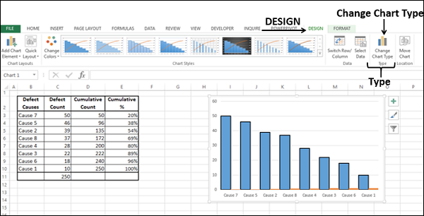
Step 4 − Design the chart as follows.
- Click on the chart.
- Click the DESIGN tab on the Ribbon.
- Click Select Data in the Data group. The Select Data Source dialog box appears.
- Click the Add button.
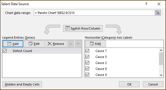
The Edit Series dialog box appears.
Step 5 − Click on the cell Cumulative % for Series name.
Step 6 − Select the data in Cumulative % column for Series values. Click OK.
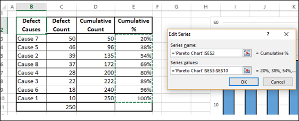
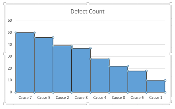
Step 7 − Click OK in the Select Data Source dialog box. Your chart will be as shown below.
Step 8 − Click the DESIGN tab on the Ribbon.
Step 9 − Click Change Chart Type in the Type group.
Step 10 − Change Chart Type dialog box appears.
- Click the All Charts tab.
- Click the Combo button.
- Select Clustered Column for Defect Count and Line for Cumulative %.
- Check the box Secondary Axis for Line chart. Click OK.
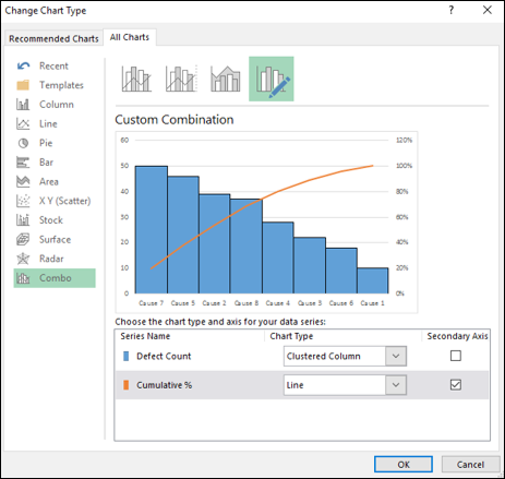
As you can observe, 80% of the defects are due to two causes.
Advanced Excel - Organization Chart
You can illustrate the reporting relationships in your team or organization using an organization chart. In Excel, you can use a SmartArt graphic that uses an organization chart layout.
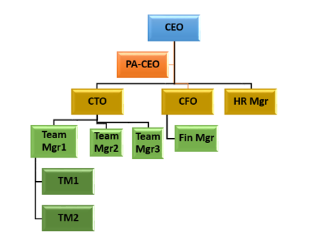
What is an Organization Chart?
An Organization chart graphically represents the management structure of an organization, such as department managers and the corresponding reporting employees within the organization. Further, there can be assistants for the top managers and they are also depicted in the Organization chart.
An Organization chart in Excel will be as shown below.
Preparation of Data
Following are steps to prepare the data for an Organization chart −
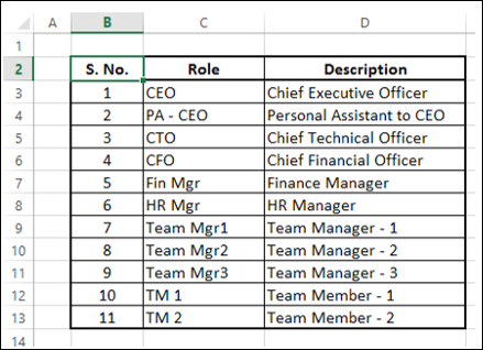
Step 1 − Collate the information about the different roles in the organization as given below.
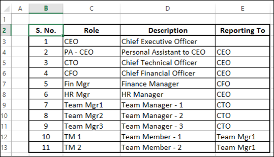
Step 2 − Identify the reporting relationships in the hierarchy.
You will use this information to create the Organization chart.
Creating an Organization Chart
Following are the steps to create the Organization chart.
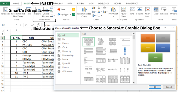
Step 1 − Click the INSERT tab on the Ribbon.
Step 2 − Click the SmartArt Graphic icon in the Illustrations group.
Step 3 − Choose a SmartArt Graphic dialog box appears.
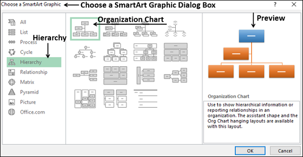
Step 4 − Select Hierarchy from the left pane.
Step 5 − Click on an Organization Chart.
Step 6 − A preview of the Organization Chart appears. Click OK.
The Organization chart template appears in your worksheet.
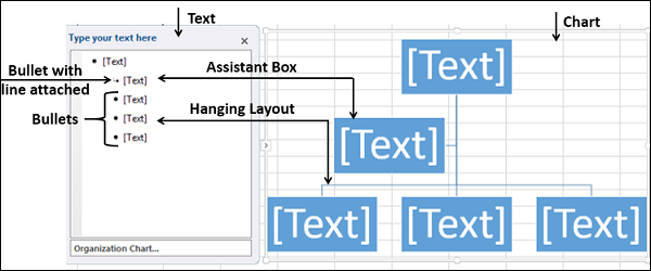
As you can observe, you can enter the text in the left pane and it appears immediately on the chart on the right. The box that has a bullet with line attached in the left pane indicates that it is Assistant box in the chart. The boxes with bullets in the left pane indicate they are part of hanging layout in the chart.
Step 7 − Enter the information in the Text pane.
Step 8 − Demote if there is reporting relationship.
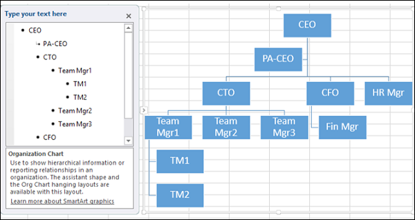
Step 9 − Click outside the chart. Your Organization chart is ready.
Formatting the Organization Chart
You can format the Organization chart to give it a designer look. Follow the steps given below −
- Click on the chart.
- Click the DESIGN tab on the Ribbon.
- Select Polished from the SmartArt Styles group.
- Change the colors of the boxes.
- Change the font color.
- Adjust the size of the boxes.
- Adjust the widths of the lines.
Your Organization chart is ready.
