- Advanced Excel Charts - Home
- Advanced Excel - Introduction
- Advanced Excel - Waterfall Chart
- Advanced Excel - Band Chart
- Advanced Excel - Gantt Chart
- Advanced Excel - Thermometer
- Advanced Excel - Gauge Chart
- Advanced Excel - Bullet Chart
- Advanced Excel - Funnel Chart
- Advanced Excel - Waffle Chart
- Advanced Excel Charts - Heat Map
- Advanced Excel - Step Chart
- Box and Whisker Chart
- Advanced Excel Charts - Histogram
- Advanced Excel - Pareto Chart
- Advanced Excel - Organization Chart
- Advanced Excel Charts - Quick Guide
- Advanced Excel Charts - Resources
- Advanced Excel Charts - Discussion
Advanced Excel Charts - Heat Map
Heat Map is normally used to refer to the colored distinction of areas in a two dimensional array, with each color associated with a different characteristic shared by each area.
In Excel, Heat Map can be applied to a range of cells based on the values that they contain by using cell colors and/or font colors. Excel Conditional Formatting comes handy for this purpose.
What is a Heat Map?
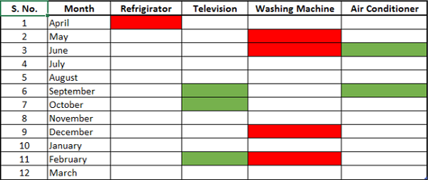
A Heat Map is a visual representation of data in a table to highlight the data points of significance. For example, if you have month wise data on sale of products over the last one year, you can project in which months a product has high or low sales.
A Heat Map looks as shown below.
Advantages of Heat Maps
Heat Map can be used to visually display the different ranges of data with distinct colors. This is very useful when you have large data sets and you want to quickly visualize certain traits in the data.
Heat maps are used to −
- Highlight the top few and the bottom few of a range of values.
- Portray a trend in the values by using color shades.
- Identify blank cells say in an answer sheet or a questionnaire.
- Highlight the quality ranges of the products.
- Highlight the numbers in supply chain.
- Highlight negative values.
- Highlight zero values.
- Highlight outliers defined by thresholds.
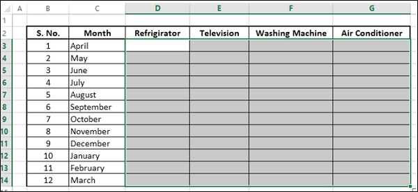
Preparation of Data
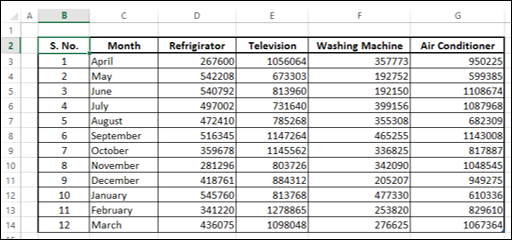
Arrange the data in a table.
As you can see, the data is for a fiscal year, April March, month-wise for each product. You can create a Heat Map to quickly identify during what months the sales were high or low.
Creating a Heat Map
Following are the steps to create a Heat Map −
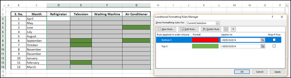
Step 1 − Select the data.
Step 2 − Click Conditional Formatting on the Ribbon. Click Manage Rules and add rules as shown below.
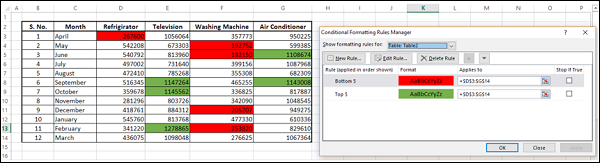
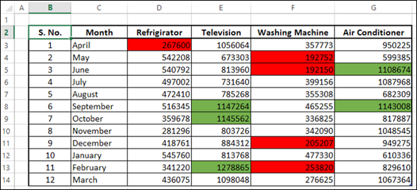
The top five values are colored with green (fill) and the bottom five values are colored with red (fill).
Creating Heat Map without Displaying Values
At times, the viewers might be just be interested in the information and the numbers might not be necessary. In such a case, you can do a bit of formatting as follows −
Step 1 − Select the data and select the font color as white.
As you can see, the numbers are not visible. Next, you need to highlight the top five and bottom five values without displaying the numbers.
Step 2 − Select the data (which is not visible, of course).
Step 3 − Apply Conditional Formatting such that the top five values are colored with green (both fill and font) and the bottom five values are colored with red (both fill and font).
Step 4 − Click the Apply button.
This gives a quick visualization of high and low sales across the year and across the products. As you have chosen the same color for both fill and font, the values are not visible.
