- Advanced Excel Charts - Home
- Advanced Excel - Introduction
- Advanced Excel - Waterfall Chart
- Advanced Excel - Band Chart
- Advanced Excel - Gantt Chart
- Advanced Excel - Thermometer
- Advanced Excel - Gauge Chart
- Advanced Excel - Bullet Chart
- Advanced Excel - Funnel Chart
- Advanced Excel - Waffle Chart
- Advanced Excel Charts - Heat Map
- Advanced Excel - Step Chart
- Box and Whisker Chart
- Advanced Excel Charts - Histogram
- Advanced Excel - Pareto Chart
- Advanced Excel - Organization Chart
- Advanced Excel Charts - Quick Guide
- Advanced Excel Charts - Resources
- Advanced Excel Charts - Discussion
Advanced Excel - Bullet Chart
Bullet charts came into existence to overcome the drawbacks of Gauge charts. We can refer to them as Liner Gauge charts. Bullet charts were introduced by Stephen Few. A Bullet chart is used to compare categories easily and saves on space. The format of the Bullet chart is flexible.
What is a Bullet Chart?
According to Stephen Few, Bullet charts support the comparison of a measure to one or more related measures (for example, a target or the same measure at some point in the past, such as a year ago) and relate the measure to defined quantitative ranges that declare its qualitative state (for example, good, satisfactory and poor). Its linear design not only gives it a small footprint, but also supports more efficient reading than the Gauge charts.
Consider an example given below −
In a Bullet chart, you will have the following components −
- The qualitative bands representing the qualitative states −
| Band | Qualitative Value |
|---|---|
| <30% | Poor |
| 30% - 60% | Fair |
| 60% - 80% | Good |
| > 80% | Excellent |
- Target Value, say 80%.
- Actual Value, say 70%.
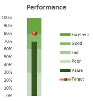
With the above values, the Bullet chart looks as shown below.
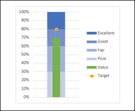
Though we used colors in the above chart, Stephen Few suggests the usage of only Gray shades in the interest of color-blind people.
Advantages of Bullet Charts
Bullet charts have the following uses and advantages −
Bullet Charts are widely used by data analysts and dashboard vendors.
Bullet charts can be used to compare the performance of a metric. For example, if you want to compare the sales of two years or to compare the total sales to a target, you can use bullet charts.
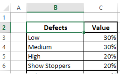
You can use Bullet chart to track the number of defects in Low, Medium and High categories.
You can visualize the Revenue flow across the Fiscal year.
You can visualize the expenses across the Fiscal year.
You can track Profit%.
You can visualize customer satisfaction and can be used to display KPIs also.
Preparation of Data
Arrange the data as given below.
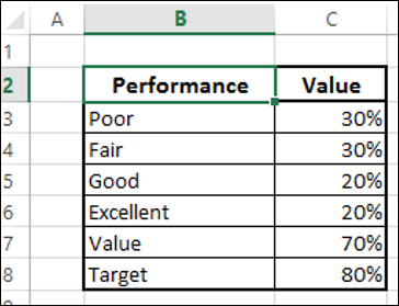
As you can observe, the qualitative values are given in the column Performance. The Bands are represented by the column Value.
Creating a Bullet Chart
Following are the steps to create a Bullet chart −
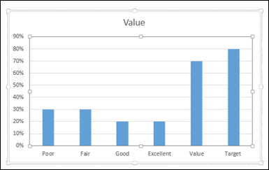
Step 1 − Select the data and insert a Stacked Column chart.
Step 2 − Click on the chart.
Step 3 − Click the DESIGN tab on the Ribbon.
Step 4 − Click Switch Row/ Column button in the Data group.
Step 5 − Change the chart type.
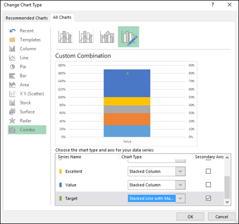
- Click Change Chart Type.
- Click the Combo icon.
- Change the chart type for Target to Stacked Line with Markers.
- Check the box Secondary Axis for Target and click OK.
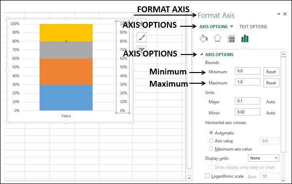
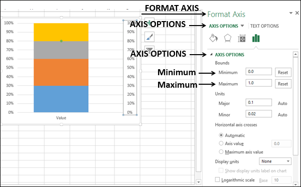
Step 6 − As you can see, the Primary and the Secondary Vertical Axis have different ranges. Make them equal as follows.
- Right click on Primary Vertical Axis and select Format Axis.
- Click on the AXIS OPTIONS tab in the Format Axis pane.
- In AXIS OPIONS, under Bounds, type the following −
- 0.0 for Minimum
- 1.0 for Maximum
- Repeat the above steps for Secondary Vertical Axis.
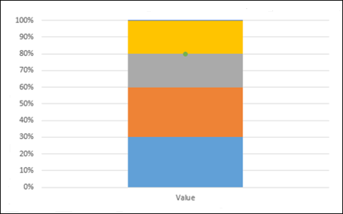
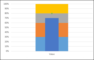
Step 7 − Deselect Secondary Vertical Axis in the Chart Elements.
Step 8 − Design the chart
- Click on the chart.
- Click the DESIGN tab on the Ribbon.
- Click Change Chart Type.
- Check the Secondary Axis box for the Value series.
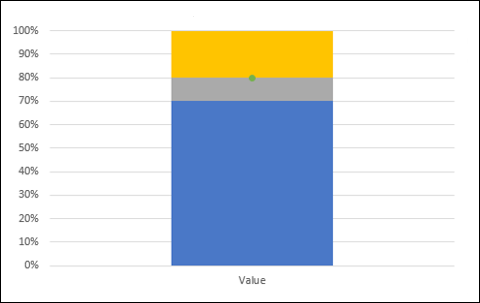
Step 9 − Right click on the column for Value (blue color in the above chart).
Step 10 − Select Format Data Series.
Step 11 − Change Gap Width to 500% under SERIES OPTIONS in Format Data Series pane.
Step 12 − Deselect Secondary Vertical Axis in the Chart Elements.
The chart will look as follows −
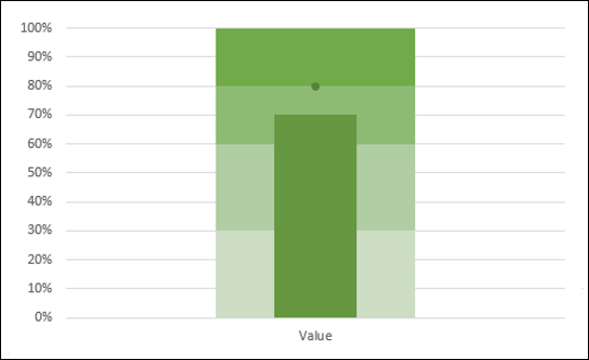
Step 13 − Design the chart as follows −
- Click on the chart.
- Click Chart Styles at the right corner of the chart.
- Click the COLOR tab.
- Select Color 17.
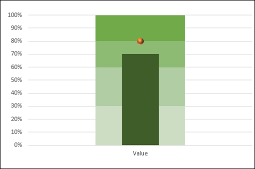
Step 14 − Fine tune the chart as follows.
- Right click on the Value column.
- Change the Fill color to dark green.
- Click on the Target.
- Change the Fill and Line color of Marker to orange.
- Increase the size of the Marker.
Step 15 − Fine-tune the chart design.
- Resize the chart.
- Select Legend in Chart Elements.
- Deselect Primary Horizontal Axis in Chart Elements.
- Deselect Gridlines in Chart Elements.
- Give a Chart Title.
Your Bullet chart is ready.
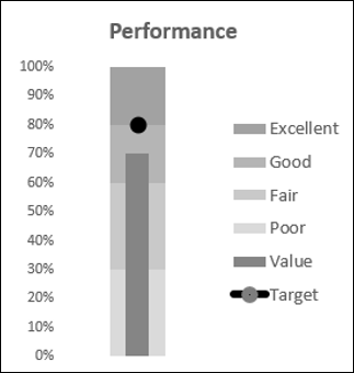
You can change the color of the chart to gray gradient scale to make it colorblind friendly.
Bullet Chart in Reverse Contexts
Suppose you want to display the number of defects found in a Bullet chart. In this case, lesser defects mean greater quality. You can define defect categories as follows −
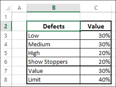
Step 1 − You can then define a Limit for number of defects and represent the number of defects found by a Value. Add Value and Limit to the above table.
Step 2 − Select the data.
Step 3 − Create a Bullet chart as you have learnt in the previous section.
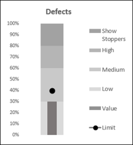
As you can see, the ranges are changed to correctly interpret the context.
