- Advanced Excel Charts - Home
- Advanced Excel - Introduction
- Advanced Excel - Waterfall Chart
- Advanced Excel - Band Chart
- Advanced Excel - Gantt Chart
- Advanced Excel - Thermometer
- Advanced Excel - Gauge Chart
- Advanced Excel - Bullet Chart
- Advanced Excel - Funnel Chart
- Advanced Excel - Waffle Chart
- Advanced Excel Charts - Heat Map
- Advanced Excel - Step Chart
- Box and Whisker Chart
- Advanced Excel Charts - Histogram
- Advanced Excel - Pareto Chart
- Advanced Excel - Organization Chart
- Advanced Excel Charts - Quick Guide
- Advanced Excel Charts - Resources
- Advanced Excel Charts - Discussion
Advanced Excel - Gantt Chart
Gantt charts are widely in use for project planning and tracking. A Gantt chart provides a graphical illustration of a schedule that helps to plan, coordinate, and track specific tasks in a project. There are software applications that provide Gantt chart as a means of planning work and tracking the same such as Microsoft Project. However, you can create a Gantt chart easily in Excel also.
What is a Gantt Chart?
A Gantt chart is a chart in which a series of horizontal lines shows the amount of work done in certain periods of time with relation to the amount of work planned for those periods. The horizontal lines depict tasks, task duration and task hierarchy.
Henry L. Gantt, an American engineer and social scientist, developed gantt chart as a production control tool in 1917.
In Excel, you can create a Gantt chart by customizing a Stacked Bar chart type with the Bars representing tasks. An Excel Gantt chart typically uses days as the unit of time along the horizontal axis.
Advantages of Gantt Charts
Gantt chart is frequently used in project management to manage project schedule.
It provides visual timeline for starting and finishing specific tasks.
It accommodates multiple tasks and timelines into a single chart.
It is an easy way to understand visualization that shows the amount of work done, the remaining work, and schedule slippages, if any at any point of time.
If the Gantt chart is shared at a common place, it limits the number of status meetings.
Gantt chart promotes on-time deliveries, as the timeline is visible to everyone who is involved in the work.
It promotes collaboration and team spirit with project completion on-time as a common goal.
It provides a realistic view of the project progress and eliminates project end surprises.
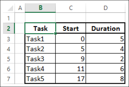
Preparation of Data
Arrange your data in a table in the following way −
Create three columns Task, Start and Duration.
In the Task column, give the names of the Tasks in the project.
In the Start column, for each Task, place the number of days from the Start Date of the project.
In the Duration column, for each Task, place the duration of the Task in days.
Note − When the Tasks are in a hierarchy, Start of any Task Taskg is Start of previous Task + its Duration. That is, Start of a Task Taskh is the End of the previous Task, Taskg if they are in a hierarchy, meaning that Taskh is dependent on Taskg. This is referred to as Task Dependency.
Following is the data −
Creating a Gantt Chart
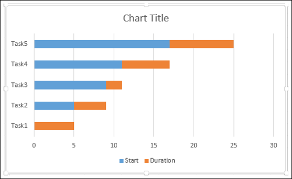
Step 1 − Select the data.
Step 2 − Insert a Stacked Bar chart.
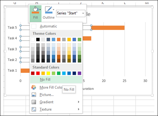
Step 3 − Right click on a bar representing Start series.
Step 4 − Click the Fill icon. Select No Fill from the dropdown list.
Step 5 − Right click on the Vertical Axis (Categories Axis).
Step 6 − Select Format Axis from the dropdown list.
Step 7 − On the AXIS OPTIONS tab, in the Format Axis pane, check the box - Categories in reverse order.
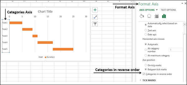
You will see that the Vertical Axis values are reversed. Moreover, the Horizontal Axis shifts to the top of the chart.
Step 8 − Make the chart appealing with some formatting.
- In Chart Elements, deselect the following −
- Legend.
- Gridlines.
- Format the Horizontal Axis as follows −
- Adjust the range.
- Major Tick Marks at 5 day intervals.
- Minor Tick Marks at 1 day intervals.
- Format Data Series to make the Bars look impressive.
- Give a Chart Title.
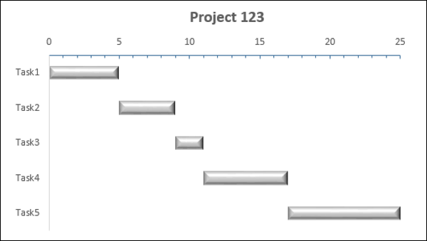
Your Gantt chart is ready.
