- Advanced Excel Charts - Home
- Advanced Excel - Introduction
- Advanced Excel - Waterfall Chart
- Advanced Excel - Band Chart
- Advanced Excel - Gantt Chart
- Advanced Excel - Thermometer
- Advanced Excel - Gauge Chart
- Advanced Excel - Bullet Chart
- Advanced Excel - Funnel Chart
- Advanced Excel - Waffle Chart
- Advanced Excel Charts - Heat Map
- Advanced Excel - Step Chart
- Box and Whisker Chart
- Advanced Excel Charts - Histogram
- Advanced Excel - Pareto Chart
- Advanced Excel - Organization Chart
- Advanced Excel Charts - Quick Guide
- Advanced Excel Charts - Resources
- Advanced Excel Charts - Discussion
Advanced Excel - Step Chart
Step chart is useful if you have to display the data that changes at irregular intervals and remains constant between the changes. For example, Step chart can be used to show the price changes of commodities, changes in tax rates, changes in interest rates, etc.
What is a Step Chart?
A Step chart is a Line chart that does not use the shortest distance to connect two data points. Instead, it uses vertical and horizontal lines to connect the data points in a series forming a step-like progression. The vertical parts of a Step chart denote changes in the data and their magnitude. The horizontal parts of a Step chart denote the constancy of the data.
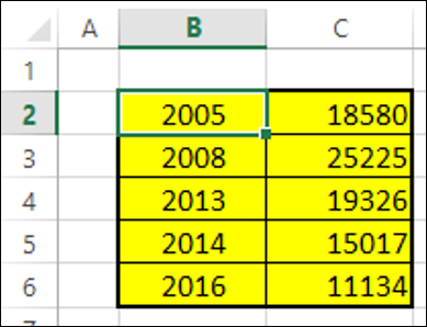
Consider the following data −
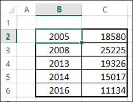
As you can observe, the data changes are occurring at irregular intervals.
A Step chart looks as shown below.
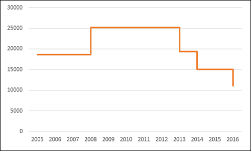
As you can see, the data changes are occurring at irregular intervals. When the data remains constant, it is depicted by a horizontal Line, till a change occurs. When a change occurs, its magnitude is depicted by a vertical Line.
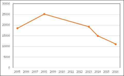
If you had displayed the same data with a Line chart, it would be like as shown below.
Differences between Line Charts and Step Charts
You can identify the following differences between a Line chart and a Step chart for the same data −
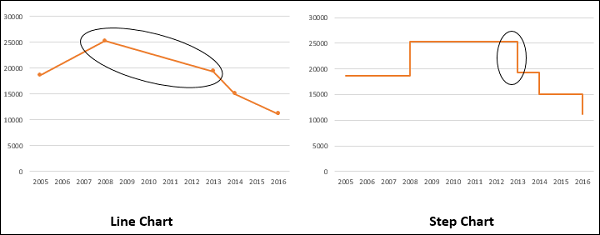
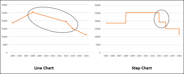
The focus of the Line chart is on the trend of the data points and not the exact time of the change. A Step chart shows the exact time of the change in the data along with the trend.
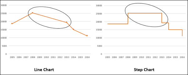
A Line chart cannot depict the magnitude of the change but a Step chart visually depicts the magnitude of the change.
Line chart cannot show the duration for which there is no change in a data value. A Step chart can clearly show the duration for which there is no change in a data value.
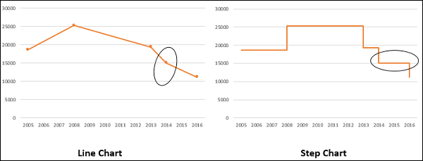
A Line chart can sometimes be deceptive in displaying the trend between two data values. For example, Line chart can show a change between two values, while it is not the case. On the other hand, a step chart can clearly display the steadiness when there are no changes.
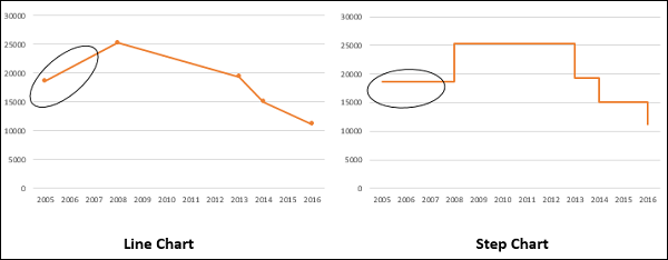
A Line chart can display a sudden increase/decrease, though the changes occur only on two occasions. A Step chart can display only the two occurred changes and when the changes actually happened.
Advantages of Step Charts
Step charts are useful to portray any type of data that has an innate nature of data changes at irregular intervals of time. Examples include the following −
- Interest rates vs. time.
- Tax rates vs. income.
- Electricity charges slabs based on the Units utilized.
Preparation of Data
Consider the following data −
Step 1 − Select the data. Copy and paste the data below the last row of the data.
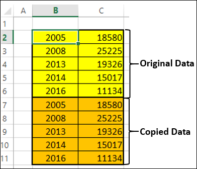
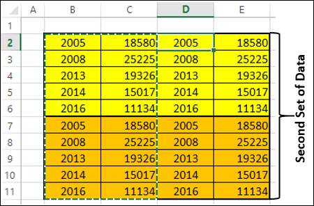
Step 2 − Copy and paste the entire data on the right side of the data. The data looks as given below.
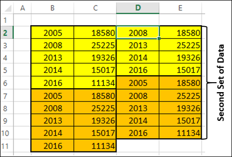
Step 3 − Delete the cells highlighted in red that are depicted in the table of second set of data given below.
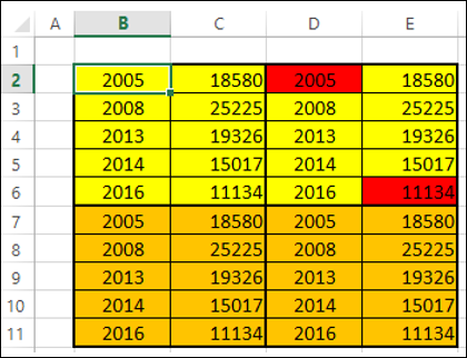
Step 4 − Shift the cells up while deleting. The second set of data looks as given below.
Step 5 − Copy the second set of data and paste it to the right side of it to get the third set of data.
Step 6 − Select the third set of data. Sort it from the smallest to the largest values.
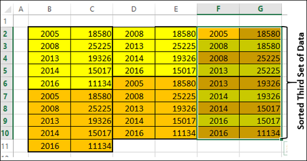
You need to use this sorted third set of data to create the Step chart.
Creating a Step Chart
Follow the steps given below to create a step chart −
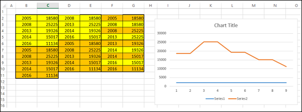
Step 1 − Select the third set of data and insert a Line chart.
Step 2 − Format the chart as follows −
Click on the chart.
Click the DESIGN tab on the Ribbon.
Click Select Data in the Data group. The Select Data Source dialog box appears.
Select Series1 under Legend Entries (Series).
Click the Remove button.
Click the Edit button under Horizontal (Category) Axis Labels. Click OK.
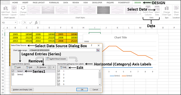
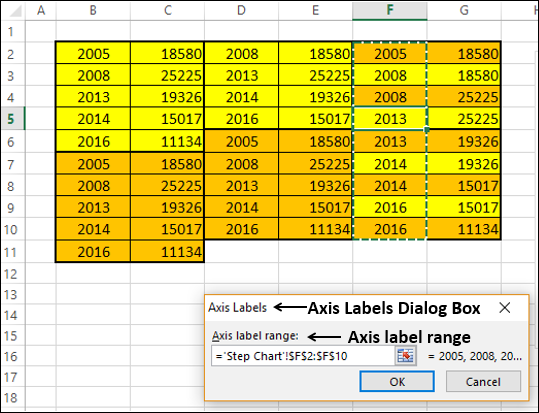
The Axis Labels dialog box appears.
Step 3 − Select the cells F2:F10 under the Axis labels range and click OK.
Step 4 − Click OK in the Select Data Source dialog box. Your chart will look as shown below.
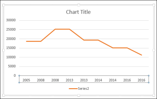
Step 5 − As you can observe, some values (Years) in the Horizontal (Category) Axis are missing. To insert the values, follow the steps given below.
- Right click on the Horizontal Axis.
- Select Format Axis.
- Click AXIS OPTIONS in the Format Axis pane.
- Select Date Axis under Axis Type in AXIS OPTIONS.
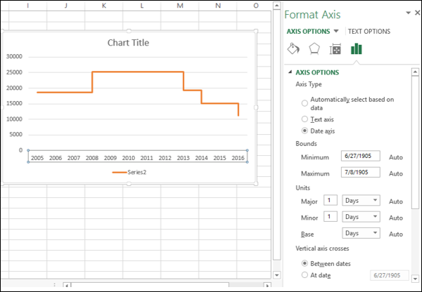
As you can see, the Horizontal (Category) Axis now contains even the missing Years in the Category values. Further, until a change occurs, the line is horizontal. When there is a change, its magnitude is depicted by the height of the vertical line.
Step 6 − Deselect the Chart Title and Legend in Chart Elements.
Your Step chart is ready.
