- Advanced Excel Charts - Home
- Advanced Excel - Introduction
- Advanced Excel - Waterfall Chart
- Advanced Excel - Band Chart
- Advanced Excel - Gantt Chart
- Advanced Excel - Thermometer
- Advanced Excel - Gauge Chart
- Advanced Excel - Bullet Chart
- Advanced Excel - Funnel Chart
- Advanced Excel - Waffle Chart
- Advanced Excel Charts - Heat Map
- Advanced Excel - Step Chart
- Box and Whisker Chart
- Advanced Excel Charts - Histogram
- Advanced Excel - Pareto Chart
- Advanced Excel - Organization Chart
- Advanced Excel Charts - Quick Guide
- Advanced Excel Charts - Resources
- Advanced Excel Charts - Discussion
Advanced Excel - Box and Whisker Chart
Box and Whisker charts, also referred to as Box Plots are commonly used in statistical analysis. For example, you can use a Box and Whisker chart to compare experimental results or competitive exam results.
What is a Box and Whisker Chart?
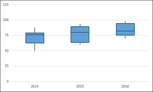
In a Box and Whisker chart, numerical data is divided into quartiles and a box is drawn between the first and third quartiles, with an additional line drawn along the second quartile to mark the median. The minimums and maximums outside the first and third quartiles are depicted with lines, which are called whiskers. Whiskers indicate variability outside the upper and lower quartiles, and any point outside the whiskers is considered as an outlier.
A Box and Whisker chart looks as shown below.
Advantages of Box and Whisker Charts
You can use Box and Whisker chart wherever to understand the distribution of data. And the data can be diverse that is drawn from any field for statistical analysis. Examples include the following −
Survey responses on a particular product or service to understand the users preferences.
Examination results to identify which students need more attention in a particular subject.
Question-Answer patterns for a competitive examination to finalize the combination of categories.
Laboratory results to draw conclusions on a new drug that is invented.
Traffic patterns on a particular route to streamline the signals that are enroute. The outliers also help in identifying the reasons for the data to get outcast.
Preparation of Data
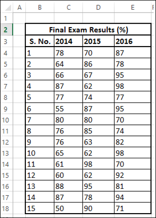
Suppose you are given the following data −
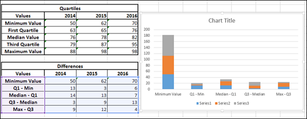
Create a second table from the above table as follows −
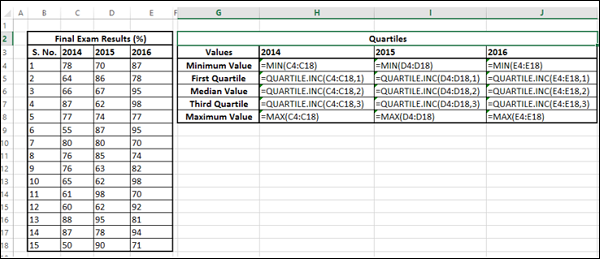
Step 1 − Compute the following for each of the series 2014, 2015 and 2016 using Excel Functions MIN, QUARTILE and MAX.
- Minimum Value.
- First Quartile.
- Median Value.
- Third Quartile.
- Maximum Value.
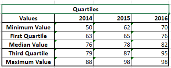
The resulting second table will be as given below.
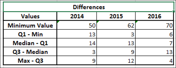
Step 2 − Create a third table from the second table, computing the differences −
- Retain the first row Minimum Value as it is.
- In the second row compute values as First Quartile - Minimum Value.
- In the third row compute values as Median Value - First Quartile.
- In the fourth row compute values as Third Quartile - Median Value.
- In the fifth row compute values as Maximum Value - Third Quartile.
You will get the third table as shown below.
You will use this data for the Box and Whisker chart.
Creating a Box and Whisker Chart
Following are the steps to create a Box and Whisker chart.
Step 1 − Select the data obtained as the third table in the previous section.
Step 2 − Insert a Stacked Column chart.
Step 3 − Click the DESIGN tab on the Ribbon.
Step 4 − Click Switch Row / Column button in the Data group.
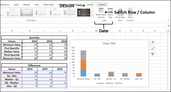
Your chart will be as shown below.
Step 5 − Right click on the bottom Data Series. Click Fill and select No Fill.
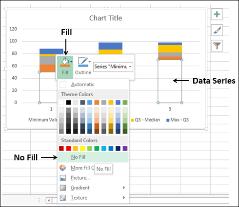
The bottom Data series becomes invisible.
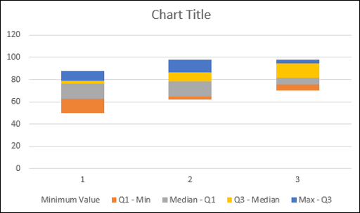
Step 6 − Deselect Chart Title and Legend in Chart Elements.
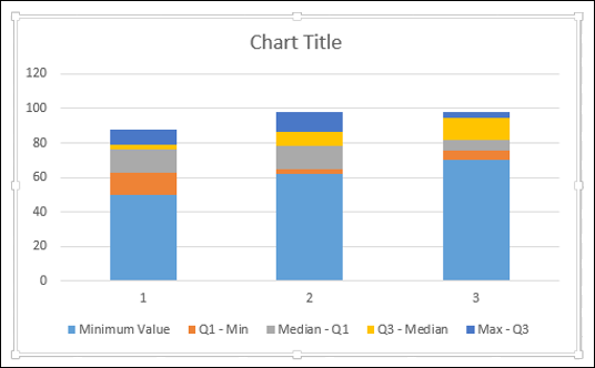
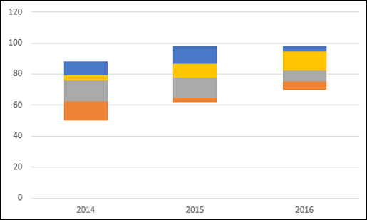
Step 7 − Change the Horizontal Axis Labels to 2014, 2015 and 2016.
Step 8 − Now, your Boxes are ready. Next, you have to create the Whiskers.
- Right click on the Top Data Series.
- Change Fill to No Fill.
- Click the DESIGN tab on the Ribbon.
- Click Add Chart Element in the Chart layouts group.
- Click Error Bars in the dropdown list and select Standard Deviation.
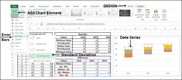
Step 9 − You got the top Whiskers. Next, format Whiskers (Error Bars) as follows −
Right click on the Error Bars.
Select Format Error Bars.
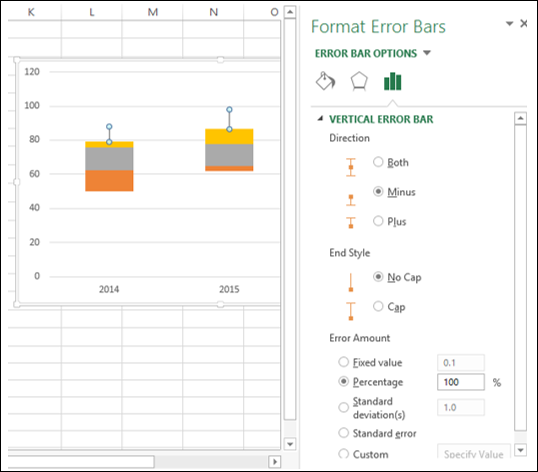
Select the following under ERROR BAR OPTIONS in the Format Error Bars pane.
Select Minus under Direction.
Select No Cap under End Style.
Select Percentage under Error Amount and type 100.
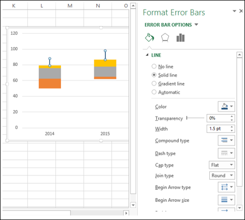
Step 10 − Click the Fill & Line tab under ERROR BAR OPTIONS in the Format Error Bars pane.
- Select Solid line under LINE.
- Select the color as dark blue.
- Type 1.5 in the Width box.
Step 11 − Repeat the above given steps for the second lower bottom Series.
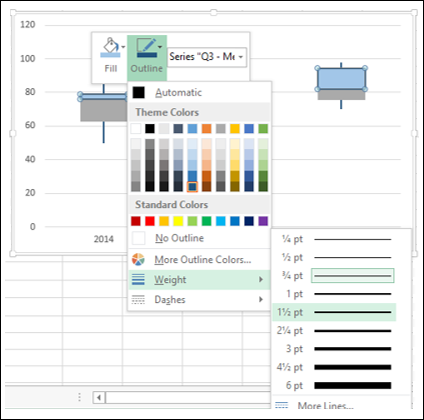
Step 12 − Next, format the boxes as follows.
- Right click on one of the Box series.
- Click Fill.
- Choose color as light blue.
- Click Outline.
- Choose the color as dark blue.
- Click Weight.
- Select 1½ pt.
Step 13 − Repeat the steps given above for the other Box series.
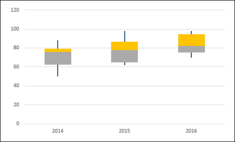
Your Box and Whisker chart is ready.
