- Excel - Chart Recommendations
- Advanced Excel - Format Charts
- Advanced Excel - Chart Design
- Advanced Excel - Richer Data Labels
- Advanced Excel - Leader Lines
- Advanced Excel - New Functions
- Fundamental Data Analysis
- Excel - Instant Data Analysis
- Excel - Sorting Data by Color
- Advanced Excel - Slicers
- Advanced Excel - Flash Fill
- Powerful Data Analysis
- Excel - PivotTable Recommendations
- Powerful Data Analysis – 1
- Advanced Excel - Data Model
- Advanced Excel - Power Pivot
- Excel - External Data Connection
- Advanced Excel - Pivot Table Tools
- Powerful Data Analysis – 2
- Advanced Excel - Power View
- Advanced Excel - Visualizations
- Advanced Excel - Pie Charts
- Advanced Excel - Additional Features
- Advanced Excel - Power View Services
- Advanced Excel - Format Reports
- Advanced Excel - Handling Integers
- Other Features
- Advanced Excel - Templates
- Advanced Excel - Inquire
- Advanced Excel - Workbook Analysis
- Advanced Excel - Manage Passwords
- Advanced Excel - File Formats
- Excel - Discontinued Features
- Advanced Excel Useful Resources
- Advanced Excel - Quick Guide
- Advanced Excel - Useful Resources
- Advanced Excel - Discussion
Advanced Excel - Visualizations
You can quickly create a number of different data visualizations that suit your data using Power View. The visualizations possible are Tables, Matrices, Cards, Tiles, Maps, Charts such as Bar, Column, Scatter, Line, Pie and Bubble Charts, and sets of multiple charts (charts with same axis).
Create Charts and other Visualizations
For every visualization you want to create, you start on a Power View sheet by creating a table, which you then easily convert to other visualizations, to find one that best illustrates your Data.
Step 1 − Under the Power View Fields, select the fields you want to visualize.
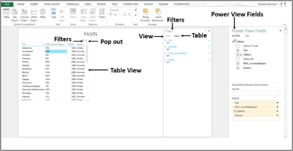
Step 2 − By default, the Table View will be displayed. As you move across the Table, on the top-right corner, you find two symbols Filters and Pop out.
Step 3 − Click on the Filters symbol. The filters will be displayed on the right side. Filters has two tabs. View tab to filter all visualizations in this View and Table tab to filter the specific values in this table only.
Visualization Matrix
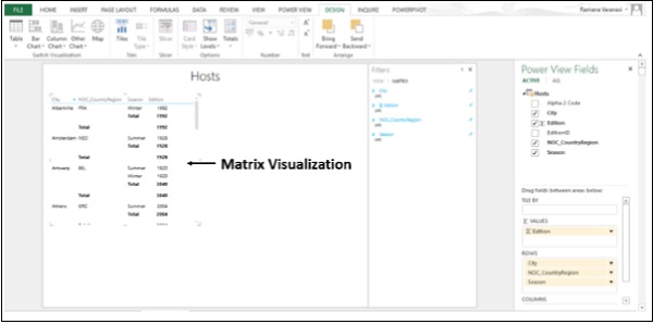
A Matrix is made up of rows and columns like a Table. However, a Matrix has the following capabilities that a Table does not have −
- Display data without repeating values.
- Display totals and subtotals by row and column.
- With a hierarchy, you can drill up/drill down.
Collapse and Expand the Display
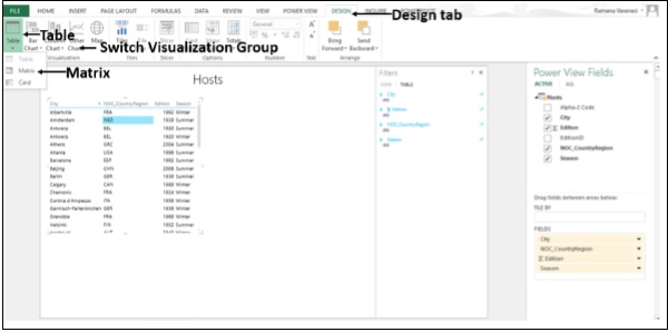
Step 1 − Click on the DESIGN tab.
Step 2 − Click on Table in the Switch Visualization Group.
Step 3 − Click on Matrix.
The Matrix Visualization appears.
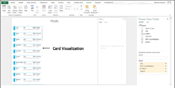
Visualization Card
You can convert a Table to a series of Cards that display the data from each row in the table laid out in a Card format, like an index Card.
Step 1 − Click on the DESIGN tab.
Step 2 − Click on Table in the Switch Visualization Group.
Step 3 − Click on Card.
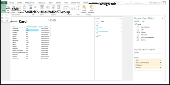
The Card Visualization appears.
Visualization Charts
In Power View, you have a number of Chart options: Pie, Column, Bar, Line, Scatter, and Bubble. You can use several design options in a chart such as showing and hiding labels, legends, and titles.
Charts are interactive. If you click on a Value in one Chart −
the Value in that chart is highlighted.
All the Tables, Matrices, and Tiles in the report are filtered to that Value.
That Value in all the other Charts in the report is highlighted.
The charts are interactive in a presentation setting also.
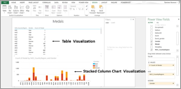
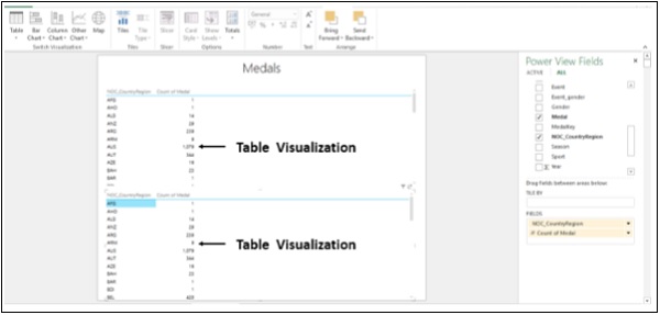
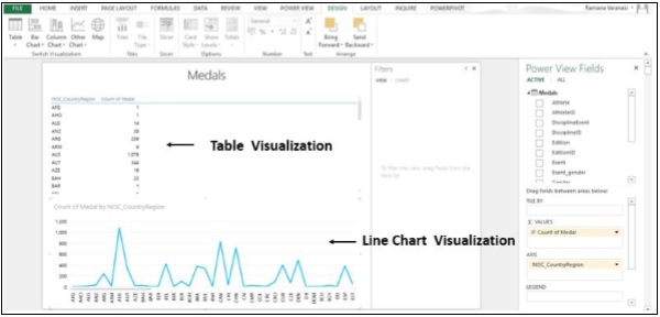
Step 1 − Create a Table Visualization from Medals data.
You can use Line, Bar and Column Charts for comparing data points in one or more data series. In these Charts, the x-axis displays one field and the y-axis displays another, making it easy to see the relationship between the two values for all the items in the Chart.
Line Charts distribute category data evenly along a horizontal (category) axis, and all numerical value data along a vertical (value) axis.
Step 2 − Create a Table Visualization for two Columns, NOC_CountryRegion and Count of Medal.
Step 3 − Create the same Table Visualization below.
Step 4 − Click on the Table Visualization below.
Step 5 − Click on Other Chart in the Switch Visualization group.
Step 6 − Click on Line.
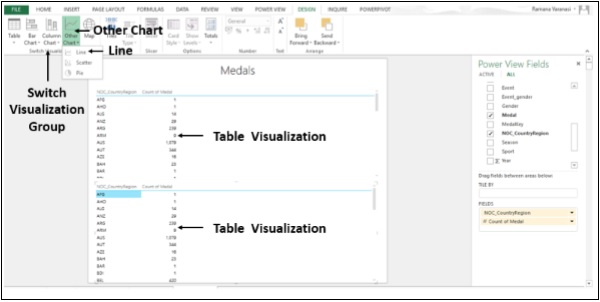
The Table Visualization converts into Line Chart Visualization.
In a Bar Chart, categories are organized along the vertical axis and values along the horizontal axis. In Power View, there are three subtypes of the Bar Chart: Stacked, 100% stacked, and Clustered.
Step 7 − Click on the Line Chart Visualization.
Step 8 − Click on Bar Chart in the Switch Visualization Group.
Step 9 − Click on the Stacked Bar option.
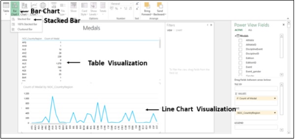
The Line Chart Visualization converts into Stacked Bar Chart Visualization.
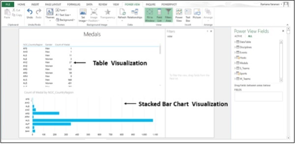
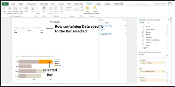
Step 10 − In the Power View Fields, in the Medals Table, select the Field Gender also.
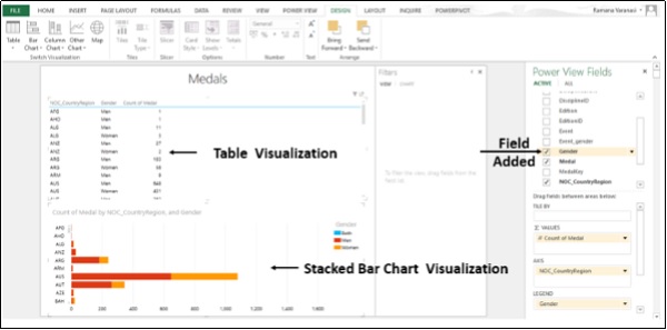
Step 11 − Click on one of the bars. That portion of the bar is highlighted. Only the row containing the Data specific to the selected bar is displayed in the table above.
You can use the column charts for showing data changes over a period of time or for illustrating comparison among different items. In a Column Chart, the categories are along the horizontal axis and values are along the vertical axis.
In Power View, there are three Column Chart subtypes: Stacked, 100% stacked, and Clustered.
Step 12 − Click on the Stacked Bar Chart Visualization.
Step 13 − Click on Column Chart in the Switch Visualization group.
Step 14 − Click on Stacked Column.
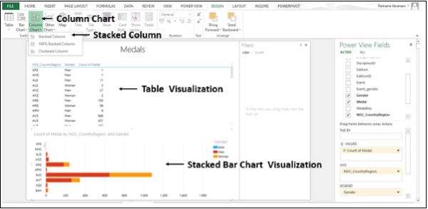
The Stacked Bar Chart Visualization converts into Stacked Column Chart Visualization.