- Excel - Chart Recommendations
- Advanced Excel - Format Charts
- Advanced Excel - Chart Design
- Advanced Excel - Richer Data Labels
- Advanced Excel - Leader Lines
- Advanced Excel - New Functions
- Fundamental Data Analysis
- Excel - Instant Data Analysis
- Excel - Sorting Data by Color
- Advanced Excel - Slicers
- Advanced Excel - Flash Fill
- Powerful Data Analysis
- Excel - PivotTable Recommendations
- Powerful Data Analysis – 1
- Advanced Excel - Data Model
- Advanced Excel - Power Pivot
- Excel - External Data Connection
- Advanced Excel - Pivot Table Tools
- Powerful Data Analysis – 2
- Advanced Excel - Power View
- Advanced Excel - Visualizations
- Advanced Excel - Pie Charts
- Advanced Excel - Additional Features
- Advanced Excel - Power View Services
- Advanced Excel - Format Reports
- Advanced Excel - Handling Integers
- Other Features
- Advanced Excel - Templates
- Advanced Excel - Inquire
- Advanced Excel - Workbook Analysis
- Advanced Excel - Manage Passwords
- Advanced Excel - File Formats
- Excel - Discontinued Features
- Advanced Excel Useful Resources
- Advanced Excel - Quick Guide
- Advanced Excel - Useful Resources
- Advanced Excel - Discussion
Advanced Excel - Instant Data Analysis
In Microsoft Excel 2013, it is possible to do data analysis with quick steps. Further, different analysis features are readily available. This is through the Quick Analysis tool.
Quick Analysis Features
Excel 2013 provides the following analysis features for instant data analysis.
Formatting
Formatting allows you to highlight the parts of your data by adding things like data bars and colors. This lets you quickly see high and low values, among other things.
Charts
Charts are used to depict the data pictorially. There are several types of charts to suit different types of data.
Totals
Totals can be used to calculate the numbers in columns and rows. You have functions such as Sum, Average, Count, etc. which can be used.
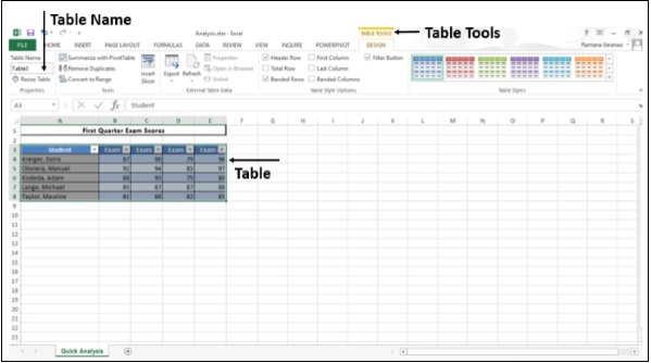
Tables
Tables help you to filter, sort and summarize your data. The Table and PivotTable are a couple of examples.
Sparklines
Sparklines are like tiny charts that you can show alongside your data in the cells. They provide a quick way to see the trends.
Quick Analysis of Data
Follow the steps given below for quickly analyzing the data.
Step 1 − Select the cells that contain the data you want to analyze.
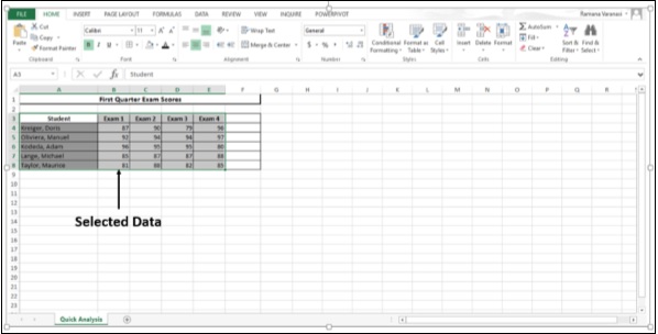
A Quick Analysis button  appears to the bottom right of your selected data.
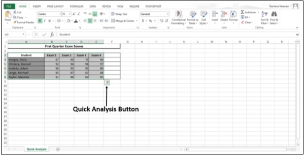
Step 2 − Click the Quick Analysis button that appears (or press CTRL + Q). The Quick Analysis toolbar appears with the options of FORMATTING, CHARTS, TOTALS, TABLES and SPARKLINES.
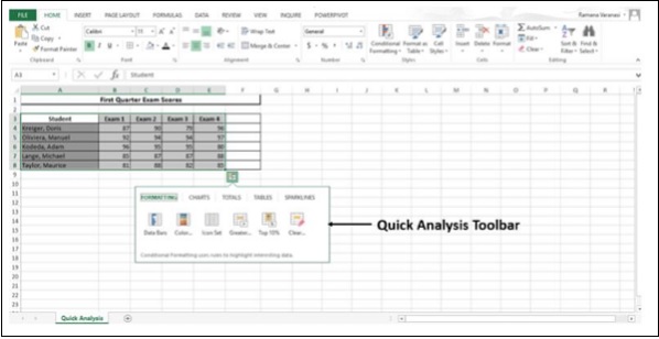
Conditional Formatting
Conditional formatting uses the rules to highlight the data. This option is available on the Home tab also, but with quick analysis it is handy and quick to use. Also, you can have a preview of the data by applying different options, before selecting the one you want.
Step 1 − Click on the FORMATTING button.
Step 2 − Click on Data Bars.
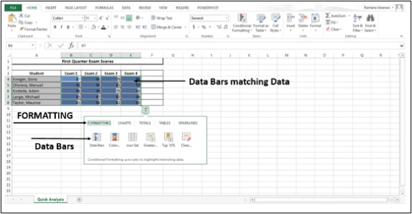
The colored Data Bars that match the values of the data appear.
Step 3 − Click on Color Scale.
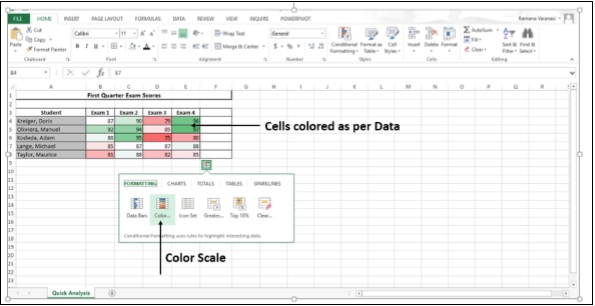
The cells will be colored to the relative values as per the data they contain.
Step 4 − Click on the Icon Set. The icons assigned to the cell values will be displayed.
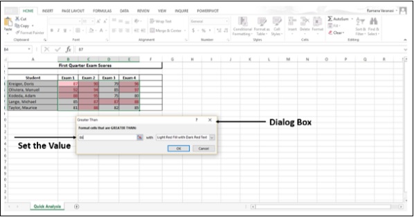
Step 5 − Click on the option - Greater than.
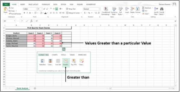
Values greater than a value set by Excel will be colored. You can set your own value in the Dialog Box that appears.
Step 6 − Click on Top 10%.
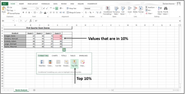
Values that are in top 10% will be colored.
Step 7 − Click on Clear Formatting.
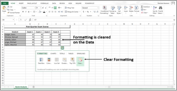
Whatever formatting is applied will be cleared.
Step 8 − Move the mouse over the FORMATTING options. You will have a preview of all the formatting for your Data. You can choose whatever best suits your data.
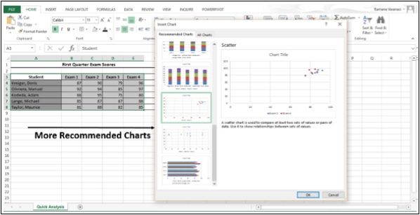
Charts
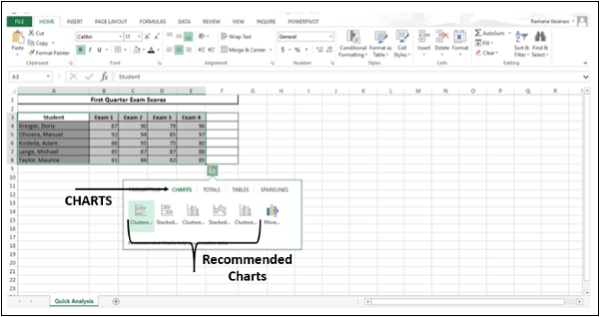
Recommended Charts help you visualize your Data.
Step 1 − Click on CHARTS. Recommended Charts for your data will be displayed.
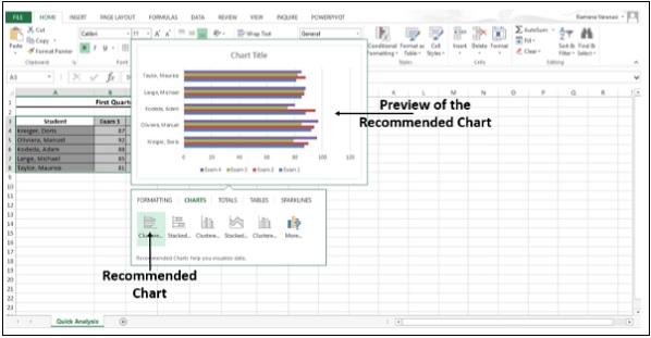
Step 2 − Move over the charts recommended. You can see the Previews of the Charts.
Step 3 − Click on More as shown in the image given below.
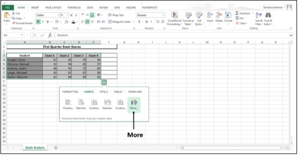
More Recommended Charts are displayed.
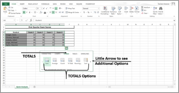
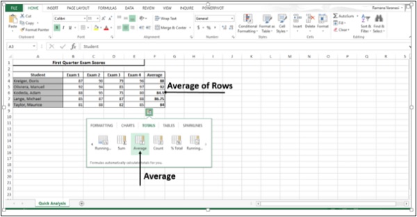
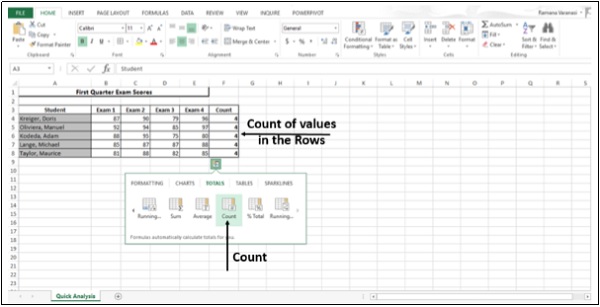
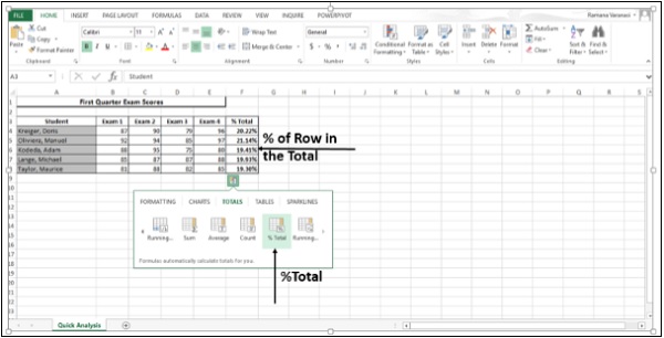
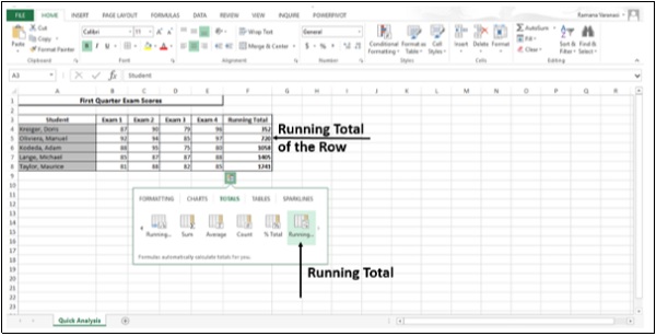
Totals
Totals help you to calculate the numbers in rows and columns.
Step 1 − Click on TOTALS. All the options available under TOTALS options are displayed. The little black arrows on the right and left are to see additional options.
Step 2 − Click on the Sum icon. This option is used to sum the numbers in the columns.
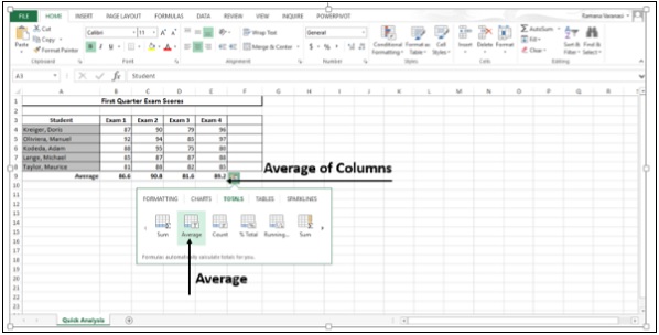
Step 3 − Click on Average. This option is used to calculate the average of the numbers in the columns.
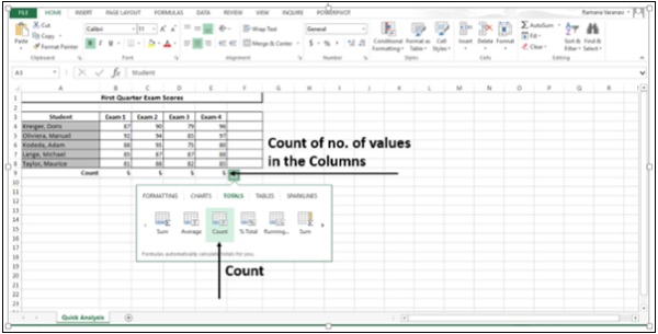
Step 4 − Click on Count. This option is used to count the number of values in the column.
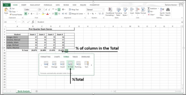
Step 5 − Click on %Total. This option is to compute the percent of the column that represents the total sum of the data values selected.
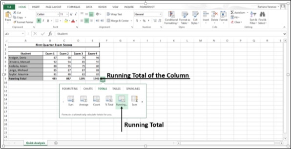
Step 6 − Click on Running Total. This option displays the Running Total of each column.
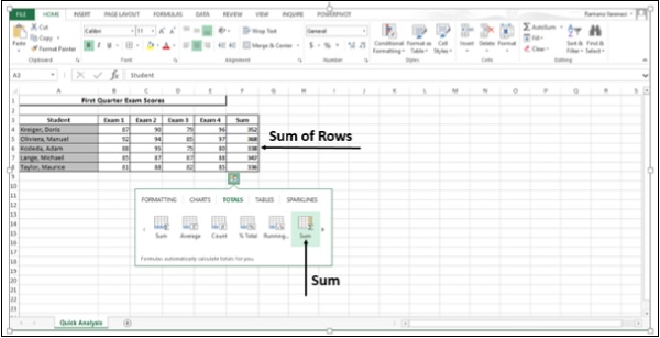
Step 7 − Click on Sum. This option is to sum the numbers in the rows.
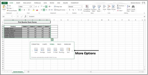
Step 8 − Click on the symbol  . This displays more options to the right.
Step 9 − Click on Average. This option is to calculate the average of the numbers in the rows.
Step 10 − Click on Count. This option is to count the number of values in the rows.
Step 11 − Click on %Total.
This option is to compute the percent of the row that represents the total sum of the data values selected.
Step 12 − Click on Running Total. This option displays the Running Total of each row.
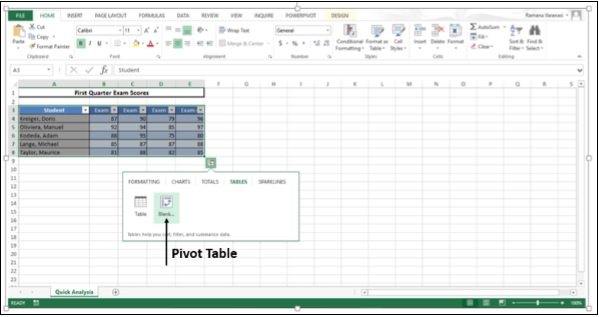
Tables
Tables help you sort, filter and summarize the data.
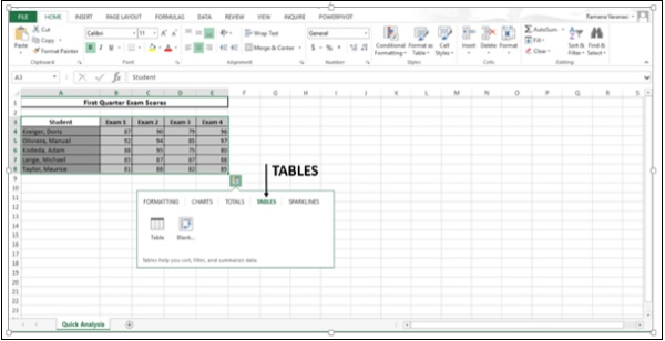
The options in the TABLES depend on the data you have chosen and may vary.
Step 1 − Click on TABLES.
Step 2 − Hover on the Table icon. A preview of the Table appears.
Step 3 − Click on Table. The Table is displayed. You can sort and filter the data using this feature.
Step 4 − Click on the Pivot Table to create a pivot table. Pivot Table helps you to summarize your data.
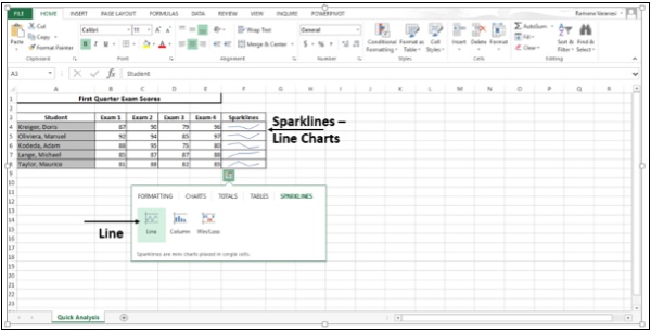
Sparklines
SPARKLINES are like tiny charts that you can show alongside your data in cells. They provide a quick way to show the trends of your data.
Step 1 − Click on SPARKLINES. The chart options displayed are based on the data and may vary.
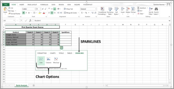
Step 2 − Click on Line. A line chart for each row is displayed.
Step 3 − Click on the Column icon.
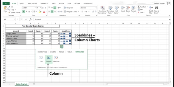
A line chart for each row is displayed.
