- Excel - Chart Recommendations
- Advanced Excel - Format Charts
- Advanced Excel - Chart Design
- Advanced Excel - Richer Data Labels
- Advanced Excel - Leader Lines
- Advanced Excel - New Functions
- Fundamental Data Analysis
- Excel - Instant Data Analysis
- Excel - Sorting Data by Color
- Advanced Excel - Slicers
- Advanced Excel - Flash Fill
- Powerful Data Analysis
- Excel - PivotTable Recommendations
- Powerful Data Analysis – 1
- Advanced Excel - Data Model
- Advanced Excel - Power Pivot
- Excel - External Data Connection
- Advanced Excel - Pivot Table Tools
- Powerful Data Analysis – 2
- Advanced Excel - Power View
- Advanced Excel - Visualizations
- Advanced Excel - Pie Charts
- Advanced Excel - Additional Features
- Advanced Excel - Power View Services
- Advanced Excel - Format Reports
- Advanced Excel - Handling Integers
- Other Features
- Advanced Excel - Templates
- Advanced Excel - Inquire
- Advanced Excel - Workbook Analysis
- Advanced Excel - Manage Passwords
- Advanced Excel - File Formats
- Excel - Discontinued Features
- Advanced Excel Useful Resources
- Advanced Excel - Quick Guide
- Advanced Excel - Useful Resources
- Advanced Excel - Discussion
Advanced Excel - Quick Guide
Advanced Excel - Chart Recommendations
Change in Charts Group
The Charts Group on the Ribbon in MS Excel 2013 looks as follows −
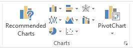
You can observe that −
The subgroups are clubbed together.
A new option Recommended Charts is added.
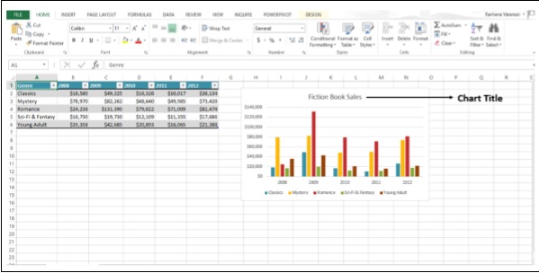
Let us create a chart. Follow the steps given below.
Step 1 − Select the data for which you want to create a chart.
Step 2 − Click on the Insert Column Chart icon as shown below.
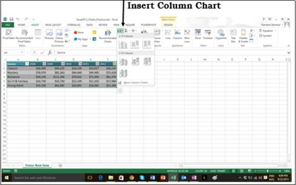
When you click on the Insert Column chart, types of 2-D Column Charts, and 3-D Column Charts are displayed. You can also see the option of More Column Charts.
Step 3 − If you are sure of which chart you have to use, you can choose a Chart and proceed.
If you find that the one you pick is not working well for your data, the new Recommended Charts command on the Insert tab helps you to create a chart quickly that is just right for your data.
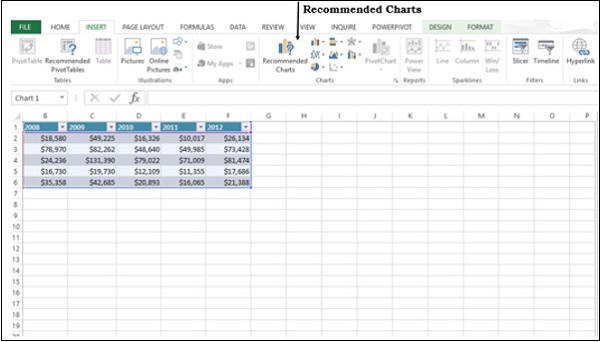
Chart Recommendations
Let us see the options available under this heading. (use another word for heading)
Step 1 − Select the Data from the worksheet.
Step 2 − Click on Recommended Charts.
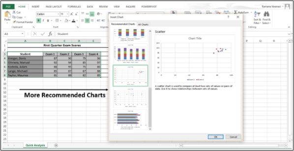
The following window displaying the charts that suit your data will be displayed.
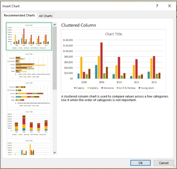
Step 3 − As you browse through the Recommended Charts, you will see the preview on the right side.
Step 4 − If you find the chart you like, click on it.
Step 5 − Click on the OK button. If you do not see a chart you like, click on All Charts to see all the available chart types.
Step 6 − The chart will be displayed in your worksheet.
Step 7 − Give a Title to the chart.
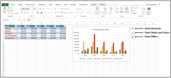
Fine Tune Charts Quickly
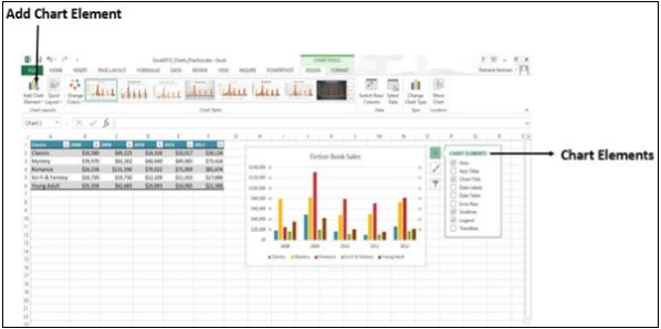
Click on the Chart. Three Buttons appear next to the upper-right corner of the chart. They are −
- Chart Elements
- Chart Styles and Colors, and
- Chart Filters
You can use these buttons −
- To add chart elements like axis titles or data labels
- To customize the look of the chart, or
- To change the data thats shown in the chart
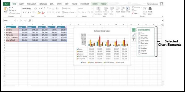
Select / De-select Chart Elements
Step 1 − Click on the Chart. Three Buttons will appear at the upper-right corner of the chart.
Step 2 − Click on the first button Chart Elements. A list of chart elements will be displayed under the Chart Elements option.
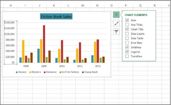
Step 3 − Select / De-select Chart Elements from the given List. Only the selected chart elements will be displayed on the Chart.
Format Style
Step 1 − Click on the Chart. Three Buttons will appear at the upper-right corner of the chart.
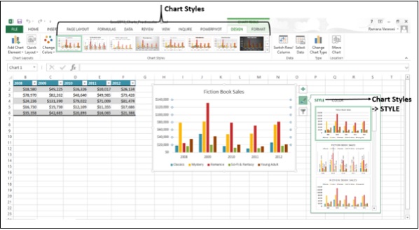
Step 2 − Click on the second button Chart Styles. A small window opens with different options of STYLE and COLOR as shown in the image given below.
Step 3 − Click on STYLE. Different options of Style will be displayed.
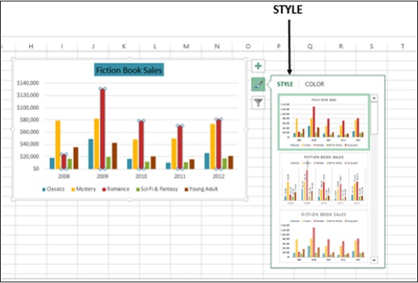
Step 4 − Scroll down the gallery. The live preview will show you how your chart data will look with the currently selected style.
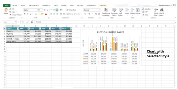
Step 5 − Choose the Style option you want. The Chart will be displayed with the selected Style as shown in the image given below.
Format Color
Step 1 − Click on the Chart. Three Buttons will appear at the upper-right corner of the chart.
Step 2 − Click on Chart Styles. The STYLE and COLOR window will be displayed.
Step 3 − Click on the COLOR tab. Different Color Schemes will be displayed.
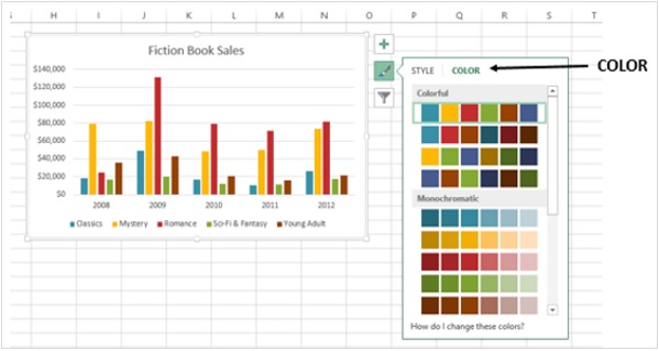
Step 4 − Scroll down the options. The live preview will show you how your chart data will look with the currently selected color scheme.
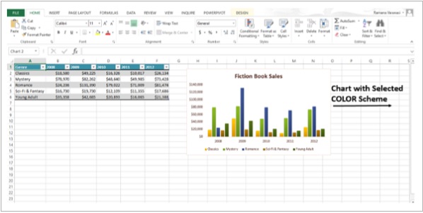
Step 5 − Pick the color scheme you want. Your Chart will be displayed with the selected Style and Color scheme as shown in the image given below.
You can change color schemes from Page Layout Tab also.
Step 1 − Click the tab Page Layout.
Step 2 − Click on the Colors button.
Step 3 − Pick the color scheme you like. You can also customize the Colors and have your own color scheme.
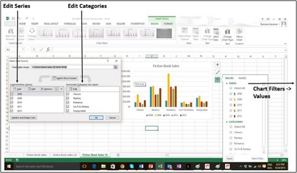
Filter Data being displayed on the Chart
Chart Filters are used to edit the data points and names that are visible on the chart being displayed, dynamically.
Step 1 − Click on the Chart. Three Buttons will appear at the upper-right corner of the chart.
Step 2 − Click on the third button Chart Filters as shown in the image.
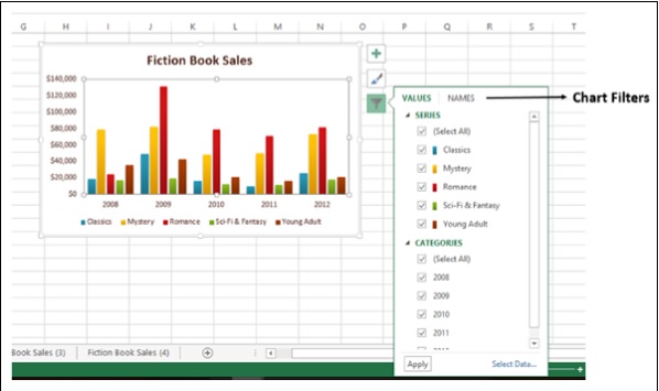
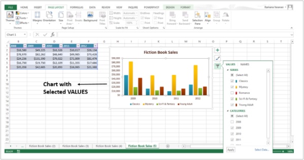
Step 3 − Click on VALUES. The available SERIES and CATEGORIES in your Data appear.
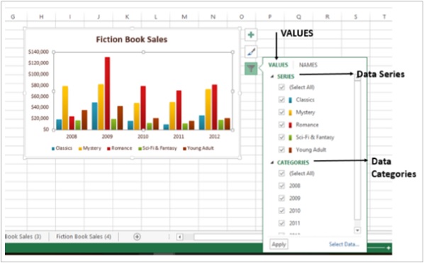
Step 4 − Select / De-select the options given under Series and Categories. The chart changes dynamically.
Step 5 − After, you decide on the final Series and Categories, click on Apply. You can see that the chart is displayed with the selected data.
Advanced Excel - Format Charts
The Format pane is a new entry in Excel 2013. It provides advanced formatting options in clean, shiny, new task panes and it is quite handy too.
Step 1 − Click on the Chart.
Step 2 − Select the chart element (e.g., data series, axes, or titles).
Step 3 − Right-click the chart element.
Step 4 − Click Format <chart element>. The new Format pane appears with options that are tailored for the selected chart element.
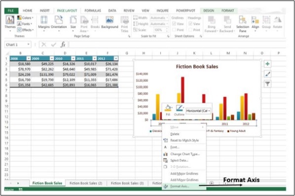
Format Axis
Step 1 − Select the chart axis.
Step 2 − Right-click the chart axis.
Step 3 − Click Format Axis. The Format Axis task pane appears as shown in the image below.
You can move or resize the task pane by clicking on the Task Pane Options to make working with it easier.
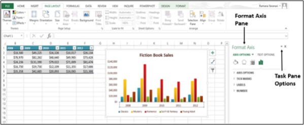
The small icons at the top of the pane are for more options.
Step 4 − Click on Axis Options.
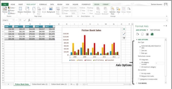
Step 5 − Select the required Axis Options. If you click on a different chart element, you will see that the task pane automatically updates to the new chart element.
Step 6 − Select the Chart Title.

Step 7 − Select the required options for the Title. You can format all the Chart Elements using the Format Task Pane as explained for Format Axis and Format Chart Title.
Provision for Combo Charts
There is a new button for combo charts in Excel 2013.
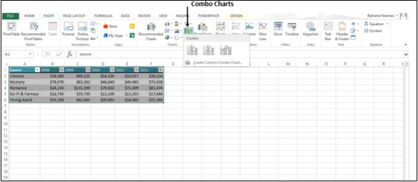
The following steps will show how to make a combo chart.
Step 1 − Select the Data.
Step 2 − Click on Combo Charts. As you scroll on the available Combo Charts, you will see the live preview of the chart. In addition, Excel displays guidance on the usage of that particular type of Combo Chart as shown in the image given below.
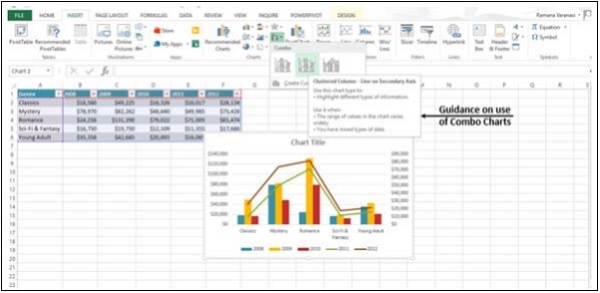
Step 3 − Select a Combo Chart in the way you want the data to be displayed. The Combo Chart will be displayed.
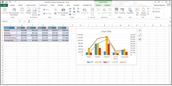
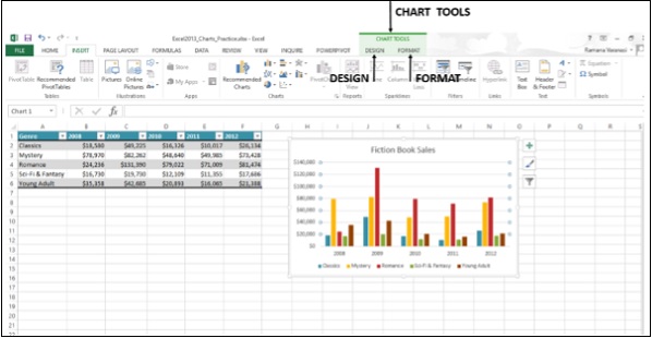
Advanced Excel - Chart Design
Ribbon of Chart Tools
When you click on your Chart, the CHART TOOLS tab, comprising of the DESIGN and FORMAT tabs is introduced on the ribbon.
Step 1 − Click on the Chart. CHART TOOLS with the DESIGN and FORMAT tabs will be displayed on the ribbon.
Let us understand the functions of the DESIGN tab.
Step 1 − Click on the chart.
Step 2 − Click on the DESIGN tab. The Ribbon now displays all the options of Chart Design.
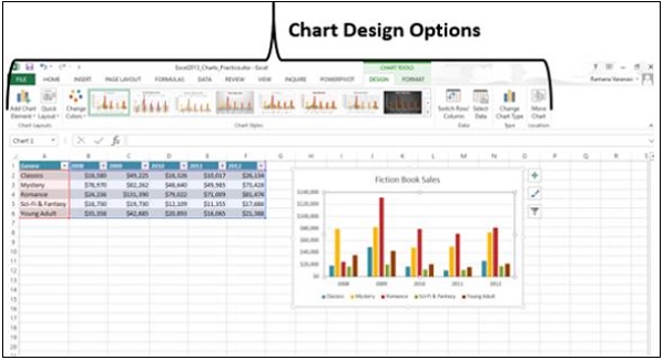
The first button on the ribbon is the Add Chart Element, which is the same as the Chart Elements, given at the upper right corner of the Charts as shown below.
Quick Layout
You can use Quick Layout to change the overall layout of the Chart quickly by choosing one of the predefined layout options.
Step 1 − Click on Quick Layout. Different possible layouts will be displayed.
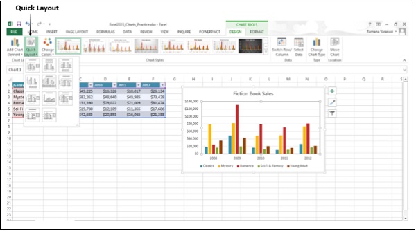
Step 2 − As you move on the layout options, the chart layout changes to that particular option. A preview of how your chart will look is shown.
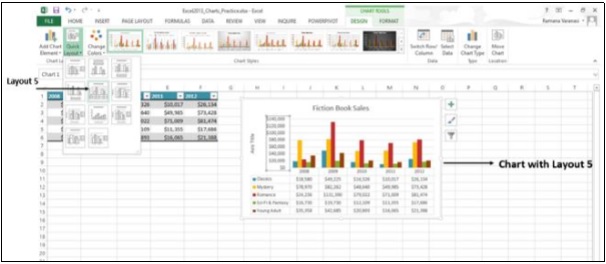
Step 3 − Click on the layout you like. The chart will be displayed with the chosen layout.
Change Colors
The Change Colors option is the same as in CHART ELEMENTS → Change Styles → COLOR.
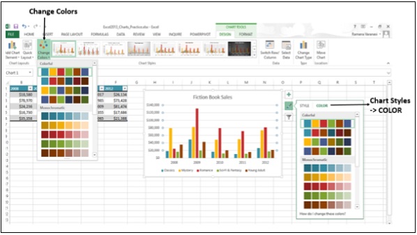
Chart Styles
The Chart Styles option is the same as in CHART ELEMENTS → Change Styles → STYLE.
Switch Row / Column
You can use the Switch Row / Column button on the ribbon to change the display of data from X-axis to Y-axis and vice versa. Follow the steps given below to understand this.
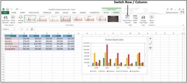
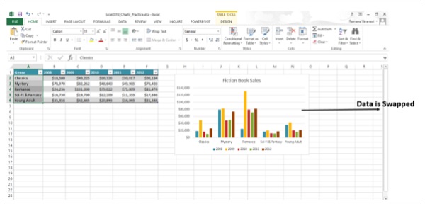
Step 1 − Click on Switch Row / Column. You can see that the data will be swapped between X-Axis and Y-Axis.
Select Data
You can change the Data Range included in the chart using this command.
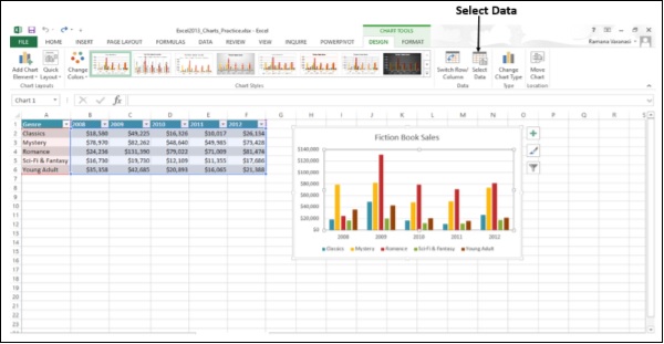
Step 1 − Click on Select Data. The Select Data Source window appears as shown in the image given below.
Step 2 − Select the Chart Data Range.
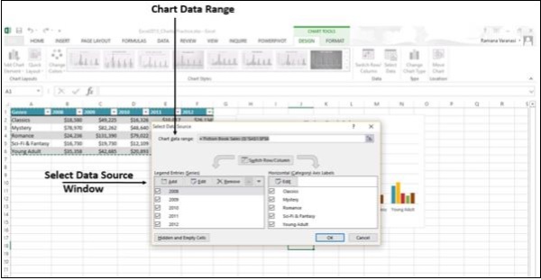
The window also has the options to edit the Legend Entries (Series) and Categories. This is the same as Chart Elements → Chart Filters → VALUES.
Change Chart Type
You can change to a different Chart Type using this option.
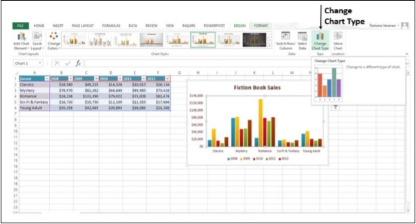
Step 1 − Click on the Change Chart Type window. The Change Chart Type window appears.

Step 2 − Select the Chart Type you want. The Chart will be displayed with the type chosen.
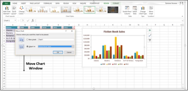
Move Chart
You can move the Chart to another Worksheet in the Workbook using this option.
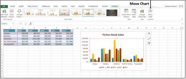
Click on Move Chart. The Move Chart window appears.
Advanced Excel - Richer Data Labels
You can have aesthetic and meaningful Data Labels. You can
- include rich and refreshable text from data points or any other text in your data labels
- enhance them with formatting and additional freeform text
- display them in just about any shape
Data labels stay in place, even when you switch to a different type of chart.
You can also connect them to their data points with Leader Lines on all charts and not just pie charts, which was the case in earlier versions of Excel.
Formatting Data Labels
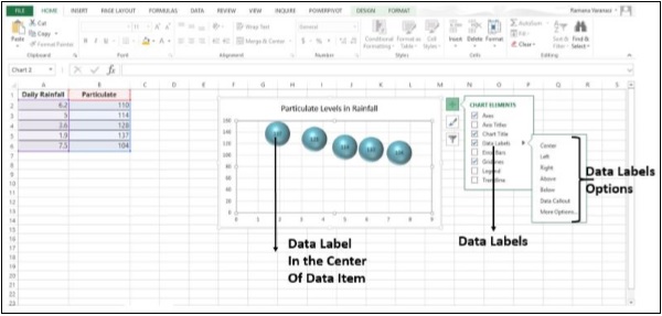
We use a Bubble Chart to see the formatting of Data Labels.
Step 1 − Select your data.
Step 2 − Click on the Insert Scatter or the Bubble Chart.
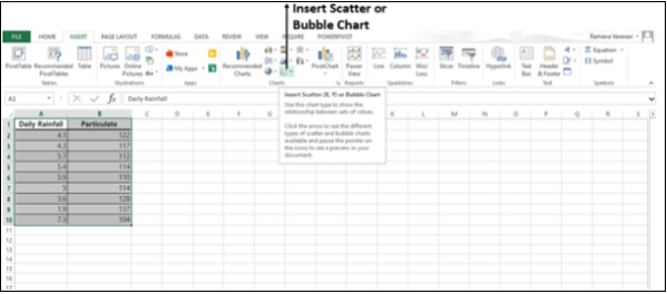
The options for the Scatter Charts and the 2-D and 3-D Bubble Charts appear.
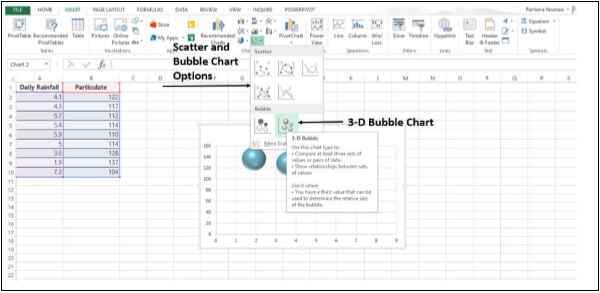
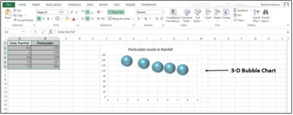
Step 3 − Click on the 3-D Bubble Chart. The 3-D Bubble Chart will appear as shown in the image given below.
Step 4 − Click on the chart and then click on Chart Elements.
Step 5 − Select Data Labels from the options. Select the small symbol given on the right of Data Labels. Different options for the placement of the Data Labels appear.
Step 6 − If you select Center, the Data Labels will be placed at the center of the Bubbles.
Step 7 − Right-click on any one Data Label. A list of option appears as shown in the image given below.
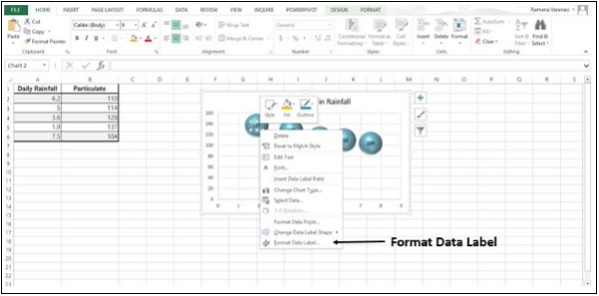
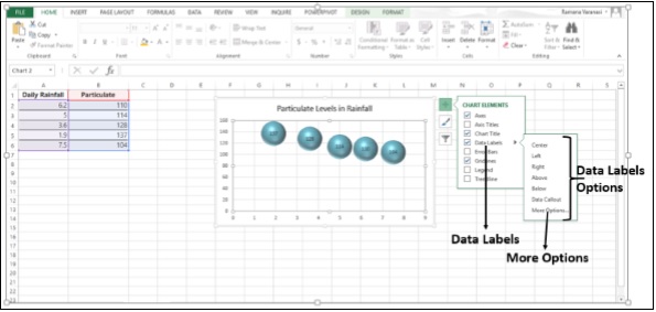
Step 8 − Click on the Format Data Label. Alternatively, you can also click on More Options available in the Data Labels options to display the Format Data Label Task Pane.
The Format Data Label Task Pane appears.
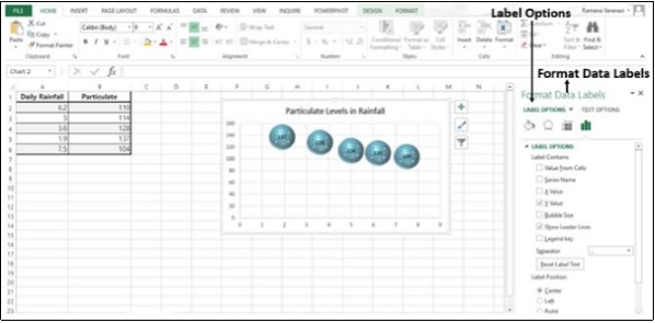
There are many options available for formatting of the Data Label in the Format Data Labels Task Pane. Make sure that only one Data Label is selected while formatting.
Step 9 − In Label Options → Data Label Series, click on Clone Current Label.
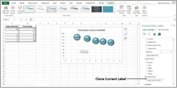
This will enable you to apply your custom Data Label formatting quickly to the other data points in the series.
Look of the Data Labels
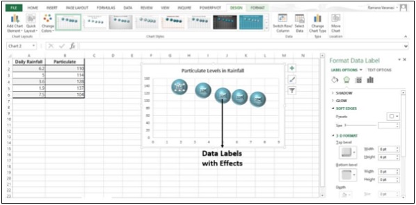
You can do many things to change the look of the Data Label, like changing the Fill color of the Data Label for emphasis.
Step 1 − Click on the Data Label, whose Fill color you want to change. Double click to change the Fill color for just one Data Label. The Format Data Label Task Pane appears.
Step 2 − Click Fill → Solid Fill. Choose the Color you want and then make the changes.
Step 3 − Click Effects and choose the required effects. For example, you can make the label pop by adding an effect. Just be careful not to go overboard adding effects.
Step 4 − In the Label Options → Data Label Series, click on Clone Current Label. All the other data labels will acquire the same effect.
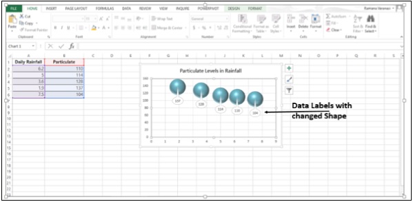
Shape of a Data Label
You can personalize your chart by changing the shapes of the Data Label.
Step 1 − Right-click the Data Label you want to change.
Step 2 − Click on Change Data Label Shapes.
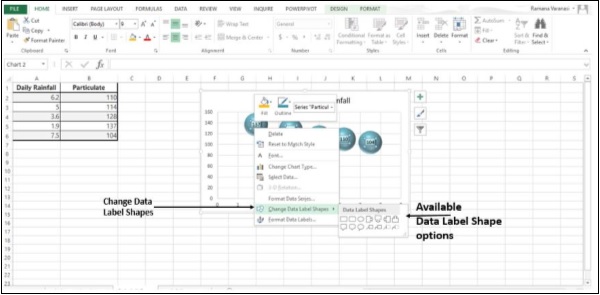
Step 3 − Choose the shape you want.
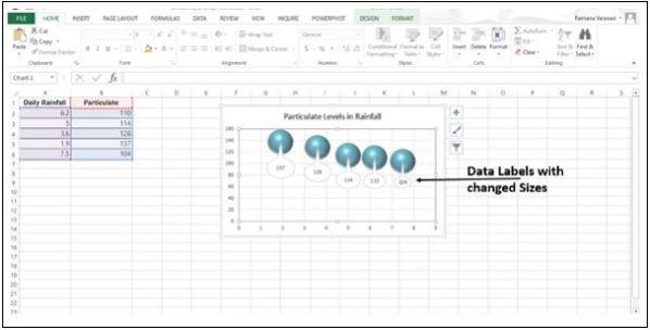
Resize a Data Label
Step 1 − Click on the data label.
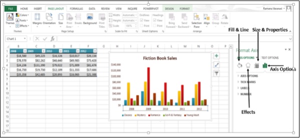
Step 2 − Drag it to the size you want. Alternatively, you can click on Size & Properties icon in the Format Data Labels task pane and then choose the size options.
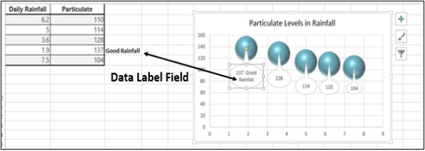
Add a Field to a Data Label
Excel 2013 has a powerful feature of adding a cell reference with explanatory text or a calculated value to a data label. Let us see how to add a field to the data label.
Step 1 − Place the Explanatory text in a cell.
Step 2 − Right-click on a data label. A list of options will appear.
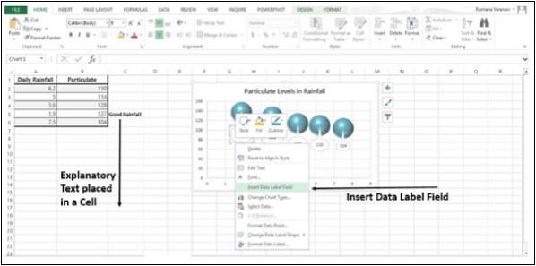
Step 3 − Click on the option − Insert Data Label Field.
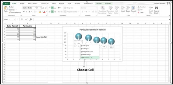
Step 4 − From the available options, Click on Choose Cell. A Data Label Reference window appears.
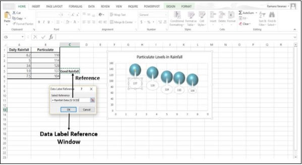
Step 5 − Select the Cell Reference where the Explanatory Text is written and then click OK. The explanatory text appears in the data label.
Step 6 − Resize the data label to view the entire text.
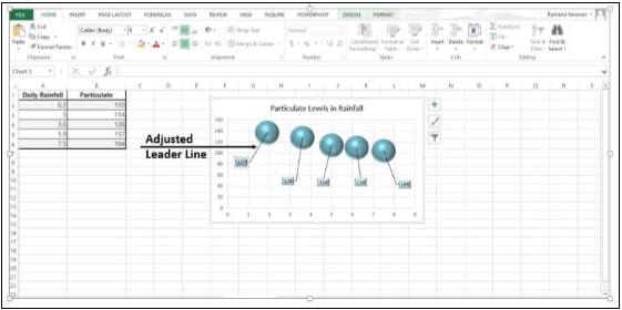
Advanced Excel - Leader Lines
A Leader Line is a line that connects a data label and its associated data point. It is helpful when you have placed a data label away from a data point.
In earlier versions of Excel, only the pie charts had this functionality. Now, all the chart types with data label have this feature.
Add a Leader Line
Step 1 − Click on the data label.
Step 2 − Drag it after you see the four-headed arrow.
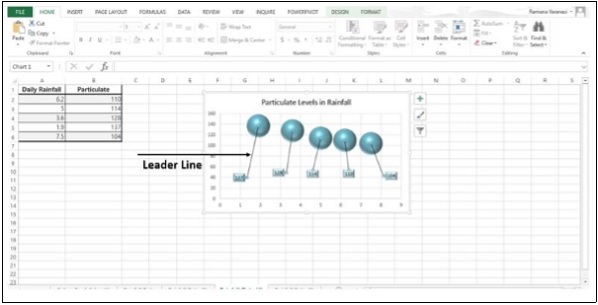
Step 3 − Move the data label. The Leader Line automatically adjusts and follows it.
Format Leader Lines
Step 1 − Right-click on the Leader Line you want to format.
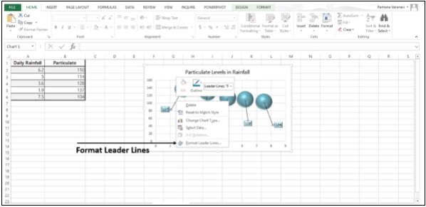
Step 2 − Click on Format Leader Lines. The Format Leader Lines task pane appears. Now you can format the leader lines as you require.
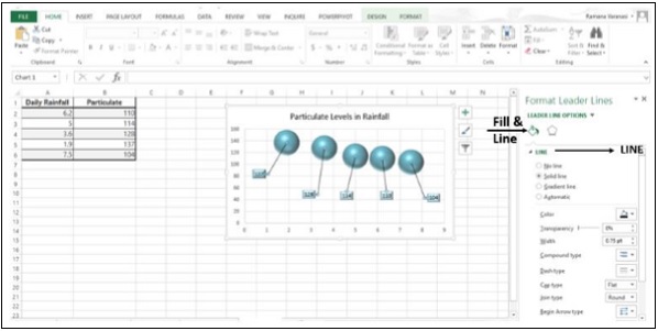
Step 3 − Click on the icon Fill & Line.
Step 4 − Click on LINE.
Step 5 − Make the changes that you want. The leader lines will be formatted as per your choices.
Advanced Excel - New Functions
Several new functions are added in the math and trigonometry, statistical, engineering, date and time, lookup and reference, logical, and text function categories. Also, Web category is introduced with few Web service functions.
Functions by Category
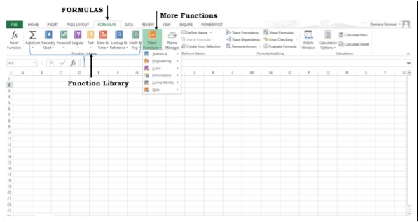
Excel functions are categorized by their functionality. If you know the category of the function that you are looking for, you can click that category.
Step 1 − Click on the FORMULAS tab. The Function Library group appears. The group contains the function categories.
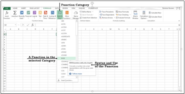
Step 2 − Click on More Functions. Some more function categories will be displayed.
Step 3 − Click on a function category. All the functions in that category will be displayed. As you scroll on the functions, the syntax of the function and the use of the function will be displayed as shown in the image given below.
New Functions in Excel 2013
Date and Time Functions
DAYS − Returns the number of days between two dates.
ISOWEEKNUM − Returns the number of the ISO week number of the year for a given date.
Engineering Functions
BITAND − Returns a 'Bitwise And' of two numbers.
BITLSHIFT − Returns a value number shifted left by shift_amount bits.
BITOR − Returns a bitwise OR of 2 numbers.
BITRSHIFT − Returns a value number shifted right by shift_amount bits.
BITXOR − Returns a bitwise 'Exclusive Or' of two numbers.
IMCOSH − Returns the hyperbolic cosine of a complex number.
IMCOT − Returns the cotangent of a complex number.
IMCSC − Returns the cosecant of a complex number.
IMCSCH − Returns the hyperbolic cosecant of a complex number.
IMSEC − Returns the secant of a complex number.
IMSECH − Returns the hyperbolic secant of a complex number.
IMSIN − Returns the sine of a complex number.
IMSINH − Returns the hyperbolic sine of a complex number.
IMTAN − Returns the tangent of a complex number.
Financial Functions
PDURATION − Returns the number of periods required by an investment to reach a specified value.
RRI − Returns an equivalent interest rate for the growth of an investment.
Information Functions
ISFORMULA − Returns TRUE if there is a reference to a cell that contains a formula.
SHEET − Returns the sheet number of the referenced sheet.
SHEETS − Returns the number of sheets in a reference.
Logical Functions
IFNA − Returns the value you specify if the expression resolves to #N/A, otherwise returns the result of the expression.
XOR − Returns a logical exclusive OR of all arguments.
Lookup and Reference Functions
FORMULATEXT − Returns the formula at the given reference as text.
GETPIVOTDATA − Returns data stored in a PivotTable report.
Math and Trigonometry Functions
ACOT − Returns the arccotangent of a number.
ACOTH − Returns the hyperbolic arccotangent of a number.
BASE − Converts a number into a text representation with the given radix (base).
CEILING.MATH − Rounds a number up, to the nearest integer or to the nearest multiple of significance.
COMBINA − Returns the number of combinations with repetitions for a given number of items.
COT − Returns the cotangent of an angle.
COTH − Returns the hyperbolic cotangent of a number.
CSC − Returns the cosecant of an angle.
CSCH − Returns the hyperbolic cosecant of an angle.
DECIMAL − Converts a text representation of a number in a given base into a decimal number.
FLOOR.MATH − Rounds a number down, to the nearest integer or to the nearest multiple of significance.
ISO.CEILING − Returns a number that is rounded up to the nearest integer or to the nearest multiple of significance.
MUNIT − Returns the unit matrix or the specified dimension.
SEC − Returns the secant of an angle.
SECH − Returns the hyperbolic secant of an angle.
Statistical Functions
BINOM.DIST.RANGE − Returns the probability of a trial result using a binomial distribution.
GAMMA − Returns the Gamma function value.
GAUSS − Returns 0.5 less than the standard normal cumulative distribution.
PERMUTATIONA − Returns the number of permutations for a given number of objects (with repetitions) that can be selected from the total objects.
PHI − Returns the value of the density function for a standard normal distribution.
SKEW.P − Returns the skewness of a distribution based on a population: a characterization of the degree of asymmetry of a distribution around its mean.
Text Functions
DBCS − Changes half-width (single-byte) English letters or katakana within a character string to full-width (double-byte) characters.
NUMBERVALUE − Converts text to number in a locale-independent manner.
UNICHAR − Returns the Unicode character that is references by the given numeric value.
UNICODE − Returns the number (code point) that corresponds to the first character of the text.
User Defined Functions in Add-ins
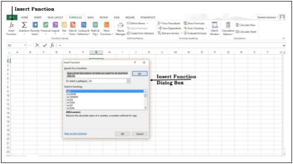
The Add-ins that you install contain Functions. These add-in or automation functions will be available in the User Defined category in the Insert Function dialog box.
CALL − Calls a procedure in a dynamic link library or code resource.
EUROCONVERT − Converts a number to euros, converts a number from euros to a euro member currency, or converts a number from one euro member currency to another by using the euro as an intermediary (triangulation).
REGISTER.ID − Returns the register ID of the specified dynamic link library (DLL) or code resource that has been previously registered.
SQL.REQUEST − Connects with an external data source and runs a query from a worksheet, then returns the result as an array without the need for macro programming.
Web Functions
The following web functions are introduced in Excel 2013.
ENCODEURL − Returns a URL-encoded string.
FILTERXML − Returns specific data from the XML content by using the specified XPath.
WEBSERVICE − Returns the data from a web service.
Advanced Excel - Instant Data Analysis
In Microsoft Excel 2013, it is possible to do data analysis with quick steps. Further, different analysis features are readily available. This is through the Quick Analysis tool.
Quick Analysis Features
Excel 2013 provides the following analysis features for instant data analysis.
Formatting
Formatting allows you to highlight the parts of your data by adding things like data bars and colors. This lets you quickly see high and low values, among other things.
Charts
Charts are used to depict the data pictorially. There are several types of charts to suit different types of data.
Totals
Totals can be used to calculate the numbers in columns and rows. You have functions such as Sum, Average, Count, etc. which can be used.
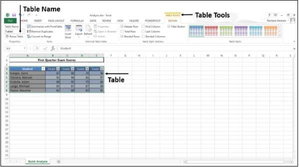
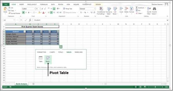
Tables
Tables help you to filter, sort and summarize your data. The Table and PivotTable are a couple of examples.
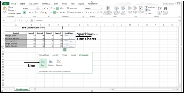
Sparklines
Sparklines are like tiny charts that you can show alongside your data in the cells. They provide a quick way to see the trends.
Quick Analysis of Data
Follow the steps given below for quickly analyzing the data.
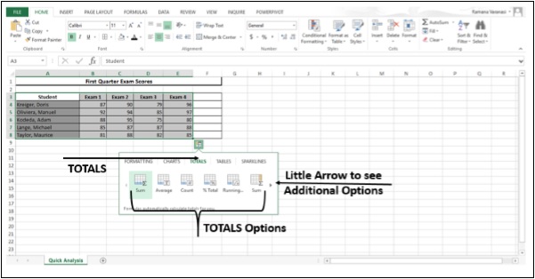
Step 1 − Select the cells that contain the data you want to analyze.
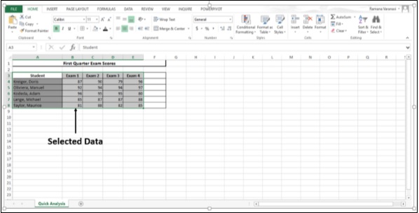
A Quick Analysis button  appears to the bottom right of your selected data.
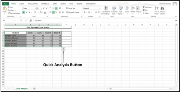
Step 2 − Click the Quick Analysis button that appears (or press CTRL + Q). The Quick Analysis toolbar appears with the options of FORMATTING, CHARTS, TOTALS, TABLES and SPARKLINES.
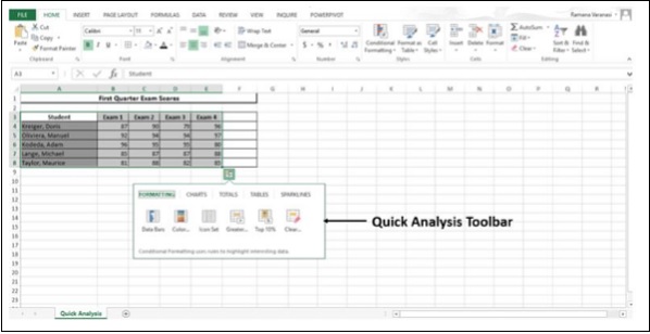
Conditional Formatting
Conditional formatting uses the rules to highlight the data. This option is available on the Home tab also, but with quick analysis it is handy and quick to use. Also, you can have a preview of the data by applying different options, before selecting the one you want.
Step 1 − Click on the FORMATTING button.
Step 2 − Click on Data Bars.
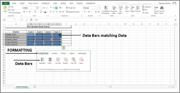
The colored Data Bars that match the values of the data appear.
Step 3 − Click on Color Scale.
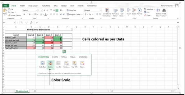
The cells will be colored to the relative values as per the data they contain.
Step 4 − Click on the Icon Set. The icons assigned to the cell values will be displayed.
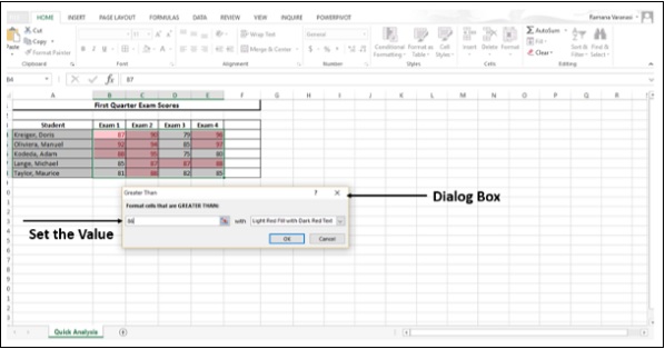
Step 5 − Click on the option - Greater than.
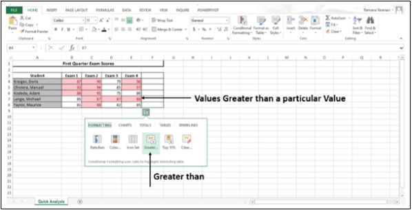
Values greater than a value set by Excel will be colored. You can set your own value in the Dialog Box that appears.
Step 6 − Click on Top 10%.
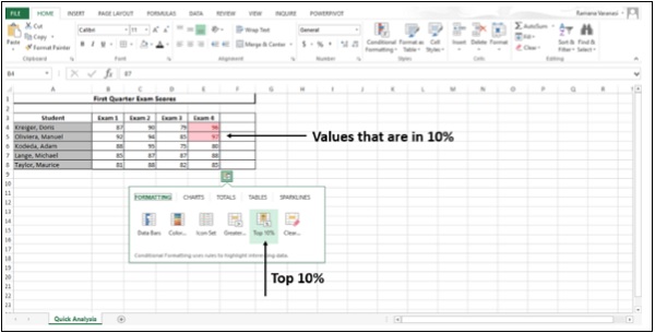
Values that are in top 10% will be colored.
Step 7 − Click on Clear Formatting.
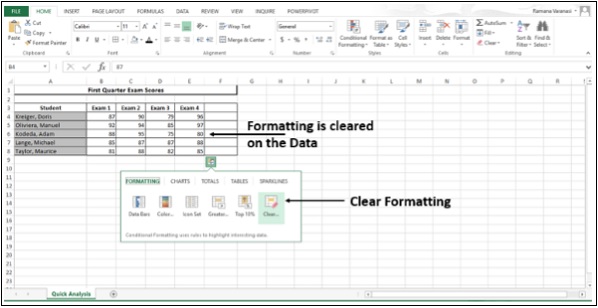
Whatever formatting is applied will be cleared.
Step 8 − Move the mouse over the FORMATTING options. You will have a preview of all the formatting for your Data. You can choose whatever best suits your data.
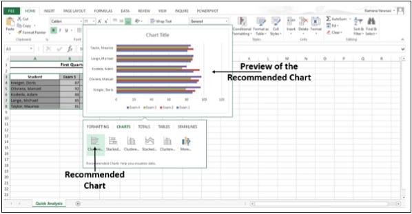
Charts
Recommended Charts help you visualize your Data.
Step 1 − Click on CHARTS. Recommended Charts for your data will be displayed.
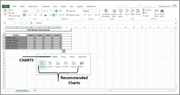
Step 2 − Move over the charts recommended. You can see the Previews of the Charts.
Step 3 − Click on More as shown in the image given below.
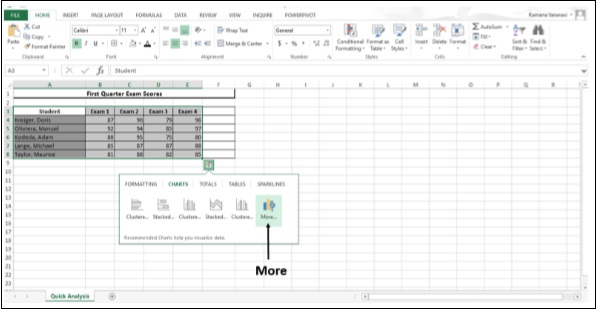
More Recommended Charts are displayed.
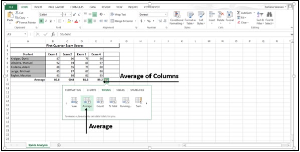
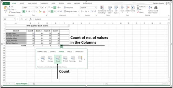
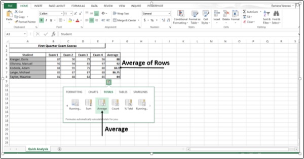
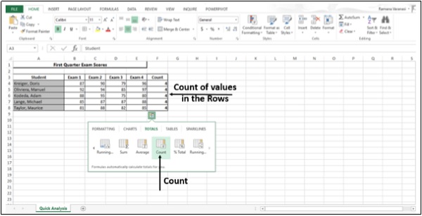
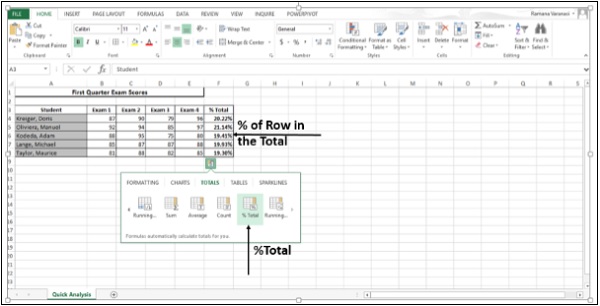
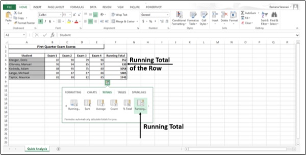
Totals
Totals help you to calculate the numbers in rows and columns.
Step 1 − Click on TOTALS. All the options available under TOTALS options are displayed. The little black arrows on the right and left are to see additional options.
Step 2 − Click on the Sum icon. This option is used to sum the numbers in the columns.
Step 3 − Click on Average. This option is used to calculate the average of the numbers in the columns.
Step 4 − Click on Count. This option is used to count the number of values in the column.
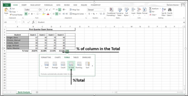
Step 5 − Click on %Total. This option is to compute the percent of the column that represents the total sum of the data values selected.
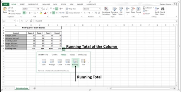
Step 6 − Click on Running Total. This option displays the Running Total of each column.
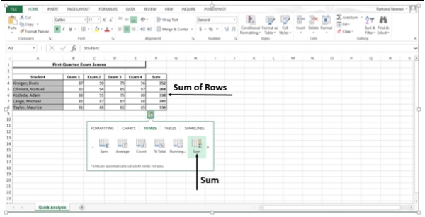
Step 7 − Click on Sum. This option is to sum the numbers in the rows.
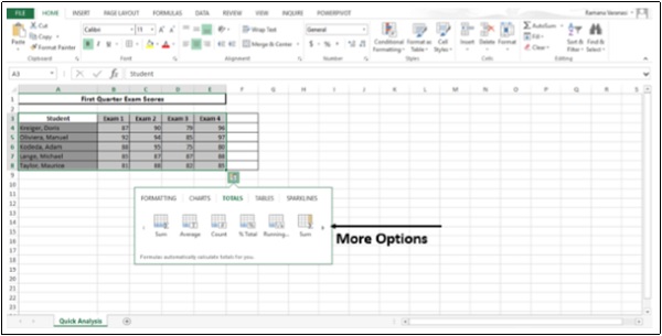
Step 8 − Click on the symbol  . This displays more options to the right.
Step 9 − Click on Average. This option is to calculate the average of the numbers in the rows.
Step 10 − Click on Count. This option is to count the number of values in the rows.
Step 11 − Click on %Total.
This option is to compute the percent of the row that represents the total sum of the data values selected.
Step 12 − Click on Running Total. This option displays the Running Total of each row.
Tables
Tables help you sort, filter and summarize the data.
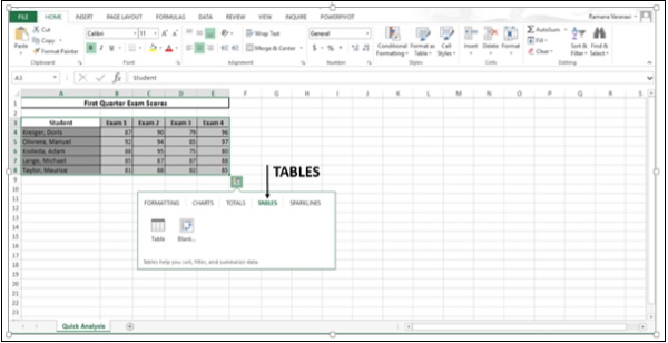
The options in the TABLES depend on the data you have chosen and may vary.
Step 1 − Click on TABLES.
Step 2 − Hover on the Table icon. A preview of the Table appears.
Step 3 − Click on Table. The Table is displayed. You can sort and filter the data using this feature.
Step 4 − Click on the Pivot Table to create a pivot table. Pivot Table helps you to summarize your data.
Sparklines
SPARKLINES are like tiny charts that you can show alongside your data in cells. They provide a quick way to show the trends of your data.
Step 1 − Click on SPARKLINES. The chart options displayed are based on the data and may vary.
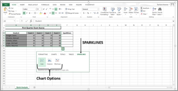
Step 2 − Click on Line. A line chart for each row is displayed.
Step 3 − Click on the Column icon.
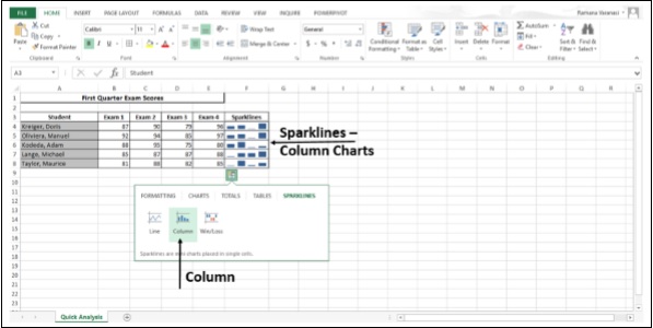
A line chart for each row is displayed.
Advanced Excel - Sorting Data by Color
If you have formatted a table column, manually or conditionally, with the cell color or font color, you can also sort by these colors.
Step 1 − Click on the DATA tab.
Step 2 − Click on Sort in the Sort & Filter group. The Sort dialog box appears.
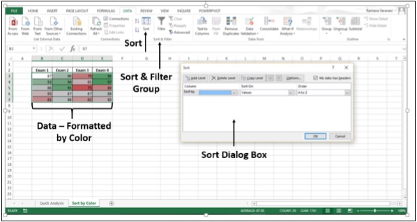
Step 3 − Under the Column option, in the Sort by box, select the column that you want to sort. For example, click on Exam 2 as shown in the image given below.
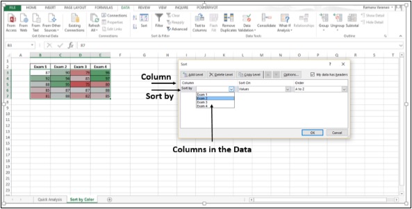
Step 4 − Under the topic Sort On, select the type of sort. To sort by cell color, select Cell Color. To sort by font color, select Font Color.
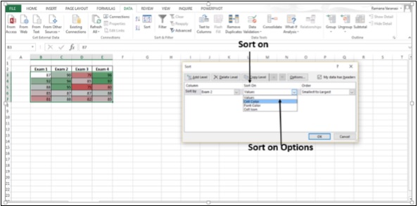
Step 5 − Click on the option Cell Color.
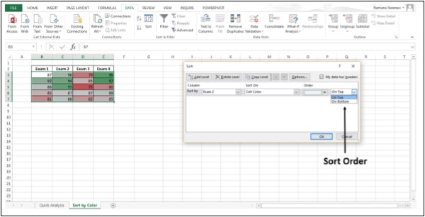
Step 6 − Under Order, click the arrow next to the button. The colors in that column are displayed.
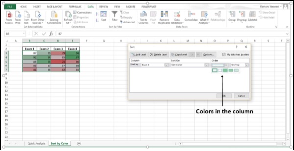
Step 7 − You must define the order that you want for each sort operation because there is no default sort order. To move the cell color to the top or to the left, select On Top for column sorting and On Left for row sorting. To move the cell color to the bottom or to the right, select On Bottom for column sorting and On Right for row sorting.
Advanced Excel - Slicers
Slicers were introduced in Excel 2010 to filter the data of pivot table. In Excel 2013, you can create Slicers to filter your table data also.
A Slicer is useful because it clearly indicates what data is shown in your table after you filter your data.
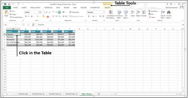
Step 1 − Click in the Table. TABLE TOOLS tab appears on the ribbon.
Step 2 − Click on DESIGN. The options for DESIGN appear on the ribbon.
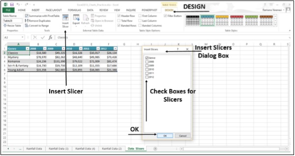
Step 3 − Click on Insert Slicer. A Insert Slicers dialog box appears.
Step 4 − Check the boxes for which you want the slicers. Click on Genre.
Step 5 − Click OK.
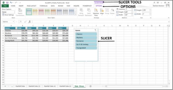
The slicer appears. Slicer tools appear on the ribbon. Clicking the OPTIONS button, provides various Slicer Options.
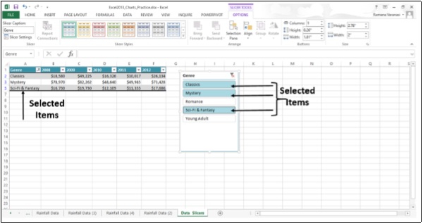
Step 6 − In the slicer, click the items you want to display in your table. To choose more than one item, hold down CTRL, and then pick the items you want to show.
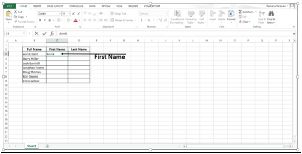
Advanced Excel - Flash Fill
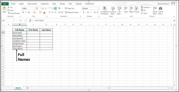
Flash Fill helps you to separate first and last names or part names and numbers, or any other data into separate columns.
Step 1 − Consider a data column containing full names.
Step 2 − Enter the first name in the column next to your data and press Enter.
Step 3 − Start typing the next name. Flash Fill will show you a list of suggested names.
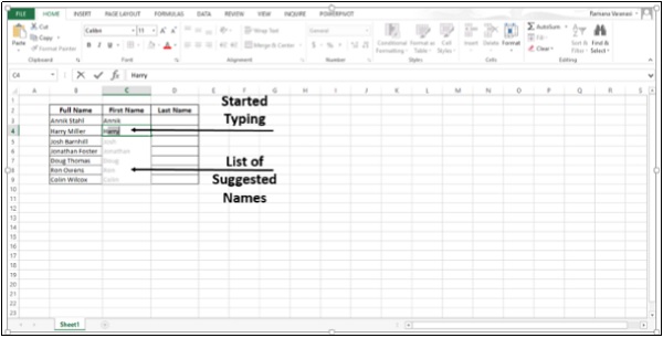
Step 4 − Press Enter to accept the list.
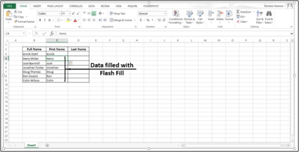
Step 5 − Enter a last name in the next column, and press Enter.
Step 6 − Start typing the next name and press Enter. The column will be filled with the relevant last names.
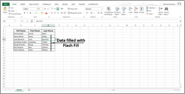
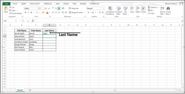
Step 7 − If the names have middle names also, you can still use Flash Fill to separate the data out into three columns by repeating it three times.
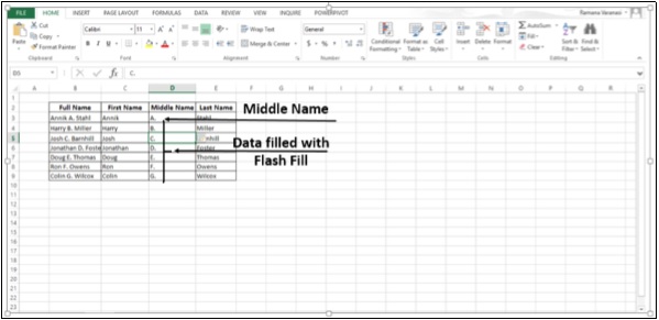
Flash Fill works with any data you need to split into more than one column, or you can simply use it to fill out data based on an example. Flash Fill typically starts working when it recognizes a pattern in your data.
Excel - PivotTable Recommendations
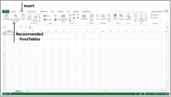
Excel 2013 has a new feature Recommended PivotTables under the Insert tab. This command helps you to create PivotTables automatically.
Step 1 − Your data should have column headers. If you have data in the form of a table, the table should have Table Header. Make sure of the Headers.
Step 2 − There should not be blank rows in the Data. Make sure No Rows are blank.
Step 3 − Click on the Table.
Step 4 − Click on Insert tab.
Step 5 − Click on Recommended PivotTables. The Recommended PivotTables dialog box appears.
Step 6 − Click on a PivotTable Layout that is recommended. A preview of that pivot table appears on the rightside.
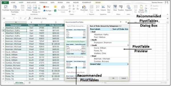
Step 7 − Double-click on the PivotTable that shows the data the way you want and Click OK. The PivotTable is created automatically for you on a new worksheet.
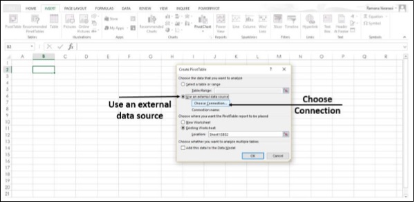
Create a PivotTable to analyze external data
Create a PivotTable by using an existing external data connection.
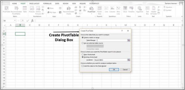
Step 1 − Click any cell in the Table.
Step 2 − Click on the Insert tab.
Step 3 − Click on the PivotTable button. A Create PivotTable dialog box appears.
Step 4 − Click on the option Use an external data source. The button below that, Choose Connection gets enabled.
Step 5 − Select the Choose Connection option. A window appears showing all the Existing Connections.
Step 6 − In the Show Box, select All Connections. All the available data connections can be used to obtain the data for analysis.
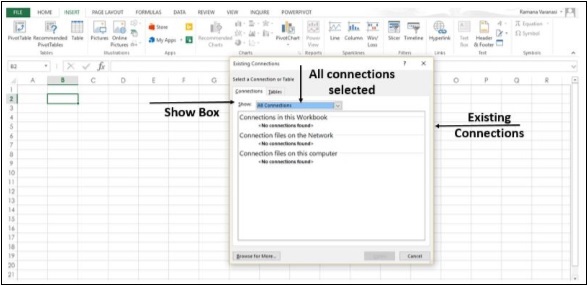
The option Connections in this Workbook option in the Show Box is to reuse or share an existing connection.
Connect to a new external data source
You can create a new external data connection to the SQL Server and import the data into Excel as a table or PivotTable.
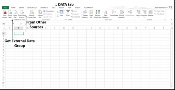
Step 1 − Click on the Data tab.
Step 2 − Click on the From Other Sources button, in the Get External Data Group.
The options of External Data Sources appear as shown in the image below.
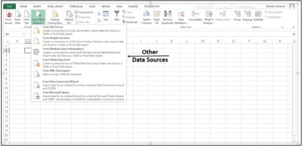
Step 3 − Click the option From SQL Server to create a connection to an SQL Server table.
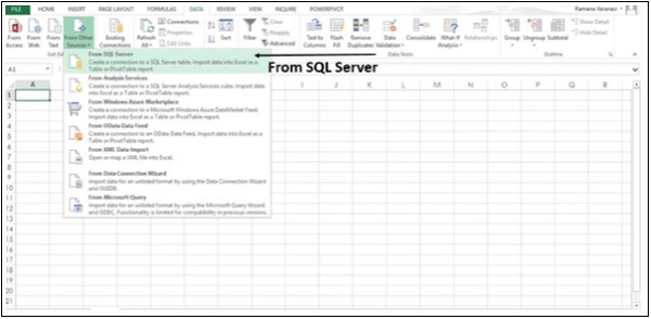
A Data Connection Wizard dialog box appears.
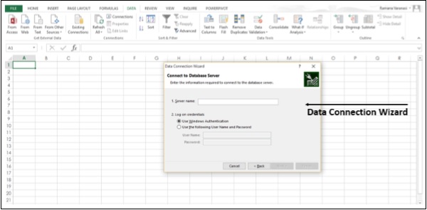
Step 4 − Establish the connection in three steps given below.
Enter the database server and specify how you want to log on to the server.
Enter the database, table, or query that contains the data you want.
Enter the connection file you want to create.
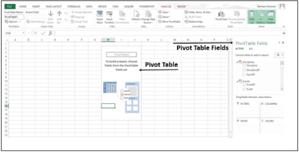
Using the Field List option
In Excel 2013, it is possible to arrange the fields in a PivotTable.
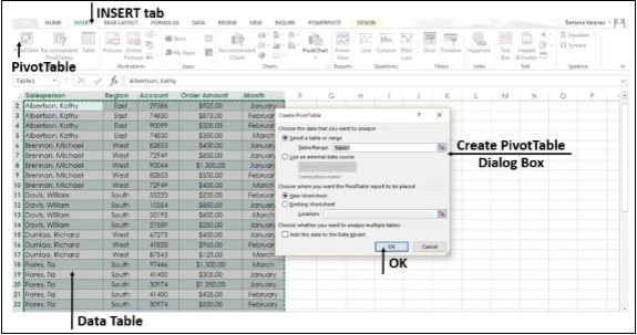
Step 1 − Select the data table.
Step 2 − Click the Insert Tab.
Step 3 − Click on the PivotTable button. The Create PivotTable dialog box opens.
Step 4 − Fill the data and then click OK. The PivotTable appears on a New Worksheet.
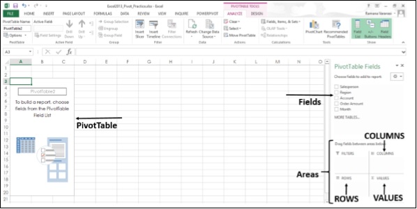
Step 5 − Choose the PivotTable Fields from the field list. The fields are added to the default areas.
The Default areas of the Field List are −
Nonnumeric fields are added to the Rows area
Numeric fields are added to the Values area, and
Time hierarchies are added to the Columns area
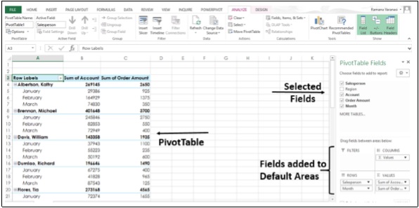
You can rearrange the fields in the PivotTable by dragging the fields in the areas.
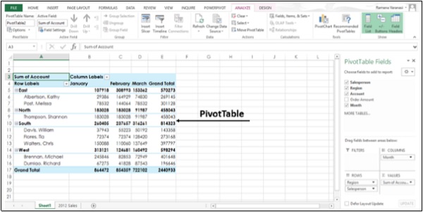
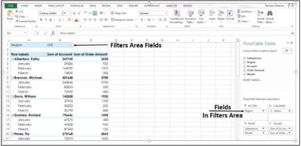
Step 6 − Drag Region Field from Rows area to Filters area. The Filters area fields are shown as top-level report filters above the PivotTable.
Step 7 − The Rows area fields are shown as Row Labels on the left side of the PivotTable.
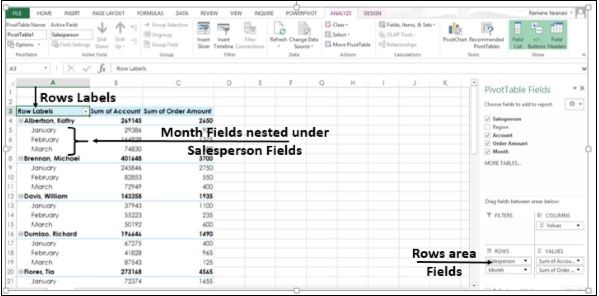
The order in which the Fields are placed in the Rows area, defines the hierarchy of the Row Fields. Depending on the hierarchy of the fields, rows will be nested inside rows that are higher in position.
In the PivotTable above, Month Field Rows are nested inside Salesperson Field Rows. This is because in the Rows area, the field Salesperson appears first and the field Month appears next, defining the hierarchy.
Step 8 − Drag the field - Month to the first position in the Rows area. You have changed the hierarchy, putting Month in the highest position. Now, in the PivotTable, the field - Salesperson will nest under Month fields.
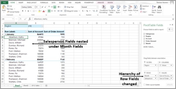
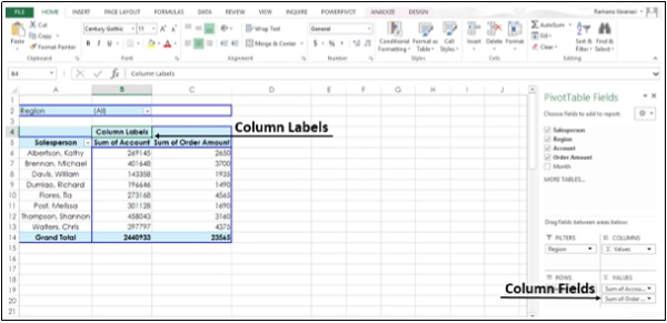
In a similar way, you can drag Fields in the Columns area also. The Columns area fields are shown as Column Labels at the top of the PivotTable.
PivotTables based on Multiple Tables
In Excel 2013, it is possible to create a PivotTable from multiple tables. In this example, the table Sales is on one worksheet and table - Products is on another worksheet.
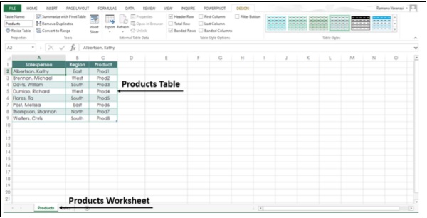
Step 1 − Select the Sales sheet from the worksheet tabs.
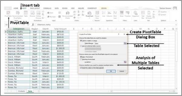
Step 2 − Click the Insert tab.
Step 3 − Click on the PivotTable button on the ribbon. The Create PivotTable dialog box,
Step 4 − Select the sales table.
Step 5 − Under choose whether you want to analyze multiple tables, Click Add this Data to the Data Model.
Step 6 − Click OK.
Under the PivotTable Fields, you will see the options, ACTIVE and ALL.
Step 7 − Click on ALL. You will see both the tables and the fields in both the tables.
Step 8 − Select the fields to add to the PivotTable. You will see a message, Relationships between tables may be needed.
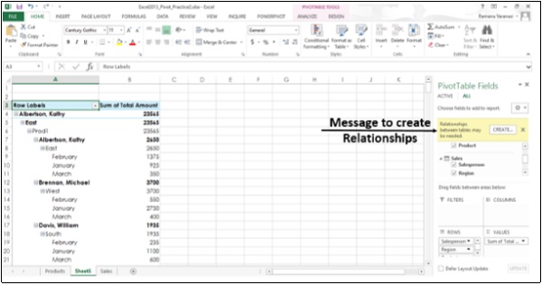
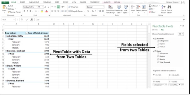
Step 9 − Click on the CREATE button. After a few steps for creation of Relationship, the selected fields from the two tables are added to the PivotTable.
Advanced Excel - Data Model
Excel 2013 has powerful data analysis features. You can build a data model, then create amazing interactive reports using Power View. You can also make use of the Microsoft Business Intelligence features and capabilities in Excel, PivotTables, Power Pivot, and Power View.
Data Model is used for building a model where data from various sources can be combined by creating relationships among the data sources. A Data Model integrates the tables, enabling extensive analysis using PivotTables, Power Pivot, and Power View.
A Data Model is created automatically when you import two or more tables simultaneously from a database. The existing database relationships between those tables is used to create the Data Model in Excel.
Step 1 − Open a new blank Workbook in Excel.
Step 2 − Click on the DATA tab.
Step 3 − In the Get External Data group, click on the option From Access. The Select Data Source dialog box opens.
Step 4 − Select Events.accdb, Events Access Database file.
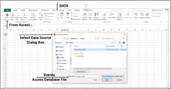
Step 5 − The Select Table window, displaying all the tables found in the database, appears.
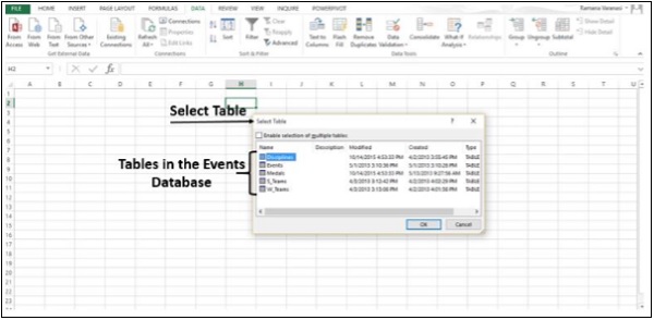
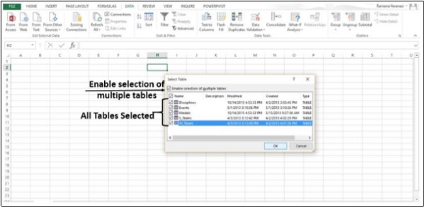
Step 6 − Tables in a database are similar to the tables in Excel. Check the Enable selection of multiple tables box, and select all the tables. Then click OK.
Step 7 − The Import Data window appears. Select the PivotTable Report option. This option imports the tables into Excel and prepares a PivotTable for analyzing the imported tables. Notice that the checkbox at the bottom of the window - Add this data to the Data Model is selected and disabled.
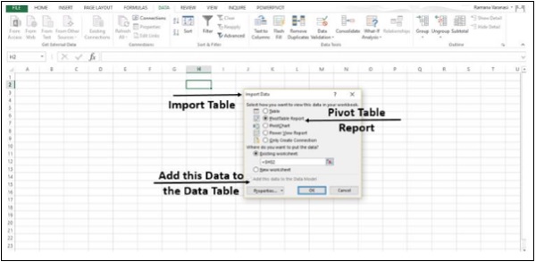
Step 8 − The data is imported, and a PivotTable is created using the imported tables.
You have imported the data into Excel and the Data Model is created automatically. Now, you can explore data in the five tables, which have relationships defined among them.
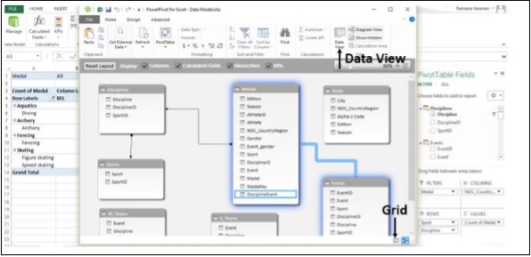
Explore Data Using PivotTable
Step 1 − You know how to add fields to PivotTable and drag fields across areas. Even if you are not sure of the final report that you want, you can play with the data and choose the best-suited report.
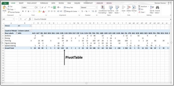
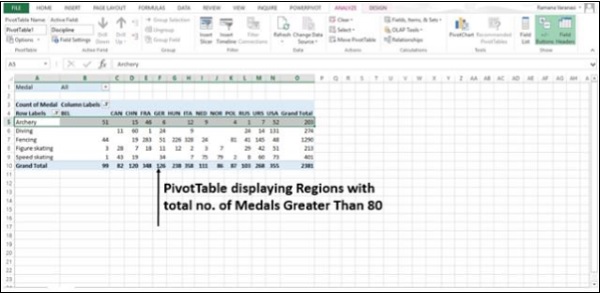
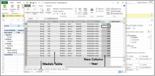
In PivotTable Fields, click on the arrow beside the table - Medals to expand it to show the fields in that table. Drag the NOC_CountryRegion field in the Medals table to the COLUMNS area.
Step 2 − Drag Discipline from the Disciplines table to the ROWS area.
Step 3 − Filter Discipline to display only five sports: Archery, Diving, Fencing, Figure Skating, and Speed Skating. This can be done either in PivotTable Fields area, or from the Row Labels filter in the PivotTable itself.
Step 4 − In PivotTable Fields, from the Medals table, drag Medal to the VALUES area.
Step 5 − From the Medals table, select Medal again and drag it into the FILTERS area.
Step 6 − Click the dropdown list button to the right of the Column labels.
Step 7 − Select Value Filters and then select Greater Than
Step 8 − Click OK.
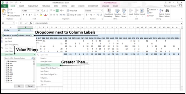
The Value Filters dialog box for the count of Medals is greater than appears.
Step 9 − Type 80 in the Right Field.
Step 10 − Click OK.
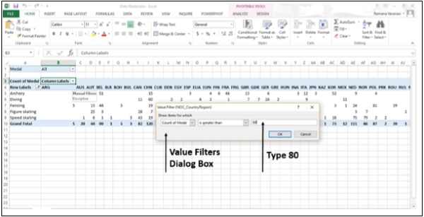
The PivotTable displays only those regions, which has more than total 80 medals.
You could analyze your data from the different tables and arrive at the specific report you want in just a few steps. This was possible because of the pre-existing relationships among the tables in the source database. As you imported all the tables from the database together at the same time, Excel recreated the relationships in its Data Model.
If you do not import the tables at the same time, or if the data is from different sources or if you add new tables to your Workbook, you have to create the Relationships among the Tables by yourself.
Create Relationship between Tables
Relationships let you analyze your collections of the data in Excel, and create interesting and aesthetic reports from the data you import.
Step 1 − Insert a new Worksheet.
Step 2 − Create a new table with new data. Name the new table as Sports.
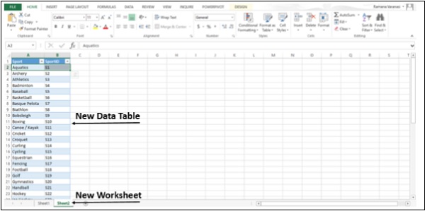
Step 3 − Now you can create relationship between this new table and the other tables that already exist in the Data Model in Excel. Rename the Sheet1 as Medals and Sheet2 as Sports.
On the Medals sheet, in the PivotTable Fields List, click All. A complete list of available tables will be displayed. The newly added table - Sports will also be displayed.
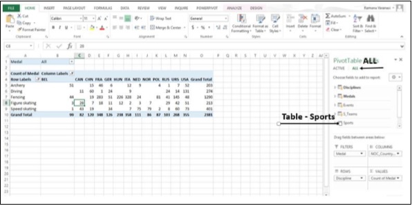
Step 4 − Click on Sports. In the expanded list of fields, select Sports. Excel messages you to create a relationship between tables.
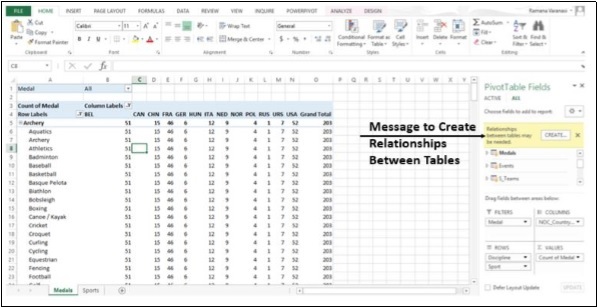
Step 5 − Click on CREATE. The Create Relationship dialog box opens.
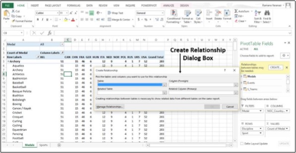
Step 6 − To create the relationship, one of the tables must have a column of unique, non-repeated, values. In the Disciplines table, SportID column has such values. The table Sports that we have created also has the SportID column. In Table, select Disciplines.
Step 7 − In Column (Foreign), select SportID.
Step 8 − In Related Table, select Sports.
Step 9 − In Related Column (Primary), SportID gets selected automatically. Click OK.
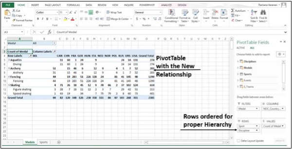
Step 10 − The PivotTable is modified to reflect the addition of the new Data Field Sport. Adjust the order of the fields in the Rows area to maintain the Hierarchy. In this case, Sport should be first and Discipline should be the next, as Discipline will be nested in Sport as a sub-category.
Advanced Excel - Power Pivot
PowerPivot is an easy to use data analysis tool that can be used from within Excel. You can use PowerPivot to access and mashup data from virtually any source. You can create your own compelling reports and analytical applications, easily share insights, and collaborate with colleagues through Microsoft Excel and SharePoint.
Using PowerPivot, you can import data, create relationships, create calculated columns and measures, and add PivotTables, slicers and Pivot Charts.
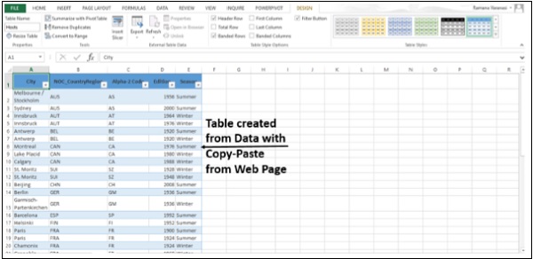
Step 1 − You can use Diagram View in PowerPivot to create a relationship. To start, get some more data into your workbook. You can copy and paste data from a Web Page also. Insert a new Worksheet.
Step 2 − Copy data from the web page and paste it on the Worksheet.
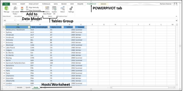
Step 3 − Create a table with the data. Name the table Hosts and rename the Worksheet Hosts.
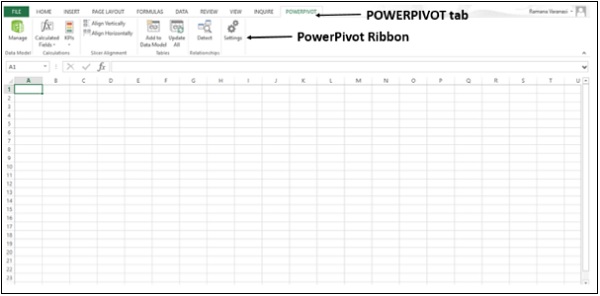
Step 4 − Click on the Worksheet Hosts. Click the POWERPIVOT tab on the Ribbon.
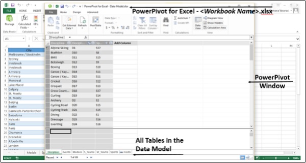
Step 5 − In the Tables group, click on Add to Data Model.
Hosts Table gets added to the Data Model in the Workbook. The PowerPivot window opens.
You will find all the Tables in the Data Model in the PowerPivot, though some of them are not present in the Worksheets in the Workbook.
Step 6 − In PowerPivot window, in View group, click on Diagram View.
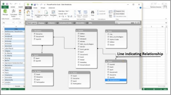
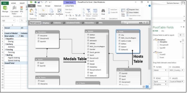
Step 7 − Use the slide bar to resize the diagram so that you can see all tables in the diagram.
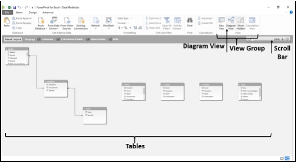
Step 8 − Rearrange the tables by dragging their title bar, so that they are visible and positioned next to one another.
Four tables Hosts, Events, W_Teams, and S_Teams are unrelated to the rest of the tables −
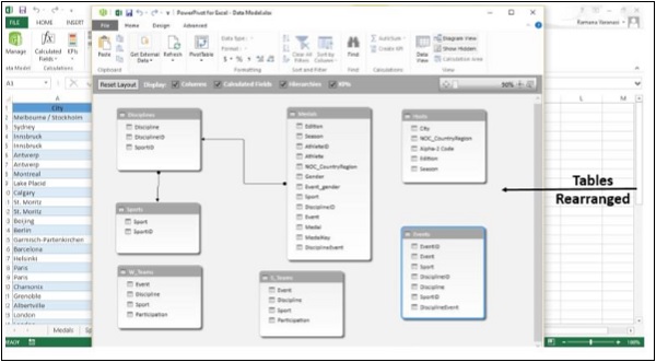
Step 9 − Both, the Medals table and the Events table have a field called DisciplineEvent. Also, DisciplineEvent column in the Events table consists of unique, non-repeated values. Click on Data View in Views Group. Check DisciplineEvent column in the Events table.
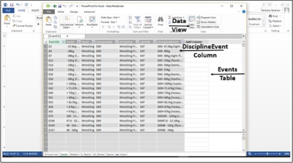
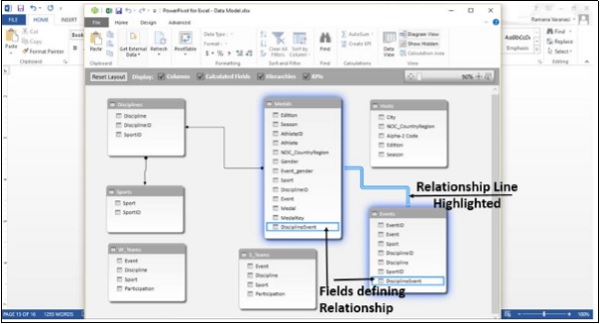
Step 10 − Once again, click on Diagram View. Click on the field Discipline Event in the Events table and drag it to the field DisciplineEvent in the Medals Table. A line appears between the Events Table and the Medals Table, indicating a relationship has been established.
Step 11 − Click on the line. The line and the fields defining the relationship between the two tables are highlighted as shown in the image given below.
Data Model using Calculated Columns
Hosts table is still not connected to any of the other Tables. To do so, a field with values that uniquely identify each row in the Hosts table is to be found first. Then, search the Data Model to see if that same data exists in another table. This can be done in Data View.
Step 1 − Shift to Data View. There are two ways of doing this.
Click on Data View in the View group.
Click on the Grid button on Task Bar.
The Data View appears.
Step 2 − Click on the Hosts table.
Step 3 − Check the data in Hosts Table to see if there is a field with unique values.
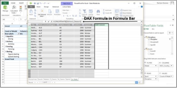
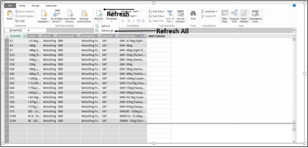
There is no such field in Hosts Table. You cannot edit or delete existing data using PowerPivot. However, you can create new columns by using calculated fields based on the existing data. In PowerPivot, you can use Data Analysis Expressions (DAX) to create calculations.
Adjacent to the existing columns is an empty column titled Add Column. PowerPivot provides that column as a placeholder.
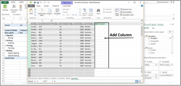
Step 4 − In the formula bar, type the DAX formula −
= CONCATENATE([Edition],[Season])
Press Enter. The Add Column is filled with values. Check the values to verify that they are unique across the rows.
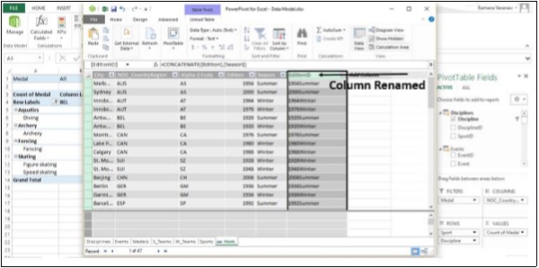
Step 5 − The newly created column with created values is named CreatedColumn1. To change the name of the column, select the column, right-click on it.
Step 6 − Click on the option Rename Column.
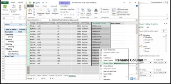
Step 7 − Rename the column as EditionID.
Step 8 − Now, Select the Medals Table.
Step 9 − Select Add Column.
Step 10 − In the Formula Bar, type the DAX Formula,
= YEAR ([EDITION])
and press Enter.
Step 11 − Rename the Column as Year.
Step 12 − Select Add Column.
Step 13 − Type in the Formula Bar,
= CONCATENATE ([Year], [Season])
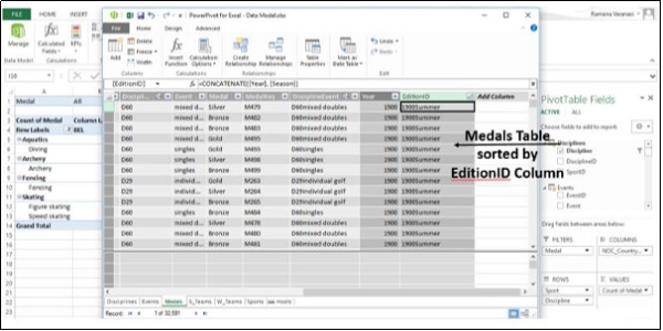
A new column with values similar to those in the EditionID column in Hosts Table gets created.
Step 14 − Rename the column as EditionID.
Step 15 − Sort the Column in Ascending Order.
Relationship using calculated columns
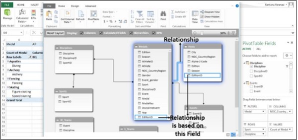
Step 1 − Switch to Diagram View. Ensure that the tables Medals and Hosts are close to each other.
Step 2 − Drag the EditionID column in Medals to the EditionID column in Hosts.
PowerPivot creates a relationship between the two tables. A line between the two tables, indicates the relationship. The EditionID Field in both the tables is highlighted indicating that the relationship is based on the column EditionID.
Advanced Excel - External Data Connection
Once you connect your Excel workbook to an external data source, such as a SQL Server database, Access database or another Excel workbook, you can keep the data in your workbook up to date by "refreshing" the link to its source. Each time you refresh the connection, you see the most recent data, including anything that is new or has been deleted.
Let us see how to refresh PowerPivot data.
Step 1 − Switch to the Data View.
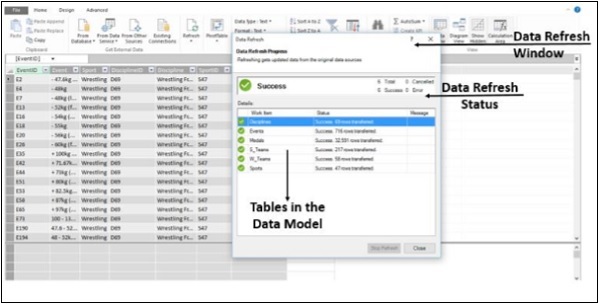
Step 2 − Click on Refresh.
Step 3 − Click on Refresh All.
The Data Refresh window appears showing all the Data Tables in the Data Model and tracking the refreshing progress. After the refresh is complete, the status is displayed.
Step 4 − Click on Close. The data in your Data Model is updated.
Update the Data Connections
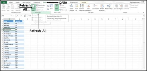
Step 1 − Click any cell in the table that contains the link to the imported data file.
Step 2 − Click on the Data tab.
Step 3 − Click on Refresh All in Connections group.
Step 4 − In the drop-down list, click on Refresh All. All the data connections in the Workbook will be updated.
Automatically Refresh Data
Here we will learn how to refresh the data automatically when the workbook is opened.
Step 1 − Click any cell in the table that contains the link to the imported Data file.
Step 2 − Click on the Data tab.
Step 3 − Click on Connections in the Connections group. The Workbook Connections window appears.
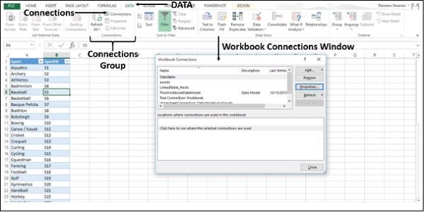
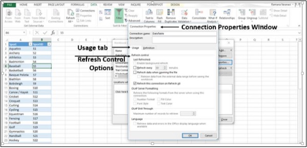
Step 4 − Click on Properties. The Connection Properties Window appears.
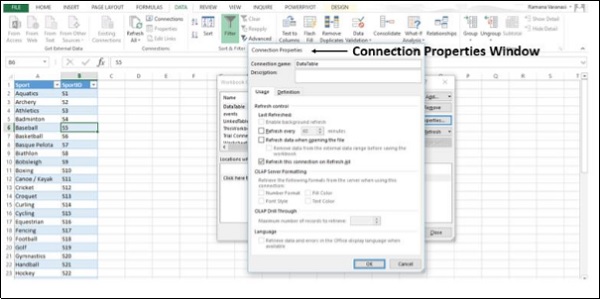
Step 5 − You will find a Usage tab and a Definition tab. Click on the Usage tab. The options for Refresh Control appear.
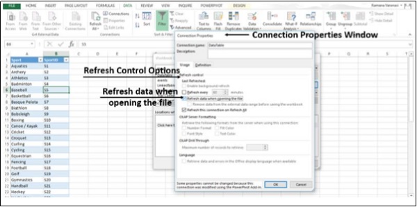
Step 6 − Select Refresh data while opening the file.
You also have an option under this: Remove data from the external data range before saving the workbook. You can use this option to save the workbook with the query definition but without the external data.
Step 7 − Click OK.
Whenever you open your Workbook, the up-to-date data will be loaded into your Workbook.
Automatically refresh data at regular intervals
Step 1 − Click any cell in the table that contains the link to the imported Data file.
Step 2 − Click on the Data tab.
Step 3 − Click on the Connections option in Connections group. A Workbook Connections window appears.
Step 4 − Click on Properties. A Connection Properties Window appears.
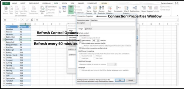
Step 5 − Click on the Usage tab. The options for Refresh Control appear.
Step 6 − Now, select Refresh every and enter 60 minutes between each refresh operation.
Step 7 − Click OK. Your data will be refreshed every 60 minute that is every hour.
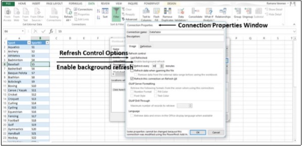
Enable Background Refresh
For very large data sets, consider running a background refresh. This returns the control of Excel to you instead of making you wait several minutes for the refresh to finish. You can use this option when you are running a query in the background. However, you cannot run a query for any connection type that retrieves data for the Data Model.
Step 1 − Click any cell in the table that contains the link to the imported Data file.
Step 2 − Click on the Data tab.
Step 3 − Click on Connections in the Connections group. The Workbook Connections window appears.
Step 4 − Click on Properties. Connection Properties Window appears.
Step 5 − Click on the Usage tab. The Refresh Control options appear.
Step 6 − Click on Enable background refresh and then click OK.
Advanced Excel - Pivot Table Tools
Source Data for a PivotTable
You can change the range of the source data of a PivotTable. For example, you can expand the source data to include more rows of data.
However, if the source data has been changed substantially, such as having more or fewer columns, consider creating a new PivotTable.
Step 1 − Click anywhere in the PivotTable. The PIVOTTABLE TOOLS appear on the ribbon, with an option named ANALYZE.
Step 2 − Click on the option - ANALYZE.
Step 3 − Click on Change Data Source in the Data group.
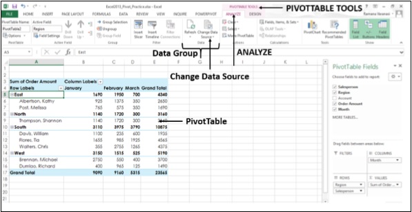
Step 4 − Click on Change Data Source. The current Data Source is highlighted. The Change PivotTable Data Source Window appears.
Step 5 − In the Table/Range Box, select the Table/Range you want to include.
Step 6 − Click OK.

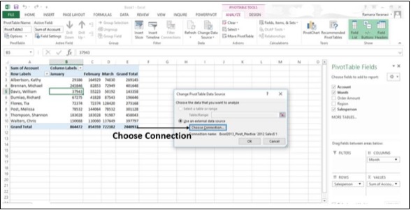
Change to a Different External Data Source.
If you want to base your PivotTable on a different external source, it might be best to create a new PivotTable. If the location of your external data source is changed, for example, your SQL Server database name is the same, but it has been moved to a different server, or your Access database has been moved to another network share, you can change your current connection.
Step 1 − Click anywhere in the PivotTable. The PIVOTTABLE TOOLS appear on the Ribbon, with an ANALYZE option.
Step 2 − Click ANALYZE.
Step 3 − Click on Change Data Source in the Data Group. The Change PivotTable Data Source window appears.
Step 4 − Click on the option Choose Connection.
A window appears showing all the Existing Connections.
In the Show box, keep All Connections selected. All the Connections in your Workbook will be displayed.
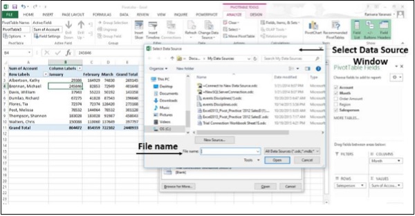
Step 5 − Click on Browse for More
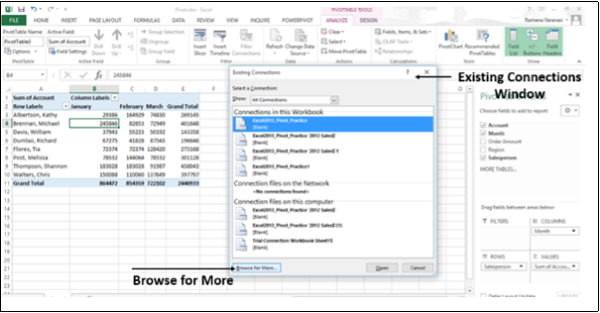
The Select Data Source window appears.
Step 6 − Click on New Source. Go through the Data Connection Wizard Steps.
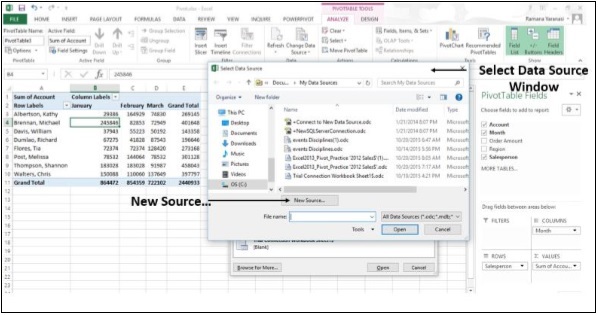
Alternatively, specify the File name, if your Data is contained in another Excel Workbook.
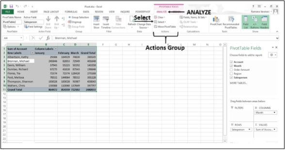
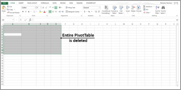
Delete a PivotTable
Step 1 − Click anywhere on the PivotTable. The PIVOTTABLE TOOLS appear on the Ribbon, with the ANALYZE option.
Step 2 − Click on the ANALYZE tab.
Step 3 − Click on Select in the Actions Group as shown in the image given below.
Step 4 − Click on Entire PivotTable. The entire PivotTable will be selected.
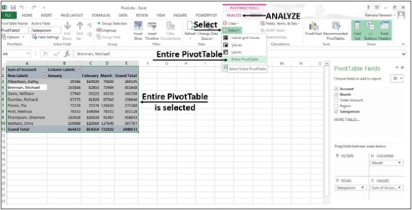
Step 5 − Press the Delete Key.
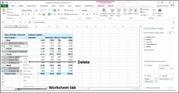
If the PivotTable is on a separate Worksheet, you can delete the PivotTable by deleting the entire Worksheet also. To do this, follow the steps given below.
Step 1 − Right-click on the Worksheet tab.
Step 2 − Click on Delete.
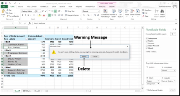
You get a warning message, saying that you cannot Undo Delete and might lose some data. Since, you are deleting only the PivotTable Sheet you can delete the worksheet.
Step 3 − Click on Delete.
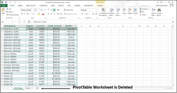
The PivotTable worksheet will be deleted.
Using the Timeline
A PivotTable Timeline is a box that you can add to your PivotTable that lets you filter by time, and zoom in on the period you want. This is a better option compared to playing around with the filters to show the dates.
It is like a slicer you create to filter data, and once you create it, you can keep it with your PivotTable. This makes it possible for you to change the time period dynamically.
Step 1 − Click anywhere in the PivotTable. The PIVOTTABLE TOOLS appear on the Ribbon, with ANALYZE option.
Step 2 − Click ANALYZE.
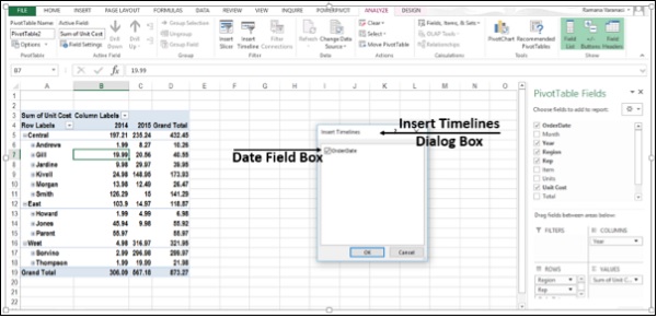
Step 3 − Click on Insert Timeline in the Filter group. An Insert Timelines Dialog Box appears.
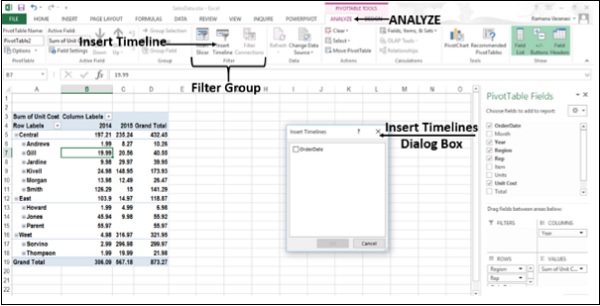
Step 4 − In the Insert Timelines dialog box, click on the boxes of the date fields you want.
Step 5 − Click OK.
The timeline for your PivotTable is in place.
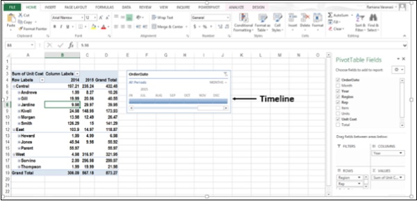
Use a Timeline to Filter by Time Period
Now, you can filter the PivotTable using the timeline by a time period in one of four time levels; Years, Quarters, Months or Days.
Step 1 − Click the small arrow next to the time level-Months. The four time levels will be displayed.
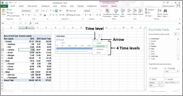
Step 2 − Click on Quarters. The Timeline filter changes to Quarters.
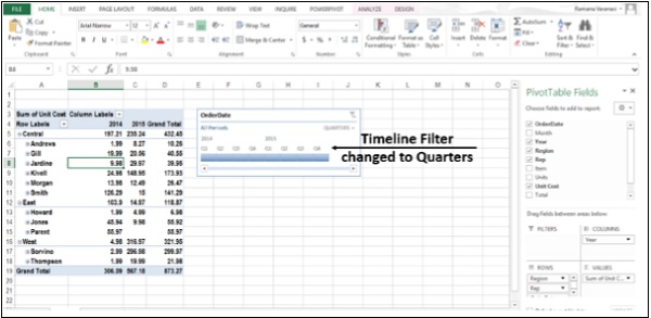
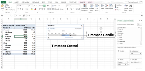
Step 3 − Click on Q1 2015. The Timespan Control is highlighted. The PivotTable Data is filtered to Q1 2015.
Step 4 − Drag the Timespan handle to include Q2 2015. The PivotTable Data is filtered to include Q1, Q2 2015.
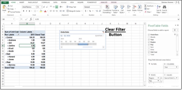
At any point of time, to clear timeline, click on the Clear Filter button.
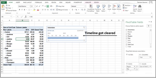
The timeline is cleared as shown in the image given below.
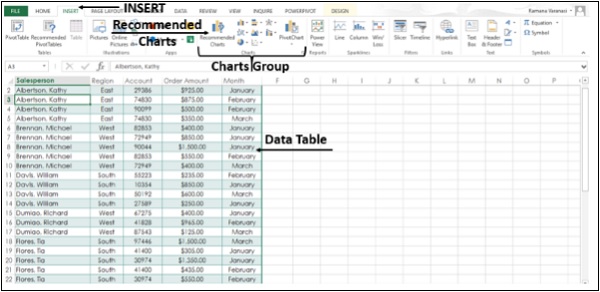
Create a Standalone PivotChart
You can create a PivotChart without creating a PivotTable first. You can even create a PivotChart that is recommended for your data. Excel will then create a coupled PivotTable automatically.
Step 1 − Click anywhere on the Data Table.
Step 2 − Click on the Insert tab.
Step 3 − In the Charts Group, Click on Recommended Charts.
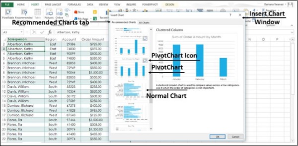
The Insert Chart Window appears.
Step 4 − Click on the Recommended Charts tab. The charts with the PivotChart icon ![]() in the top corner are PivotCharts.
in the top corner are PivotCharts.
Step 5 − Click on a PivotChart. A Preview appears on the Right side.
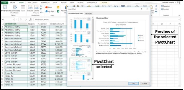
Step 6 − Click OK once you find the PivotChart you want.
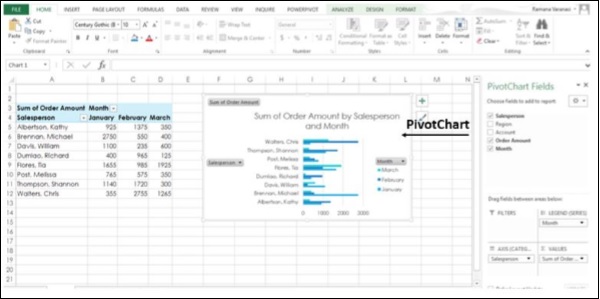
Your standalone PivotChart for your Data is available to you.
Advanced Excel - Power View
Power View is a feature of Microsoft Excel 2013 that enables interactive data exploration, visualization, and presentation encouraging intuitive ad-hoc reporting.
Create a Power View Sheet
Make sure Power View add-in is enabled in Excel 2013.
Step 1 − Click on the File menu and then Click on Options.
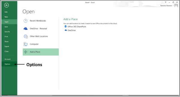
The Excel Options window appears.
Step 2 − Click on Add-Ins.
Step 3 − In the Manage box, click the drop-down arrow and select Excel Add-ins.
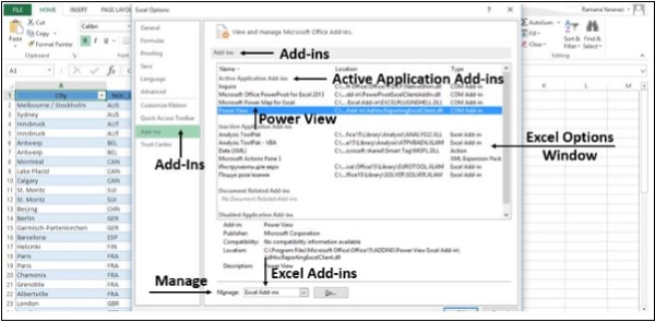
Step 4 − All the available Add-ins will be displayed. If Power View Add-in is enabled, it appears in Active Application Add-ins.
If it does not appear, follow these steps −
Step 1 − In the Excel Options Window, Click on Add-Ins.
Step 2 − In the Manage box, click the drop-down arrow and select COM Add-ins
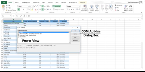
Step 3 − Click on the Go button. A COM Add-Ins Dialog Box appears.
Step 4 − Check the Power View Check Box.
Step 5 − Click OK.
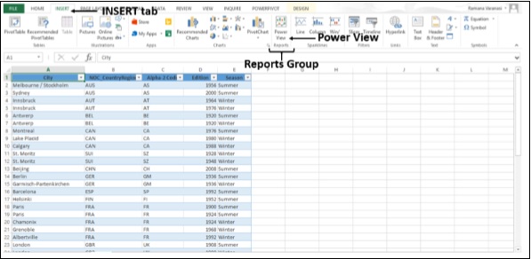
Now, you are ready to create the Power View sheet.
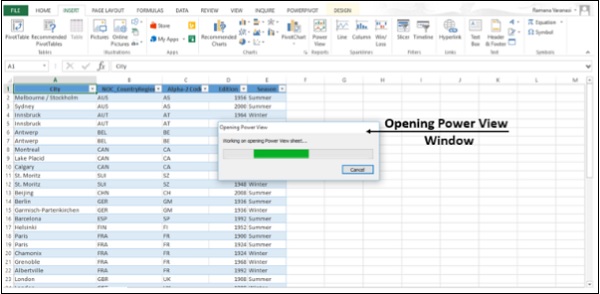
Step 1 − Click on the Data Table.
Step 2 − Click on Insert tab.
Step 3 − Click on Power View in Reports Group.
An Opening Power View window opens, showing the progress of Working on opening Power View sheet.
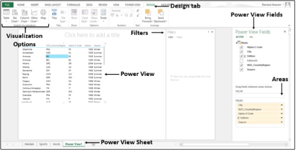
The Power View sheet is created for you and added to your Workbook with the Power View. On the Right-side of the Power View, you find the Power View Fields. Under the Power View Fields you will find Areas.
In the Ribbon, if you click on Design tab, you will find various Visualization options.
Advanced Excel - Visualizations
You can quickly create a number of different data visualizations that suit your data using Power View. The visualizations possible are Tables, Matrices, Cards, Tiles, Maps, Charts such as Bar, Column, Scatter, Line, Pie and Bubble Charts, and sets of multiple charts (charts with same axis).
Create Charts and other Visualizations
For every visualization you want to create, you start on a Power View sheet by creating a table, which you then easily convert to other visualizations, to find one that best illustrates your Data.
Step 1 − Under the Power View Fields, select the fields you want to visualize.
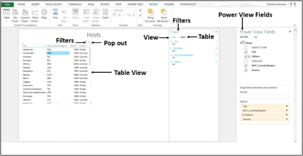
Step 2 − By default, the Table View will be displayed. As you move across the Table, on the top-right corner, you find two symbols Filters and Pop out.
Step 3 − Click on the Filters symbol. The filters will be displayed on the right side. Filters has two tabs. View tab to filter all visualizations in this View and Table tab to filter the specific values in this table only.
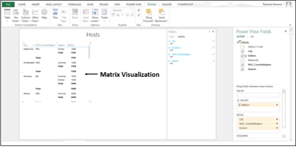
Visualization Matrix
A Matrix is made up of rows and columns like a Table. However, a Matrix has the following capabilities that a Table does not have −
- Display data without repeating values.
- Display totals and subtotals by row and column.
- With a hierarchy, you can drill up/drill down.
Collapse and Expand the Display
Step 1 − Click on the DESIGN tab.
Step 2 − Click on Table in the Switch Visualization Group.
Step 3 − Click on Matrix.
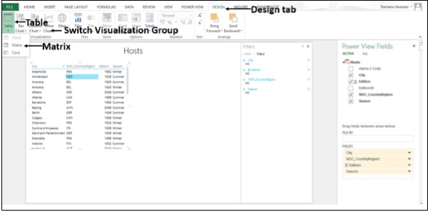
The Matrix Visualization appears.
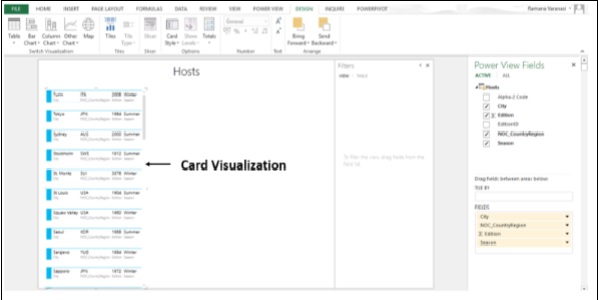
Visualization Card
You can convert a Table to a series of Cards that display the data from each row in the table laid out in a Card format, like an index Card.
Step 1 − Click on the DESIGN tab.
Step 2 − Click on Table in the Switch Visualization Group.
Step 3 − Click on Card.
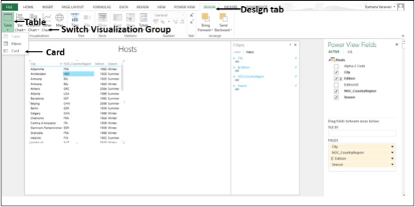
The Card Visualization appears.
Visualization Charts
In Power View, you have a number of Chart options: Pie, Column, Bar, Line, Scatter, and Bubble. You can use several design options in a chart such as showing and hiding labels, legends, and titles.
Charts are interactive. If you click on a Value in one Chart −
the Value in that chart is highlighted.
All the Tables, Matrices, and Tiles in the report are filtered to that Value.
That Value in all the other Charts in the report is highlighted.
The charts are interactive in a presentation setting also.
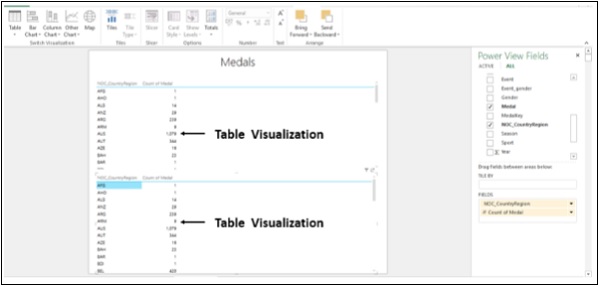
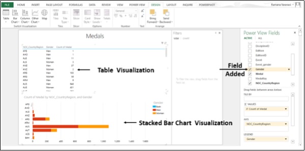
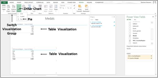
Step 1 − Create a Table Visualization from Medals data.
You can use Line, Bar and Column Charts for comparing data points in one or more data series. In these Charts, the x-axis displays one field and the y-axis displays another, making it easy to see the relationship between the two values for all the items in the Chart.
Line Charts distribute category data evenly along a horizontal (category) axis, and all numerical value data along a vertical (value) axis.
Step 2 − Create a Table Visualization for two Columns, NOC_CountryRegion and Count of Medal.
Step 3 − Create the same Table Visualization below.
Step 4 − Click on the Table Visualization below.
Step 5 − Click on Other Chart in the Switch Visualization group.
Step 6 − Click on Line.
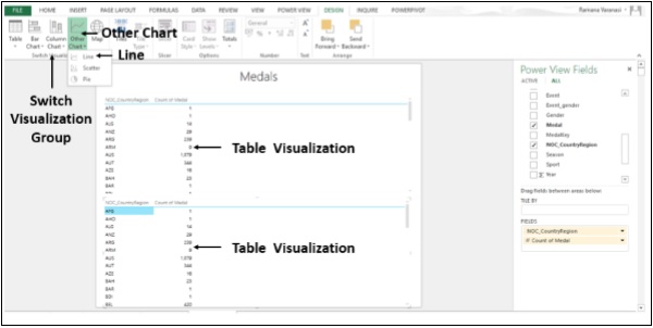
The Table Visualization converts into Line Chart Visualization.
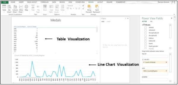
In a Bar Chart, categories are organized along the vertical axis and values along the horizontal axis. In Power View, there are three subtypes of the Bar Chart: Stacked, 100% stacked, and Clustered.
Step 7 − Click on the Line Chart Visualization.
Step 8 − Click on Bar Chart in the Switch Visualization Group.
Step 9 − Click on the Stacked Bar option.
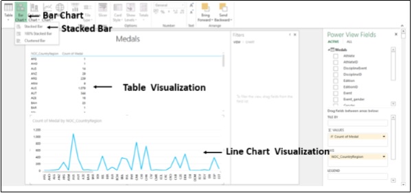
The Line Chart Visualization converts into Stacked Bar Chart Visualization.
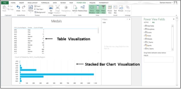
Step 10 − In the Power View Fields, in the Medals Table, select the Field Gender also.
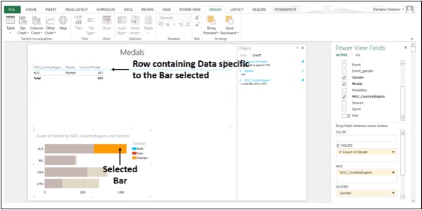
Step 11 − Click on one of the bars. That portion of the bar is highlighted. Only the row containing the Data specific to the selected bar is displayed in the table above.
You can use the column charts for showing data changes over a period of time or for illustrating comparison among different items. In a Column Chart, the categories are along the horizontal axis and values are along the vertical axis.
In Power View, there are three Column Chart subtypes: Stacked, 100% stacked, and Clustered.
Step 12 − Click on the Stacked Bar Chart Visualization.
Step 13 − Click on Column Chart in the Switch Visualization group.
Step 14 − Click on Stacked Column.
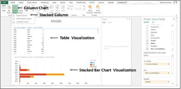
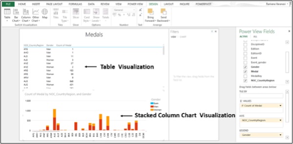
The Stacked Bar Chart Visualization converts into Stacked Column Chart Visualization.
Advanced Excel - Pie Charts
You can have simple Pie Chart Visualizations in Power View.
Step 1 − Click on the Table Visualization as shown below.
Step 2 − Click on Other Chart in the Switch Visualization group.
Step 3 − Click on Pie as shown in the image given below.
The Table Visualization converts into Pie Chart Visualization.
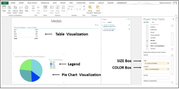
You now have a Simple Pie Chart Visualization wherein the count of Medals are shown by the Pie Size, and Countries by Colors. You can also make your Pie Chart Visualization sophisticated by adding more features. One such example is SLICES.
Step 1 − Add Field Gender to the Table above.
Step 2 − Click on Pie Chart Visualization.
Step 3 − Drag Field Gender in the Power View Fields List to the SLICES Box as shown below.
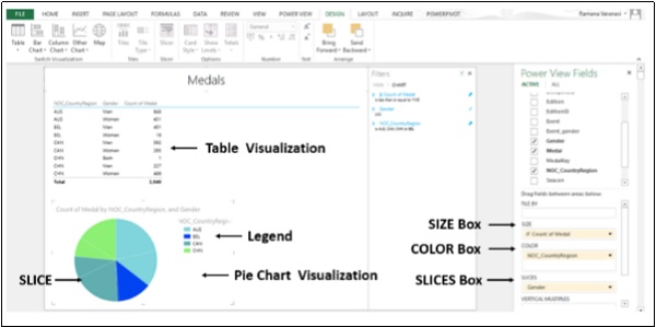
Now, with SLICES, you can visualize the count of Medals for men and for women in each country.
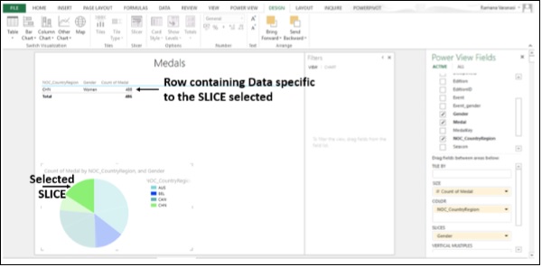
Step 4 − Click on a SLICE in the Pie Chart Visualization.
Step 5 − Only the specific row containing the data specific to the SLICE will be displayed in the TABLE VISUALIZATION above.
Bubble and Scatter Charts
You can use the Bubble and Scatter charts to display many related data in one chart. In Scatter charts, the x-axis displays one numeric field and the y-axis displays another, making it easy to see the relationship between the two values for all the items in the chart. In a Bubble Chart, a third numeric field controls the size of the data points.
Step 1 − Add one Category Field and one Numeric Field to the Table.
Step 2 − Click on Other Chart in the Switch Visualization group.
Step 3 − Click on Scatter.
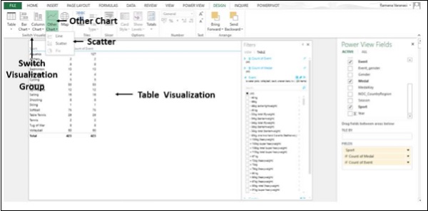
The Table Visualization converts into Scatter Chart Visualization. The Data points are little circles and all are of same size and same color. Category is in DETAILS Box.
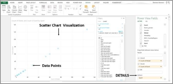
Step 4 − Drag Medal to Size.
Step 5 − Drag field NOC_CountryRegion to Σ X VALUE.
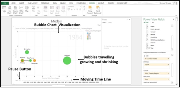
The Scatter Chart Visualization converts into Bubble Chart Visualization. The data points are circles of the size represented by the values of Data points. The color of the circles is the X VALUE and given in the Legend. The data labels are the Category Values.
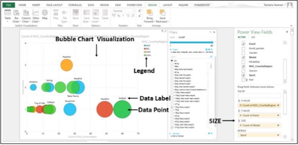
Step 6 − Drag the field NOC_CountryRegion to the COLOR Box. The bubbles will be colored by the values of the field in the COLOR box.
Step 7 − Drag the Year field to PLAY AXIS. A Time Line with Play button will be displayed below the Bubble Chart Visualization.
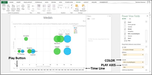
Step 8 − Click on the Play button. The bubbles travel, grow, and shrink to show how the values change based on the PLAY AXIS. You can pause at any point to study the data in more detail.
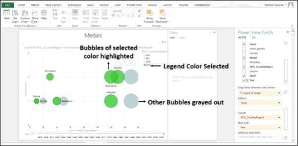
Step 9 − Click any color on the Legend. All the bubbles of that color will be highlighted and other bubbles will be grayed out.
Maps
You can use Maps to display your data in the context of geography. Maps in Power View use Bing map tiles, so you can zoom and pan as you would with any other Bing map. To make maps work, Power View has to send the data to Bing through a secured web connection for geocoding. So, it asks you to enable the content. Adding locations and fields places dots on the map. The larger the value, the bigger the dot. When you add a multivalue series, you get pie charts on the map, with the size of the pie chart showing the size of the total.
Step 1 − Drag a Geographic Field such as Country/Region, State/Province, or City from Power View Fields List to the table.
Step 2 − Drag a numeric field such as Count to the table.
Step 3 − Click on DESIGN tab on the ribbon.
Step 4 − Click on Map in the Switch Visualization group.
The Table Visualization converts into Map Visualization. Power View creates a map with a dot for every geographic location. The size of the dot is the value of the corresponding numeric field.
Step 5 − Click on a dot. The data, viz., the geographic location and the numeric information relating to the size of the dot will be displayed.
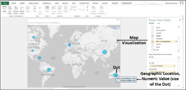
Step 6 − You can also verify that below the Power View Fields List, the Geographic field is in the Locations Box and Numeric Field is in the Σ SIZE Box.
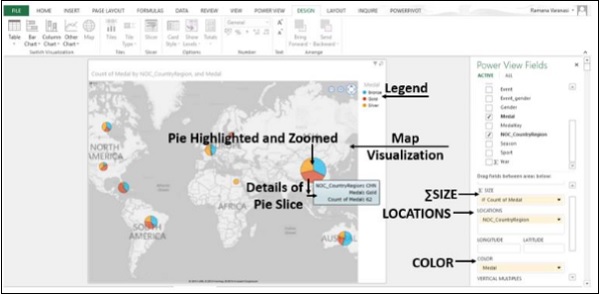
Step 7 − Drag Medal to COLOR Box. The Dots are converted into Pie Charts. Each Color in the Pie representing the category of the Medals.
Step 8 − Place the cursor on one of the Dots. The Dot gets highlighted and zoomed. The details of the Pie Slice are displayed.
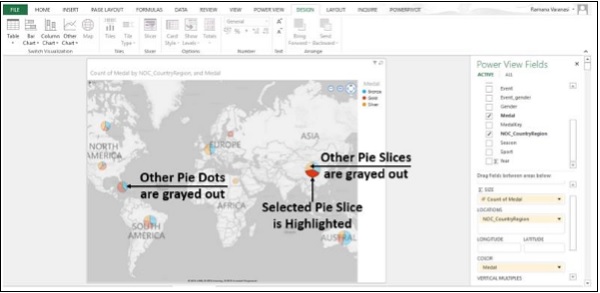
Step 9 − Place the cursor on one of the Dots and click on it. That Pie Slice is highlighted. The other Slices in the Pie and all other Pie Dots will gray out.
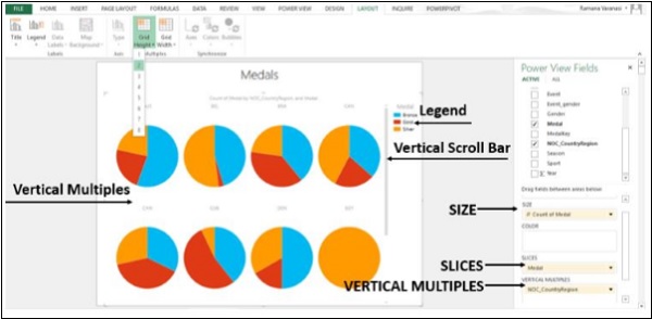
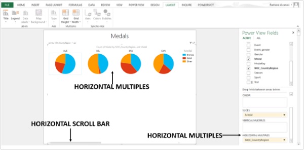
Multiples: A Set of Charts with the Same Axes
Multiples are a series of charts with identical X and Y axes. You can have Multiples arranged side by side, making it easy to compare many different values at the same time. Multiples are also called Trellis Charts.
Step 1 − Start with a Pie Chart. Click on the Pie Chart.
Step 2 − Drag a Field to Vertical Multiples.
Step 3 − Click on the LAYOUT tab on the ribbon.
Step 4 − Click on Grid Height and select a number.
Step 5 − Click on Grid Width and select a number.
Vertical Multiples expand across the available page width and then wrap down the page into the space available. If all the multiples do not fit in the available space, you get a vertical scroll bar.
Step 6 − Drag the field in VERTICAL MULTIPLES to HORIZONTAL MULTIPLES. The horizontal multiples expand across the page. If all the multiples do not fit in the page width, you get a horizontal scroll bar.
Step 7 − Click on Multiples.
Step 8 − Click on the DESIGN tab on the ribbon.
Step 9 − Click on Other Chart in the Switch Visualization group.
Step 10 − Click on Line. You have created Horizontal Multiples of the Line charts.
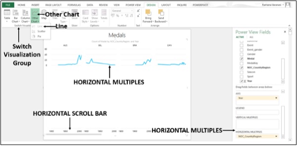
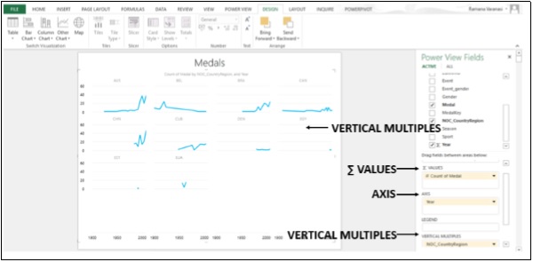
Step 11 − Drag the Field in HORIZONTAL MULTIPLES to VERTICAL MULTIPLES. You have created VERTICAL MULTIPLES of Line Charts.
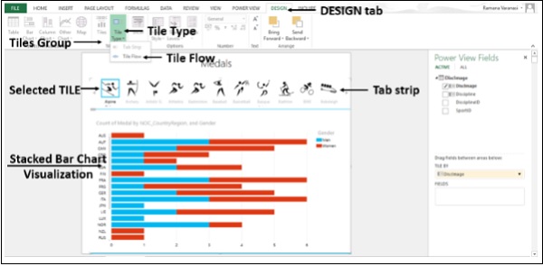
Visualization Tiles
Tiles are containers with a dynamic navigation strip. You can convert a Table, Matrix or Chart to Tiles to present data interactively. Tiles filter the content inside the Tile to the value selected in the Tab Strip. You can have a single Tile for each possible field value so that if you click on that Tile, data specific to that Field is displayed.
Step 1 − Drag the Field you want to use as your Tile from the Fields List and drop it in the Tile by box. The Tile Navigation Strip displays the Values for that Field.
Step 2 − Click the Tiles to move between the data for different Tiles. The data changes in the Stacked Bar Chart Visualization according to the selected Tile. All the content in the container is filtered by the selected Tile value.
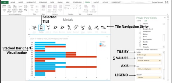
The Tile container has two navigation strip types: tile flow and tab strip.
What you have created above is the tab strip. Tab strip displays the navigation strip across the top of the visualization.
Step 3 − Click on a Tile.
Step 4 − Click on the DESIGN tab on the ribbon.
Step 5 − Click on Tile Type in the Tiles group.
Step 6 − Click on Tile Flow.
The Tile flow displays the navigation strip across the bottom of the Visualization. The selected Tile is always centered.
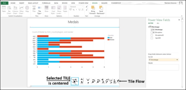
You can click on the Tiles or you can Scroll through the Tiles by using the Scroll Bar. When you Scroll, the Tiles go on being selected.
Step 7 − Click on Map in the Switch Visualization group.
Step 8 − Drag Medal to Color.
Step 9 − De-select the Field Gender
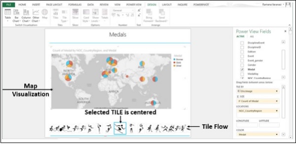
You got Map Visualization with Tile Flow. Likewise, you can have any data visualization with Tiles.
Advanced Excel - Additional Features
Power View in Excel 2013 provides an interactive data exploration, visualization, and presentation experience for all skill levels as you have seen in the previous section. You can pull your data together in Tables, Matrices, Maps, and a variety of Charts in an Interactive View that brings your Data to life. New features have been added to Power View in Excel 2013.
You can also publish Excel workbooks with Power View sheets to Power BI. Power BI saves the Power View sheets in your workbook as a Power BI report.
Power View sheets can connect to different data models in one workbook.
In Excel 2013, a workbook can contain −
An internal Data Model that you can modify in Excel, in Power Pivot, and even in a Power View sheet in Excel.
Only one internal Data Model, and you can base a Power View sheet on the Data Model in that workbook or on an external data source.
Multiple Power View sheets, and each of the sheets can be based on a different data model.
Each Power View sheet has its own Charts, Tables, and other Visualizations. You can copy and paste a chart or other visualization from one sheet to another, but only if both sheets are based on the same Data Model.
Modify the internal Data Model
You can create Power View sheets and an internal Data Model in an Excel 2013 workbook. If you base your Power View sheet on the internal Data Model, you can make some changes to the Data Model while you are in the Power View sheet itself.
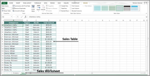
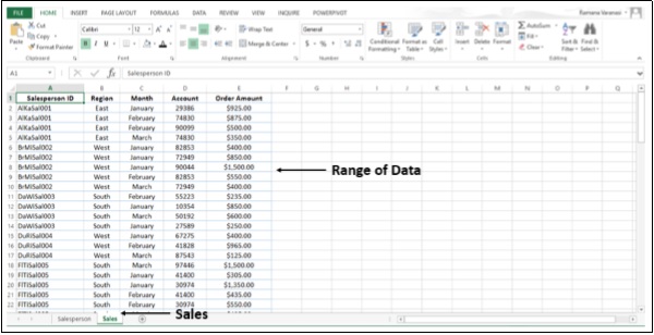
Step 1 − Select the worksheet Salesperson.
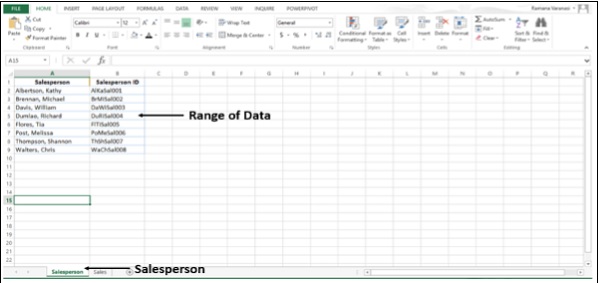
You have a Range of Data of Salesperson and Salesperson ID.
Step 2 − Now select the Worksheet Sales. You have a Range of Data of Sales.
Step 3 − Convert the data in the worksheet Salesperson to table and name it Salesperson.
Step 4 − Convert the data on the Sales Worksheet to table and name it Sales. Now, you have two tables in two Worksheets in the Workbook.
Step 5 − Click on the Sales Worksheet.
Step 6 − Click on the INSERT tab on the ribbon.
Step 7 − Click on Power View.
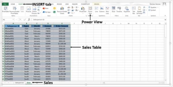
Power View sheet is created in the Workbook. In the Power View Fields list, you can find both the tables that are available in the Workbook. However, in the Power View, only the Active Table (Sales) Fields are displayed since only the active Data Table Fields are selected in the Fields List.
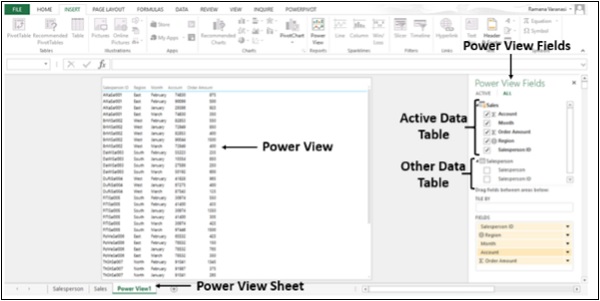
In the Power View, Salesperson ID is displayed. Suppose, instead you want to display the names of the salespersons.
Step 8 − De-select the Field Salesperson ID in Power View Fields.
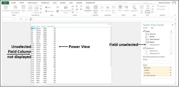
Step 9 − Select the Field Salesperson in the Table Salesperson in Power View Fields.
You do not have a Data Model in the Workbook and hence no relationship exists between the two tables. Excel does not display any Data and displays messages directing you what to do.
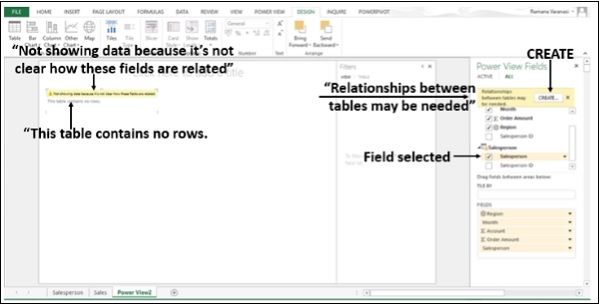
Step 10 − Click on the CREATE button. The Create Relationship Dialog Box opens in the Power View sheet itself.
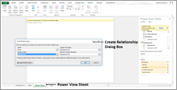
Step 11 − Create the relationship between the two tables using the Salesperson ID Field.
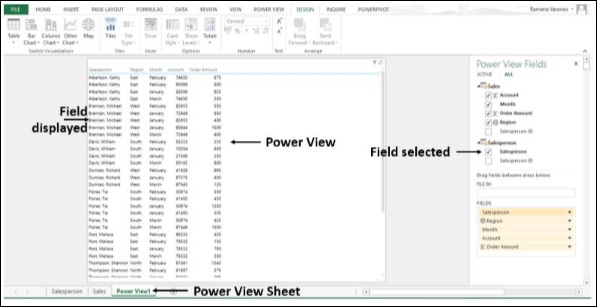
You have successfully created the internal Data Model without leaving the Power View sheet.
Advanced Excel - Power View in Services
When you create Power View sheets in Excel, you can view and interact with them onpremises in Excel Services, and in Office 365. You can only edit Power View sheets in Excel 2013 on a client computer.
Power View sheets cannot be viewed on OneDrive.
If you save an Excel workbook with Power View sheets to a Power Pivot Gallery, the Power View sheets in the workbook will not be displayed in the Gallery, but they are still in the file. You will see them when you open the workbook.
When you publish Excel workbooks with Power View sheets to Power BI. Power BI saves the Power View sheets in your workbook as a Power BI report.
Pie Charts
We have already discussed Pie Chart Visualization in the previous chapter.
Maps
We have already discussed Maps in the previous chapter.
Key Performance Indicators (KPIs)
A KPI is a quantifiable measurement for gauging business objectives. For example,
Sales department of an organization might use a KPI to measure the monthly gross profit against the projected gross profit.
Accounting department might measure monthly expenditures against revenue to evaluate costs.
Human resources department might measure quarterly employee turnover.
Business professionals frequently use KPIs that are grouped together in a business scorecard to obtain a quick and accurate historical summary of business success or to identify trends.
A KPI includes Base Value, Target Value / Goal, and Status.
A Base Value is defined by a calculated field that resolves to a value. The calculated field represents the current value for the item in that row of the table or matrix, for example, aggregate of sales, profit for a given period, etc.
A Target Value (or Goal) is defined by a calculated field that resolves to a value, or by an absolute value. The current value is evaluated against this value. This could be a fixed number, some goal all the rows should achieve, or a calculated field, which might have a different goal for each row. For example, budget (calculated field), average number of sick-leave days (absolute value).
Status is the visual indicator of the value. In Power View in Excel, you can edit the KPI, choosing which indicators to use and what values to trigger each indicator.
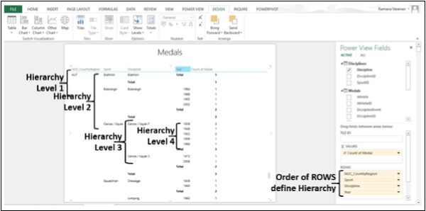
Hierarchies
If your data model has a hierarchy, you can use it in Power View. You can also create a new hierarchy from scratch in Power View.
Step 1 − Click on the Matrix Visualization.
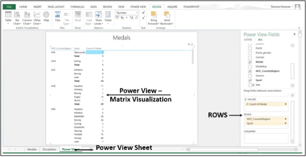
Step 2 − Add ROWS / COLUMNS to the ROWS / COLUMNS box. The hierarchy is decided by the order of the fields in the ROWS box. You can put fields in any order in a hierarchy in Power View. You can change the order be simply dragging the fields in the ROWS Box.
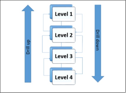
Drill-Up and Drill-Down
Once you create a hierarchy in Power View, you can drill up and drill down such that you can show just one level at a time. You can drill down for details and drill up for summary.
You can use drill up and drill down in Matrix, Bar, Column, and Pie Chart Visualizations.
Step 1 − Order the Fields in the Rows Box to define Hierarchy. Say, we have four Levels in the hierarchy.
The Hierarchy, Drill down and Drill up are depicted as follows −
Step 2 − Click on the DESIGN tab on the ribbon.
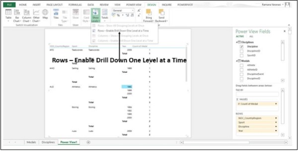
Step 3 − Click on Show Levels in the Options group.
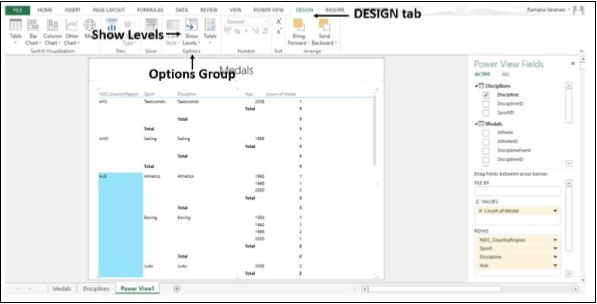
Step 4 − Click on Rows Enable Drill Down one Level at a time.
The Matrix collapses to display only Level 1 Data. You find an arrow on right side of the Level 1 Data item indicating Drill down.
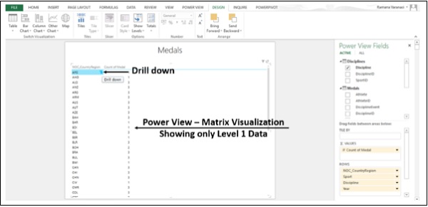
Step 5 − Click on the Drill down arrow. Alternatively, you can double-click on the Data item to Drill down. That particular Data item Drills down by one Level.
You have one arrow on the left indicating Drill up and one arrow on the right indicating Drill down.
You can double-click one value in a level to expand to show the Values under that one in the Hierarchy. You click the up arrow to drill back up. You can use Drill up and Drill down in Bar, Column, and Pie Charts also.
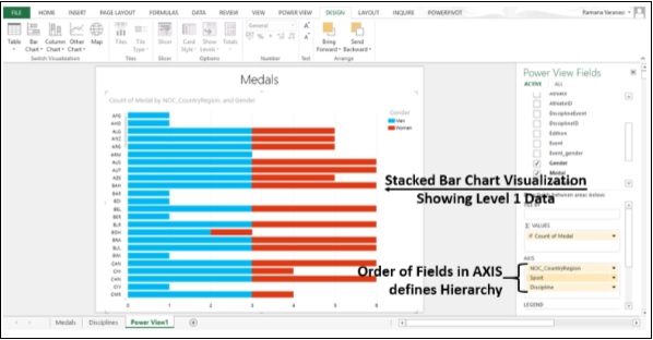
Step 6 − Switch to Stacked Bar Chart Visualization.
Step 7 − Order the Fields in the AXIS Box to define the Hierarchy. Stacked Bar Chart with only Level 1 Data is displayed.
Step 8 − Double-click on a Bar. The Data in the next Level of that particular bar is displayed.
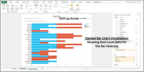
You can Drill down one Level at a time by double-clicking on any bar. You can Drill up one Level by clicking the Drill up arrow on the Right Top Corner.
Advanced Excel - Format Reports
In Excel 2013, Power View has 39 additional themes with more varied chart palettes as well as fonts and background colors. When you change the theme, the new theme applies to all the Power View Views in the Report or Sheets in the Workbook.
You can also change the text size for all of your Report Elements.
You can add Background Images, choose Background Formatting, choose a Theme, change the Font Size for One Visualization, change the Font or Font Size for the whole sheet and Format numbers in a Table, Card, or Matrix.
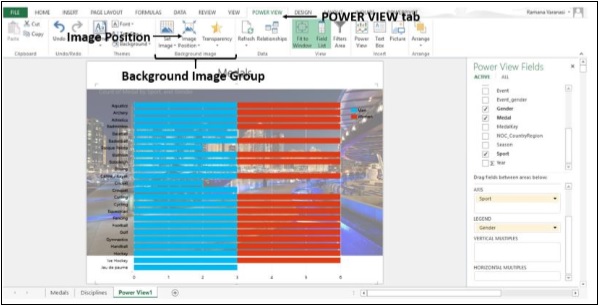
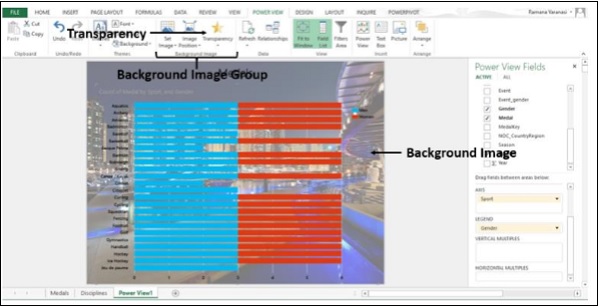
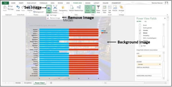
Step 1 − Click on the Power View tab on the ribbon.
Step 2 − Click on Set Image in the Background Image group.
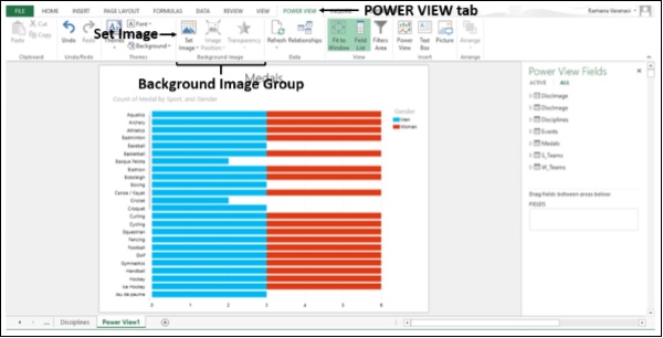
Step 3 − Click on Set Image in the drop-down menu. The File Browser opens.
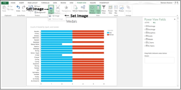
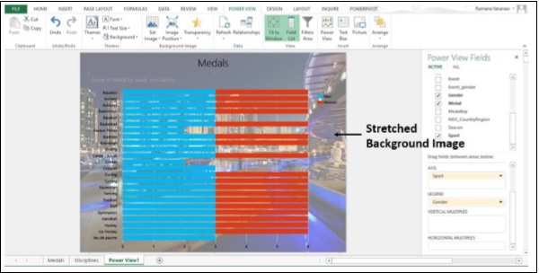
Step 4 − Browse to the Image File you want to use as Background and click open. The image appears as background in the Power View.
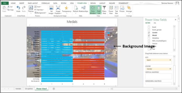
Step 5 − Click on Image Position in the Background Image group.
Step 6 − Click on Stretch in the Drop down menu as shown in the image given below.
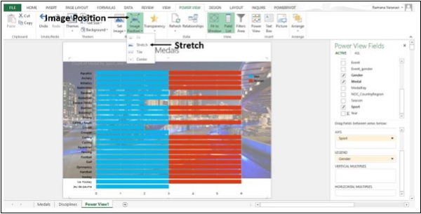
The Image stretches to the full size of Power View.
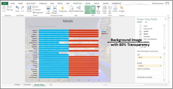
Step 7 − Click on Transparency in the Background Image group.
Step 8 − Click on 80% in the Drop down box.
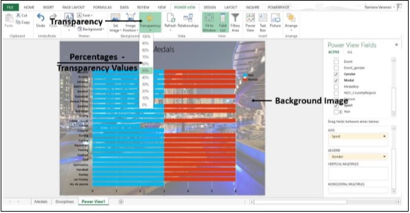
The higher the percentage, the more transparent (less visible) the image.
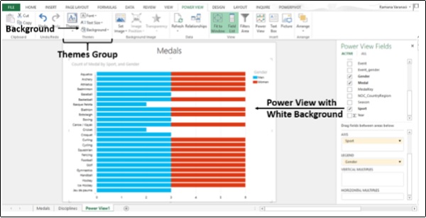
Instead of images, you can also set different backgrounds to Power View.
Step 9 − Click on Power View tab on the ribbon.
Step 10 − Click on Set Image in the Background Image group.
Step 11 − Click on Remove Image.
Now, Power View is with White Background.
Step 12 − Click on Background in the Themes Group.
You have different backgrounds, from solids to a variety of gradients.
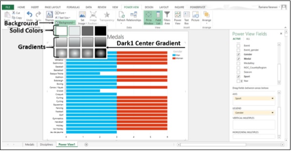
Step 13 − Click on Dark1 Center Gradient.
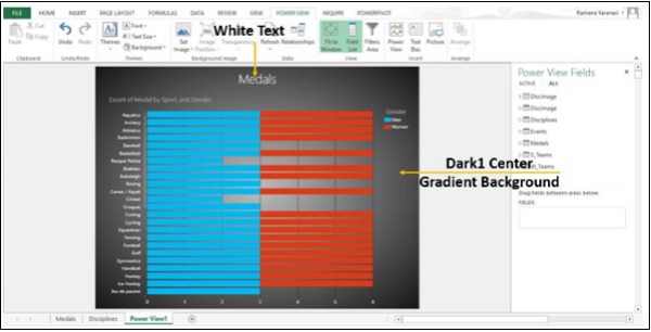
The background changes to Dark1 Center Gradient. As the background is darker, the text turns into white color.
Step 14 − Click on the Power View tab on the ribbon.
Step 15 − Click on Font in the Themes group.
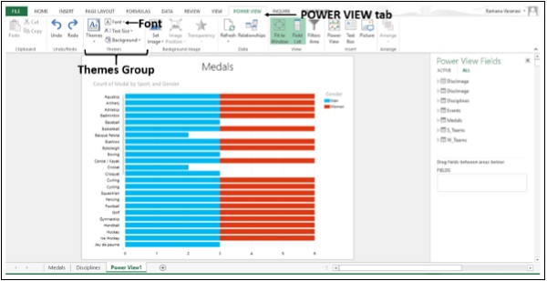
All the available fonts will be displayed in the Drop down list.
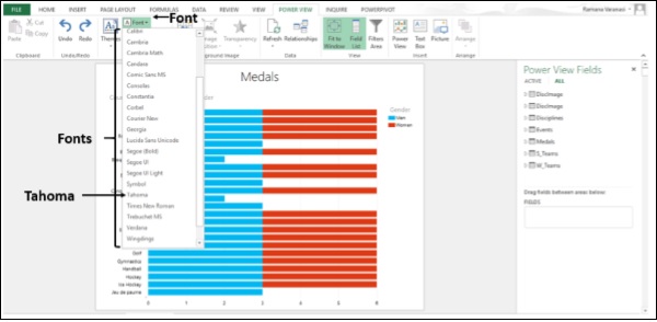
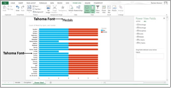
Step 16 − Click on Tahoma. The font of the text changes to Tahoma.
Step 17 − Click on Text Size in the Themes group.
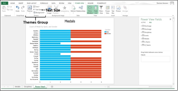
The percentages of the font sizes will be displayed. The default font size 100% is highlighted.
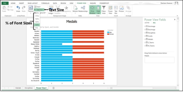
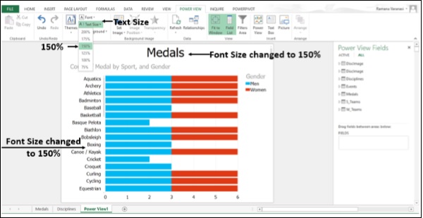
Step 18 − Select 150%. The font size changes from 100% to 150%.
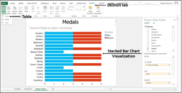
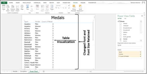
Step 19 − Switch Stacked Bar Chart Visualization to Table Visualization.
The changed font and font size are retained in the Table Visualization.
When you change the font in one Visualization, the same font is applied to all visualizations except for the font in a Map Visualization. You cannot have different fonts for different Visualizations. However, you can change the font size for individual visualizations.
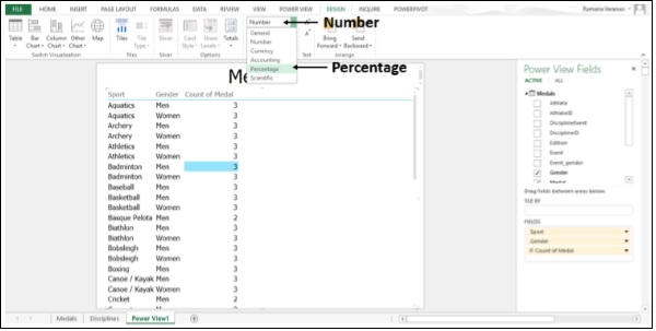
Step 20 − Click on a Cell in the Column containing Numbers.
Step 21 − Click on Number in the Number Group.
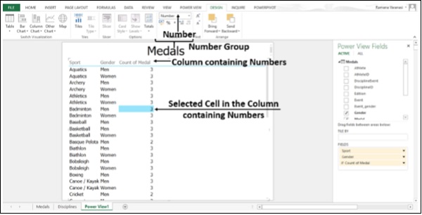
Step 22 − Click on Percentage in the Drop down menu.
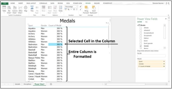
The entire column containing the selected cell gets converted to the selected format.
You can format numbers in Card and Matrix Visualizations also.
Hyperlinks
You can add a Hyperlink to a text box in Power View. If Data Model has a field that contains a Hyperlink, add that field to the Power View. It can link to any URL or email address.
This is how you could get the sport images in Tiles in Tiles Visualization in the previous section.
Printing
You can print Power View sheets in Excel 2013. What you print is what you see on the sheet when you send it to the printer. If the sheet or view contains a region with a scroll bar, the printed page contains the part of the region that is visible on the screen. If a sheet or view contains a region with tiles, then whichever tile is selected is the one that prints.
Support for right-to-left languages
Power View in Excel 2013 supports right-to-left languages. Power View takes the setting for default direction from Excel. You can change those settings.
Step 1 − Click on File.
Step 2 − Click on Options. The Excel Options window appears.
Step 3 − By default, the direction has two options Right-to-left and Left-to-right.
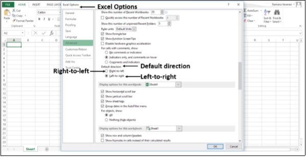
Step 4 − Set the default direction to Left-to-right.
Step 5 − Click OK.
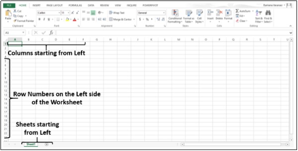
Step 6 − Change the default direction to Right-to-left.
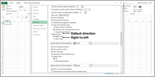
Step 7 − Click OK. You can see that the columns are now starting from the right side of the screen as shown in the image given below.
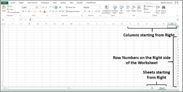
Microsoft Office supports right-to-left functionality and features for languages that work in a right-to-left or a combined right-to-left, left-to-right environment for entering, editing, and displaying text. In this context, "right-to-left languages" refers to any writing system that is written from right to left and includes languages that require contextual shaping, such as Arabic, and languages that do not. You can change your display to read right-to-left or change individual files so their contents read from right to left.
If your computer does not have a right-to-left language version of Office installed, you will need to install the appropriate language pack. You must also be running a Microsoft Windows operating system that has right-to-left support for example, the Arabic version of Windows Vista Service Pack 2 and enable the keyboard language for the right-to-left language that you want to use.
Advanced Excel - Handling Integers
In Power View, to convert a table to a chart, at least one data column needs to be aggregated. In Excel 2013, Power View aggregates both decimal numbers and integers by default. A Data Model designer can still specify other default behavior, but that is the default.
In Power View, in the Power View Fields, some number fields will have a Sigma Σ symbol next to them. They are aggregates, meaning they will be summed or averaged.
Step 1 − Click on Stacked Bar Chart.
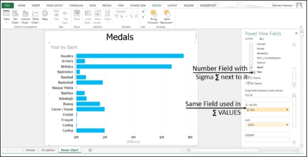
Power View has taken the Year as aggregate, as that is the only numeric field in the selected fields.
Step 2 − Click on the drop-down arrow next to a text (non-numeric) field in the Power View Fields.
Step 3 − Drag that field to Σ VALUES box.
Power View has taken it as Count of the Values of the Field.
Power Query
Power Query is a data discovery and query tool in Excel 2013. You can use Power Query to
Import data from external data sources, including big data sources like Hadoop and Facebook, shaping the data before you bring it into Excel and bringing in only the data you need.
Search for public data from sources such as Wikipedia.
Merge data from a variety of data sources, or append tables together, such as data from several shared tables in SQL Azure.
Bring the result into Excel as a single table for −
- Visualizing in Power Map and Power View.
- Further analysis and modeling in Power Pivot.
Share queries to the Power BI data catalogue so others can use it as a starting point for their data exploration.
Unpivot source data from a PivotTable or matrix format to a flat table.
To summarize, the Power Query Data Sources are −
Web page, Excel or CSV file, XML file, Text file, Folder, SQL Server database, Microsoft Azure, SQL Database, Access database, Oracle database, IBM DB2 database, MySQL database, PostgreSQL Database, Sybase Database, Teradata Database, SharePoint List, OData feed, Microsoft Azure Marketplace, Hadoop File (HDFS), Microsoft Azure HDInsight, Microsoft Azure Table Storage, Active Directory, Microsoft Exchange and Facebook.
Power BI Desktop
Power BI is a collection of online services and features that enables you to find and visualize data, share discoveries, and collaborate in intuitive new ways. Power BI extends to all your mobile devices, too.
Power BI introduces the Power BI Desktop, a dedicated report-authoring tool that enables you to transform data, create powerful reports and visualizations, and easily publish to the Power BI service.
Power BI Desktop lets you create a collection of queries, data connections, and reports that can easily be shared with others. Power BI Desktop integrates proven Microsoft technologies the powerful Query engine, data modeling, and visualizations and works seamlessly with the online Power BI service.
With the combination of Power BI Desktop (where analysts and others can create powerful data connections, models and reports) and the Power BI service (where Power BI Desktop reports can be shared so the users can view and interact with them), new insights from the world of data are easier to model, build, share, and extend.
Data analysts will find Power BI Desktop a powerful, flexible, and a highly accessible tool to connect with and shape the world of data, build robust models, and create wellstructured reports.
You can perform the following tasks in Power BI −
- Connect to Data
- Shape Data
- Combine Data
- Build Reports
- Share Your Work
Connect to Data
You can contact various web resources and find the ever-growing data in the world. You can Connect to the Data Source so that you can retrieve the Data you want and Adjust the data to meet your needs. The process of adjusting the connected data is called shaping the data.
Shape Data
As you Shape the Data, a Query Editor follows your instructions to adjust the data while loading. The original data source is not affected; only this particular view of the data is shaped.
Steps to Shape Data may include −
- Rename a Table
- Rename a Column
- Transform a Data Type
- Delete Column
- Change text to numbers
- Remove Rows
- Setting the First Row as Headers
Combine Data
If the tables are a result of the queries you applied to the data, they are often referred to as queries. You can combine two tables, or queries, into one.
There are two primary ways of combining queries merging and appending.
When you have one or more columns to add to another query, you merge the queries. When you have additional rows of data to add to an existing query, you append the query.
If you have enough Data to create interesting Reports, save the Data as Power BI Desktop (.pbix) file. You can Load this data file whenever you want and you can make changes and Reload.
Build Reports
You can build Reports in Power BI Desktop Report view.
The Report view has five main areas −
The ribbon, which displays common tasks associated with reports and visualizations.
The Report view, or canvas, where visualizations are created and arranged.
The Pages tab area along the bottom, which lets you select or add a report page.
The Visualizations pane, where you can change visualizations, customize colors or axes, apply filters, drag fields, and more.
The Fields pane, where query elements and filters can be dragged onto the Report view, or dragged to the Filters area of the Visualizations pane.
You can create different types of interesting reports and visualizations.
Share Your Work
You can share a completed Power BI Desktop report with the others on the Power BI service. There are a few ways to share your work in Power BI Desktop. You can
publish to the Power BI service
upload the .pbix file directly from the Power BI service
save the .pbix file and send it like any other file
Advanced Excel - Templates
Excel 2013 has thousands of online Templates of several categories that help you get started quickly by doing most of the set-up and design work for you. You can just focus on your data.
Step 1 − Open Excel 2013. You will see many templates. You also see a Search Box on the top and some Categories below that.
Step 2 − Click on the category - Business. You will get a message saying Excel is Searching Thousands of Online Templates.
All the templates available in the category Business will be displayed. Also, all the categories available will be displayed on the right side, with the selected category listed as top most. The list of the categories gives the number of templates in each Category.
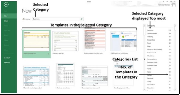
Step 3 − Select another Category Sales from the Category List on the right side. The Category Sales moves up to the top most position in the Category List. The templates of the selected category Sales are displayed.
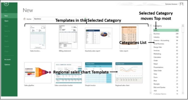
Step 4 − Click on Regional sales chart Template. A brief description of the template, preview of the template and CREATE button are displayed.
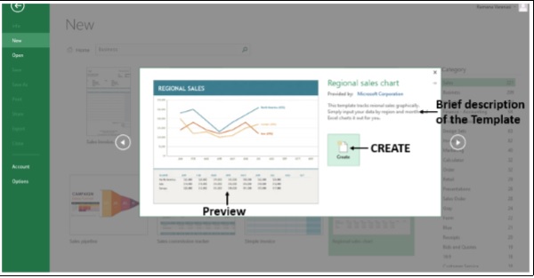
Step 5 − Click on CREATE. Excel creates a Sample Excel Worksheet with the Template you have chosen and with the sample data.
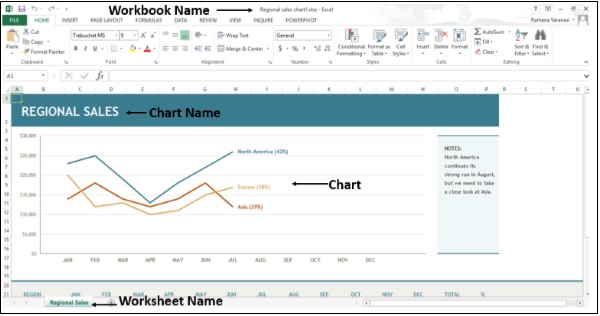
Note that the Workbook Name, Worksheet Name, Chart Name are also given by Excel appropriately.
Step 6 − Replace the data in the worksheet with your data.
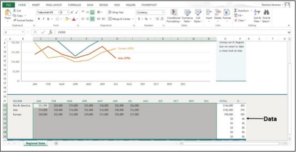
Your Excel Worksheet is ready with mere focus on data.
Advanced Excel - Inquire
You can use Inquire to −
- Compare two Workbooks
- Analyze a Workbook for problems or inconsistencies
- See the links between the Workbooks
- See the links between the Worksheets
- See the Relationships between the cells
- Clean Excess Cell Formatting
- Manage Passwords
The Inquire tab is on the Ribbon. It has commands for all the tasks given above.
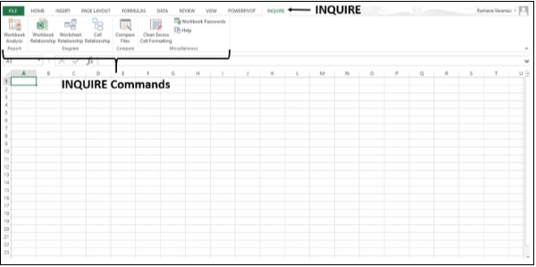
If you do not find the INQUIRE tab on the Ribbon, you have to ensure that Inquire Add-in is Active.
Ensure Inquire Add-in is Active
Step 1 − Click on the File tab. Click on Options.
Step 2 − In the Excel Options window, click on Add-Ins. If Inquire Add-in is Active, then it will appear under Active Application Add-ins.
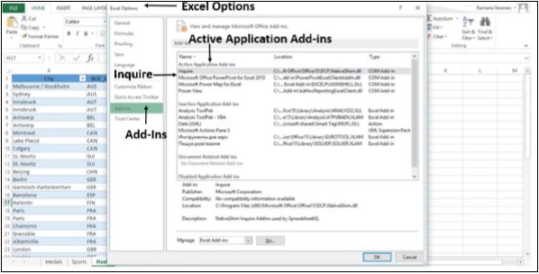
If Inquire Add-in is not active, do the following −
Step 3 − Click on the File tab. Click on Options.
Step 4 − In the Excel Options Window, click on Add-Ins.
Step 5 − In the Manage Box, Click on COM Add-ins.
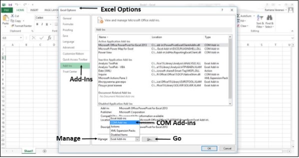
Step 6 − Click on the Go Button. The COM Add-Ins window appears. You find that Inquire is not selected.
Step 7 − Select Inquire and then click OK.
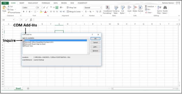
Now, the Inquire Add-In is active.
Compare Two Workbooks
You can compare two workbooks cell by cell and see the differences, if any.
Step 1 − Open two Workbooks.
Step 2 − Click on the INQUIRE tab on the ribbon.
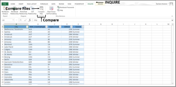
Step 3 − Click on Compare Files in the Compare Group. A Select Files To Compare dialog box appears.
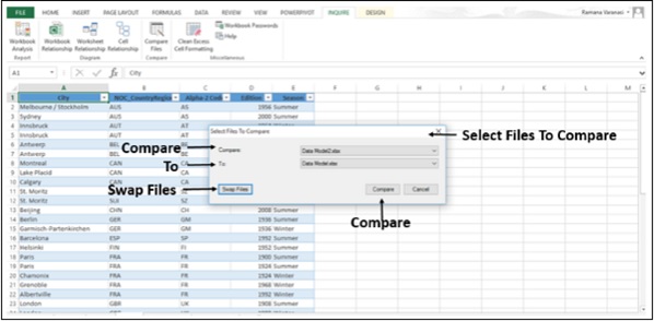
Step 4 − Check the file names displayed.
Step 5 − If the file name displayed is not the one you wanted, click on the down-arrow next to the File name. Only the Workbooks that are open will be displayed.
Step 6 − Select the File you want.
Step 7 − Check the order of the Files in Compare and To.
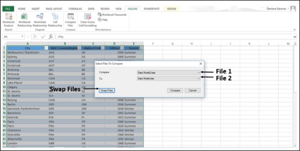
Step 8 − If it has to be the other way round, click on Swap Files. The order of the Files is changed.
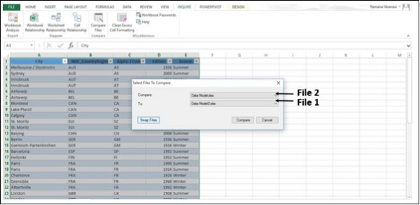
Step 9 − Click on Compare.
The results of the comparison appear in a two-pane grid. The Workbook on the left corresponds to the "Compare" file you chose and the Workbook on the right corresponds to the "To" file. The details appear in a pane below the two grids. The changes are highlighted by color, depending on the kind of change. The legend that shows what the colors mean is in the lower-left pane.
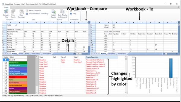
Step 10 − Click on Resize Cells to Fit if necessary, to view the cell contents in the Compare To workbooks.
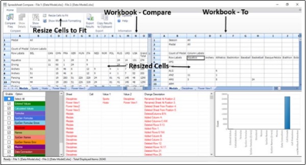
Step 11 − Click on the Export Results in the Export Group.
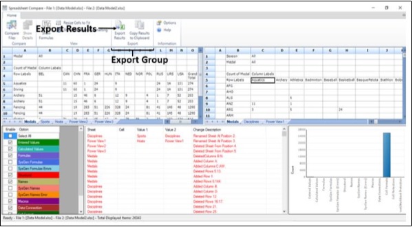
The Save As Dialog Box opens.
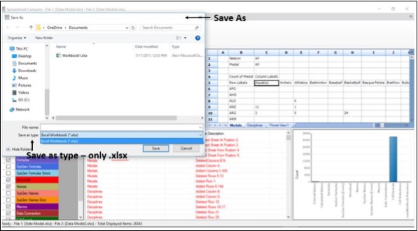
You can save the results to an Excel Workbook. Note that only .xlsx File type is available.
If you need the results in another program, you can do it by copying it to the Clipboard.
Step 12 − Click on Copy Results to Clipboard in the Export group.
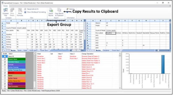
Step 13 − Paste in another program.
Advanced Excel - Workbook Analysis
Workbook Analysis command creates an interactive report showing detailed information about the Workbook and its Structure, Formulas, Cells, Ranges, and Warnings.
Step 1 − Click on the Inquire tab on the ribbon.
Step 2 − Click on Workbook Analysis in the Report group.
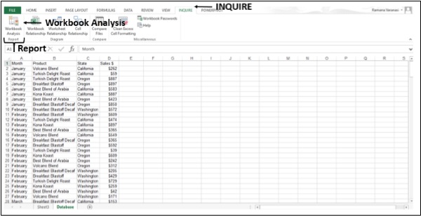
The Report will be displayed after the Workbook Analysis is completed.
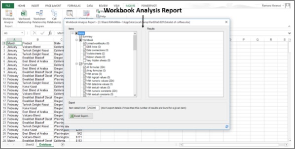
The Report has six categories −
Summary − General information about the structure and content of the Workbook.
Workbook (with subcategories) − General Workbook Statistics.
Formulas (with subcategories) − Specific information about formulas in the Workbook.
Cells (with subcategories) − Specific information about the cells in the Workbook.
Ranges (with subcategories) − Specific information about the ranges in the Workbook.
Warnings − Several types of warnings about the Workbook structure and content.
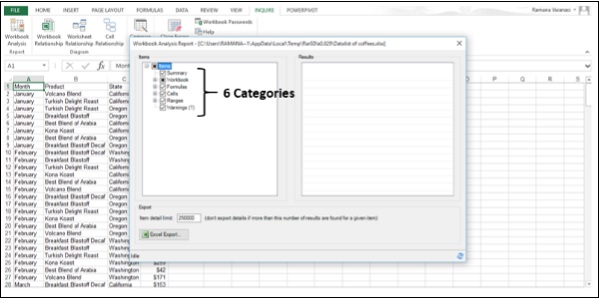
Selecting a Category gives you more information about that Category.
Step 3 − Click on the Formulas category. Sub-Categories of the formulas will be displayed.
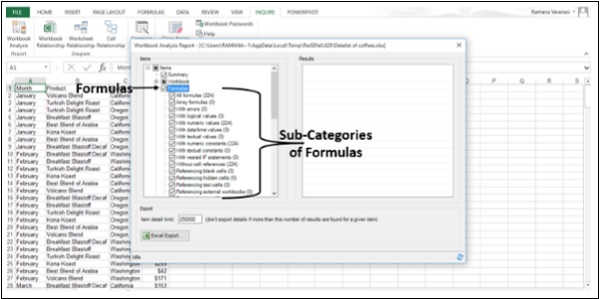
For example,
- All formulas are 224 in number.
- With numeric values are 224 in number.
Step 4 − Click on a Sub-Category. For example, click "With numeric values".
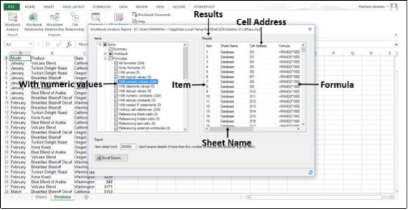
Step 5 − Click on the Excel Export button.
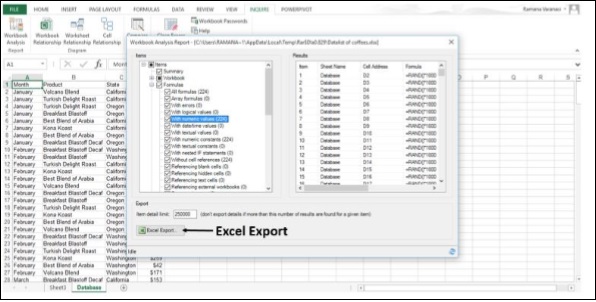
The Save As Dialog Box opens.
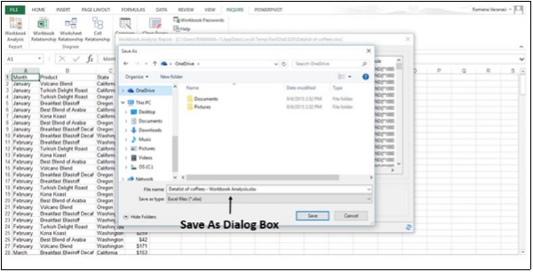
Step 6 − Save the Report as an Excel Workbook. A Load Export File button appears next to Excel Export button.
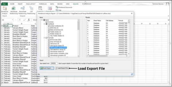
Step 7 − Click on the Load Export File button. The saved Report Excel Workbook opens.
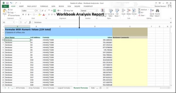
Diagrams
In the Diagram group, under the INQUIRE tab, three types of diagrams are available.
- Workbook Relationship
- Worksheet Relationship
- Cell Relationship
They are interactive diagrams created by links. The links show the dependencies between the nodes in the diagram. You can drag the links or nodes to arrange them and align them to view whatever you are looking for.
Workbook Relationship
You can use the Workbook Relationship diagram to create an interactive, graphical map of Workbook dependencies created by connections (links) between files.
The types of links in the diagram can include other Workbooks, Access databases, text files, HTML pages, SQL Server databases, and other data sources.
Step 1 − Click on the INQUIRE tab on the ribbon.
Step 2 − Click on Workbook Relationship in the Diagram group.
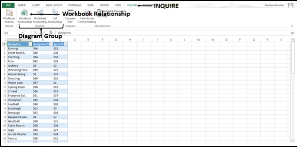
The Workbook Relationship Diagram appears, showing its links with different Data Sources.
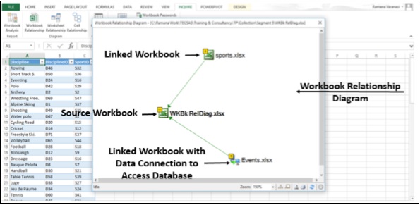
Worksheet Relationship
You can use Worksheet Relationship Diagram to create an interactive, graphical map of connections (links) between Worksheets in the same Workbook and /or Worksheets in other Workbooks.
Step 1 − Click on the INQUIRE tab on the ribbon.
Step 2 − Click on Worksheet Relationship in the Diagram Group.
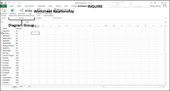
The Worksheet Relationship Diagram appears, showing the links between the Worksheets in the same Workbook and in other Workbooks.
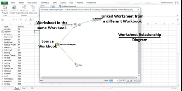
Cell Relationship
You can use the Cell Relationship Diagram to get a detailed, interactive diagram of all links from a selected cell to cells in other worksheets or even other workbooks.
Step 1 − Click on the INQUIRE tab on the ribbon.
Step 2 − Click on Cell Relationship in the Diagram group.
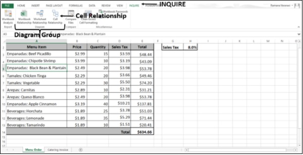
The Cell Relationship Diagram options window appears.
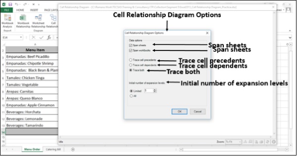
Step 3 − Select the options.
Step 4 − Click OK.
The Cell Relationship Diagram appears, showing links between the Selected Cell and the Cells in the same Worksheet, same Workbook and in other Workbooks, based on the options you have chosen.
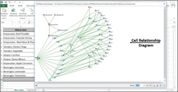
Step 5 − Click on Zoom.
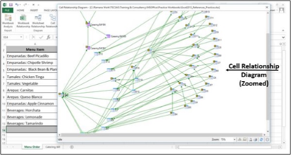
You can view the nodes clearly.
Clean Excess Cell Formatting
When a Workbook loads slowly, or has become huge, it might have formatting applied to rows or columns you are not aware of.
You can use the Clean Excess Cell Formatting command to remove the excess formatting and greatly reduce the file size. This reduces file size and improves your Excel's speed.
But, you may want to make a backup copy of your file before cleaning the excess cell formatting, because there are certain cases where this process may increase your file size, and there is no way to undo the change.
Step 1 − Click on the INQUIRE tab on the ribbon.
Step 2 − Click on Clean Excess Cell Formatting in the Miscellaneous Group.
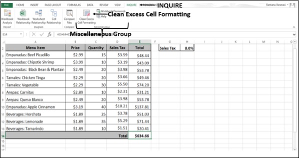
The Clean Excess Cell Formatting Dialog Box appears.
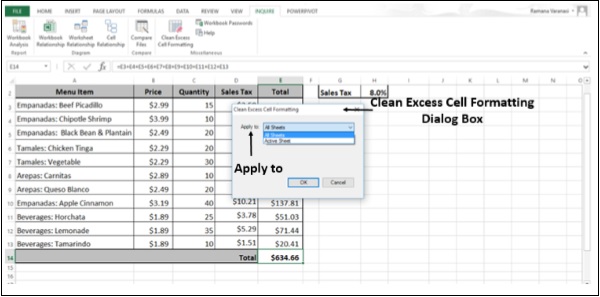
Step 3 − Choose All Sheets in the Apply to box. You will get a message about saving the changes made.
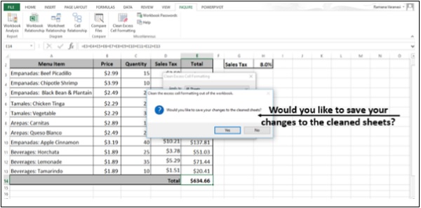
Step 4 − Click OK.
Advanced Excel - Manage Passwords
If you are using Workbook Analysis or Compare Files commands for Workbooks that are password-protected, you can avoid having to type the password each time those files are opened.
Excel 2013 has a Password Manager, which can be accessed through the Workbook Passwords Command.
Step 1 − Click on the INQUIRE tab on the ribbon.
Step 2 − Click on Workbook Passwords in the Miscellaneous Group.
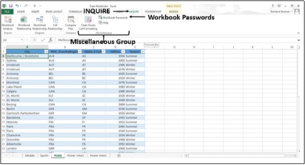
The Password Manager window opens.
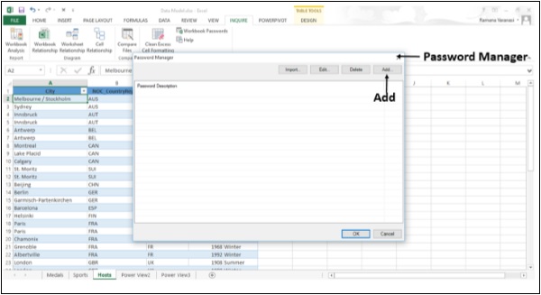
Step 3 − Add passwords of your Workbooks. Add password descriptions also.
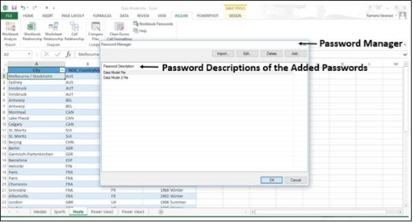
Embed Worksheet Data in a Web Page
To share a part of your worksheet on the web, you can simply embed it on your web page. Other people can then work with the data in Excel Online or open the embedded data in Excel.
Share an Excel worksheet in an online meeting
You can present your Workbook online if you have the Lync installed.
Step 1 − Close all the Workbooks that you do not want to share and keep only the Workbook you want to share Open.
Step 2 − Click on the File menu.
Step 3 − Click on the option - Share.
Step 4 − Click on Present Online.
Step 5 − Under the option - Present Online, click Present.
Step 6 − In the Share Workbook Window, pick a scheduled meeting or click Start a new Lync meeting, and then click OK.
Step 7 − To stop sharing, click Stop Sharing at the top of the screen. You can present your Workbook online if you have a Skype Account also. Microsoft is introducing Skype for Business.
Advanced Excel - File Formats
Save a Workbook in another File Format
When you save an Excel 2013 Workbook, by default it saves in the .xlsx format. Excel 2013 supports saving in other formats, but whenever you save a workbook in another file format, some of its formatting, data, and features might not be saved.
File Formats (File Types) that are supported in Excel 2013 −
- Excel File Formats
- Text File Formats
- Other File Formats
Excel File Formats
| Format | Extension | Description |
|---|---|---|
| Excel Workbook | .xlsx | The default XML-based file format for Excel 2007-2013. Cannot store Microsoft Visual Basic for Applications (VBA) macro code or Microsoft Office Excel 4.0 macro sheets (.xlm). |
| Strict Open XML Spreadsheet | .xlsx | An ISO strict version of the Excel Workbook file format (.xlsx). |
| Excel Workbook (code) | .xlsm | The XML-based and macro-enabled file format for Excel 2007-2013. Stores VBA macro code or Excel 4.0 macro sheets (.xlm) |
| Excel Binary Workbook | .xlsb | The binary file format (BIFF12) for Excel 2007-2013. |
| Template | .xltx | The default file format for an Excel template for Excel 2007-2013. Cannot store VBA macro code or Excel 4.0 macro sheets (.xlm). |
| Template (code) | .xltm | The macro-enabled file format for an Excel template in Excel 2007-2013. Stores VBA macro code or Excel 4.0 macro sheets (.xlm). |
| Excel 97- Excel 2003 Workbook | .xls | The Excel 97 - Excel 2003 Binary file format (BIFF8). |
| Excel 97- Excel 2003 Template | .xlt | The Excel 97 - Excel 2003 Binary file format (BIFF8) for an Excel template |
| Microsoft Excel 5.0/95 Workbook | .xls | The Excel 5.0/95 Binary file format (BIFF5). |
| XML Spreadsheet 2003 | .xml | XML Spreadsheet 2003 file format (XMLSS). |
| XML Data | .xml | XML Data format. |
| Excel Add-In | .xlam | The XML-based and macro-enabled Add-In format for Excel 2007-2013. An Add-In is a supplemental program that is designed to run additional code. Supports the use of VBA projects and Excel 4.0 macro sheets (.xlm). |
| Excel 97-2003 Add-In | .xla | The Excel 97-2003 Add-In, a supplemental program that is designed to run additional code. Supports the use of VBA projects. |
| Excel 4.0 Workbook | .xlw | An Excel 4.0 file format that saves only worksheets, chart sheets, and macro sheets. You can open a workbook in this file format in Excel 2013, but you cannot save an Excel file to this file format. |
Text File Formats
If you save a workbook in any text format, all formatting is lost.
| Format | Extension | Description |
|---|---|---|
| Formatted Text (Spacedelimited) | .prn | Lotus space-delimited format. Saves only the active sheet. |
| Text (Tabdelimited) | .txt | Saves a workbook as a tab-delimited text file for use on another Microsoft Windows operating system, and ensures that tab characters, line breaks, and other characters are interpreted correctly. Saves only the active sheet. |
| Text (Macintosh) | .txt | Saves a workbook as a tab-delimited text file for use on the Macintosh operating system, and ensures that tab characters, line breaks, and other characters are interpreted correctly. Saves only the active sheet. |
| Text (MS-DOS) | .txt | Saves a workbook as a tab-delimited text file for use on the MS-DOS operating system, and ensures that tab characters, line breaks, and other characters are interpreted correctly. Saves only the active sheet. |
| Unicode Text | .txt | Saves a workbook as Unicode text, a character encoding standard that was developed by the Unicode Consortium. |
| CSV (comma delimited) | .csv | Saves a workbook as a comma-delimited text file for use on another Windows operating system, and ensures that tab characters, line breaks, and other characters are interpreted correctly. Saves only the active sheet. |
| CSV (Macintosh) | .csv | Saves a workbook as a comma-delimited text file for use on the Macintosh operating system, and ensures that tab characters, line breaks, and other characters are interpreted correctly. Saves only the active sheet. |
| CSV (MS-DOS) | .csv | Saves a workbook as a comma-delimited text file for use on the MS-DOS operating system, and ensures that tab characters, line breaks, and other characters are interpreted correctly. Saves only the active sheet. |
| DIF | .dif | Data Interchange Format. Saves only the active sheet. |
| SYLK | .slk | Symbolic Link Format. Saves only the active sheet. |
Other File Formats
| Format | Extension | Description |
|---|---|---|
| DBF 3, DBF 4 | .dbf | dBase III and IV. You can open these files formats in Excel, but you cannot save an Excel file to dBase format. |
| OpenDocument Spreadsheet | .ods | OpenDocument Spreadsheet. You can save Excel 2010 files so they can be opened in spreadsheet applications that use the OpenDocument Spreadsheet format, such as Google Docs and OpenOffice.org Calc. You can also open spreadsheets in the .ods format in Excel 2010. Formatting might be lost when saving and opening .ods files. |
| Portable Document Format (PDF). This file format preserves document formatting and enables file sharing. When the PDF format file is viewed online or printed, it retains the format that you intended. Data in the file cannot be easily changed. The PDF format is also useful for documents that will be reproduced by using commercial printing methods. | ||
| XPS Document | .xps | XML Paper Specification (XPS). This file format preserves document formatting and enables file sharing. When the XPS file is viewed online or printed, it retains exactly the format that you intended, and the data in the file cannot be easily changed. |
Step 1 − Select the File menu.
Step 2 − Click on the option Save As. You get a choice of places to save the Workbook, both on local devices (e.g. Computer) and internet (e.g. OneDrive).
Step 3 − Click on Computer.
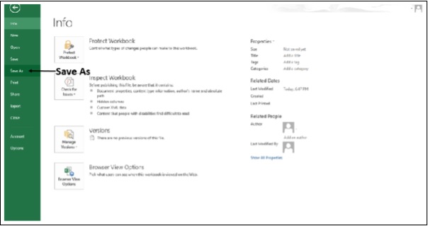
The Save As Dialog box opens.
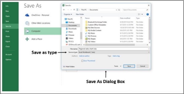
Step 4 − Click on Save As type. The file formats will be listed.
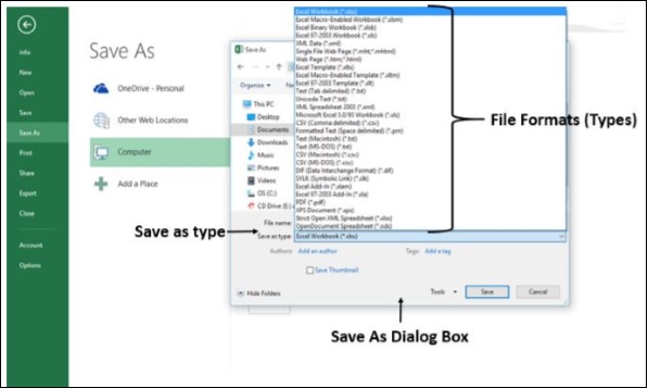
The file formats displayed depend on the type of active Worksheet in your Workbook (Data Worksheet, Chart Worksheet, or other type of Worksheet).
Step 5 − Click on the File Format you want.
File Formats that Use the Clipboard
You can use the Clipboard to copy data to the clipboard in few File Formats, which you can paste into Excel using the command Paste or Paste Special.
| Format | Extension | Clipboard Type Identifiers |
|---|---|---|
| Picture | .wmf or .emf | Pictures in Windows Metafile Format (WMF) or Windows Enhanced Metafile Format (EMF). NOTE − If you copy a Windows metafile picture from another program, Excel pastes the picture as an enhanced metafile. |
| Bitmap | .bmp | Pictures stored in Bitmap format (BMP). |
| Microsoft Excel file formats | .xls | Binary file formats for Excel versions 5.0/95 (BIFF5), Excel 97-2003 (BIFF8), and Excel 2013 (BIFF12). |
| SYLK | .slk | Symbolic Link Format. |
| DIF | .dif | Data Interchange Format. |
| Text (tabdelimited) | .txt | Tab-separated text format. |
| CSV (Commadelimited) | .csv | Comma-separated values format. |
| Formatted text (Space-delimited) | .rtf | Rich Text Format (RTF). Only from Excel. |
| Embedded object | .gif, .jpg, .doc, .xls, or .bmp | Microsoft Excel objects, objects from properly registered programs that support OLE 2.0 (OwnerLink), and Picture or another presentation format. |
| Linked object | .gif, .jpg, .doc, .xls, or .bmp | OwnerLink, ObjectLink, Link, Picture, or other format. |
| Office drawing object | .emf | Office drawing object format or Picture (Windows enhanced metafile format, EMF). |
| Text | .txt | Display Text, OEM Text. |
| Single File Web Page | .mht, .mhtml | Single File Web Page (MHT or MHTML). This file format integrates inline graphics, applets, linked documents, and other supporting items referenced in the document. |
| Web Page | .htm, .html | Hypertext Markup Language (HTML). NOTE − When you copy text from another program, Excel pastes the text in HTML format, regardless of the format of the original text. |
File Formats not Supported in Excel 2013
Excel 2013 does not support the following File Formats anymore and you cannot open or save files in these File Formats.
| Format | Extension | Clipboard Type Identifiers |
|---|---|---|
| Excel Chart | .xlc | Excel 2.0, 3.0, and 2.x file formats |
| WK1, FMT, WK2, WK3, FM3, WK4 | .wk1, .wk2, .wk3, .wk4, .wks | Lotus 1-2-3 file formats (all versions) |
| Microsoft Works | .wks | Microsoft Works file format (all versions) |
| DBF 2 | .dbf | DBASE II file format |
| WQ1 | .wq1 | Quattro Pro for MS-DOS file format |
| WB1, WB3 | .wb1, .wb3 | Quattro Pro 5.0 and 7.0 for Windows. |
If you have to work with your Workbook data in a program that is not supported anymore, try the following −
Search the web for a company that makes File Format Converters for File Formats that are not supported by Excel 2013.
Save your Workbook to another File Format that can be opened in the other program. For example, save to an XML spreadsheet or text File Format that the other program might support as well.
Advanced Excel - Discontinued Features
Discontinued / Changed features
So far, you have seen the features that are added in Excel 2013. You also need to be aware of the −
- features existing in earlier versions of Excel that are no more available in Excel 2013, and
- the changed functionality in certain cases
Save Workspace
The Save Workspace command is no longer available in Excel. This command was used in earlier versions of Excel to save the current layout of all windows as a workspace. However, you can still open a workspace file (*.xlw) that was created in an earlier version of Excel.
New from Existing
In the earlier versions of Excel, the New from Existing option, which you get when you click File and then click New, let you base a new file on an existing one. This option is no longer available. Instead, you can open an existing Workbook and save it with a different file name.
Step 1 − Click on File.
Step 2 − Click on Save As. In the Save As dialog box give a different file name.
Alternatively, check if the workbook you want to use is in the Recent Workbooks folder.
Step 1 − Click on the File menu.
Step 2 − Click on Open.
Step 3 − Click on Recent Workbooks.
If the file is available there,
Step 4 − Right-click on its file name.
Step 5 − Then Click on Open a Copy.
Excel creates a copy of the file by adding a number to the file name. You can save the Workbook with a different file name as needed.
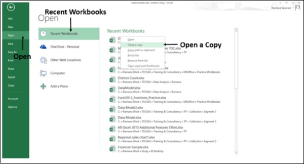
Save as Template
In the earlier versions of Excel, you can save a chart as a template on the Chart Tools ribbon by following the steps − Chart Tools → Design → Type.
In Excel 2013, Save as Template is no longer available on the Ribbon. To save a chart as a template −
Step 1 − Right-click on the Chart.
Step 2 − Click on the Save as Template option.
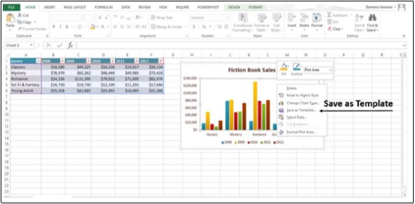
Excel saves the chart as a Chart template (*.crtx) in the default Microsoft Templates folder.
You can use it to create a Chart or change a Chart Type.
Step 1 − Select a Data Table.
Step 2 − Click on the INSERT tab on the Ribbon.
Step 3 − Click on Recommended Charts in the Charts group.
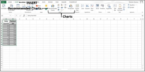
The Insert chart window appears.
Step 4 − Click on the All Charts tab.
Step 5 − Click on Templates. Under the Header My Templates, your saved Chart Templates will be displayed.
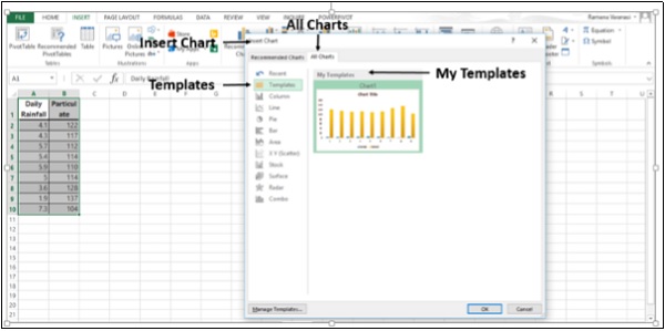
Similarly, to change a Chart Type −
Step 1 − Right-click on a Chart.
Step 2 − Click on Change Chart Type.
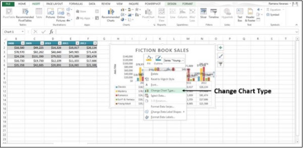
The Change Chart Type window appears.
Step 3 − Click on the All Charts tab.
Step 4 − Click on Templates. Under the Header My Templates, your saved Chart Templates will be displayed.
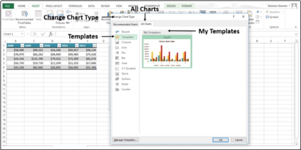
Split Box Control
You used the Split Box Controls on the worksheet to split the window into panes at any position on the Worksheet in earlier versions of Excel. In Excel 2013, Split Box Control is removed.
Instead, you can use the Split Command on the ribbon.
Step 1 − Click on the VIEW tab on the Ribbon.
Step 2 − Select the cell where you want to place the Split. Click on Split in the Window Group.
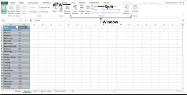
The Split appears. As earlier, you can drag a split to reposition it, and double-click a split to remove it.
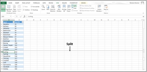
Blank Workbook
In the earlier versions of Excel, when you saved the Workbook settings, you frequently used a Workbook template called Book.xltx that is stored in the XLStart folder. This template would open automatically when you created a new blank Workbook.
When you start Excel 2013, the Start screen appears and Excel does not open a new Workbook automatically. The blank Workbook, which you click on the start screen is not associated with Book.xltx.
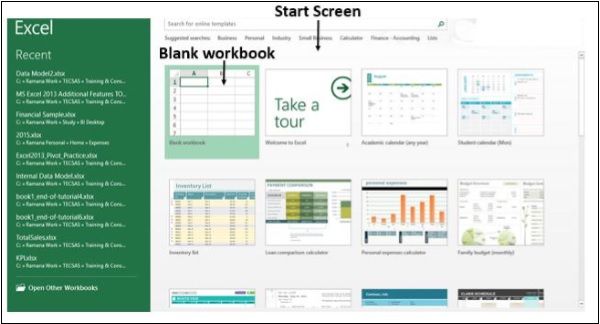
You can set up Excel to open a new Workbook automatically that uses Book.xltx −
Step 1 − Click on File.
Step 2 − Click on Options. The Excel Options window appears.
Step 3 − Click on General.
Step 4 − Uncheck the Show the Start screen when this application starts box under the Start up options.
The next time you start Excel, it opens a Workbook that uses Book.xltx.
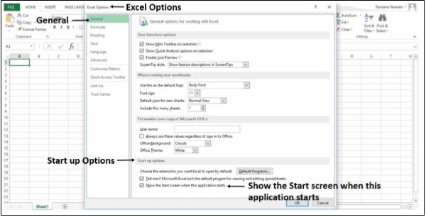
Save Options
In the earlier versions of Excel, when you saved a Workbook as a template, it automatically appeared in the My Templates folder under the Available Templates.
In Excel 2013, when you save a Workbook as a template, it will not automatically appear as a personal template on the new page.
Step 1 − Click on the File tab.
Step 2 − Click on Options.
Step 3 − Click on Save.
In the default personal templates location box, enter the path to the templates folder you created.
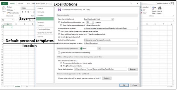
Microsoft Clip Organizer
Microsoft Clip Organizer is no longer included in Office 2013. The Clip Organizer feature is replaced by the Insert Pictures dialog box (Insert > Online Pictures). This new Insert Online Pictures feature lets you find and insert content from the Office.com Clip Art collection and other online sources, such as Bing Image/Video search, Flickr, and your OneDrive or Facebook page.
In Excel 2013, Microsoft Clip Organizer is not included. Instead, you can insert Pictures from online sources such as Bing Image Search, Flickr, your OneDrive, and Facebook.
Step 1 − Click on the INSERT tab on the ribbon.
Step 2 − Click on the Online Pictures button in the Illustrations group. An Insert Pictures dialog box opens.
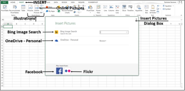
Step 3 − Select the picture from any of the sources.
MS Office Picture Manager
Microsoft Office Picture Manager is removed.
Exit option
In the earlier versions of Excel, you can exit Excel and close all the open workbooks at once. This was causing confusion among the different close and exit commands in Backstage View. Hence, it is removed.
Clicking on the File menu and then the Close option or the Close button  (in the upper-right corner of the application window) closes the workbooks one at a time. If there are many open workbooks and you want to close all at once, it is time consuming because you can close only one workbook at a time.
If you want the Exit command available to you, you can add it to Quick Access Toolbar.
Step 1 − Click on the File tab.
Step 2 − Click on Options.
Step 3 − In the Excel Options window, click on the Quick Access Toolbar in the left pane. The option Customize the Quick Access Toolbar appears in the Right pane.
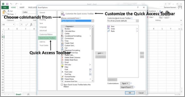
Step 4 − In Choose commands from: select All Commands.
Step 5 − Select Exit.
Step 6 − Click on Add. The Exit command is added to the list on the right side.
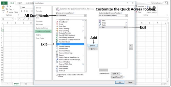
Step 7 − Click on OK.
The Exit Excel Command appears on Quick Access Toolbar.
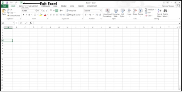
Step 8 − Click on the Exit Excel command. All the open workbooks close at once.
Browser View Options
Earlier, when saving a workbook to the web, you used to set how users will see your workbook when they view it. These options used to be in the Save As dialog box when you saved a workbook to SharePoint.
In Excel 2013, first you need to set the Browser View options.
Step 1 − Click on File.
Step 2 − Click on Info.
Step 3 − In the Info pane, click on the Browser View Options.
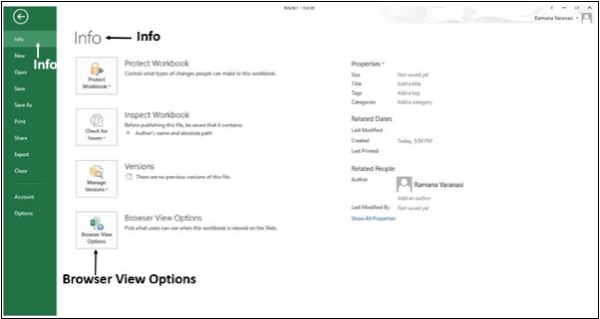
Step 4 − In the Browser View Options window, select the options.
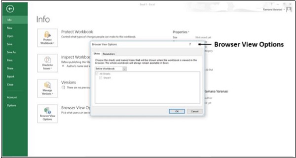
Step 5 − Save the workbook to any web location.
Individual Data Series
In the earlier versions of Excel, you could change the Chart type of an individual data series to a different Chart type by selecting each series at a time. Excel would change the Chart type of the selected data series only.
In Excel 2013, Excel will automatically change the Chart type for all data series in the Chart.
Pyramid and Cone Chart Types
The Column and Bar Charts are removed from the Pyramid and Cone Chart types in the Insert Chart and Change Chart Type dialog boxes.
However, you can apply Pyramid and Cone shapes to any 3-D Column or Bar Chart.
Step 1 − Right-click on the 3-D Column chart.
Step 2 − Click on Format Data Series.
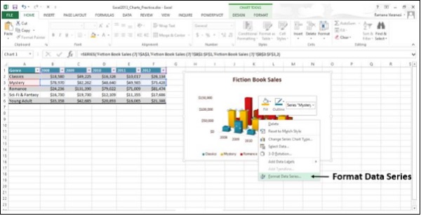
Step 3 − Select the shape you want.
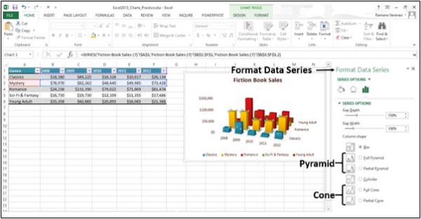
The required format will be displayed.
