- WPF Tutorial
- WPF - Home
- WPF - Overview
- WPF - Environment Setup
- WPF - Hello World
- WPF - XAML Overview
- WPF - Elements Tree
- WPF - Dependency Properties
- WPF - Routed Events
- WPF - Controls
- WPF - Layouts
- WPF - Nesting Of Layout
- WPF - Input
- WPF - Command Line
- WPF - Data Binding
- WPF - Resources
- WPF - Templates
- WPF - Styles
- WPF - Triggers
- WPF - Debugging
- WPF - Custom Controls
- WPF - Exception Handling
- WPF - Localization
- WPF - Interaction
- WPF - 2D Graphics
- WPF - 3D Graphics
- WPF - Multimedia
- WPF Useful Resources
- WPF - Quick Guide
- WPF - Useful Resources
- WPF - Discussion
WPF - Menu
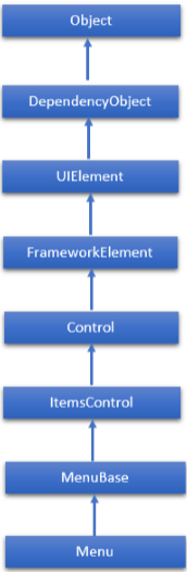
Menu is a control that enables you to hierarchically organize elements associated with the commands and event handlers. Menu is an ItemsControl, so it can contain a collection of any object type such as string, image, or panel. The hierarchical inheritance of Menu class is as follows −
Below are the commonly used properties on Menu class
| Sr.No. | Property & Description |
|---|---|
| 1 | Background Gets or sets a brush that describes the background of a control. (Inherited from Control.) |
| 2 | BindingGroup Gets or sets the BindingGroup that is used for the element. (Inherited from FrameworkElement.) |
| 3 | BitmapEffect Obsolete. Gets or sets a bitmap effect that applies directly to the rendered content for this element. This is a dependency property. (Inherited from UIElement.) |
| 4 | BorderThickness Gets or sets the border thickness of a control. (Inherited from Control.) |
| 5 | ContextMenu Gets or sets the context menu element that should appear whenever the context menu is requested through user interface (UI) from within this element. (Inherited from FrameworkElement.) |
| 6 | Effect Gets or sets the bitmap effect to apply to the UIElement. This is a dependency property. (Inherited from UIElement.) |
| 7 | Height Gets or sets the suggested height of the element. (Inherited from FrameworkElement.) |
| 8 | IsMainMenu Gets or sets a value that indicates whether this Menu receives a main menu activation notification. |
| 9 | Items Gets the collection used to generate the content of the ItemsControl. (Inherited from ItemsControl.) |
| 10 | ItemsPanel Gets or sets the template that defines the panel that controls the layout of items. (Inherited from ItemsControl.) |
| 11 | ItemsSource Gets or sets a collection used to generate the content of the ItemsControl. (Inherited from ItemsControl.) |
| 12 | ItemStringFormat Gets or sets a composite string that specifies how to format the items in the ItemsControl if they are displayed as strings. (Inherited from ItemsControl.) |
| 13 | ItemTemplate Gets or sets the DataTemplate used to display each item. (Inherited from ItemsControl.) |
| 14 | ToolTip Gets or sets the tool-tip object that is displayed for this element in the user interface (UI). (Inherited from FrameworkElement.) |
| 15 | VerticalContentAlignment Gets or sets the vertical alignment of the control's content. (Inherited from Control.) |
| 16 | Width Gets or sets the width of the element. (Inherited from FrameworkElement.) |
Commonly Used Events in Menu Class
| Sr.No. | Event & Description |
|---|---|
| 1 | ContextMenuClosing Occurs just before any context menu on the element is closed. (Inherited from FrameworkElement.) |
| 2 | ContextMenuOpening Occurs when any context menu on the element is opened. (Inherited from FrameworkElement.) |
| 3 | KeyDown Occurs when a key is pressed while focus is on this element. (Inherited from UIElement.) |
| 4 | KeyUP Occurs when a key is released while focus is on this element. (Inherited from UIElement.) |
| 5 | ToolTipClosing Occurs just before any tooltip on the element is closed. (Inherited from FrameworkElement.) |
| 6 | ToolTipOpening Occurs when any tooltip on the element is opened. (Inherited from FrameworkElement.) |
| 7 | TouchDown Occurs when a finger touches the screen while the finger is over this element. (Inherited from UIElement.) |
| 8 | TouchEnter Occurs when a touch moves from outside to inside the bounds of this element. (Inherited from UIElement.) |
| 9 | TouchLeave Occurs when a touch moves from inside to outside the bounds of this element. (Inherited from UIElement.) |
| 10 | TouchMove Occurs when a finger moves on the screen while the finger is over this element. (Inherited from UIElement.) |
| 11 | TouchUp Occurs when a finger is raised off of the screen while the finger is over this element. (Inherited from UIElement.) |
Example
Let’s create a new WPF project with the name WPFMenuControl.
Drag a menu control from the Toolbox to the design window.
The following example contains three menu options with some menu items. When the user clicks an item, the program updates the title. Here is the XAML code −
<Window x:Class = "WPFMenuControl.MainWindow"
   xmlns = "http://schemas.microsoft.com/winfx/2006/xaml/presentation"
   xmlns:x = "http://schemas.microsoft.com/winfx/2006/xaml"
   xmlns:d = "http://schemas.microsoft.com/expression/blend/2008"
   xmlns:mc = "http://schemas.openxmlformats.org/markup-compatibility/2006"
   xmlns:local = "clr-namespace:WPFMenuControl"
   mc:Ignorable = "d" Title = "MainWindow" Height = "350" Width = "604">

   <Grid>
      <Menu HorizontalAlignment = "Left" VerticalAlignment = "Top" Width = "517">

         <MenuItem Header = "File">
            <MenuItem Header = "Item 1" HorizontalAlignment = "Left" Width = "140"
               Click = "MenuItem_Click" />

            <MenuItem Header = "Item 2" HorizontalAlignment = "Left" Width = "140"
               Click = "MenuItem_Click" />

            <Separator HorizontalAlignment = "Left" Width = "140" />

            <MenuItem Header = "Item 3" HorizontalAlignment = "Left" Width = "140"
               Click = "MenuItem_Click"/>
         </MenuItem>

         <MenuItem Header = "Edit">
            <MenuItem Header = "Item 1" HorizontalAlignment = "Left" Width = "140"
               Click = "MenuItem_Click1" />
            <MenuItem Header = "Item 2" HorizontalAlignment = "Left" Width = "140"
               Click = "MenuItem_Click1" />
            <Separator HorizontalAlignment = "Left" Width = "140" />
            <MenuItem Header = "Item 3" HorizontalAlignment = "Left" Width = "140"
               Click = "MenuItem_Click1" />
         </MenuItem>

         <MenuItem Header = "View">
            <MenuItem Header = "Item 1" HorizontalAlignment = "Left" Width = "140"
               Click = "MenuItem_Click2" />
            <MenuItem Header = "Item 2" HorizontalAlignment = "Left" Width = "140"
               Click = "MenuItem_Click2" />
            <Separator HorizontalAlignment = "Left" Width = "140" />
            <MenuItem Header = "Item 3" HorizontalAlignment = "Left" Width = "140"
               Click = "MenuItem_Click2"/>
         </MenuItem>

      </Menu>
   </Grid>

</Window>
Here is the events implementation in C#.
using System.Windows;
using System.Windows.Controls;

namespace WPFMenuControl {
   /// <summary>
      /// Interaction logic for MainWindow.xaml
   /// </summary>

   public partial class MainWindow : Window {

      public MainWindow() {
         InitializeComponent();
      }

      private void MenuItem_Click(object sender, RoutedEventArgs e) {
         MenuItem item = sender as MenuItem;
         this.Title = "File: " + item.Header;
      }

      private void MenuItem_Click1(object sender, RoutedEventArgs e) {
         MenuItem item = sender as MenuItem;
         this.Title = "Edit: " + item.Header;
      }

      private void MenuItem_Click2(object sender, RoutedEventArgs e) {
         MenuItem item = sender as MenuItem;
         this.Title = "View: " + item.Header;
      }

   }
}
When you compile and execute the above code, it will produce the following output −
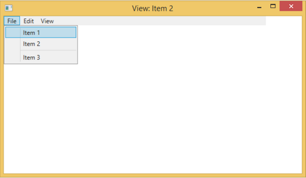
We recommend that you execute the above example code and try the other properties and events of Menu class.