- WPF Tutorial
- WPF - Home
- WPF - Overview
- WPF - Environment Setup
- WPF - Hello World
- WPF - XAML Overview
- WPF - Elements Tree
- WPF - Dependency Properties
- WPF - Routed Events
- WPF - Controls
- WPF - Layouts
- WPF - Nesting Of Layout
- WPF - Input
- WPF - Command Line
- WPF - Data Binding
- WPF - Resources
- WPF - Templates
- WPF - Styles
- WPF - Triggers
- WPF - Debugging
- WPF - Custom Controls
- WPF - Exception Handling
- WPF - Localization
- WPF - Interaction
- WPF - 2D Graphics
- WPF - 3D Graphics
- WPF - Multimedia
- WPF Useful Resources
- WPF - Quick Guide
- WPF - Useful Resources
- WPF - Discussion
WPF - Controls
Windows Presentation Foundation (WPF) allows developers to easily build and create visually enriched UI based applications.
The classical UI elements or controls in other UI frameworks are also enhanced in WPF applications.
All of the standard WPF controls can be found in the Toolbox which is a part of the System.Windows.Controls.
These controls can also be created in XAML markup language.
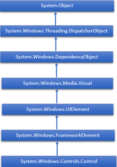
The complete inheritance hierarchy of WPF controls are as follows −
The following table contains a list of controls which we will discuss in the subsequent chapters.
| Sr. No. | Controls & Description |
|---|---|
| 1 | Button
A control that responds to user input |
| 2 | Calendar
Represents a control that enables a user to select a date by using a visual calendar display. |
| 3 | CheckBox
A control that a user can select or clear. |
| 4 | ComboBox
A drop-down list of items a user can select from. |
| 5 | ContextMenu
Gets or sets the context menu element that should appear whenever the context menu is requested through user interface (UI) from within this element. |
| 6 | DataGrid
Represents a control that displays data in a customizable grid. |
| 7 | DatePicker
A control that lets a user select a date. |
| 8 | Dialogs
An application may also display additional windows to help the user gather or display important information. |
| 9 | GridView
A control that presents a collection of items in rows and columns that can scroll horizontally. |
| 10 | Image
A control that presents an image. |
| 11 | Label
Displays text on a form. Provides support for access keys. |
| 12 | ListBox
A control that presents an inline list of items that the user can select from. |
| 13 | Menus
Represents a Windows menu control that enables you to hierarchically organize elements associated with commands and event handlers. |
| 14 | PasswordBox
A control for entering passwords. |
| 15 | Popup
Displays content on top of existing content, within the bounds of the application window. |
| 16 | ProgressBar
A control that indicates progress by displaying a bar. |
| 17 | RadioButton
A control that allows a user to select a single option from a group of options. |
| 18 | ScrollViewer
A container control that lets the user pan and zoom its content. |
| 19 | Slider
A control that lets the user select from a range of values by moving a Thumb control along a track. |
| 20 | TextBlock
A control that displays text. |
| 21 | ToggleButton
A button that can be toggled between 2 states. |
| 22 | ToolTip
A pop-up window that displays information for an element. |
| 23 | Window
The root window which provides minimize/maximize option, Title bar, border and close button |
| 24 | 3rd Party Controls
Use third-party controls in your WPF applications. |
We will discuss all these controls one by one with their implementation.